FORMALISM vs Abstract

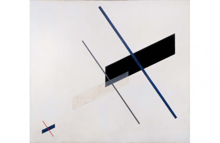
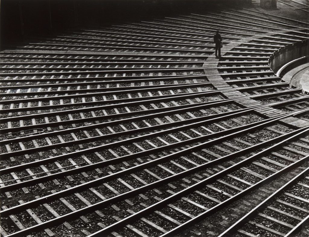
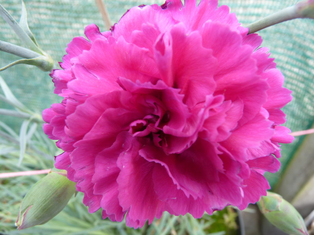
Formalism is a study in photography of form which is the way it it made and what it looks like. The photographer can sometimes become a visual designer when when deciding what will stay in the frame and not.

Its has also been descibed as “Soley by sensory or physical properties-” by a British Photographer

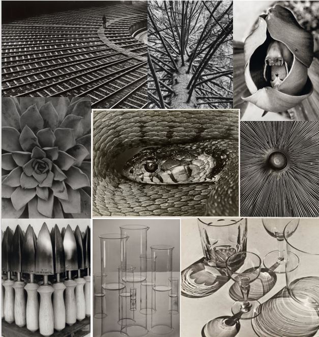
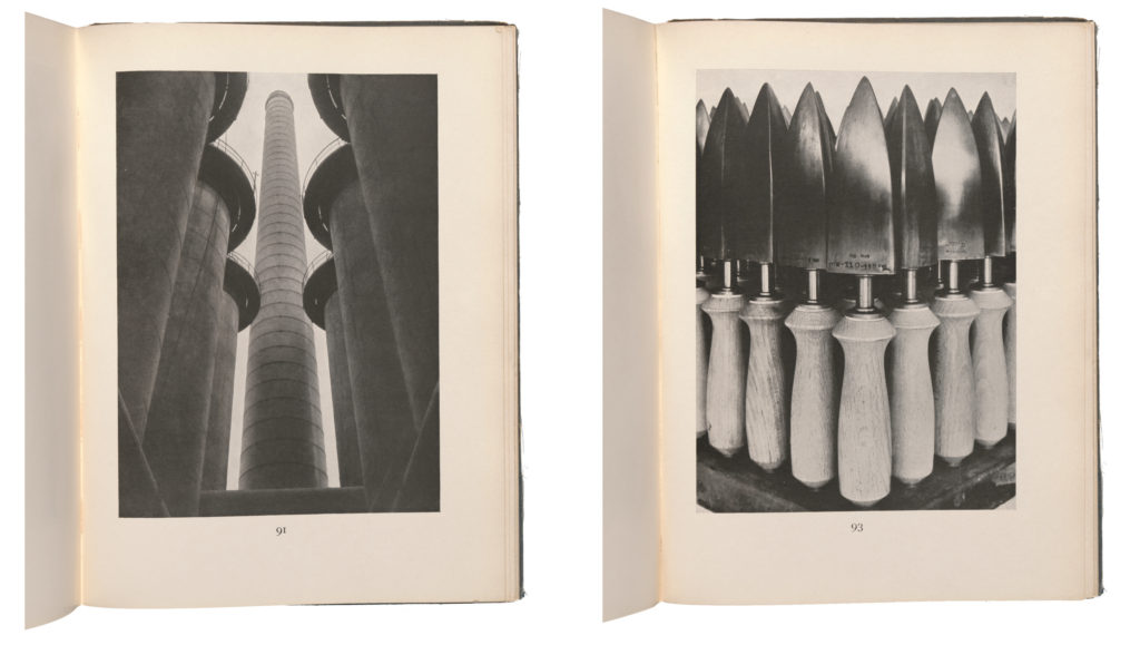
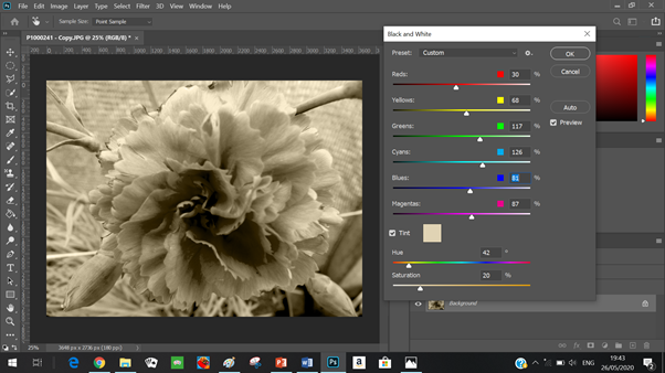
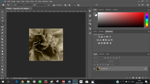
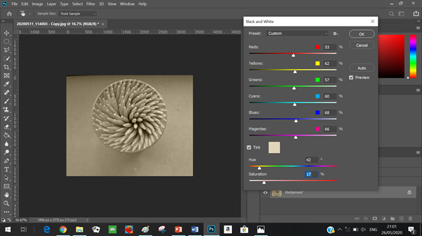
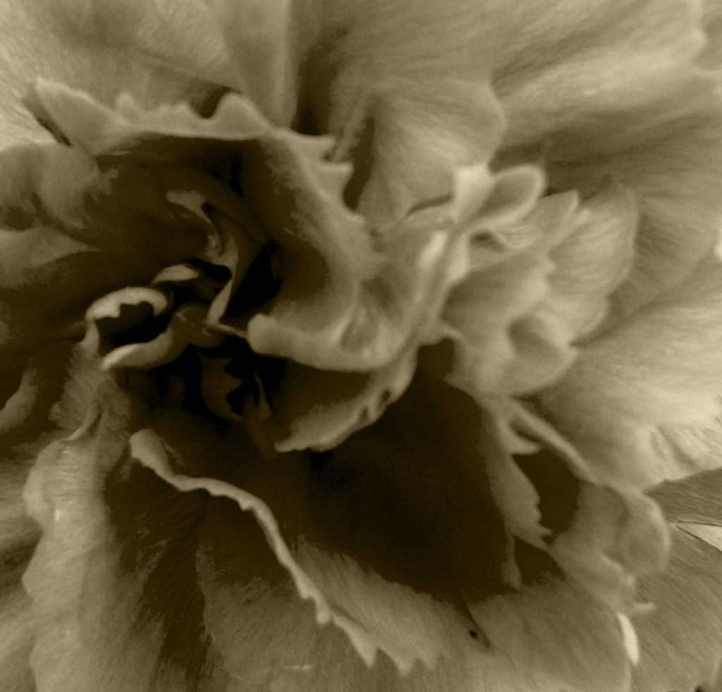
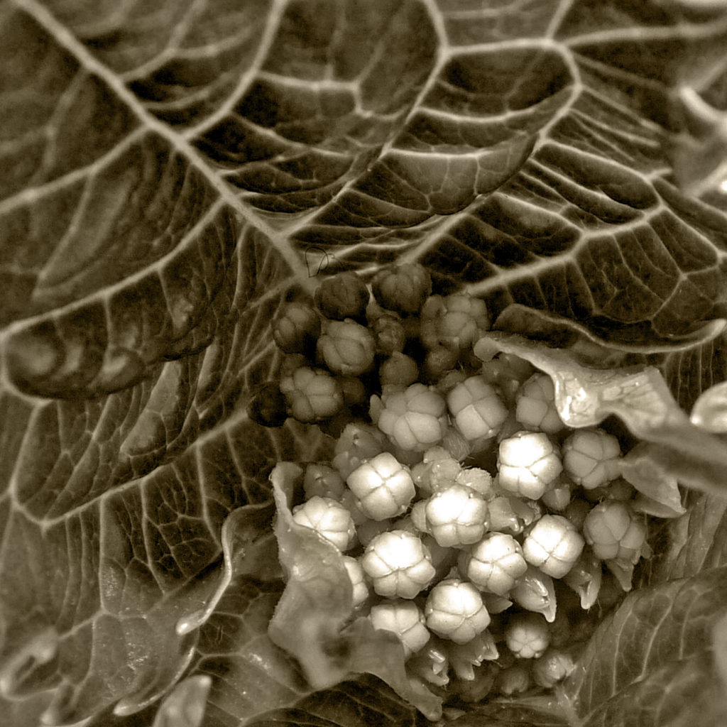
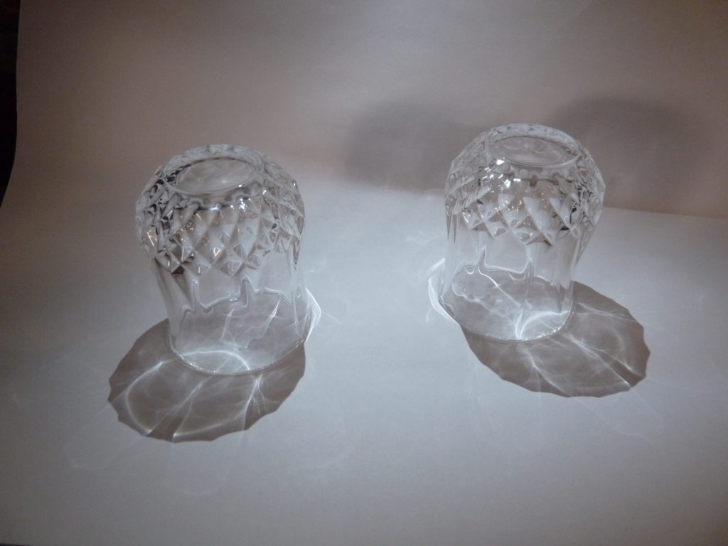
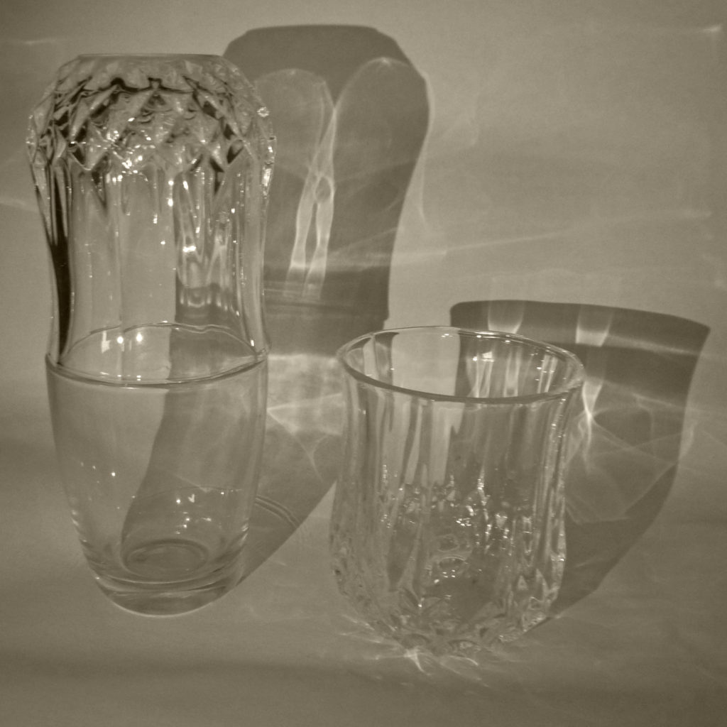
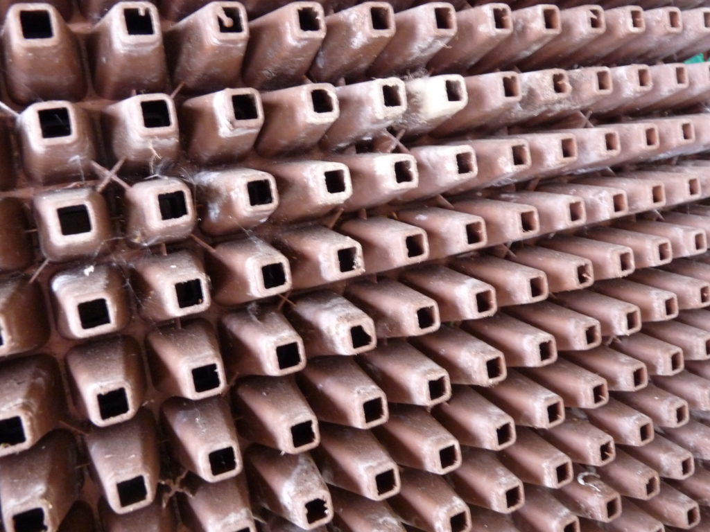
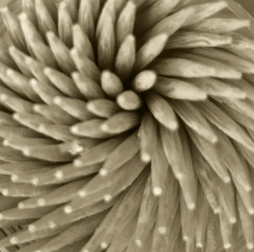
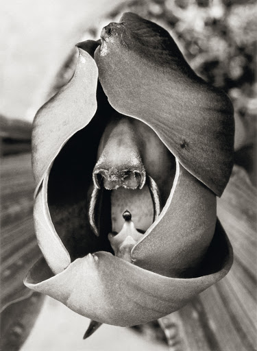
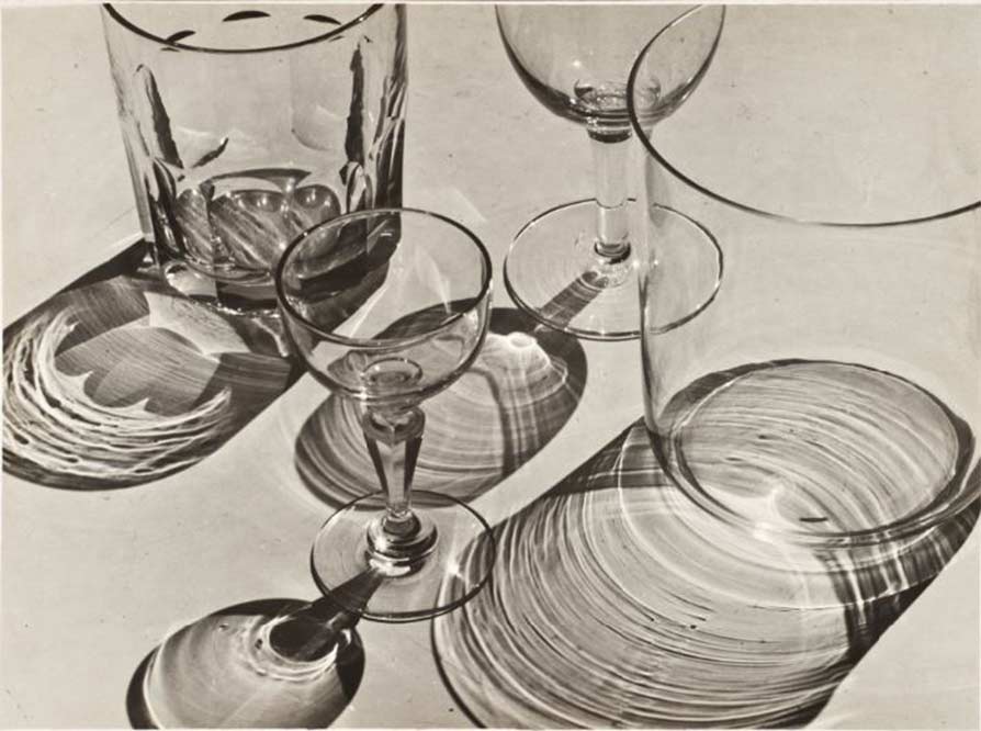
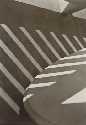
Formalism helps to enphasise compositional elements such as line, shape and texture and colour. However it does not contains aspects such as meaning or social and historic context. This strips the contextual and conceptual side of the image and allows the photographer to focus on the texture and fine detailing of the object being photographed.

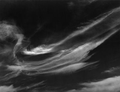
Abstraction or Abstract photography is a way of creating a visual image that doesnt not create an immediate association with the object “world”. This can be done through means of photographic lighting or equipment, materials or processes. It can also be known as non-objective, experimental, conceptual or even concrete photography

This definition can sometimes be very confusing and hard to understand, Here I found a helpful explination of this matter:

“For instance, get a sheet of paper and a pen, put your hand with fingers slightly separated, and draw an outline of your hand.

You now have just the outline information, the shape of your hand, by eliminating the skin texture, color, depth, form, etc. It has no fingerprints! This is how abstraction in general works, we leave some information behind and keep the parts we want to include in the /photograph.” https://petapixel.com/2017/03/20/introduction-abstract-photography

A form of Abstraction is done through Isolation or elimination where a photographer takes a natural scene and removes a part or fragement from it; giving context to the audience. This is often done on purpose to create seemingly unrealistic images, this is done through the use of color, light, shadow, texture, shape and/or form to convey a feeling, sensation or impression.

Key Artists:

THE FORMAL ELEMENTS – ALBERT RENGER-PATZSCH

Albert Renger-Patzsh was a famous German Photographer (June 22, 1897 – September 27, 1966) known for his association with New Objectitvity; this was a German Movement which was their attempt in a reaction against expressionism.

He began his photography career when he was only twelve years old, in Würzburg where he was born in. After completing military service in the First World War he worked as a press photographer in the early 1920s, for the Chicago Tribune before becoming a freelance photographer. by 1927 he had his first museum exhibition!’

Albert Renger-Patzsh belived that “ the value of photography was in its ability to reproduce the texture of reality, and to represent the essence of an object.

He has also had many books for example this one titled: Die Welt ist schön which means The World is Beautiful

Image Analysis:

Organic vs Geometric / Natural vs Man Made: Here it is Clear that image 1 is Geometric through the clear distinction of sharp straight lines and has been made by humans through the use of tools and knowledge in order to create the almost spiral effect with these objects. Whereas Image 2 is Organic as it has been made by nature and has come from living matter without the use of chemical. It is also Natural as it has not been tampered with but simply allowed to grow and nourish naturally.

Rhythm: Both images seem to have a Circular / Spiral rhythm, In image one half the circle is shown dragging my attention to the inner circle and the man in the frame. In image 2 The flower petals form a natural spiral again bringing my attention to the center of the flower.

Pattern/Repetition: In image 1, it is shown through the arrangement of the wooden planks and the metal railings, In image 2 this is shown in the flower petals.

Tone/ Light: In image 1, dynamic range is present through the darkest points being the shadows on the top left edge of the frame and the lightest point being the shine of the metal railings from a source of light. This makes the image have a high contrast making the image look dramatic. In image 2, the tones are much more muted and the dynamic range is much smaller which almost romanticises the plant to show the power and natural beauty of nature instead of making it dramatic.

Depth: Both images show Depth as in the first image depth is shown through the use of shadows and the man in the frame and in image 2 depth is shown due to the angle the image was taken in again showing depth due to the different angling of the petals themselves.

Line: Line is shown clearly in image 1 through the metal railings and the wooden rows, In Image 2; however’ lines are shown through the outlining of the petals.

Framing/Cropping: In both images, they both seem to be cropped and not showing the entire objects/ buildings, In image 1 only half of the building design is shown, and in image 2 it is clear that some of the petals have been cropped out of the picture, I think this makes the audience think about the detailing of the objects instead of the object itself.

Photoshoot Plan

What: I will be taking photoshoot for this formal elements project in which I will be taking inspiration for Albert Ranger Patzch.

When: I will be taking these photos on multiple days during lock down in order to find object that will work with this project.

Why: I want this photoshoot to be different as this style doesn’t compare to my previous shoots so I hope to reflect that through my work.

How: I will use my Lumix camera with the sun guard for outdoors shoots.

Where: I will take pictures just outside my home for safety reasons.

Editing Process

For this project I decided to use Photoshop in order to edit my images.

I started off by decreasing the brightness and increasing the contrast in order to add more dimension to the image without making the image too harsh.
I increased the Gamma correction slightly in order to again bring more dynamic range and dimension.
I then created a black and white filter which I adjusted to best fit the image, I also added a slight tint and saturation to create a type of sepia filter which I think reflected nicely with the style of my photographer.
I then went ahead and cropped the image quite substantially as I wanted the audience not to focus on what the object in the image is but the tone, the shapes and repetition of petals.
Here again I followed the similar process as with all my images here I adapted the brightness and contrast of the image in order to highlight the detail.
I then again created a black and white filter and added a slight saturation in order to make my image resemble my photographer
I then cropped this image in order to focus on the formal elements of the images.
Once again I started by adding contrast to the image and decrease the brightness in oder to enhance the detail and texture in the photo.
I then altered a black and white filter in order to make it best work for the image and added saturation to the image to mimic a sepia filter.
I wanted to get a different perspective and therefore rotated the image, i think this gave a great modification as it put the attention in the top right corner which I thought works best.
I then cropped the image and adjusted the brightness and contrast once more so that the image would look sharper and more defined.

Edited Images

Original
Original
Original
Original
Original
Original
Original
Original
Original

Final Outcomes

These were my favourite pictures from my photoshoot for the Formal Elements topic. I tried to focus on the idea of repetition, natural vs man made, geometric shapes, spiral rhythm, depth, line etc. I think my work overall worked well as I have tried to focus on the idea of taking an object and using certain angles and cropping to take the focus away from the object and onto its formal elements, here I found this challenging at times as I wasn’t taking photos to make them”aesthetically pleasing ” or have a “conceptual” meaning and instead had to focus on the face value of the objects and what formal elements they bring.

Spiralized shows the geometric, man made side of the formal elements this is due to the wooden picks being carved by humans into straight tooth picks and therefore emphasied the lines of each individual toothpick. Their is a circular rhythm shown through the arrangement of the picks their is also depth and dynamic range shown through the shadows towards the top right corner of the image which allows the image to look. Another point to add is the repetition of the amount of picks and all the points at the end of the pic this draws the attention of the audience. Overall I think I have linked well with my style of images to my photographer not only by the colour but through the style and careful choice of objects; I think this has helped to achieve these outcomes and I believe that they blend in well with Albert Ranger Patzch’s photographs.

Main photos of inspiration from this photoshoot: