– Formalism – Abstract –
– Definitions –
Formalism – Formalism refers to a way of creating, viewing and interpreting art that focuses on the visual elements and principles of design, disregarding politics, historical context, content and the artist. Formalism at it’s core focuses on the form – Shape, colour, texture and line – the visual components that make up the image.
Abstraction – Commonly referred to as ‘non-objective’ or ‘experimental’ photography, is a way of portraying a visual image that does not have an immediate or obvious association with the external world and that has been created through the use of photographic manipulation, equipment or materials – taking the key object of the image out of it’s original context.
– Formalism Moldboard –
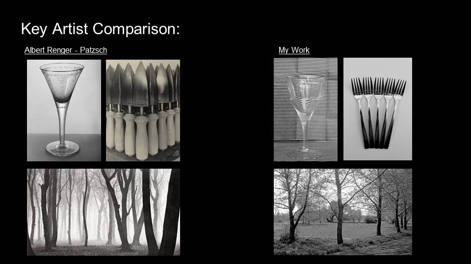
Formalism photography focuses on shape, colour, texture and line – the visual element that make up an image. This allows the viewer to interpret and relate to the image on their own basis as there is no focus on any political or historical contexts, allowing them to create their own. A key artist related to formalist photography is Albert Renger-Patzsch –
– Albert Renger-Patzsch – Artist Research –
Born in Wurzburg, Germany, 1897, Albert Renger-Patzsch’s photographic career first started in 1924 through producing the images for the first two books in a series titled Die Welt der Pflanze. He later became an independent photographer, presenting his own photos at different exhibitions.
During the period of WW2, Patzsch was appointed as the head of the department of pictorial photography of the Folkwangschule in Essen, however Nazi takeover of the arts forced him to leave after only a short period in the role. A bombing in 1944 destroyed his residence and most of his archive at the Folkwang, after this he concentrated on his own photography.
Patzsch was one of the pioneering photographers in the ‘New Objectivity’ movement; its aims to engage with the world as clearly and precisely as possible.
There must be an increase in the joy one takes in an object, and the photographer should be fully conscious of the splendid fidelity of reproduction made possible by his technique
Albert Renger-Patzsch
Patzsch believed that everyday objects were taken for granted, and their beauty commonly disregarded. His work exemplifies the aesthetic of The New Objectivity that flourished in the arts in Germany during WW2. Renger-Patzsch believed that the value of photography was in its ability to reproduce the texture of reality, and to represent the essence of an object. Or, in other words, show its natural beauty.
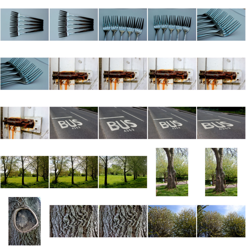
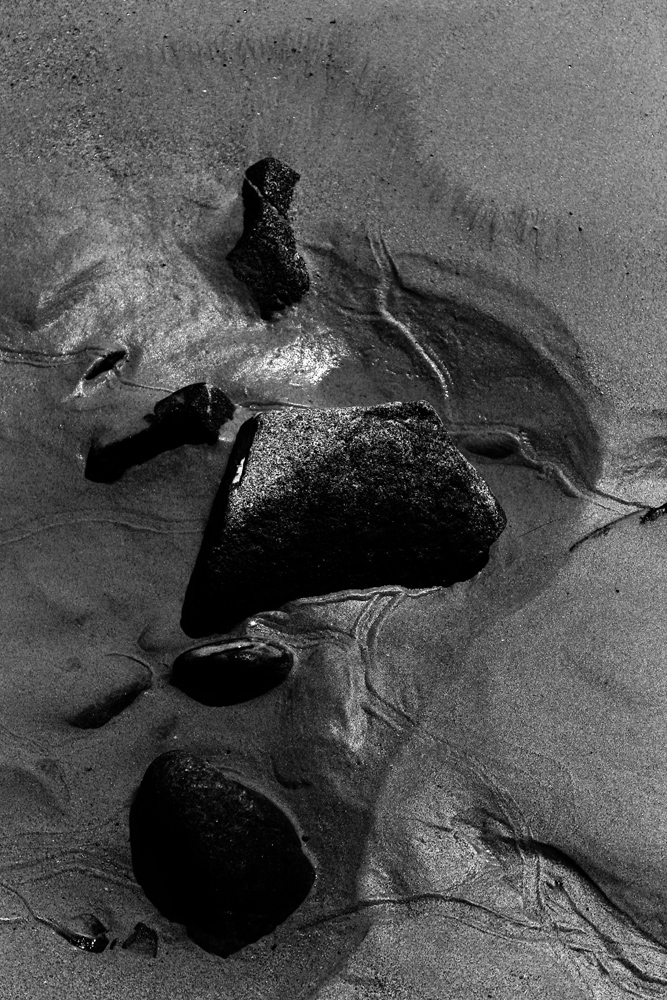
– Image Analysis –
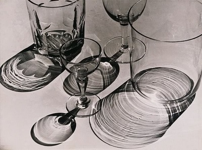
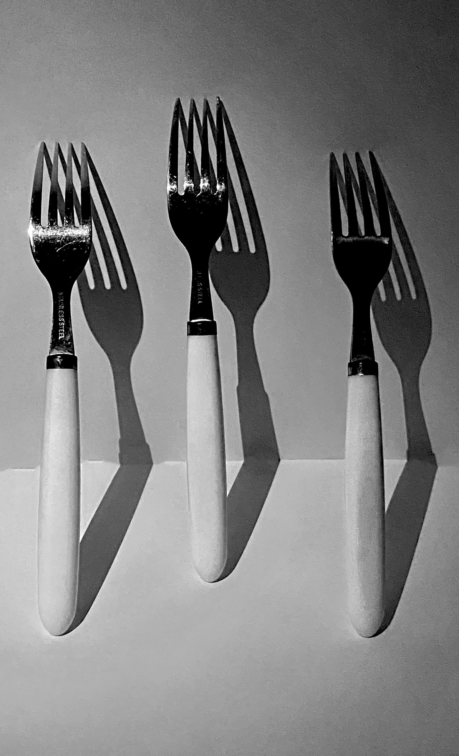
This image is from Albert Renger-Patzsch’s project called ‘The World is Beautiful’.
As an image that falls under the ‘Formalism’ genre of photography, the key idea of this project, and therefore this image, is to express the beauty of everyday objects by focusing on – Shape, colour, texture and line – the visual components that make up the image, rather than hidden messages the image may suggest.
As seen in the photo above, the glasses each have their own shadow all facing the same direction, suggesting that the light source could be natural sunlight or a source of one-point lighting in order to create the effect. However, seen as this specific style of photography focuses on exposing the beauty of everyday objects, the most likely source of light is probably sunlight. The close-up image focuses mostly on the shadows created by the glasses, rather than the actual glasses themselves which could refer to a more broader meaning for ‘everyday object’ – as when exposed to light, every object will create a reflection or shadow. Due to the time Albert Renger-Patzsch’s was producing his images, the technology wouldn’t have been as advanced as modern technology, explaining why his images are all negative/ Black & White, however, due to the lighting and shades produced it can be seen that this image (if in colour) would of had quite a warm temperature hue – also due to the natural sunlight.
A the glasses are the only objects in the image, it is clear what Patzsch wanted the viewer to focus on – the glasses as well as their shadows – fairly ‘normal’ objects. However, the combination of the different, shape, size and type of glasses create different lines and patterns in the shadows; creating a form of leading line, as the subject tends to follow the flow of the shadows.
– Plan –
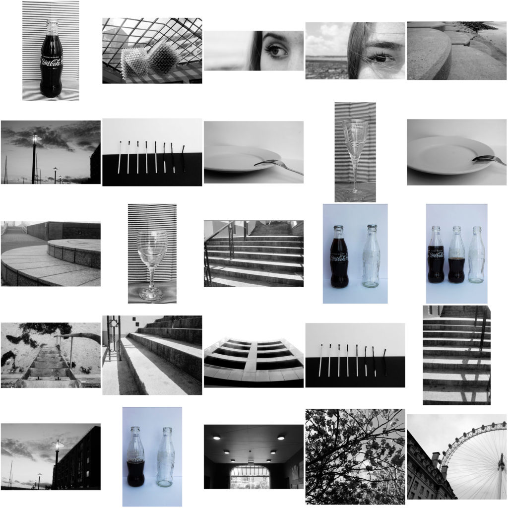
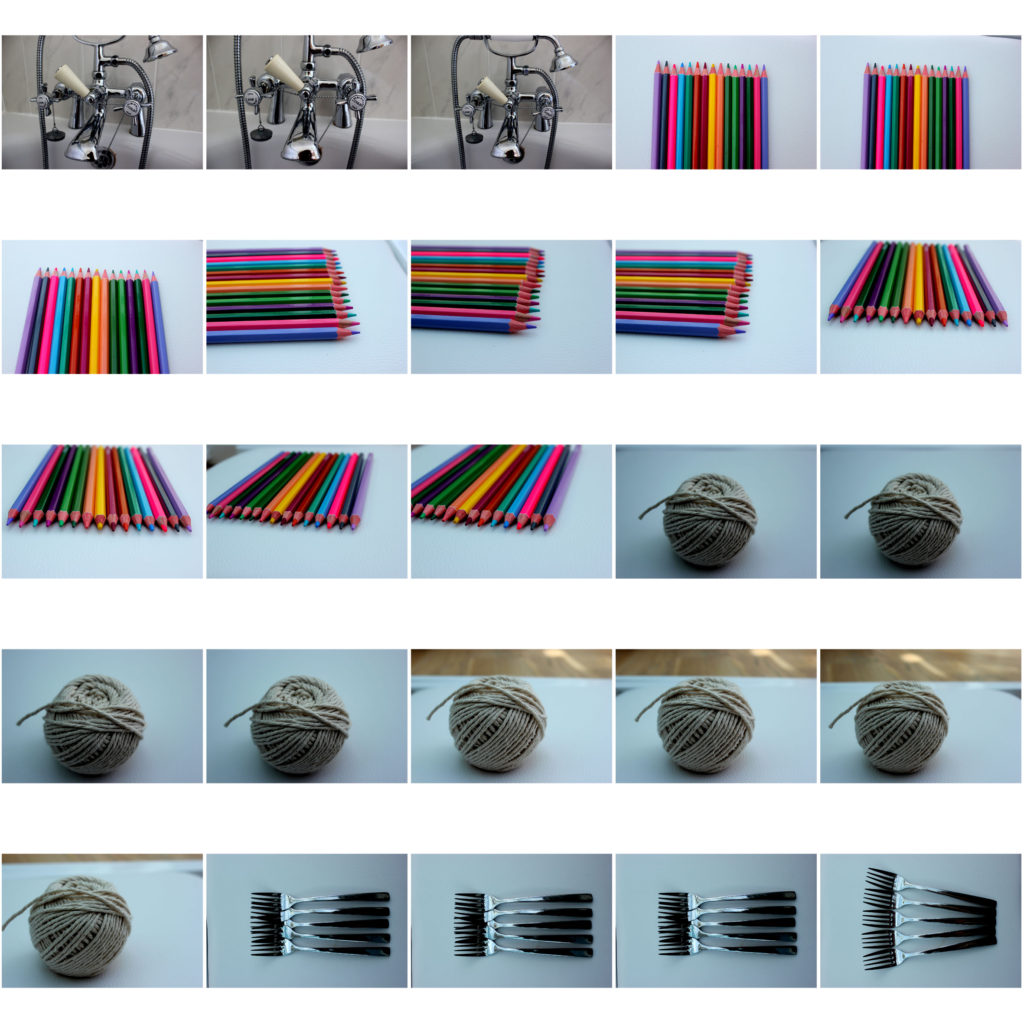
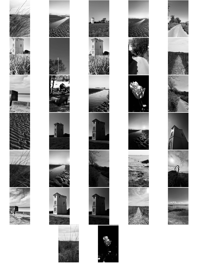
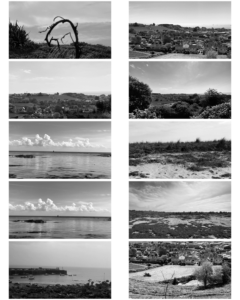
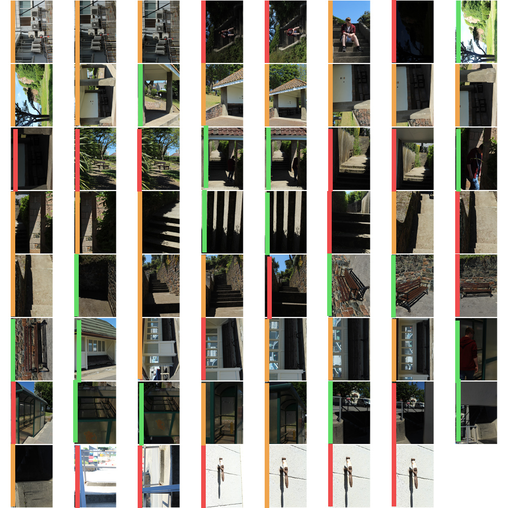
– Contact Sheets –
– Edits/ Ideas –
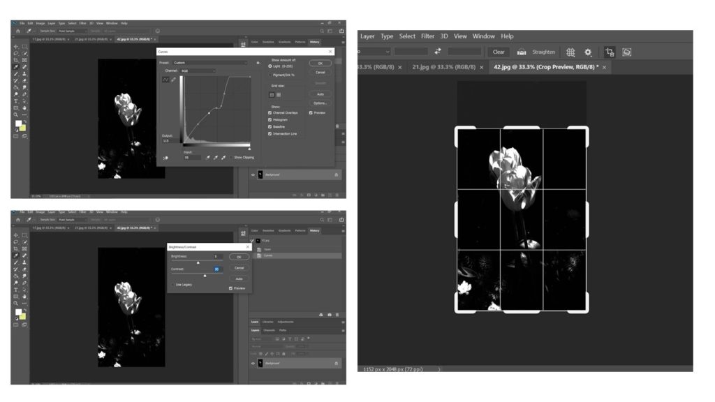
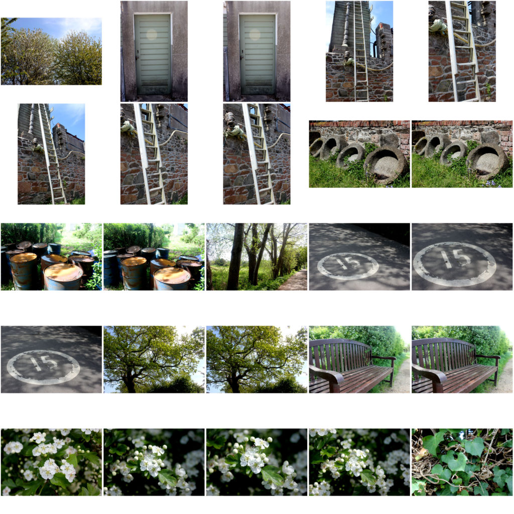
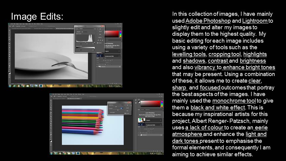
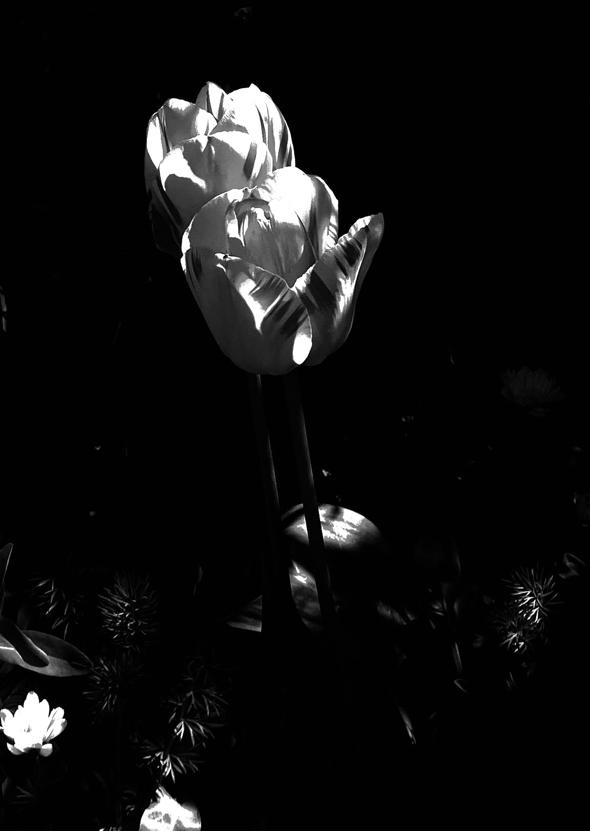
For this edit, I first began shooting on my iPhone in Noir mode as it allowed the different visual components in an image to be more prevalent due to the contrast in colours. On Photoshop, I used the exposure tool in order to brighten the flower as well as the few in the background. I then used the brightness and contrast tool to remove any noise/ over exposure created through the exposure tool. Finally in order reduce the amount of negative space in the image, I cropped the top, allowing more of the image to be filled with the flowers.
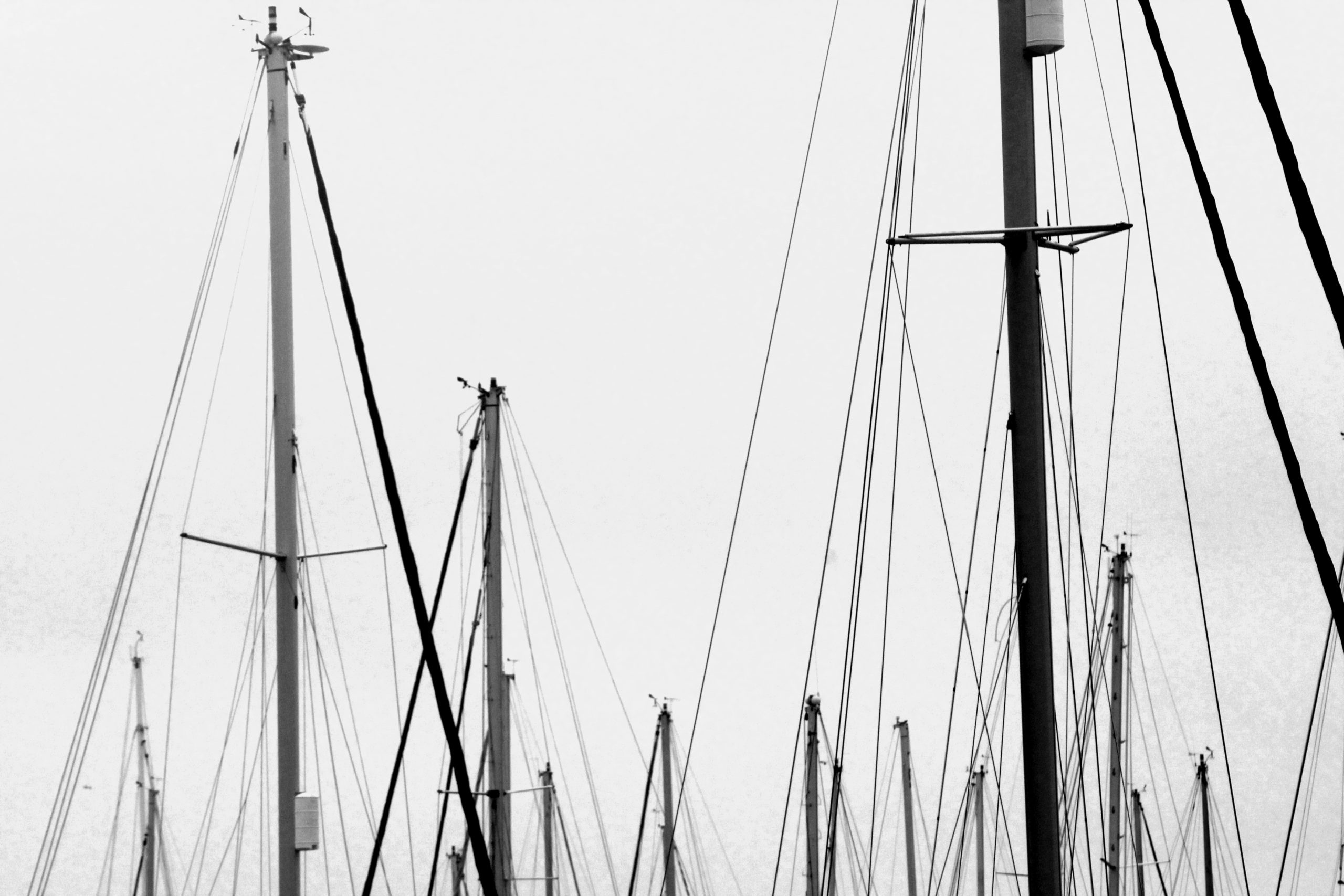
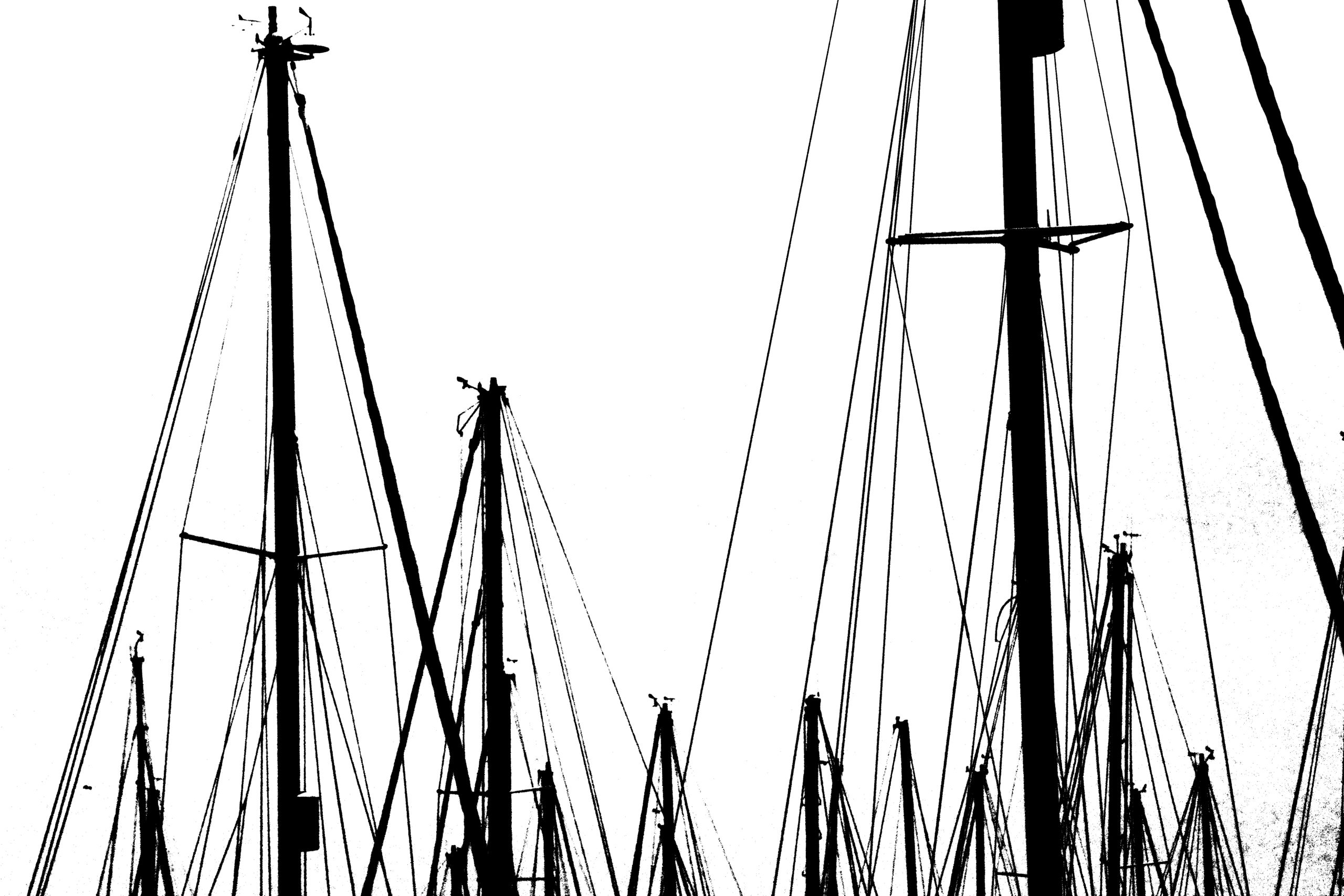
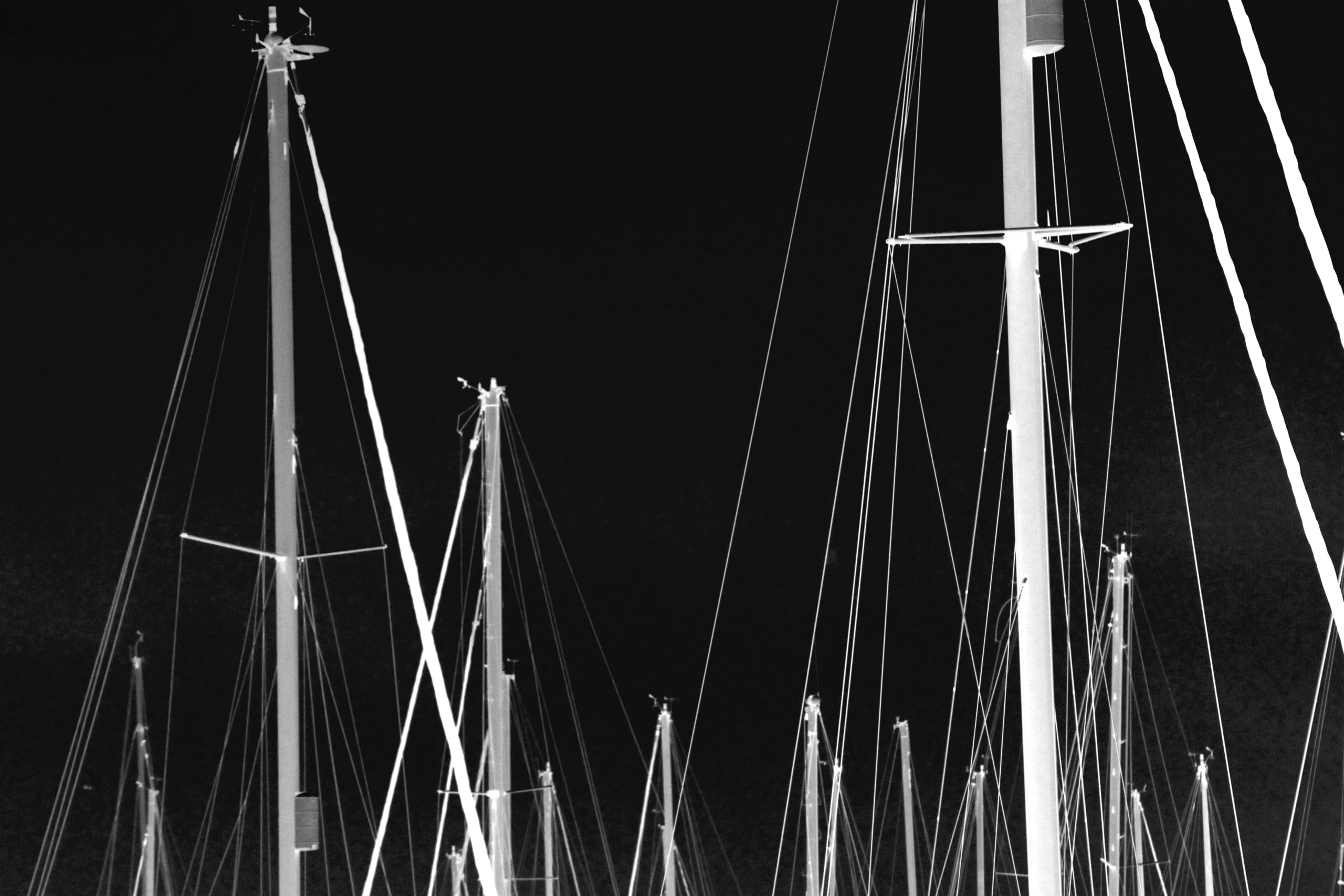
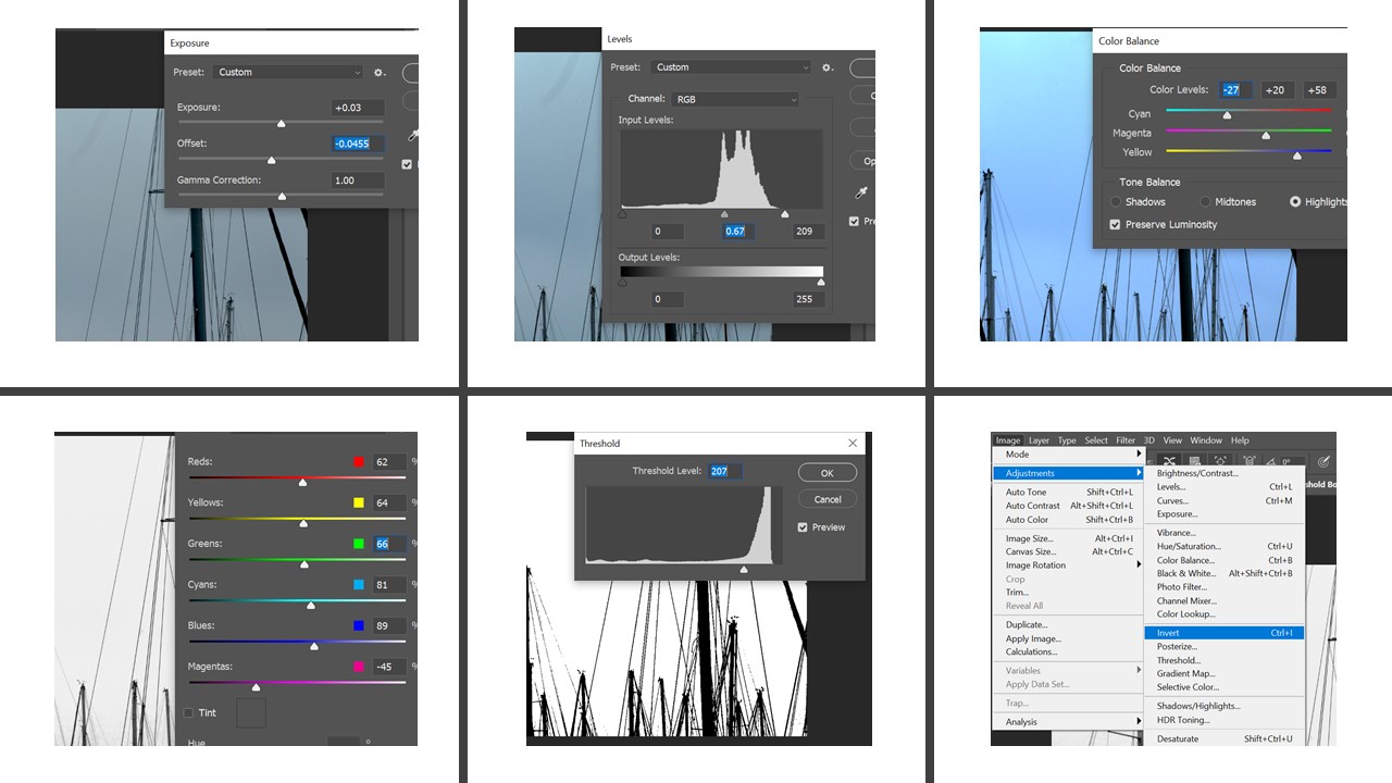
For this idea, I tried to follow the abstract formalist theme by exposing the different visual aspects of the image through the use of contrasting colours. Firstly, I adjusted the exposure and levels of the image so the lines and sails stood out against the sky. Next, in order to further brighten the background I adjusted the colour balance, increasing the blue hues to brighten the sky. After this I made a second version of the image and converted it to black and white so that the visual objects stood out against the sky, I then created a third image in which I inverted the colours to create three final outcomes.
– Light and Tone –
– Definitions –
Light – In photography Light can be used in multiple different ways in order to reflect and highlight different patterns and colours. Light can also be used in different positions and angles in order to cover and create shadows over subjects, objects or any visual elements that make up the image. Lighting is key in an image as it can also be used in order to create atmosphere and convey multiple messages, ideas and feelings towards the viewers.
Tone – Tones are key in images, dark tones correspond to shadows, light tones correspond to bright or highlight areas.
– Light and Tone Moldboard –
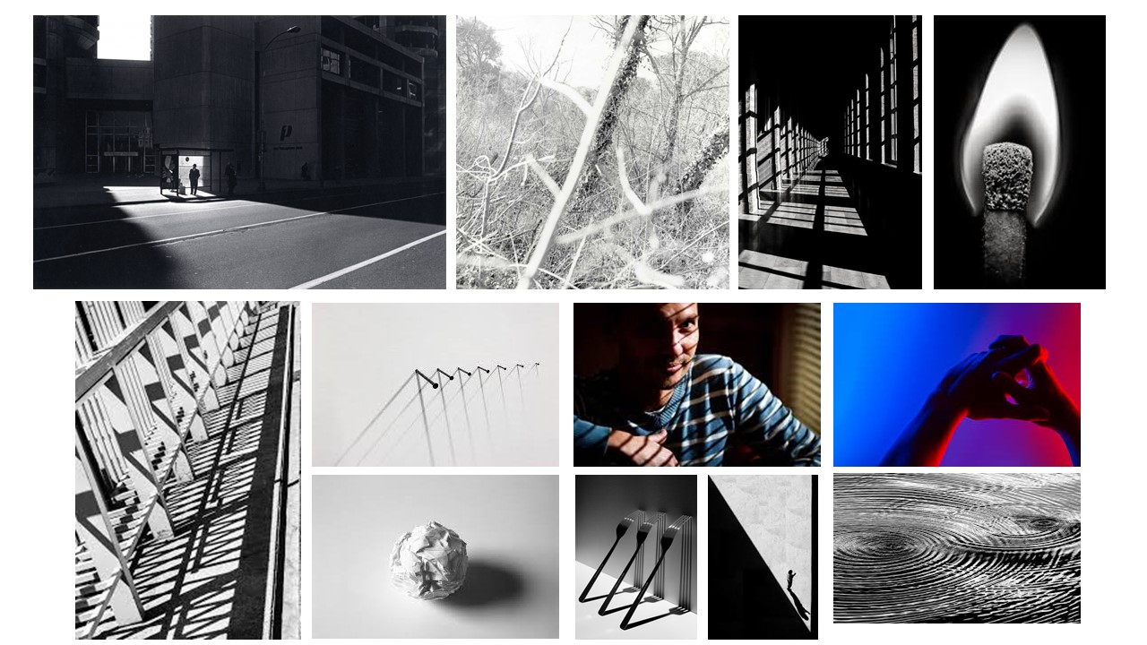
– Artists –
– Ray Metzker – Artist Research –
Born in 1931 in Milwaukee, Ray Metzker was highly influenced by the avant-garde movement that had developed in Europe during the 1920s. This artists used black and white photography in order to explore alternate realities and the effect of light and tone through the contrasting colours and shapes.
Sadly, Ray Metzker died in October 2014 at 83 in Philadelphia.
– Ray Metzker Image Analysis –

This image was taken as a part of Ray Metzkers project – ‘City Whispers’ 1981. This is a key example of light and tone photography, using both bright, medium and dark tones in order to create juxtaposition. By taking advantage of natural light and man-made structures.
In order to correctly show the light in the image as well as the darker, shadowed corners, this image is fairly under exposed. The main part of this image, the section of light, draws in viewers due to the contrasting colours, the light area can be seen as a symbol of hope, further reinforced by the majority of people who are standing in the light.
– Photoshoot Plan –
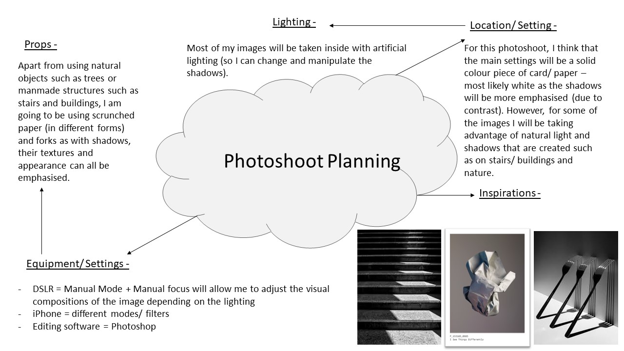
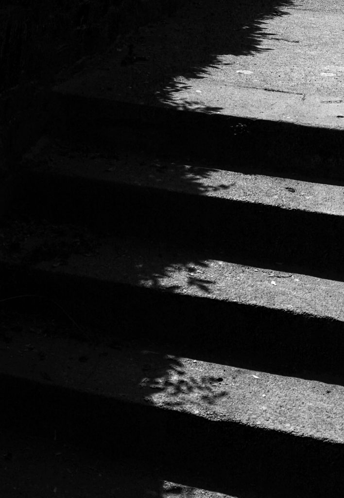
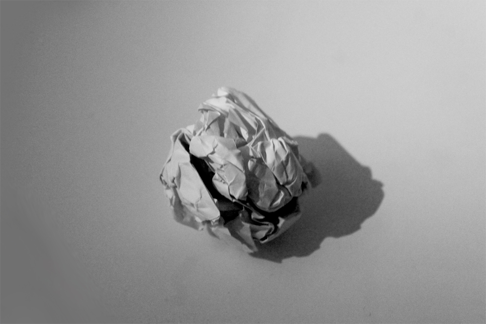
– First photoshoot- Shadows –
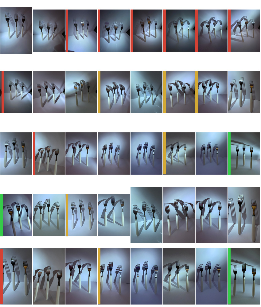
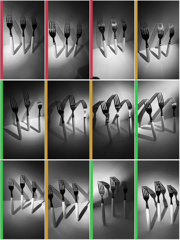

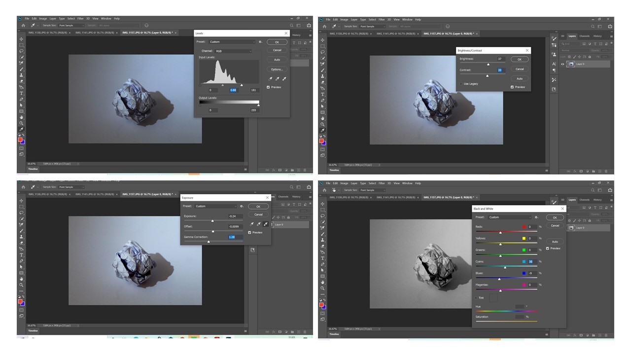
Edit –
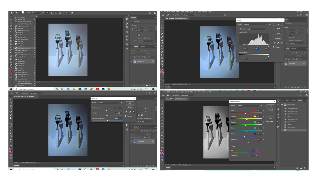
For this edit, I first used the ‘Spot healing brush tool’ in order to mask any out of place lines, shadows and reflections. I then used the leveling option in order to darken the image, exposing the source of lighting due to the contrast between the shadows and light background. I then adjusted the exposure to further darken the image. Finally, I converted the image to black and white, similar to my example; this also allowed the darker components of the image (e.g shadows) to be further emphasized.
– White Paper –
Edit –
For this edit I aimed to try and maximize the amount of contrast between the shadows and white background. In order to do this I adjusted visual elements such as the levels of the image, the brightness and contrast of the image and the exposure and off-set. By adjusting these e.g by turning up the exposure and reducing the off-set, the shadow appears a lot darker and heavy especially due to the light background. Finally, I turned the image to black and white to further emphasize the contrast.


– Surfaces –
– Definitions –
Surfaces – The outside/ top layer of something. The outer face, outside, or exterior boundary of a thing; outermost or uppermost layer or area – Any face of a body or thing: the six surfaces of a cube. The outward appearance, especially as distinguished from the inner nature.
Texture – the feel, appearance, or consistency of a surface or a substance – what a surface may appear to look like and how it feels.
– Surfaces MoodBoard –
– The Boyle Family – Artist Research –
The Boyle Family is a group of collaborative artists based in London, Mark Boyle and Joan Hills began working collaboratively in 1957, with their two children Sebastian, born 1962 and Georgia, born 1963, assisting them later on in their careers – they became known as ‘The Boyle Family’.
– Photo Analysis –
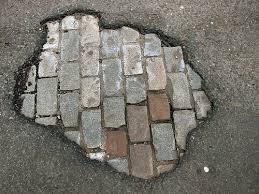
The Boyle Family’s photographs are commonly subjected to the collision of two or more contrasting surfaces, patterns, textures and colours such as evident in the above image. This urban style of photography allows for multiple opinions and ideas to be drawn. For example, the composition of the image consists of two differing surfaces, one of bricks and the other of tarmac. The natural yet dull colours and lighting of the image further express the reality of the photo. The meaning of the photo, though, can be seen as a metaphor for people who may build guards up in order to protect themselves, or used to support the phrase ‘Don’t judge a book by its cover’ as the reality may be completely different (expressed through the more complex pattern underneath the tarmac surface.
– Photoshoot –
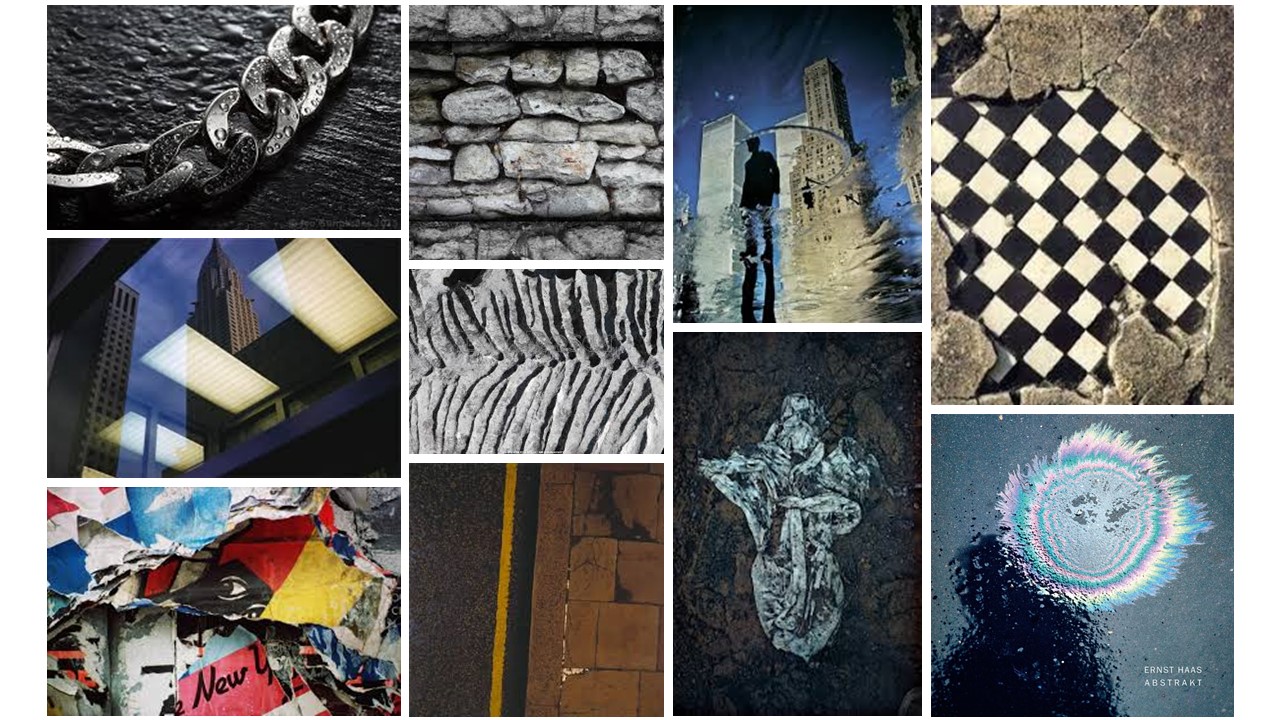
– Ernst Haas –
– Shape & Colour –
– MoodBoard –
– Artists –
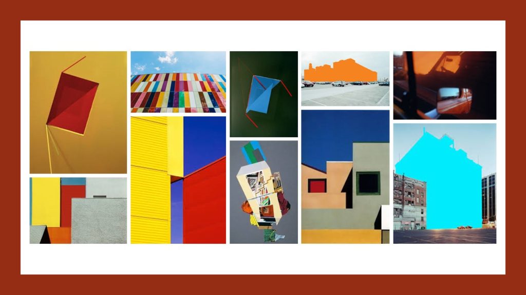
– Mauren Brodbeck –
Mauren Brodbeck was born 1974 in Geneva, where she currently lives and works.
Brodbeck uses her art in order to creating unique reinterpretations of everyday objects and buildings; further emphasized through the bright colours that she uses. The artists current work focus on the concepts of identity, authenticity and territory, exploring the gap between reality and fantasy; frequently re-imagining common experiences to reshape stories and emotions.
– Image Analysis –
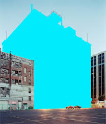
For this project, the artists removes large buildings from their origin and replaces them with bright colour blocks. This use of colour and harsh shapes allows the artist to create contrasting compositions and realities; showing the possibilities and beauty in everyday objects that are usually disregarded.
This project can also be used to highlight man-made structures, ones that we are so used to, causing us to imaging the world without them. In addition, the solid colours can also create other meaning depending on their connotations. For example – the bright blue used in this image has connotations of faith, truth, and heaven which link into the messages the artist wants to convey.
– Minimalism –
– MoodBoard –
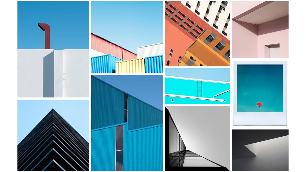
– Artists –
– Franco Fontana –
Franco Fontana was born in Modena on December 9, 1933, with his first solo exhibition in photography launching in Modena in 1968.
Fontana’s images follow a similar minimalist trend, using bright colours throughout simple yet emotive landscapes or buildings/ structures.
– Image Analysis –


I chose this image as it conveys key aspects of a minimalist image such as subtle lines and a complimentary colour scheme but also because it creates quite a nostalgic feelings.
The pale/ dull colours of the image all connote feelings of tranquility and calm whereas the light in the center of the images has connotations of warmth and comfort. The light which falls at the center of the image follows the ‘rule of thirds’; as it is central it is what we as the audience are most drawn to.
In addition to this, the light can be seen as a signal/ sign for hope due to the contrast with the slightly darker/ duller hues. The low angle the image was taken also gives the photo a 1st person point-of-view, as if seen through the viewers eyes which creates the nostalgic feel. The vignetting effect created at the corners suggests the image is slightly under exposed, which would allow the lighter area to be visible rather than too bright and over exposed.
– Matthieu Venot –
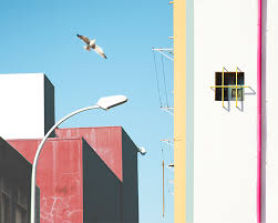
Matthieu Venot, also following the minimalist genre, uses different, objects, buildings, colours and structures in order to create different layers and illusions to his images.
For example, in this image, it is clear due to the contrasting colours that there are 4 key layers. The first being the blue gradient (sky). The second being the containers – the shadows signal that the layers are one single composition. The third layer contains the bird and the street light due to the closeness between their hues and saturation’s. Finally, the fourth layer consists of the pink building, made up of pale pink/ yellow/ white hues.