Identity

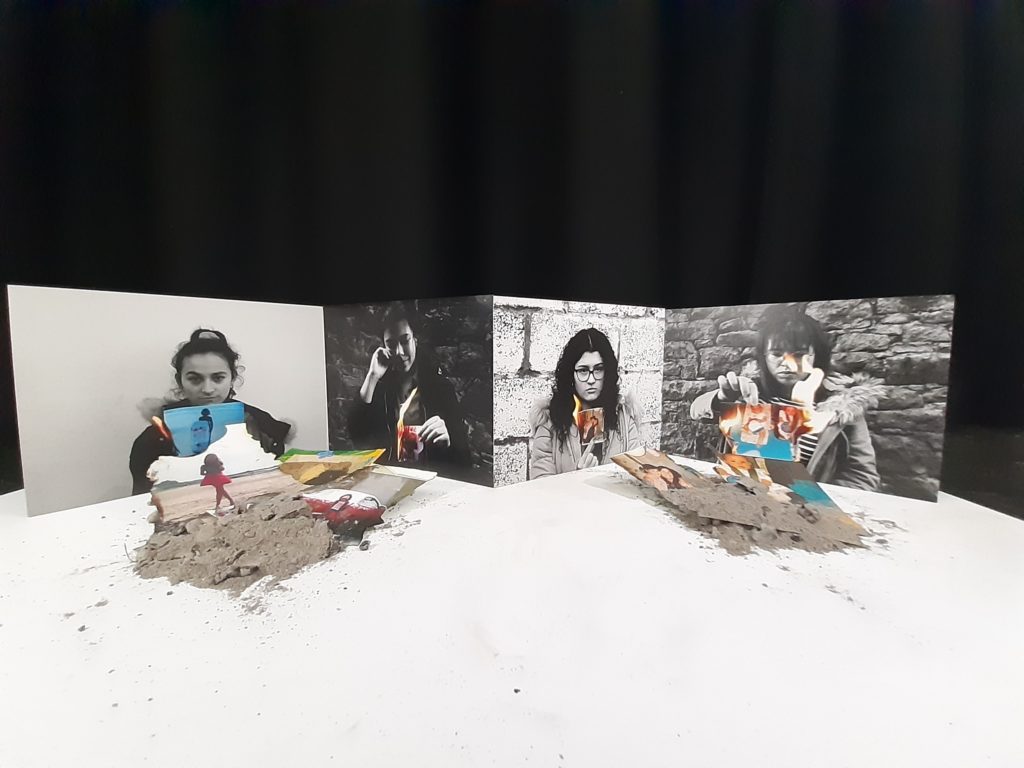
For My identity project I decided to print out these 4 (A4) images shown above. As two had a light and 2 had a dark background i decided to mix these so that I would display them going 1 dark 1 light etc. I decided to stick my images together in order to create a zigzag pattern which I thought would create an interesting pattern. I then wanted to use the images that were burnt and incorporate them back into my display. Here I got some ash from the burnt photos that got completely burnt and made two piles then collected remaining photos that didn’t fully burn and place them into the burnt pile of ashes.
I think that displaying method worked really well as it helped to continue the story of the idea on my identity piece as from the audiences perspective, it looks as though the images are looking down at the burnt remains of their childhood, which helps to symbolise the loss in their memories and the people in their memories. Overall I am really happy with these outcomes as I think they look quite professional and I like the fact that the combinations of my two artists worked well and the conceptual side of my project really shined through.
Studio

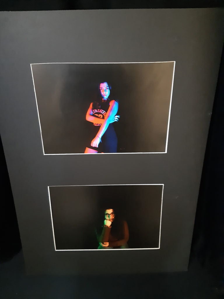
For this project I decided to print off 2 A3 pieces, here I placed them onto a window mount which I thought was the best way to present the images as I didn’t want a crazy way to display it as I wanted the images to be the main focus onto the audiences eyes.
Tableau

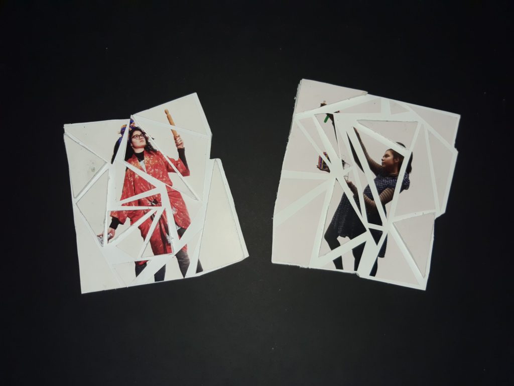
For my Tableau project, I decided to print off 2 A5 sheets here for this project I decided to cut these images into different sized triangles, here I placed them onto a foam board and placed them slightly apart form each other, to add more of a 3D effect I decided to give some of the triangles more height by sticking them to another piece of foam board. Finally I wanted to keep the edges of the images different also therefore instead of just cutting 4 straight lines around my images I followed the triangles shape on the stuck down image and cut around that accordingly which is shown above. I think that this displaying method worked quite well as it gives the idea that the images have been broken with a hammer.
Environmental

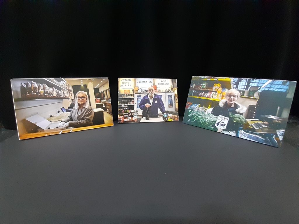
For environmental, I printed off 3 A4 images, and again I wanted to keep my displaying quite simple and make my image “do all the work” as I wanted the audience to engage with the images and again not be overly distracted. Here I simply placed my images on a foam board.
