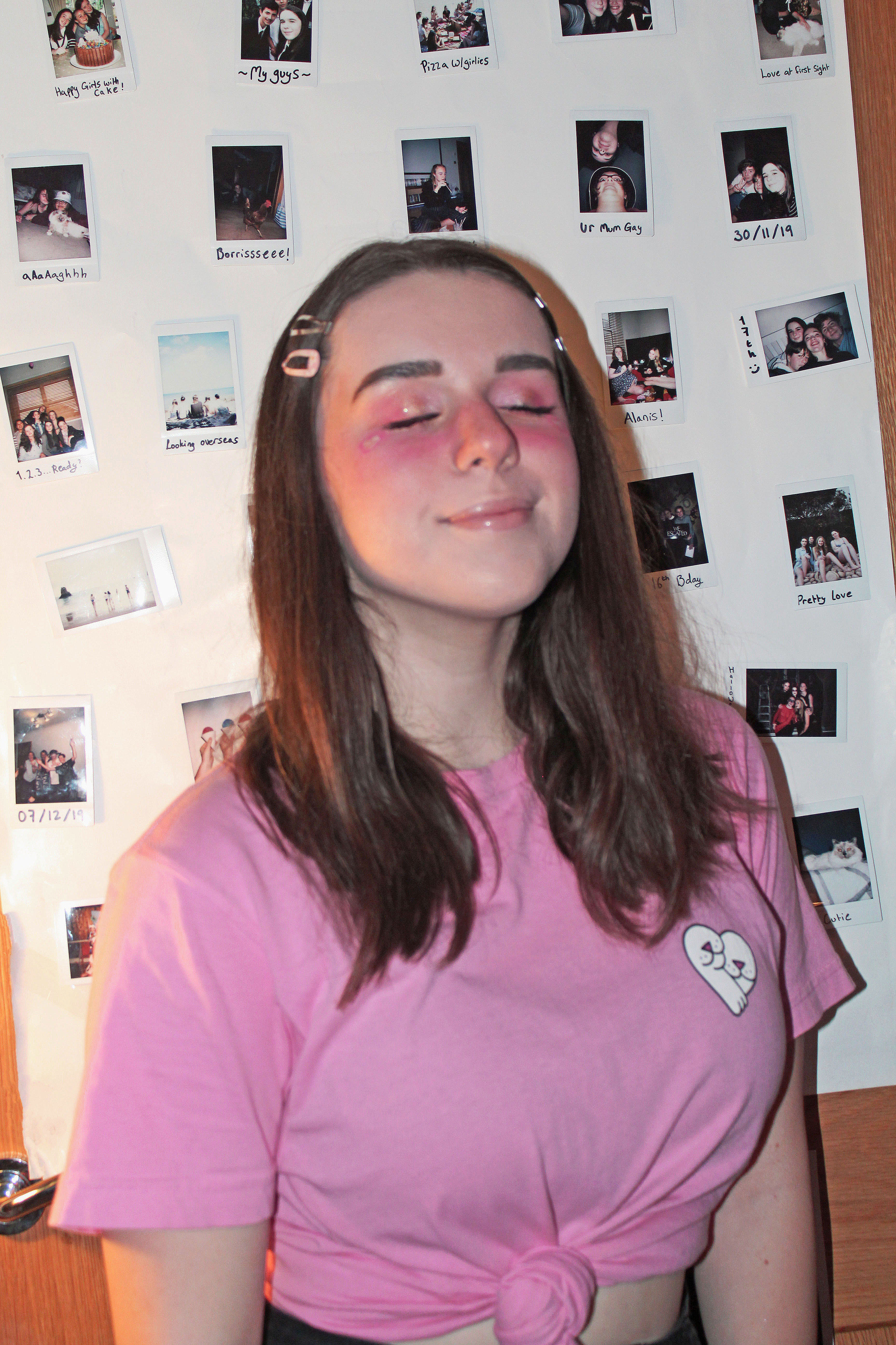
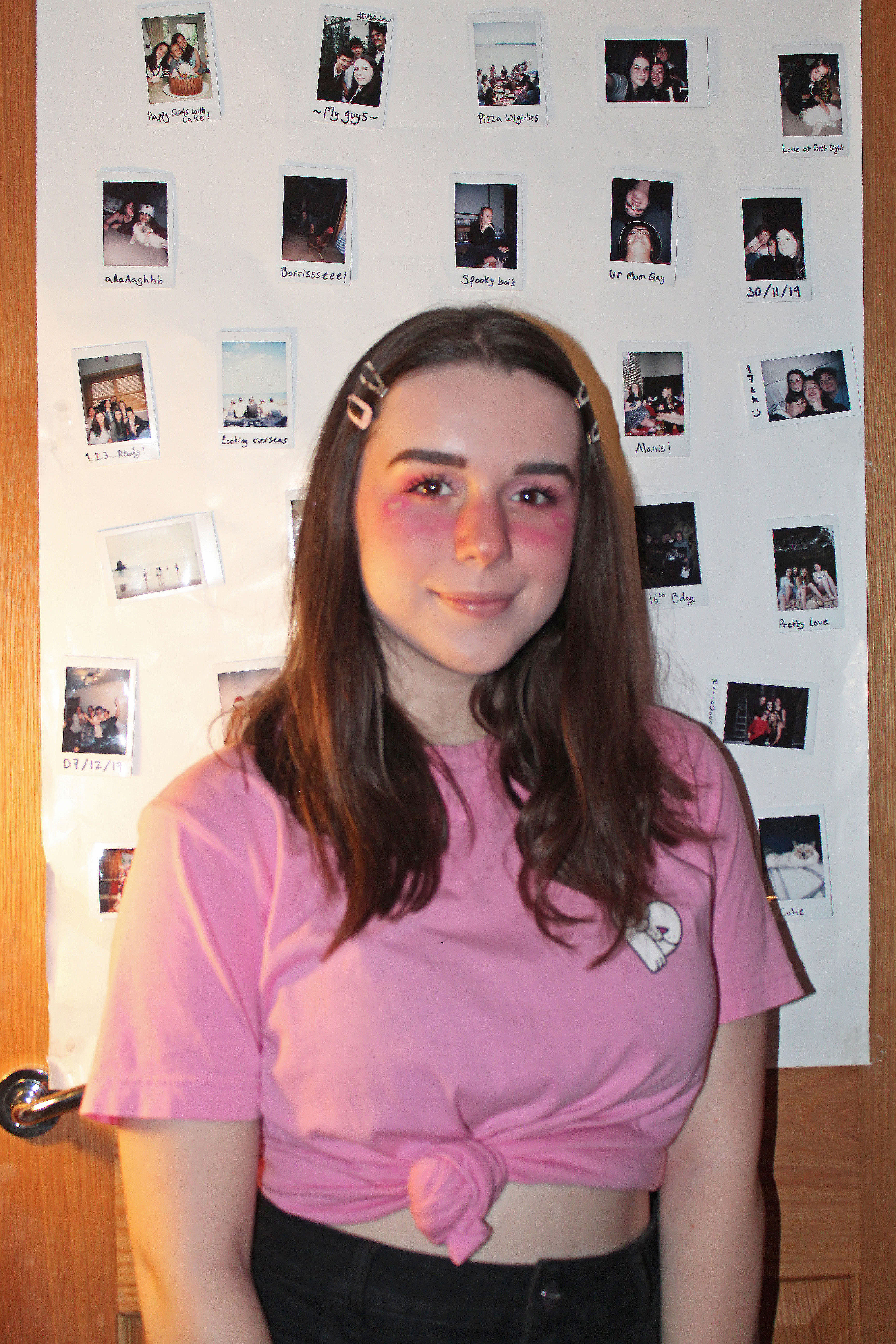
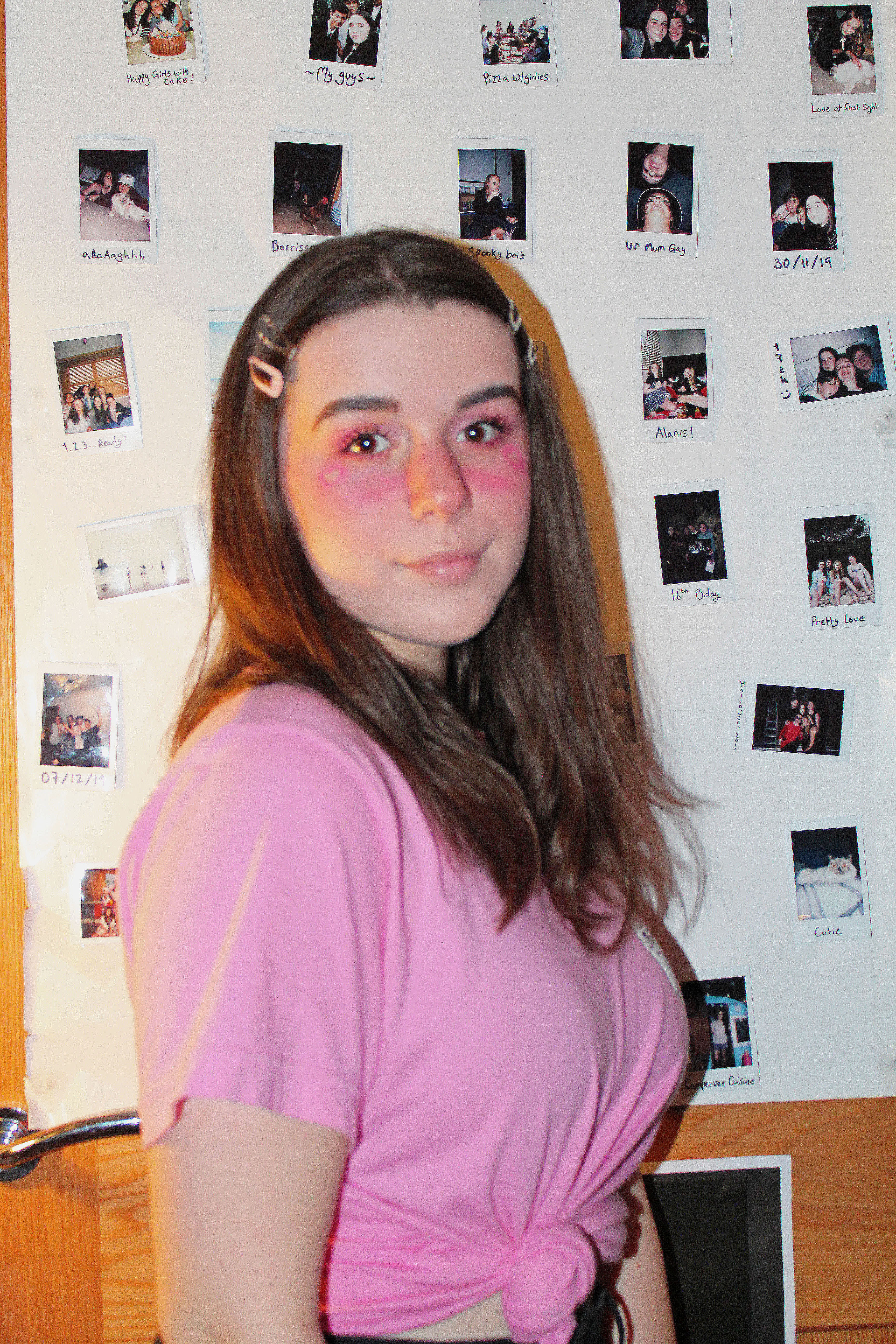
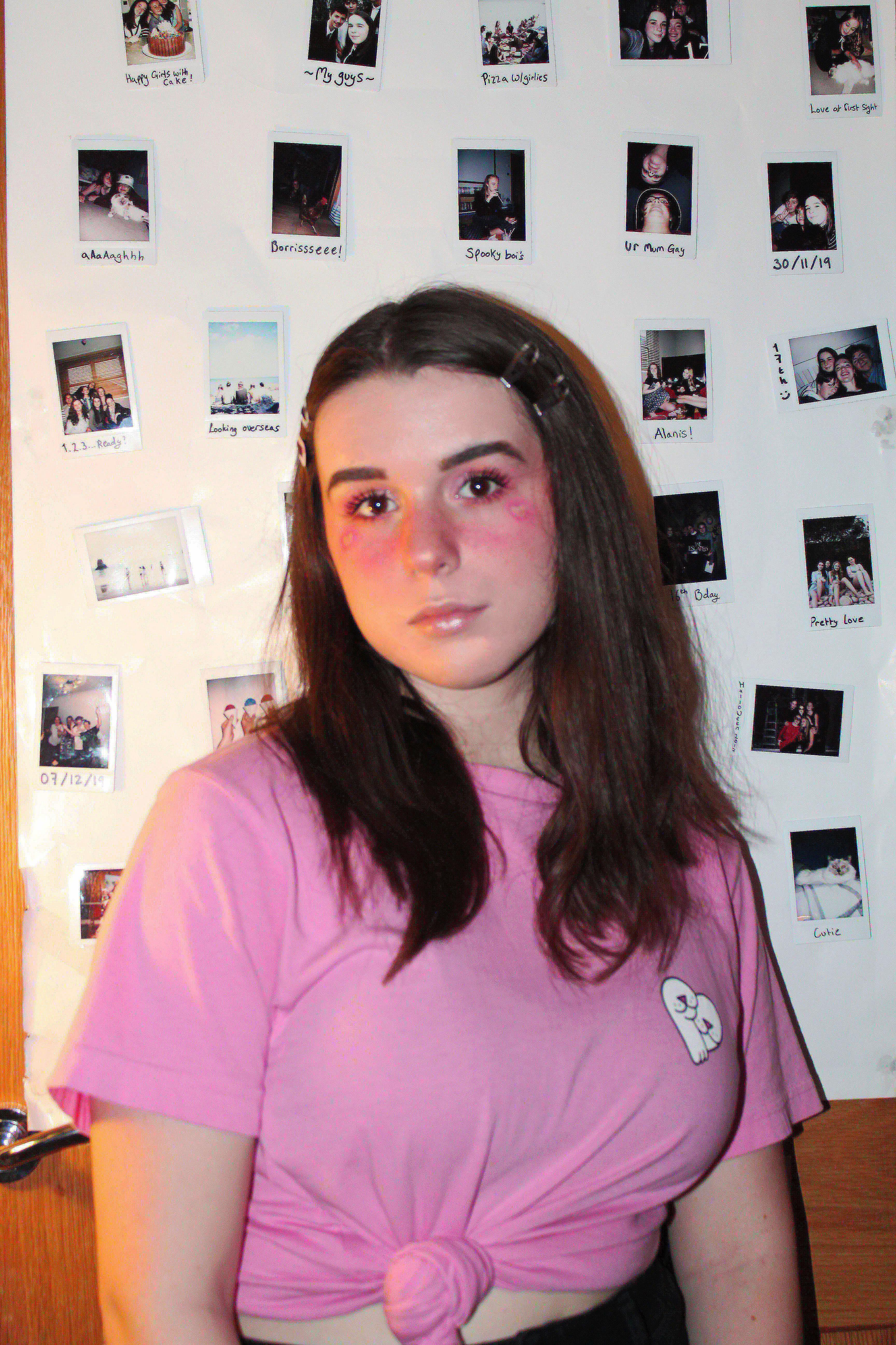
For my identity project i was more focused on creating as much as possible though physical work, like Cindy Sherman, such as my choice of clothes and makeup, so only basic editing was used
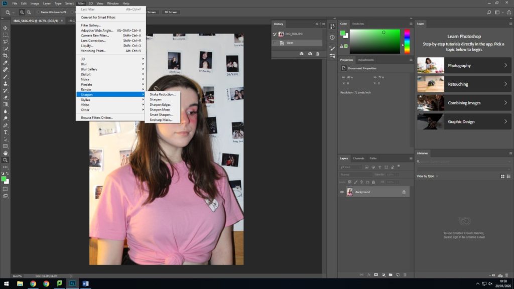
First i sharpened my images at this was my first shoot and hadn’t perfected the use of a self timer yet, so the images were slightly blurry
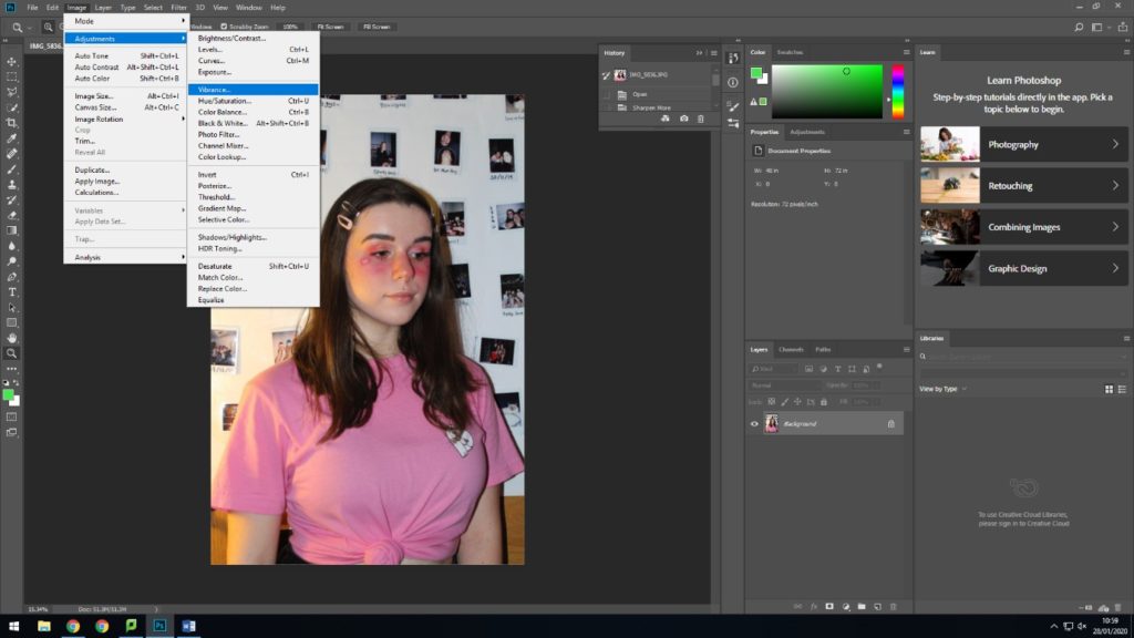
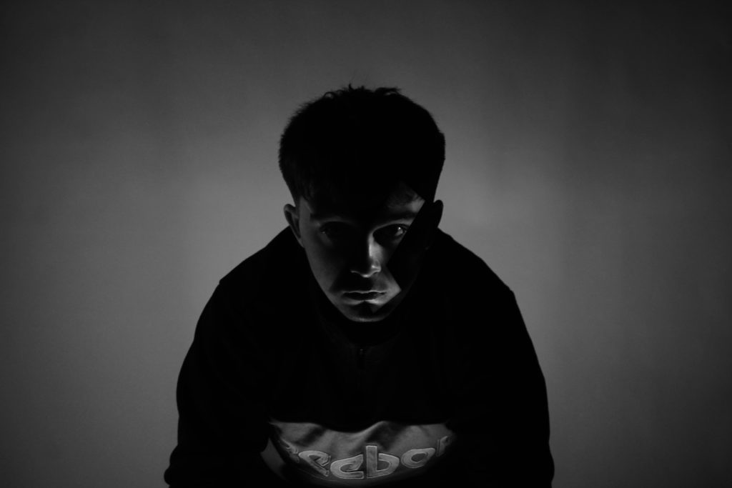
Then i made some light adjustments with brightness, contrast, highlights and saturation
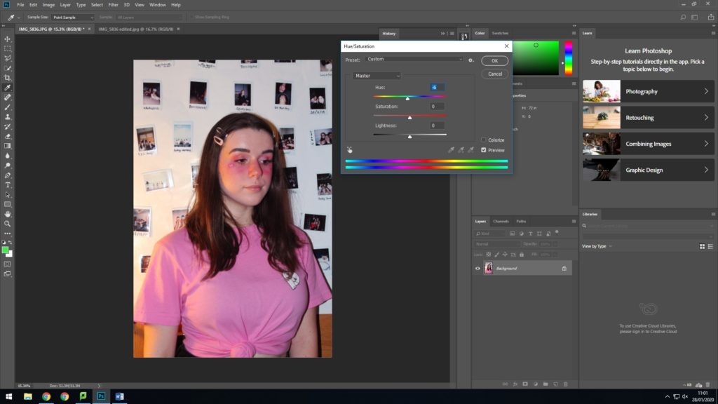
Finally i added some vibrance and gave the images a light pink hue to enhance all the warm tones
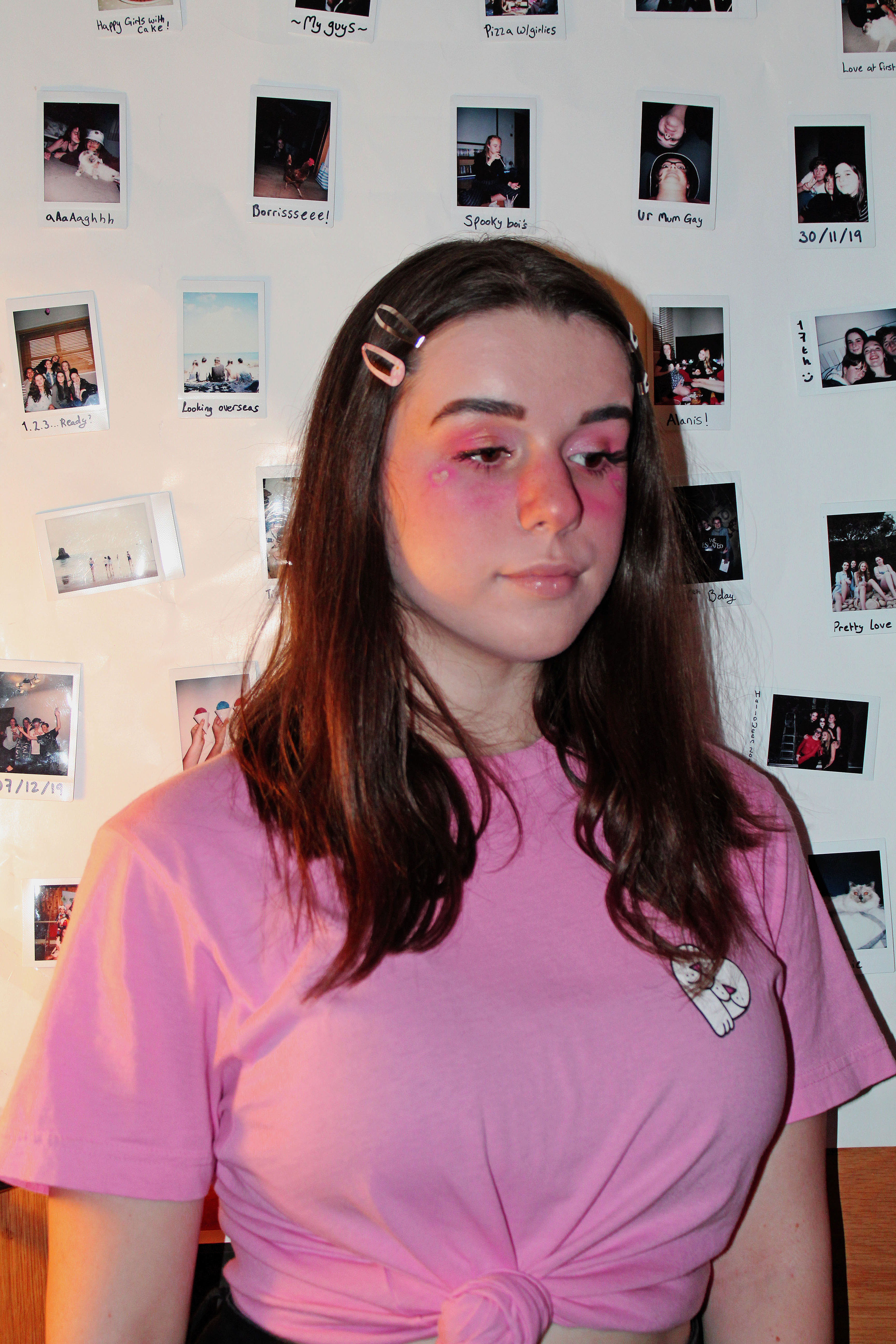
This was my favourite image from the shoot as i liked the composition of the picture as it was very centered and by looking over to the side it showed off the detail on my cheeks. Also the overall pink hue came out the best on this one.
To create this look i used lots of pink toned eye shadow for a glittery look across my eyes, and then a harsher pink across my cheeks and nose, with a highlighted heart on the top of my cheekbones. I also added small hair clips and had my hair down naturally. I paired this with a tied up, baby pink tshirt and black skirt.
This look was to match the sort of soft girl/anime girl look that has been seen across the internet, with many famous characters such as avivasophie and kiyakawaiix on platforms like TikTok. This style is a form of self expression and becomes an important part of someones identity, also having cultural links as it is associated with certain Japanese styles and interests
For this shoot i used my wall of Polaroids as the background instead of the curtain as it appropriately matched with the theme
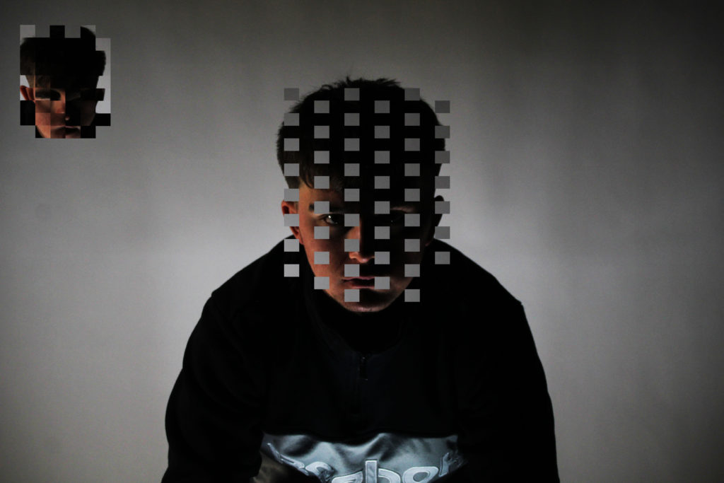
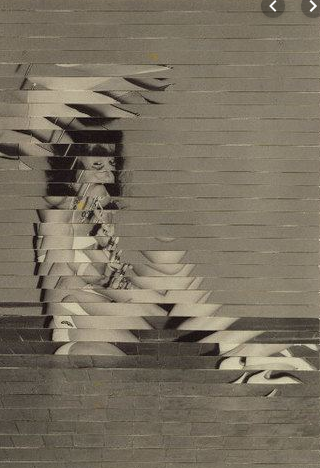
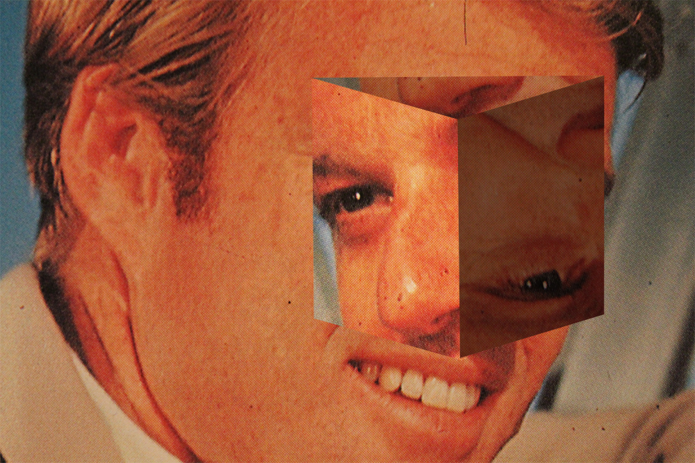
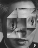
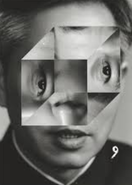
I cut equal squares out of charlies face using grid-lines on Photoshop. I cut enough squares to still have a clear original image and create a new mixed image.
Next time i will use smaller squares to make the original image even clearer and use a lighter image as the light/dark contrast makes the new image difficult to see.
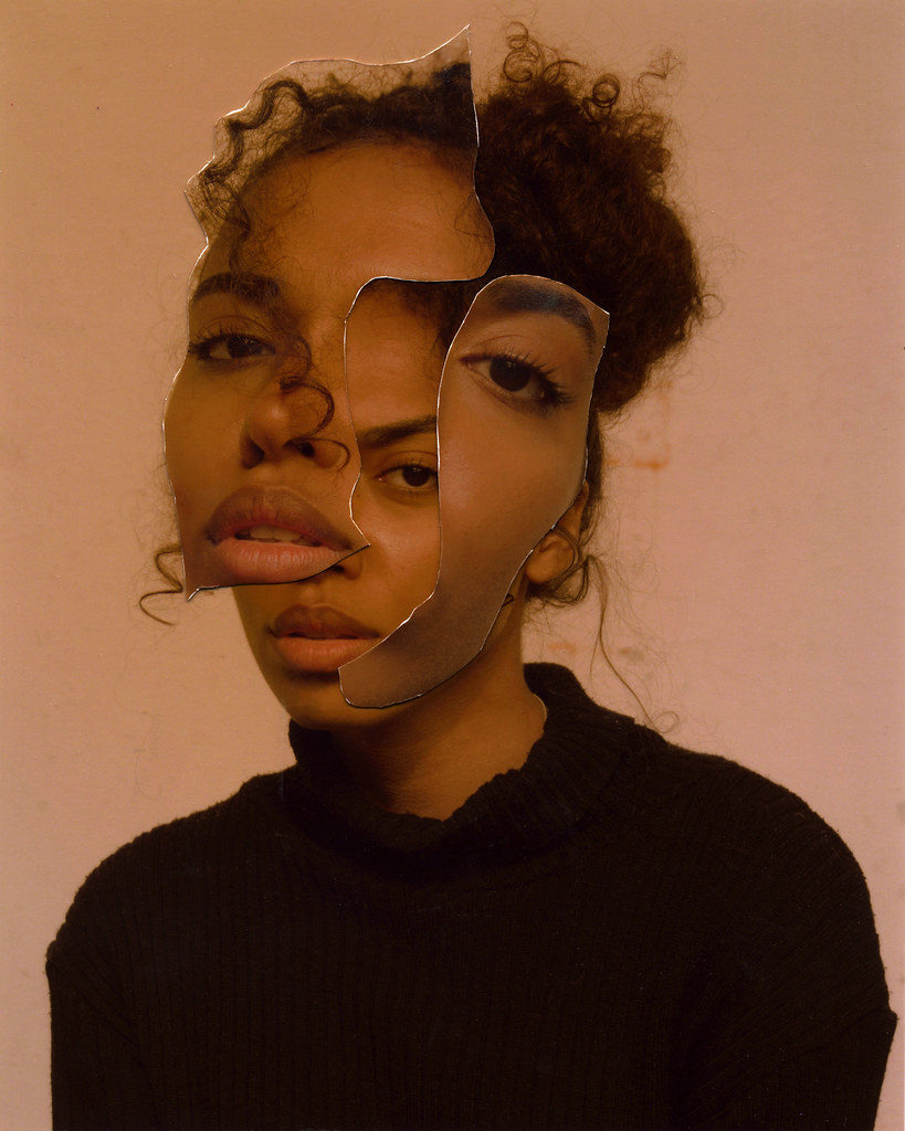
Another style similar to Kensuke Koike is the cutting up and replacing / moving of parts of the face. To put my own twist on this style i have looked at the idea of split identities. I have shown this with the lighter and darker sides of these photos and by cutting and flipping parts of the face so that they are on the wrong side. However, of all my work this is the most personal and the furthest from Koike’s work whilst maintaing his style.
This idea of split identities has a duplicitous meaning. The more obvious one is the idea that everyone has a light and a dark side, positive and negative. However the more hidden meaning is the idea that one person can have multiple personalities, a disorder related with memory loss. I used ordinary people who are not officially diagnosed with this disorder as it can be very hard to tell if someone has it or not especially to them selves. Having two or more personalities ties in with identity as you could theoretically then have two or more identities within the same culture, group or society. I used simple 1 point lighting to get a fine distinction from light and dark.
Loss of Identity
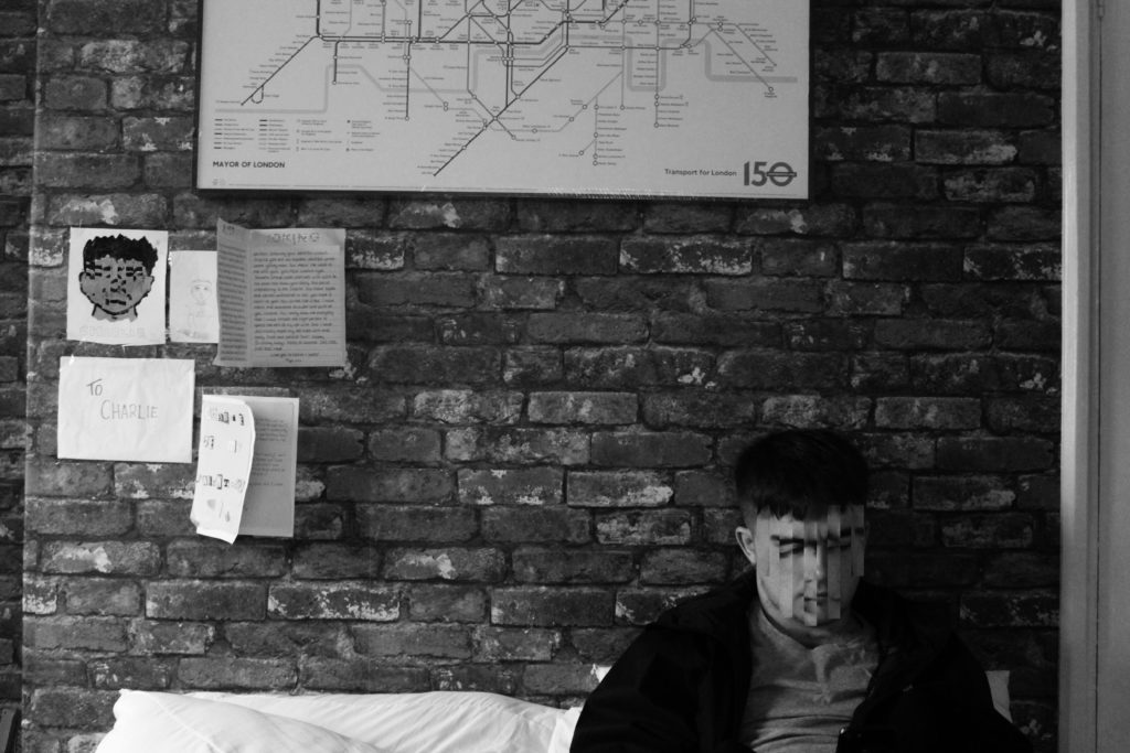
I then decided to use Koike’s loss of identity style by deforming and distorting people’s faces to the point where you can see there was a face there but it looks completely different and surreal. I started with my friend in his room at home to give a sense of his identity within his own house. I included certain decorations from his room that mean a lot to him but wouldn’t mean anything to most other people.
Final Image
Kensuke Koike
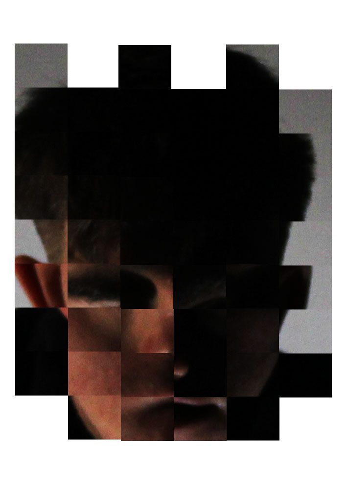
With my final image I cut out equal rectangles from charlies face and flipped them horizontally to distort his face. I also noticed his face now appears as if he could be frowning which in actual fact is not the case. I also used this effect on the drawing in the left of the photo to make a distinct connection between charlie and the drawing. I made sure that the letters on his wall were visible but not readable to emphasise the importance of them but only to him. Personally I like the idea that this image is subjective to the viewer as it could have multiple meanings. He could be a young teenager who is yet to develop his true identity or maybe a young adult who has lost his identity.
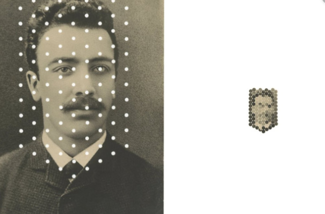
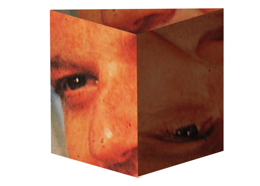
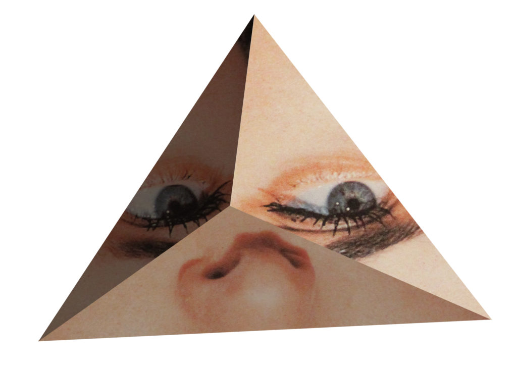
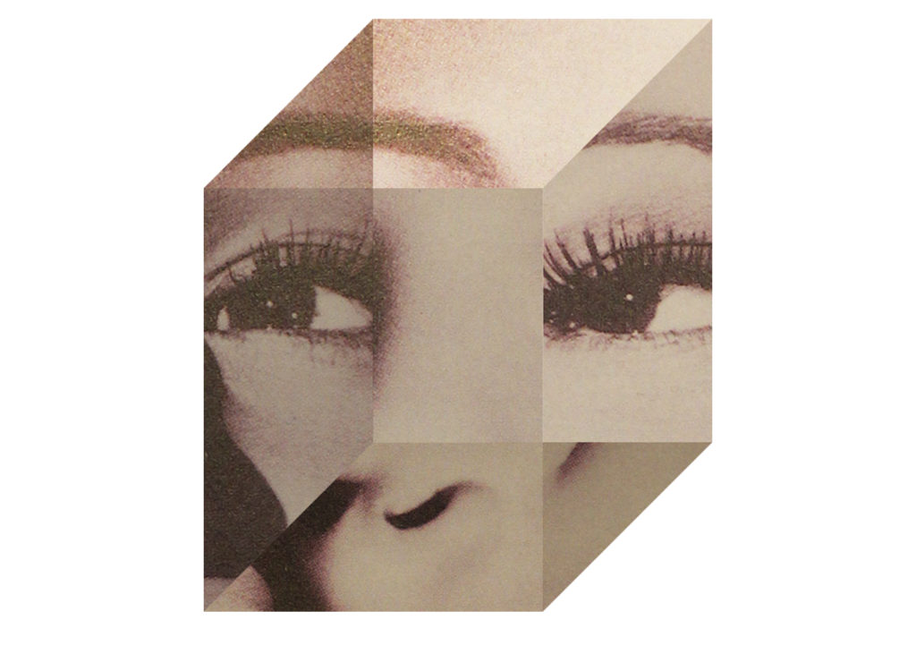
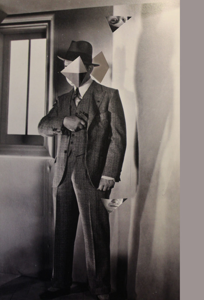
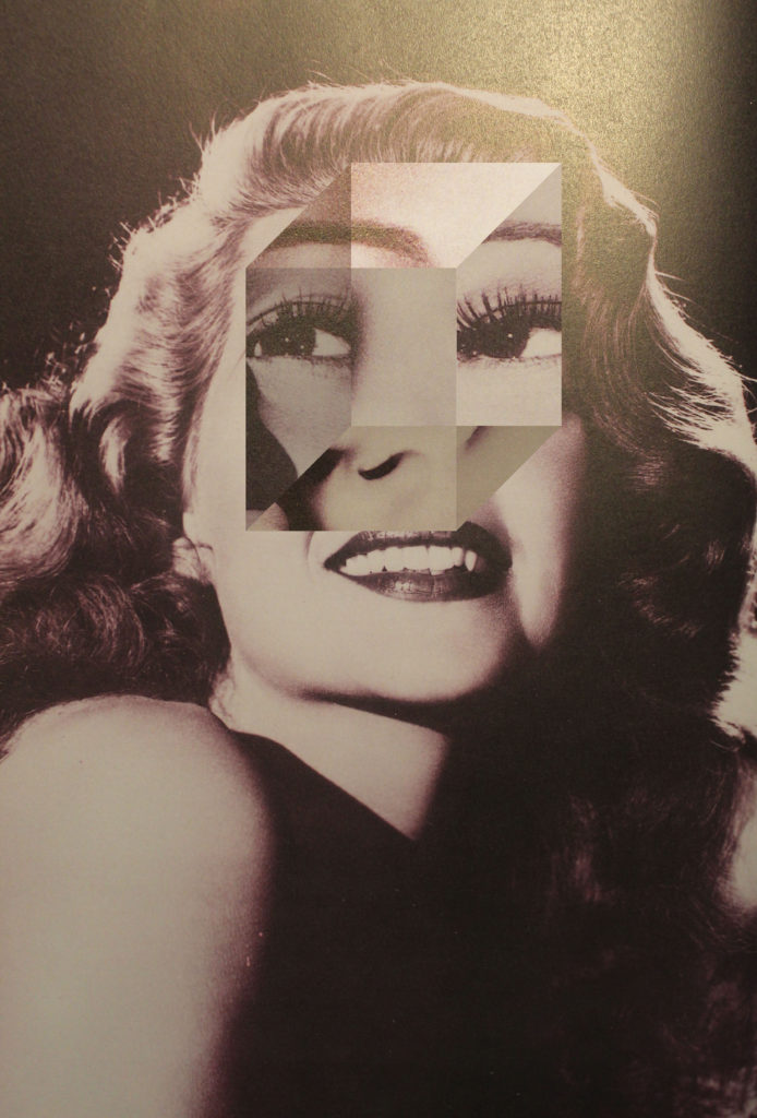
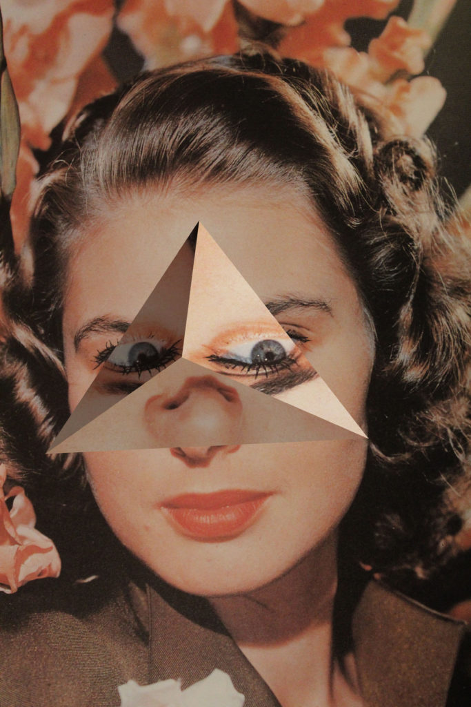
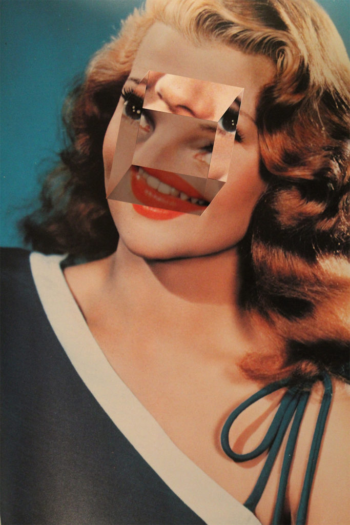
Finally, I used Koike’s found imagery technique to create my final three images. I looked through books and photos in my house and found multiple portraits and headshots to use. I distorted their faces by creating 3 dimensional shapes out of their eyes, mouth’s and noses and then placed these new shapes back over their faces.
3D shapes
Two images i created that i will not be using are:
I will not be using the first image as i feel it doesn’t quite depict the meaning of losing your identity as well as my other images did. I do not think the shape i created worked very well and overall he appears happy and i struggled to hide that as i believe a loss of identity is not a happy thing.
I was happy with my second image as i used lights and darks and shadows to create the 3d object. However, once again i do not feel that it truly depicts a sense of loss of identity.
Final Images
These are my final three images i created for the identity project. These images are similar to Koike’s but also have a historical reference to Hannah Hoch. This is because unlike Koike I have re positioned the 3d shapes so that they appear to be matched up with where they were originally from. For example with my triangular shape I have matched the eye line again but flipped the eyes vertically so that at a glance the image appears normal but with a further look you see that it is distorted. This is similar to Hoch’s work using other faces or objects the appear similar to body features. Originally i did not intend for this as I was going to make a separate shoot in the style of Hoch’s work, however i preferred this mashup of both their works. I also chose these images based on the time period they were taken from and the subjects themselves. All of these images are of white women from the 60’s to 80’s. The idea behind the loss of their identity is that the view of women between the time these photos were taken and present day has changed drastically. During the time period these photos were taken it is likely that these women faced strong sexism towards them, effecting their jobs, salaries, politics, culture and much more. Whereas, today women have much more equal rights allowing them to develop an identity true to them selves.
This could look effective because I would place all my images from a group on a document to make one image and scaled it up, as it would definitely show how their identity contains many different aspects, as their picture would be the same but the other side would be different.
collage
This could look effective because i could place all my groups together and it would show how everyone’s identity is different and contains different aspects too. It could also relate to typography, as all photographs will look very similar but just the other half of the face will be different.
small booklet, similar to a passport
This would look effective because it would link to the fact that passports prove your identity, by providing your name, birth date, place of birth and signature, however my images will juxtapose with this notion of a passport. This is because my images are showing how identity is made up of lots of different things such as, music taste, and how identity does go beyond what the passport states and proves.
virtual gallery
This would look effective because it would show what my work would look like in a gallery. It could mean that i could place images near each other in order to show my thought process and how i want the viewers to feel.
which idea i am going to use?
i have decided to display my images in a small book, which will be held in an old passport. I have decided with this idea as it directly links to identity, and how each of my edits will show what someones identity is composed up off and different compared to the formality of what a passport displays. Using a photobook would also allow my to have all my images together and each will be able influence each other.
to be show that you are the correct person and are not pretending to be someone you are not, identity fraud.
do people pretend/act as someone they are not?
some people pretend to be someone they are not, this is because social media influences us to be different, to want to change who we are to be perceived in a better light.
how am i going to use identification sources in my images
use peoples id for the other half of the photograph, to highlight how people can be identified by professionals
get people to hold their id, to highlight how they are held back by their identity source
use passports as a display method, as it directly links to identity
I will be taking photographs of people in Hautlieu school, from age 16-17. they will be both male and female models who will be photographed.
WHAT
I will focus on the faces of the models, specifically on facial features such as nose, eyes, mouth, and collectively together to form facial expressions. I may experiment with emotions, taking photos of one model, with a range of expressions; happy, sad, scared.
WHERE
I will have my photoshoot in the studio, where I can use the black and white curtains to create the backdrop. I will also be able to set up a 2 or 3 point lighting system to illuminate my model.
WHEN
I will take the photographs on Monday the 13th of January, through the entire day, depending on when the studio is free and when my models are free.
WHY
My idea is to create some sort of montage of a range of peoples faces, to explore idea that ones identity can be aspects of their body (specifically face). It will bring the idea that someone can be identified through their facial features, suggesting that faces can be one of the simplest forms of one’s identity. The concept of using many different people to create the final image is to show that everyone is different due to their face/ facial features, which, make them identifiable to their name.
EDITING TECHNIQUE FOR A RANGE OF FINAL IMAGES INSPIRED BYROSANNA JONES PHOTOGRAPHY: It alters the facial features by manual manipulation, playing with the idea of identity.
HOW
I will set up the studio with the camera on a tripod to prevent camera shakes, so the images are in focus, as well as having a two point lighting system with a neutral coloured LED panel illuminating the subject. However, to create softer lighting and decrease shadows, I may use a three point lighting system instead. The camera should be around 200 so that the image isn’t grainy, and the shutter speed should be short to keep the image in focus as the model may move around( 1/250). The aperture should be an average f/4
To create different shades of backgrounds like in the images presented above by Rosanna Jones, I will alter lighting positions during my photoshoot.
Kensuke Koike is a Japanese Modern & Contemporary artist who was born in 1980. His work was featured in several exhibitions at key galleries and museums. He looks at the idea of identity, primarily using portraits. Koike uses found imagery from shops, archives and books. He edits these images analogue and is known for distorting bodies and faces in simplistic but effective ways.
Eg.
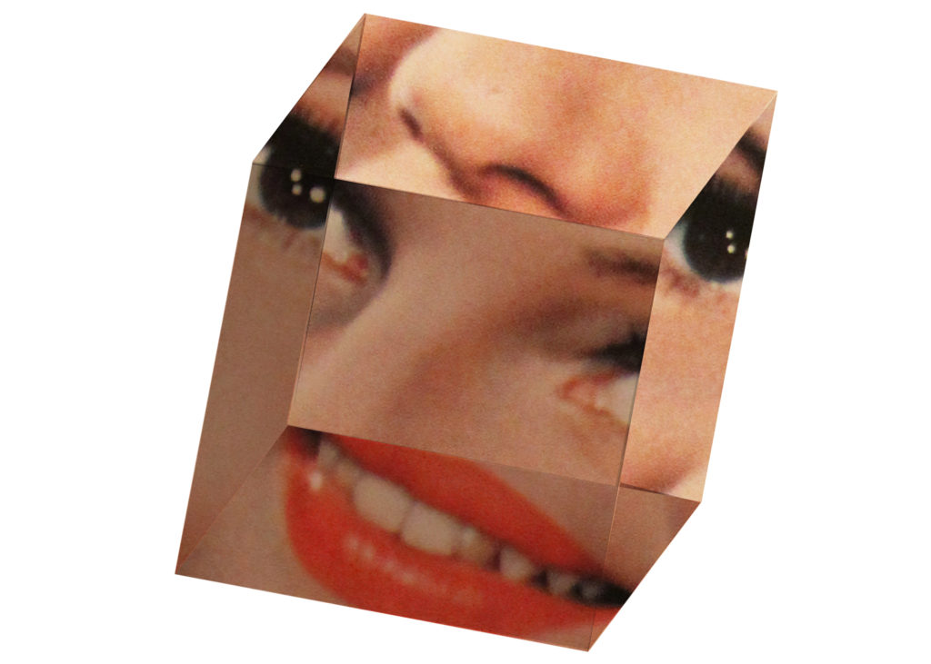
I like his style of work as it has a message that one photo can have multiple meanings. His work conveys this message as most of his images he has created have been all from one single photo. I especially like his 3 dimensional cube photo (second down) as it is made all from 2 dimensional shapes he has cut yet effectively distorts the face.
Image analysis
Technical – There appears to be a single point of light in this image creating a shadow on the left of the face. This would make the creation of the cube easier as you already have some natural shadows to give it depth. Visual – This is a flat 2 dimensional black and white image with an illusion of a 3 dimensional cube in the middle. This effect creates a very confusing image especially when viewing it printed out in 2d. Conceptual – This photo is meant to emphasise the idea of loss of identity. Koike has done this by distorting this mans face the perfect amount to make him un recognisable but still able to see his facial features
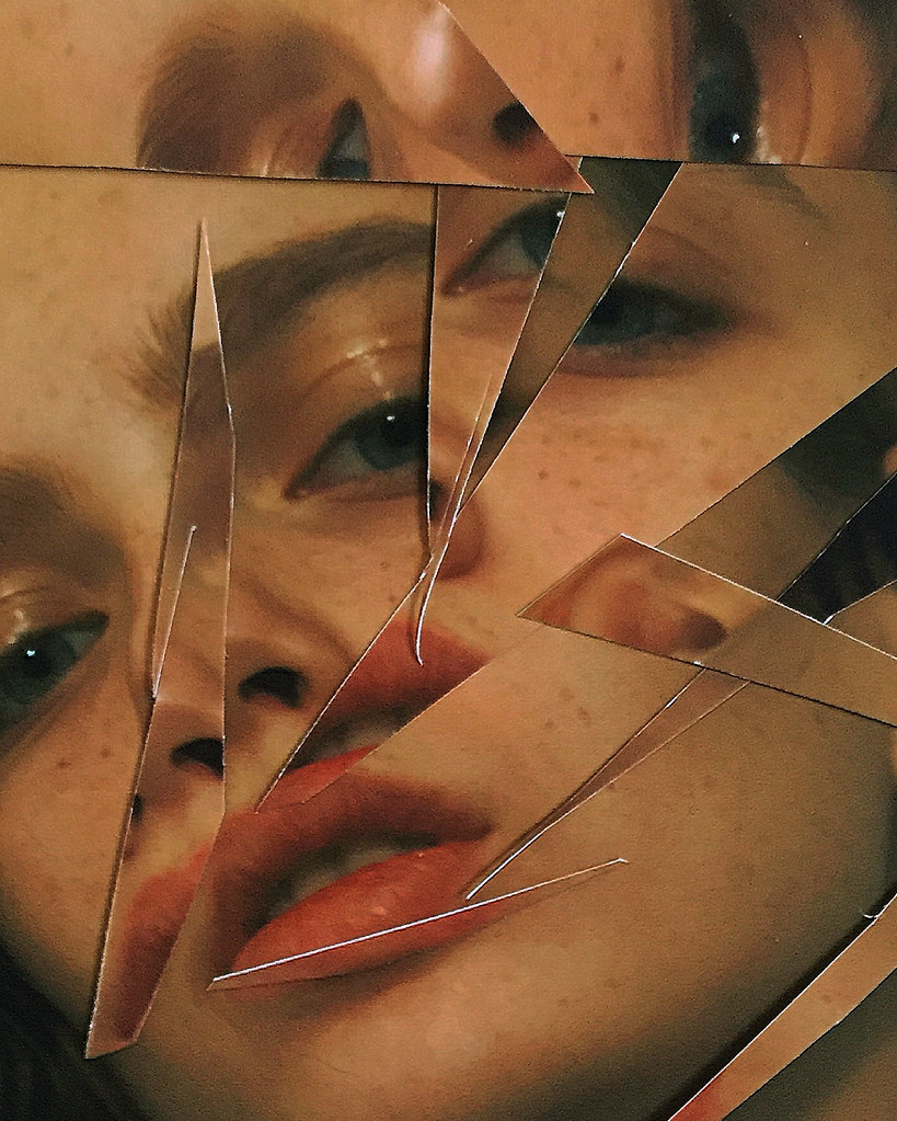
For my final photoshoot I have been deeply inspired by the work of Rosanna Jones, who bleaches, burns, and rips up images for a fresh take on fashion photography.
The subjects of Rosanna Jones’s photographs are usually very obscured, with models faces covered by blotches of colour or torn out of the image altogether. The nature of Jones’s images holds personal meaning for herself as a photographer, who uses her work to explore notions of embodiment and visual identity. Some of her work includes:
During an interview Rosanna states: “It has become a hugely therapeutic process for me,” Jones says of her practice, especially the series Destroy, which prominently features ripped up portraiture. “The images I produce definitely reflect my own personal life. I guess you could say it’s a little sadistic to enjoy bleaching, tearing, scouring, and outright burning away the subject’s eyes, face, or other body parts, but there is definitely a close connection between Destroy and my relationship to my own body and mind.”
PHOTOGRAPH ANALYSIS:
CONTEXTAL/CONSEPTUAL:
Jones’s work brings attention to portrait photography’s central conflict—the idea that taking a person’s photo can immortalise them, by bestowing fame upon them, but it can also be an act of violence. Fashion photography, which frequently exploits the female body, is perhaps the most clear example of this defiance. The subjects in Jones’s photographs are beautiful, but her interventions make them aggressive in a way that portrays the potential violence of the camera.
TECHNICAL:
The lighting of this image is generally quite light, clearly taken with a soft studio lighting setup. You can see this orange sepia lighting could have due to a filter over the lights in the studio. The image looks to have been reasonably exposed, with a moderate contrast between the backdrop of the image and the model herself. The shadows in the image seem to be edited wit ha light haze, or as if the highlights and shallows have been edited with an orange hue.
The aperture of the photograph cannot be exactly determined as the background id barely visible, however the model is in focus. The shutter speed seems to be average, maybe 1/125 as the image seems to be regularly exposed, but also quite focused and sharp. The ISO also seems to be low as the image was taken in a studio, so probably around ISO200.
VISUAL:
The image shows woman wearing a black turtleneck with her hair up, looking into the camera. The colour of the image is tinted with a peach/orange filter. There seems to be a fade to the image that has an orange tint, as the shadows and highlights seem to have a sort of sepia glow. There seems to be some form in the photograph as there is some difference in shadows and highlights on the models body. The editing of the photograph is interesting as there seems to be cut outs of different positions of the model (almost same photograph) stuck back onto the original image, altering the composition of facial features. It explores the idea that the visual identity of someone can be altered.
Born on January 17, 1941 in Düsseldorf, Germany, Hans-Peter Feldmann studied painting at the University of Arts and Industrial Design Linz in Austria. By the late 1960s, he started producing artist books he titled Bilde (Picture), which begin to feature in his work for years to come.
Hans-Peter Feldmann is a German conceptual artist who has worked in multiple formats, from drawings and sculptures to artistic books and photographic essays. Feldmann is a figure in the conceptual art movement, collecting, producing, and exhibiting photographs Since the sixties.
HIS WORK INCLUDES:
Beds , 1990s
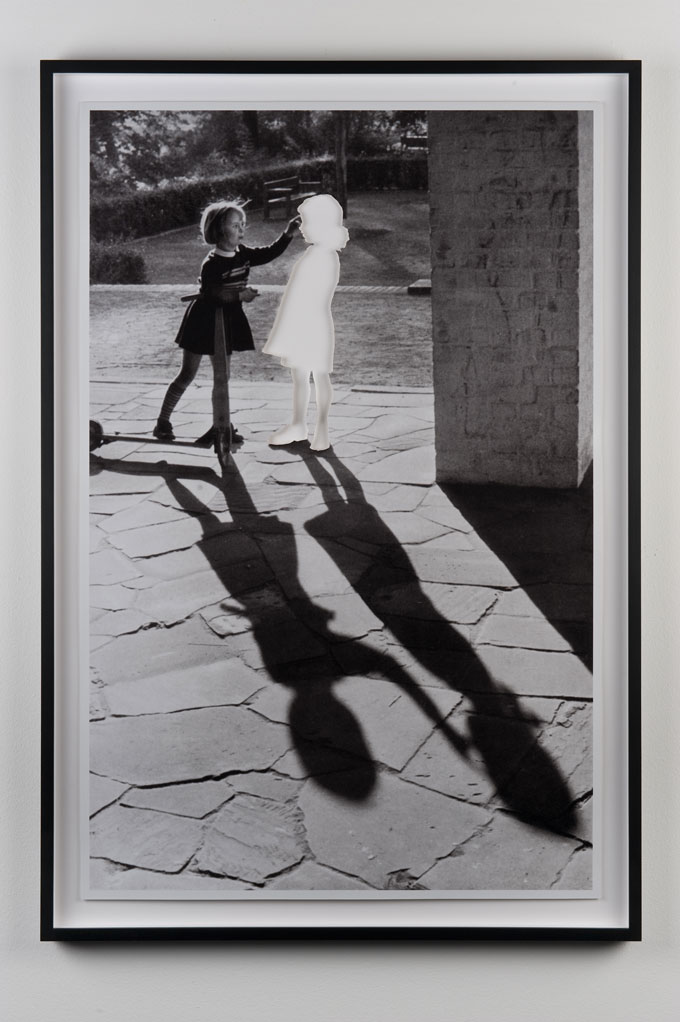
Two girls with shadow
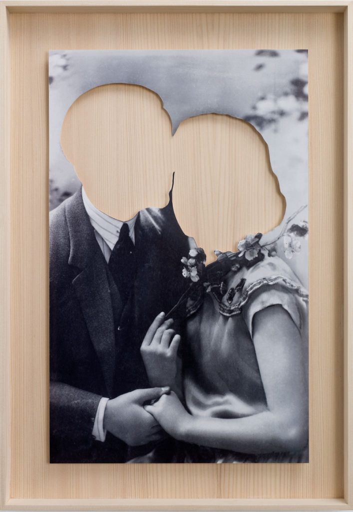
Hans-Peter Feldmann ‘Lovers‘ Cut photograph
The photographer seems to use a very unique style of manipulation when editing. His photos seem to be in black-and-white however faces or even whole bodies can be cut from the image. This may represent a lack of identity as recognizable aspects of one’s identity such as clothing and facial features, are completely cut from the final image leaving a block color background
ANALYSIS OF PIECE:
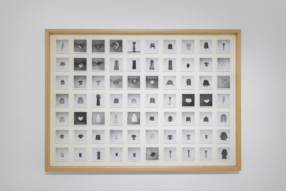
All the Clothes of a Woman 1970 Hans-Peter Feldmann
CRITICAL/ CONTEXTUAL:
One of his most famous works is his 1973 piece “All the Clothes of a Woman“. It features 70 pieces of one woman’s wardrobe, photographed one by one, then arranged into a grid of small black and white photo. The woman who the clothes belong to is veiled and she is rather an enigma (possibly presenting the idea that they could belong to anyone). She is shown only through her clothing, converted into a range of the parts of a woman, that make her, herself. The concept of the work is to use objects to represent somebody, create g the idea that one’s belongings, such as clothing, can be an aspect in one’s identity.
VISUAL:
The image shows a range of small black and white photos, arranged of 70 garments worn by a woman. The colour of the images are clearly in black-and-white with A clear use of tone being used between light backgrounds and dark clothing, and dark backgrounds with light clothing. There seems to be a little form in each individual photograph as they are usually placed on flat backgrounds allowing for no shadows, however with each piece of clothing texture can be seen through the shadows and highlights. The image shows a high level of repetition as the images are placed in a patern, in a grid like composition, leaving a very aesthetically pleasing final image. Line is also clearly shown as there are equal gaps (spaces of white background) between each photograph.
The composition is very aesthetically pleasing as the 70 images are arranged in an organized fashion with 10 photos going down in columns and seven rows going across. There seems to be balance in the colour range of photographs as they are randomly placed (not all black backgrounds are grouped, vice verse with white backgrounds).
TECHNICAL:
The type of lighting used to photograph each individual piece of clothing seems to be either daylight or studio. I think this because the light used is very soft (as daylight/ natural light can be) however the background seems to show it was taken in the studio setting (shown by backdrops of photographs). The lighting doesn’t seem to be too intense, however images with a black background seem to look slightly over exposed. There seems to be a large depth of field because the backdrop is also in focus. The shutter speed seems to be average as the images look, overall, well exposed. The ISO seems to be around 200 due to images being taken inside, and there doesn’t seem to be any colour cast in the images as the white shades do not seem to be either warm or cold (average white- no blue/ yellow tones).
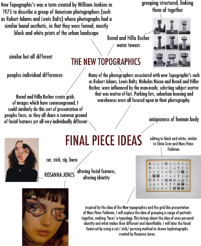
For my final piece linking to identity, my main aim is to create a link of identity between a large group of people, maybe even strangers, to show that we all have different things about ourselves (such as facial features) that make us distinguishable from each other, identifiable.
PHOTOGRAPHERS THAT HAVE INSPIRED ME ARE:
Bernd and Hilla Becher – The New Topographics
Rosanna Jones – altering identity
Hans Peter Feldman – ‘All the Clothes of a Woman 1970‘ womans’ identity
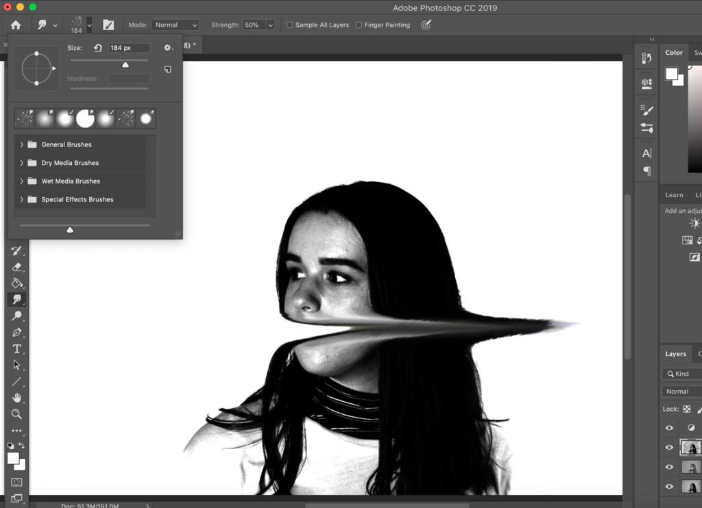
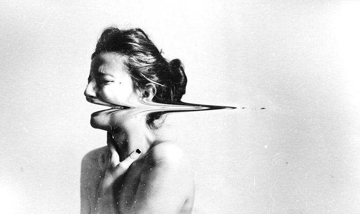
By initially editing the image to be in back and white by selecting ‘image, adjustments, black and white’, I then manipulated the levels of back and white in the image, creating a high contrasted image that represented the editing techniques of Silvia Grav, to create an “vintage edit’. I decided to recreate the image to the left by Silvia Grav. To do this I used the ‘smudge tool’ making sure the size of the brush was similar to the size of the models mouth. I repeatedly swiped the brush to the right to mimic Grav’s work.
As well as this I completed the final product by adding a grain to the image to create an authentic feel. The final result of the editing process was this image below, I think that it mimicked Grav’s work almost exactly. I like that the high contrast of the models facial features and clothes with the background create a strong and defined final image.