For my tableau editing process I used Photoshop in order to edit my photos.
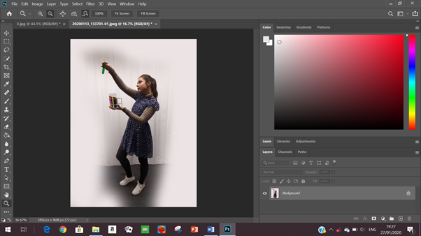
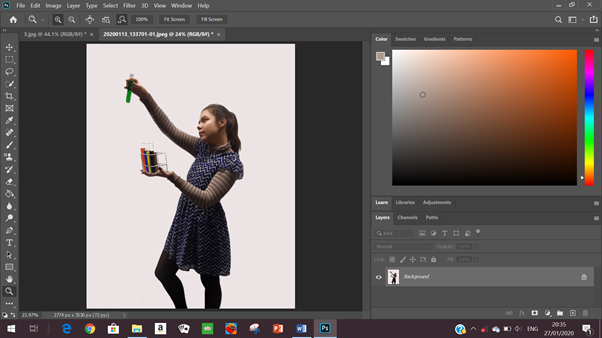
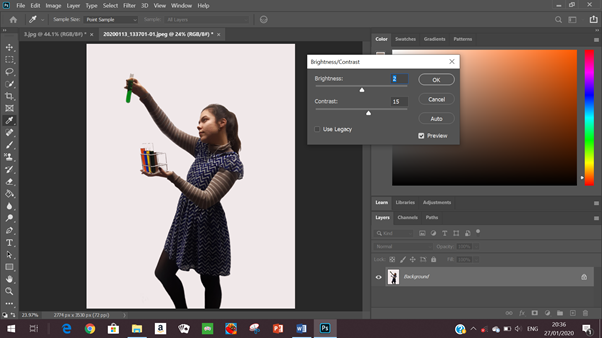
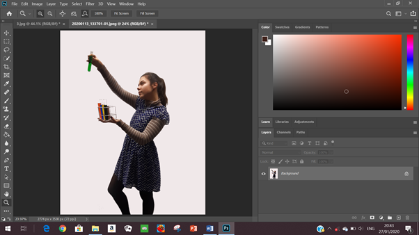
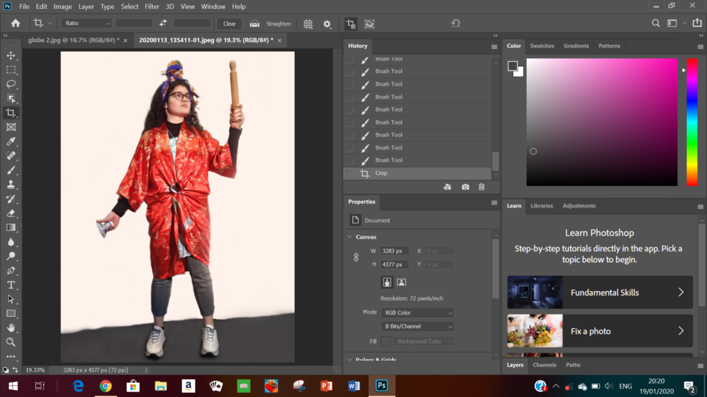
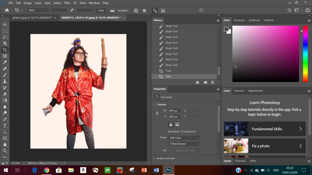
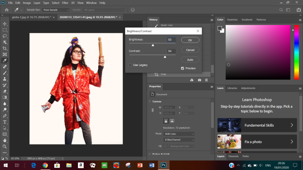
I then followed this same process for all of my images and below are my final edited outcomes.
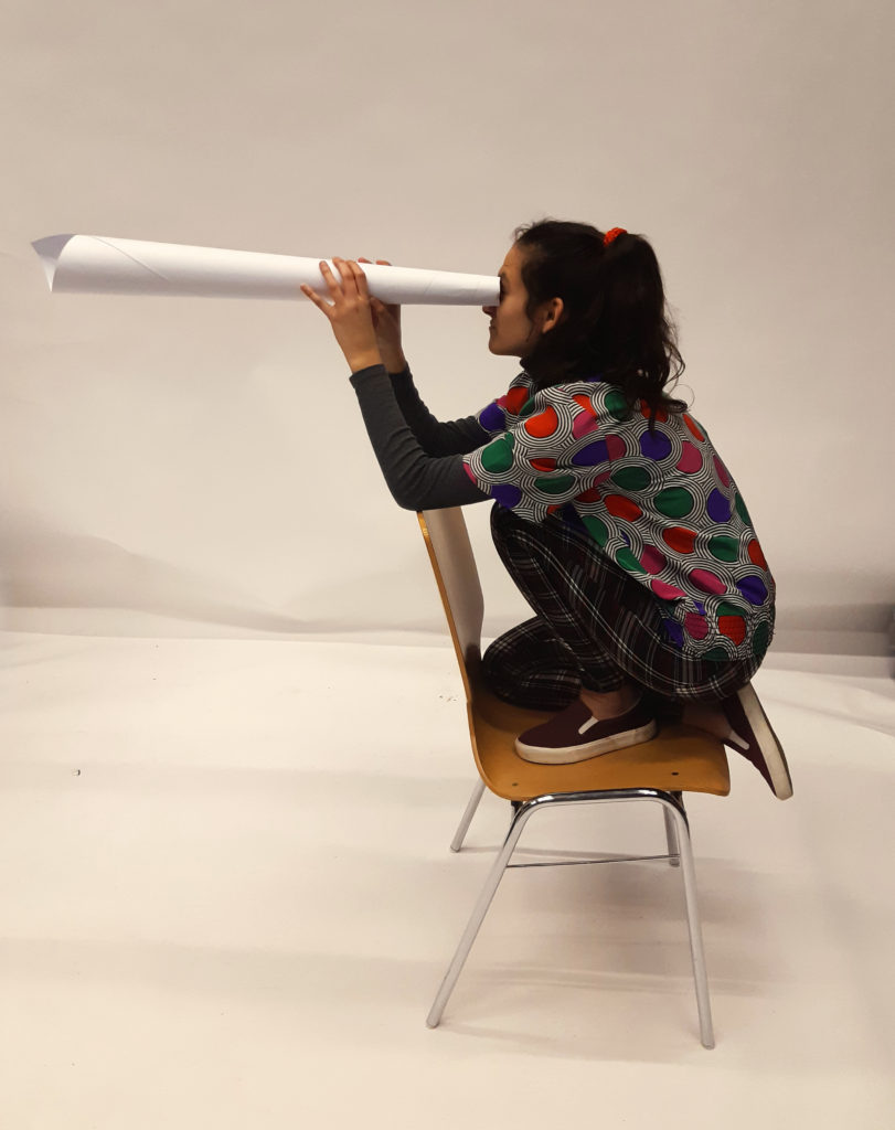
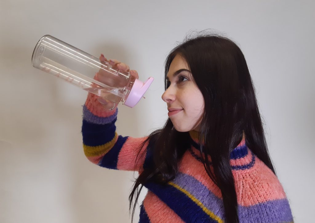
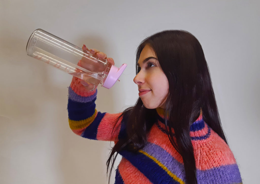
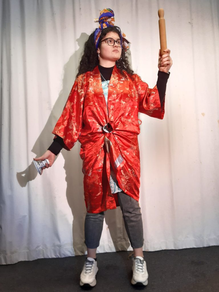
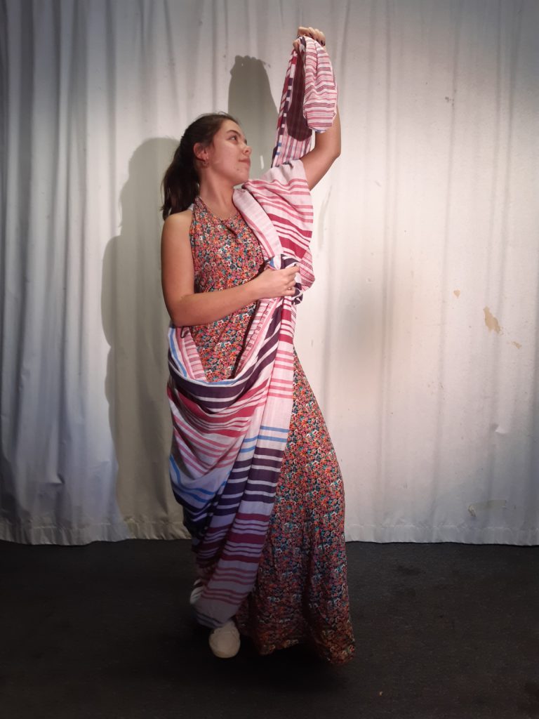
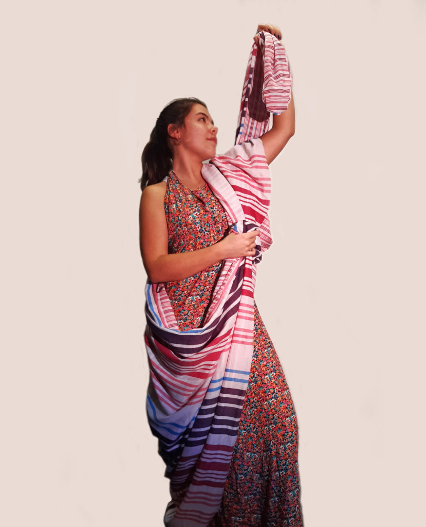
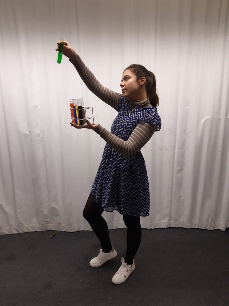
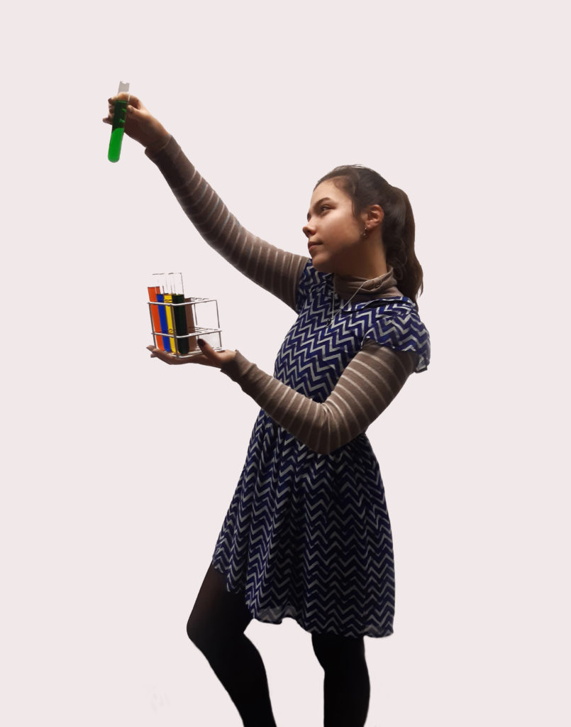
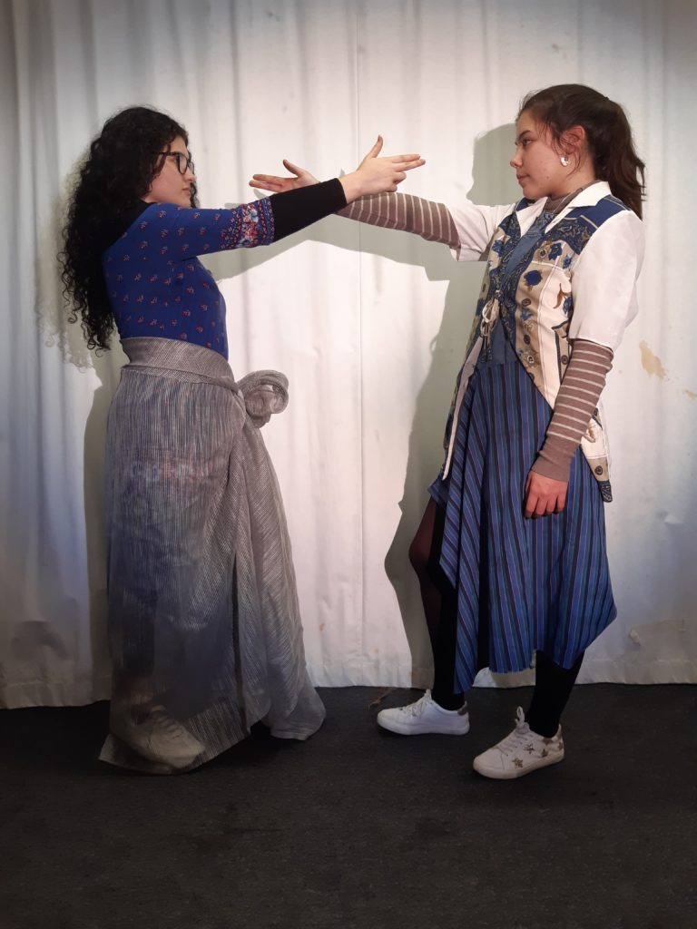
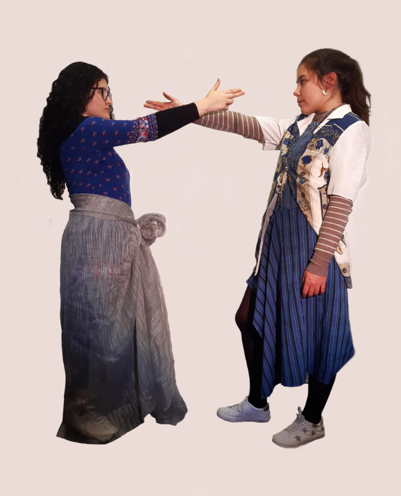
For my tableau editing process I used Photoshop in order to edit my photos.


I then followed this same process for all of my images and below are my final edited outcomes.


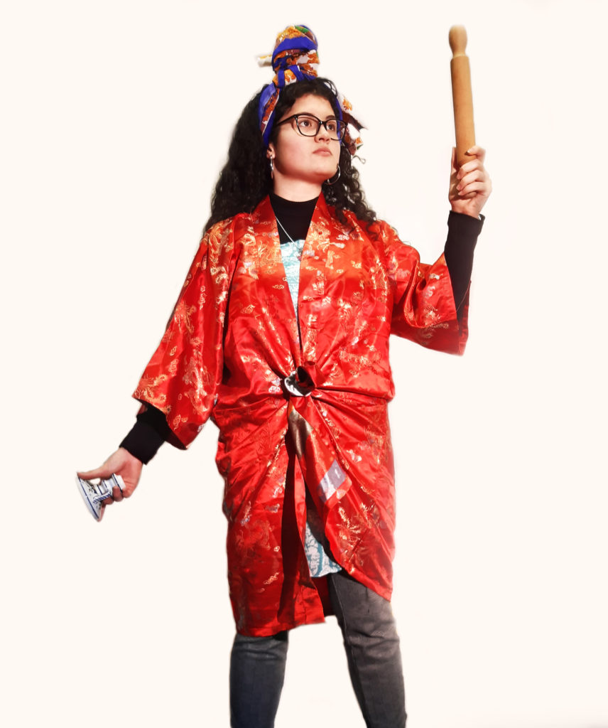
My Final Image^ Character in Comparison^
Throughout my work on this Tableau topic my aim was to imitate these Tableaux figurines in order to match my chosen artist, Yinka Shonibare, I think that through my photos and edits I have successfully achieved my aim as I think there are clear links between my image and Shonibare’s works. I have tried to incorporate the colourful clothing‘s with different patterned clothes and long pieces of material which I wrapped around my models. I also tried to incorporate any similar props that I could find in the images and try and keep my model holding them in a similar way. The main similarity I tried to incorporate, was my models body language and their expressions, I wanted to try and create what I thought the Tableaux figurines facial expression would be if they had a head instead of a globe. In this photo for example, I tried to create a proud a powerful sense in the model through her facial expression as the fact that shes looking up shows her power and authority
I cleaned up the background in the image in order to keep the focus onto the model and not on the background which I think helped create a cleaner and crisper image. The eye is successfully lead to the bold red patterned clothes and then on top my models facial expressions which is what I wanted as these were my main aims. Once again visually the patterned clothing are the main attention of the image which is striking. Overall I quite like my final outcome for Tableau as I think I have successfully matched my artists work and Incorporated there main techniques. With the image itself I loved my models body language and confinement of my image I am also again really happy with the colours of the image.
A lot of emotion is meant to be felt when looking at Lee Jefferies work especially the images from his photography project called “Homeless”, the emotions felt when looking at these photos are meant to be something which observers rarely experience in front of photographs. This might be because these are mean to be raw photographs as if you are looking at these people in person. Of course the camera still has to be used to capture the image but on the other side of the lens there is a real person. On the bodies and faces portrayed the signs of devastation due to an existence without any warmth, the closest thing these people get to happiness is from alcohol or drugs. This photographer has tried to get the models too look into thew camera lens and has tried to get them to make the emotions across the observer. His main question from this project is ” What is left of such a person?” . The darkness and lack of exposure is meant to represent how little the homeless have and the little bit of light and hope that they do get is vigorous and violent (the flash from the camera). Lee Jeffries portrays those without a home, without a land, without anything, is the same way that light has emerged from the faces of sinners, saints, common men and women painted or sculpted in marble at the feet of the Divine, such as Jesus Christ or the Virgin Mary, by artists such as Caravaggio, Leonardo, Michelangelo, Bernini, and in the greatest art pieces of European Renaissance. His work is said to not just be looked at as photography, but as “Sacred Art”, And this is what remains of Jeffries’ “divine tragedy”: the Sacred, the real meaning of being Human, too Human, in the descent towards the netherworld and return to Heaven.” All of this project links to identity and the “loss of identity” as these homeless people has expressed what little they have which prevents them from expressing themselves.

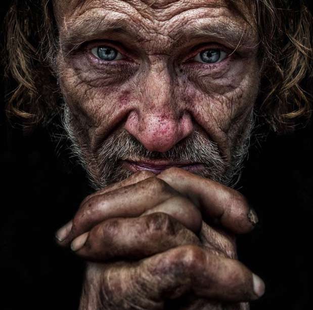
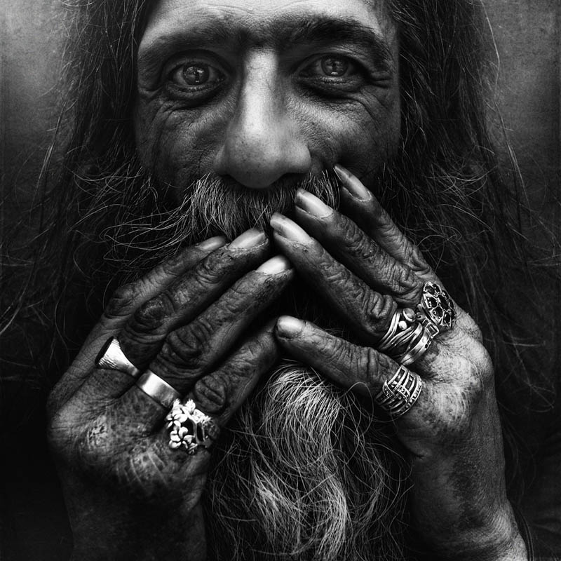


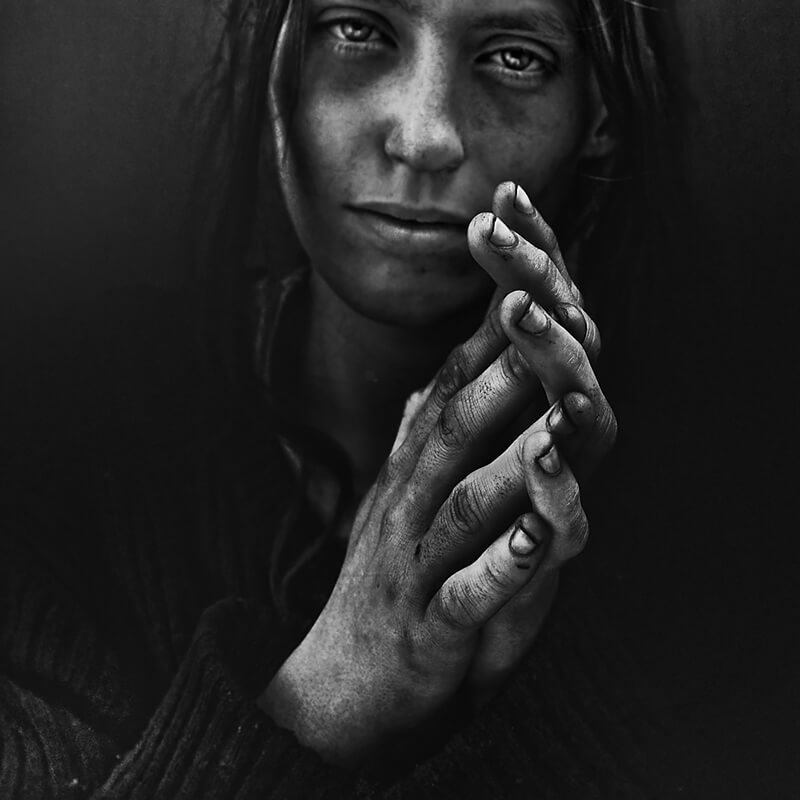

Lighting – The lighting used for this photograph is most likely flash or a spotlight using one point lighting (chiaroscuro), as it looks like the model is in a studio due to the the plain background behind her. The flash seems to be directed and position to lead towards the top of the models body as the photo is more shaded towards the bottom.
Aperture – The depth of field seems to be shallow as the photo is seems to be focused and sharpened mostly around the centre of the photo where the face and hand is.
ISO – The photo seems to have a very low sensitivity meaning it the photo appears to be grainier than usual. There is also a lot of tonal range and contrast.
In this photograph there seems to be a lot of tonal range especially when looking at model against the black backdrop. The viewer is able to the all the textures and blemishes on the woman’s face due to the sharpness of the photo. The photo is 2D although the model is in such high definition that the woman can appear as if she is being seen my our own eyes rather than through a photo allowing there to be a slight 3D concept. There is a repetition of white dots on the woman’s clothing and in many of Jefferies photos there seems to be drastic tones, shadows and highlights. The model fills up the majority of there space in the photograph although there is dome space on the side of the photograph in order for the woman to contrast with such a dark background.
A lot of emotion is meant to be felt when looking at this photograph, the emotions felt when looking at this photo is meant to be something which observers rarely experience in front of photographs. This might be because the photo is meant to be a raw photograph as if you are looking at the person in real life. Of course the camera still has to be used to capture the image but on the other side of the lens there is a real person. On the body and face portrayed the signs of devastation due to an existence without any warmth.
In this photoshoot I took the photos in the studio using two point lighting to get the brightness and exposure that I wanted in the images below. The models I used were asked to pull different facial expressions that were similar to the some of models facial expressions in Maurizio Anzeri’s photography. All lights where set at a neutral colour rather than tinted warm or a cold colour but I had the lights as bright as possible. I had the two LED panel lights illuminating the models from the right and the left also. I have chosen not use some of my photographs as the models were not always pulling the right facial expressions. I have also chosen to crop some parts of the images to make them more symmetrical. My best images were the ones where I barely had a any shadows in the background although I have chosen some photographs with shadows in the background because the facial expressions the models had were better than some of then. photographs with no shadows in the background.
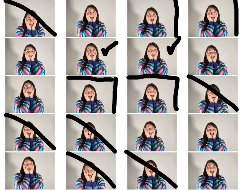
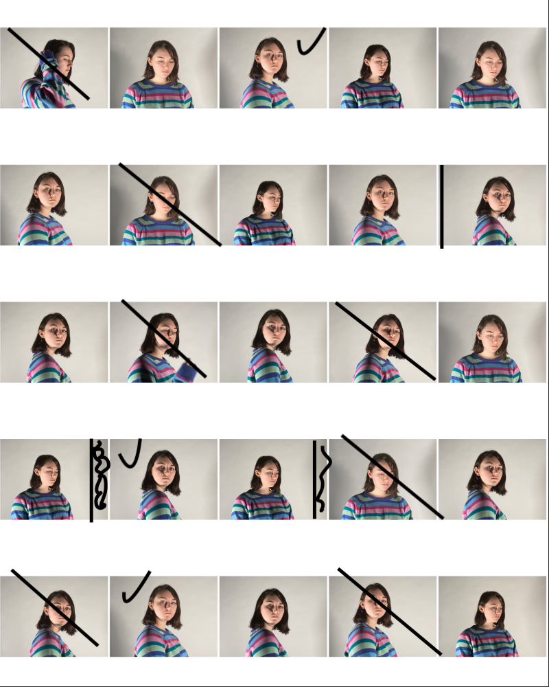
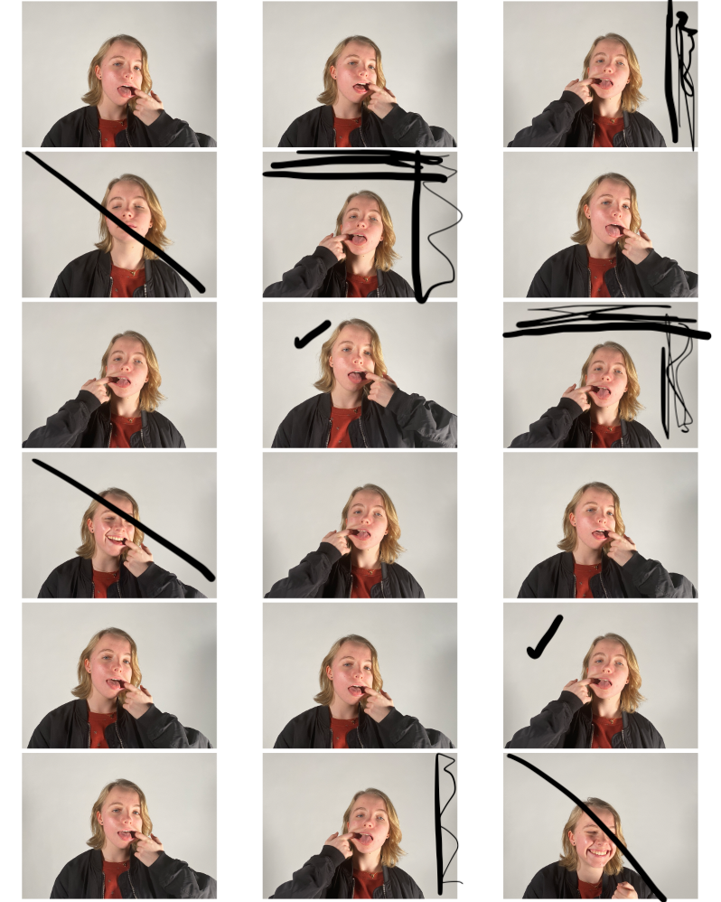
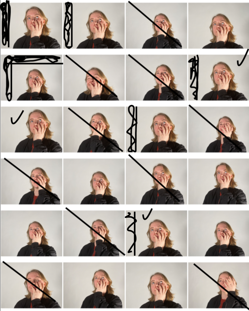
I have specifically chosen these photographs as my best images as my best images because they had the best lighting on the models face and in the background/the models had the best facial expressions. These images were also the most in focus due to the camera being on a tripod keeping the camera steady.

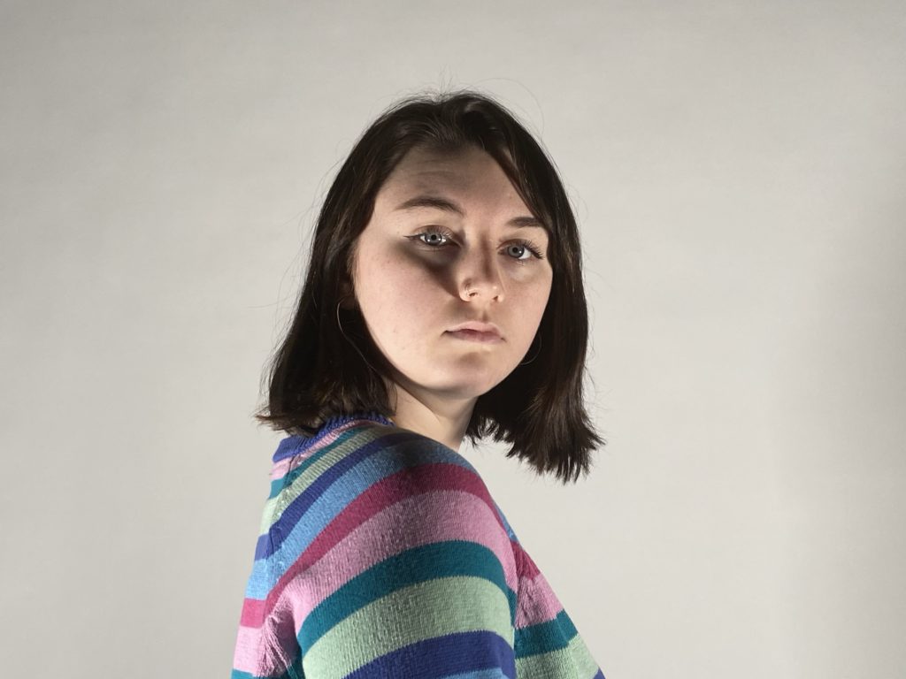
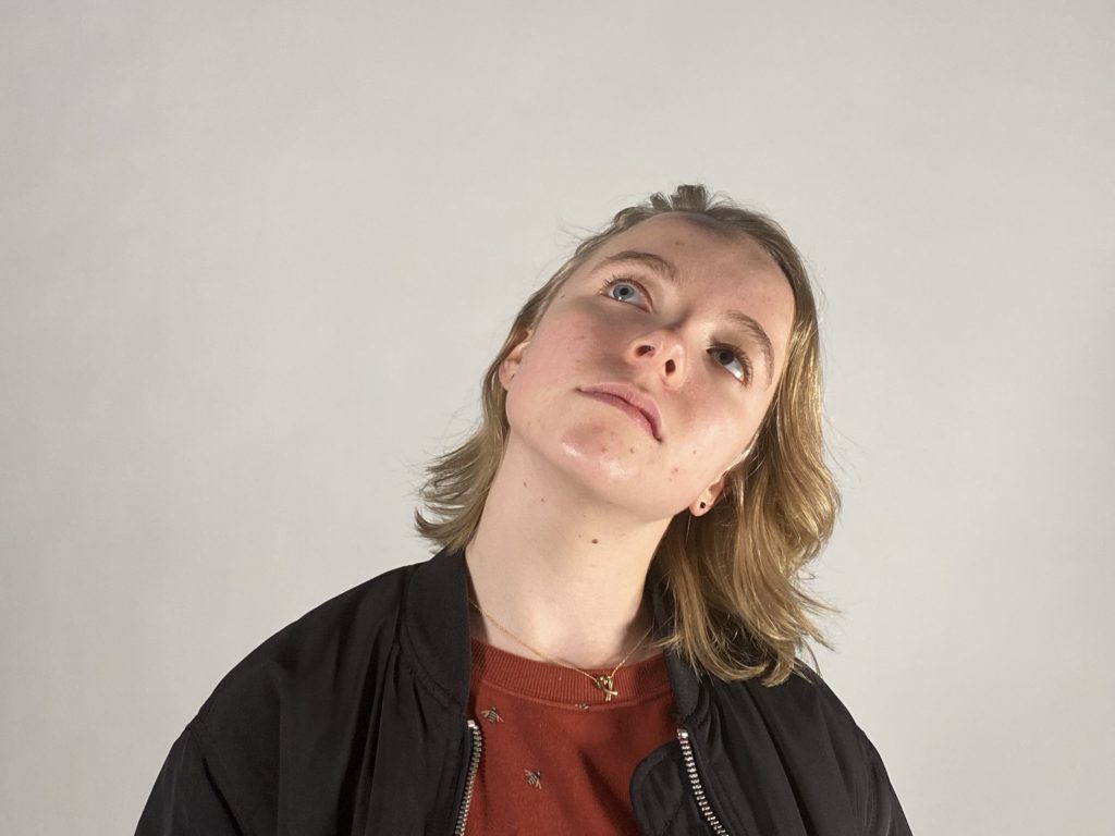
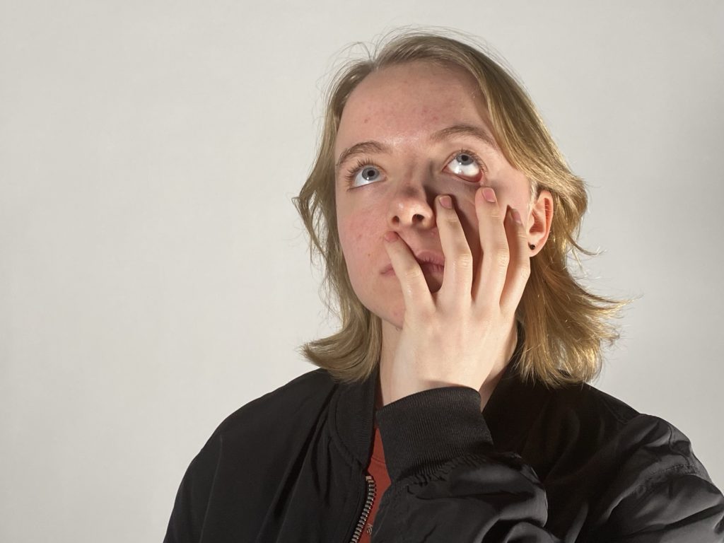
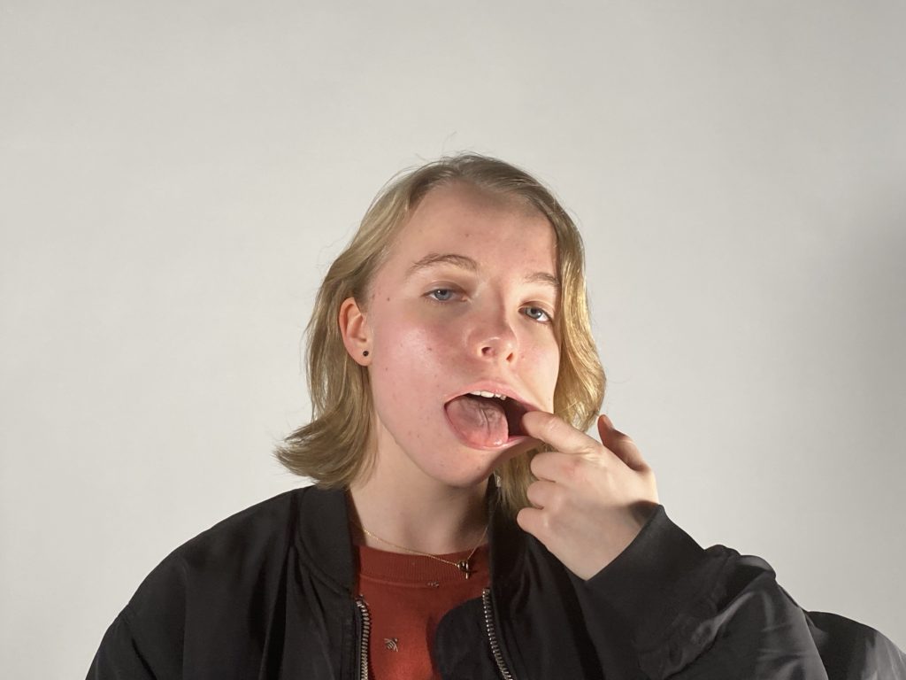
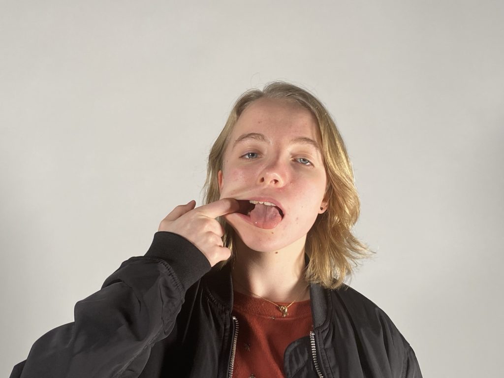
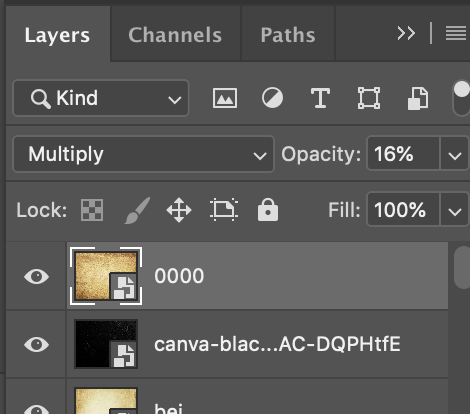
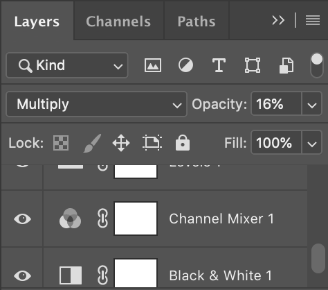
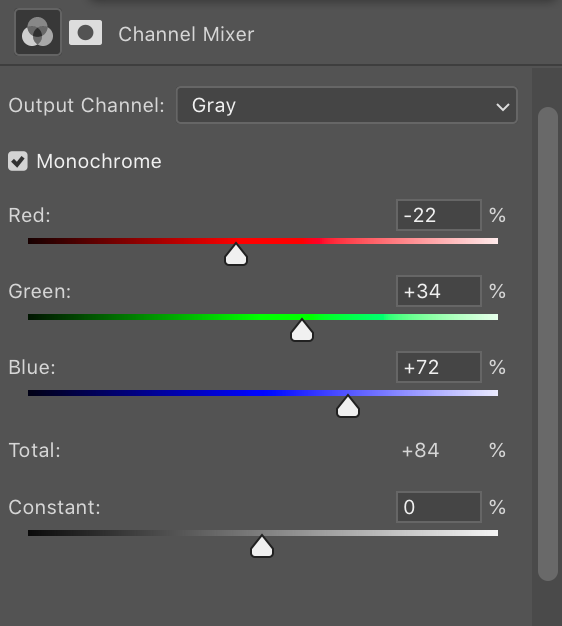
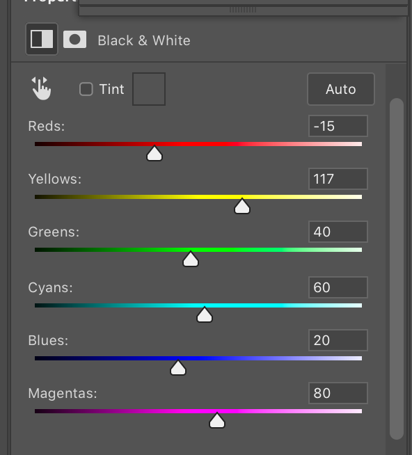
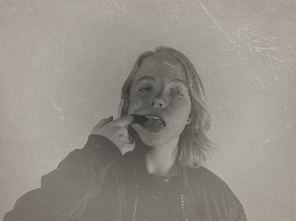
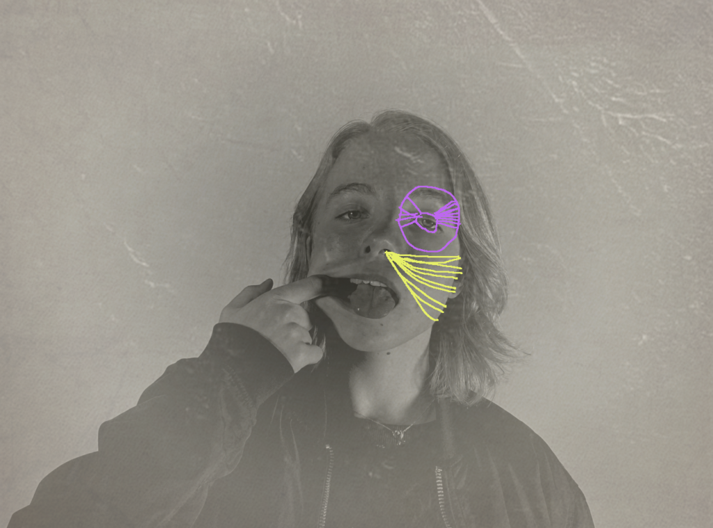
I have edited this photo to look like an older photograph although I had still tried to make the model look in focus and not grainy. I did this using photoshop using various tool and layering filters and lowering their opacity in order to see the model clearly. I will be sewing different coloured string onto the final image just like Maurizio Anzeri’s work. I have edited the photo like this as the images from Anzeri’s work are mostly old images. This photo links to the loss of identity as I am taking photo with a modern camera and then trying to make it look vintage which takes away the photos identity of being a modern photograph. The sewing I will be doing on top of the image is also related to loss of identity as the string will be cover up some of the face in the photograph.
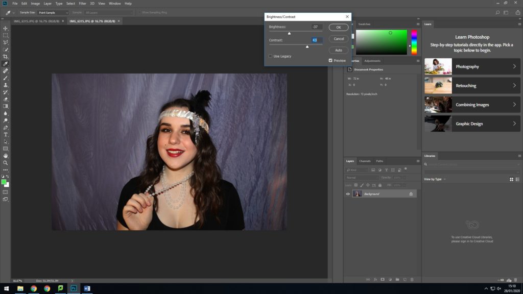
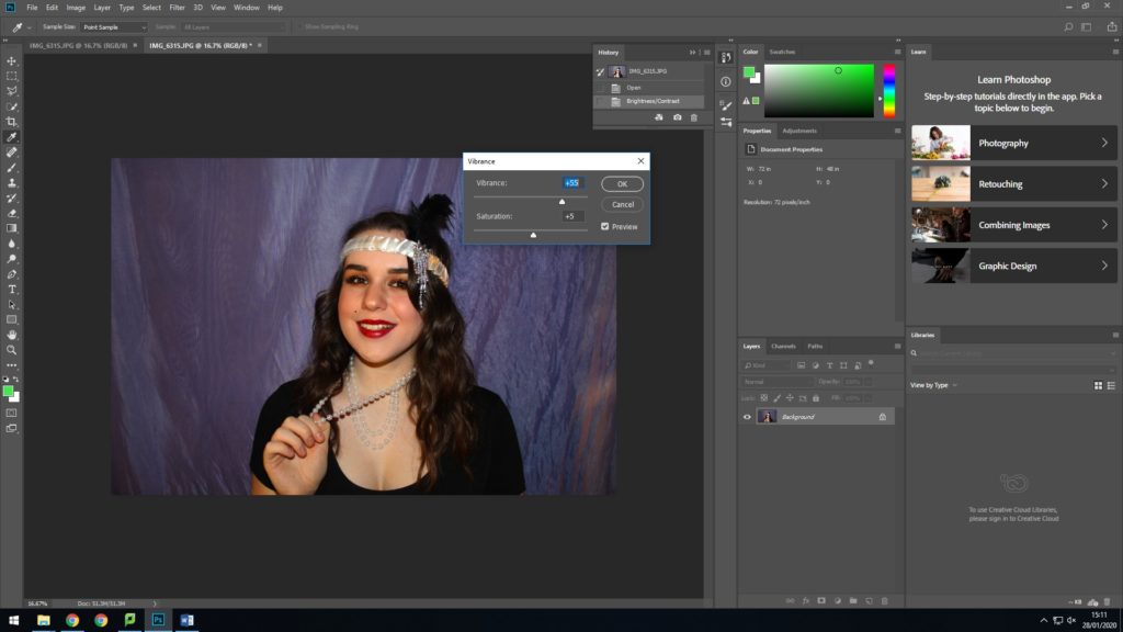
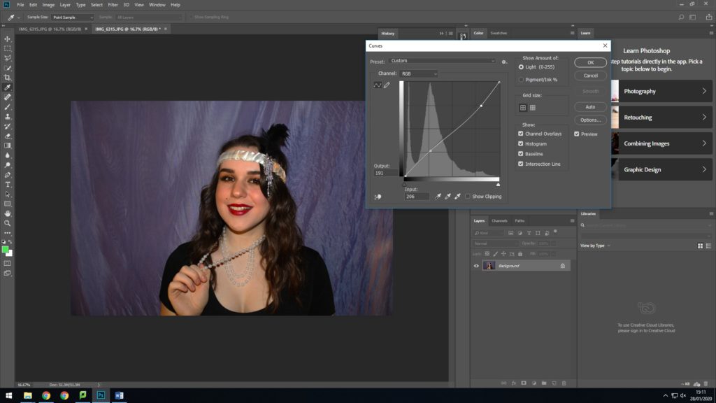
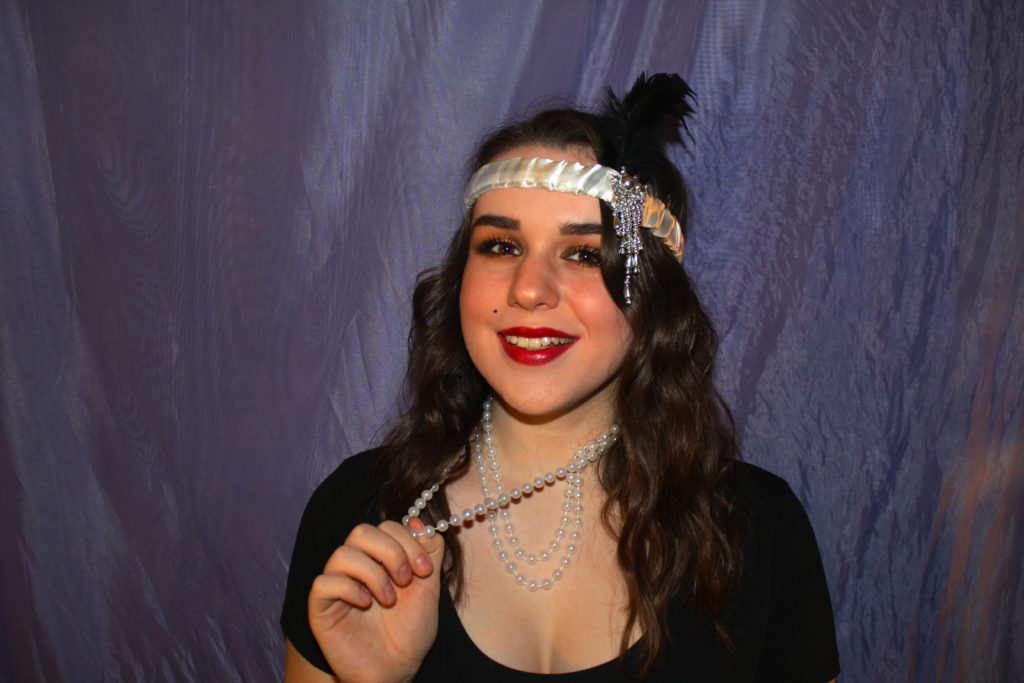
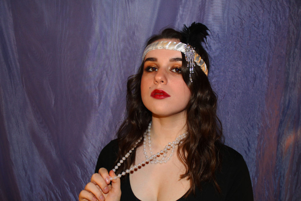
This is my favourite image as i really like how my smile expresses a happier emotion, which matched more with the persona of a 20s flapper girl, than my other more serious images. It also connotes to how when you are happy with how you look, it can drastically improve your mood and well being; linking to how the uniqueness of everyone’s identities can be shown through their confidence as well as clothing.
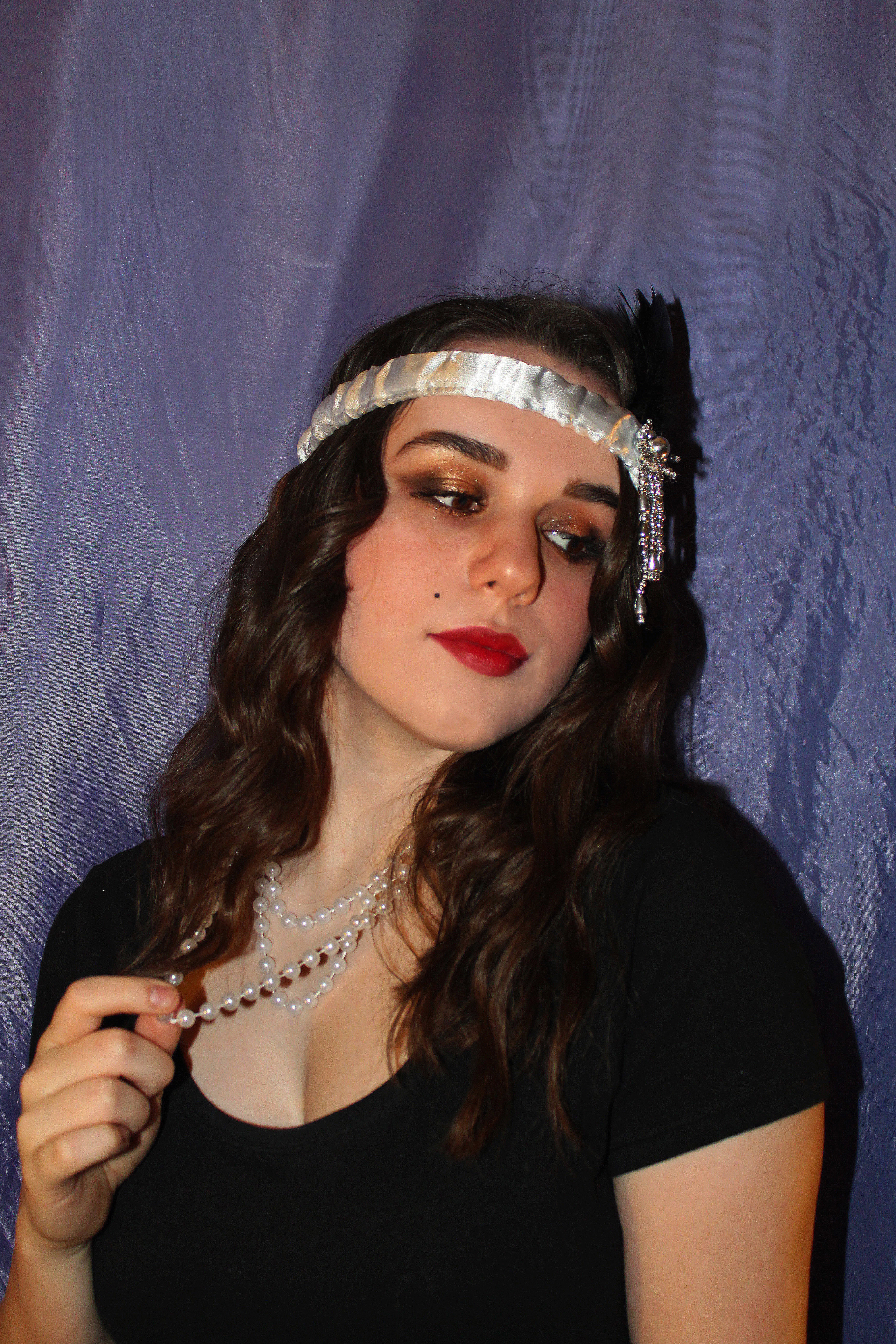
For this look i created a sparkly gold and black smoky eye, with a bold red lip and beauty spot. I then matched this with the iconic pearls and headband of a 1920s flapper girl, with intensely curled hair and a basic black top
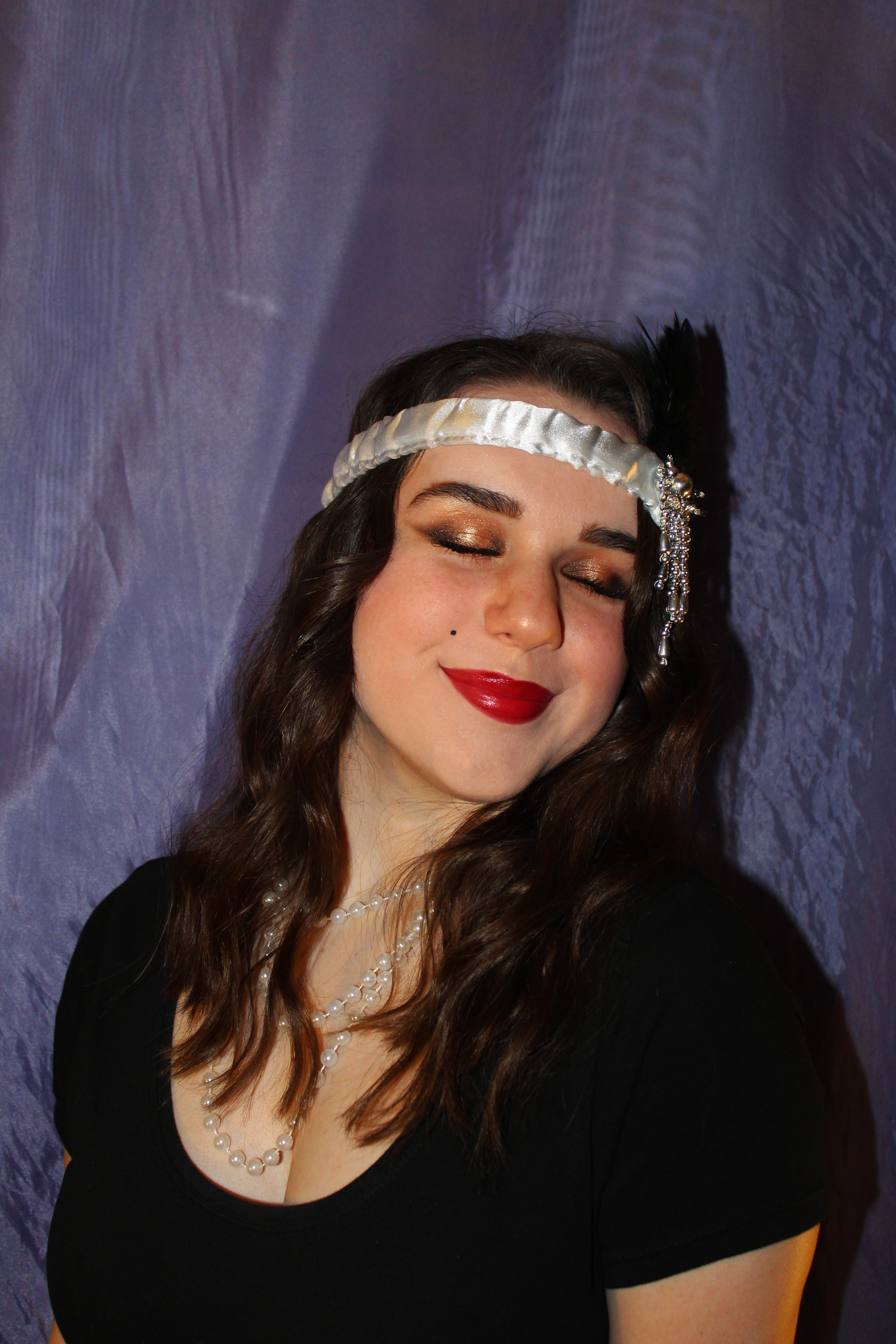
I think these images really encaptured the style of the 1920s with a fun more fancy look, which shows great contrast to how people style themselves in the world now. They can capture a moment in time as styles go in and out of fashion, as people learn to evolve their self expression
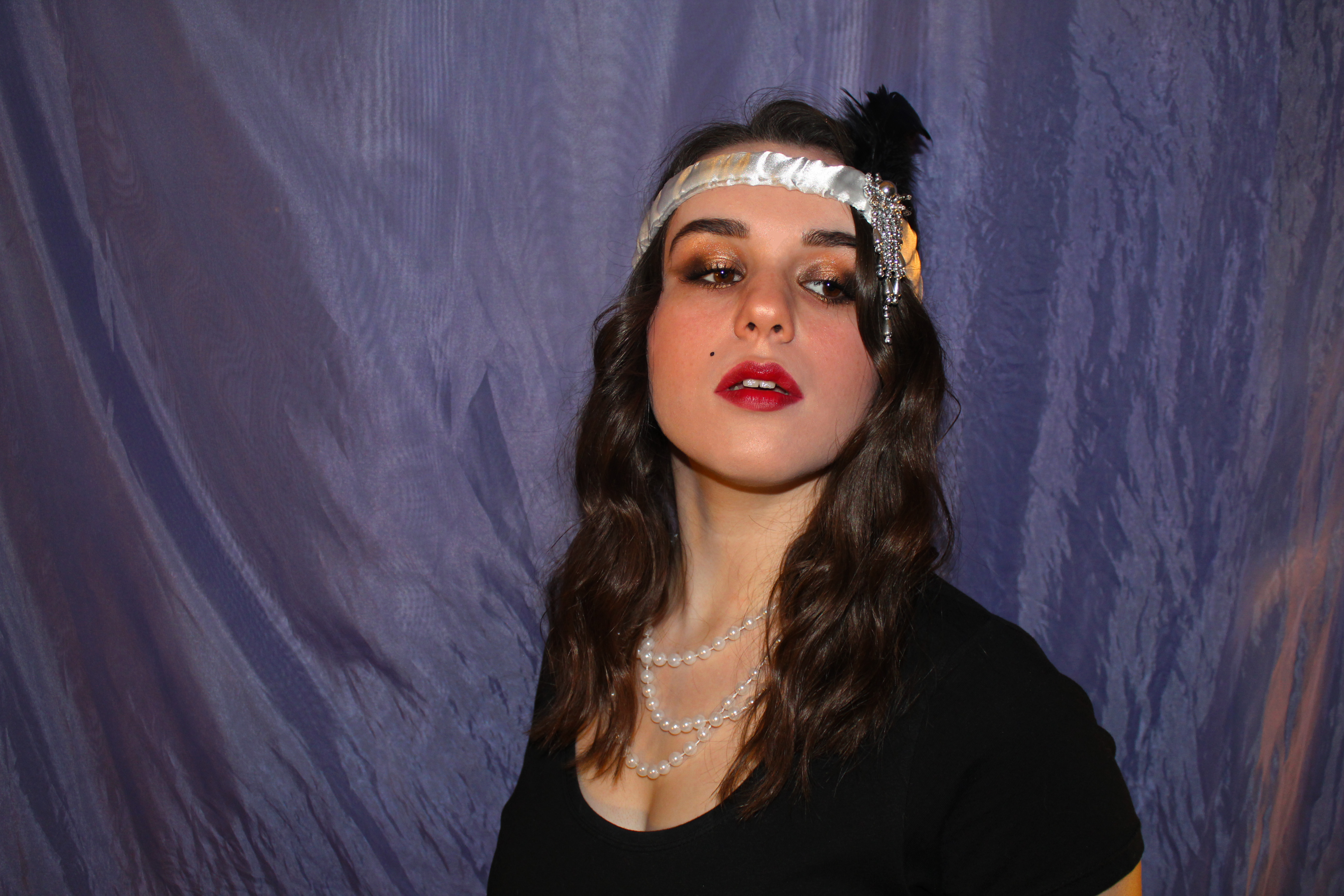
They show how as the world continues, styles can match up with personal identity, not just in everyday life but shown here through interests, such as dance.
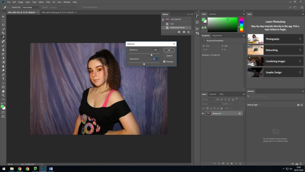
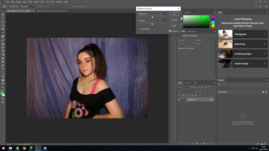
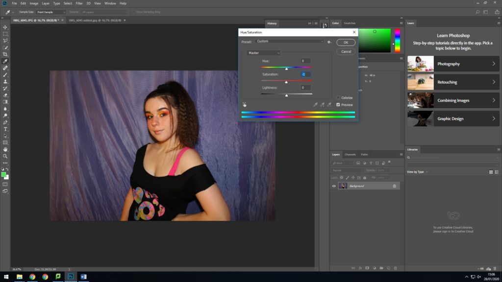
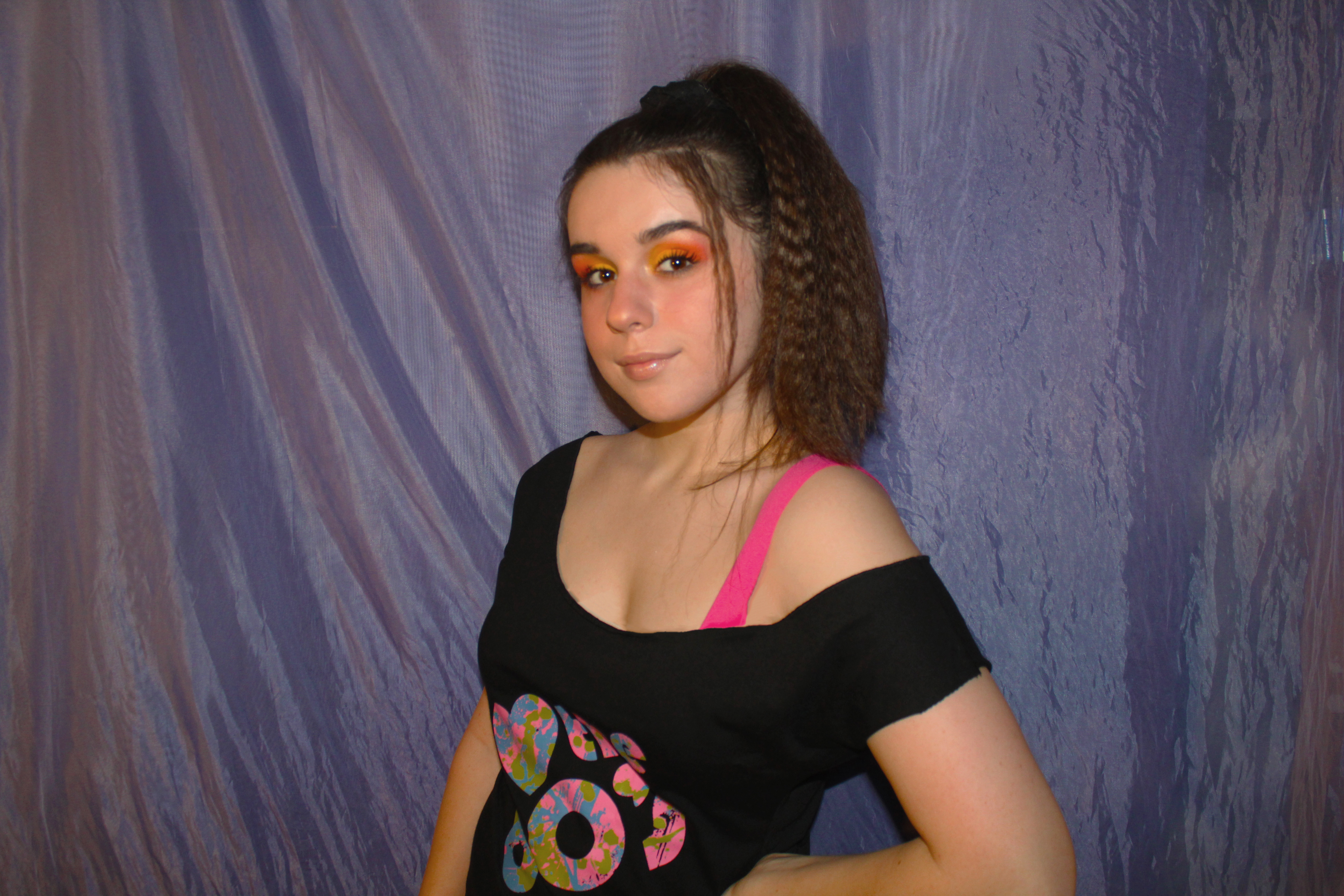
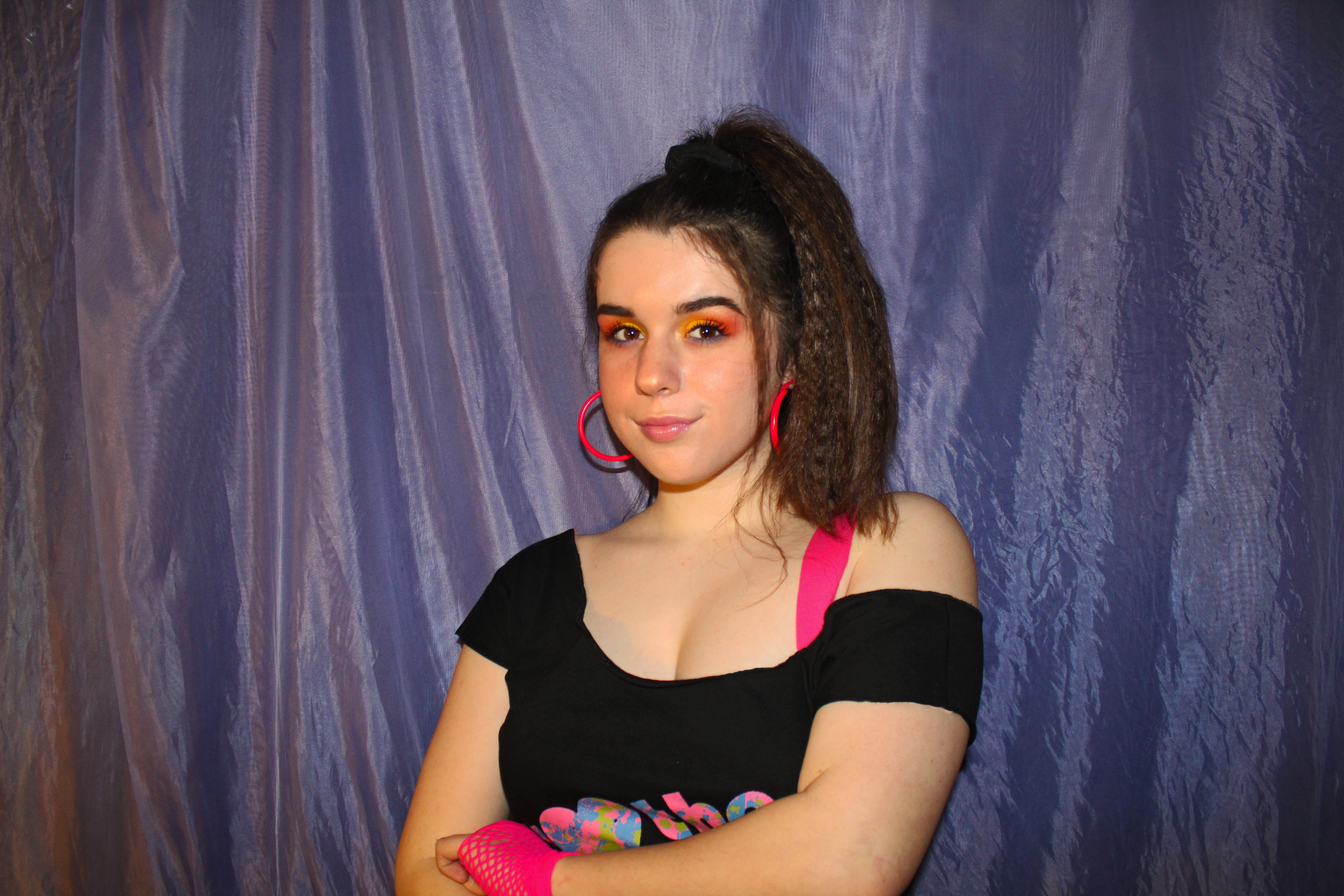
This is my chosen image as i favoured the fact it was in the very center, and landscape. It has a smooth finish and effectively highlighted the 80s aspects, allowing focus on all the small details. The bright and bold colours of this shoot was essential in expressing the essence of the time, and so i made it key to choose bright makeup and clothing. I also like how this image showed highlight to my hair so that you could see the crimped, as it brings forward the idea of styles changing over time.
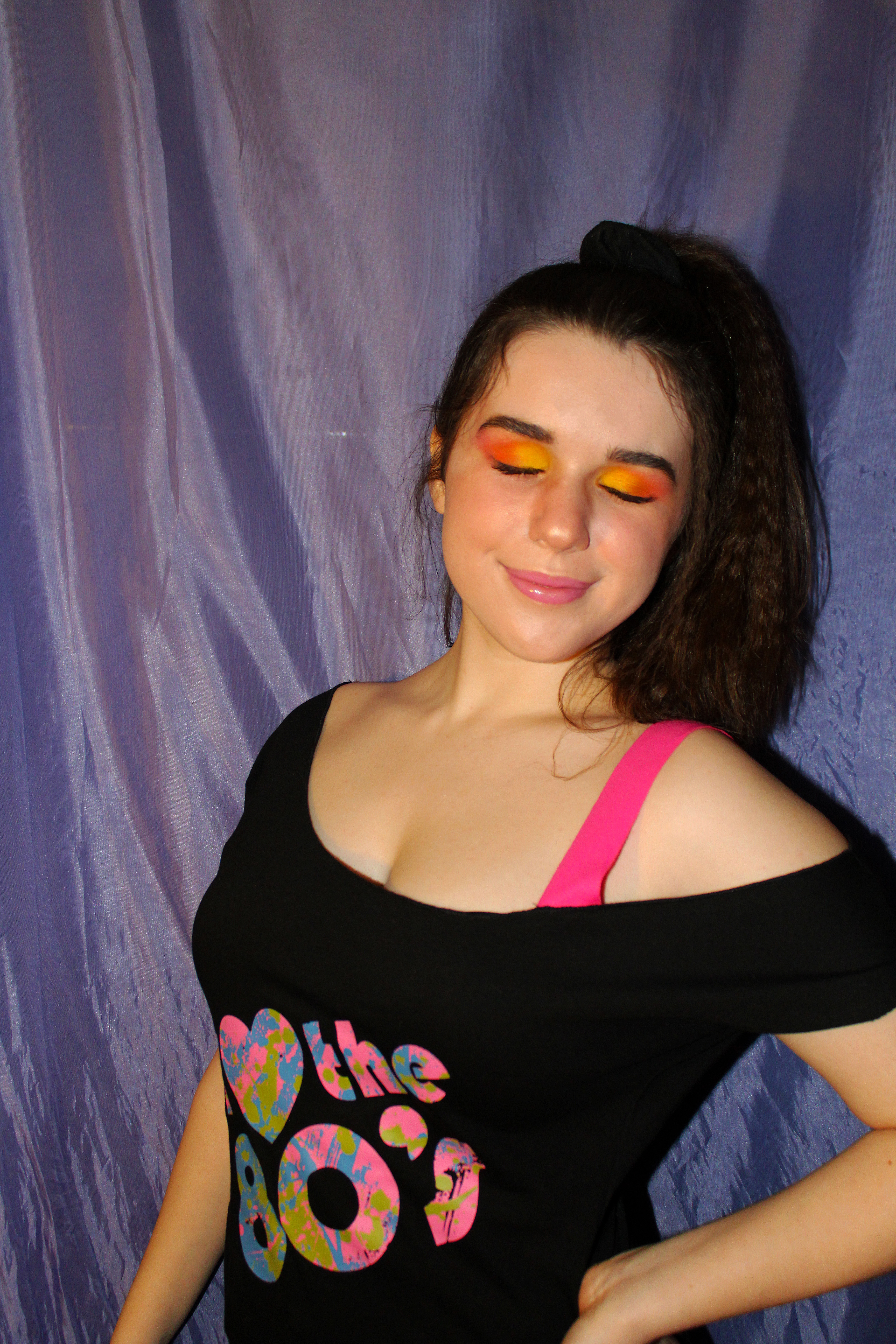
For this look i used a bold yellow and orange eyeshadow paired with a shiny pink gloss, then with my hair crimped in a high ponytail; key aspects of 1980s culture. I then chose an off shoulder 80s top with a bright pink shoulder strap
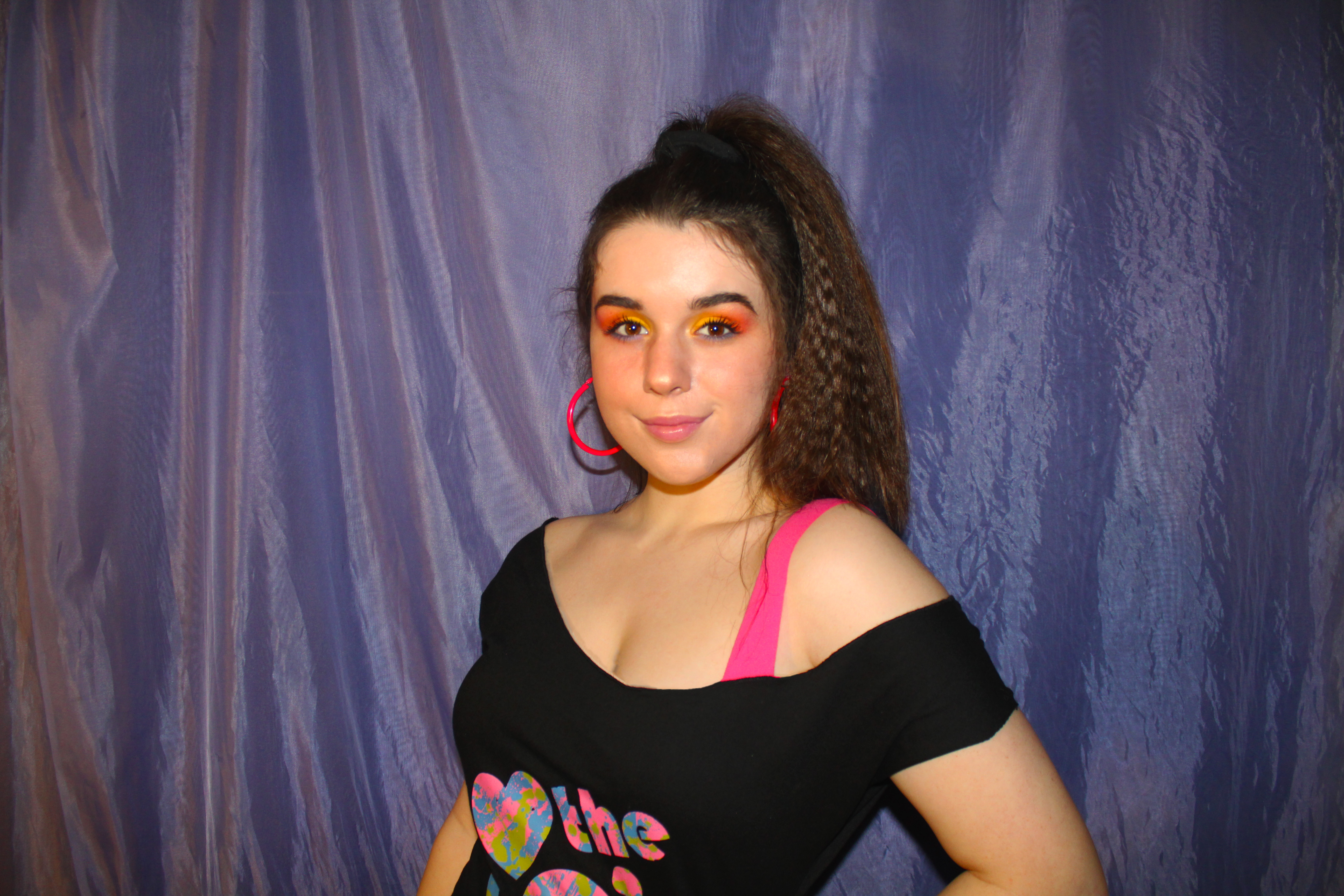
In a few of the images i also added bright pink hoop earings and netted gloves
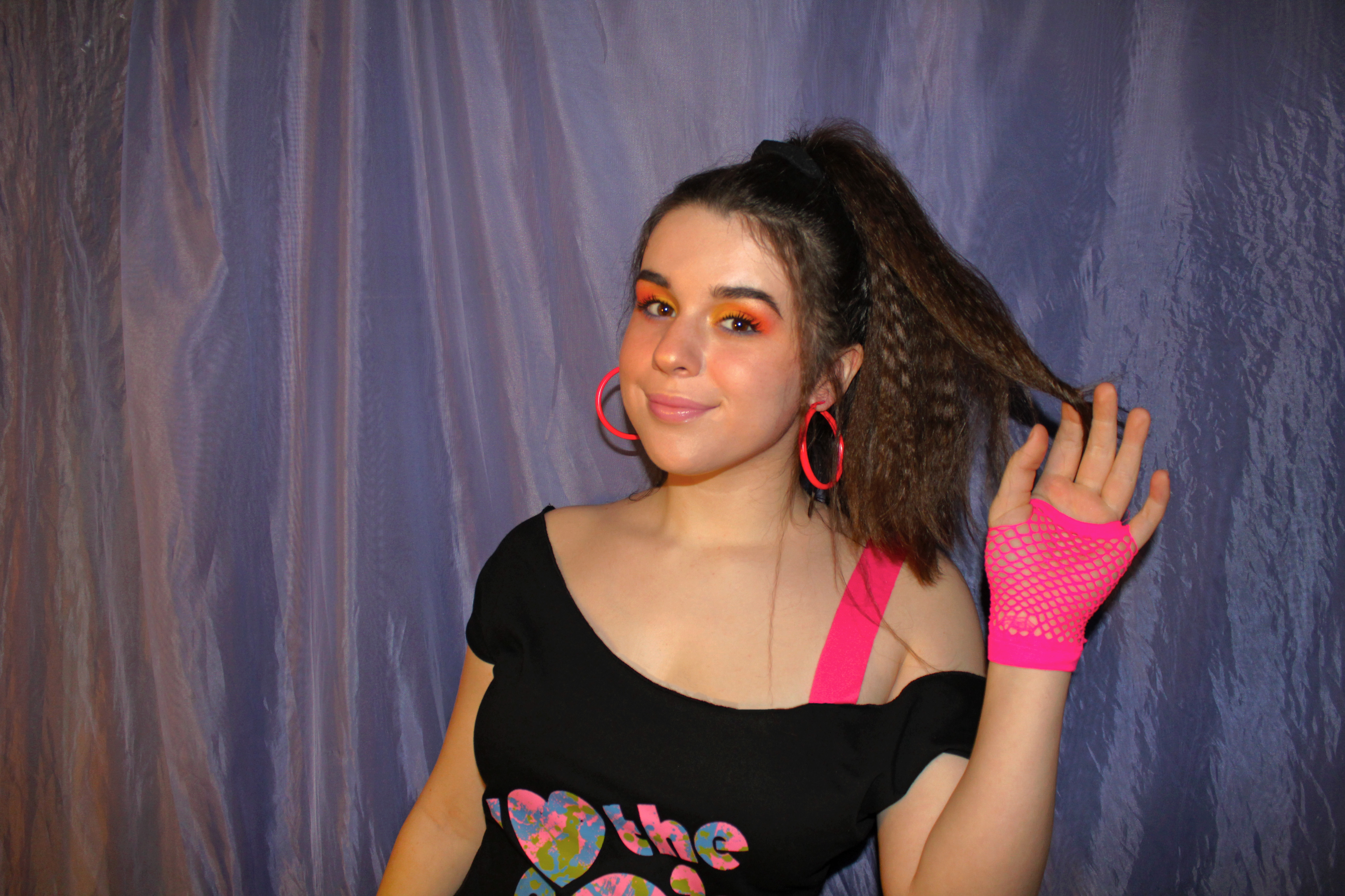
This look was to recreate the teen style popular in the 1980s, with bright bold colours, playful hair and odd accessories. These show how fashions and styles change with the times, allowing peoples sense of personal identity to grow and change with age and social aspects
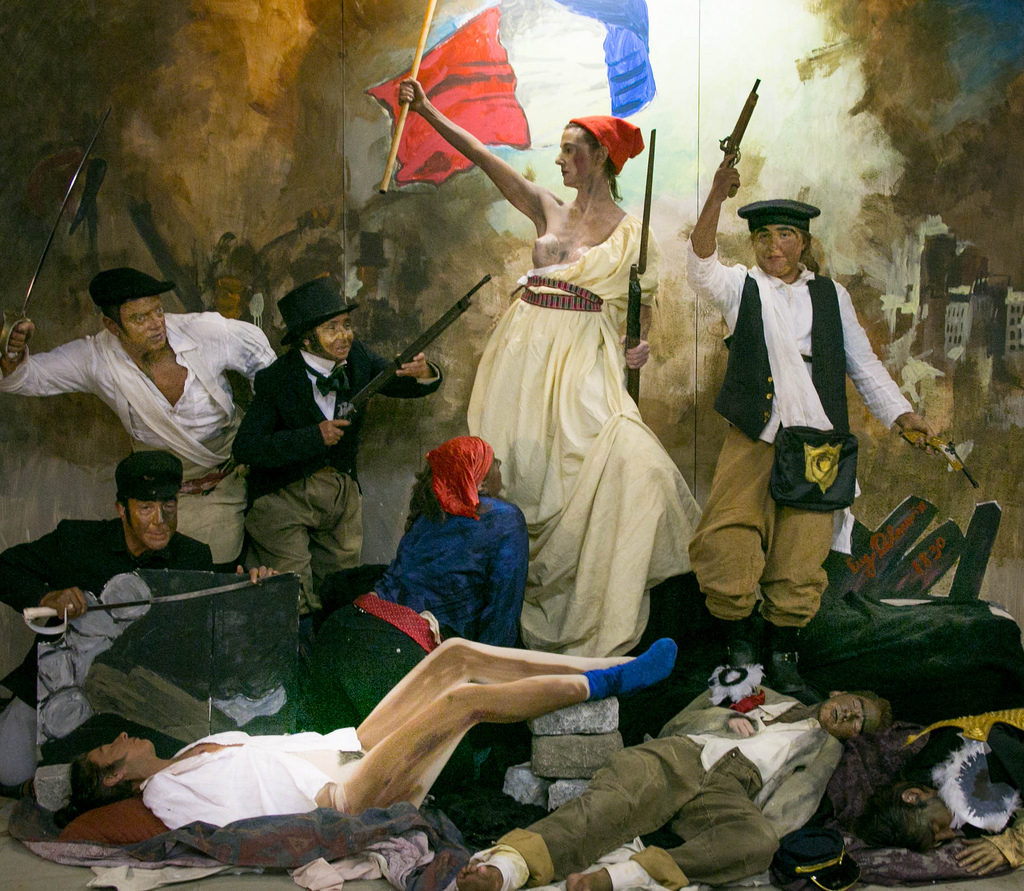
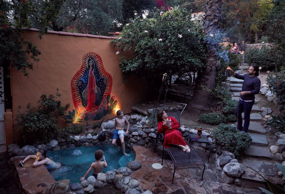
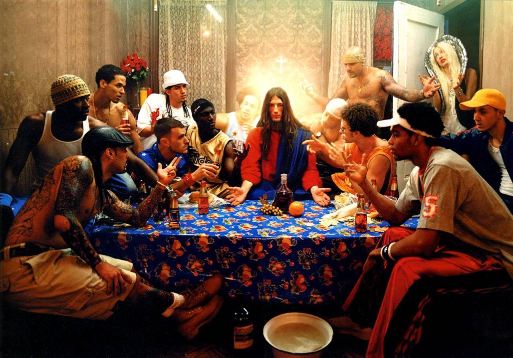
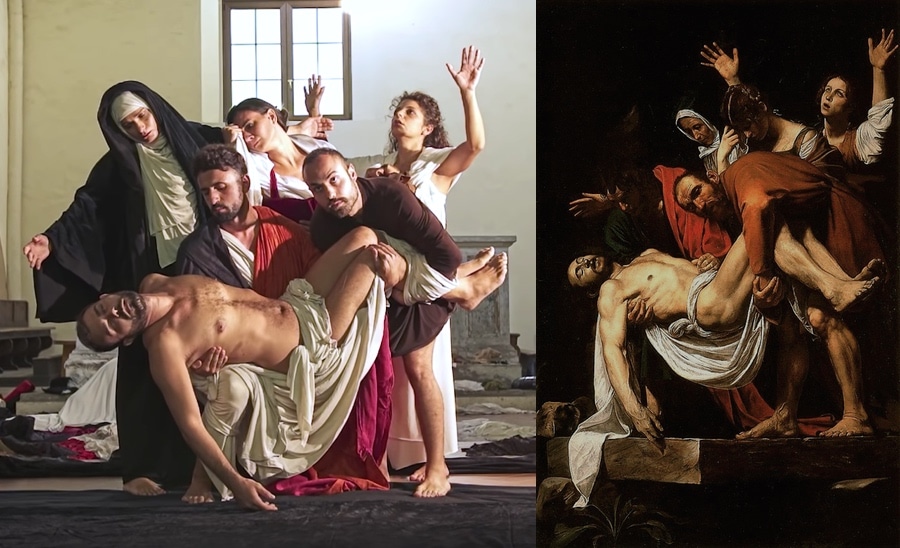
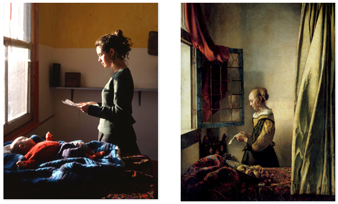
French for ‘living picture’. It’s a silent and motionless group of people arranged to represent a scene or incident. Tableaux photography combines aspects of theater and the visual arts.
examples

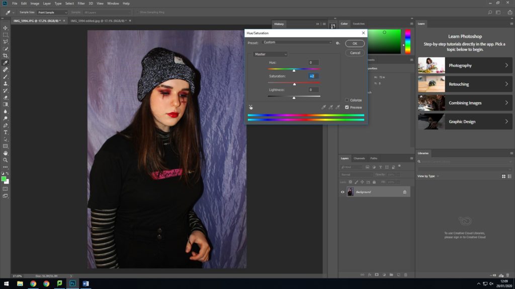
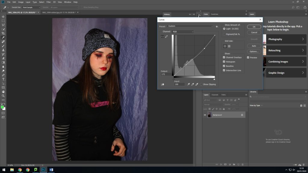


This is my favourite image as i preferred the portrait layout because it allowed for the details of the outfit to be seen, and as i’m looking off screen you can see the dramatic makeup clearer. The editing of this one also came out well and really highlighted the red and brighter areas of the image; also enhancing how the flash caused my beanie to illuminate

For this look i firstly used concealer to create a shaved eyebrow slit, then used lots of dark red shades to create a dramatic eye look, which i then paired with a thick winged eyeliner. Next i added a slit and upside down cross under my eyes with red and black eye shadows, as often seen in these sort of looks. I finally added a red gloss. My outfit included black cargo trousers with a metal loop, layered roll neck with a skater t shirt and a fluorescent threaded beanie.

With this image i added smoke as i thought it appropriately matched up with this theme and could be associated with the lifestyle often following this sort of dark, grunge appearance. I also liked the way it appeared to swirl around my head as if it were surrounding me.
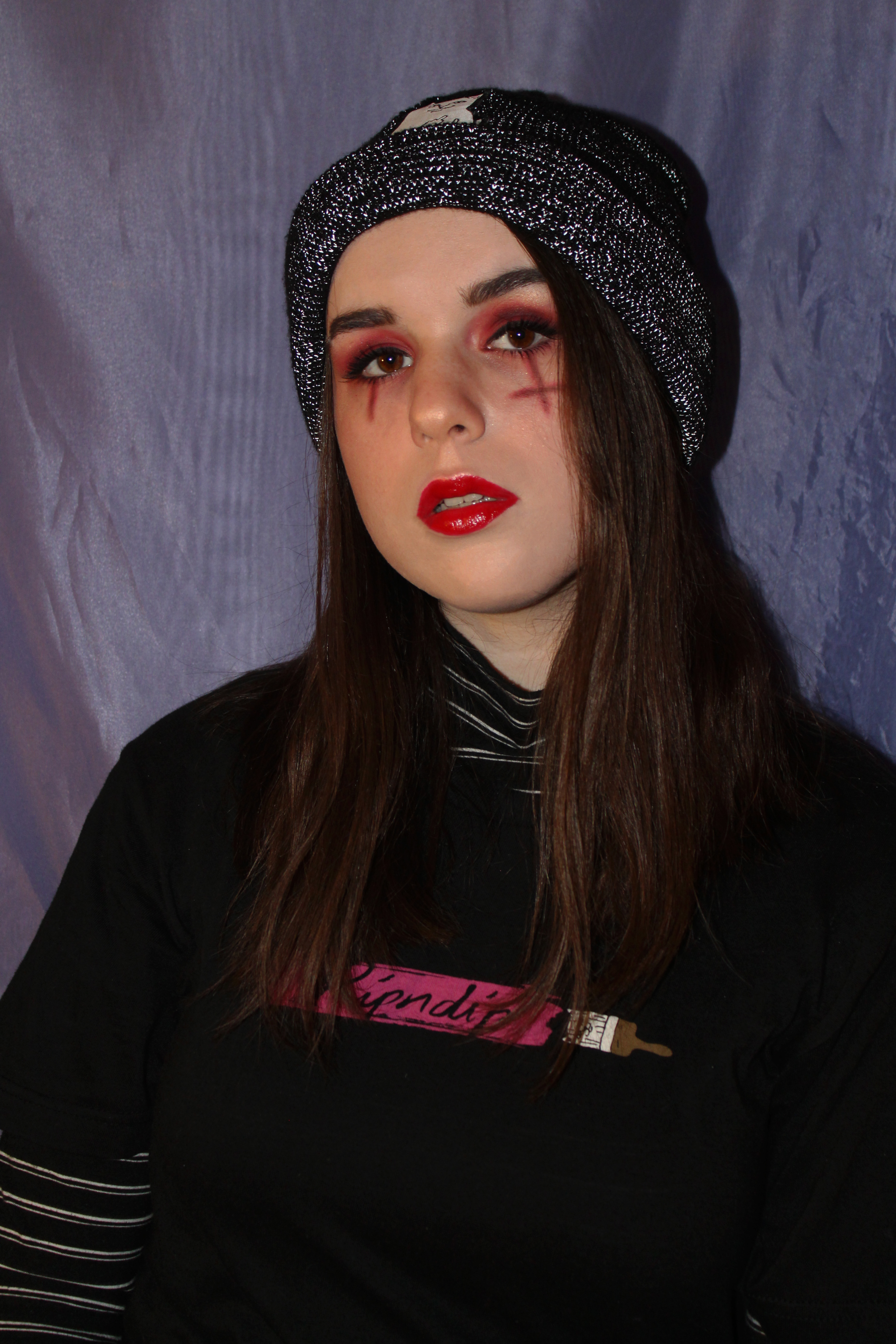
The persona i’m trying to create in this image is based on the current ‘eboy’ or ‘skater’ trend seen on the internet, but also openly displayed in the media currently through people such as Billie Eilish.

Who
Younger models, preferably females. They will most likely be some of my friends from my school.
What
I will focus on the face of the models, as well as hands put near their face. I will experiment with emotions, taking photos of the models with a range of different expressions which are similar to the models in Maurizio Anzeri’s photographs, such as; happy, serious/neutral, obscure/silly and other emotions.
Where
I will take the photos in the studio at my school using two point lighting with LED lights. I will ask the models to stand in between the two lights to ensure that the lighting is symmetrical on both sides of the model which creates less shadows.
When
I will take the photographs during a photography lesson or in one of my free periods at school, i will photographs as long as possible to ensure I have a good amount of quality photographs, although this depends on when the studio is free and when my models are free.
Why
I am deciding to have the lighting and models positioned this way in order to get similar images to the photographer Maurizio Anzeri’s work. Although I will not be able to get the exact photo I want without editing the image on photoshop as this photographers photographs look old and vintage rather than modern photos taken on a modern camera. I have chosen this photographer so I can express what I think identity is through loss of identity and identity shown through emotion and personality.
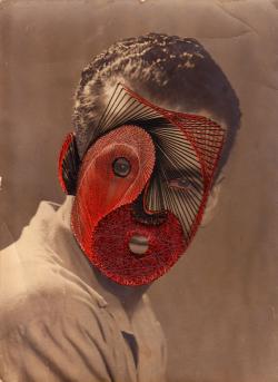
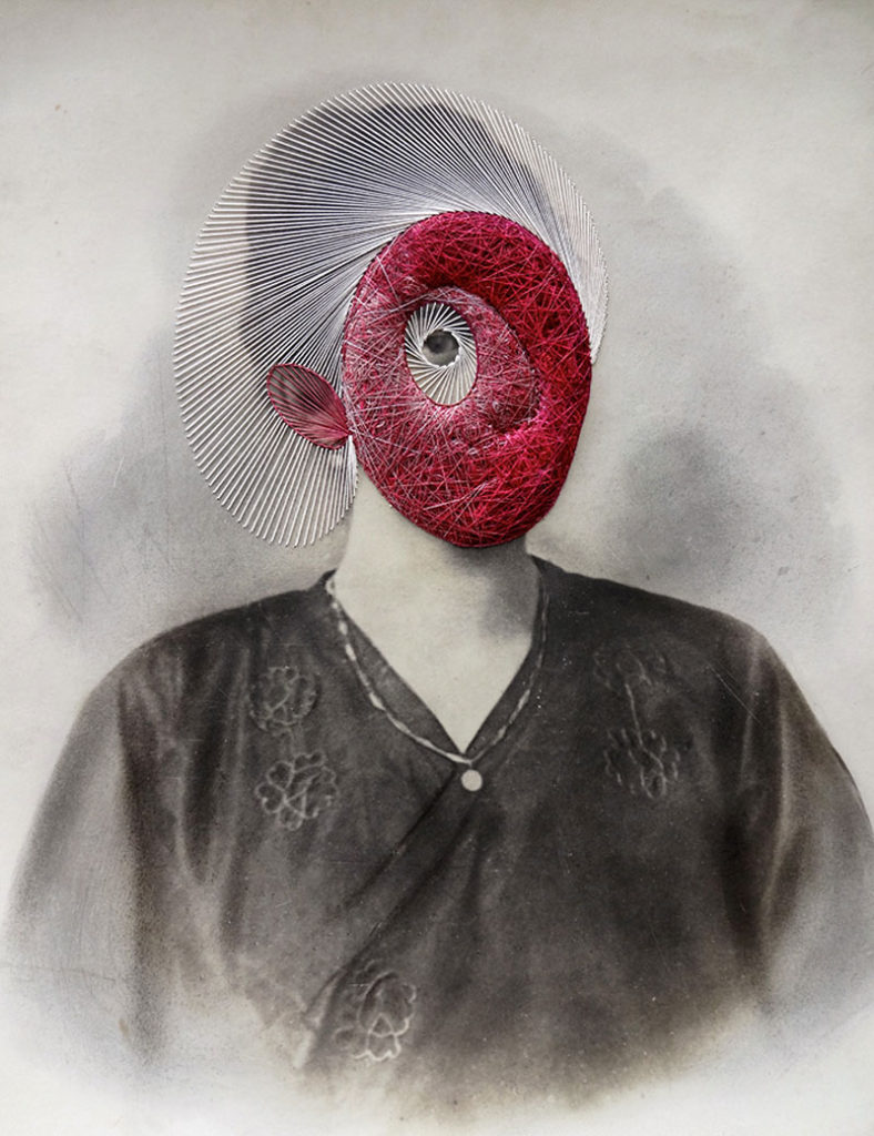
Here are some of the images that inspired me:
How
I will set up the studio with the camera on a tripod to prevent camera shakes, so the images are in focus, as well as this I will set up a two point lighting system with a neutral coloured LED panel in order to allow the faces and hands of the models to be exposed and seen properly. I will set the shutter speed to a lower setting to make the photo come out sharper and in focus and the aperture should be around f/4.
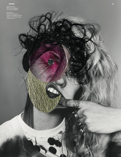
The photographer Maurizio Anzeri makes his portraits by sewing directly into found vintage photographs. The faces of serious-looking children, sophisticated adults, and prim newlyweds are obscured by intricate thread-work masks, while leaving exposed an eye, a mouth, or an ear to make the observer slightly uncomfortable as it seems like the person in the photograph can see you completely but you can’t see the majority of their face and you are unable to identify who they are or what they really look like.His embroidered patterns can also cover the figures like abstract costumes, but they also suggest a “psychological aura”, as if revealing the person’s thoughts or feelings therefore linking to their identity. The antique appearance of the photographs often contrasts drastically with the sharp lines and silky shimmer of the threads. The combined media of the photograph and the threads gives the effect of a dimension where history and future join together.
Maurizio Anzeri has inspired me to do something very similar with my work when it comes to the theme of identity and how identity can control what you think of yourself and how other people look at you.
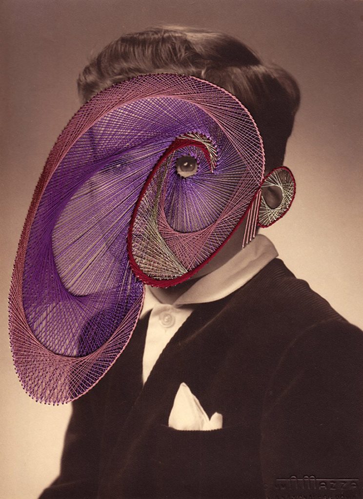
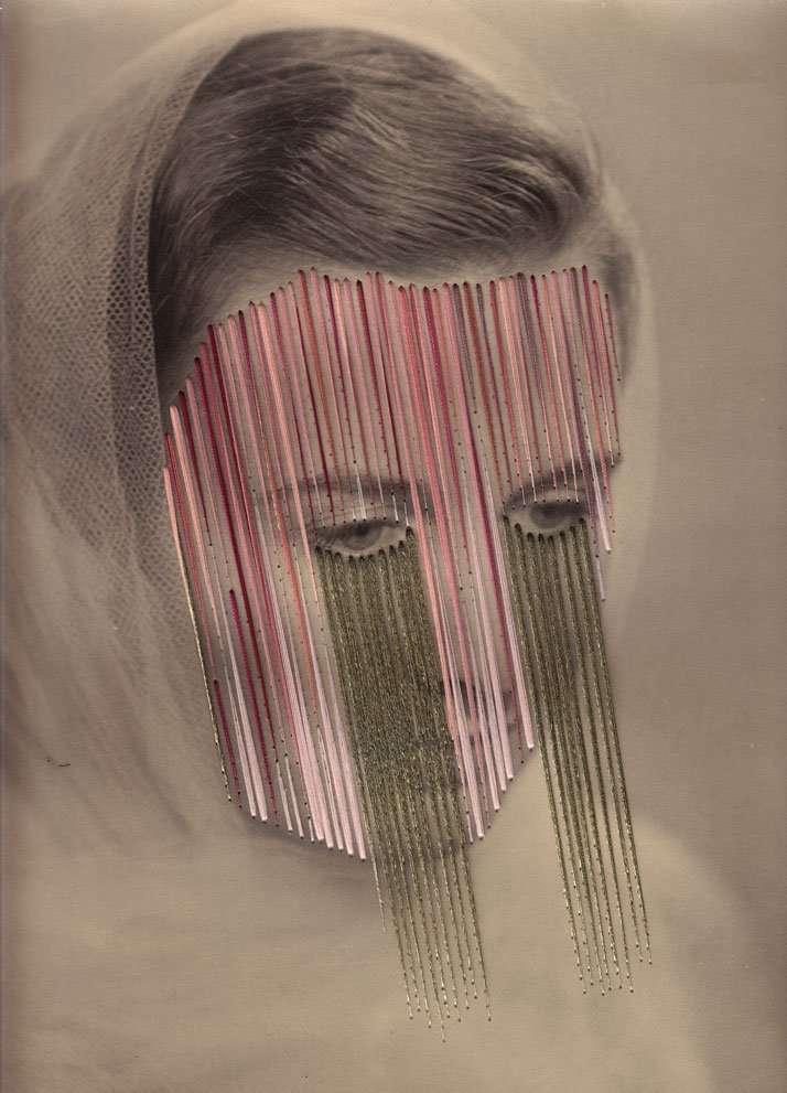
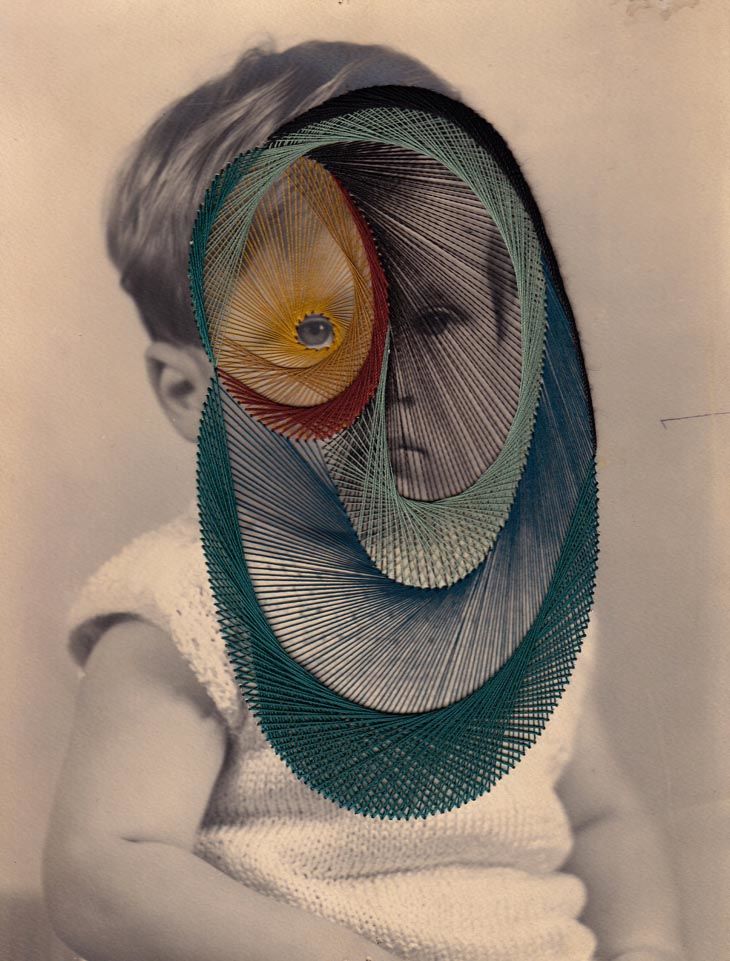

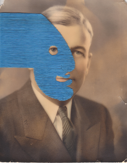
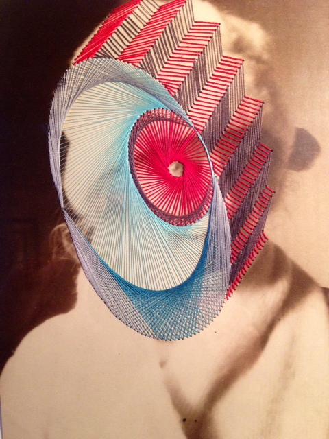
(Round Midnight)
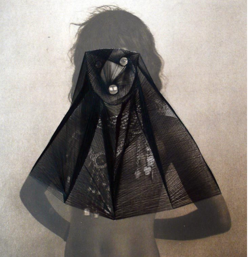
Lighting – The lighting used for this photograph is most likely flash as it looks like the model is in a studio due to the the plain background behind her, as well as their not being much choice in lighting in the early 20th century compared to the choice of lighting we have today. The flash seems to be directed and position to lead towards the top of the models body as the photo is more shaded towards the bottom
Aperture – The depth of field seems to be very shallow as the photo is not very sharp although that may be due to the lack of camera quality used in the early 20th century.
Shutter speed – Early cameras had a very slow shutter speed, meaning that the shutter remained open exposing the plate to light for a longer period of time.
ISO – The photo seems to have a very high sensitivity meaning it the photo appears to be grainier than usual. There also isn’t much tonal range due to the camera being so dated.
White Balance -The colour accuracy is not quite right due to their being some brown tones towards the bottom of the photo although it adds warmer tones to the image.
There aren’t many colours in this image but the variation in tones is quite dramatic when looking at how the background d fades from light to dark mostly due to the flash being used and the black thread contrasts dramatically to the photo. There is texture in this photo but its not very sharp or clear and the thread adds much more texture to the photo as well as forming the 3D effect to a 2D image.
This photo was used in Round Midnight in an early 20th century ‘glamour shot’ that at the time would have been considered visually pleasing for its ethnicity. Anzeri’s delicately stitched veil changes the figure with an uncomfortable modesty, overlaying a past generation with something modern (the threading). This image is also quite ironic as it was taken when nudity was deemed as even more inappropriate than in modern society, so the fact that someone from the present generation is covering up someone from the older generation seems very unlikely and ironic.