Monthly Archives: January 2020
Filters


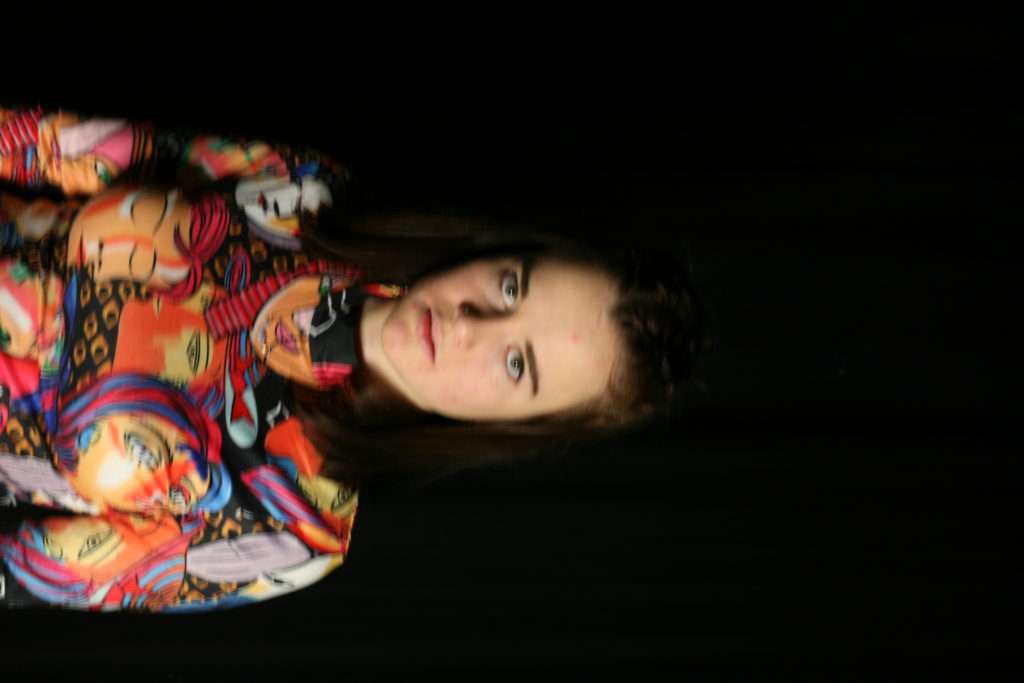
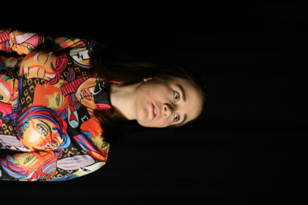
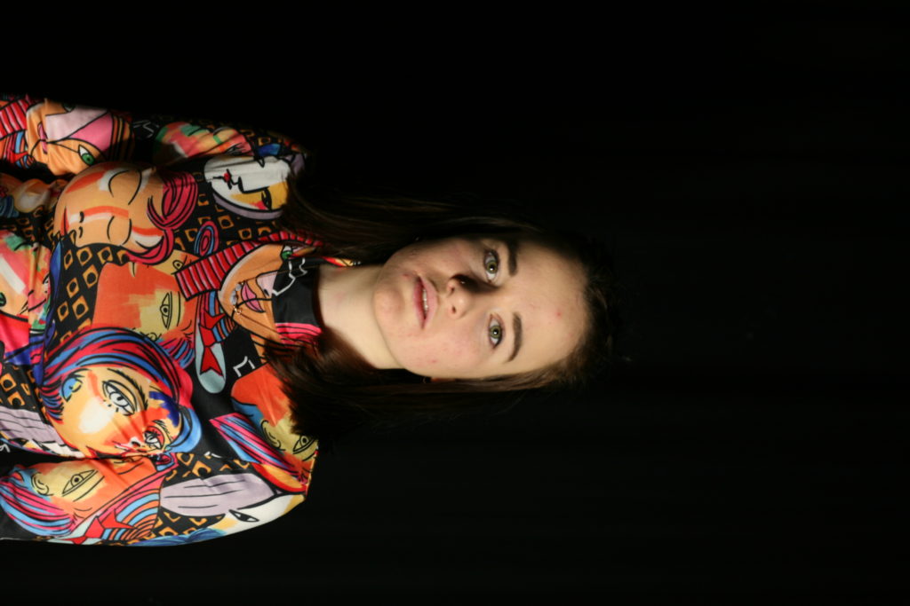
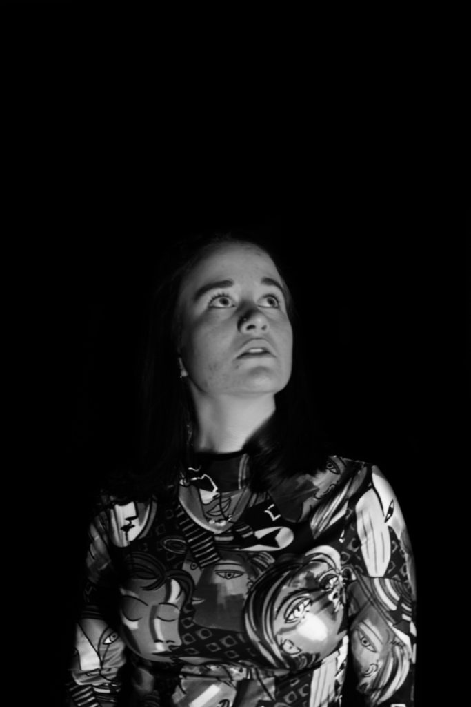
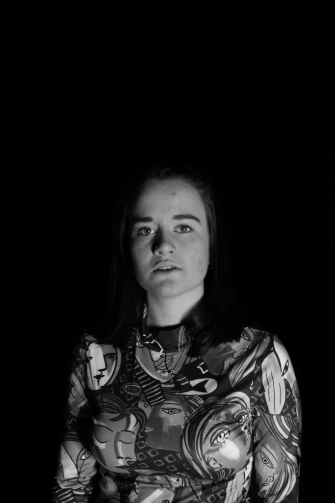
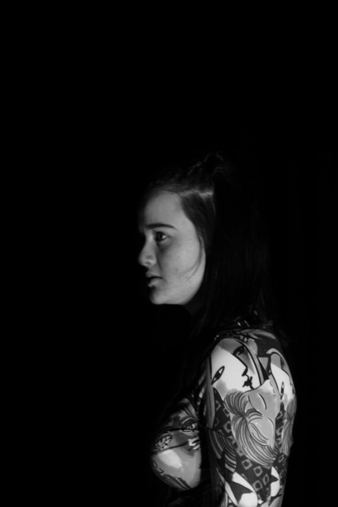
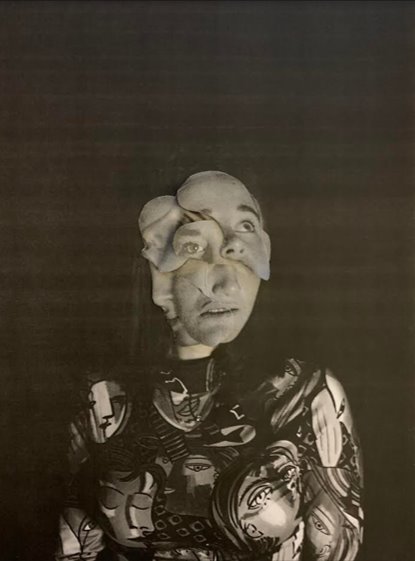
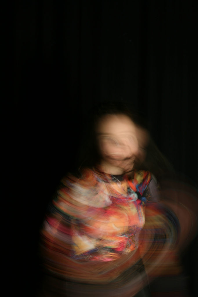
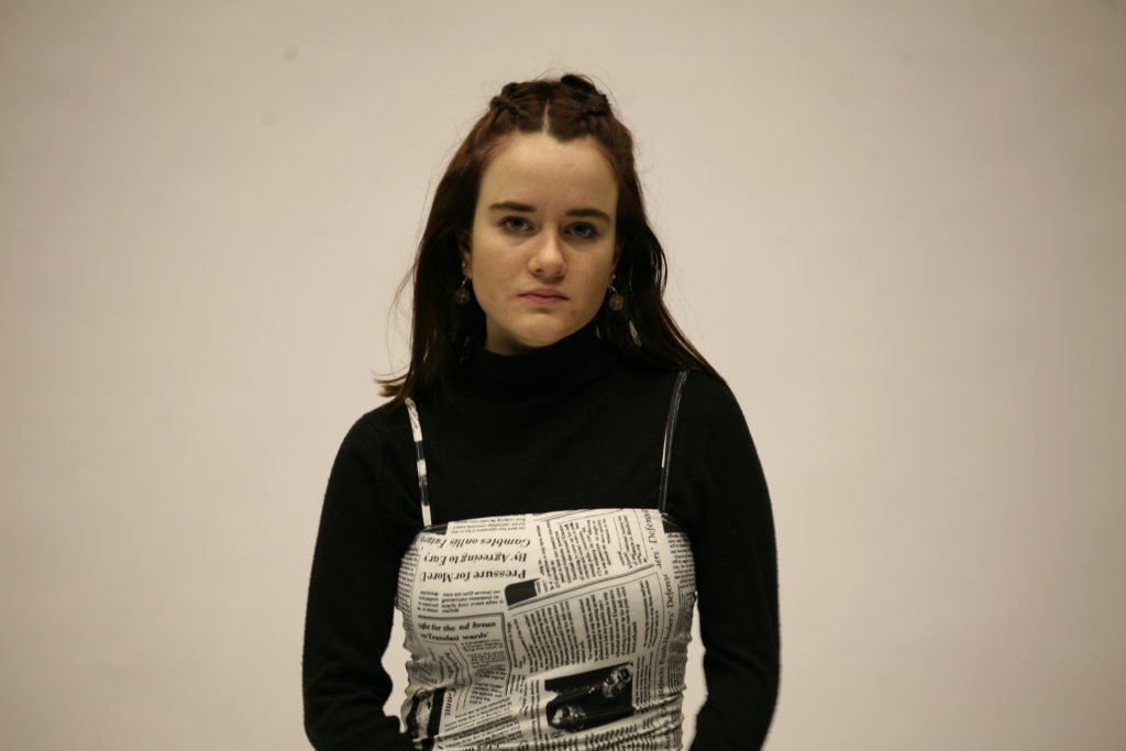
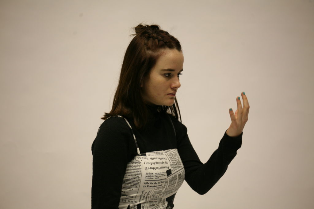
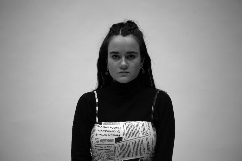
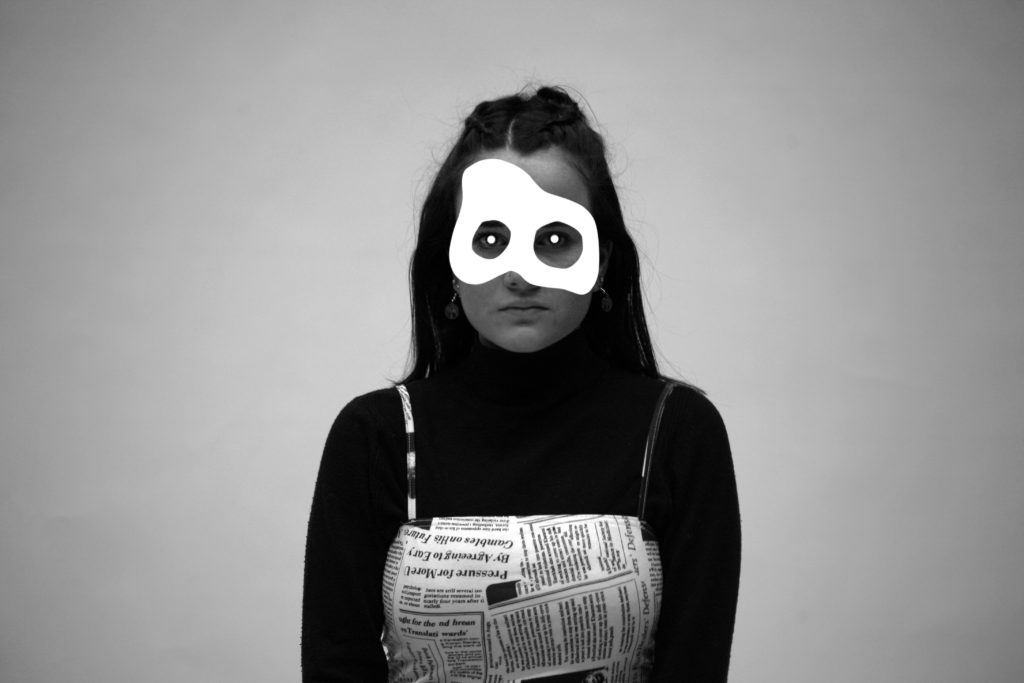
Final Images and Evaluation
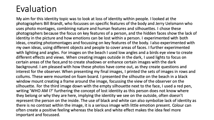
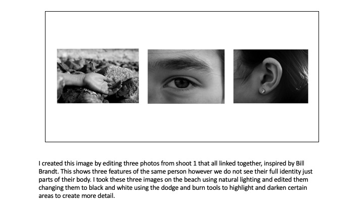
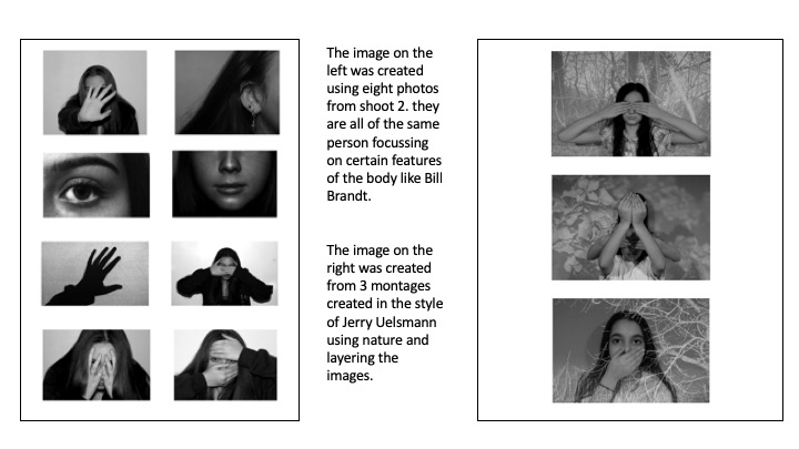
These are my final 4 chosen images that i am going to display for my identity project. I think they are all the most effective at showing all the little details of each shoot and look

I will print all the images as A5 and then most likely use a window mount to display them together, slightly mismatched.
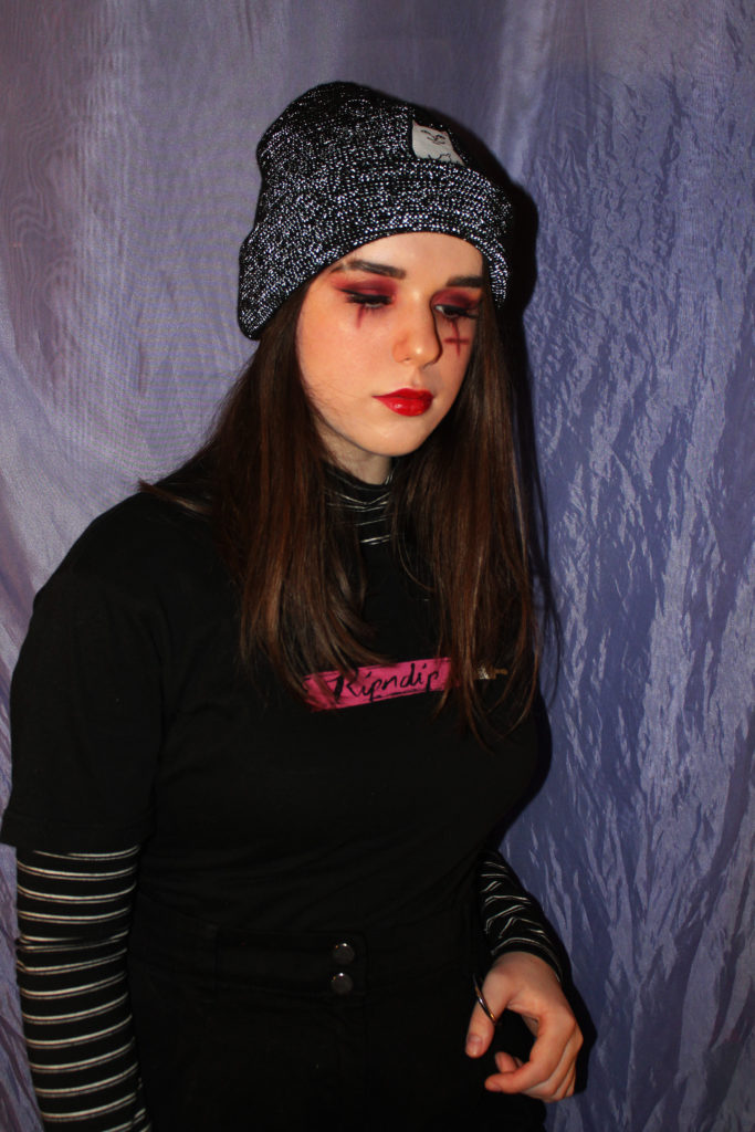
I think presenting the images all together as one will be the most effective way to show the contrast between all the styles, and really highlight how clothes and makeup can allow you to show your own self expression, and how the means of this has evolved though time
This way of self expression has so much available freedom, and every day people can decide how they identify just by choosing what the wear and their appearance, even without realizing. By following the work of Cindy Sherman, i was able to explore this in an interesting way and capture the essence of my reference

The definition of identity is who you are, how you think of yourself and how you are viewed by the world. This project shows how everyone can create their own identity just by the simplest means of everyday choices. Whether you decide one day to put lots of effort into your appearance and little the next, you are still creating an identity for yourself, for others to interpret how they like.
Identity


Identity Photoshoot 2
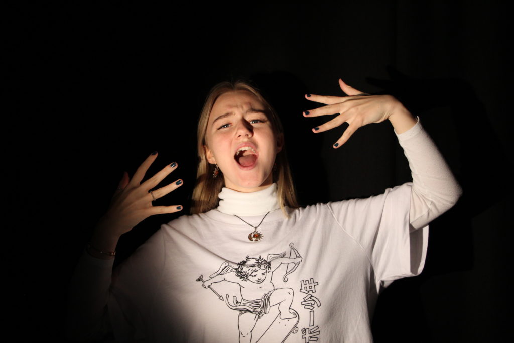
In this photoshoot I took the photos in the studio using a ring light to get the brightness and exposure that I wanted in the images below as the light exposes the face perfectly. The models I used were asked to pull different facial expressions that were similar to the some of models facial expressions in Lee Jeffries’ photos. I also used a spot light for a different part of my shoot as I wanted to change the background in order to make the image look darker.I have chosen not use some of my photographs as the models were not always pulling the right facial expressions. I have also chosen to crop some parts of the images to make them more symmetrical. My best images were the ones where the models were pulling the correct facial expression, such as neutral. Overall I think I prefer the majority of the photos with the black background over the photographs where I used the ring light as I want my photos to be darker and gloomier to match Lee Jefferies’ style.


My Best Photos
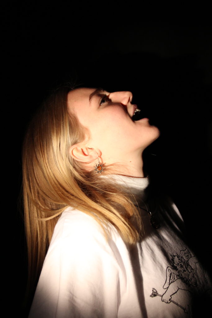
I have specifically chosen these photographs as my best images as because they had the best lighting on the models face and in the background/the models had the best facial expressions. These images were also the most in focus due to the camera being on a tripod keeping the camera steady.


Editing one of my best images
I have edited one of my best images from this photoshoot to look more like Lee Jeffries work. I have made the photo black and white and I have intensified this by lowering the red and yellow tones do allow more contrast to be seen. This image was one of the most successful as it was the most in focus and you can see minute details such as the freckles on the models face, similarly to some of Jefferies’ models. I have also edited the photo to be in black and white because the loss of colour links to the sub theme “loss of identity”. The photo also links to this theme as the background tells the observer no further information about what the model is like personality wise or what their life is like as well as what their past/background is like. I cropped the image in order let the observer focus more on the details of the models face, this is similar to what Jefferies does with his own photography.


Final Image from the photoshoot:
IDENTITY PHOTOSHOOT PLAN 2
Who
Younger models, preferably females. They will most likely be some of my friends from my school.
What
I will focus on the face of the models, as well as hands put near their face. I will experiment with emotions, taking photos of the models with a range of different expressions which are similar to the models in Maurizio Anzeri’s photographs, such as; happy, serious/neutral (mostly), obscure/silly and other emotions. I want to make sure the photos of the models faces are as sharp as possible, similarly Lee Jefferies photography.
Where
I will take the photos in the studio at my school using one point lighting like did in my chiaroscuro photoshoot and maybe change the lighting to a ring light half way through the photoshoot. I will ask the models to stand slightly to the side of the spotlight the create shadows on their faces and I will also as them to stand directly in front of it also, I will do the same for the ring light.
When
I will take the photographs during a photography lesson or in one of my free periods at school, i will photographs as long as possible to ensure I have a good amount of quality photographs, although this depends on when the studio is free and when my models are free.
Why
I am deciding to have the lighting and models positioned this way in order to get similar images to the photographer Lee Jefferies’ work. Although I will not be able to get the exact photo I want without editing the image on photoshop as this photographers photographs look extremely dark due to certain tones being diminished to allow other tones to stand out, as well having to lower the aperture. I have chosen this photographer so I can express what I think identity is through loss of identity and identity shown through lack of emotion and loss of belonging.
Here are some of the images that inspired me:


How
I will set up the studio with the camera on a tripod to prevent camera shakes, so the images are in focus, as well as this I will set up a one point lighting system in order to allow the faces and hands of the models to be exposed and seen properly without the background being shown in detail, the same goes for the ring light. I will set the shutter speed to a lower setting to make the photo come out sharper and in focus and the aperture should be around f/4 or lower.
Identity + Place
Identity is who a person or group is, the way they think about themselves, the way they are viewed by the world and the characteristics that define them. This may include their personality, looks and/or beliefs.
Identity is created throughout a lifetime, but can be influenced by factors such as nationality, race, ethnic group, physical appearance, culture, talents, interests, language, and religion.
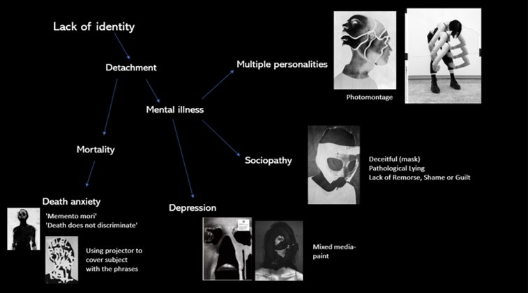
A lack of identity can be detrimental to an individual’s mental health, as identity relates to self-image, self-esteem and individuality.


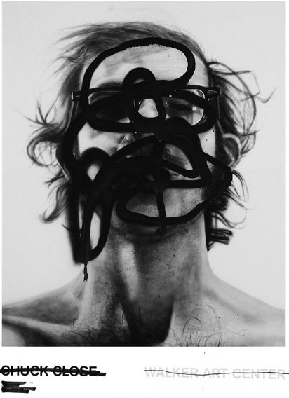
Jesse Draxler (lack of identity)
Jesse Draxler is a modern portrait photographer, well known for his abstract, disturbing and slightly morbid head shots. He focuses on identity (or lack of) within his images, intriguing those who view it and leaving them wanting to figure out what’s beneath the art
Draxler uses mixed media to present his obscure state of mind and view of the world. His work is monochromatic, using techniques such as photo-montage and incorporating black paint in many of his pieces to achieve his desired outcome. Draxler’s work is dark, mysterious and perturbing, focusing mainly on a lack of identity and mortality as themes.

On his book ‘Misophonia’, Draxler personifies his art and his work as ‘a sociopath’, a person who is deranged, delusional and impulsive. He uses faceless figures to to represent his own identity and the emotions he has been dealing with his entire life. Torn between his past and frightening future, Draxler often feels detached from his own personal identity.
On ‘Terror Management’, Draxler further explores this theme of mortality, especially naming the gallery after the theory (TMT) that attempts to explain a type of defensive human thinking and behavior that stems from an awareness and fear of death.


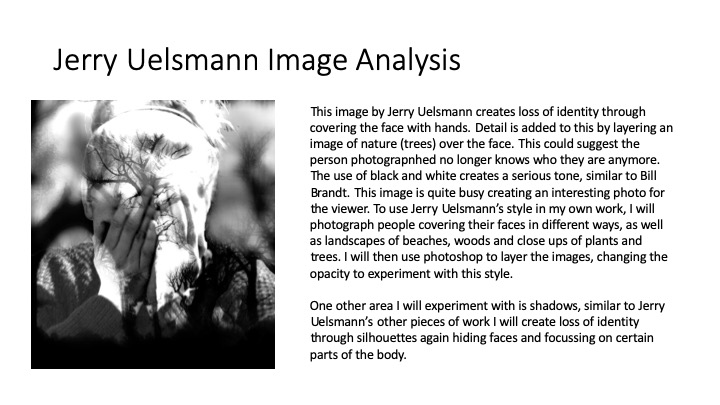
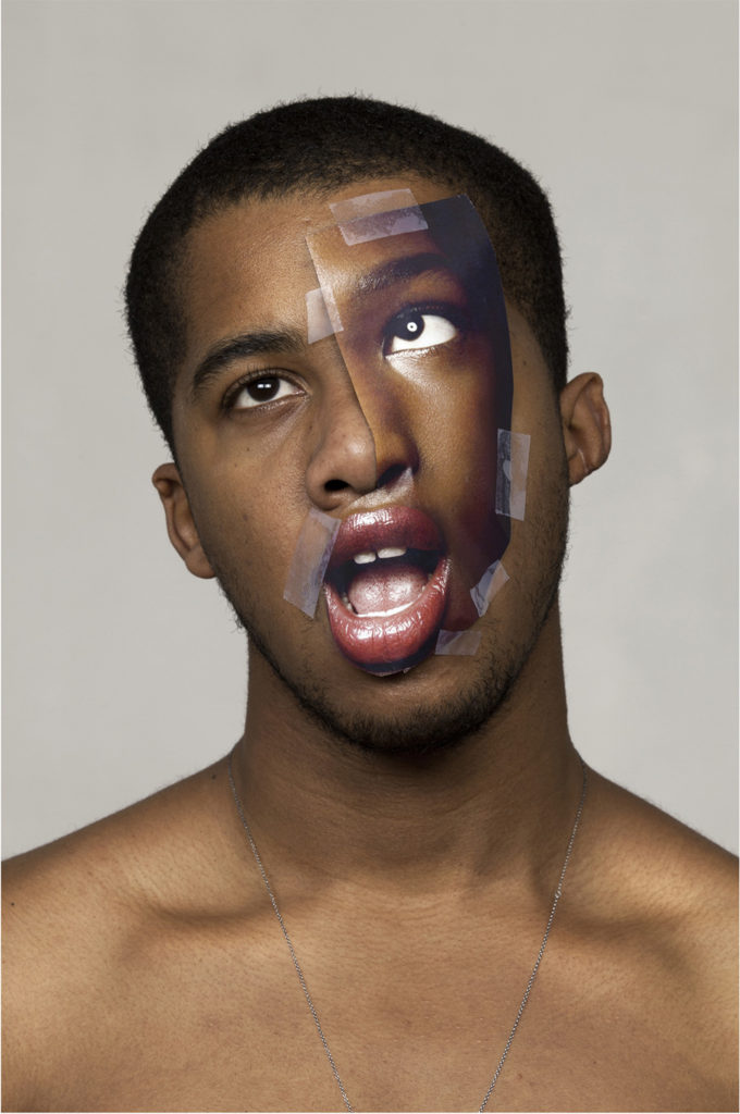
Photo analysis

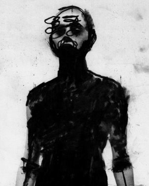
This image is a prime example of how Draxler embraces mortality and a lack of identity within his work. Working mainly in mixed media, he created this using a head-shot of his subject as a background and black paint.
The lighting in the image is very much unnatural, most likely two or three point lighting there’s no natural shadows. There’s a large tonal range within the image, ranging from the darkest tones of the pupils to the lightest tones in the background, creating a strong contrast between the two.
The patterns and textures of the image are conflicting. The paint itself has multiple textures: The wetter parts of the paint (top of the head) contrasts with the rougher strokes down the neck and the thicker paint on the subject’s face itself. These contradicting textures aid in directing the viewers eyes around the image. With the smoothness of the background carrying out a more passive role within the image, it allows the subject and the media surrounding them to have a more assertive part within the composition– leading the observer’s eyes around the subject multiple times.
The lack of eye-contact with the camera from the subject could connote a sense of anxiety, amplified by the paint which engulfs them. This wholly incorporates the theme of mortality/lack of identity as the paint could be an allegory for death, something completely out of control and inevitable to all humanity. This deterministic factor in all our lives can make many feel like they’ve lost their autonomy, leaving them feeling this anxiety with a sense of detachment from their identity.
A possible intention of this image may be to provoke morbid thoughts, specifically ones related to their own mortality, as the ambiguity of the image is disconcerting to those who inspect it. This is due to the conflict between how the shapes within the image are familiar (the paint and head-shot resembling a person-like figure), but the mystery behind it as the whole person is unrecognisable- if anyone was to naturally come across the subject they wouldn’t be aware.
Main focus- lack of identity (detachment from oneself)
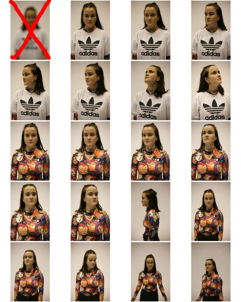
Photoshoot Plans
One subject throughout.
SHOOT 1-
- Studio.
- Collecting images for photomontage.
- Different angles, Headshot+Half–body.
- Experiment with shutter speed (slower+more movement= disfigured subject).
- 2-point lighting.
SHOOT 2-
- Studio.
- Projector + clear acetate.
- Reds suit (red= danger,urgency).
- Normal lighting (All lights on).
- White background (words will show up more clearly).
SHOOT 3-
- Studio.
- For sociopathy (Holding a mask/pretending to).
- Normal lighting (All lights on).
Photoshoot 1


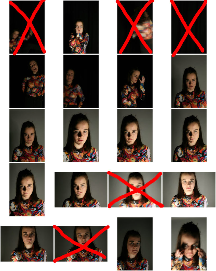

Photoshoot 2
Photoshoot 3

Photomontage
Images to work with:


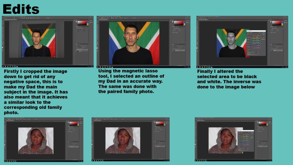
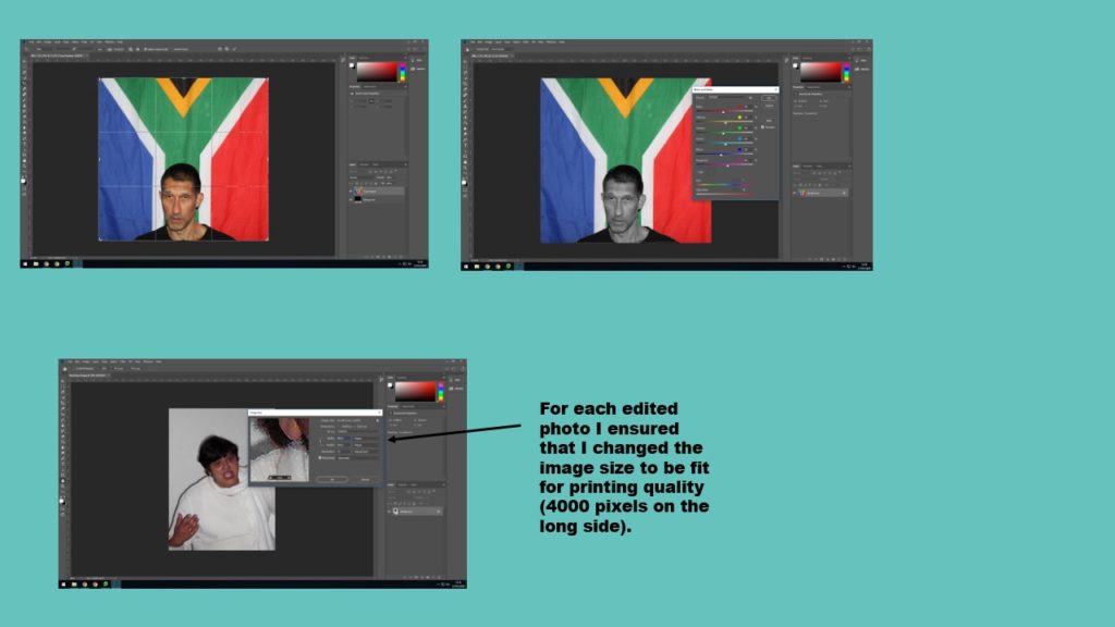
For each of these images, I converted the original photo to black and white and duplicated the layer. With the background copy, I increased the contrast and decreased the brightness to create a completely black background. I then erased the subject from this second layer to reveal the original, edited subject.


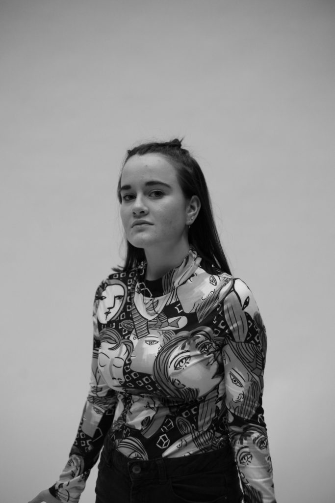
I printed out these series of images and created a collage using different sections of my subject’s face. I did this to represent my Multiple Personality aspect of the project on identity. The reasoning for this was to show how individuals with mental disorders (such as Bipolar disorder, Dissociate Identity Disorder and Borderline personality disorder) feel detached from their own identity. These people feel as though they lack free will and autonomy due to the idea that their disorder defines them as individuals. To amplify this imagery, my subject wore clothing with multiple faces printed on to it.

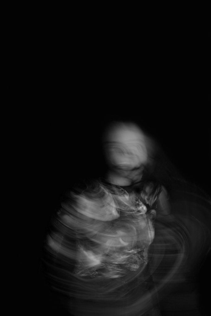
Slow shutter speed- Death anxiety
Using a black background and a slow shutter speed, I got my subject to wave their arms and move their head. This movement allowed for the creation of a skeleton-like figure, a metaphor for death. The blurred lines act as a representation of time and by having it surround the figure it aided me in portraying how many individuals feel as though time is momentary and fleeting- a reminder of their own mortality.
Alongside my inspiration from Draxler, converting the image to black and white allowed me to shift the focus of the viewer on to the figure, as well as maintain the theme of mortality- with darker tones and shadows having associations with death and grief.
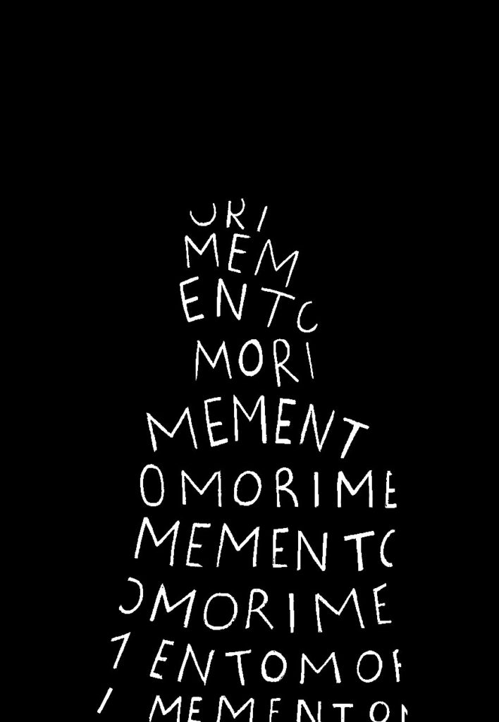
Mixed media– Death anxiety
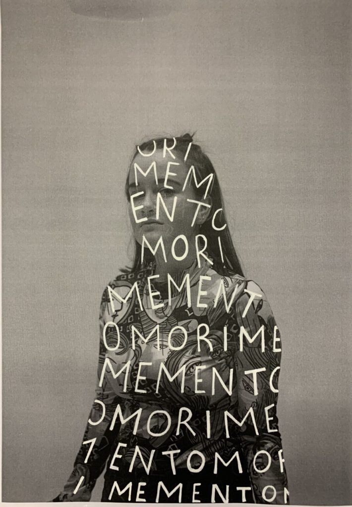


I decided to print the chosen half-body image and repeatedly painted over the subject the phrase ‘memento mori’, which represents an artistic reminder about the inevitability of death. Working back into this image on photoshop, I corrected the toning within the image and altered the background so it would be a single colour.
Having done this I used the threshold tool to focus predominantly on the phrase written out- the tool created an image with an outline of the subject, which I felt was a good, symbolic representation of the death of an individual (Leaving a sort of ‘shell’ of a person who was once there).


To amplify this imagery, I aim to present these images beside one another to portray the temporariness of humans. This links into the theme of identity as it further shows how mortality defines many people, with a select amount identifying as nihilists (and individual who believes that life is meaningless and rejects all religious and moral principles).
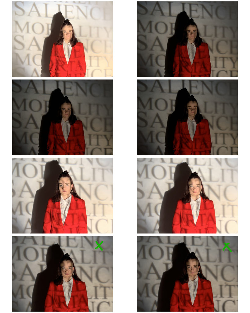
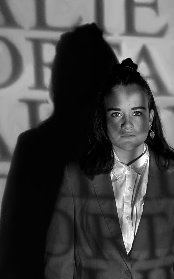
Clear Acetate and projector– Depression/death anxiety

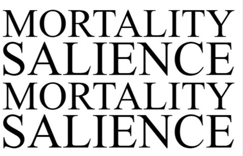
I printed this phrase onto sheets of clear acetate and used a projector the project it onto my subject for the photoshoot. Mortality salience is the awareness by an individual that their death is inevitable. This term derives from the terror management theory (also linking to Draxler through his ‘Terror Management’ exhibition), and proposes that this awareness causes existential anxiety within the person. In relation to a person’s self-esteem and identity, this anxiety can be highly destructive- leading to possible mental health issues such as depression.
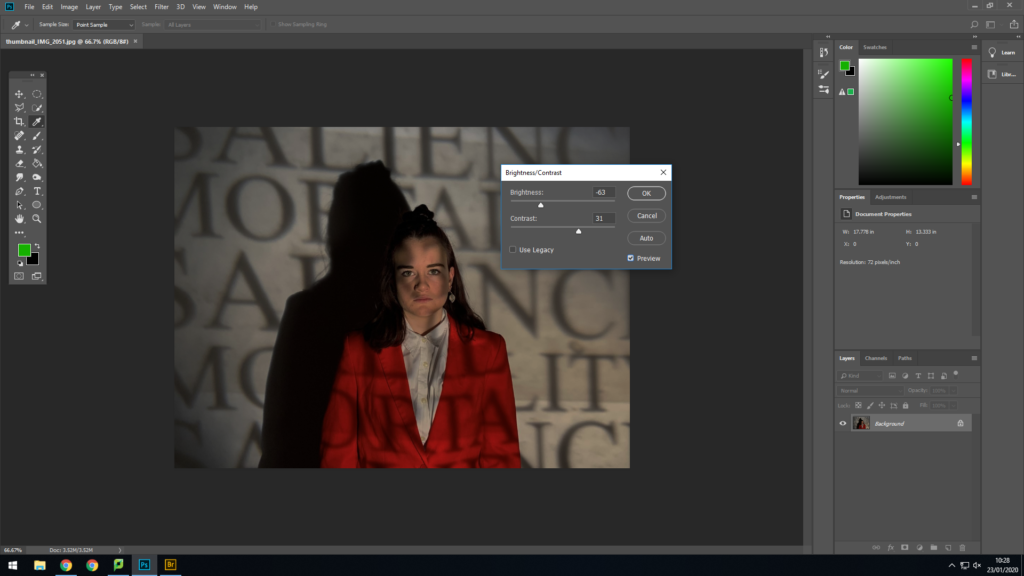

I created a duplicate layer and using the selective colour tool on photoshop, I enhanced the black projected writing and then erased the top layer accordingly to bring this out, without affecting the subject’s shadow and hair.
I decided I wanted to crop the image so as the keep the focus of the image on the subject. Cropping the image allowed a more sinister aspect of the image to come through- the shadow, which looms over the subject, making her look inferior. This conflict between the subject and her shadow, to me, represents how individuals hide many aspects of their identity from others (portrayed through the shadow figure) and feel overwhelmed by this as it’s something that they feel they can’t express or it will affect others’ perspective on themselves.
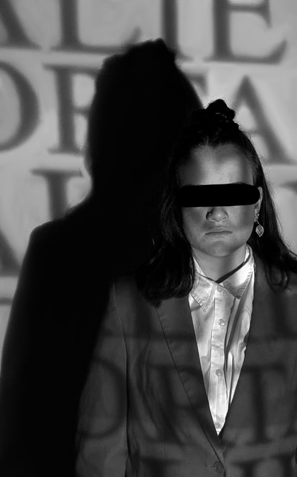

With the theme of ‘lack of identity’ I decided to remove the subject’s recognisable features (eyes and mouth) using a black brush tool on Photoshop, allowing the focus of the image to be on the letters and shapes surrounding the subject. By doing this, it also creates a clear link with my influential artist as Draxler disfigures the faces of many of his subjects.

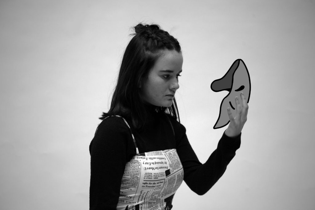
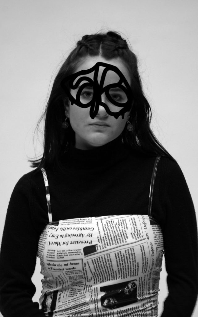
Sociopathy
Individuals with sociopathy disorder are disconnected from themselves in the sense that they lack emotions, such as empathy, and struggle with the understanding of others. I felt as though sociopaths fit into my theme of identity as they’re highly manipulative and deceiving people, who can turn out be a completely different person from who they say that they are- their personal identity is almost hidden. Their manipulative nature can be spotted by their constant switching back and forth between extreme charm and extreme threats, to get what they want.


I wanted to portray these deceiving characters to be cold and uninviting. To achieve this, I directed my subject to be expressionless during the shoot- having her make direct eye contact when facing the camera.


I also used the brush tool to depict an object used to cover the subject’s face to symbolise the ‘mask’ these individuals wear to fool those around them.

In an attempt to create a more ominous image, I also changed the colour of my subject’s pupils to match their mask, in turn recreating the unnaturalness and inhumane nature of Draxler’s own work.

I used the brush tool the create a messier-looking mask, represent the tumultuous mindset of those who suffer from sociopathy disorder. It also represents how their own identity is unclear and distracting to others.
I decided to crop these images to show only a half-body, reducing the negative space around the subject
Outcomes:

death anxiety 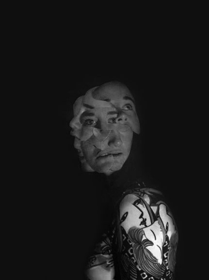
multiple personality 
death anxiety 
death anxiety2 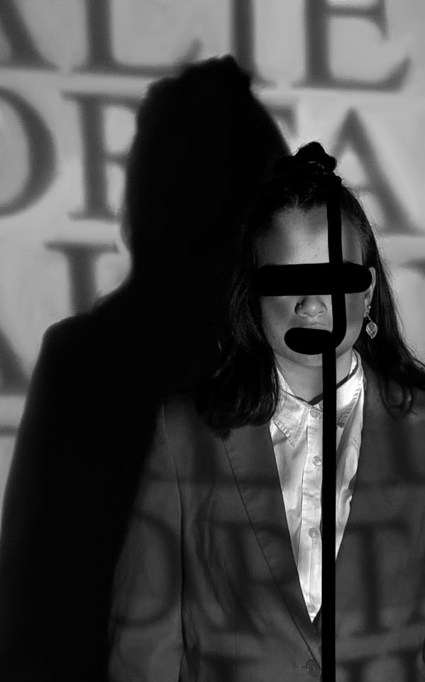
depression 
sociopathy2
Comparison to Draxler

draxler
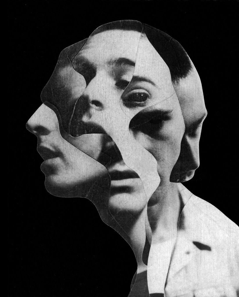
This particular piece of Draxler’s work inspired me to create my own photo-collage. I felt as though it perfectly portrayed how split-personality and multiple-personality disorders could be physically represented.

draxler 
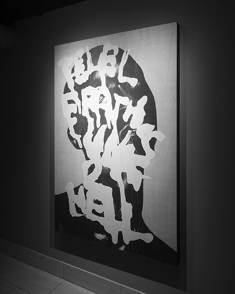
Looking at how Draxler painted over his work, it influenced me to incorporate different methods into my photo-shoots and editing, such as the projector and physical writing of words over my images. Although the methods I used are significantly different to those of Draxler, the outcomes are relatively similar.
draxler
Draxler’s original image, to me, was considerably comparable to a skeleton. I wanted to create a similar piece of work using the camera only. I used a slow shutter speed and movement to remove features that made my person look alive (not too dissimilar to how Draxler removed the hair, eyes, mouth and other key features of his subject).

draxler
My aim with this piece wasn’t to replicate Draxler’s work. There is no evidence of actual photography within his original image but I was inspired by the mask to incorporate artwork into my own image, instead of completely hiding my subject’s face as he’d done.
draxler
The messiness of Draxler’s piece resonated with me. It provoked the thought that no single person has a perfectly curated sense of self and identity. I presented my image under the term sociopathy and I feel it shows how even those who have developed a perfected fake identity, are also just as messy and confused as the rest of humanity.
Final Images


Evaluation
I feel as though this project has been overly successful. By having one word (‘Identity’) it allowed me to form a broad range of ideas- focusing on the lack of identity due to mental illnesses such as depression, multiple personality disorder and sociopathy, along with detachment from personal identity due to death anxiety.
I focused on Jesse Draxler as an influential artist as his fascination with mortality and other morbid themes within his work fit well with my concepts. His work inspired me to try new techniques and resulted in me taking a more abstract approach towards my work. I experimented with shutter speed, projectors and mixed media to create my final outcomes. Experimenting during the editing process using the threshold tool and selective colour tool (before converting to black and white) allowed me to create highly contrasted and striking images.
However, a drawback on this project is the effectiveness of my techniques. For example, printing off my images to make the photo-collage resulted in an unintentionally, grainy image when re-uploaded to the blog. In future, to avoid this, I will print using higher standard photo paper to get the best quality prints to work on when using mixed media.
Additionally, my own time management led to be a hindrance to my final outcomes. If I had organised myself by gathering needed materials/props for my shoots and editing processes with sufficient time, I may have more higher quality work to reflect upon.
Virtual Gallery
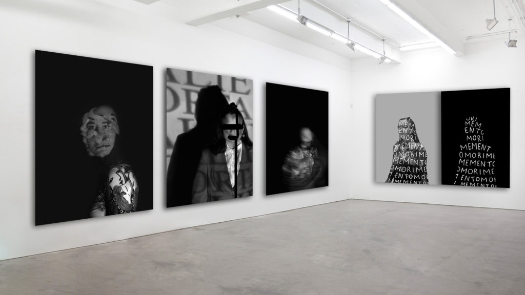
Tableau Vivant
Tableau Vivant is french for “living picture”. Here this is a static image normally consisting of one or more models or actors. Here the people are carefully posed, usually with props and or costumes in order to create the effect of an image that is actually living.
The origins of Tableau Vivants believe to have come from sources of entertainment popular in royal weddings, coronations. Here actors often imitated paintings or statues in the manner of todays street entertainers; however in these times the performance would usually consist of larger groups creating elaborate tempoary stands along the path of the processions. Often a poem or music would accompany the actors when remaining in there still positions and a wooden frame would outline the stage to give the effect of a living picture.
in the late 19th and 20th century, tableau normally consisted of “flexible poses” or “poses plastiques” through semi naked or naked models which was used as a source of entertainment either live or in-print.
In today’s society Tableau is normally present in living statues, here people dress up and normally use body paint in hope to busk and receive money from taking photos.
Photography Tableau was said to have started in 1970/ 1980; here Jean-François Chevrier was one of the first to use tableau in a art photography format in an essay called “The Adventures of the Picture Form in the History of Photography”.
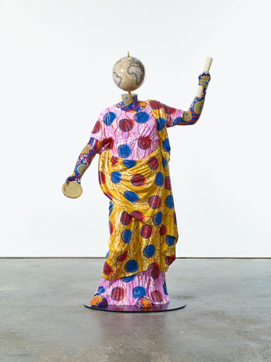
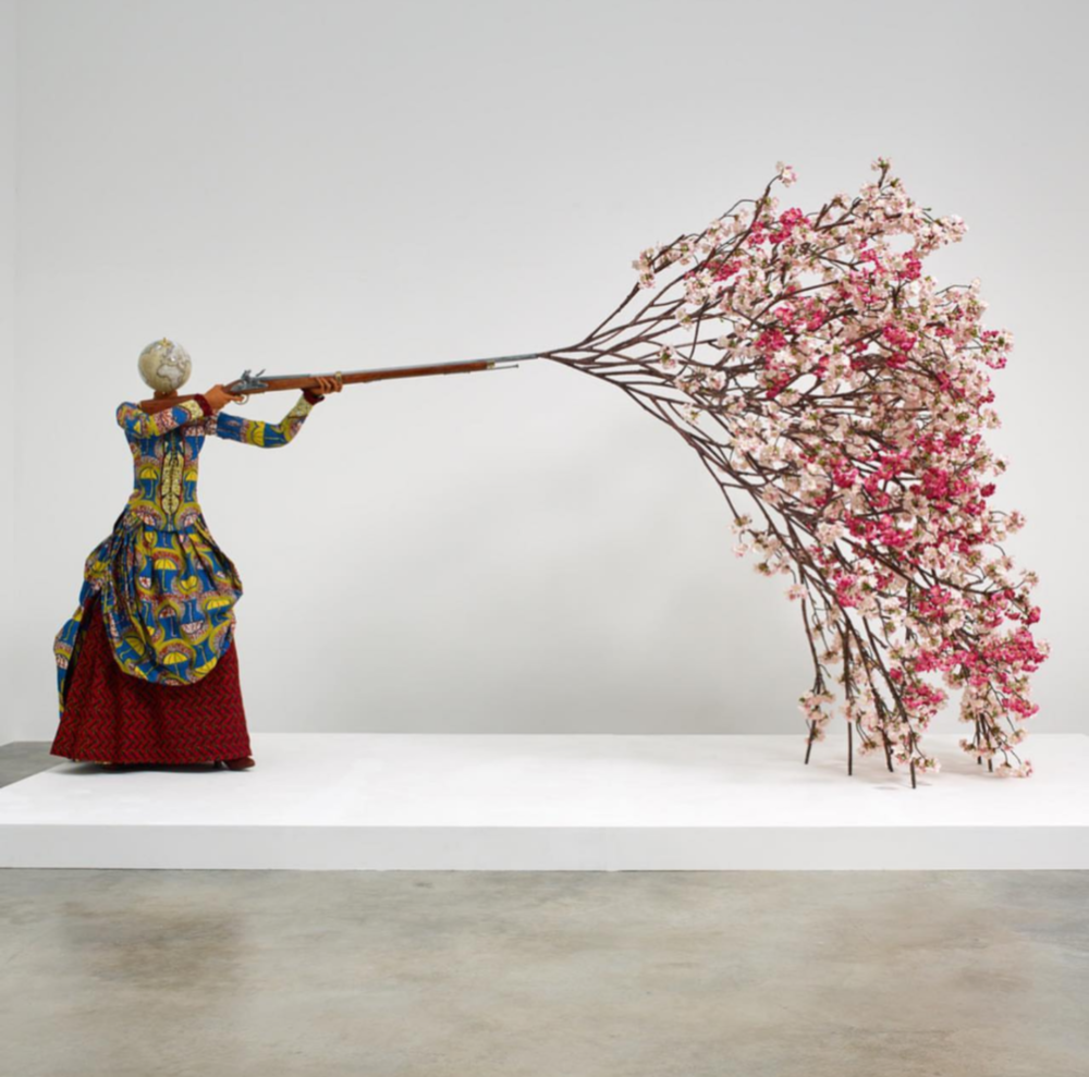
Yinka Shonibare
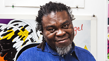
Yinka Shonibare is a British-Nigerian artist living in the United Kingdom. Shonibare works on a variety of things such as painting, sculpture, photography, installation art, and, more recently, film and performance. He has a psychical disability which has paralysed on one side of his body; however he still creates his photos and art work but by using some assistance. He has since used his disability as an advantage as in 2013, Shoibare became a patron for an annual Shape Arts “Open” exhibition where disabled and non-disabled artists are invited and allowed to submit their own work following an open theme.
He has received many awards such as a CBE which is a “Order of the British Empire” this is a British order of chivalry, which rewards contributions to arts, sciences, public service outside of the civil service and work with charitable and welfare organisations. Shonibare had his very first exhibition in 1989 in Byam Shaw Gallery, London. During 2008-09 he was part of a major mid career opportunity in both Australia and the USA. where he toured his work through Sydney and up to the Brooklyn Museum.
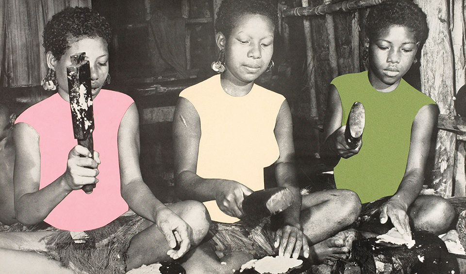
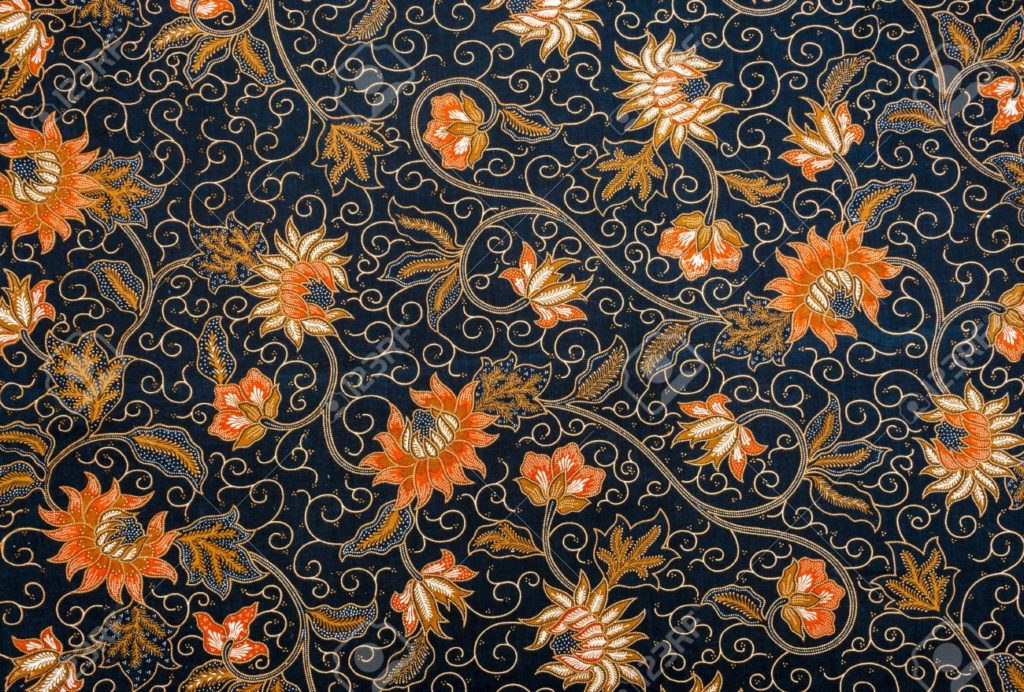
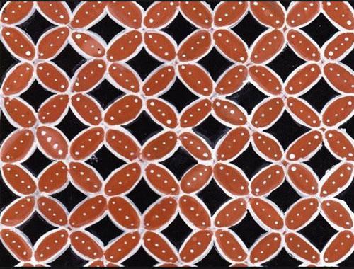
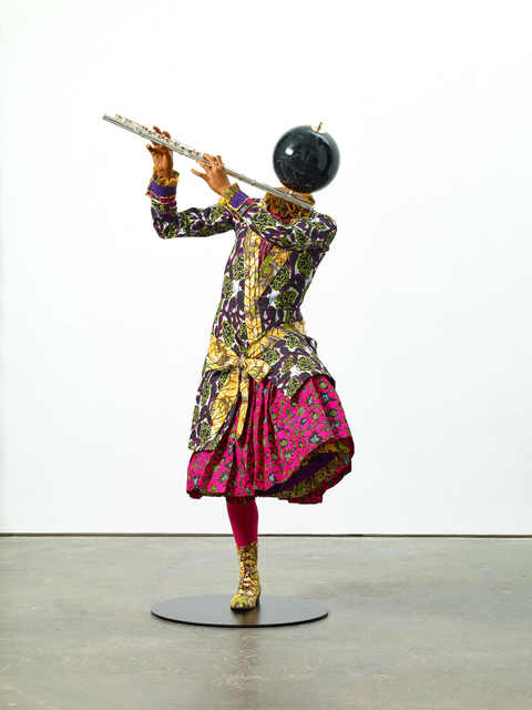
His work usually surrounds cultural identity, colonialism and post-colonialism. He mainly focuses on the identity between Europe and Africa; especially on economic and political histories. Yinka Shonibare is best known for his tableaux characters which are dressed in amazing period costumes from batik; which is an Indonesian designed fabric which is usually produced in the Netherlands but has been popularised in West Africa. Here he re-imagines a scene from Tchaikovsky’s Swan Lake in a complex and subtle interplay between two dancers of different races. Here he tries to capture each others expressions on either side of a ornate Baroque frame; showing the movements of the characters as estranged and united
(Batik examples shown below)

Examples of his work:


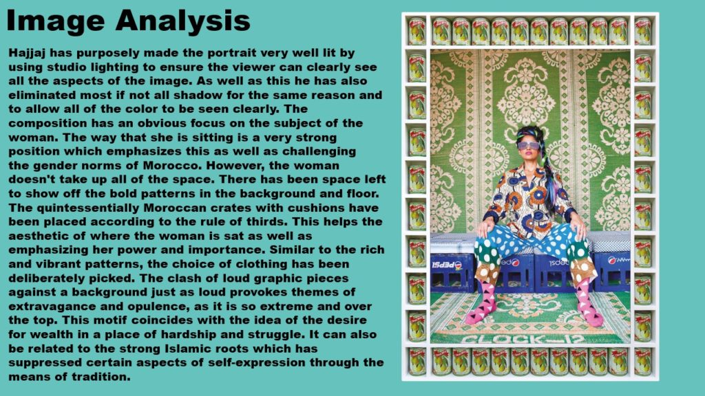
Analysis
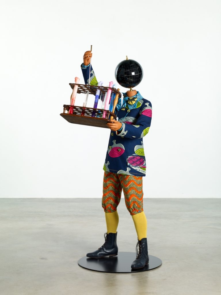
Technical: Here flash lighting has been used which is shown through the reflection on the globe. The Camera has been placed at chest height and the light seems to be pointing towards the right side of the characters body shown as the left side of the characters body is receiving less light. Overall the photo seems to be well exposed and there are no signs of glares or under exposement. The Focal point seems to be on the globs/head of the character as that is the sharpest point of the image. The white balance seems to be well defined as the image doesn’t seem to be warm or cold but rather once again the image seems to have a well balance white balance.
Visual: Colour is well represented in this image which I think is important due to the photographer, here there are various colours each rich and vivid. Tone is also present in the image especially the contrast between the light white walls and the black globe as it helps to bring the attention onto the the character. Strong patterns are shown through the different styles of clothing shown all coming with different colourful patterns which are striking and interesting. The shape and form of the the image is present through the use of shadows on the character and the contrasting colours of the background which is quite light and plain against the foreground of the character which is rich and full of colour. The eye is first lead to the characters globe head as it the darkest and the focal point of the image, its then lead to its chemistry set, due to that being the main movement of the character and then onto the characters fun and colorful traditional clothing.
Contextual / Conceptual I think these characters help to bring back culture into today’s society, which I think is vital as many traditions have been lost through these years due to modernisations. The colour is definitely a key part of the image as the vivid colours represent the pride in the patterns that people that wear this have there for these characters show how diversity can be shown everywhere and even in professions; such as this scientist in colourful Indonesian clothing. I think these images also represent joy and happiness which can stand out from the crowd as many people are now dealing with many mental and physical illnesses whereas this tries to represent a happier and maybe even a fantasy in what Shonibare whats life to look like and be.
Tableau Photoshoot Plan
What? I will be taking photos for my tableau photoshoot and trying to imitate Shonibare work through colourful outfits and his staged structures.
When? I will take my photographs on Monday 11th January.
Where? In the Studio or the Dry Room.
Who? I will be using my friends as models for my shoot.
How? I will be using a variety of clothing items to imitate Shonibare use of traditional colorful clothes and I will be asking my models to imitate his staged images to create my desired effect.
Why? I want to create successful set of outcomes and because I like my artists work as I found it interesting.

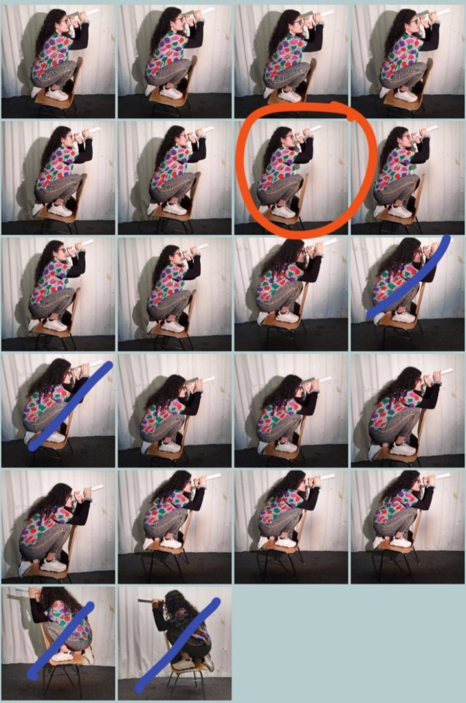
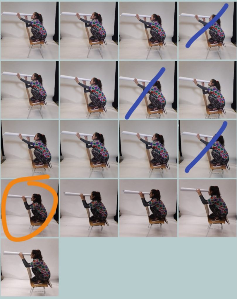
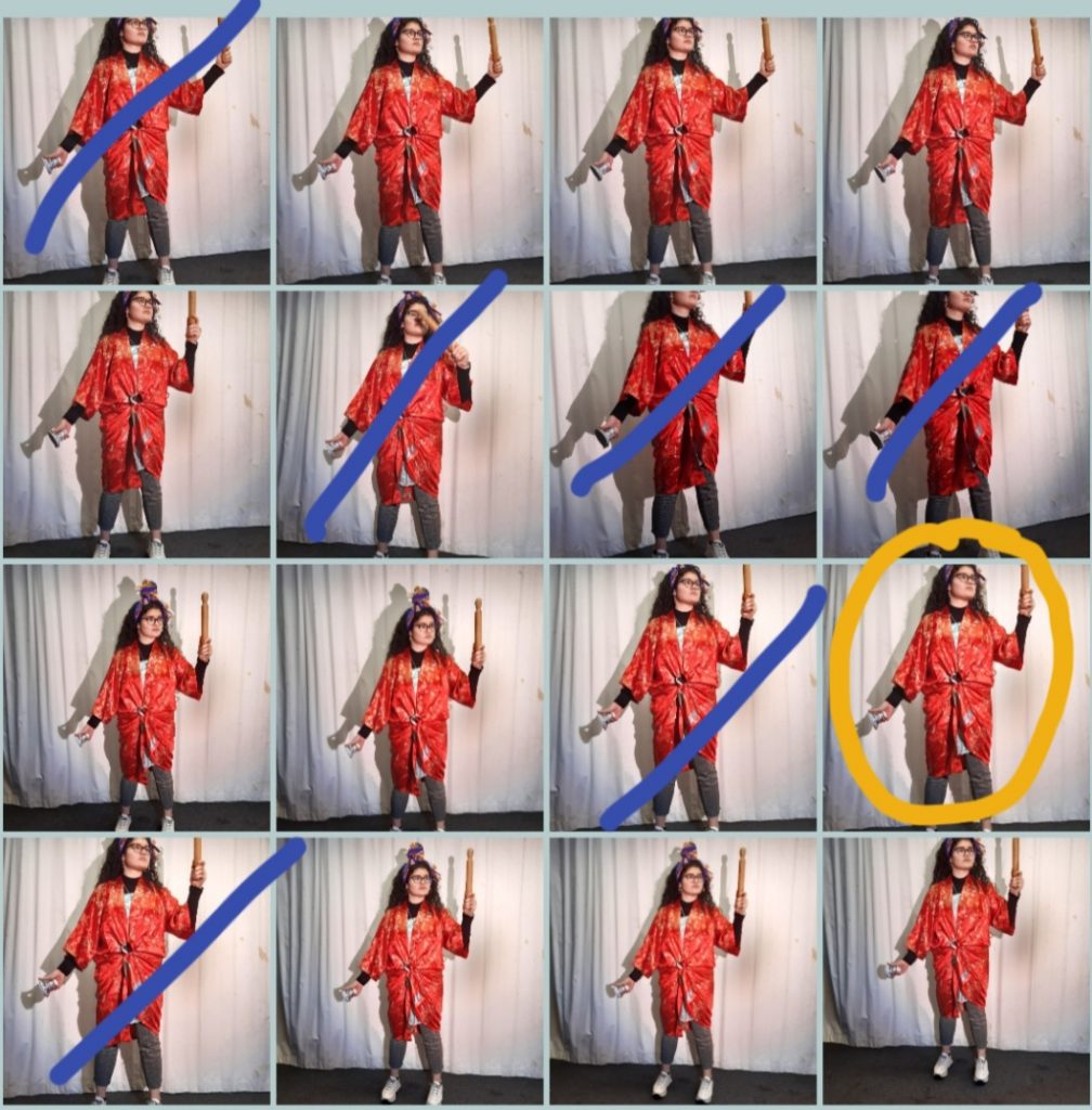
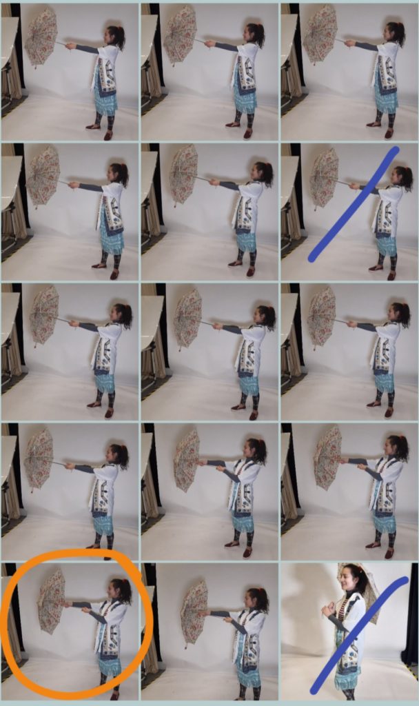
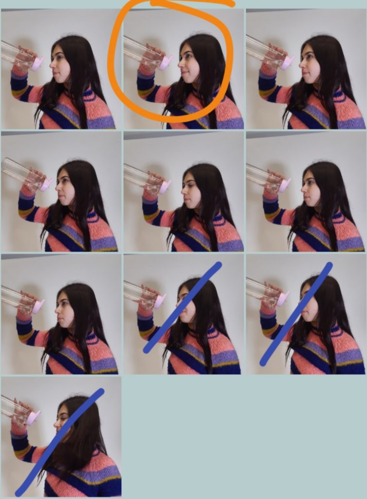
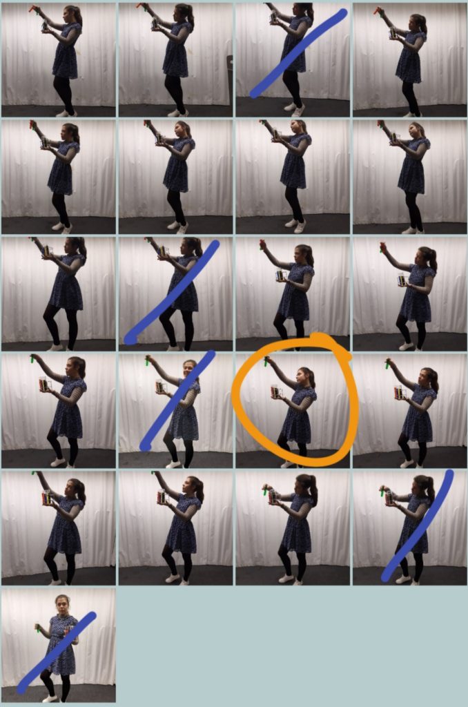
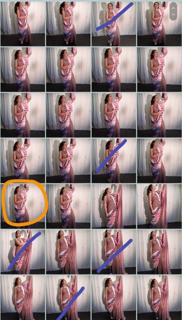
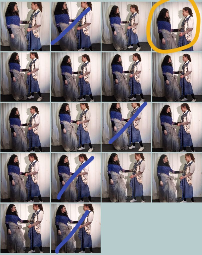
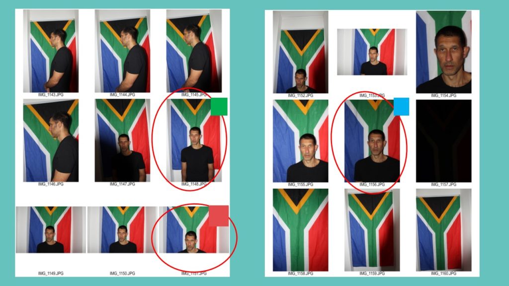
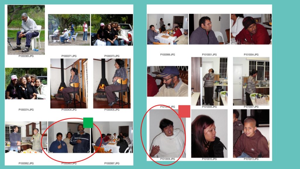
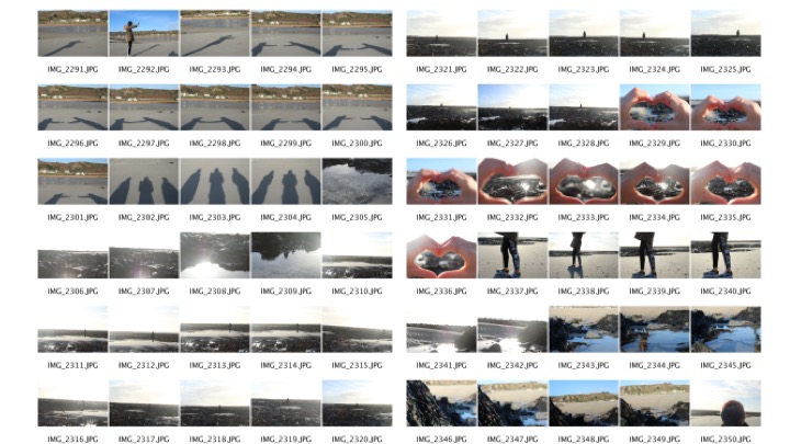
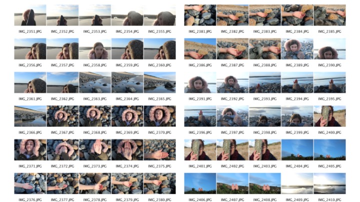
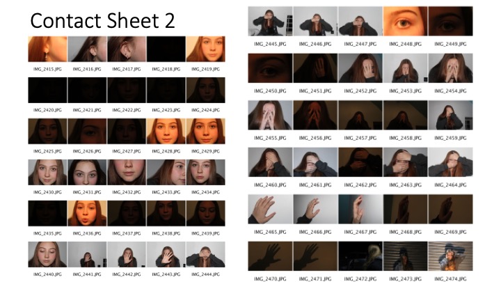
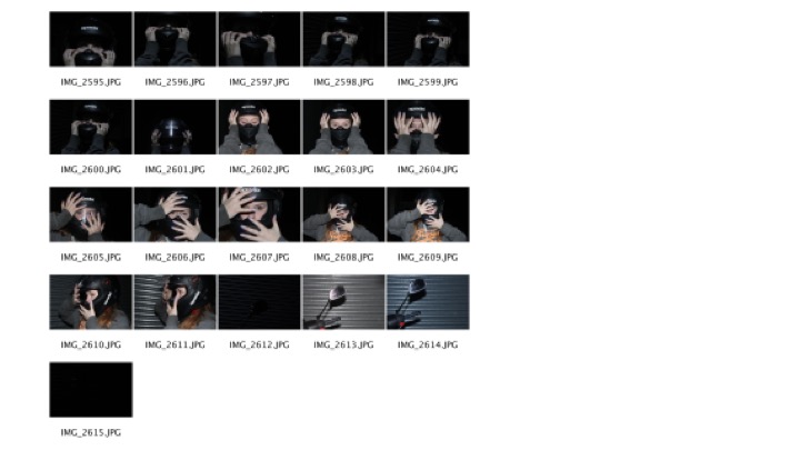
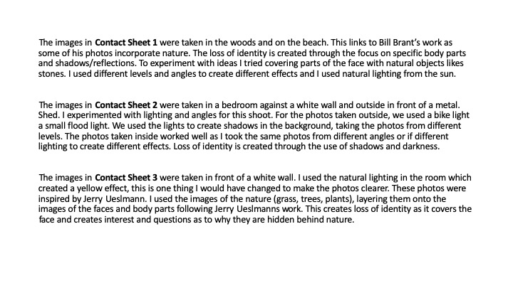
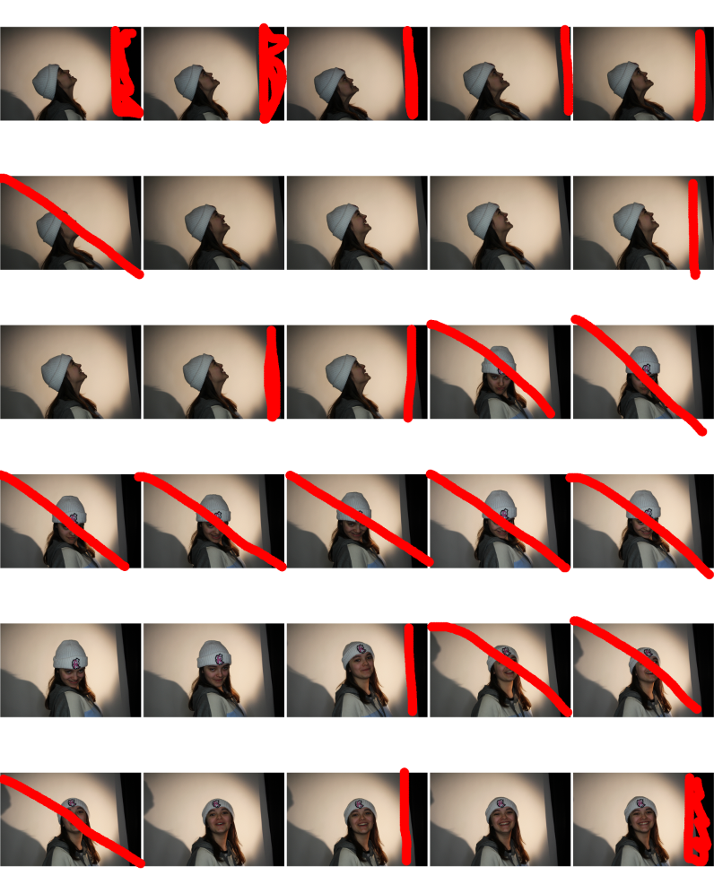
ConTact Sheets
Orange: Images I want to use to edit
Blue: Model not ready / Bad Angle