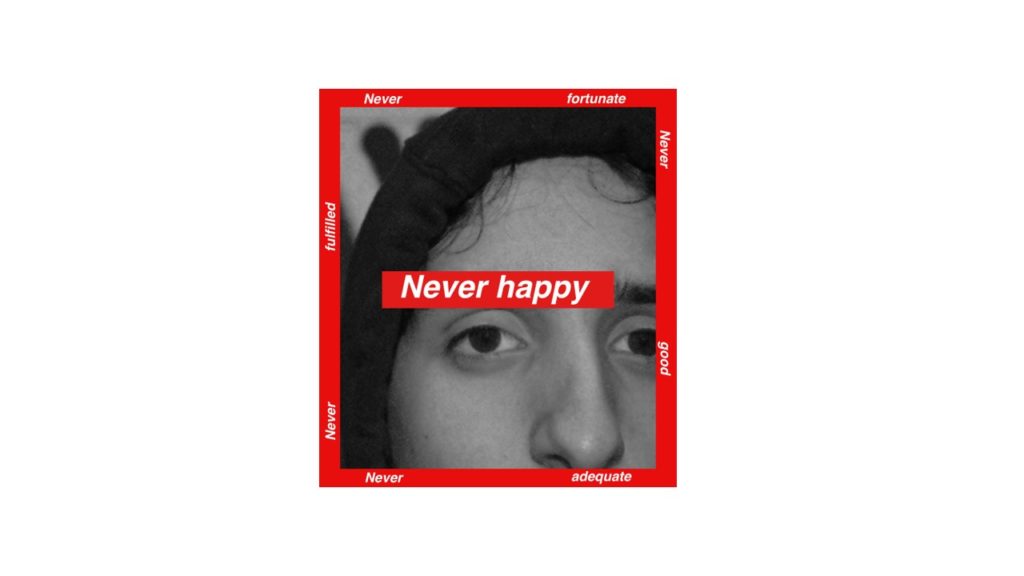
Below are all the edits I have completed, which are inspired by JOACHIM SCHMID.
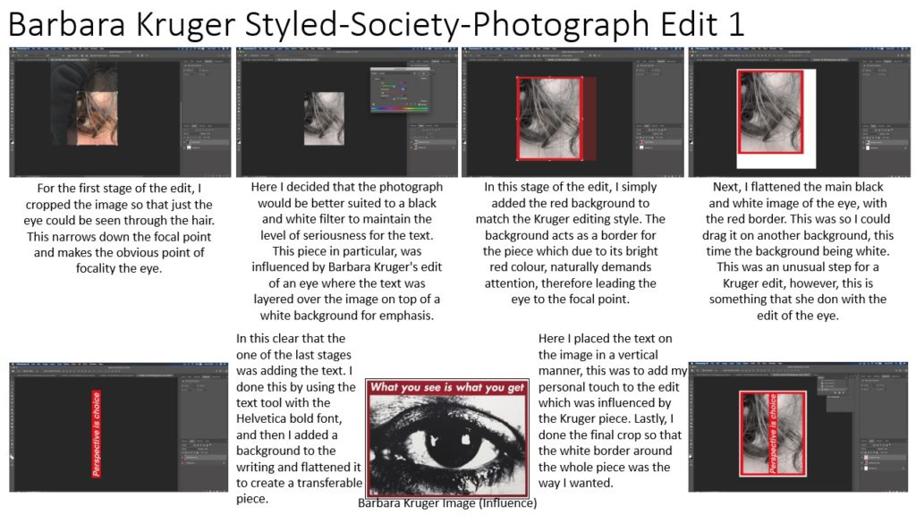
edit one
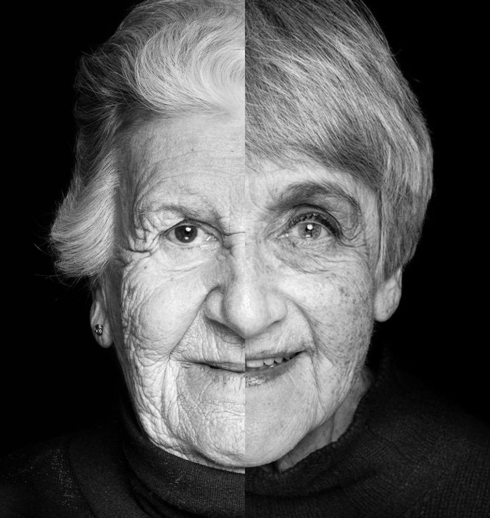
This edit is a mix up of 2 holocaust survivors. I decided to look into the holocaust survivors as I find the whole situation to be interesting and realised that all the people who survived the horrific conditions relate in someway and share a part of their identity. This edit was done as a practice run for the images i was going to take. I had to line up all aspects of the face, so that it looked like they were on person, who shared a part of their identity with each other.
edit two
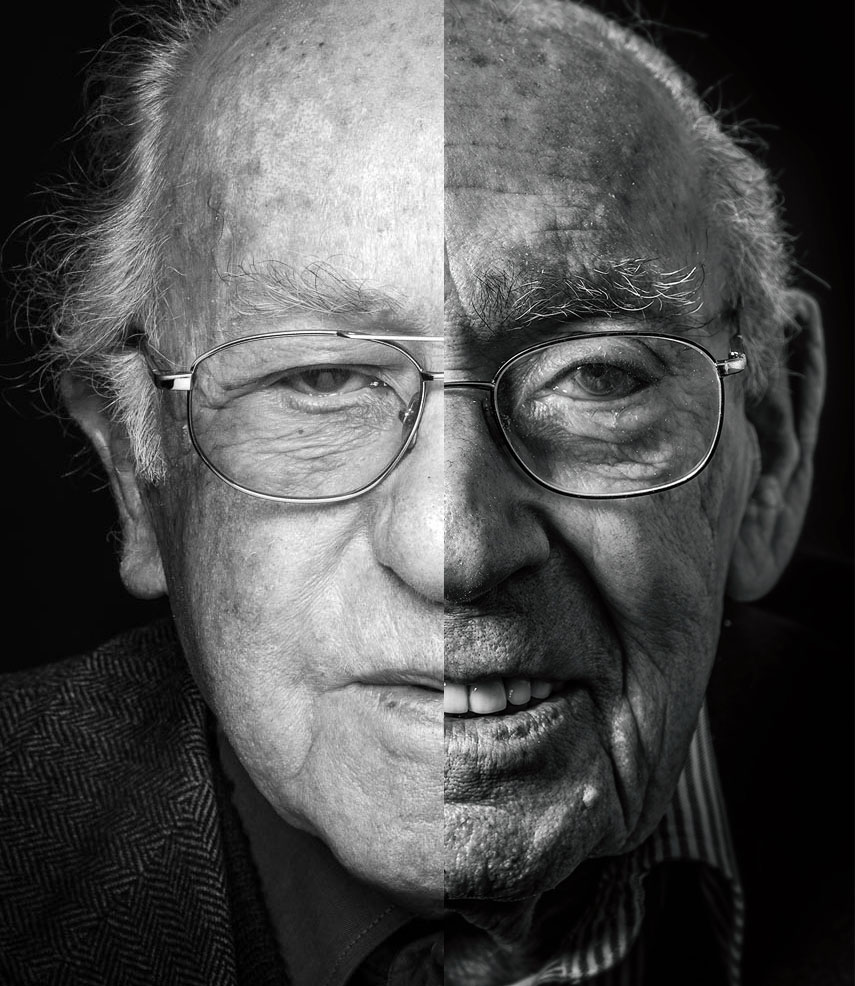
This edit is also a mix of two holocaust survivors, for exactly the same reason of how i think the holocaust is fascinating, in the sense that these people lived through immense conditions.
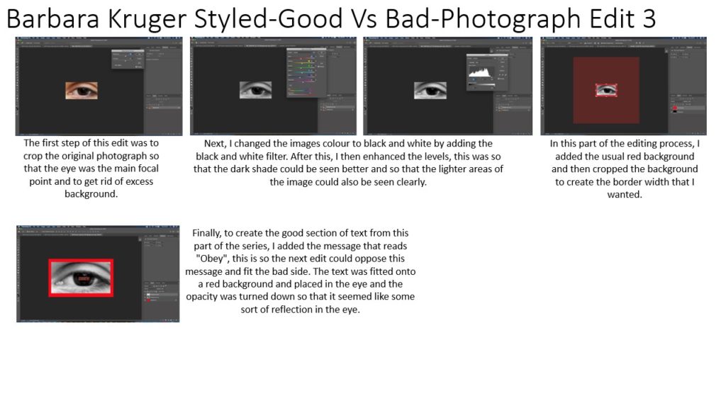
edit three
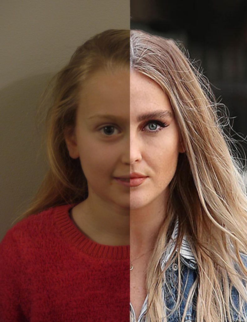
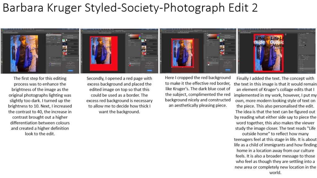
This edit is a mix of my sister and her favourite singer, Ariana Grande. I decided to do this edit because of how much my sister idolises this singer and how she aspires to be like her. Ariana Grande and my sister both share the same star sign, cancer and I feel this links to our identity and how we are as a person.
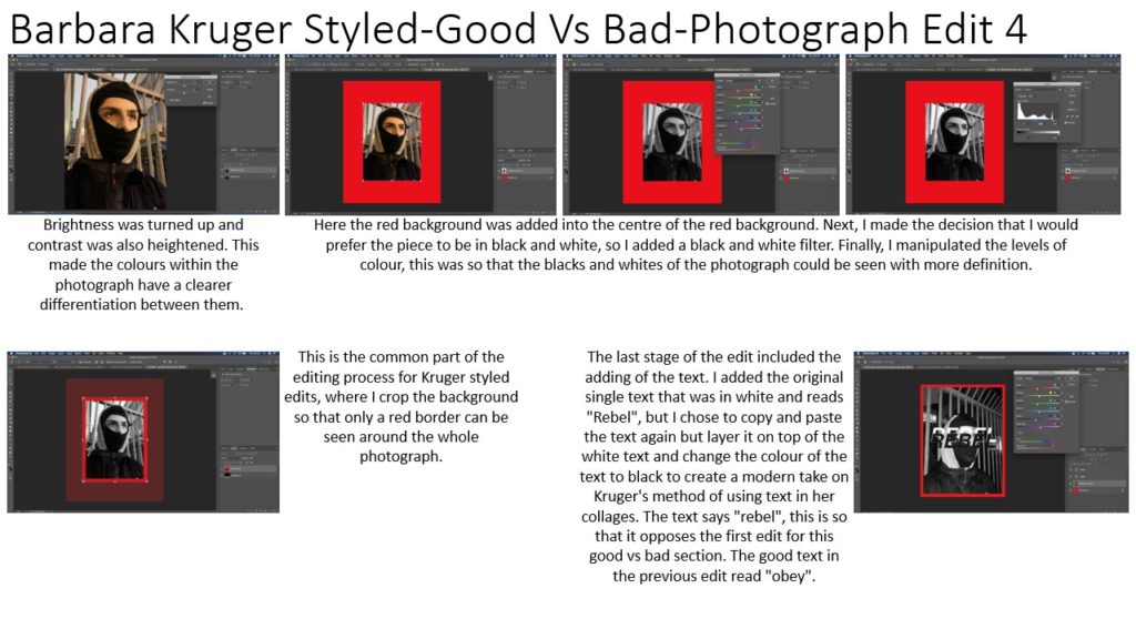
edit four
This edit is also of my sister and one of her favourite celebrities, Perrie Edwards. I decided to do this mix because of my sister looks up to her and her presence in the media.
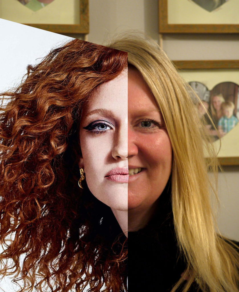
edit five
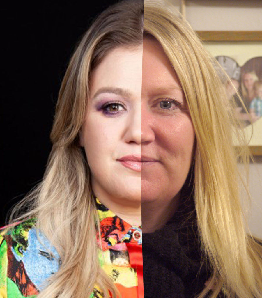
This edit is of my mum and Kelly Clarkson. I decided to this edit because of how much my mum likes Kelly Clarkson and her music. My mum relates to the lyrics of her music. Also my mum has always been said they look similar. Kelly Clarkson also share the same star sign, Taurus.
edit six
This edit is of my mum and Jess Glynne, who is an artist she listens to and likes the music of.
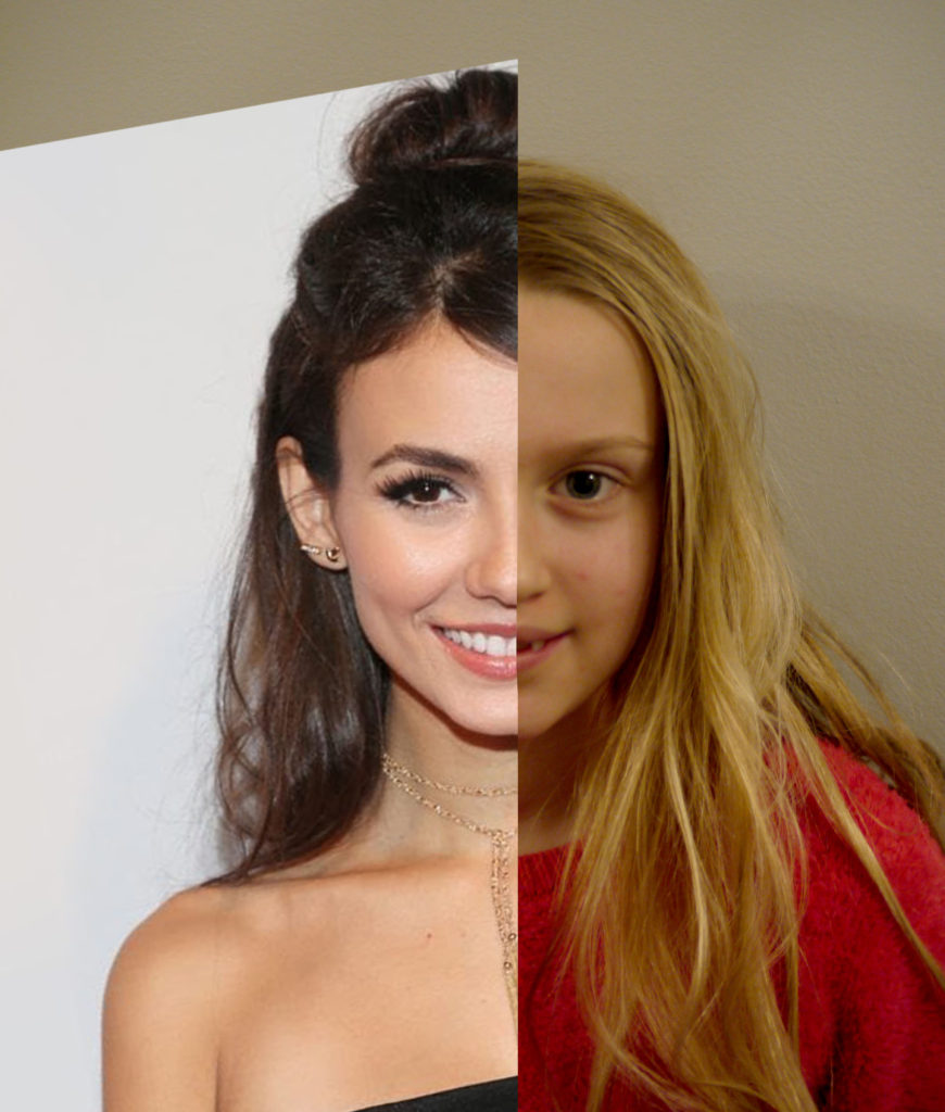
edit seven
This edit is of my sister and Victoria Justice, an actor from my sisters favourite program, Victorious. I decided to do this edit because their personalities are similar, in the sense that they are funny and stubborn.
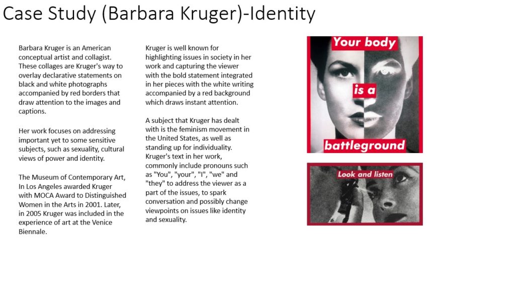
Sam Contis is a Postwar & Contemporary artist who was born in 1982. Their work was featured in numerous exhibitions at key galleries and museums, including the The Museum of Modern Art and the and the Klaus von Nichtssagend Gallery.
Sam Contis’ series Deep Springs speaks to the idea of community and the social self. Contis spent lengthy visits at a traditionally all-male liberal arts college in the high desert of California, a remote backdrop that contrasts starkly with the group mode of collegiate life. Contis’ subjects are pictured at a moment in their lives where they are in their early college years that has been typically understood as a time of coming into an adult self. In this case, such identity-formation is impacted by group social dynamics as well as connection to the characteristic western landscape of California.
Paul Mpagi Sepuya’s
Paul Mpagi Sepuya was born in 1982 he is an American photographer and artist. His photographs focus heavily on the relationship between artist and subject. He often explores the nude in relation to the intimacy of studio photography. The foundation of Sepuya’s work is portraiture. He features friends and muses in his work that creates meaningful relationships through the medium of photography. Sepuya reveals the subjects in his art in fragments: torsos, arms, legs, or feet rather the entire body. Through provocative photography, Sepuya creates a feeling of longing and wanting more.
Paul Mpagi Sepuya’s images often substitute masks, parts and space to fragment both the literal and figurative body. Layers and collage effects unsettle what the eye anticipates, viewers’ fixed beliefs, the historical canon of portraiture and the social context more broadly. “There is a confusion of positions – Where is the camera? The model? – which forces viewers to confront our own perspectives,
Since its origins photography has enabled people to make sense of themselves and their environment. In one sense all photography, whether it is directly about the photographer or not, is an exploration of identity and/or place.
Identity or parts of identity may be classified by any number of things such as religion, gender, or ethnicity.
Loss of identity can result in increased levels of generalized anxiety, low self-esteem, depression, a loss of self-confidence, social anxiety, isolation, chronic loneliness, all of which threaten our ability to connect with other people.
You are the one who defines yourself only your thoughts and actions define who you are, and if you don’t recognize yourself anymore, it means you weren’t being fair to yourself.
Self Portraits
A portrait can be of your cat or your brother’s feet on a skateboard. It should say something about the person you are photographing or the person you are creating with the camera.
the difference between a self-portrait and a portrait is seeing themselves. for example a selfie is a smaller branch of self-portraiture. A self-portrait considers the inferiority of the artist; it’s a moment for self-reflection, to pause and to look at yourself.
Since the beginnings of photography, artists have used the self-portrait to push the technical and artistic boundaries of the average in photography.
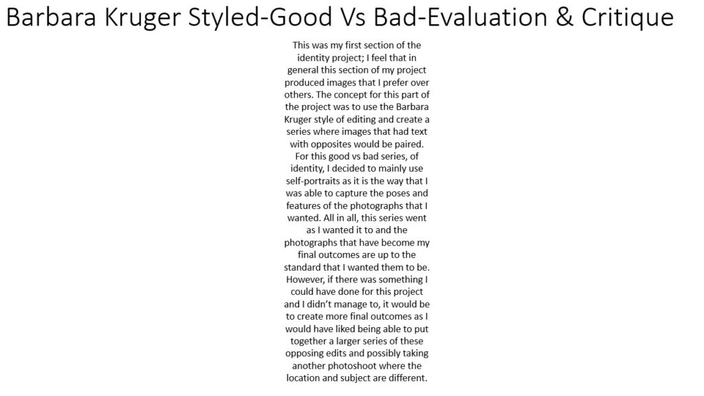
Overall I am happy with how this identity project turned out, as it can clearly be seen how I used the reference artists of Hassan Hajjaj and Diana Markosian to inspire my work, and I developed a clear plan beforehand, which I then followed through to completion. I used Hassan Hajjaj’s slightly pop-art style of a frame of repeated images around the outside of each portrait, and followed my theme of representing cultural identity by having these images be flags of all the nationalities of each person. I was inspired by how, in Diana Markosian’s portrait work in Cuba, the subjects are all in a natural position and don’t look too posed, which gives them a sense of power as they are in their home environment and whoever is looking at the image is the outsider. This sense of power is also featured in Hassan Hajjaj’s work as well. The settings for each of my selected pictures reflect the person and their personality well through colour palettes and general vibe also.
However if I were to pick out a flaw it would be how the images turned out slightly grainy. This is because, due to the time of day I did the shoots and the (lack of) natural light available, I had to increase the ISO which reduced the picture quality a little, and I also had to adjust the brightness and such in editing afterwards, which has the same effect. I don’t feel as though this affected my pictures too negatively as they still turned out well in my opinion and I was still able to use some images for my final editing process
Nevertheless, if I were to do this project again, I would redo the photoshoots with more natural lighting, for example in the early afternoon or morning, so that the sun would be in a good position, and possibly I would use a tripod for the first shoot, in order to reduce this grainy effect.
On the other hand, I feel as though the grainy quality of the images has a positive effect, as it can be seen to represent how these pictures were taken in well-known public places, where many people have passed through for years and even decades, and may have even taken pictures like these, where the grain would have been due to the camera quality of the era.
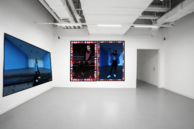
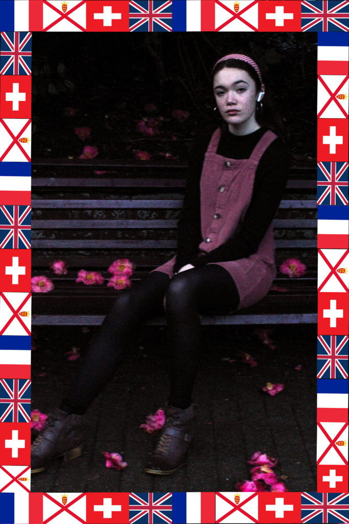
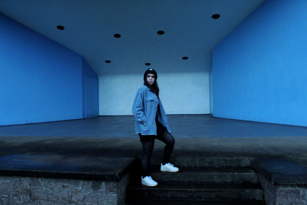
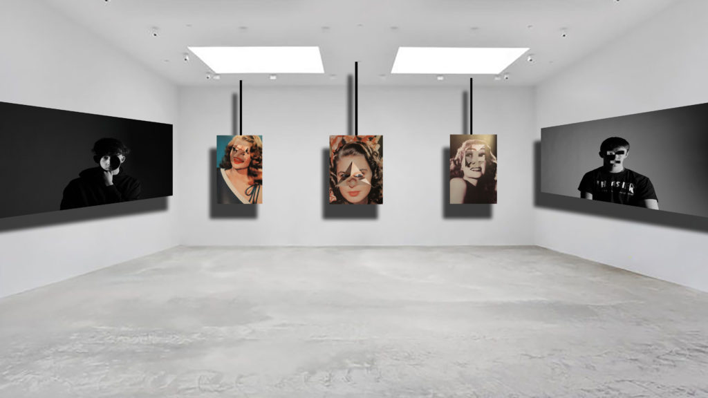
I am going to present the two portrait images together as they are the same sort of style, in A4 and using the window mount method. I am going to present the landscape image in A3 and mount it on a foam board. The to set of images will showcase how my project had multiple influences and how I carried them out.
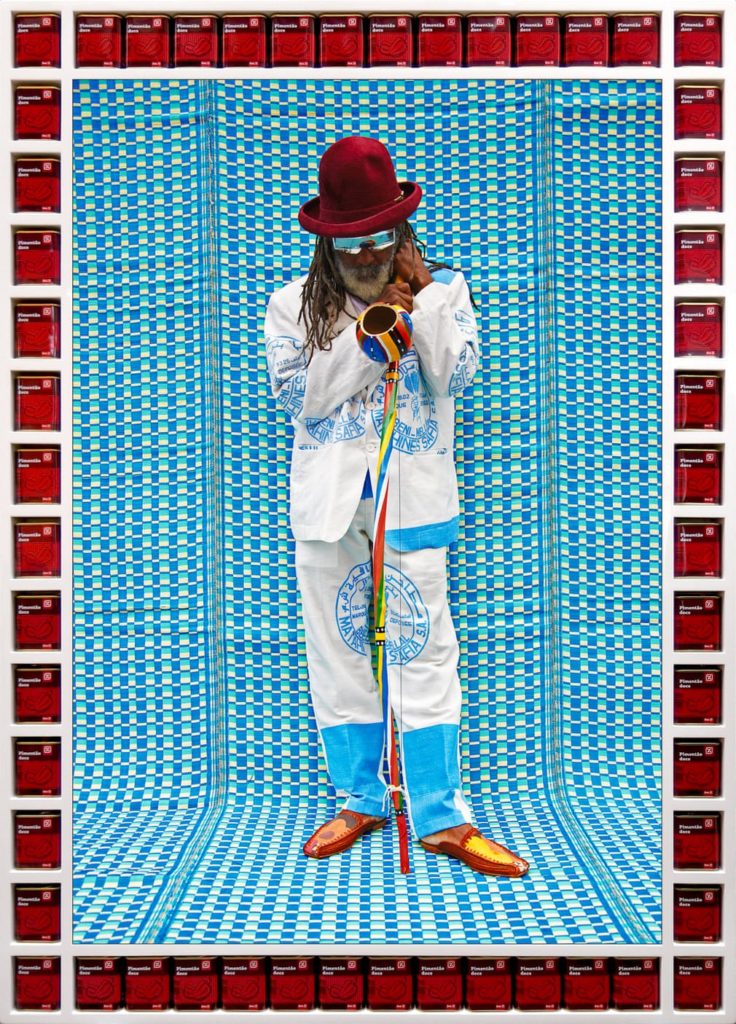
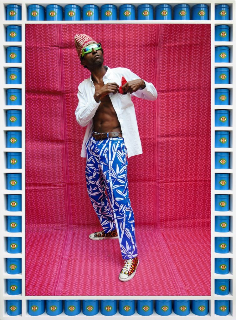
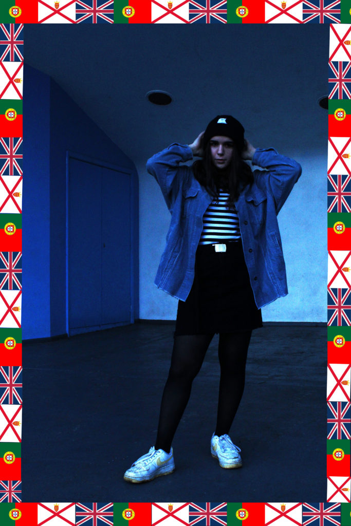
I like the colour scheme of this image and how the background uses the same image as the subject in the foreground’s clothing, which makes this image cohesive and nice to look at. Her position is casual and relaxed yet the way she maintains eye contact directly down the camera lens adds a sense of power to the whole image and present her as being comfortable in her home environment. I believed I executed the flag border well which helps to carry how I am intending to represent cultural identity here,
I also like the subject’s (me) position here as the leg extended in the foreground leads the eye deeper into the picture. The colours all work together and the pink colour of the dress and headband is reflected in the flowers scattered on the ground and in the red repeated in the flags in the border. The flags also stick with my ideas for this project, representing how people’s cultural identity is mixed with their ethnicity and where they live currently, and is not a singular and fixed thing.
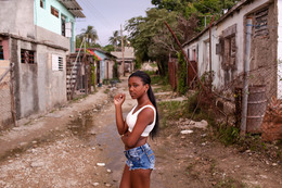
This third image is not following the style of Hassan Hajjaj, but more Diana Markosian (my second case study artist), hence the lack of flag-border. I like it because the colours are all cohesive as well as the composition making the subject in the best possible position, against a white background with two blue accent walls against her either side, reflecting her clothing.
COMPARISON-
Hassan Hajjaj-
Own work-
Diana Markosian-
As can be seen above, I was inspired by several elements from these two photographers and combined them together along with my own personal style in order to create the finished products. I employed Hajjaj’s use of a vibrant colour palette throughout each image and using clothing to represent the subject’s personality, as well as Markosian’s style of photographing the subject in their home environment in a natural pose.
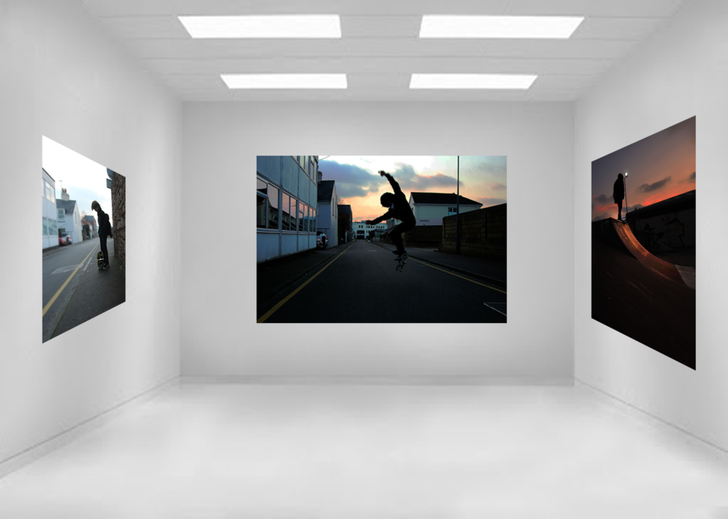
These are my contact sheets that I have organised from 3 separate photo shoots. My aim was to explore like Markosian, geographical identity taking photos of my best mate who was Jersey born and bred. I aimed to show his lifestyle on the small island of Jersey, his hobbies and thoughts of living on such a small island through my photos, and raise questions such as… “is Jersey a claustrophobic’s nightmare” or “how does Jersey’s youth make the most of what little space there is?” and so on.
The Process/Final Outcomes
During the shoots I decided to take on a similar mindset such as Markosian which is to “get as far away from the photo herd as possible. Go your own way.” By embracing this mentality and after extensively looking at their work, their images all have a similarity, which is the focus on environmental portrait photography. These are my final chosen images that i am going to display for my identity project. I think they are all the most effective at showing all the little details of each shoot and look most similar to Markosian’s work.
Jersey Boy – Reflection
I like this photo as it highlights a young mind’s desire to be free, spread their wings and discover more. This is a common topic among teenagers, especially so in Jersey, a small and arguably overpopulated island with arguably too little to do. The photo pictures Dylan, a “Jersey Boy”, where he is about to ride his motorcycle in an attempt to spread his wings and escape the day-to-day boredom that many claim the island brings.
Like Markosian, I have told a brief story that relates to the geography of the area I have photographed and how it affects the people living there, with the theme of realism in mind. I’ve tried as best I could to imitate her style of work, noticing how she likes to use lots of contrast in her photos, which i have replicated here by increasing contrast and simultaneously lowering the exposure. Furthermore, too add detail in the foreground, I altered the levels/tones and tweaked about with the ‘curves’ feature on Photoshop. I additionally used the blur tool to blur the background as I have seen in some of Marksoian’s work, but also to help emphasize the foreground and give the photo some depth, as the mirror didn’t pop, but rather blended in with the cluttered background in the original photo. Lastly, I sharpened the photo as well as using the lighten tool to help lighten the centre with the mirror and the subject in order to highlight the main aim of the photo. I especially like the composition of this photo as it is centred well, and symmetrical, thus appealing to the viewer as well as the photo generally being good quality/resolution and in focus.
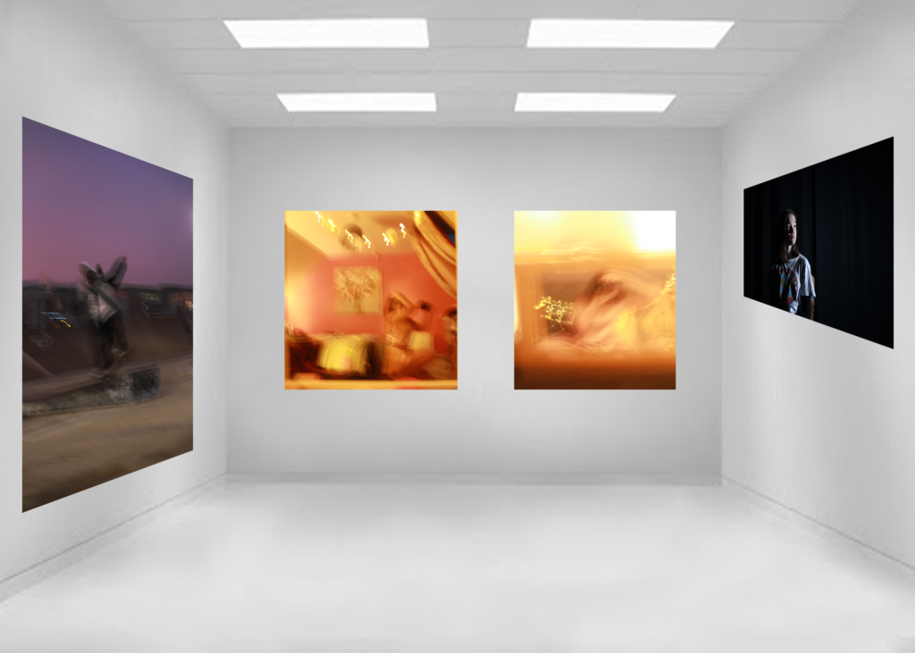
Here, unlike Markosian, I decided to experiment by adding noise in order to add a distinct vintage vibe to the photo as an attempt of experimentation out of pure curiosity. I thought the photo looked really good, thus decided to post it on here as an edit.
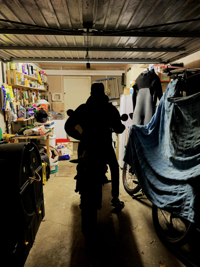
Jersey Boy – Garage
In this photo, I positioned myself behind Dylan as he departed the garage about to embark on his ride. Yet again, I tried imitate her previous work, using high contrasts and low exposures to best bring out the theme of realism. I changed the levels and curves slightly to emphasize the shadows more, and help distinguish a clear subject in the middle. To finish it off, I increased the colours and slightly altered the saturation in the image using Photoshop’s “vibrance” tool in order to separate the background from the dark tones in the foreground and add a bit of colour to spice up the image. The image is similar to some of Markosian’s work in respect to the fact that the subject isn’t facing the camera and is minding his own business, an example of candid photography with the theme of realism in mind, often explored by photographers such as Markosian.
All the techniques as mentioned in the previous images were also used in my third final outcome as seen above. This photo incorporates similar meanings as with the others, still including the theme of realism and exploring the inquisitive and adventurous minds of young people, and how they source the knowledge and life experience on this small island.