
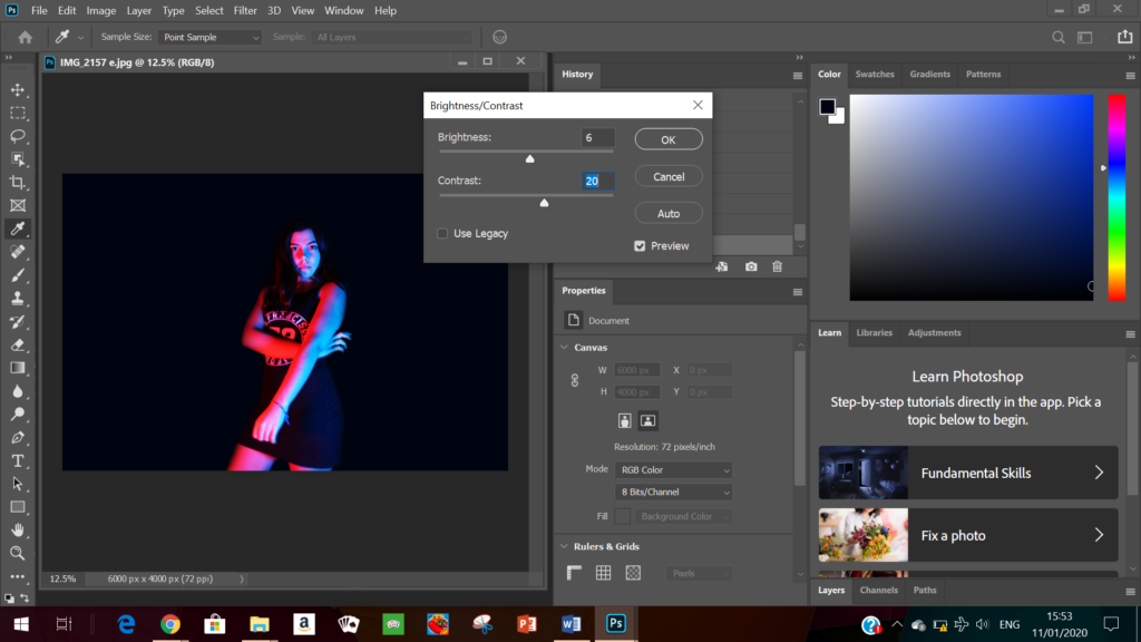
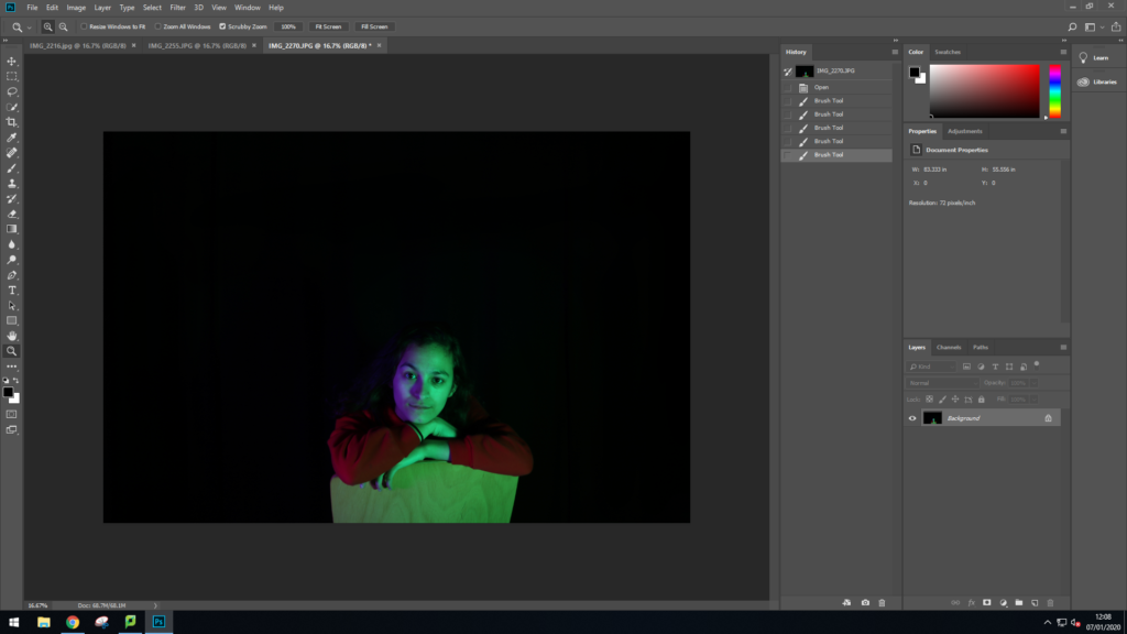
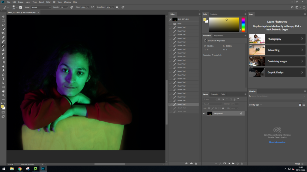
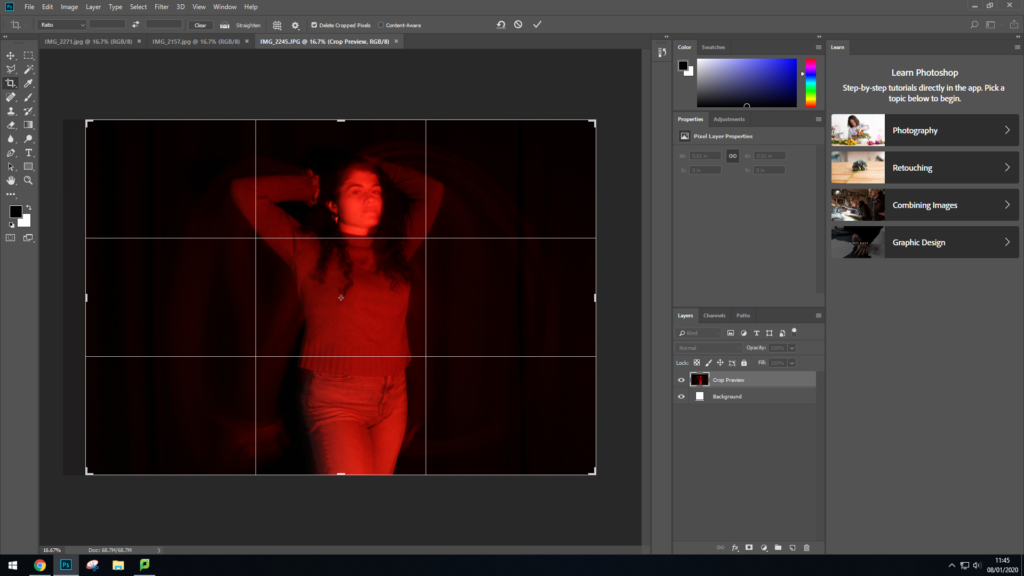
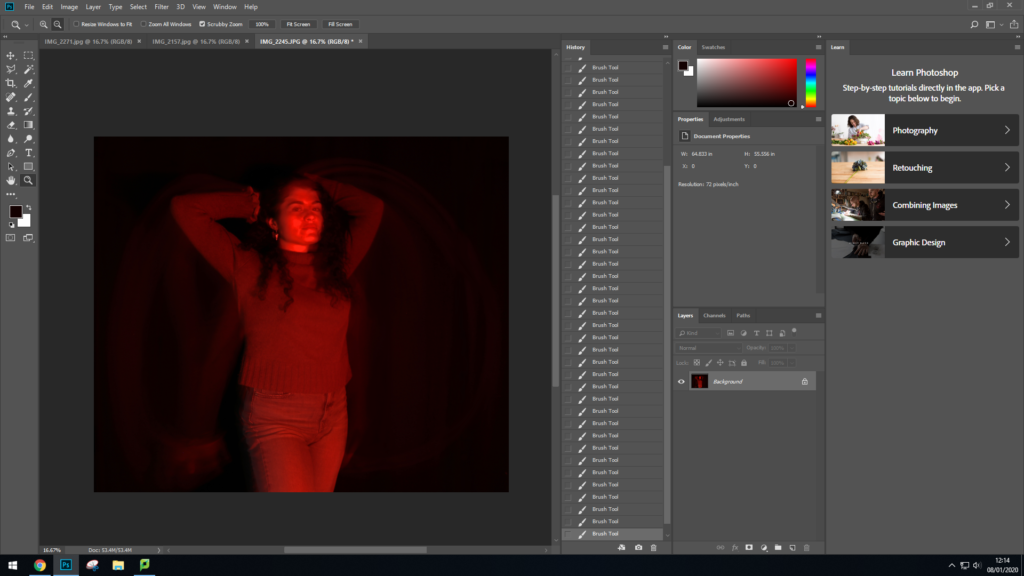
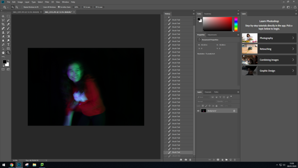
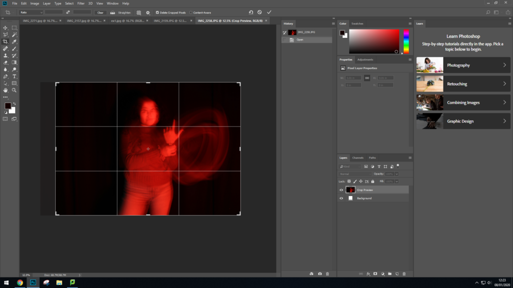
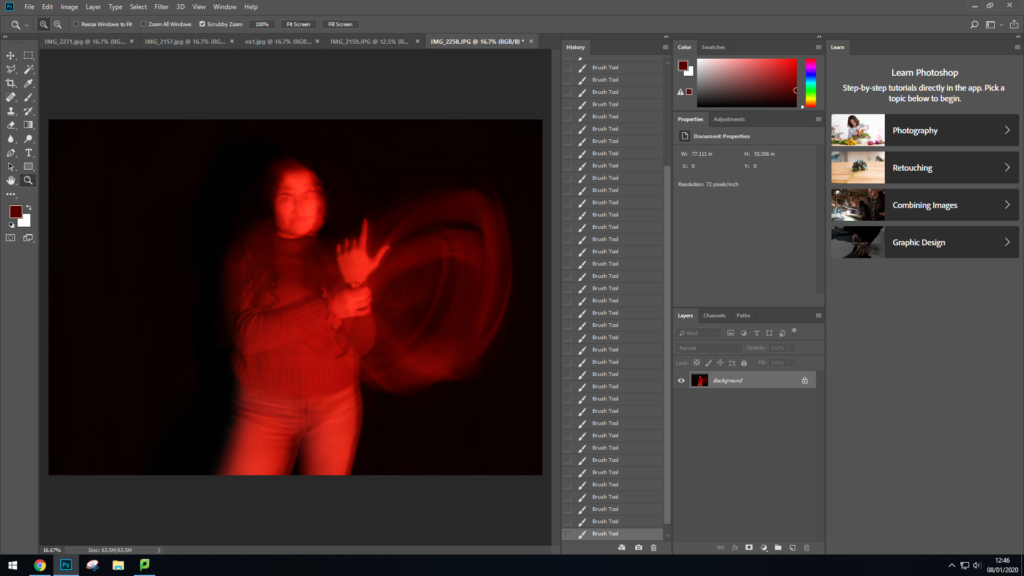
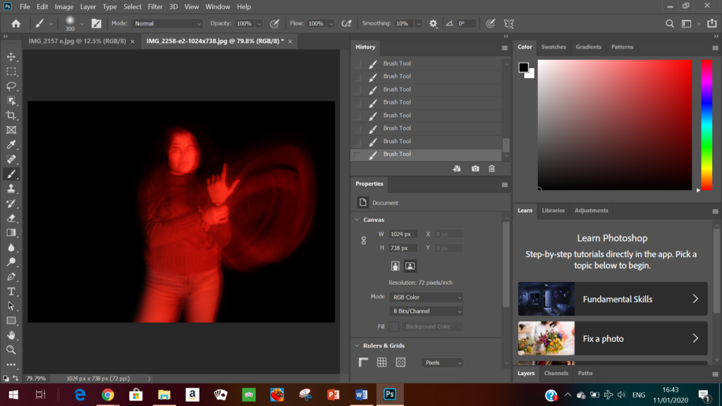
For my editing I used Photoshop as I found that it was the easiest option to help me edit the background.


Here I used these tools to help my crush the background colours^^
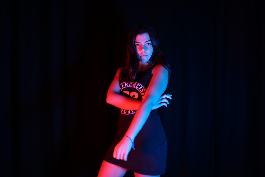

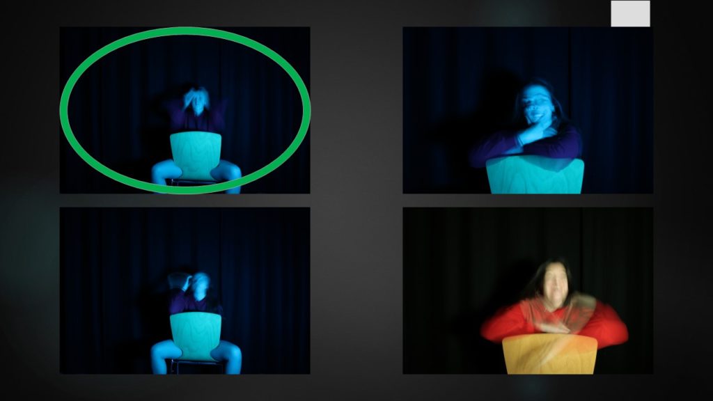
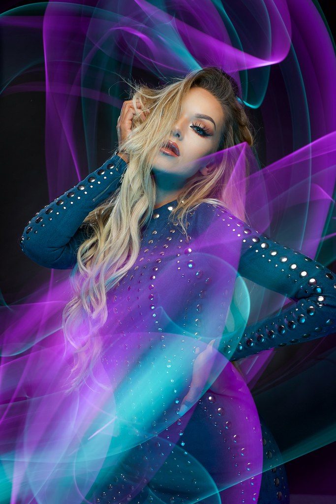
Here I wanted to experiment with long exposures (therefore creating motion blurs) and the coloured gels together, which is parallel to Hicks work.
Examples of Long Exposed photos taken by Jake Hicks^
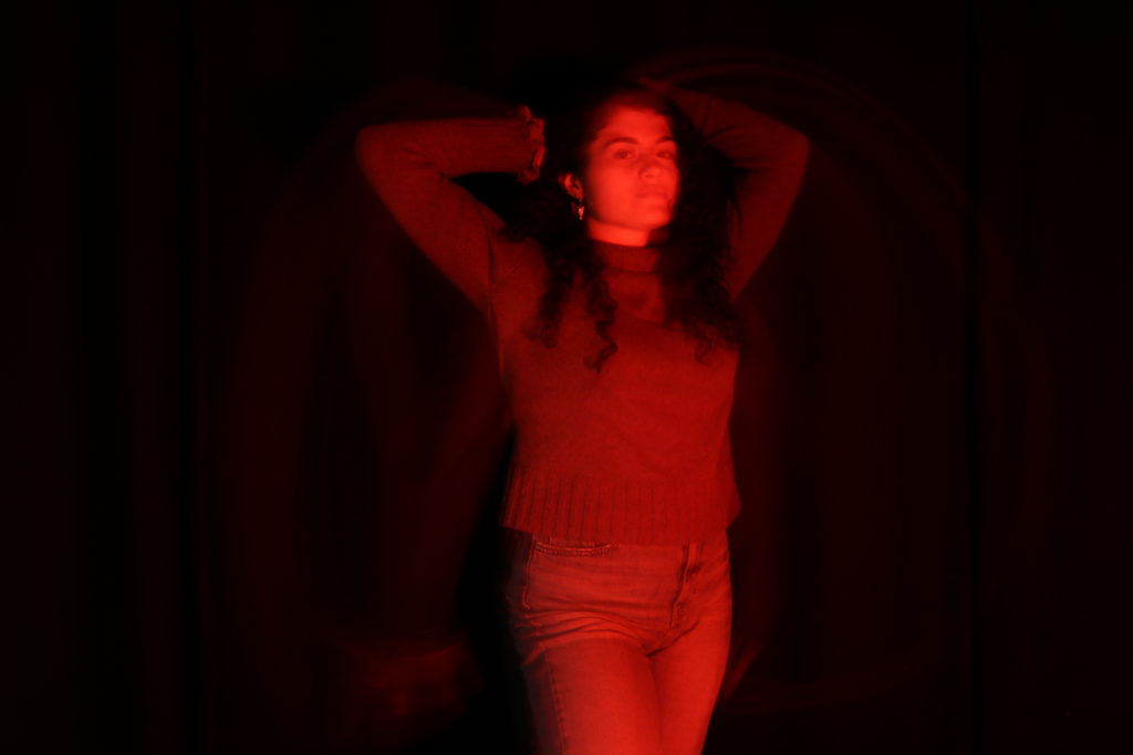
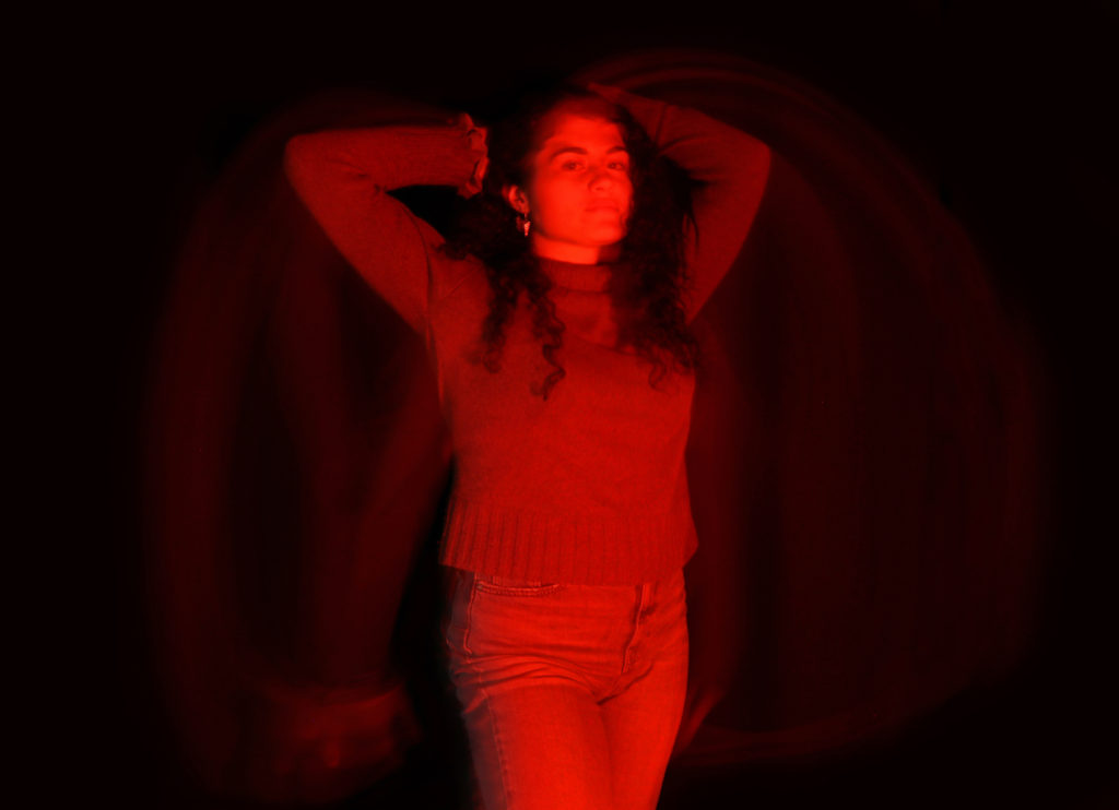
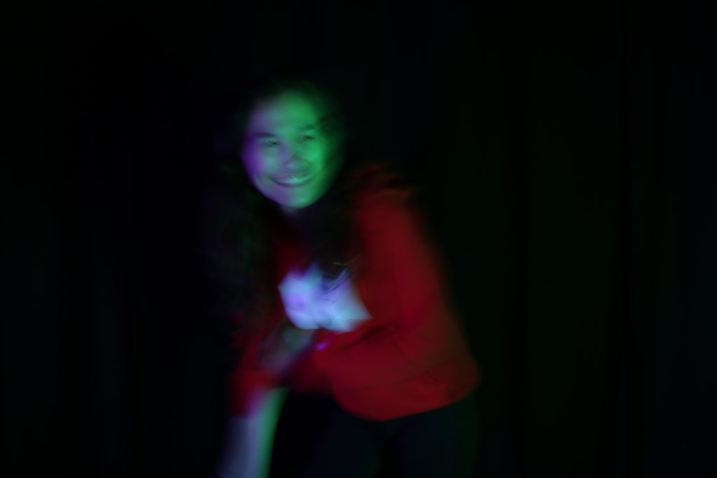
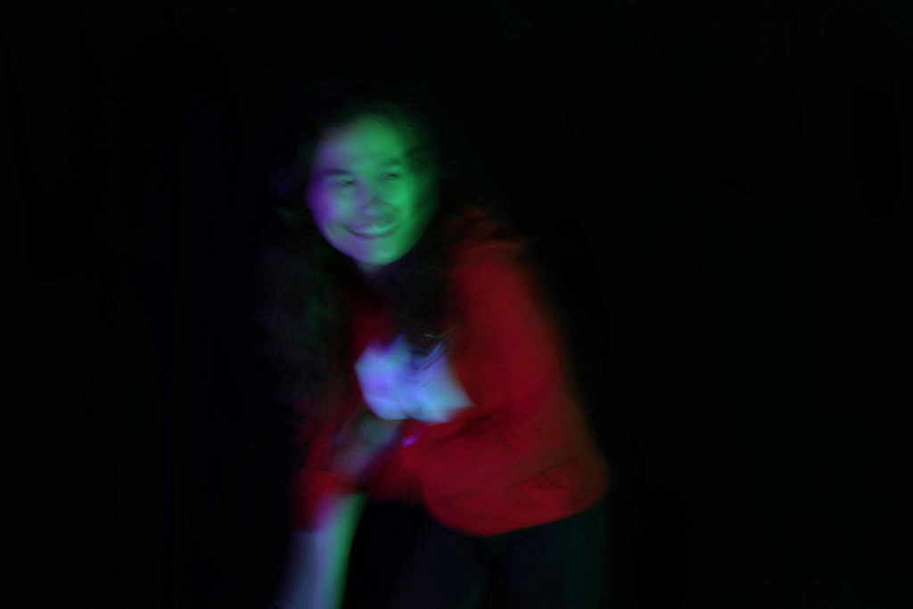
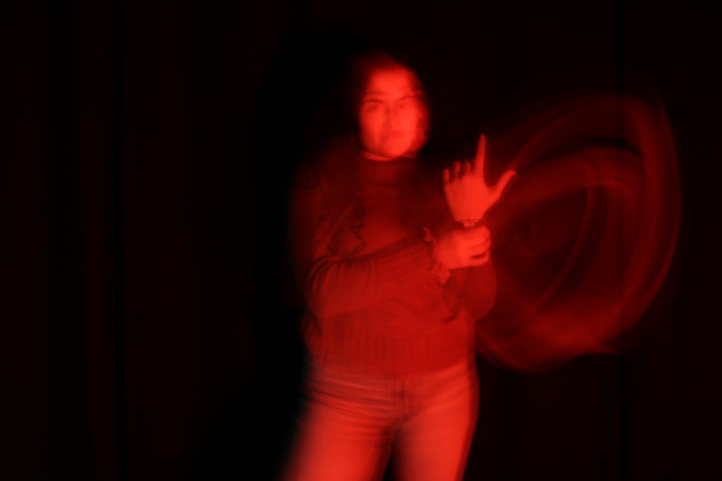
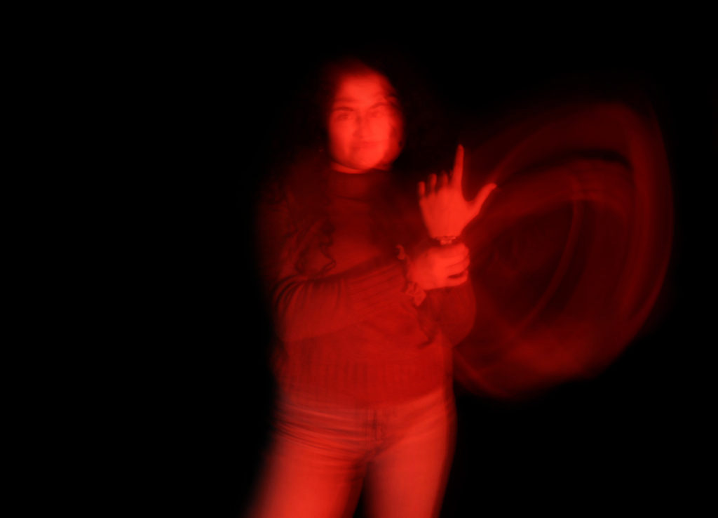
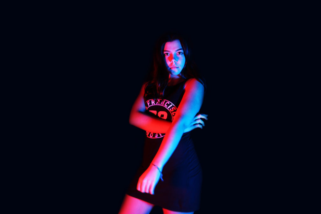

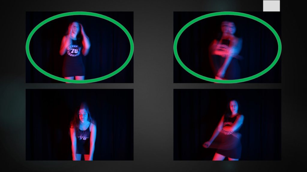
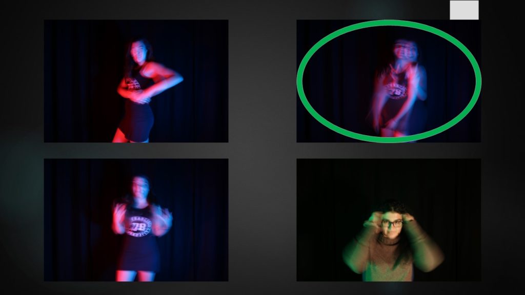
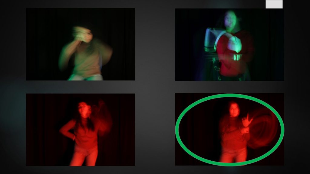
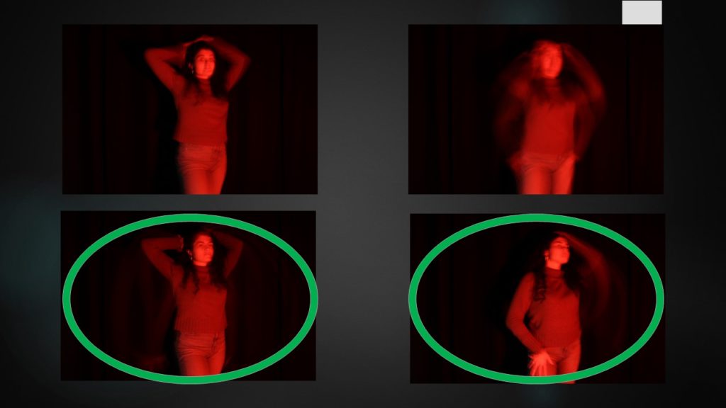
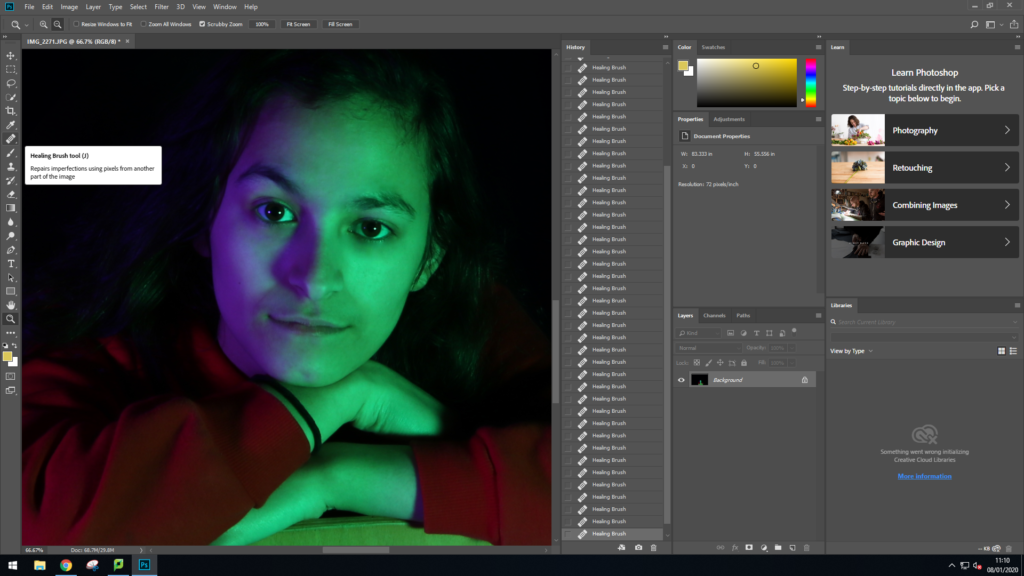
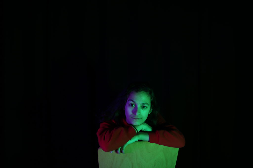
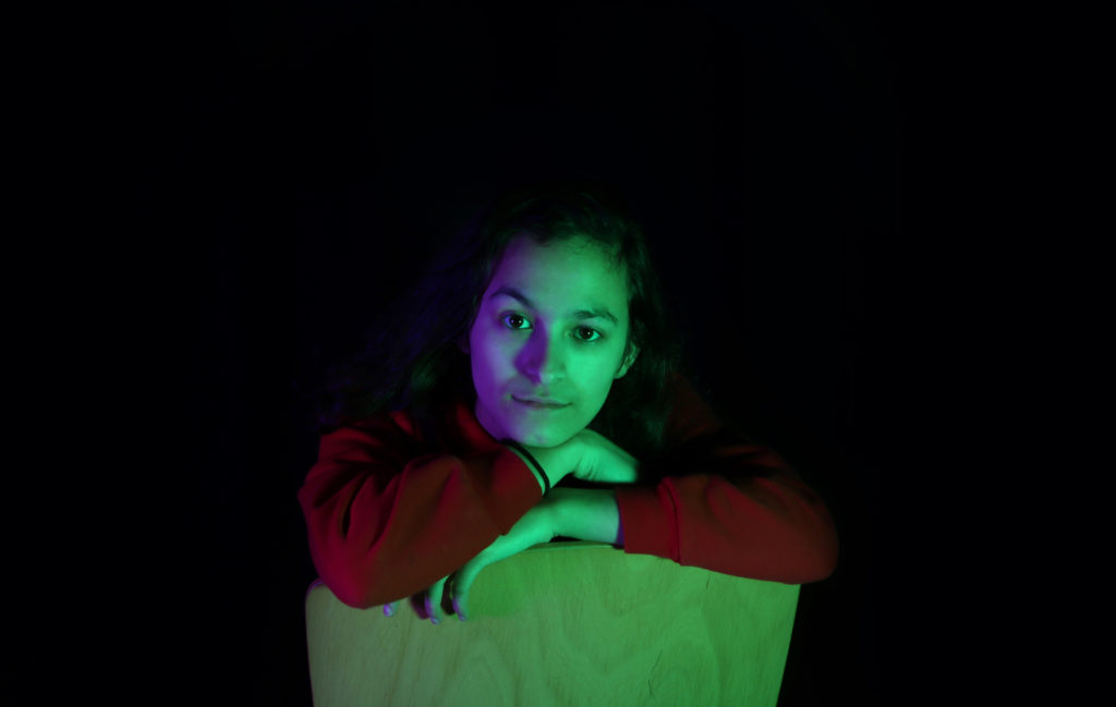
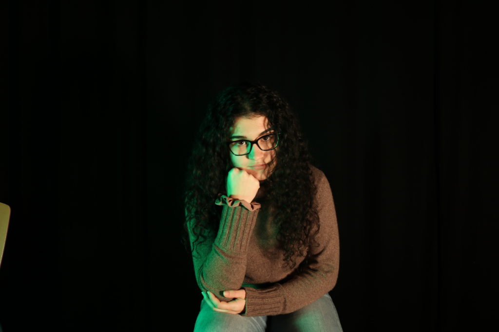
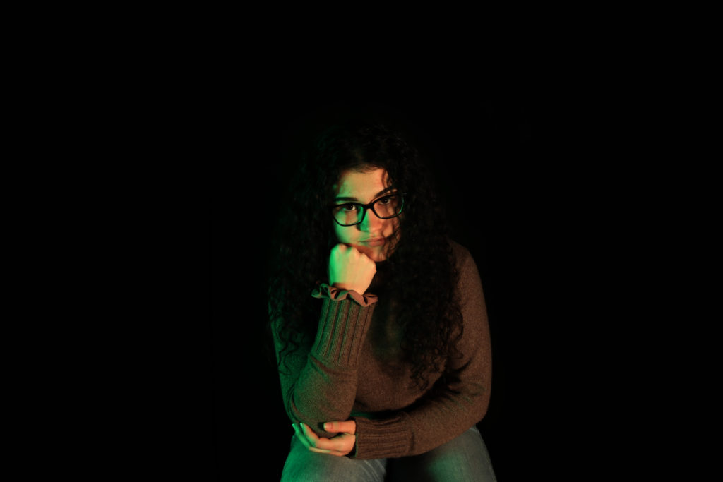
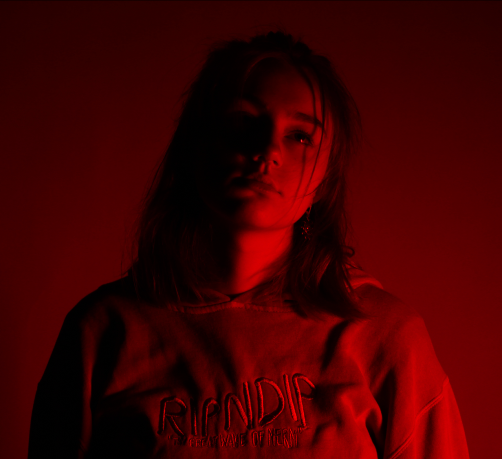
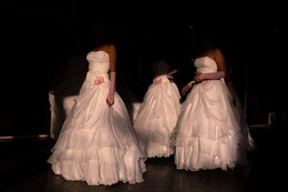
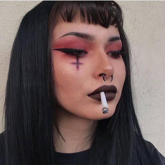
These were my favourite images from my Studio Project. In this photoshoot I used two point lighting. In the first image I used Red and Blue gels on top of the LED lights and in the second photo I used Black and Red gels. To make the colours more vivid I layered multiple gels of the same colour or similar colours together, to create a stronger final colour, this worked effectively as I needed a strong gel to work with the black background. Here I used long exposures as I kept the camera steady on a tripod and used a clicker to take the photos so that I wouldn’t need to physically touch the camera and effect the sharpness of the image.
I think these images relate to Hicks work due to the bold colours used which makes the image look vivid and more interesting; I also tried to evoke confidence onto the models in a similar to Hicks work; I experimented with long exposures to make the photographs look more extraordinary and tried to create the best quality image “in camera” so that I wouldn’t have to edit and manipulate much when finishing the photoshoot.
I quite like the first image due to the outcome looking very professional and at a high standard. I ended up changing the colour of the background from black to navy as I thought that the black contrasting against the model was too harsh and made the image look more manipulated and fake. I think this image worked well as the model looks confident and professional which helps to create a more high quality photograph.
With the second image I love the effect created by the motion blur (which was created due to using long exposures), I think it adds power to the model; making her therefore looking more powerful. The red creates a “devil” illusion which makes the model look attractive. Here I was quite happy with the ratios of the image itself as it fits faultlessly with the rule of thirds concept.
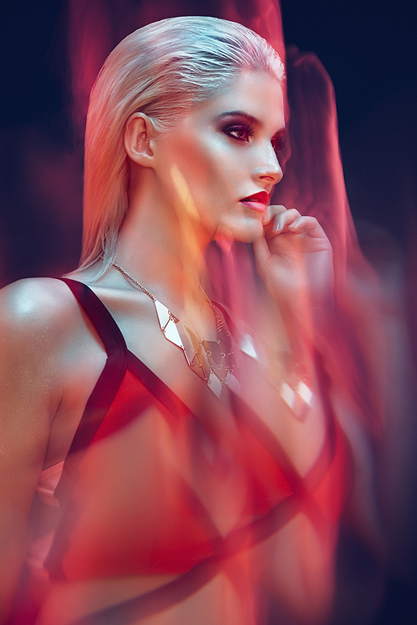
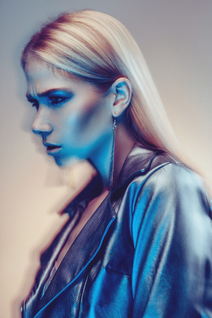
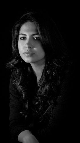
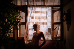
I took these photos in the studio and used the technique Chiaroscuro using one point lighting as well as adding the coloured filter so I can relate the photos to the photographer Mads Perch, as he use various colours in his photography as well as creating dramatic contrasts with shadows. I set the ISO at a lower setting to make the image less grainy to make the photo look as sharp as Mads Perch’s images. In the foreground there is a lot of shaded areas that look under exposed in comparison to the light on the model. The lighting reflects off the models skin which allows there to be some tonal range and the lighting also brightens the back drop behind her. I changed the aperture as wells depth of field in the photos are quite shallow to make the most sharpened part of the image is the model, again like Mads Perch’s photography.

I have chosen my best photos from the contact sheets above. They are the sharpest and most successful out of the photos above although I have cropped some them so they are more symmetrical. I have also chosen these images as the models poses are the most dramatic and most similar to Mads Perch’s work/photography. I haven’t chosen more as I wanted to display quality of quantity.


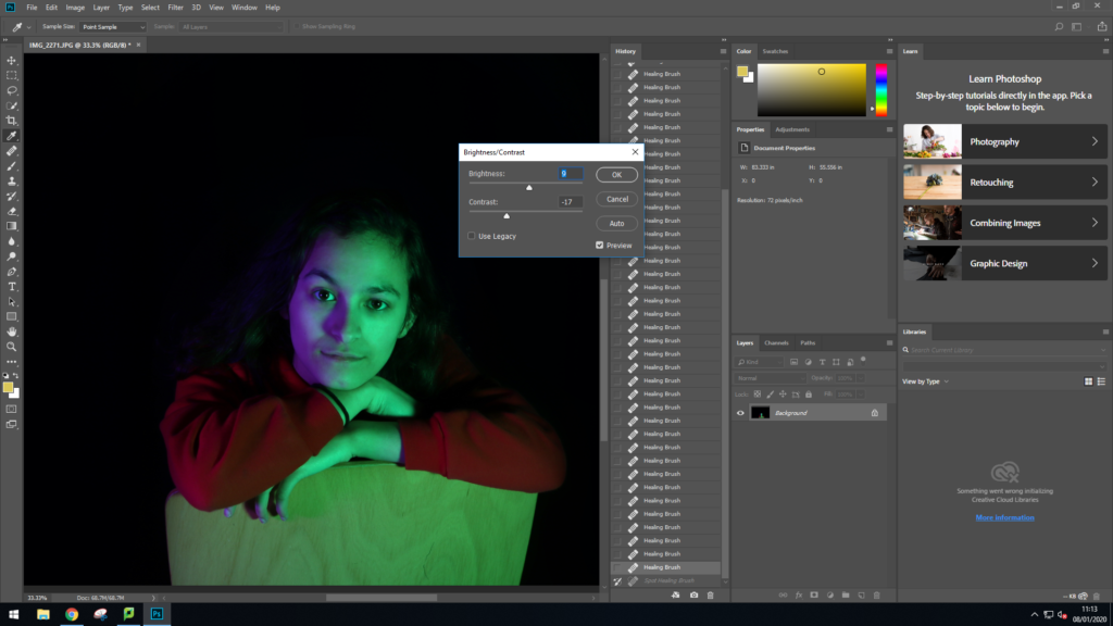
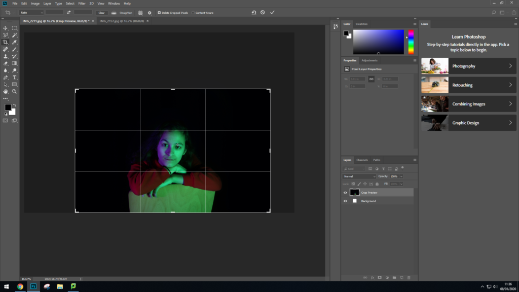
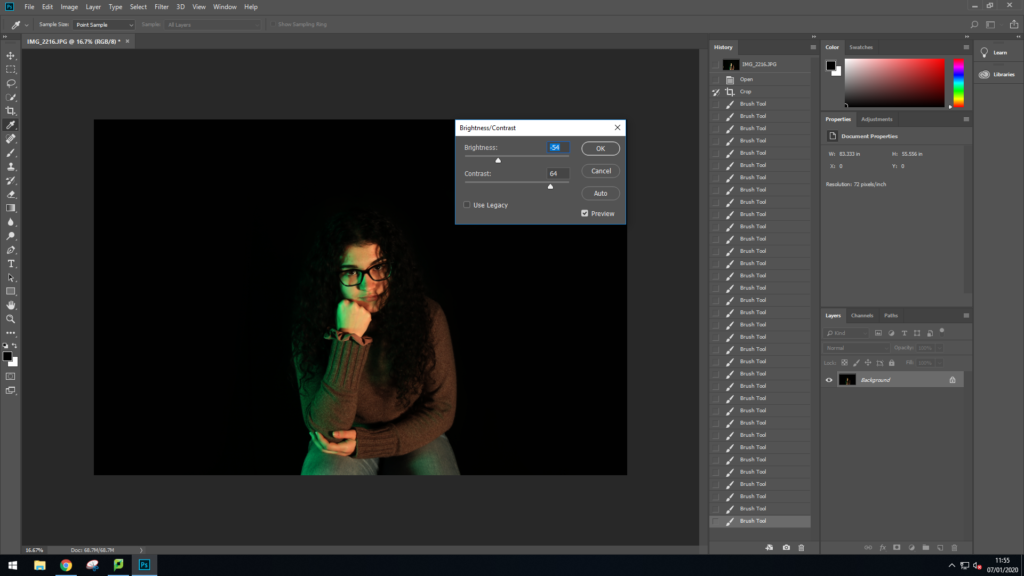
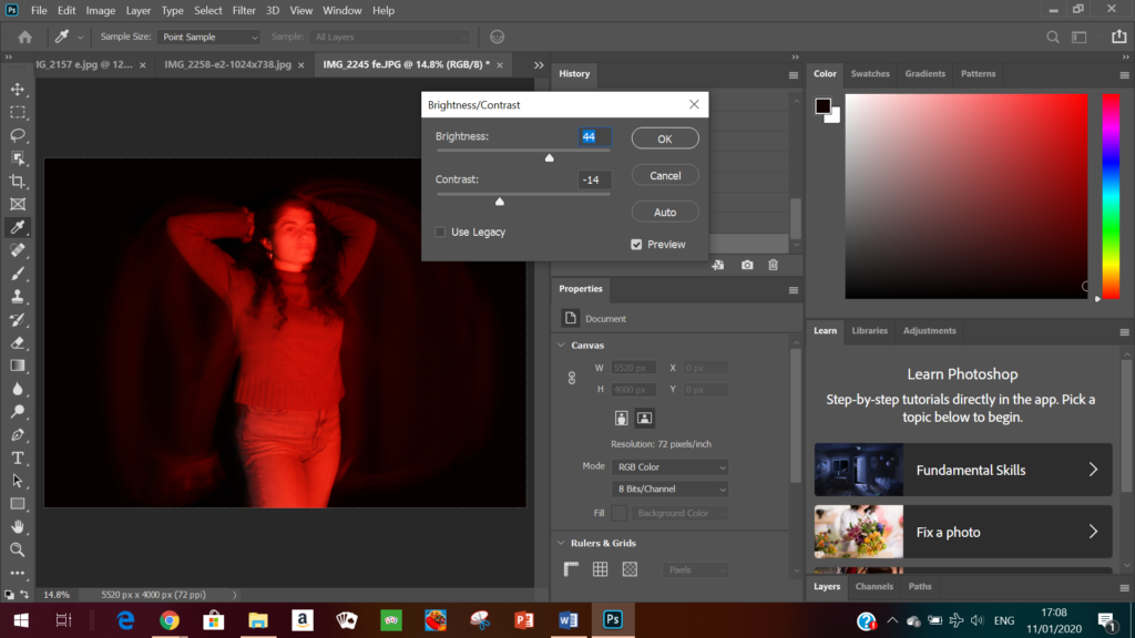
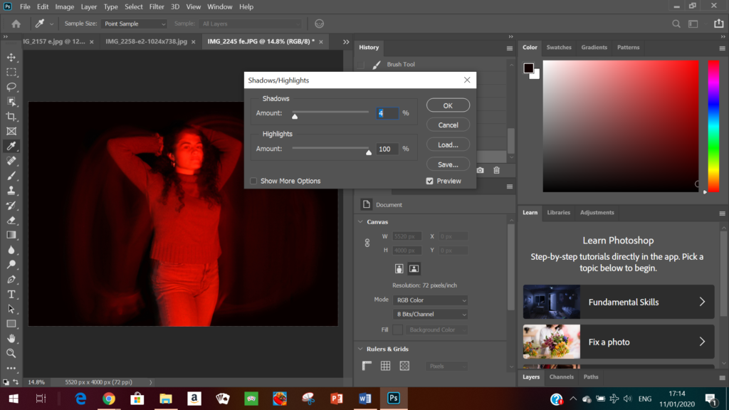
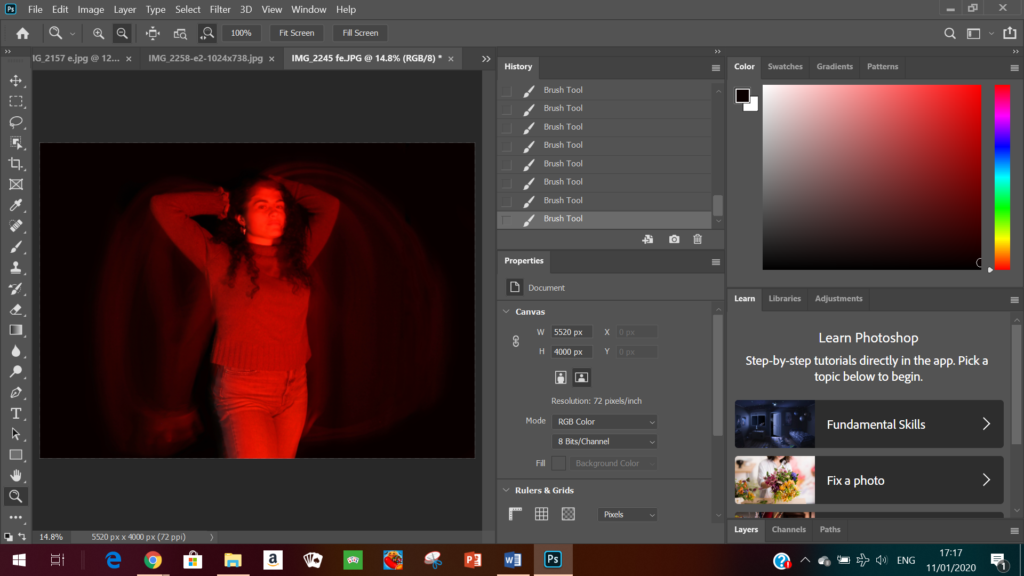
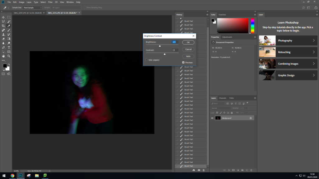
On photoshop I adjusted the brightness to allow you to see the mode more clearly as the image came out quite dark. Although I brightened the photo I still tried to have a good contrast of the the darker and lighter tones to get the final image I wanted. As well as this I changed the intensity of the shadows and highlights to ensure certain points were more exposed to the viewer as well as drawing their attention to it particular parts of the photo. I also cropped this image on photoshop to allow the model to be in the centre of the photo.


A tableau vivant , French for ‘living picture’, is a static scene containing one or more actors or models. They are stationary and silent, usually in costume, carefully posed, with props and/or scenery, and may be theatrically lit. A tableau may either be ‘performed’ live, or depicted in painting, photography and sculpture.

In the late 19th and early 20th centuries, tableaux sometimes featured poses plastiques (‘flexible poses’) by virtually nude models, providing a form of erotic entertainment, both on stage and in print. Tableaux continue to the present day in the form of living statues, street performers who busk by posing in costume.
Jean-François Chevrier was the first to use the term tableau in relation to a form of art photography, which began in the 1970’s and 1980’s in an essay titled “The Adventures of the Picture Form in the History of Photography” in 1989.

It shows us three teenage girls posed formally in a dining room. In the center of this photograph, a clock face is on top of a dark marble fireplace. Above the clock hangs a nineteenth century portrait of an old man mounted in a heavy gilt frame. On either side of the painting, framed prints of men hunting on horseback hang on the wall. However this isn’t what catches the attention the image is dominated by the colour of the wall behind, rich blue that screams royalty. The polished surface of the dining table cuts across the picture horizontally and the table’s surface is highly reflective, creating a mirror effect and almost like symmetry as it reflects the silver platter and an ornate ceramic tureen. A dark-haired girl stands to the center right of the image, holding onto the back of a chair pulled out behind the table. She stares directly, at the viewer. Two girls sit at the table, on either side of its centerpiece.
On the right, a girl wearing a blue shirt is gazing at the table center piece. One hand rests lightly on the table, while the other, half hidden behind a cascade of hair, supports her face as she leans her elbow on the table almost looking bored of being there.
On the left, a girl in an orange shirt is folded over her arms, her face hidden and her blonde hair flowing onto the table. The table’s surface is highly reflective mirroring the girls. The dark space underneath it constitutes the foreground of the image and has a significant effect to the visual power of the image and adds a sinister undertone their environment. The girls wear make-up and are well groomed, echoing the room’s extremely clean and well-ordered appearance.
Diana Markosian is an American and Russian photographer, of Armenian descent, but I am only going to focus on one piece of her work for this project, which is the photographs she took when in Cuba, all about the tradition of quinceaneras.
A quinceanera is a lavish and grand celebration of a girl’s 15th birthday, where she wears an (often elaborate) princess-style dress and has a big procession to celebrate her journey into womanhood. It is a big part of Cuban and Latino culture, which is why I chose to use it for my case study.
The images below are from Diana Markosian’s trip to Cuba, and I like them because of their vivid colours and the clear sense of cultural pride that they portray, and when researching them, I found that these quinceaneras are very much a part of the Latino shared cultural identity.


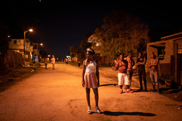

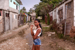


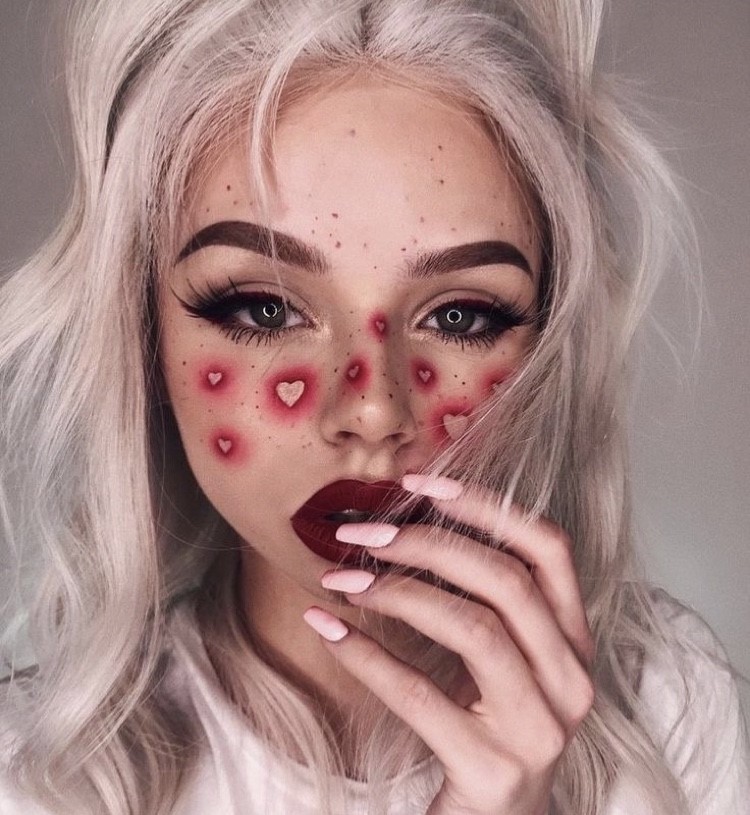
TECHNICAL- This image uses natural light and a warm tone as it was taken during the day. It has a high saturation and is very vibrant, which helps to provide a contrast between the red and white of the seat and the girl’s leg in the centre foreground of the image. There is no motion blur, which shows how it was taken with a fast shutter speed to capture a single moment in time.
VISUAL- The image has a good composition; the main focal point is the foot, which is in the centre of the image to lead the eye directly there. The texture of the image is smooth, shown by the reflection in the back of the seat, which demonstrates how the material of the seat is smooth.
CONTEXTUAL- This image was taken as part of a series of images to demonstrate the significance of quinceaneras, which can be seen through the extravagance of the car (a vintage Chevrolet) and the shoe: glitter, heels, gems. However, the image also shows how Cuba is a relatively poor country, as the ground in the bottom left segment of the image is dirty and scuffed, showing the contrast between this one ceremony and the rest of these Cubans lives.
I want to focus on cultural and geographical identity, and how someone’s origins and nationality can affect their sense of identity. Jersey is a very multicultural island due to the many waves of immigration from all over Europe, which can be seen simply by walking through town, and I want to use this to my advantage to gather a range of different cultural experiences and identities for this project.
Diana Markosian, specifically her work on quinceañeras in Cuba. I love how the colours are bright and vibrant and how the main subject of the photo is in the centre of the image, and how the images are not too posed, but not completely candid either. I am going to use this almost natural but slightly posed method of shooting to capture my subjects to keep their liveliness in the image.
Hassan Hajjaj is a Moroccan photographer who lived much of his life in London, and his work mimics this by blending London’s hip-hop and street-style into Morocco’s vibrancy and intense colours. His images show the vivid personalities of each subject, as well as a sense of strong cultural pride. He uses the pop-art style as well, with each image having a frame of everyday objects around it, which I am going to use in my own images.
I am going to take pictures of my friends wearing the clothes that they would normally wear (modern, vibrant) in typical Jersey locations where the tone is different (rural, different colour palette) to show how people’s backgrounds differ from where they live, and specifically how Jersey as an island has a very multicultural population.
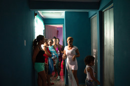
Below are my two final images from tableau vivant shoot. I have chosen these images because they portray the notion of how women stereotypically act in the public eye.
final image one
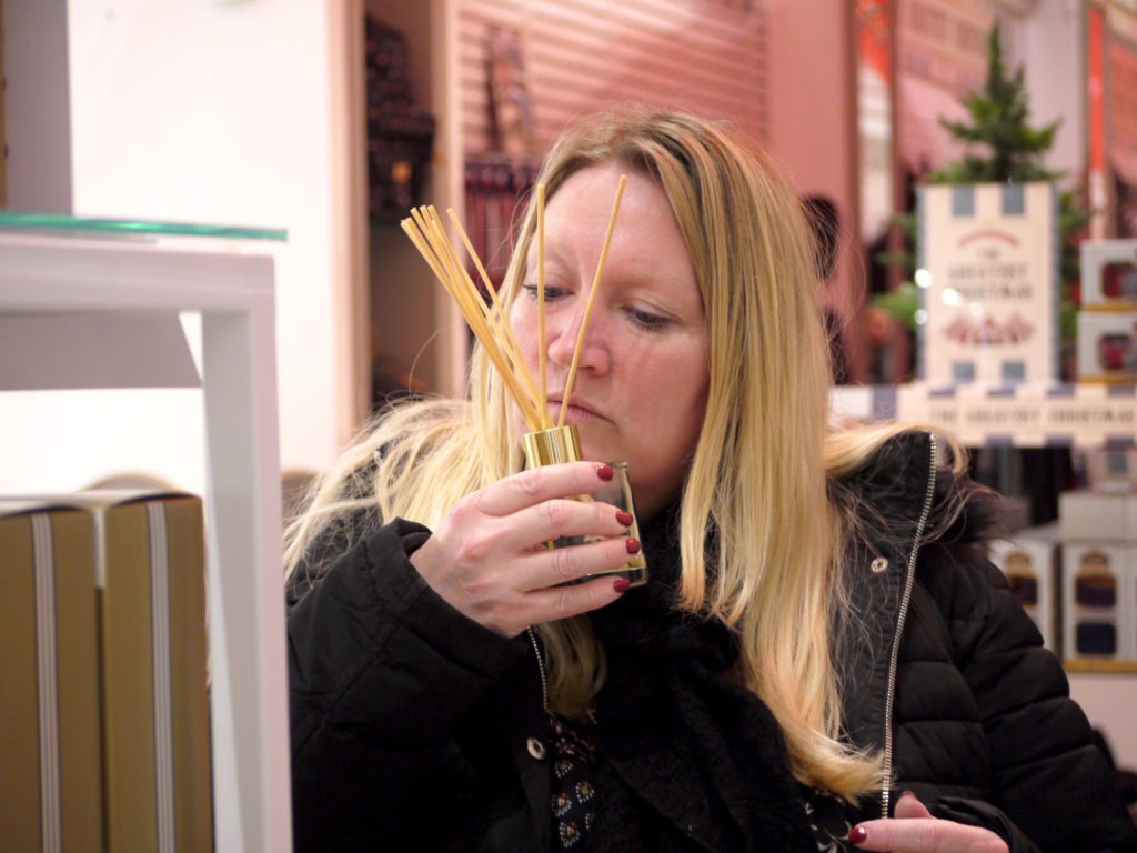
I have chosen this to be one of my final images because it portrays how women shop, by being very thoughtful and making the time an experience. Women are supposed to enjoy shopping and have a good time while out in the shops. I enjoy to candidness of the photograph and how natural it looks for the viewer. I like the warmth of the colours in the image and how they relate to the happy feeling a shopper has while shopping. If i were to take this photograph again, I would try to get more of the body in and position myself in a better place, so that the shelf would not be in the shot, because it does distract from the individual in the photograph.
final image two
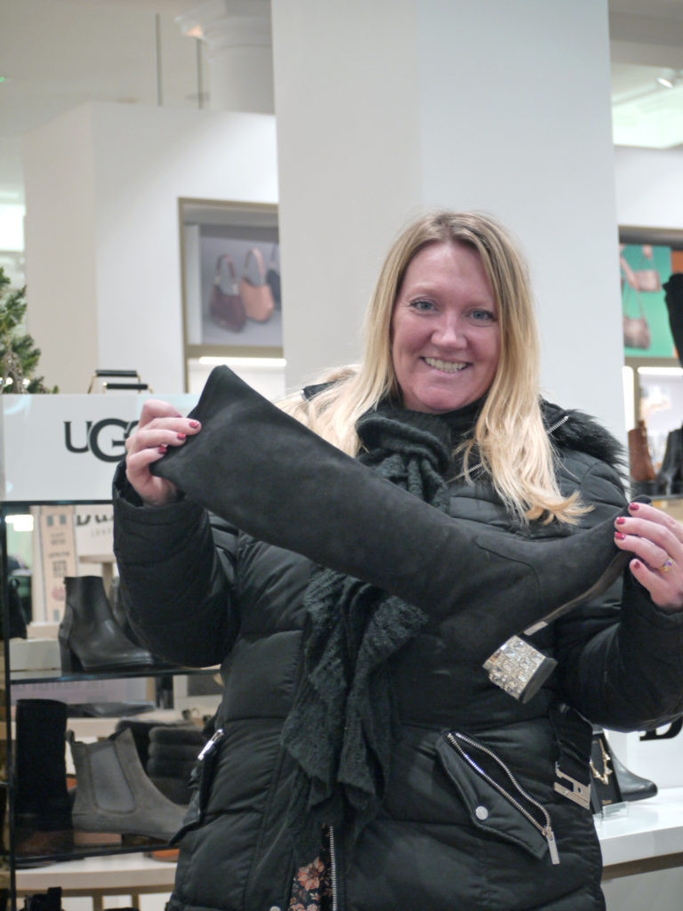
I have chosen this to be one of my final images because I also think it relates to stereotypical things women enjoy, eg shopping, clothes and shoes. In the media women are portrayed to enjoy girly things and this photograph definitely epitomises this notion. I enjoy how staged this image is and it truly shows how the individual feels about the shoe. The background of the image really links to the stereotypical shoe shop, with lots of shoes that are very high end and expensive. If i were to take this photograph again I would try to get more of the background of the shoe shop in the photograph, as i feel it would improve the overall feel of the photograph. I would also try to centre the individual to improve the overall aesthetics of the image.
whole shoot evaluation
Overall I think this shoot had a few strong images that relate to my predetermined idea for the shoot. However I did feel that i truly was passionate about the images I was taking as the tableau vivant project didnt really inspire me to be creative. If i were to do this whole shoot again, I would try not to rush the image taking process and take photographs that really are interesting to me and inspire me to take more of these sorts of images.
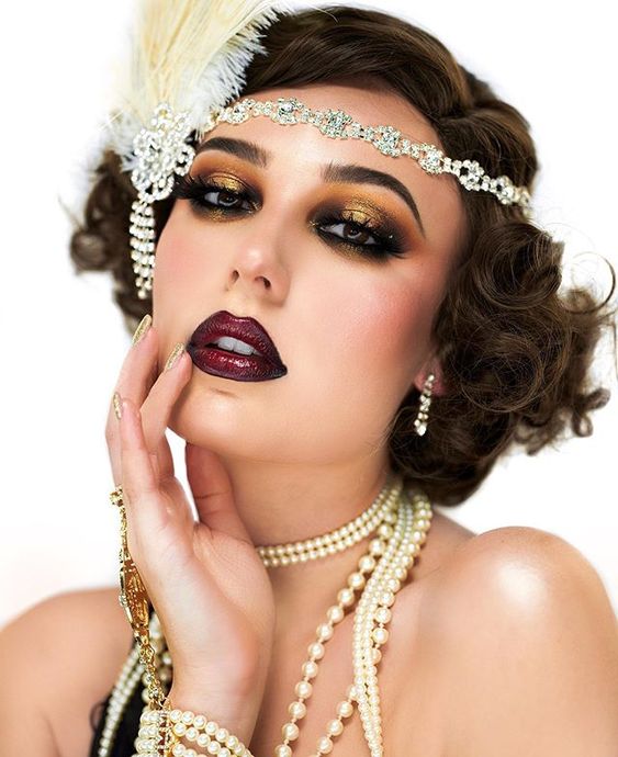
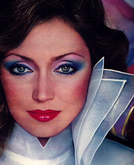
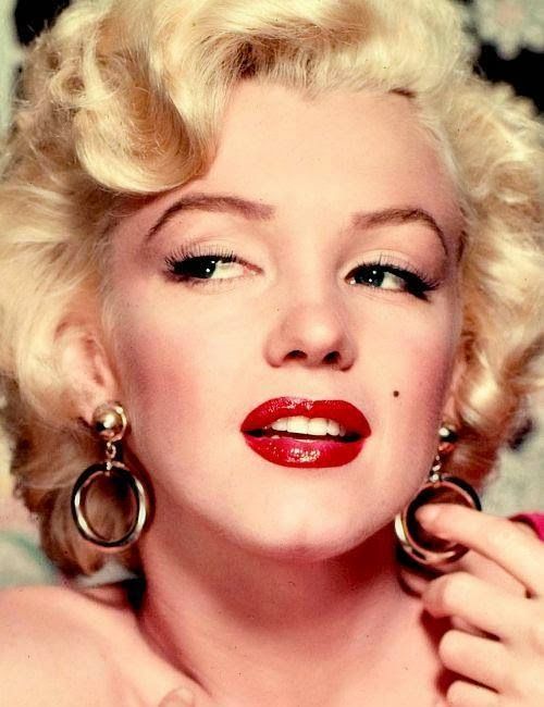
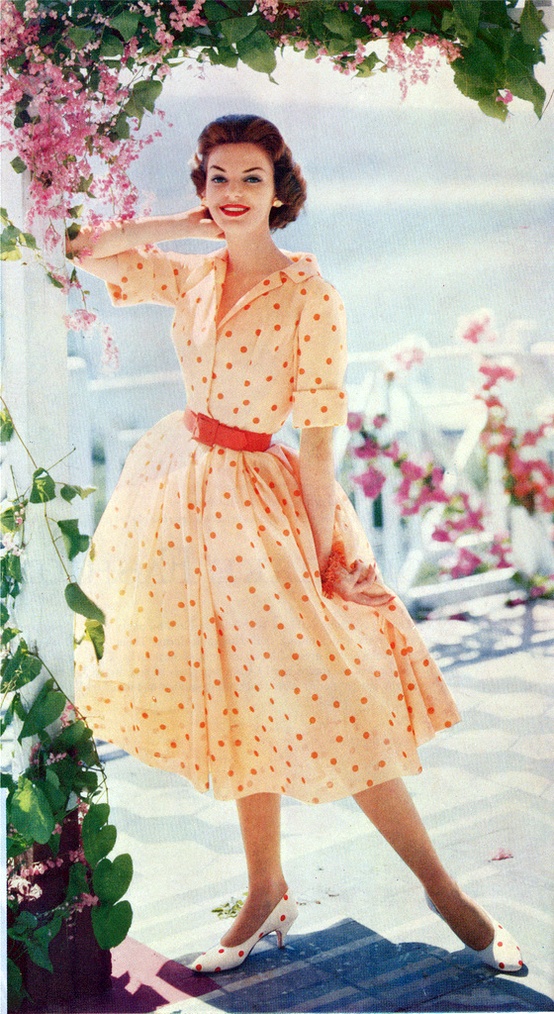
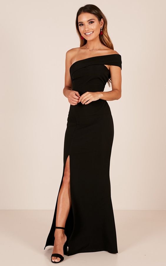
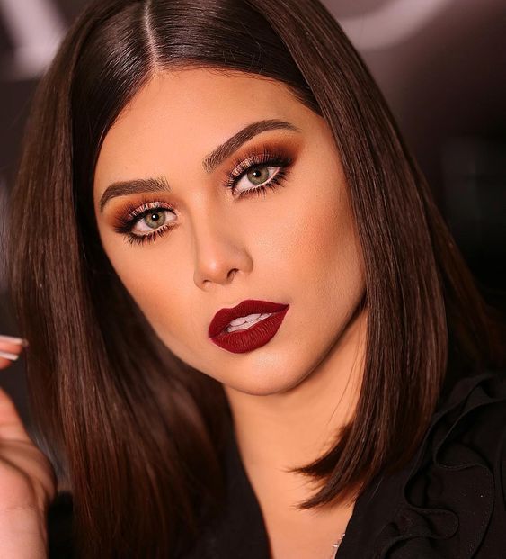
Following the work of Cidney Sherman, im looking at how makeup and your appearance can change peoples perspective on you, from day to day or however you choose. This moodboard collects fashion and styles from past periods such as the 1920s, 1950s, and the 1980s, and then a few current styles among teens which shows further change, including styles like ‘egirls’, ‘softgirls/vsco’ and a general evening or going out look.


These fashions, hairstyles, and makeup looks all come together to create a character of yourself which can be seen as an expression of each persons identity and individuality, which can grow and change over time.