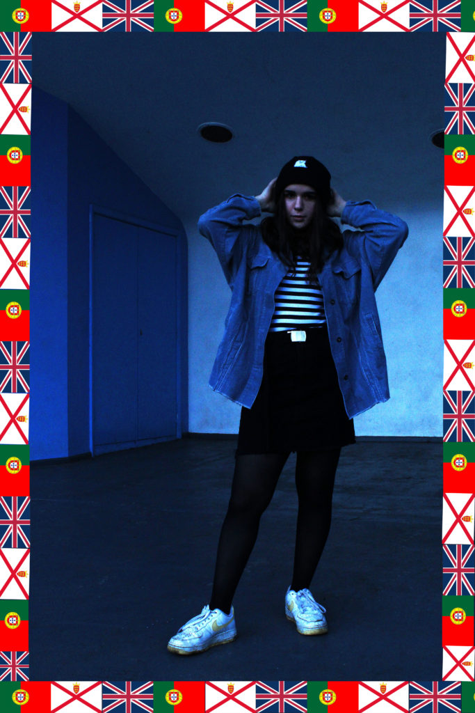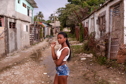
I like the colour scheme of this image and how the background uses the same image as the subject in the foreground’s clothing, which makes this image cohesive and nice to look at. Her position is casual and relaxed yet the way she maintains eye contact directly down the camera lens adds a sense of power to the whole image and present her as being comfortable in her home environment. I believed I executed the flag border well which helps to carry how I am intending to represent cultural identity here,
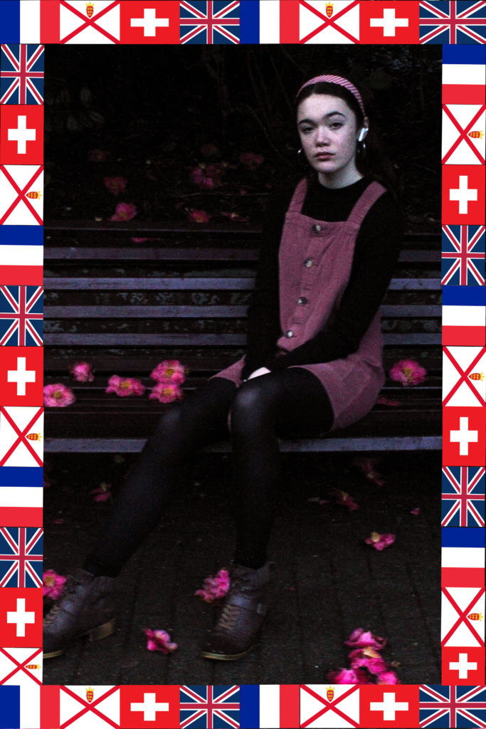
I also like the subject’s (me) position here as the leg extended in the foreground leads the eye deeper into the picture. The colours all work together and the pink colour of the dress and headband is reflected in the flowers scattered on the ground and in the red repeated in the flags in the border. The flags also stick with my ideas for this project, representing how people’s cultural identity is mixed with their ethnicity and where they live currently, and is not a singular and fixed thing.
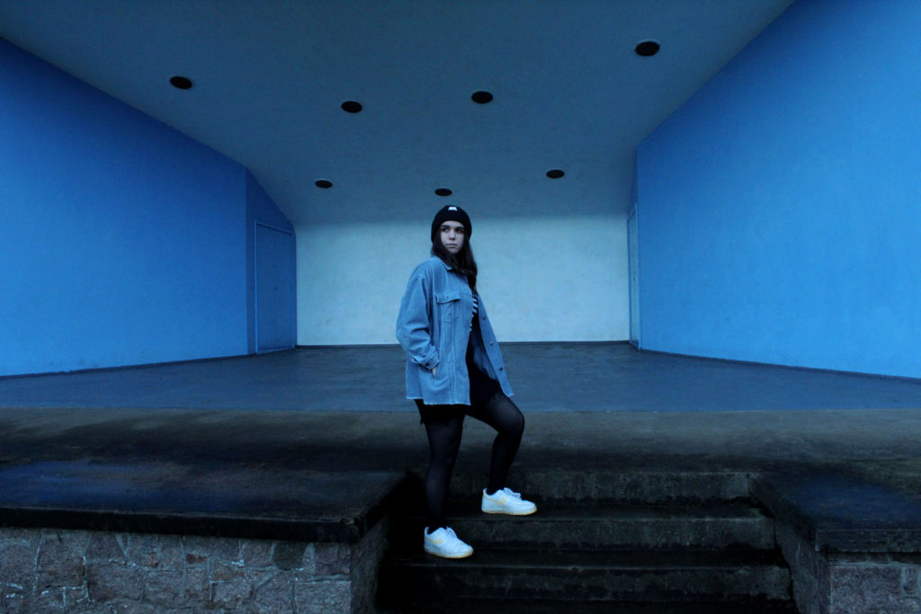
This third image is not following the style of Hassan Hajjaj, but more Diana Markosian (my second case study artist), hence the lack of flag-border. I like it because the colours are all cohesive as well as the composition making the subject in the best possible position, against a white background with two blue accent walls against her either side, reflecting her clothing.
COMPARISON-
Hassan Hajjaj-
Own work-
Diana Markosian-
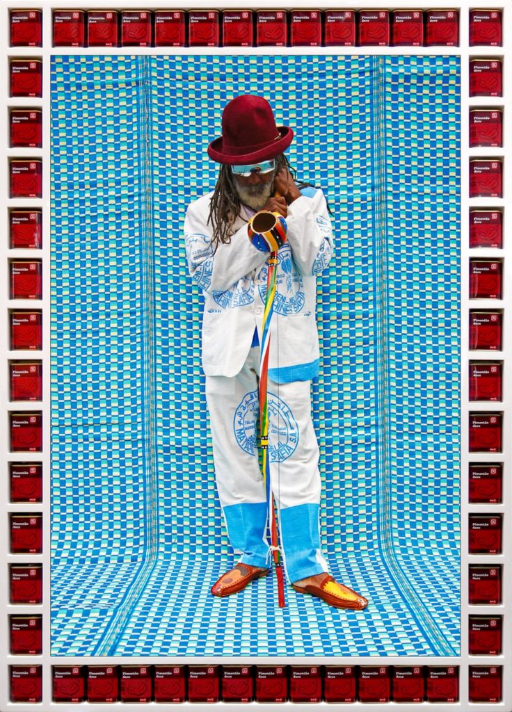
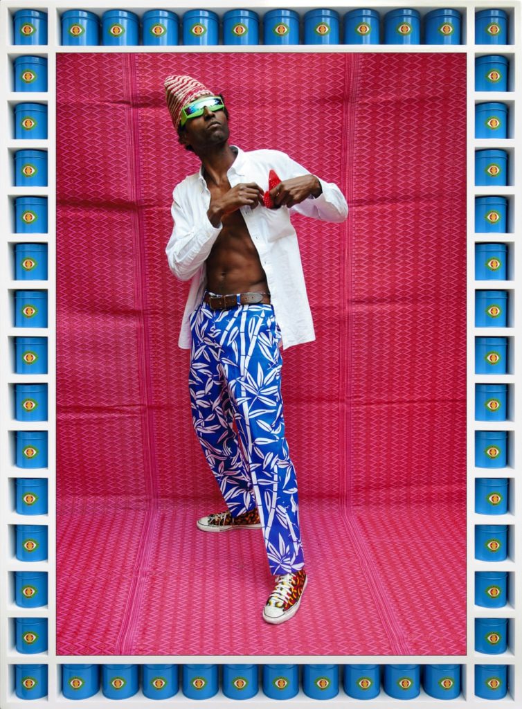
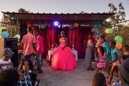
As can be seen above, I was inspired by several elements from these two photographers and combined them together along with my own personal style in order to create the finished products. I employed Hajjaj’s use of a vibrant colour palette throughout each image and using clothing to represent the subject’s personality, as well as Markosian’s style of photographing the subject in their home environment in a natural pose.

