First i went over the image with the spot healing brush for a smoother finish, then made some contrast and brightness alterations 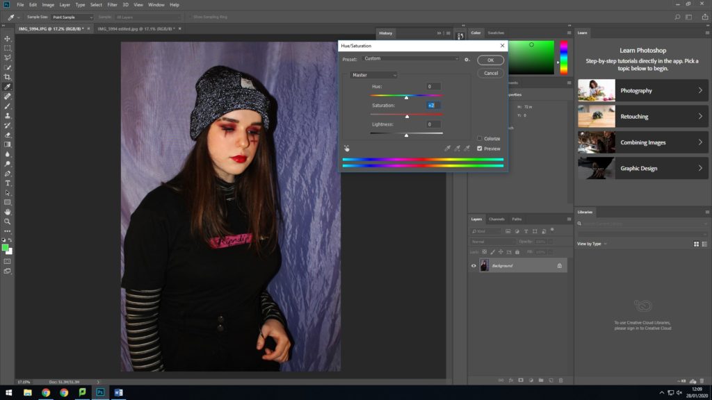
I then increased the saturation to enhance the red colours, with a mix of vibrance and lightness 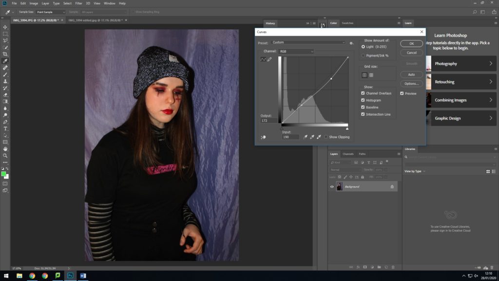
Next i used curves as i think its an easy and effective way to handle the contrast to get the exact look i want 
Lastly i adjusted the shadows and highlights to keep my face bright but with a dark enough effect on specifically my clothing

This is my favourite image as i preferred the portrait layout because it allowed for the details of the outfit to be seen, and as i’m looking off screen you can see the dramatic makeup clearer. The editing of this one also came out well and really highlighted the red and brighter areas of the image; also enhancing how the flash caused my beanie to illuminate

For this look i firstly used concealer to create a shaved eyebrow slit, then used lots of dark red shades to create a dramatic eye look, which i then paired with a thick winged eyeliner. Next i added a slit and upside down cross under my eyes with red and black eye shadows, as often seen in these sort of looks. I finally added a red gloss. My outfit included black cargo trousers with a metal loop, layered roll neck with a skater t shirt and a fluorescent threaded beanie.

With this image i added smoke as i thought it appropriately matched up with this theme and could be associated with the lifestyle often following this sort of dark, grunge appearance. I also liked the way it appeared to swirl around my head as if it were surrounding me.
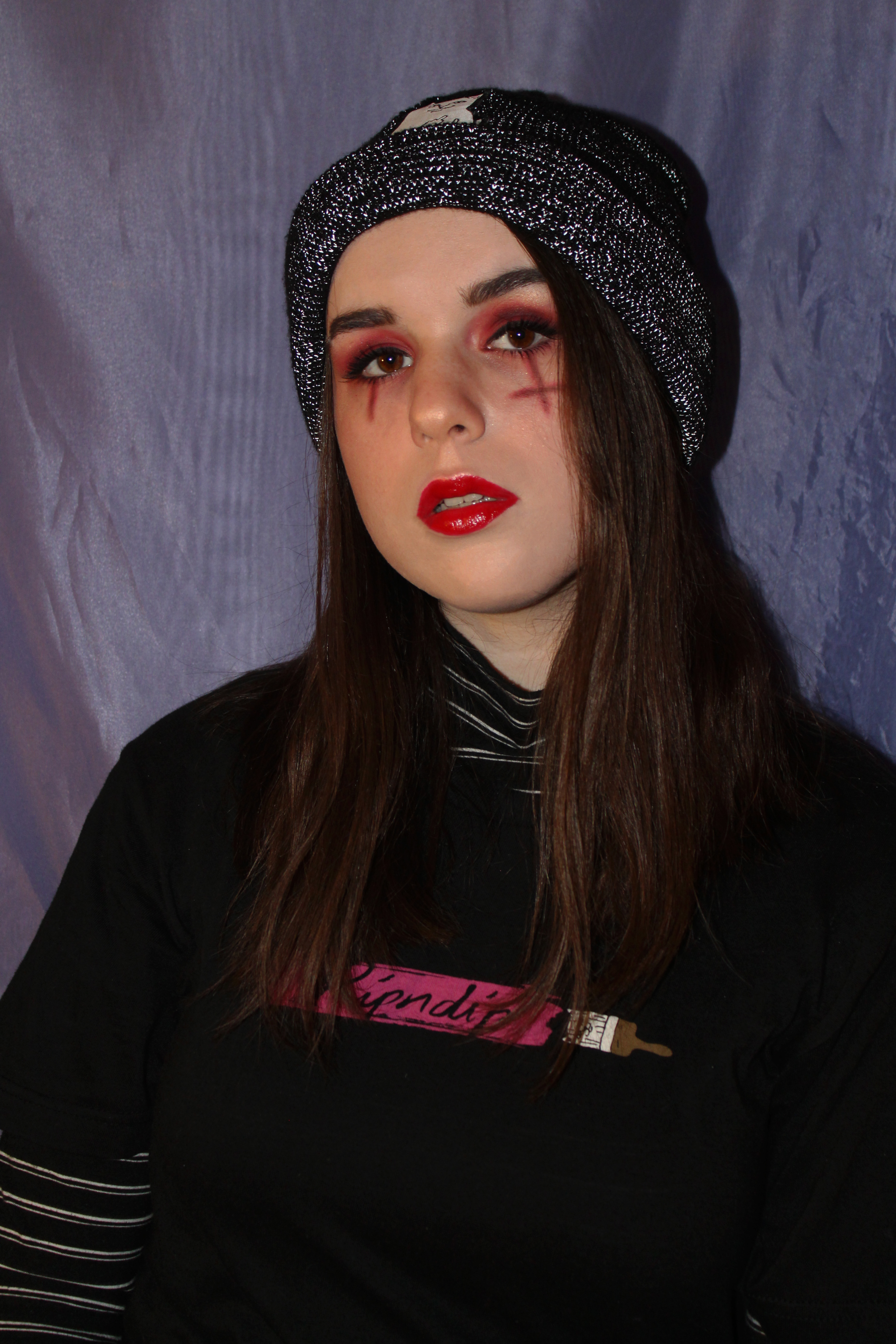
The persona i’m trying to create in this image is based on the current ‘eboy’ or ‘skater’ trend seen on the internet, but also openly displayed in the media currently through people such as Billie Eilish.


