Split Identity
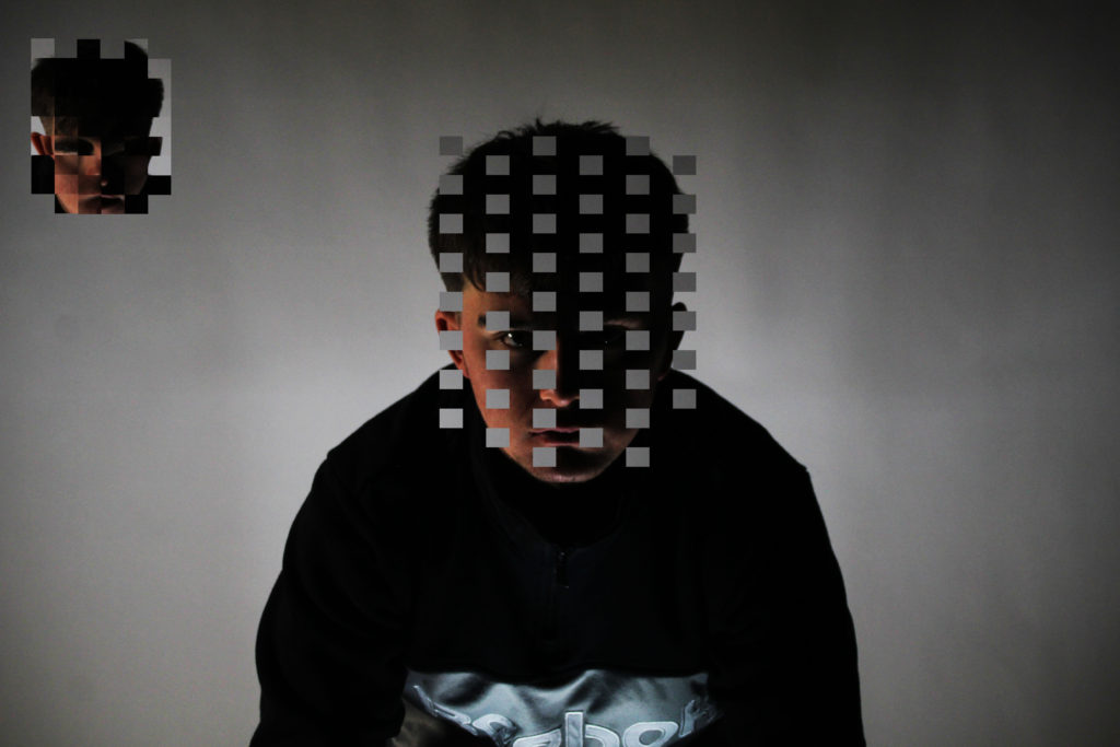
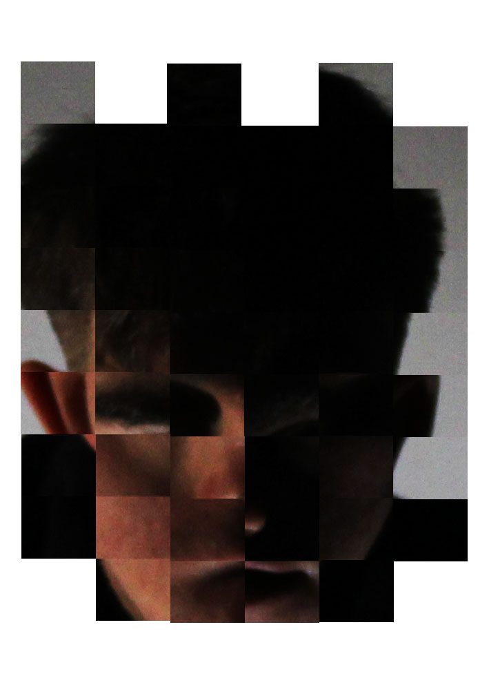
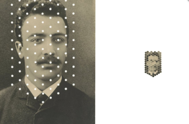
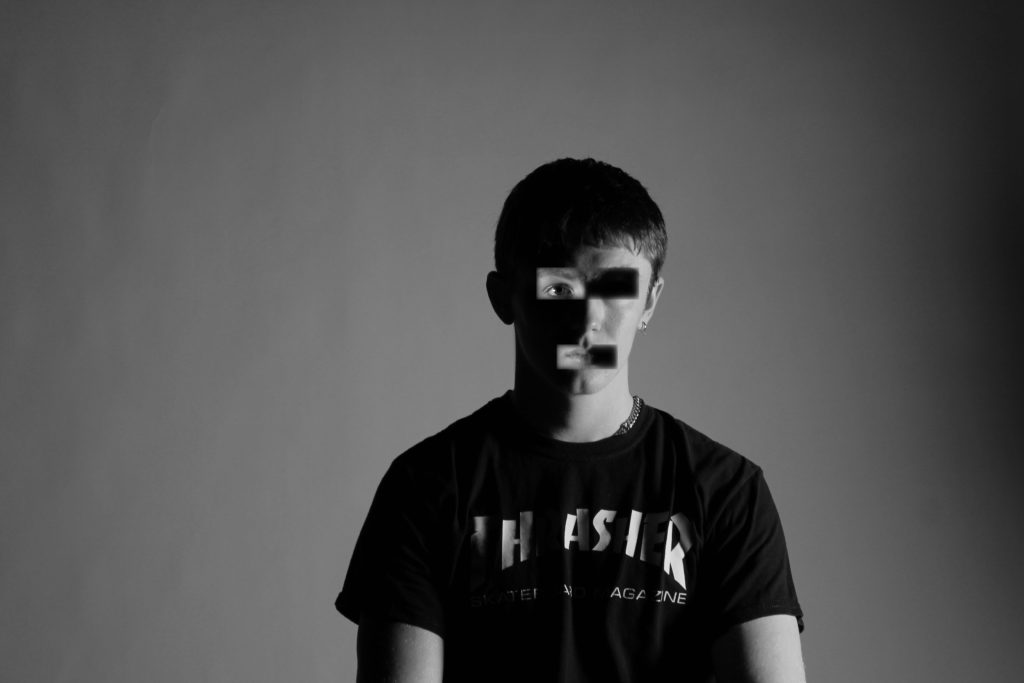
I cut equal squares out of charlies face using grid-lines on Photoshop. I cut enough squares to still have a clear original image and create a new mixed image.
Next time i will use smaller squares to make the original image even clearer and use a lighter image as the light/dark contrast makes the new image difficult to see.
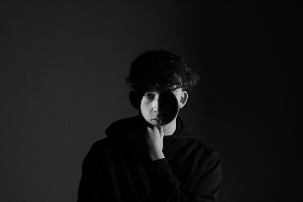
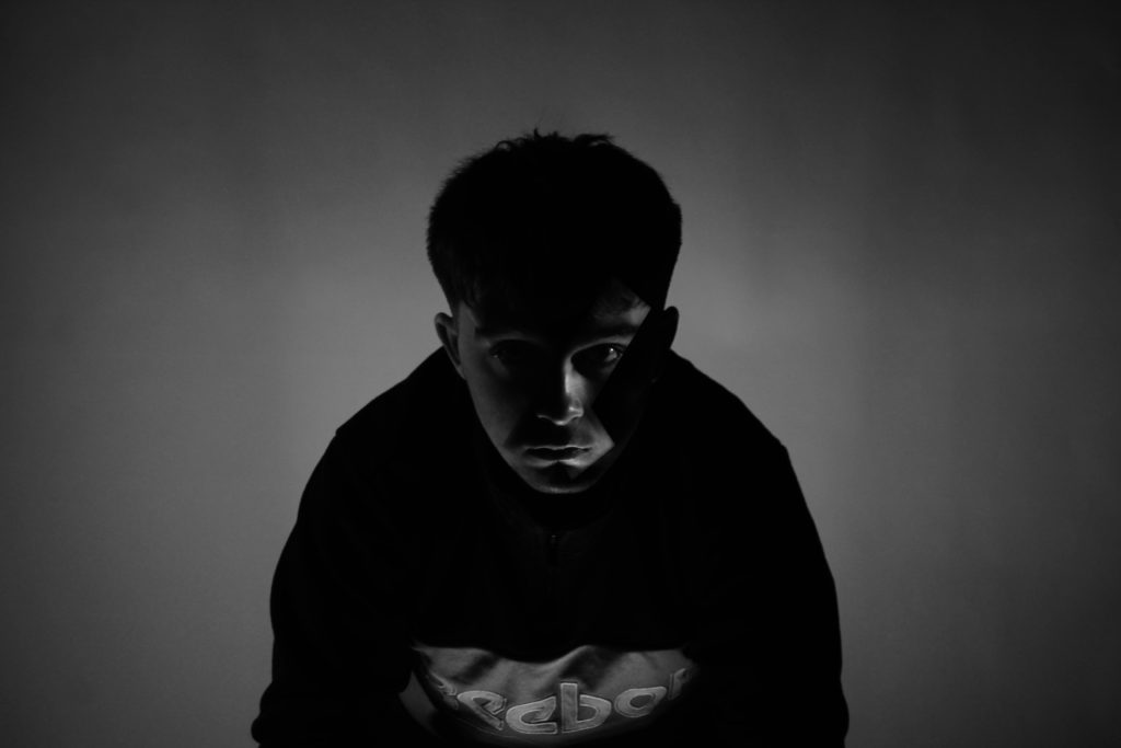
Another style similar to Kensuke Koike is the cutting up and replacing / moving of parts of the face. To put my own twist on this style i have looked at the idea of split identities. I have shown this with the lighter and darker sides of these photos and by cutting and flipping parts of the face so that they are on the wrong side. However, of all my work this is the most personal and the furthest from Koike’s work whilst maintaing his style.
This idea of split identities has a duplicitous meaning. The more obvious one is the idea that everyone has a light and a dark side, positive and negative. However the more hidden meaning is the idea that one person can have multiple personalities, a disorder related with memory loss. I used ordinary people who are not officially diagnosed with this disorder as it can be very hard to tell if someone has it or not especially to them selves. Having two or more personalities ties in with identity as you could theoretically then have two or more identities within the same culture, group or society. I used simple 1 point lighting to get a fine distinction from light and dark.
Loss of Identity
I then decided to use Koike’s loss of identity style by deforming and distorting people’s faces to the point where you can see there was a face there but it looks completely different and surreal. I started with my friend in his room at home to give a sense of his identity within his own house. I included certain decorations from his room that mean a lot to him but wouldn’t mean anything to most other people.
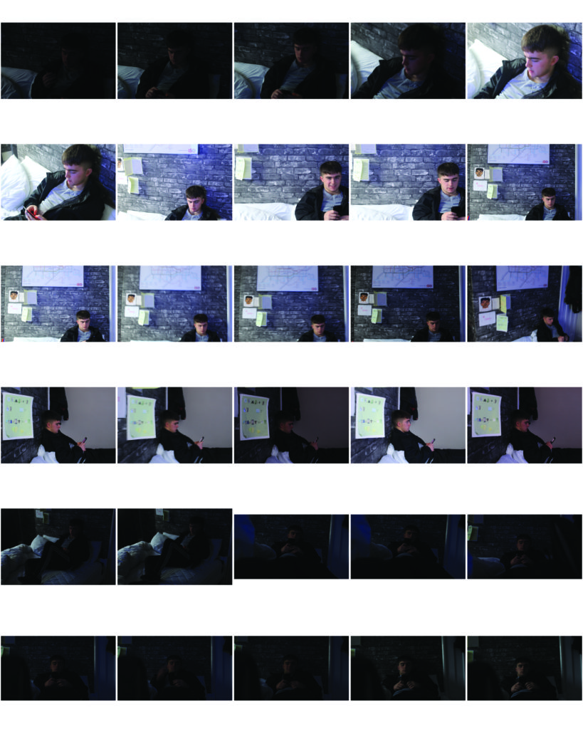
Final Image
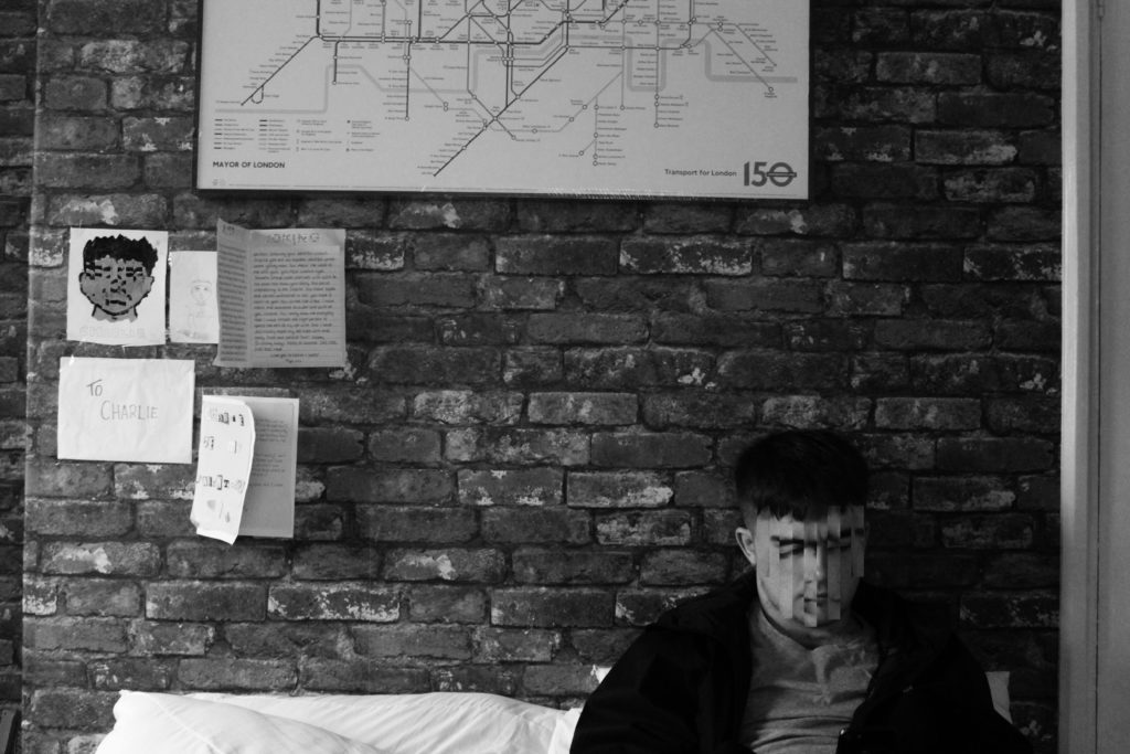
With my final image I cut out equal rectangles from charlies face and flipped them horizontally to distort his face. I also noticed his face now appears as if he could be frowning which in actual fact is not the case. I also used this effect on the drawing in the left of the photo to make a distinct connection between charlie and the drawing. I made sure that the letters on his wall were visible but not readable to emphasise the importance of them but only to him. Personally I like the idea that this image is subjective to the viewer as it could have multiple meanings. He could be a young teenager who is yet to develop his true identity or maybe a young adult who has lost his identity.
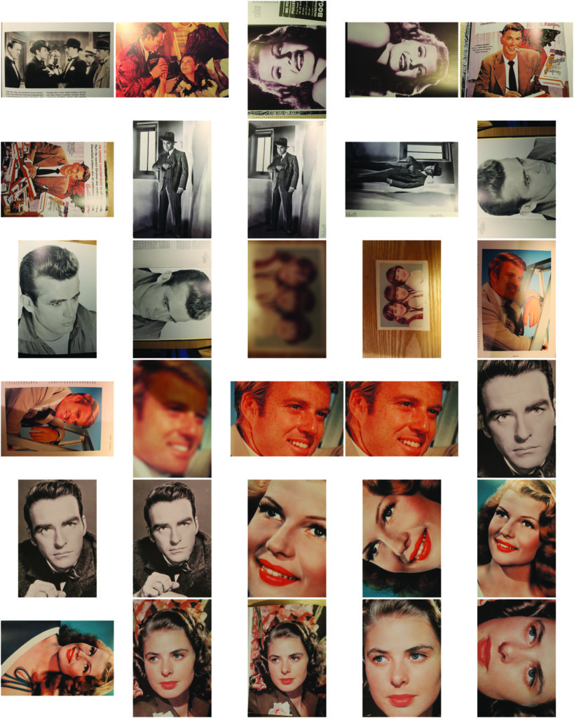
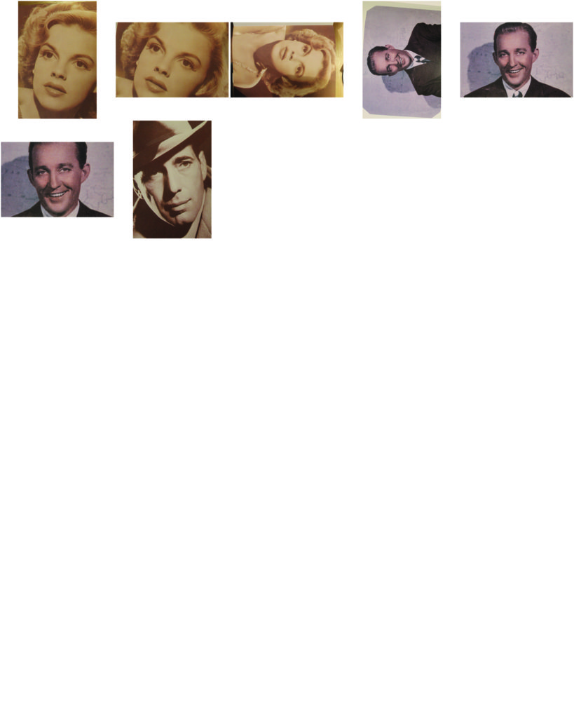
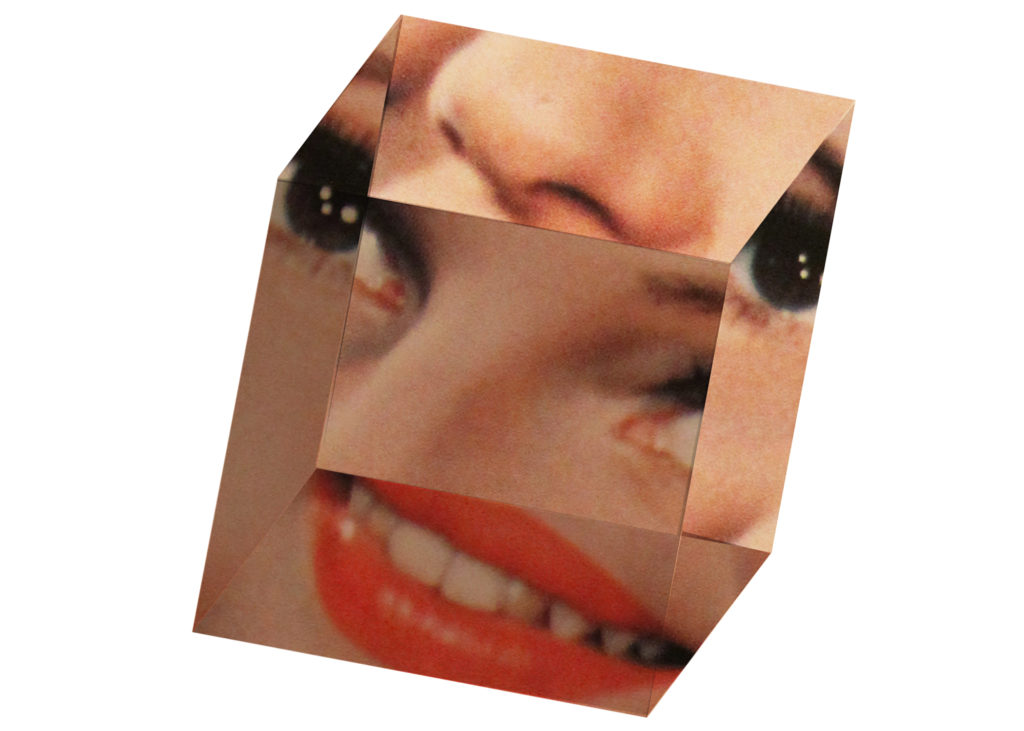
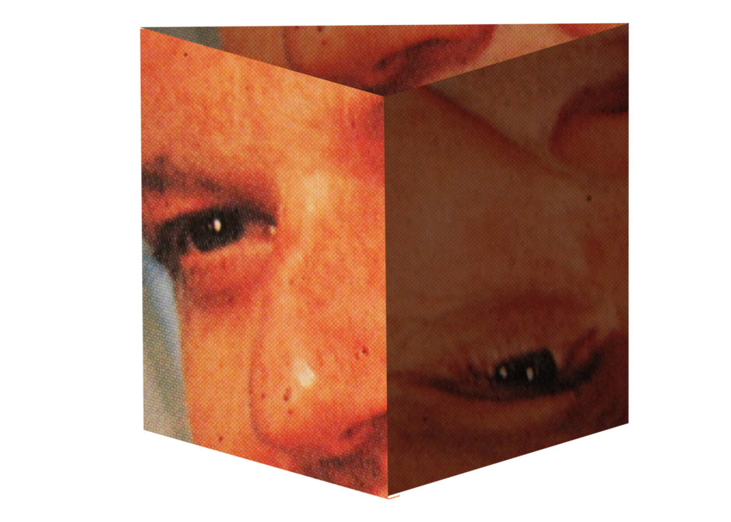
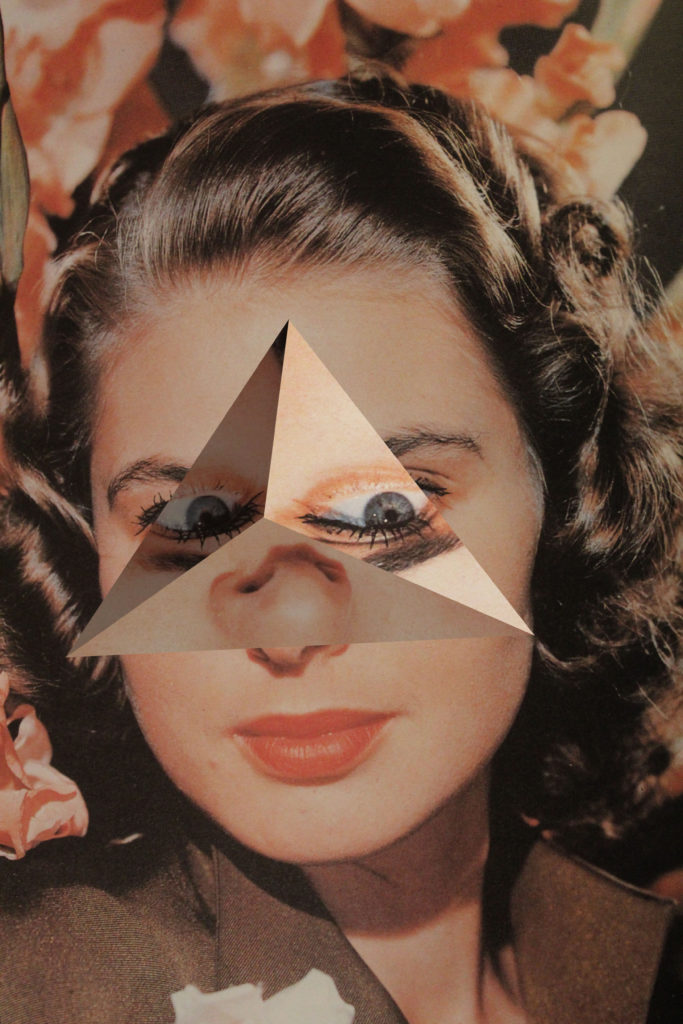
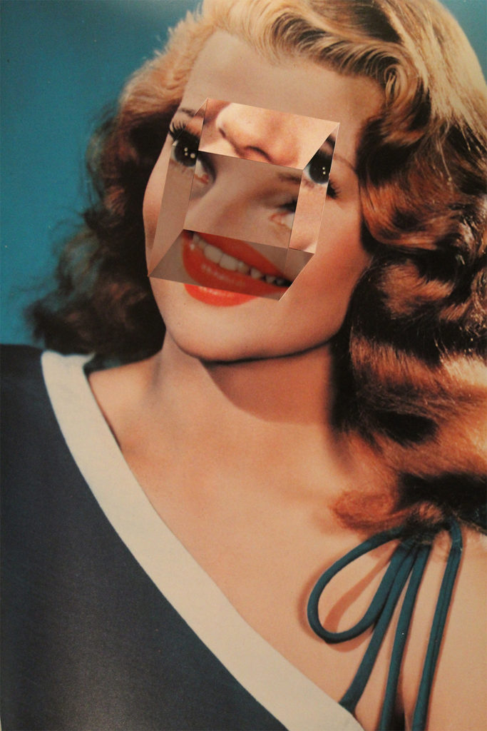
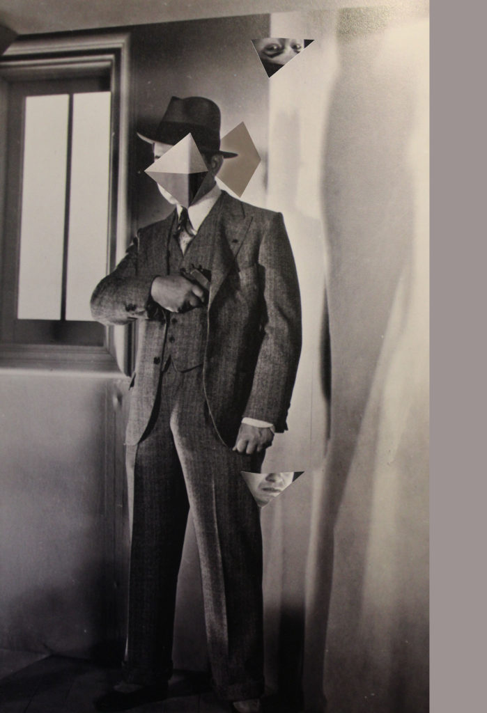
Finally, I used Koike’s found imagery technique to create my final three images. I looked through books and photos in my house and found multiple portraits and headshots to use. I distorted their faces by creating 3 dimensional shapes out of their eyes, mouth’s and noses and then placed these new shapes back over their faces.
3D shapes
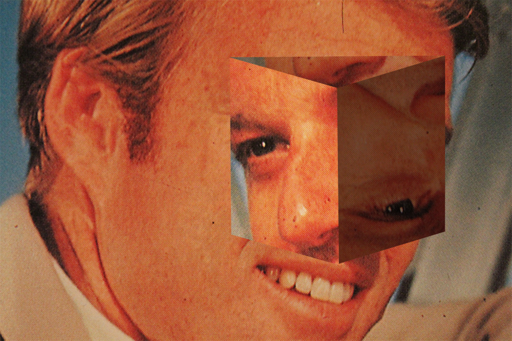
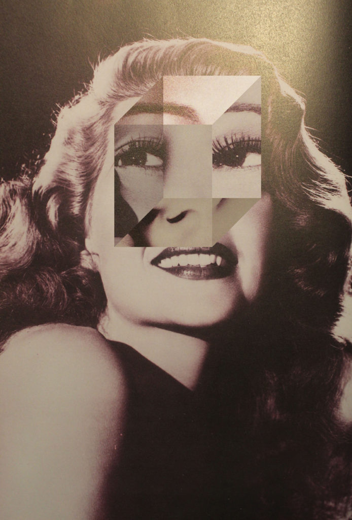
Two images i created that i will not be using are:
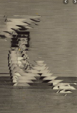
I will not be using the first image as i feel it doesn’t quite depict the meaning of losing your identity as well as my other images did. I do not think the shape i created worked very well and overall he appears happy and i struggled to hide that as i believe a loss of identity is not a happy thing.
I was happy with my second image as i used lights and darks and shadows to create the 3d object. However, once again i do not feel that it truly depicts a sense of loss of identity.
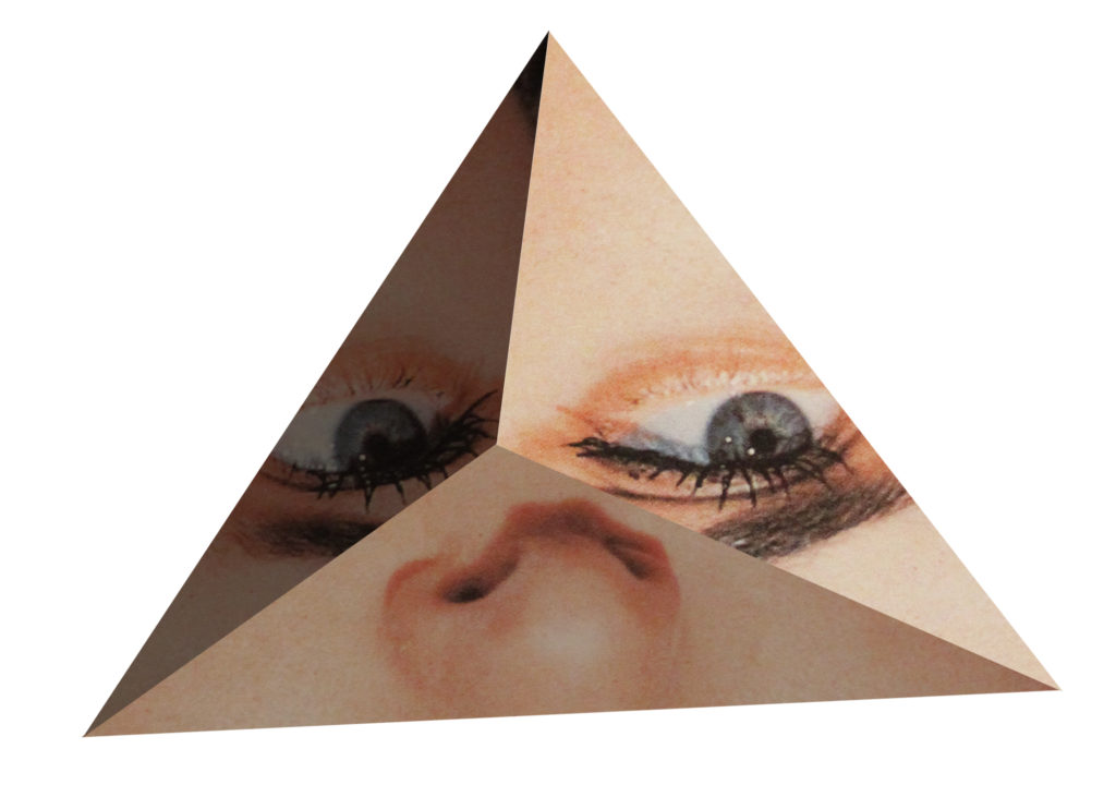
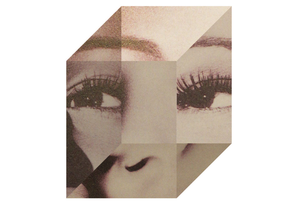
Final Images
These are my final three images i created for the identity project. These images are similar to Koike’s but also have a historical reference to Hannah Hoch. This is because unlike Koike I have re positioned the 3d shapes so that they appear to be matched up with where they were originally from. For example with my triangular shape I have matched the eye line again but flipped the eyes vertically so that at a glance the image appears normal but with a further look you see that it is distorted. This is similar to Hoch’s work using other faces or objects the appear similar to body features. Originally i did not intend for this as I was going to make a separate shoot in the style of Hoch’s work, however i preferred this mashup of both their works. I also chose these images based on the time period they were taken from and the subjects themselves. All of these images are of white women from the 60’s to 80’s. The idea behind the loss of their identity is that the view of women between the time these photos were taken and present day has changed drastically. During the time period these photos were taken it is likely that these women faced strong sexism towards them, effecting their jobs, salaries, politics, culture and much more. Whereas, today women have much more equal rights allowing them to develop an identity true to them selves.

