ABOUT HANS-PETER FELDMANN:
Born on January 17, 1941 in Düsseldorf, Germany, Hans-Peter Feldmann studied painting at the University of Arts and Industrial Design Linz in Austria. By the late 1960s, he started producing artist books he titled Bilde (Picture), which begin to feature in his work for years to come.
Hans-Peter Feldmann is a German conceptual artist who has worked in multiple formats, from drawings and sculptures to artistic books and photographic essays. Feldmann is a figure in the conceptual art movement, collecting, producing, and exhibiting photographs Since the sixties.
HIS WORK INCLUDES:

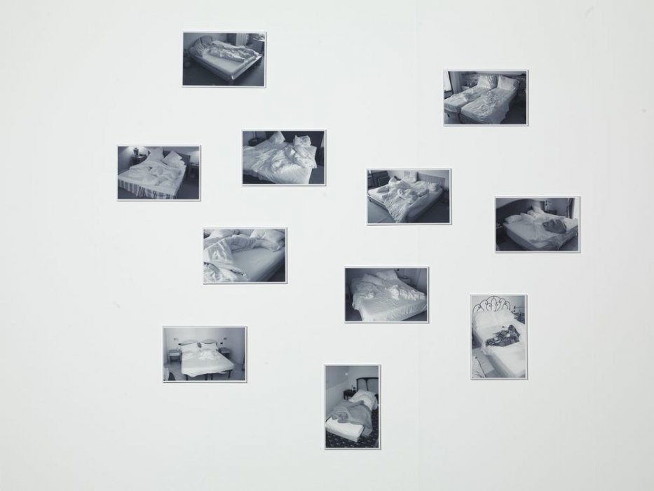
Beds , 1990s

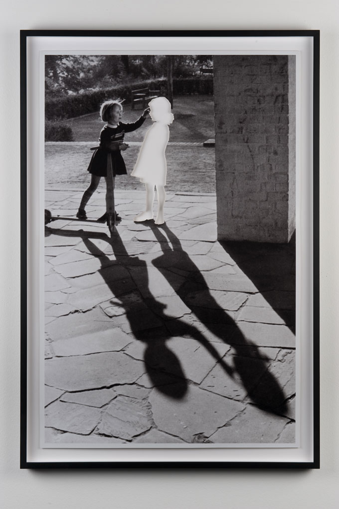
Two girls with shadow 
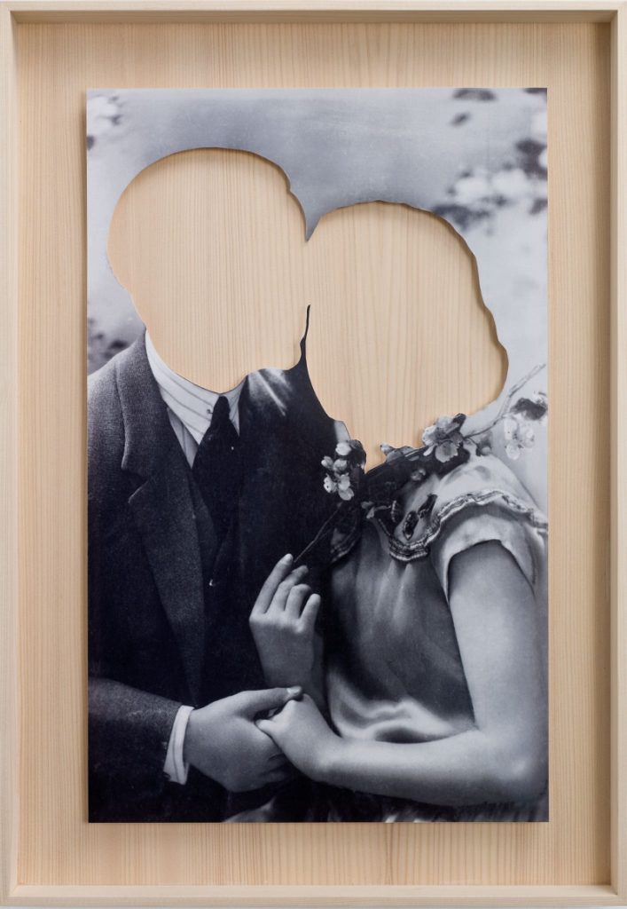
Hans-Peter Feldmann ‘Lovers‘ Cut photograph
The photographer seems to use a very unique style of manipulation when editing. His photos seem to be in black-and-white however faces or even whole bodies can be cut from the image. This may represent a lack of identity as recognizable aspects of one’s identity such as clothing and facial features, are completely cut from the final image leaving a block color background
ANALYSIS OF PIECE:

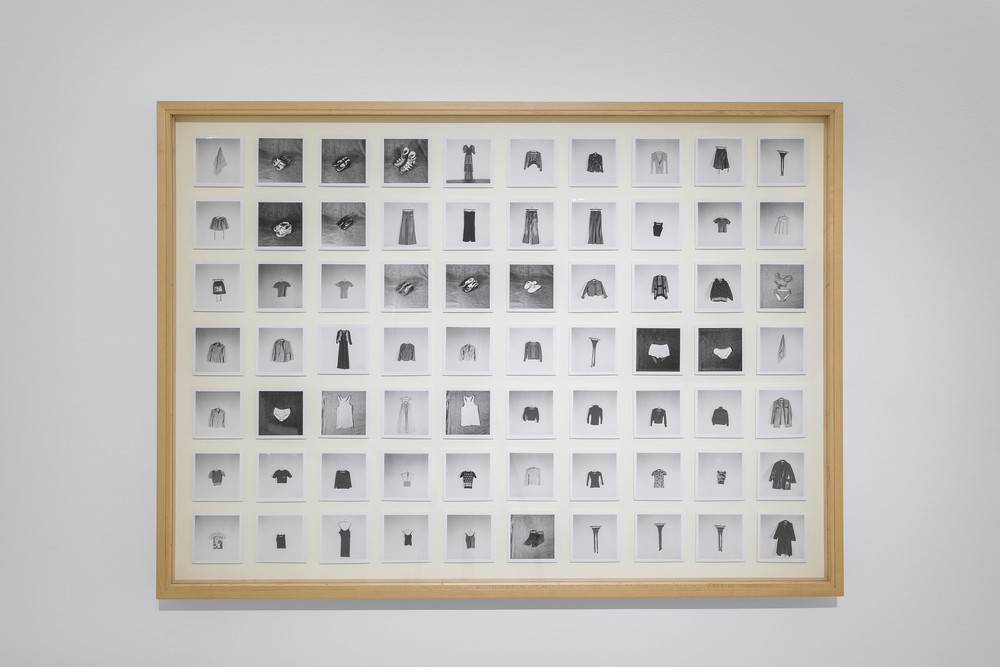
All the Clothes of a Woman 1970 Hans-Peter Feldmann
CRITICAL/ CONTEXTUAL:
One of his most famous works is his 1973 piece “All the Clothes of a Woman“. It features 70 pieces of one woman’s wardrobe, photographed one by one, then arranged into a grid of small black and white photo. The woman who the clothes belong to is veiled and she is rather an enigma (possibly presenting the idea that they could belong to anyone). She is shown only through her clothing, converted into a range of the parts of a woman, that make her, herself. The concept of the work is to use objects to represent somebody, create g the idea that one’s belongings, such as clothing, can be an aspect in one’s identity.
VISUAL:
The image shows a range of small black and white photos, arranged of 70 garments worn by a woman. The colour of the images are clearly in black-and-white with A clear use of tone being used between light backgrounds and dark clothing, and dark backgrounds with light clothing. There seems to be a little form in each individual photograph as they are usually placed on flat backgrounds allowing for no shadows, however with each piece of clothing texture can be seen through the shadows and highlights. The image shows a high level of repetition as the images are placed in a patern, in a grid like composition, leaving a very aesthetically pleasing final image. Line is also clearly shown as there are equal gaps (spaces of white background) between each photograph.
The composition is very aesthetically pleasing as the 70 images are arranged in an organized fashion with 10 photos going down in columns and seven rows going across. There seems to be balance in the colour range of photographs as they are randomly placed (not all black backgrounds are grouped, vice verse with white backgrounds).
TECHNICAL:
The type of lighting used to photograph each individual piece of clothing seems to be either daylight or studio. I think this because the light used is very soft (as daylight/ natural light can be) however the background seems to show it was taken in the studio setting (shown by backdrops of photographs). The lighting doesn’t seem to be too intense, however images with a black background seem to look slightly over exposed. There seems to be a large depth of field because the backdrop is also in focus. The shutter speed seems to be average as the images look, overall, well exposed. The ISO seems to be around 200 due to images being taken inside, and there doesn’t seem to be any colour cast in the images as the white shades do not seem to be either warm or cold (average white- no blue/ yellow tones).
