Below are all the images I chose to edit from my shoot for tableau vivant. I edited them on Lightroom as it allows for more in-depth editing.
image one
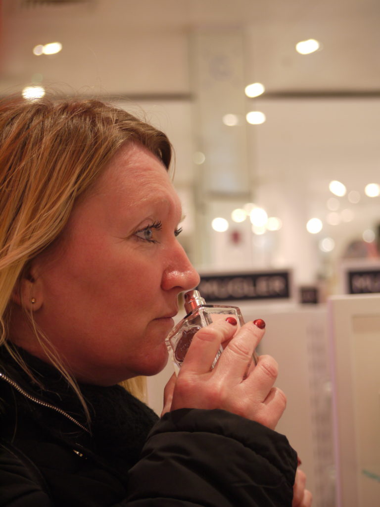
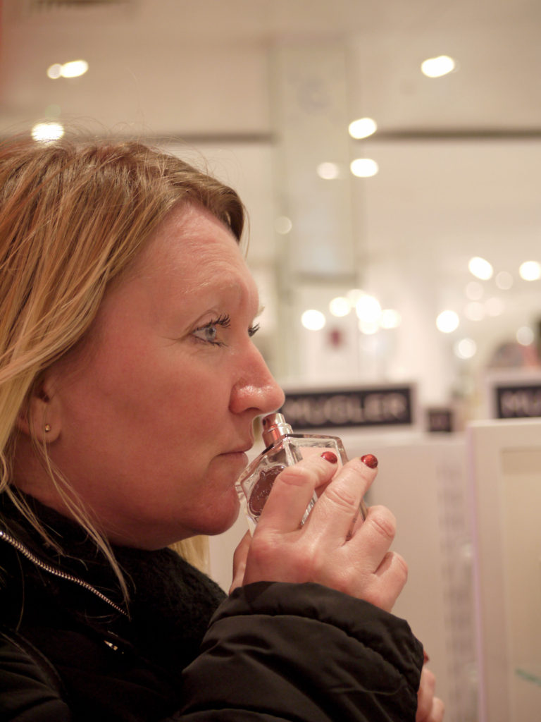
For this image, I decreased the saturation as the face is quite red and looks unnatural. I also altered the levels of the image to create darker darks and lighter lights, this allowed for the background to become a lot lighter and brighter, attracting the viewer more to the face.
image two
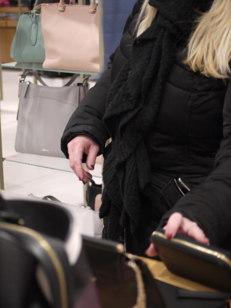
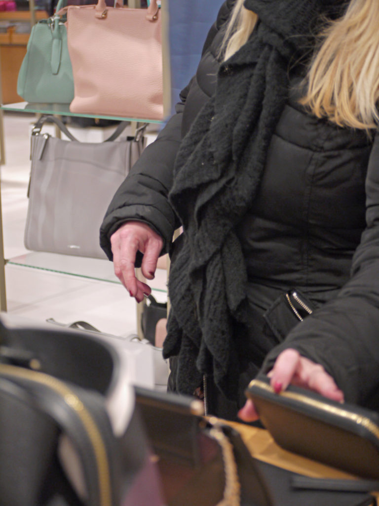
For this image, there was very little editing need to make it strong and interesting. All I did was alter the levels to make it more balanced and easy on the eye.
image three
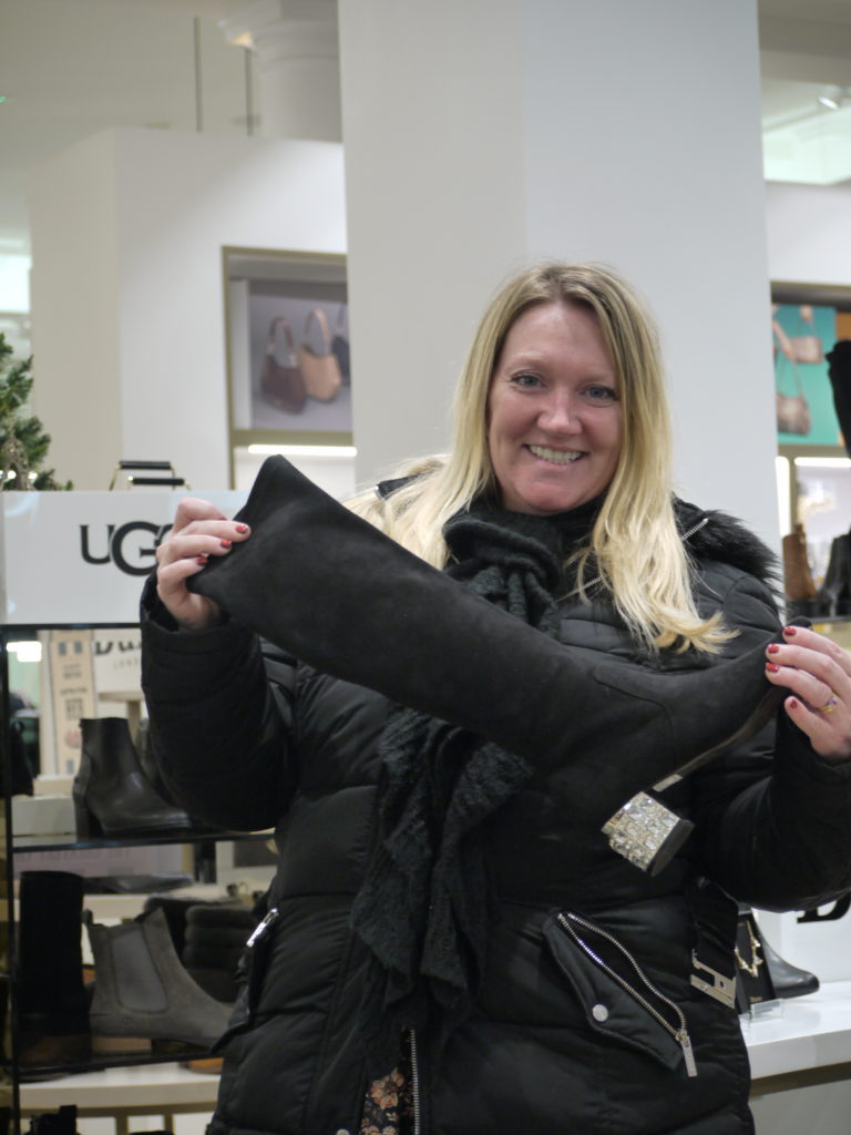
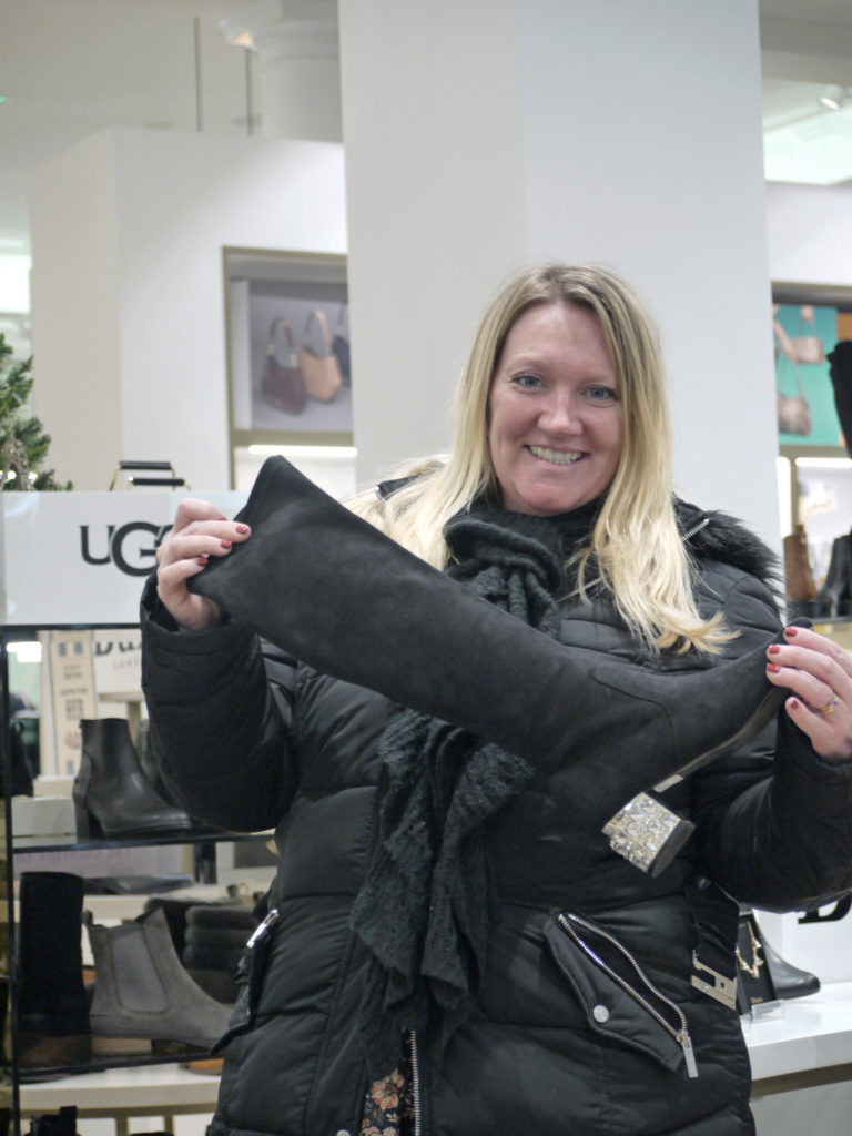
For this image, I again decreased the saturation to make sure the face looked less red and more natural. I also altered the highlights and shadows, meaning the background became brighter.
image four
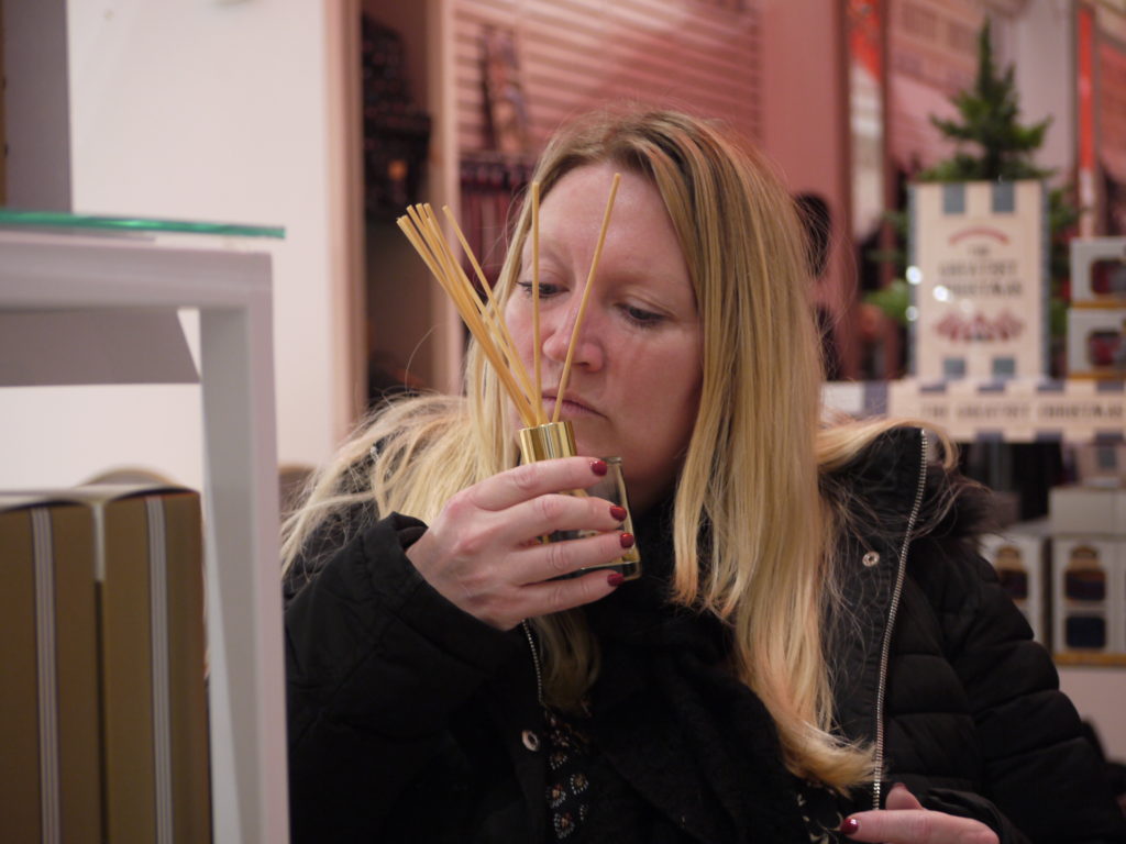
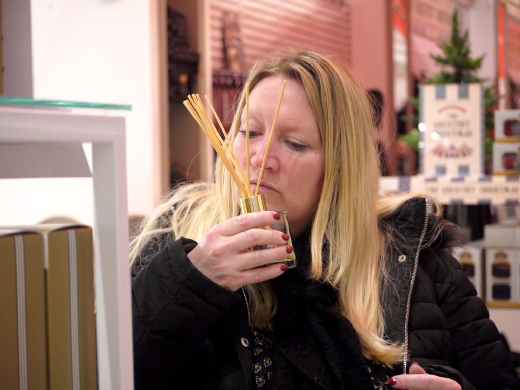
For this image, I decided to yet again decrease the saturation to make sure the face looked less red and more natural. I also increase the highlights to make sure the features on the face were more illuminated and easier to see.
