


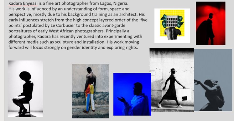


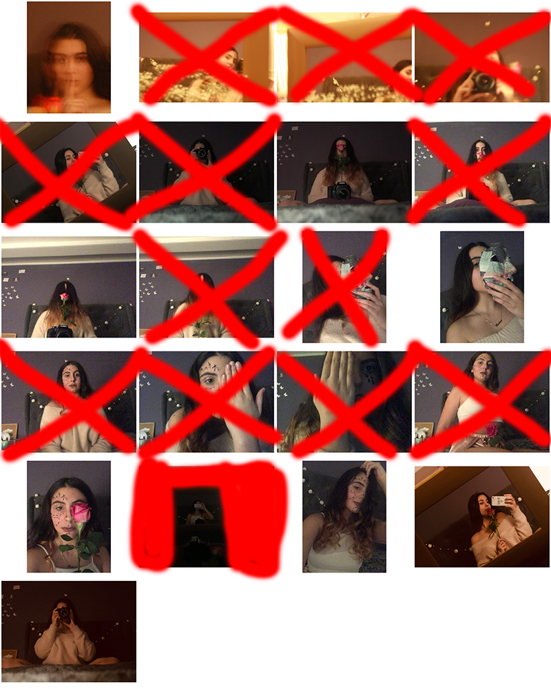
Below are my final portraiture images. I have chosen this images due to them being interesting and showing my skill, which i have developed during the portraiture project.
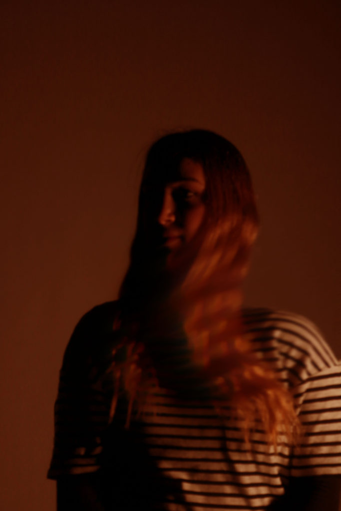
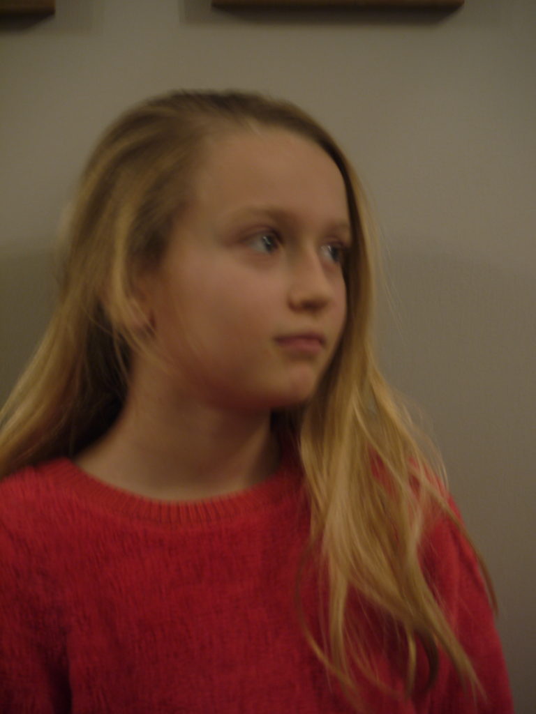
final image one
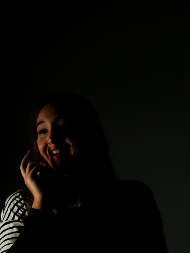
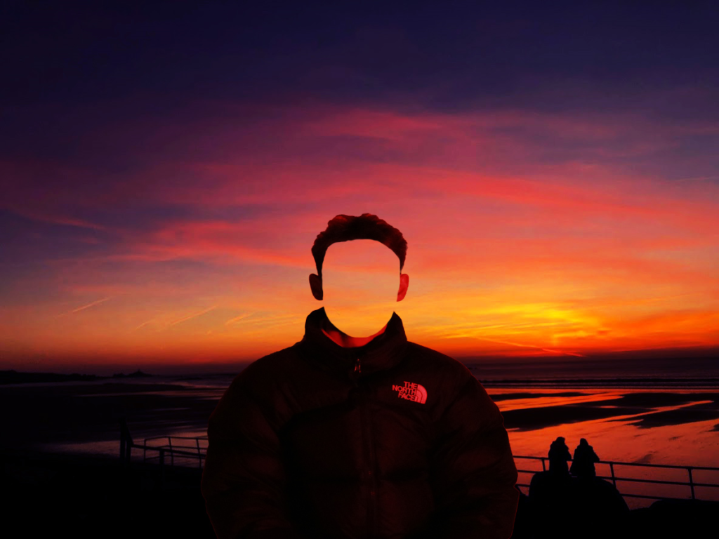
I have chosen this image for one of my finals as it is a strong image in terms of composition and aesthetics, as there is negative space that draws more attention to the individual. The pose the individual did is also effective, as it allows for shadows to be cast on the face and a more interesting pose than a simple straight on shot. The contrast between the light and dark is also very powerful too. This element was captured by placing a continuous light on individuals face, which only illuminated parts of it, to create strong shadows and bright lights. If I were to take this photograph again, I would try to position the light in a way that would mean that the backdrop was not illuminated as much, as it is a little distracting. Having a darker backdrop would also allow there to be a stronger negative space to draw more eyes towards the individuals face.
final image two
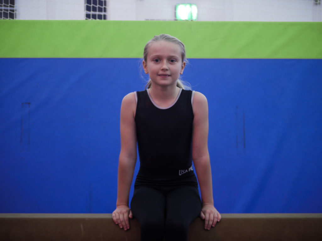
I have chosen this image to be one of my final images because i enjoy the simplicity of the image, which makes it look like a strong image. The horizontal lines along the image add to the overall look of the image and aesthetics. If i were to take this photograph again I would try to get more of the legs in the image to gain more of a full body shot, as i think it would be more interesting for the viewer. This is because at the moment the photograph cuts off at a strange place and looks odd.
final image three
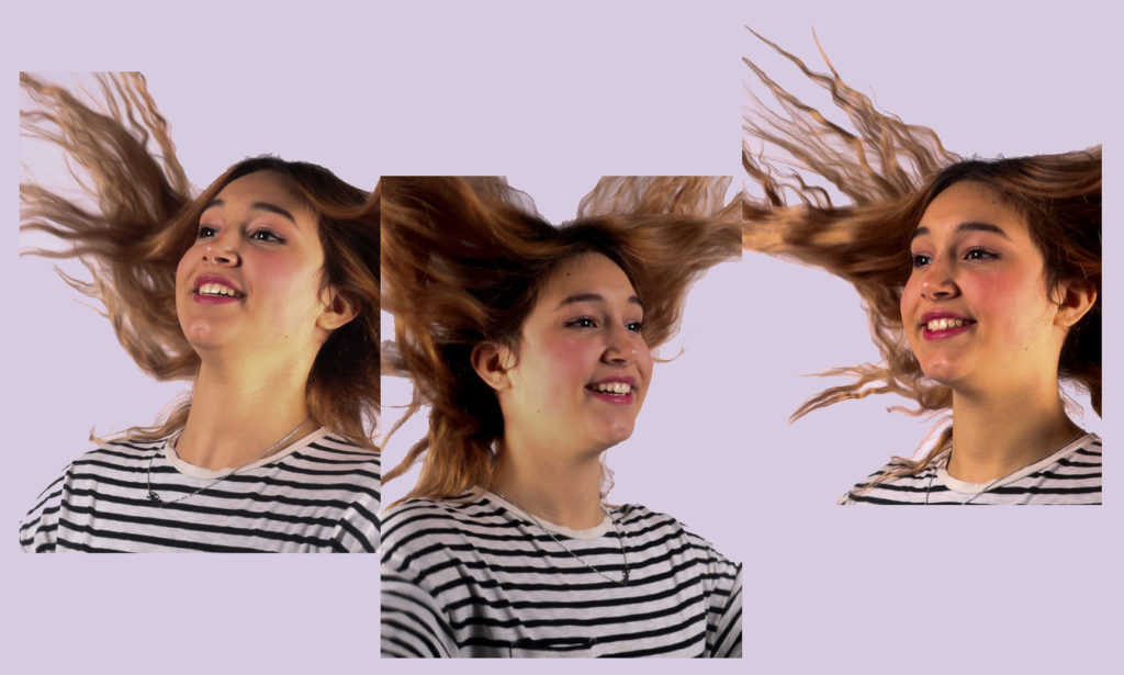
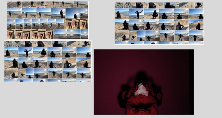
I have chosen this image to be one of my finals as it is creative and includes more than one image doing the same activity. By lining up the photographs in a way to look like they are joined in a way, came to me on the spot, as I liked these images but found they were very similar. However by placing them into Photoshop and playing around with the position of the images, this idea was created. The background colour adds to the creativeness of the image and how fun it is, even though it is only a light colour. I made it a pastel colour so it would not distract from the images. If I were to create this image again, I would try to take the photographs from straight on, so that the hair could flow and connect in a more realistic way.
final image four

This is one of my final images because it clearly shows how peoples identities are comprised of different elements that make the person who they are. By placing them on one sheet makes the images look more effective than displaying them separately. This is because on their own, the images have no story or link to anything. If i were to make this piece again i would try to get more images as the more images the more i could portray my point of how identity is made up of lots of elements.
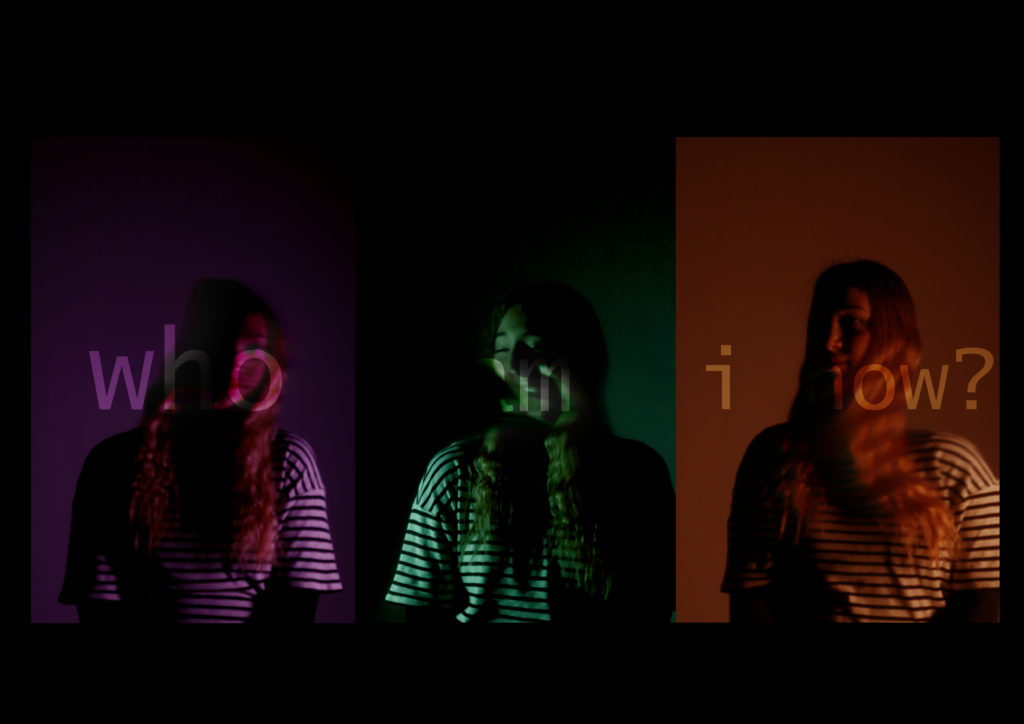
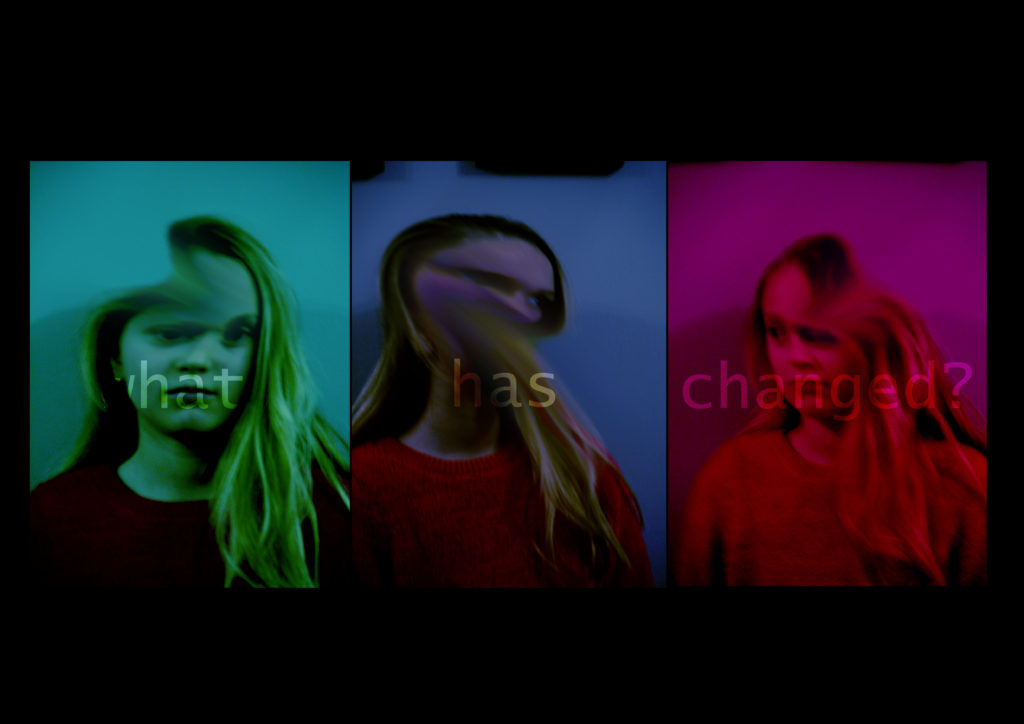
final image seven

This is one of my final images because it captures and shows the theme of lack of identity. The colours work together well and are eyecatching too, which will draw in viewers. The captions are subtle but do still hold the same power and share the same message as to if there were bold. If they were bold it would distract from the images below them, which would mean that the aestethics and overall look of the image would be lost. The image shows how people change and will lose their identity throughout this process, and this can clearly be seen where the faces have been smudged and the images arent in focus. If i were to make this image again I would try to blur the faces more, as then it would show how the people have been changed. I could also progressively blur the faces to show a change the images, to portray the notion of identity changes.
virtual gallery

Below are my final images for the identity project. I have chosen these images because they clearly show the theme of identity and lack of identity, they are eyecatcing and create a question for the viewer of how their identity is made up.
final image one
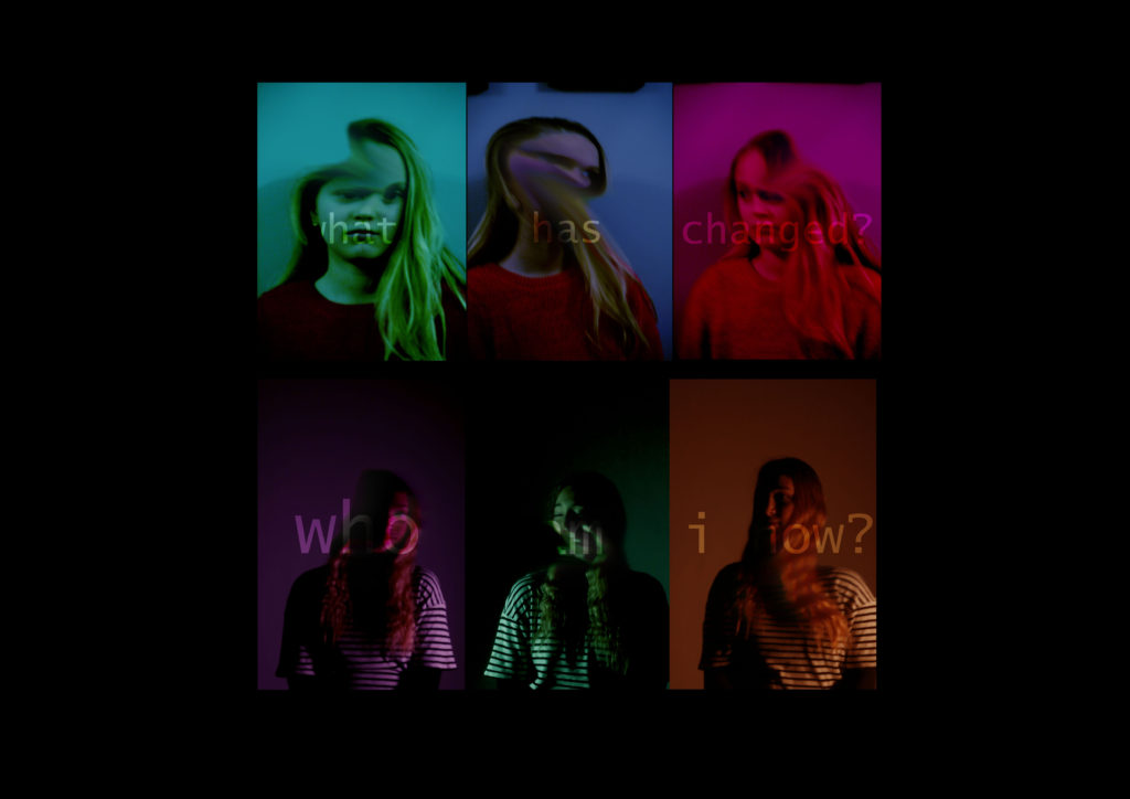
This is one of my final images because it captures and shows the theme of lack of identity. The colours work together well and are eyecatching too, which will draw in viewers. The captions are subtle but do still hold the same power and share the same message as to if there were bold. If they were bold it would distract from the images below them, which would mean that the aestethics and overall look of the image would be lost. The image shows how people change and will lose their identity throughout this process, and this can clearly be seen where the faces have been smudged and the images arent in focus. If i were to make this image again I would try to blur the faces more, as then it would show how the people have been changed. I could also progressively blur the faces to show a change the images, to portray the notion of identity changes.
final image two

This is one of my final images because it clearly shows how peoples identities are comprised of different elements that make the person who they are. By placing them on one sheet makes the images look more effective than displaying them separately. This is because on their own, the images have no story or link to anything. If i were to make this piece again i would try to get more images as the more images the more i could portray my point of how identity is made up of lots of elements.
project evaluation
Overall I think the identity project went well, I learnt how to create interesting and eyecatching pieces that hold a message for the viewer to find and interpret for themselves. I consolidated my skills with taking portrait photographs, although they still arent perfect. If i were to do this project again I would try to link to formal identity, passports, and how they do not show our true identity. This is because I think it would look effective. I would also try to take more photographs because then I would have more images to work with and choose from.
Below are the edits i have made relating to lack of identity.
edit one


For this edit, I changed the levels to make the image to be overall alot darker. I then changed the colour levels, so that the highlights would be a particual colour. I then took the smudge tool and smudged a bit of the face, so that it looked abnormal. I then placed all the images on one layer on Photoshop and added a caption over the top, reading “who am i now?”. I made the writing blend into the background by changing the layer type to soft light.
edit two


For this edit I changed the contrast and levels of the image to make the photograph darker and have brighter areas too, so that colour i add later will be more vibrant. I then changed the colour levels to a particular colour. I then used the smudge tool to smudge an area on the photograph. I then placed all the images on a separate sheet on Photoshop and added a caption “what has changed?”. I made the captions blend into the images by changing the layer type to soft light.
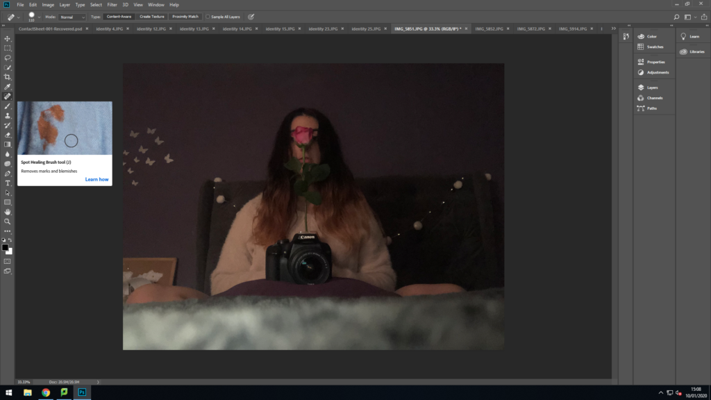
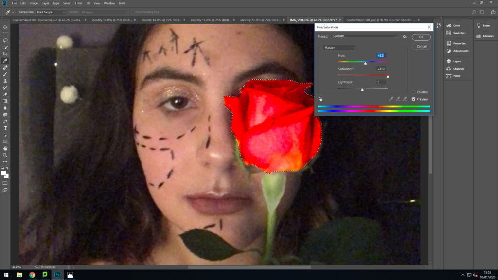
“My life is part humor, part roses, part thorns.”
I used a rose because a rose is pretty but also has thorns which in a way represents my personality, through all the good there is also the thorns and bad parts.
The colours of roses all mens different things for example:


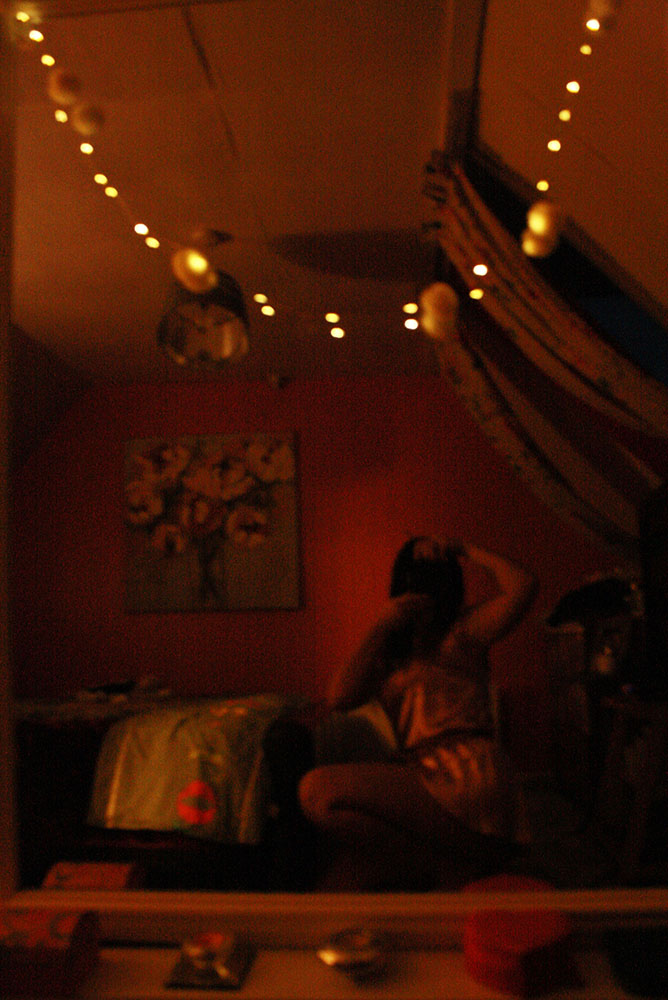
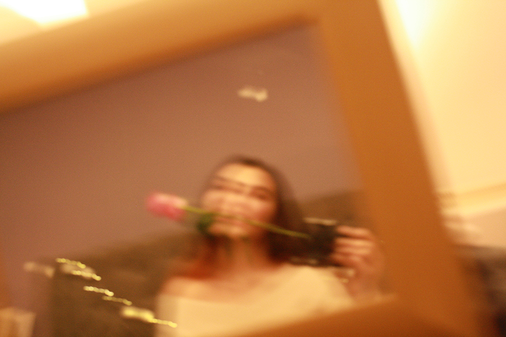
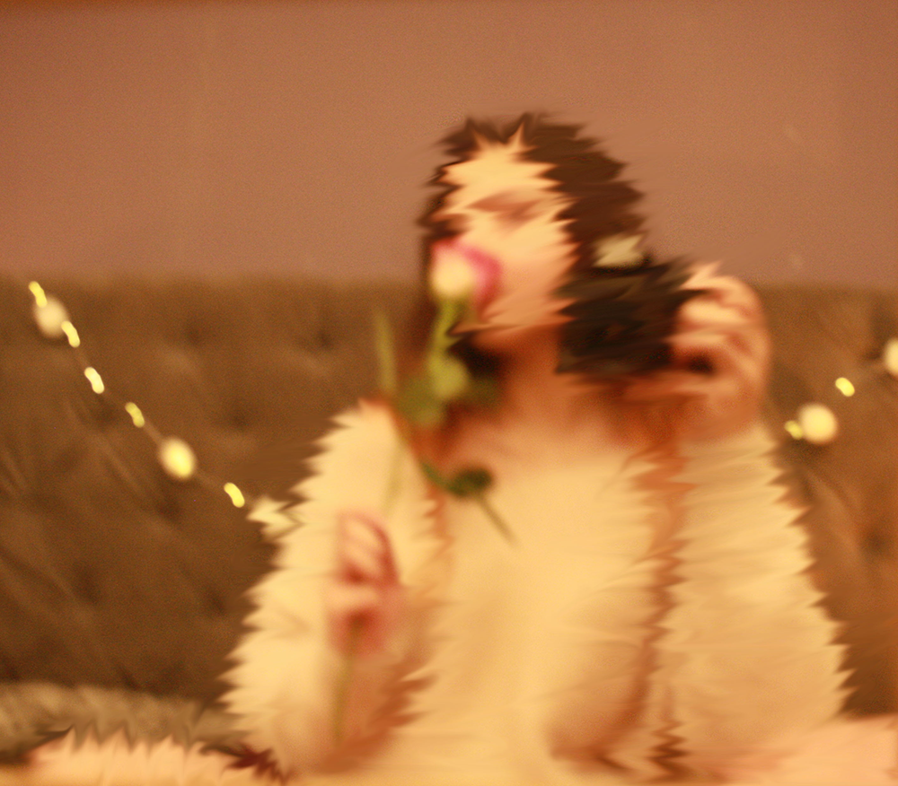


I decided to do this small photo shoot in my bedroom with a mirror because I liked the atmosphere of the environment, also a persons room shows a lot about their personality because its years of accumulated information, which is often hard to fake, and can be a more reliable indicator of what someone is like.
We leave clues about ourselves in a space, either deliberately or unconsciously. The first sets of clues are, identity claims. These are deliberate statements we make to others about who we are. Maybe you use your space to tell someone about your culture, or the politics you believe in.
My room beyond the furniture, which isn’t really coordinated, it’s filled, and decorated, with fairy lights, candles and plenty of prints, colourful artwork, photos and cushions. It’s probably quite cluttered but it always feels cosy to me. As an artist, I’m a big day dreamer – so good lighting and comfy surroundings help me relax, while being surrounded by colour and images can inspire me creatively.

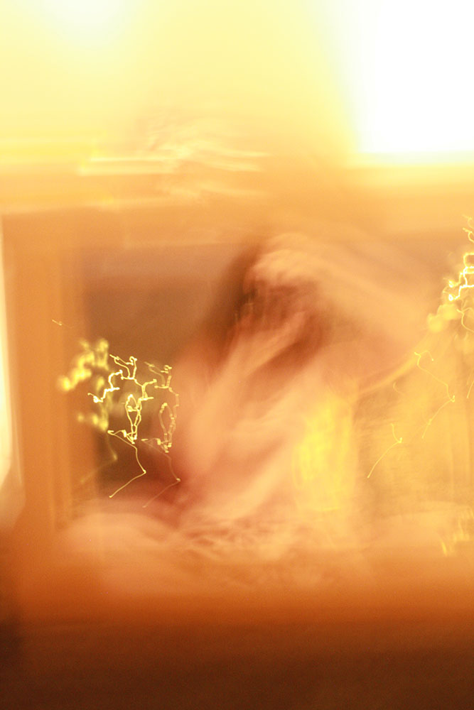
I actually decided that most of these were not really to my satisfaction and decided I was not going to use many of them.
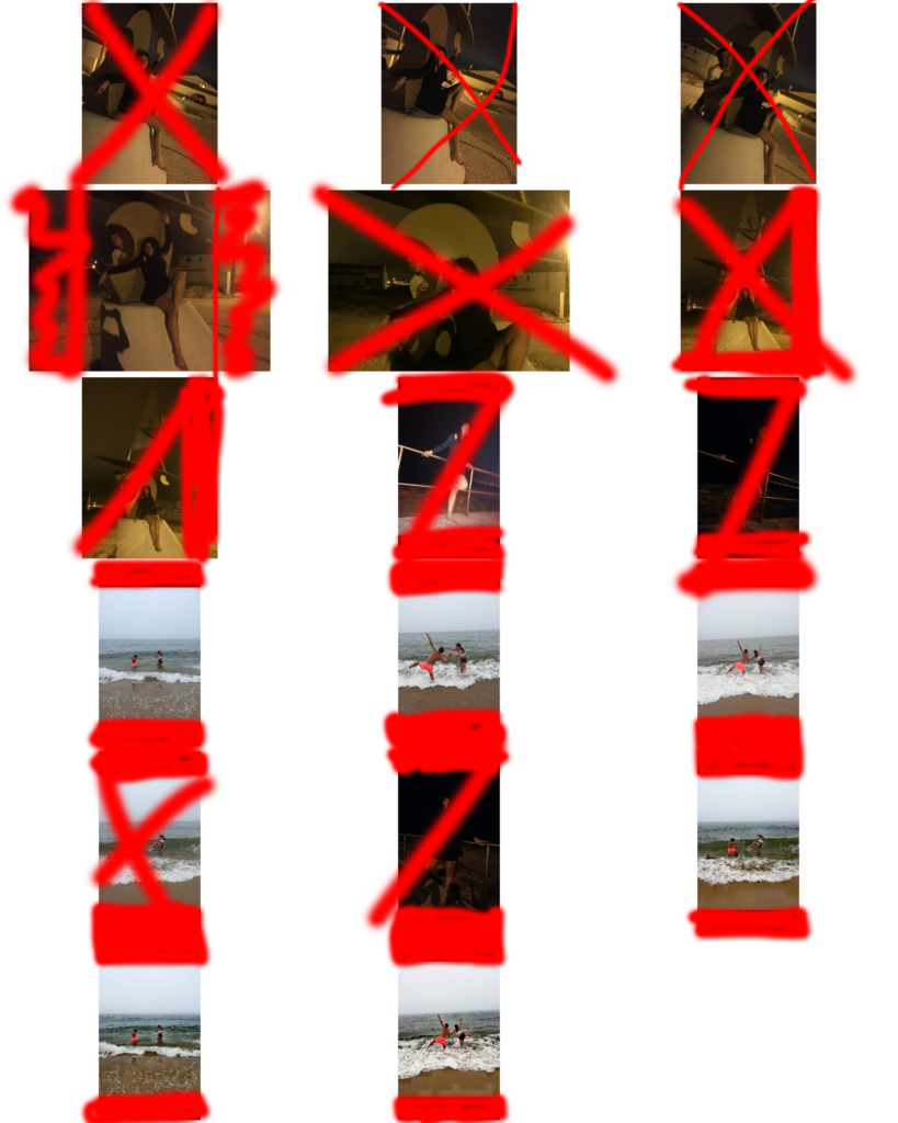
This photoshoot was taken in my hometown back in portugal, this place is where I normally go on holiday to in the summer it is where i am re-united with my friends and in a way have more freedom to act as myself an do my own thing.
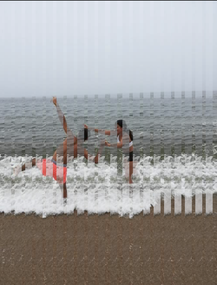
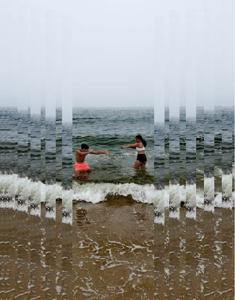
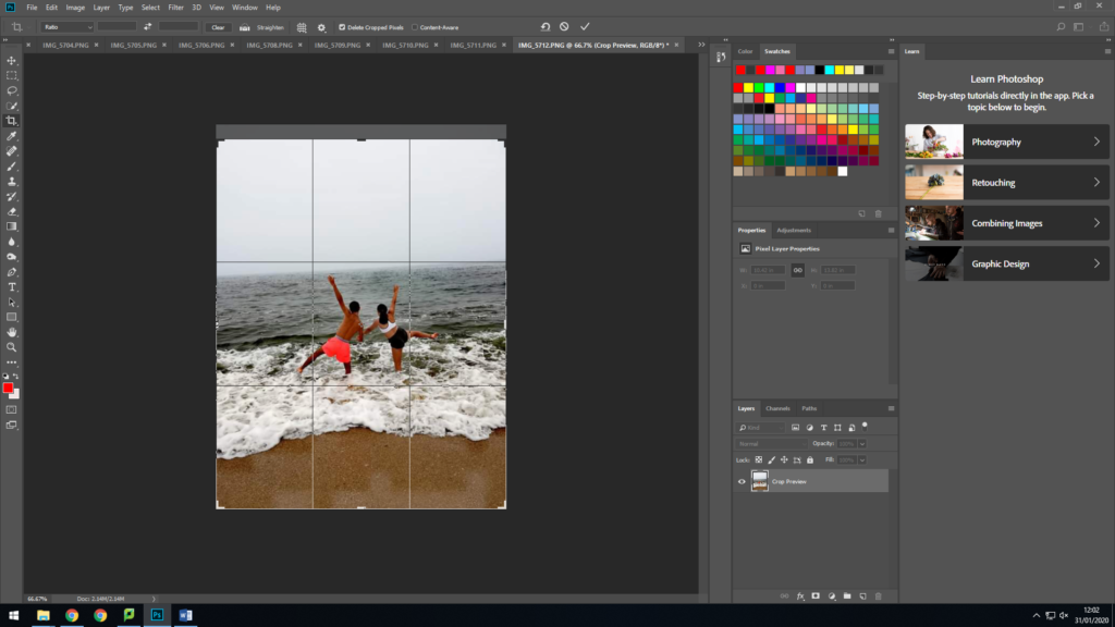
This photoshoot was taken at one of the many beaches in my hometown which is were I spent my time when im on holiday. I love to surf and swim in the wild sea and watch the waves crash, have a bonfire on the beach and have fun with my friends.
Below are the images I am going to edit and display together. These images are slightly blurred and therefore cannot be used as final images but can be used to relate to having a lack of identity.

Claude Cahun was a Surrealist photographer whose work explored gender identity and the subconscious mind. The artist’s self-portrait from 1928 epitomizes her attitude and style, as she stares rebelliously at the camera in an outfit that looks neither conventionally masculine nor feminine. with her photography one of her many skins is gender-defying as she gives this photograph a very neutral look that leaves to question ‘What is this persons gender?’ this was one of the many question that were going through my head when I first saw this photograph. I think she is trying to show us and tell us that it really should not matter what gender she identifies as because she is still going to be this quirky photographer from jersey and her gender does not identify her. She is the main focus point in this image which is quite symmetrical is a way as she has a heart on both sides of her check and her hair is styled the same and gives it an even more symmetrical look. I am pretty sure this image has been taken in the studio as she is sat on a chair with what looks to be a curtain for a backdrop.

Claude Cahun’s photographic self-portraits present mix of mystery, exuberance, and sobriety. Born in France, she lived most of her life on the island of Jersey with her stepsister and long-term love, Marcel Moore.
Themes of melancholy, futility, and uncertainty run deep through Cahun’s career. Cahun’s exploration of self is relentless and at times unsettling. From circus performer, clothed in layers of artifice, to a stripped-down Buddhist monk grounded by integrity, Cahun is engaged in an ongoing dialogue with abundance.