
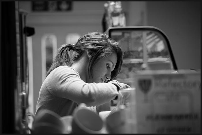
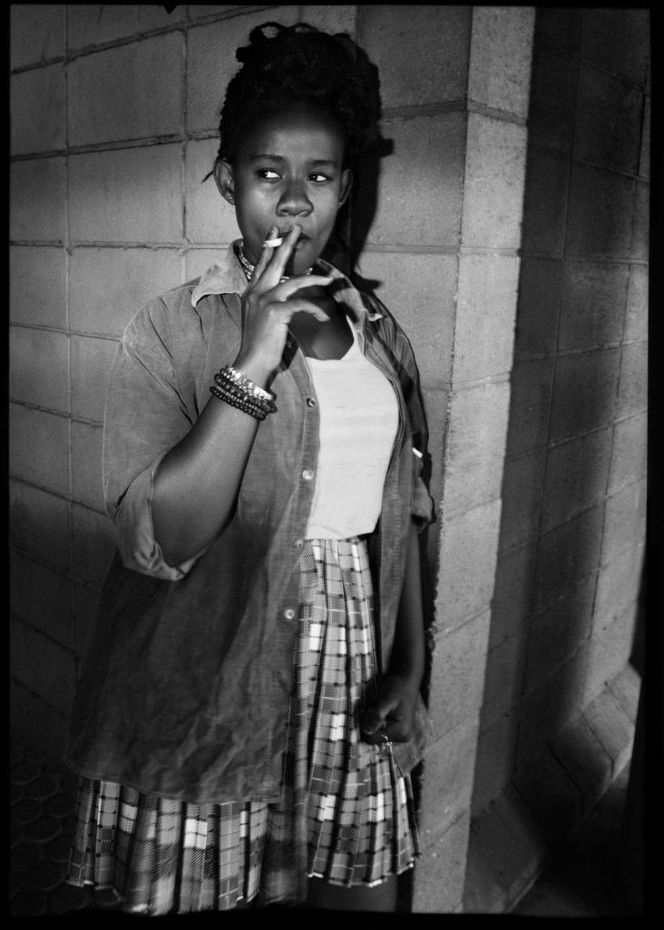
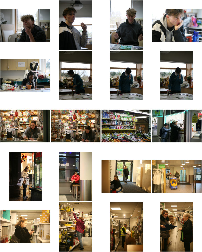
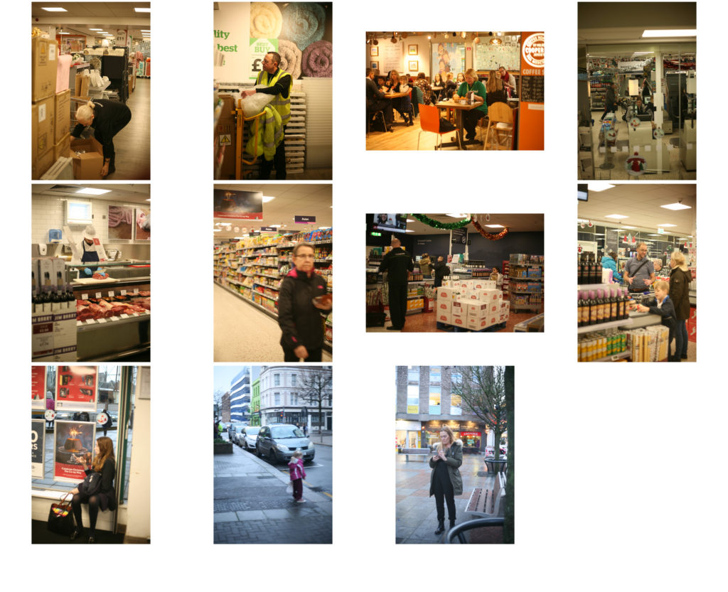
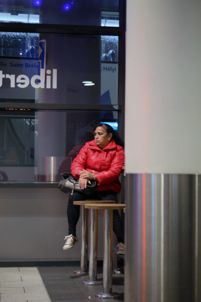
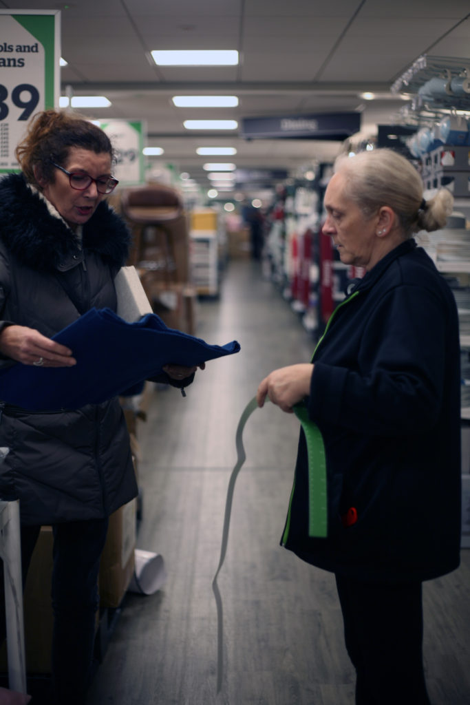
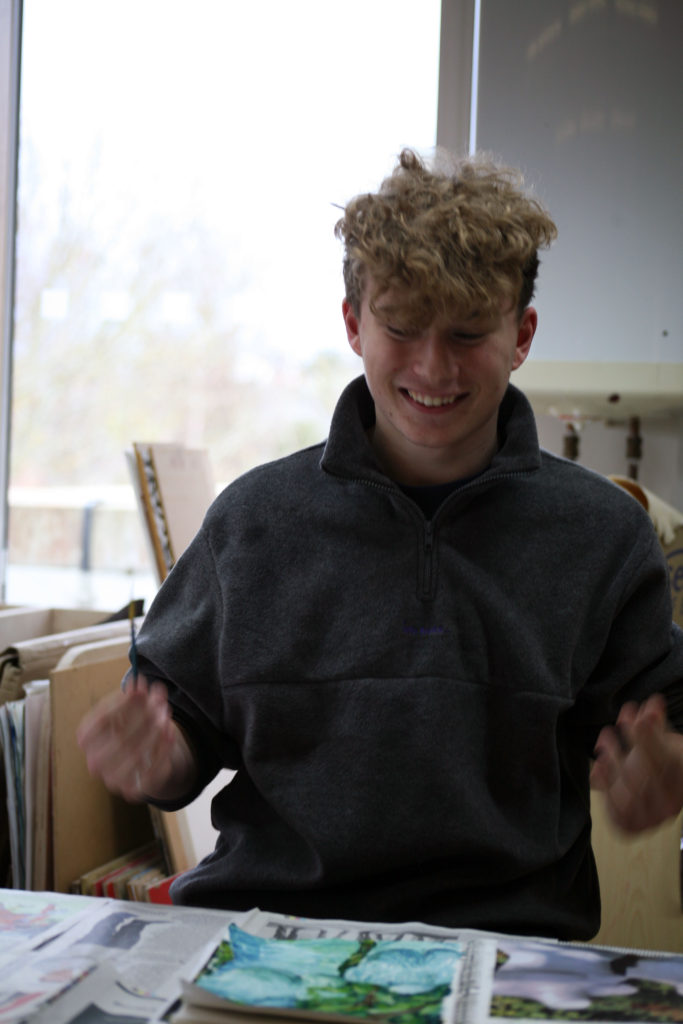
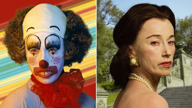
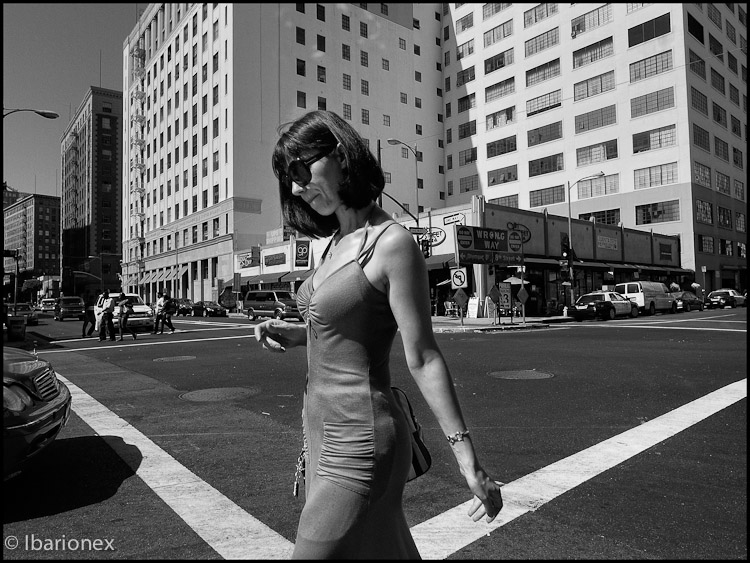
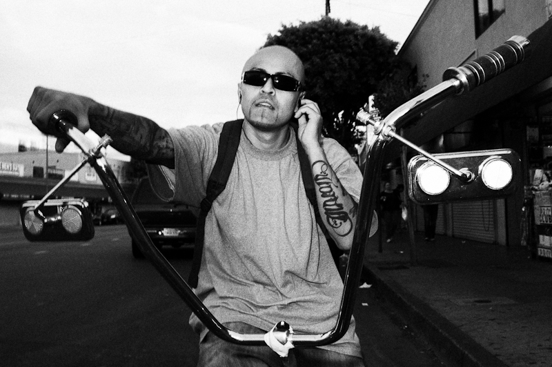
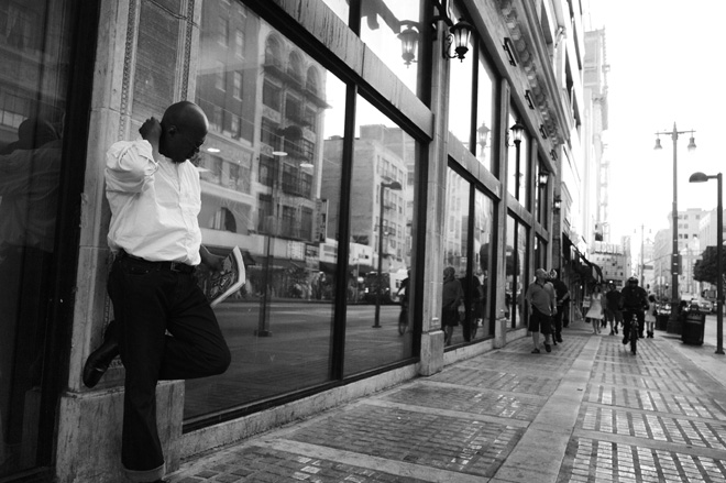
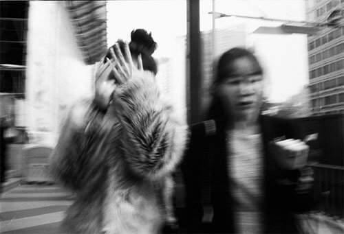
A candid portrait is a photograph captured without a staged and posed appearance. The subject is usually unaware of the image being taken.
The idea of a candid portrait is to capture people acting naturally. They should be unaware they are being photographed, as their behavior often changes once they become aware of the camera.
examples

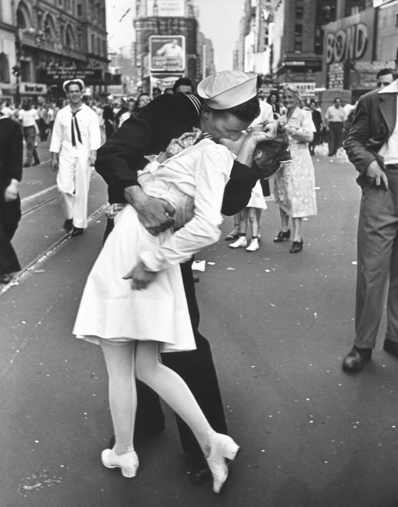
Eisenstaedt was a German-born American photographer and photojournalist, well known for his candid photography throughout the 20th century, documenting the rise of hitler and many other occasions throughout the war. He began his career before World War II, having first started photography at age 14, and in 1936 Eisensatedt became one of four original staff photographers for the new magazine at the time, ‘Life’. In Times Square (1945), VJ Day (Victory over Japan day) provided Eisenstaedt with the opportunity to capture the image he is likely most famous for.
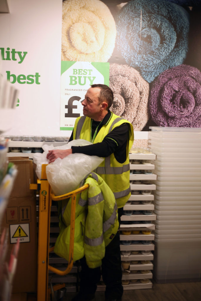
Who: Strangers/ acquaintances- ie: street photography
What: Subjects performing actions: Working, smoking, reading, on their phone etc.
Where: Workplaces, Schools, Town, Parks, Public spaces to avoid a breach of privacy
How: Daytime, full body portraits, half body portraits, possible headshots.

Final image editing:
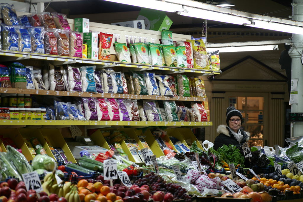
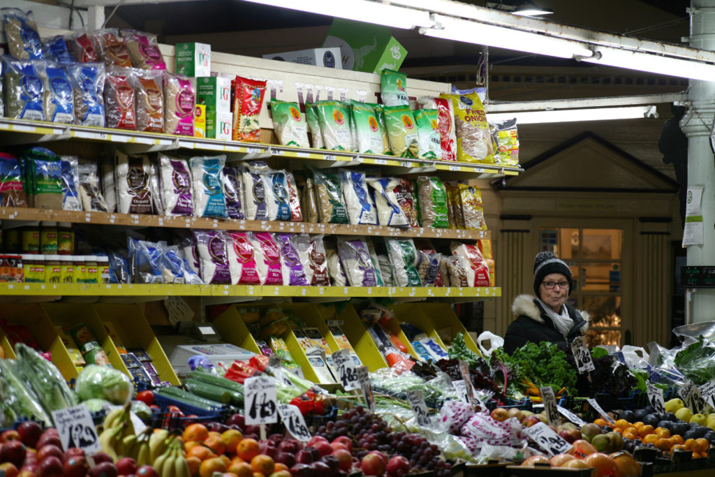
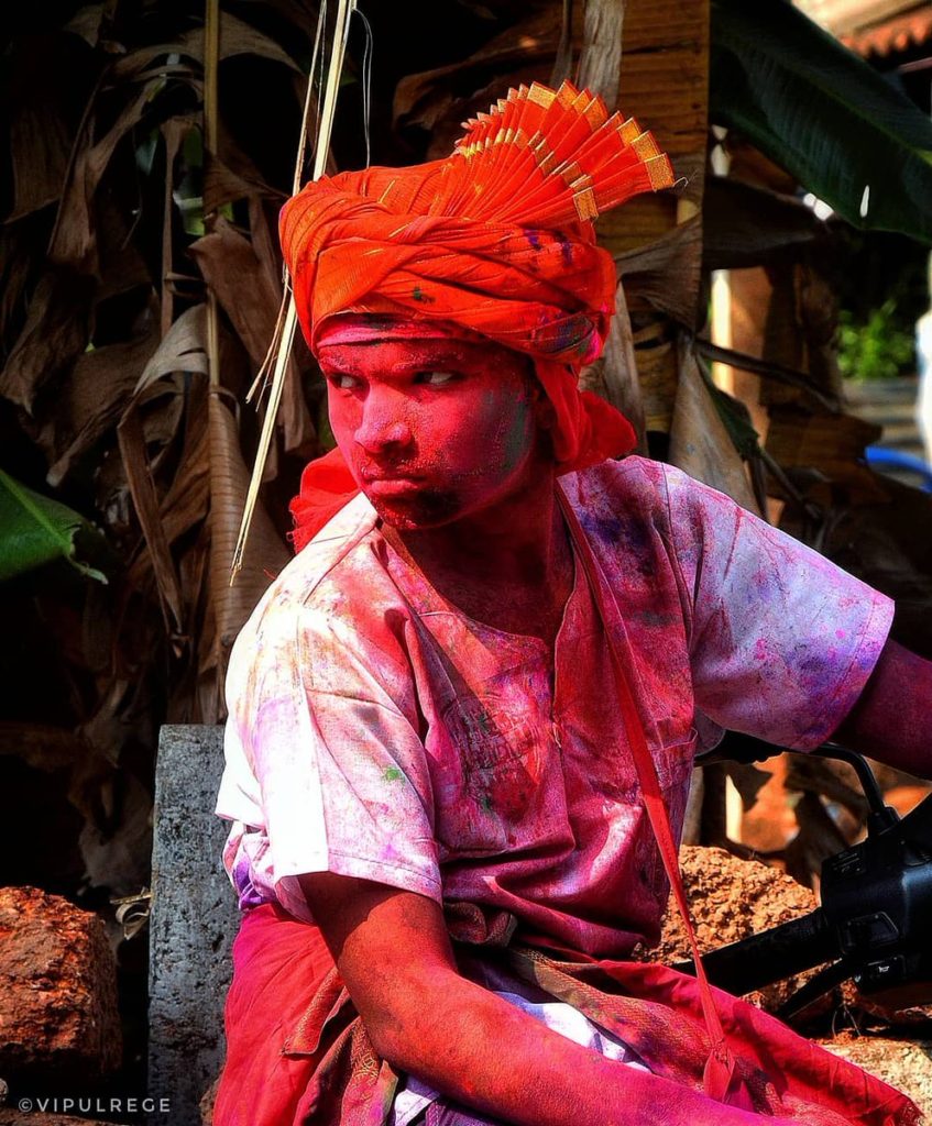
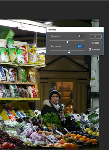
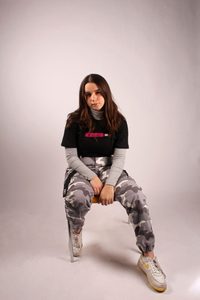
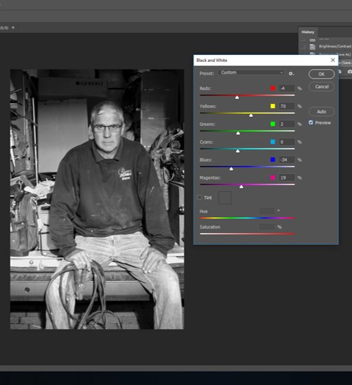
Using photoshop, I aimed to enhance the vibrant colours of the market. I increased the vibrance and saturation of the image, as seen below.
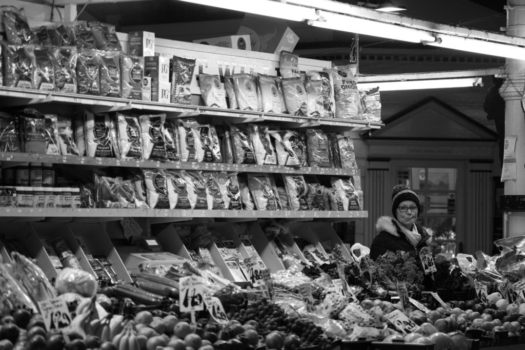
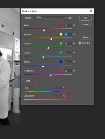
I also experimented with black and white imaging. I ensured all the tones were different to create a highly contrasted image. (pictured below).
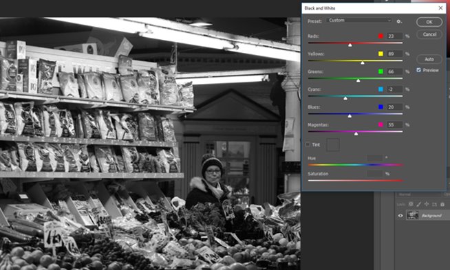
However, I felt as though the black and white filter caused the subject to blend into their environment, defeating the point of a portrait.
Final Image:

Rather than directing their subjects to pose in a certain way, candid photographers take their photos unbeknownst to the subject.
The subject’s environment is extremely vibrant, juxtaposed by the sombre expression and dull clothing the subject is wearing. The fruit in the foreground and colourful packaging behind encircle the subject, with the dark tones of their coat and hat enhancing
The lighting in the image is unnatural, with LED lights that act as horizontal leading lines as well as the shelving to direct the viewer’s eyes to the subject, and the structure directly behind them acts as a sort of frame within a frame, outlining the subject.
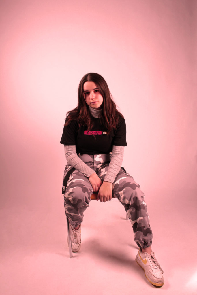
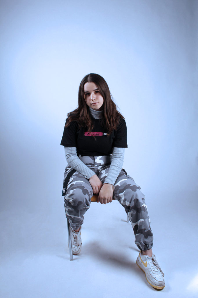
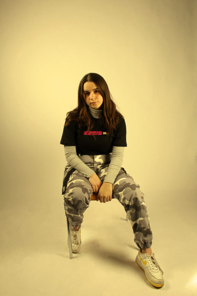
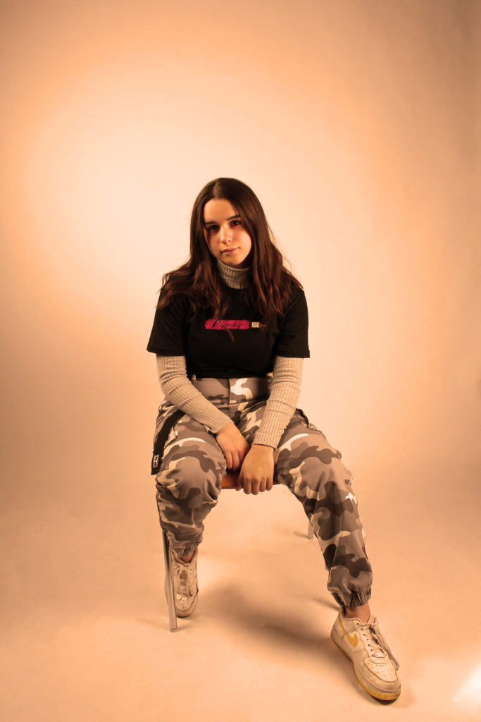
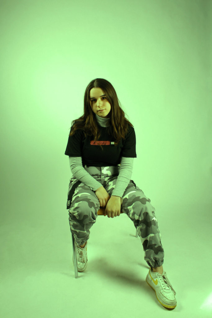
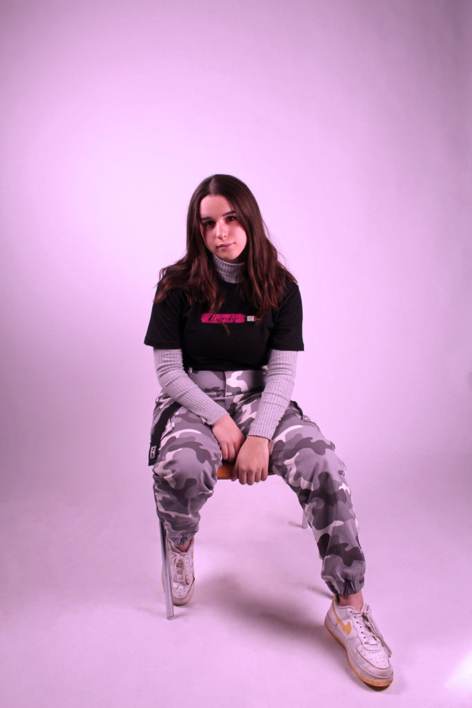
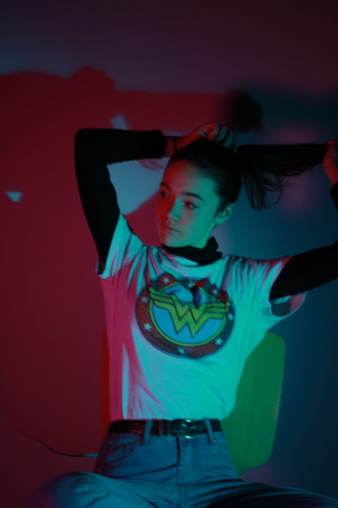
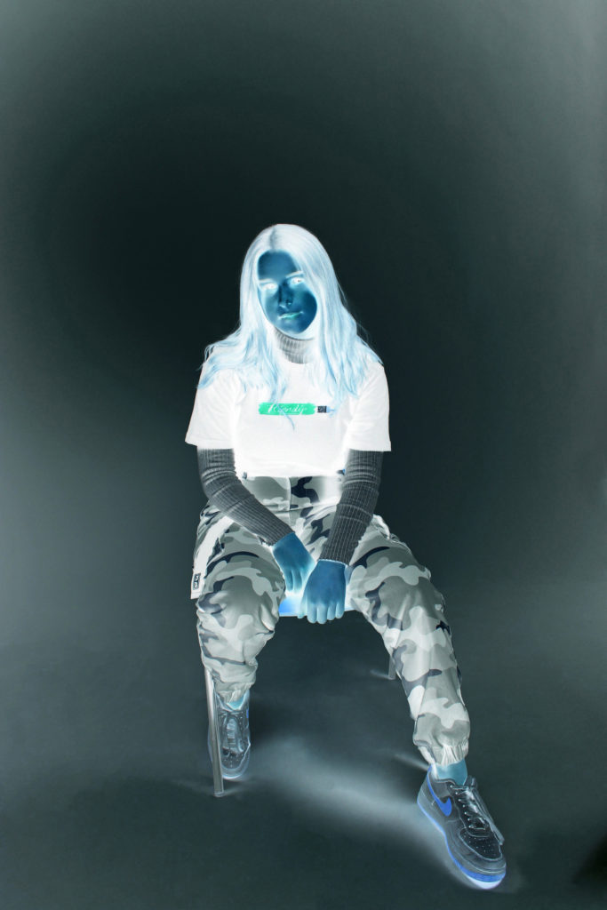
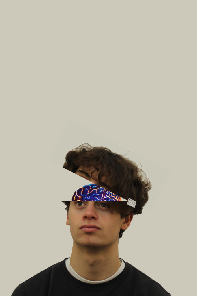
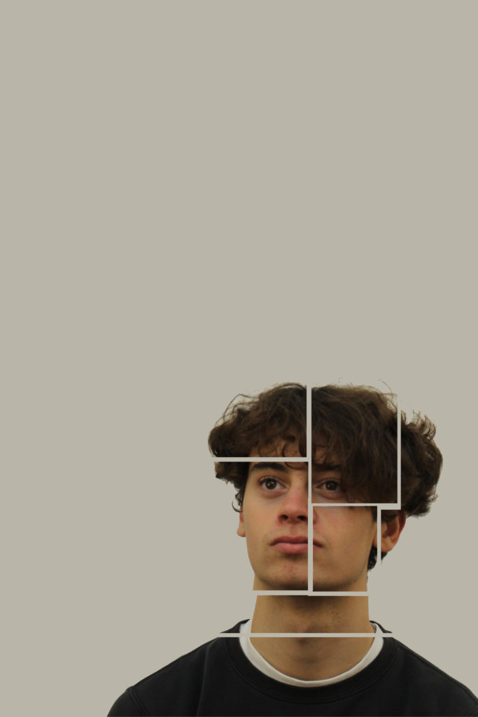
For these images i opened up my original edited photo on Photoshop and used photo filters in image adjustments, selecting each different colour and increasing them to about 80% density. The first three are the primary colours, and the next three are the secondary colours. My favourite colour filters are the warmer tones, like red, orange and purple because they match the pink paint streak on my shirt and warms up my skintone
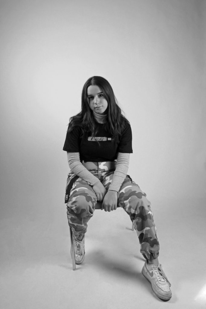
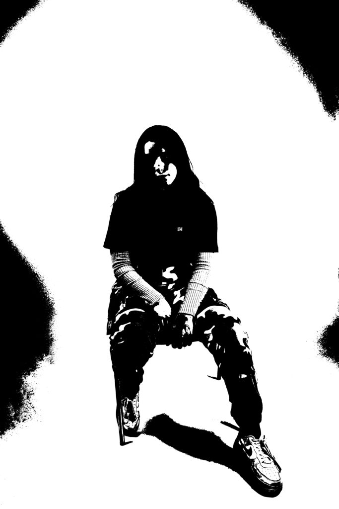
Here i experimented with different dark filters. First was classic black and white which adds a defined aspect to any picture. I adjusted the contrast, shadows and highlights to the pre-set black and white setting. To invert i only used the invert filter in image adjustments, which gave it an alien, somewhat confusing and odd view. I chose threshold to blacken the image and give a silhouette feel, still with detail. I adjusted the levels and highlights, and made sure that specific details such as the sleeves and shoes were maintained, but opted to have a blacked out face

CLICK HERE FOR LINK TO TATE DEFINITION
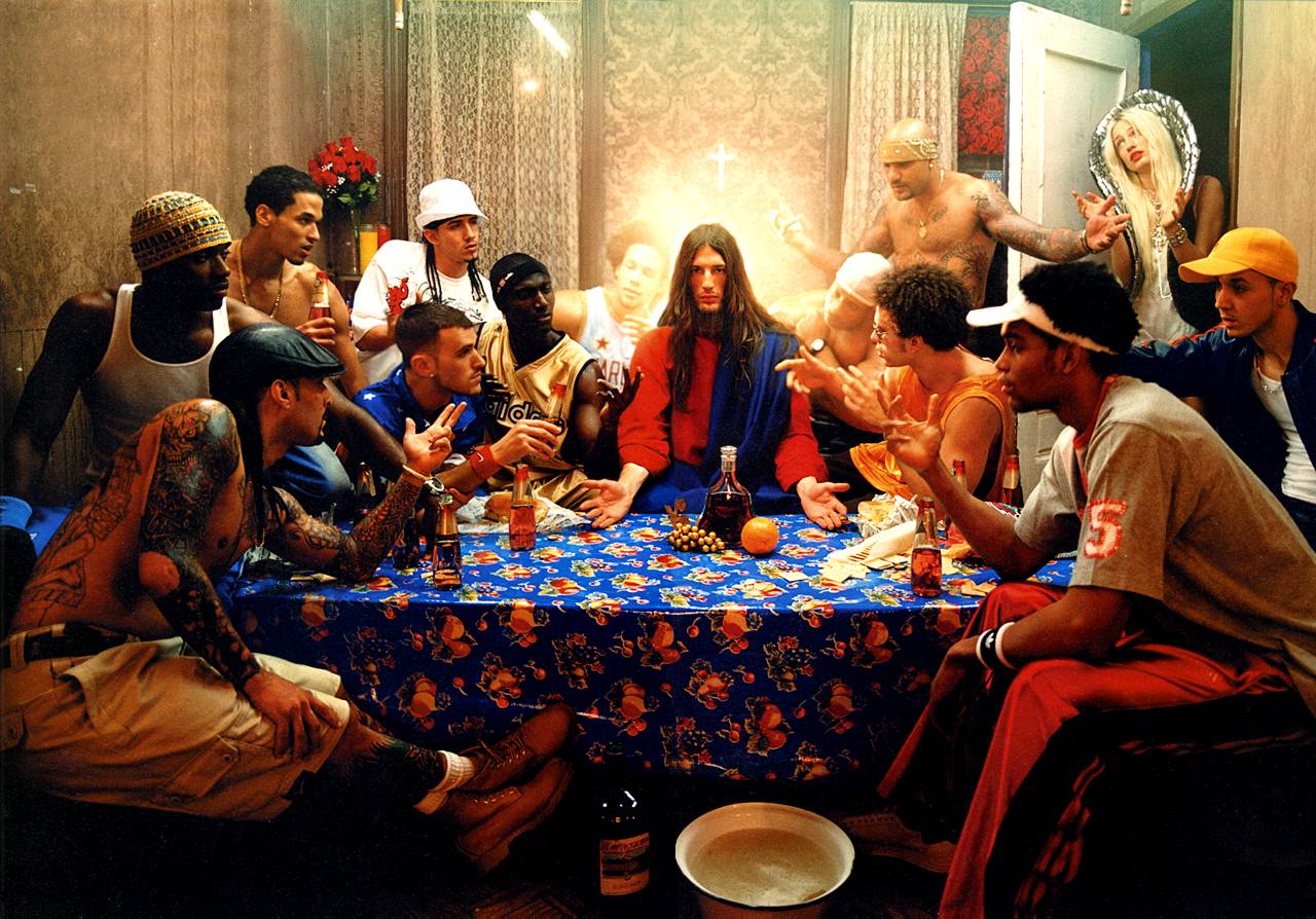
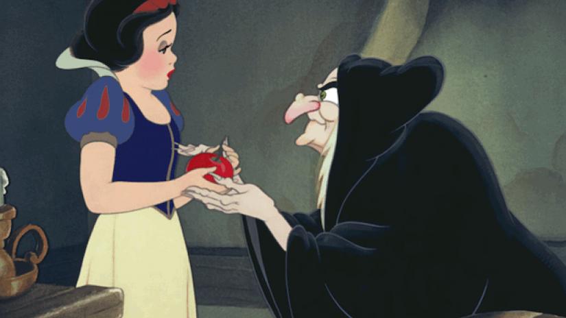
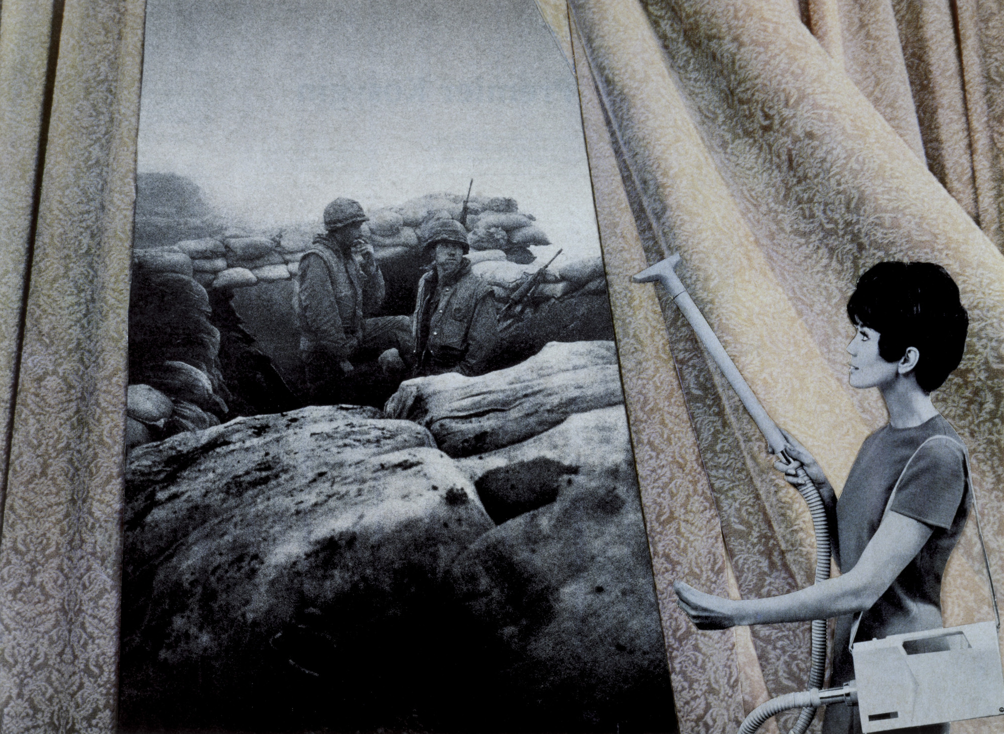
A tableau vivant (often shortened to tableau, plural: tableaux vivants), French for ‘living picture’, is a static scene containing one or more actors or models. They are stationary and silent, usually in costume, carefully posed, with props and/or scenery, and may be theatrically lit.
Tableau Ideas and Starting points
Tableau Photography is staged. Think of it like theatre.
Tableau Photography is dependent on a defined NARRATIVE, theme or storyline
Blog Post 1 / TASK 1 .(extend and complete for homework)
Final Outcomes : a choice of
Blog Post 2 / TASK 2 (minimum 1 x blog post)
COMPLETE TABLEAU UNIT BY FRIDAY 20th DECEMBER
DiCorcia’s working methodology:
DiCorcia has no patience for visual passivity. “I’ve been trying to create photographs in which the emotional and psychological content is time-released… From the very beginning, I was fighting against this media-created idea that imagery is so disposable that it’s exhausted within a very short amount of time.” His tendency is to slow time down, an apprehension that has nothing to do with entropy. Instead, it is a seduction into the act of looking.
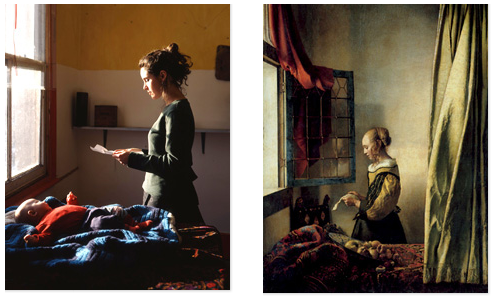
… amongst the art historical references glimpsed within Hunter’s oeuvre, the voyeurism of Vermeer is most discernible. Subjects are often shown full figure, in private spheres (e.g. sites of domesticity), and set in the mid-ground in order to include something of their environment.
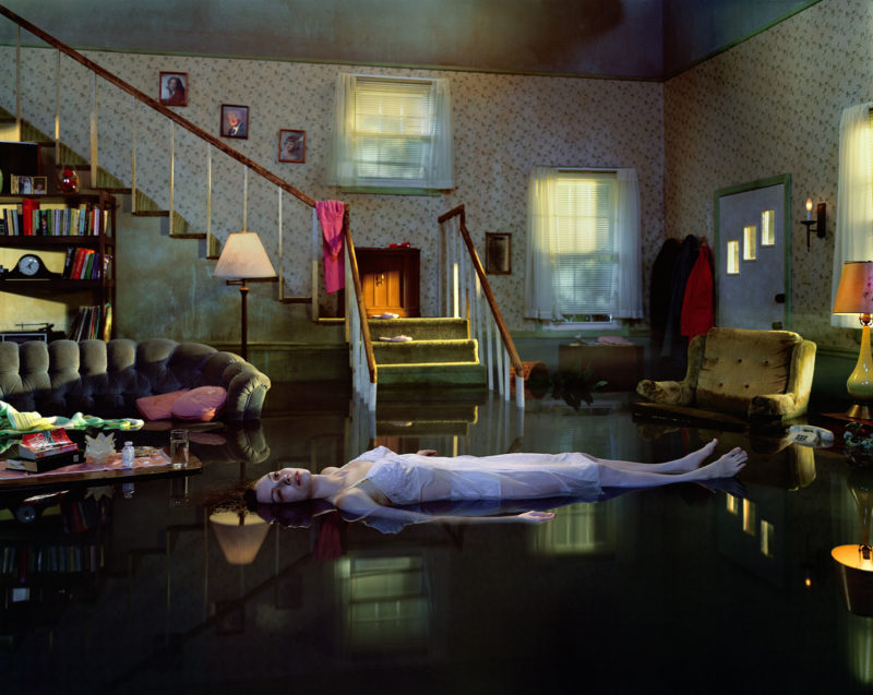
Gregory Crewsdon talks about ‘the real and the imagined’. He works around concepts of place / setting; character; narrative. He is also very clear about the technical aspects of his work, particularly lighting and mise-en-scene, ie the arrangements of objects in his frame. He is a storyteller, using photography to catch a frozen moment in time, that both suggests the back-story (what happened before this frozen moment) and the story that may unfold. It is about ‘bringing the viewer in’. As he says, ‘there are no answers in these pictures, only questions.’
Tableau Photography makes use of symbolism and metaphor.
Allegorical paintings / photographs contain metaphor and symbolism
Pictorialist Photography was the starting point for Tableaux art
Narrative is vital to successful tableau / staged reality
Here are some examples that could inspire your own ideas…
Research some of these examples…and then re-stage, re-enact and re-photograph


Historical / Contextual Example :
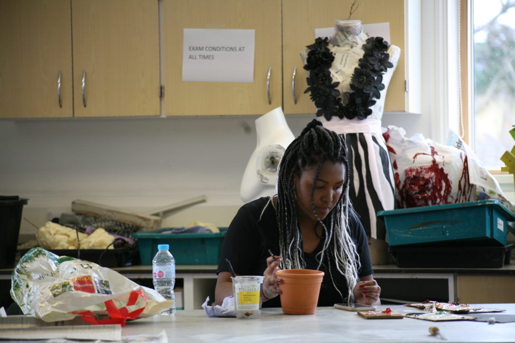
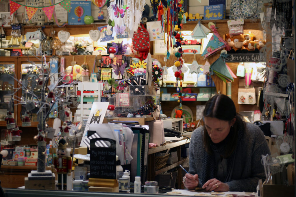
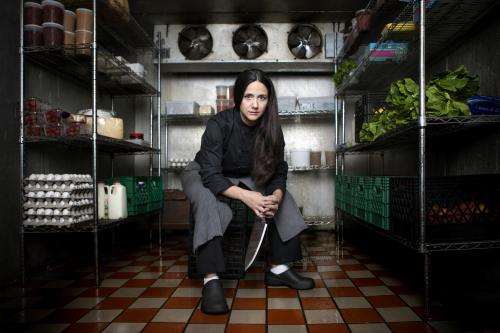
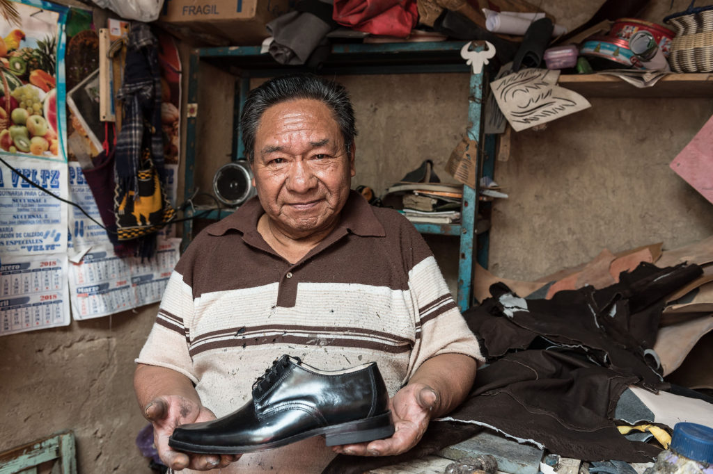
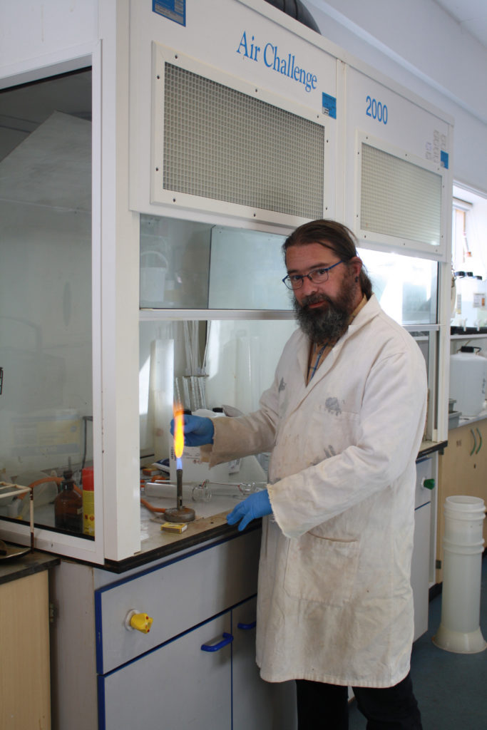
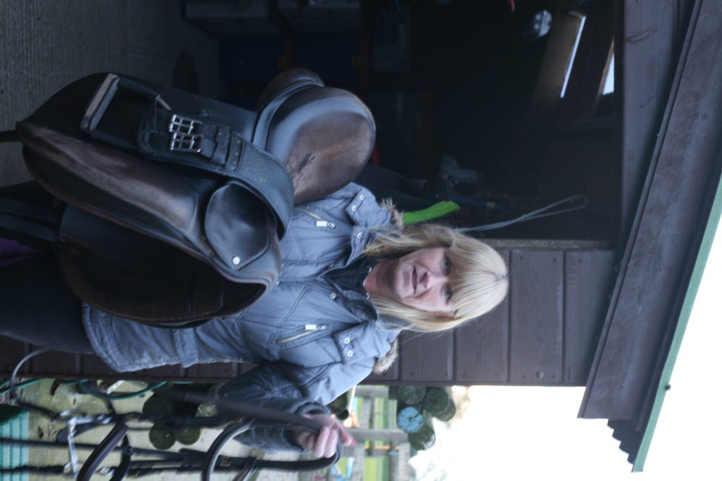
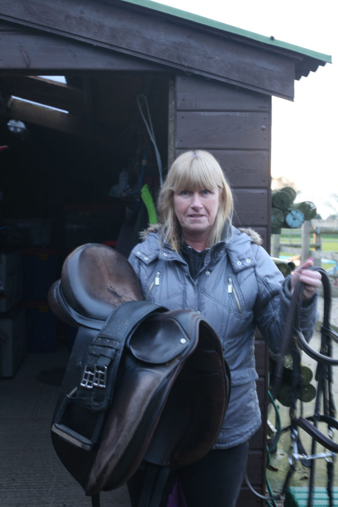
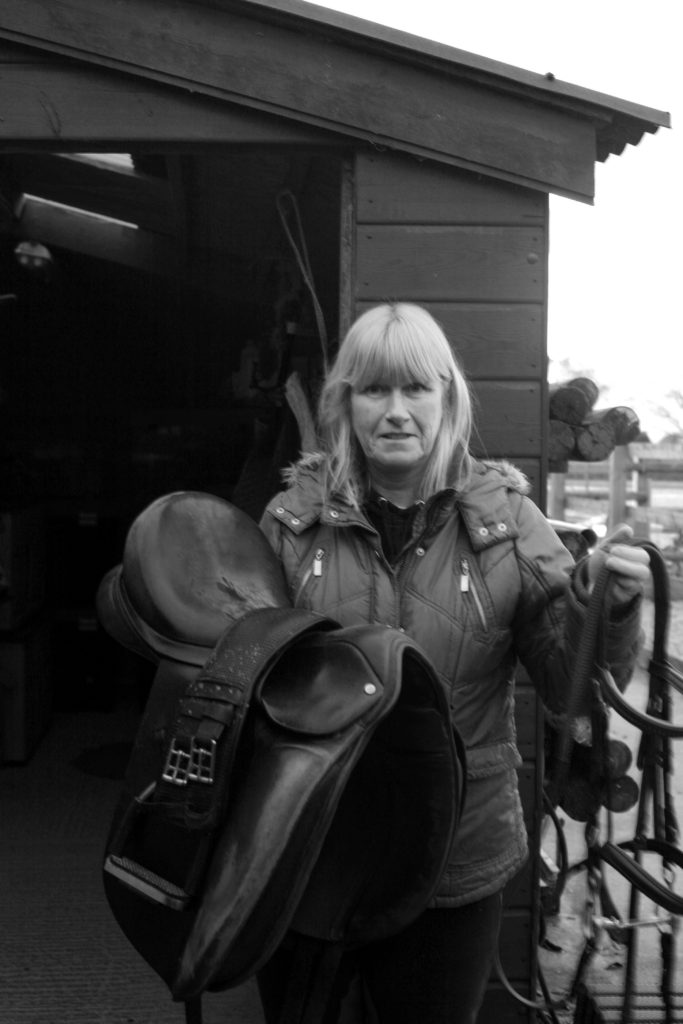
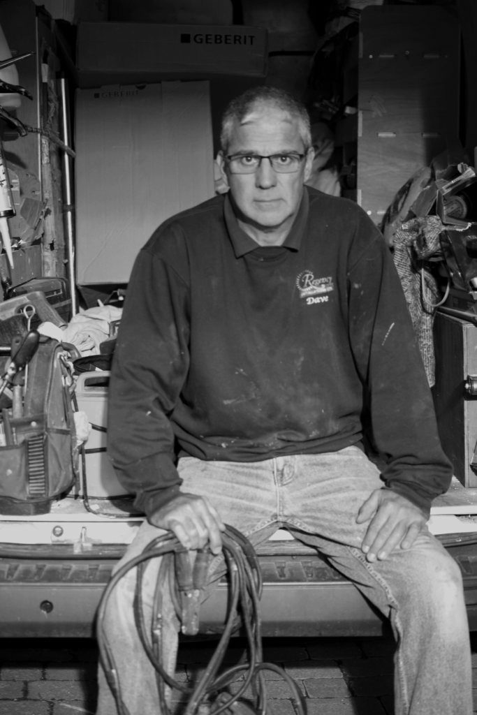
An environmental portrait is a image shot in the subject’s usual environment, such as in their home or workplace, and typically depicts the subject’s life/occupation and surroundings.
Arnold Newman
Newman was an American photographer, best known for his environmental portraits of famous artists, such as Pablo Picasso, and politicians, like John F. Kennedy, as an example. He was, in fact, the founder of the term ‘Environmental Portraits’.
He used features and shapes within his images to portray and symbolise the subject’s life, work or occupation. He usually photographed the individual in their own familiar surroundings with relevant visual elements to represent each subject’s personality and profession
One of his most famous portraits being of musician Igor Stravinsky
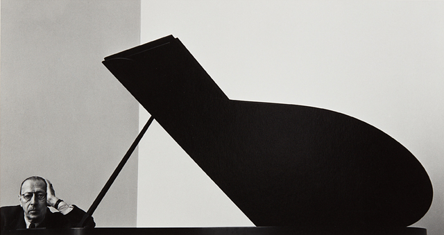
Photo analysis

The wide range of tones Newman uses creates a highly contrasted, striking and successful image. With the lightest tones being on the piano keys, Gould’s occupation is clearly stated.
Newman lined Gould up within the vertical third on the right, appearing indistinctly over the piano, possibly implying a power imbalance between the two objects in frame- a sense of dominance and control from Gould over the instrument.
The position the subject has been placed in also amplifies this idea. The relaxed pose and direct eye contact from Gould shows the ease at which he governs his occupation.
The use of negative space naturally draws the viewer’s inspection towards to the subject. Leading lines from the edge of the keys and from the wall above Gould (having been intently lined up) also aid in the focus of the portrait being on the subject.
Who
What
Builders, Farmers, Pharmacists, Vicar/priest?, Baristas, Students, Sports students, Science technicians.
Where
Hamptonne egg farm, St Lawrence church, Hautlieu school, science department.
Why
Environmental portraits connect the subject to the place they’re being photographed (home or work place). It tells a narrative about the person’s life story, adding meaning to the portraits.
How
shoot 1:

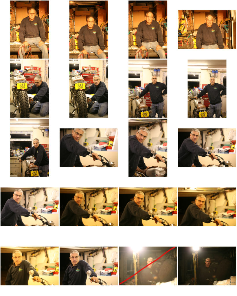
shoot 2:
Best images from shoot:
EDITING:
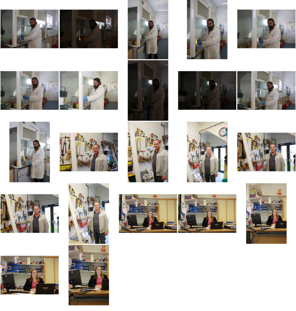
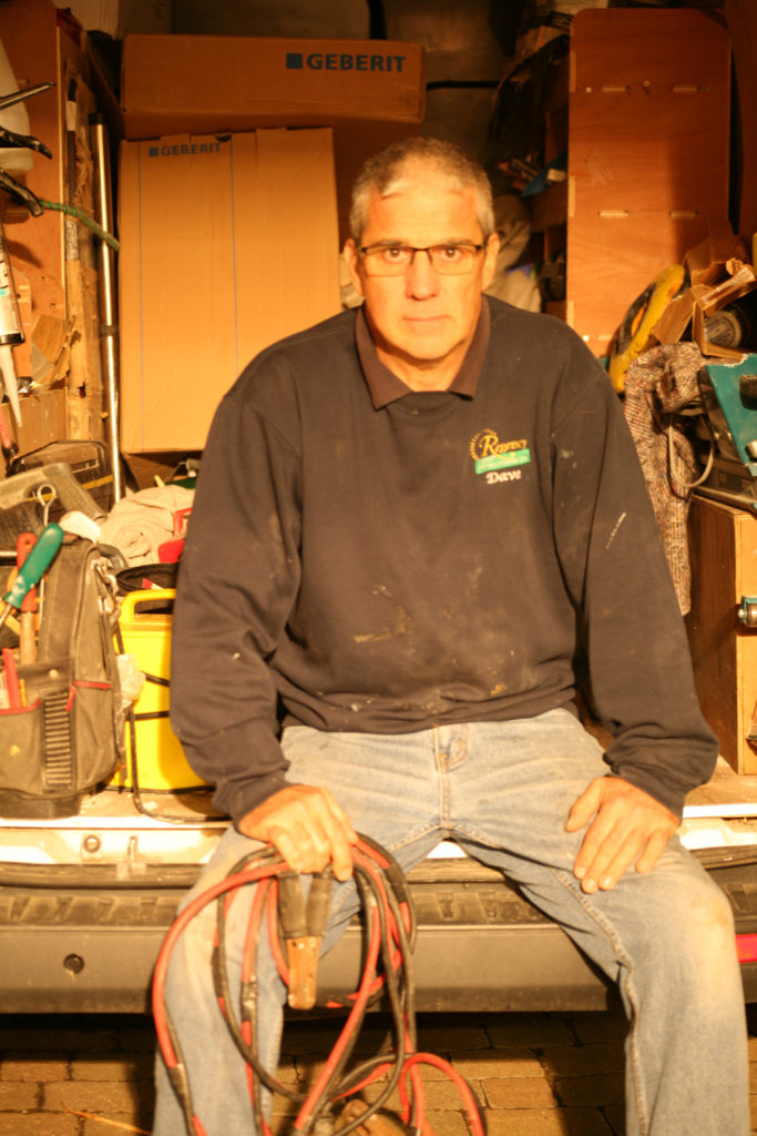
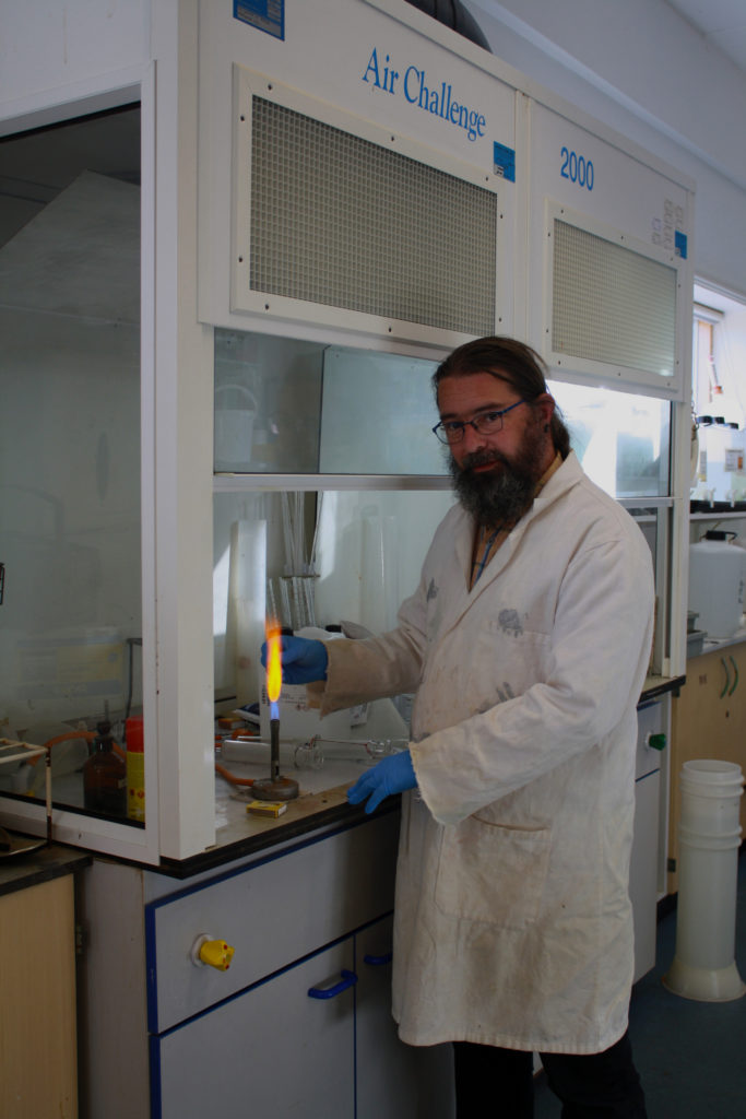
Having failed to adjust the white balance during the photo-shoot, I began by adjusting the color balance of red, green and blue tones within the highlights, shadows and mid-tones of the image to correct how the it originally looked through the view finder.
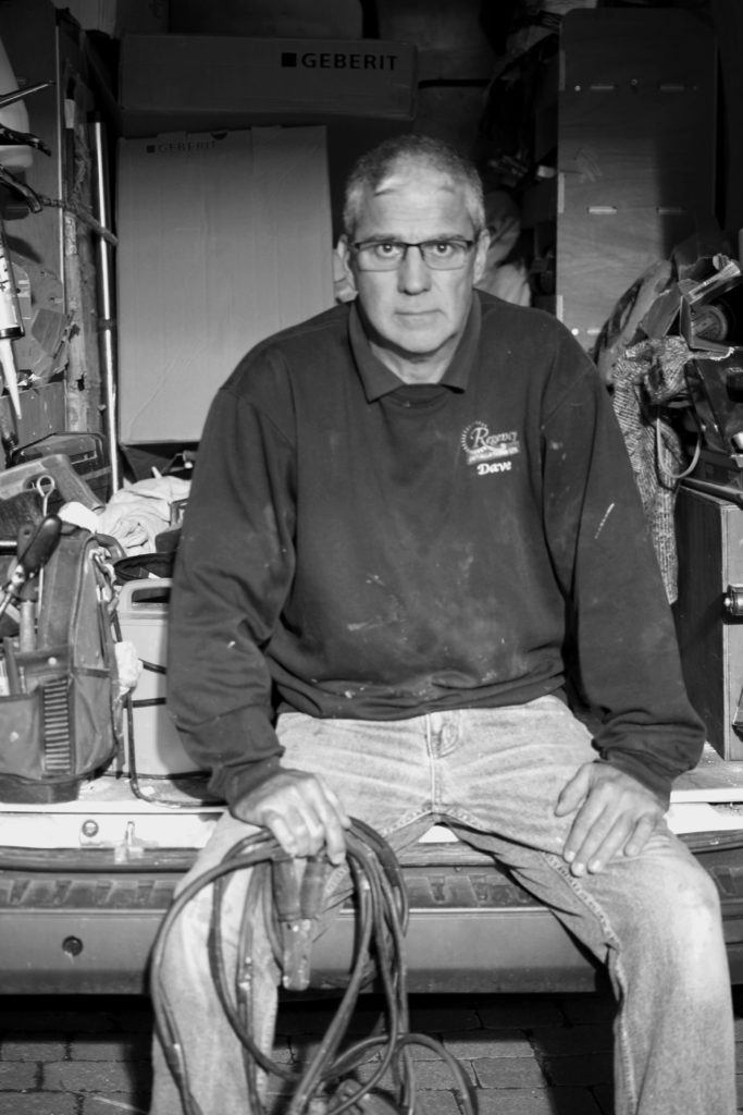
By converting the image to black and white, it gave me some control over what I wanted the viewer to focus on the most. Having made the image monochrome, I was able to shift the focus to be on the the subject in the foreground.
To bring out the main features of the subject I made the red tones darker, bringing out the contours of his face and the cable lead in hand. By making the blue tones darker than the red I could create contrast between the exposed skin (hands, neck face) and clothing, as well as the objects in the background.

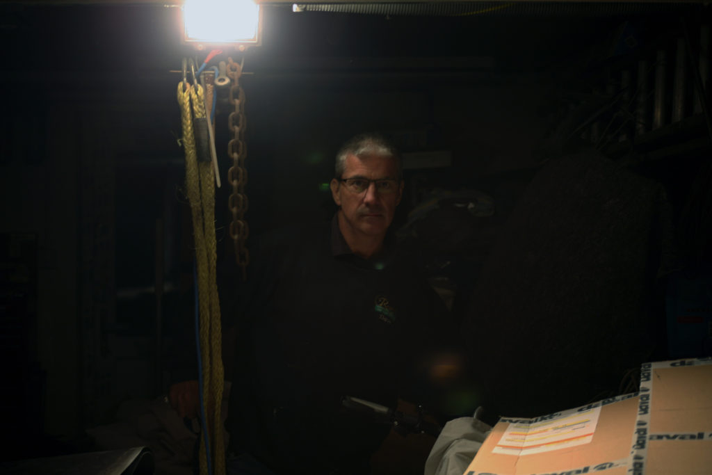
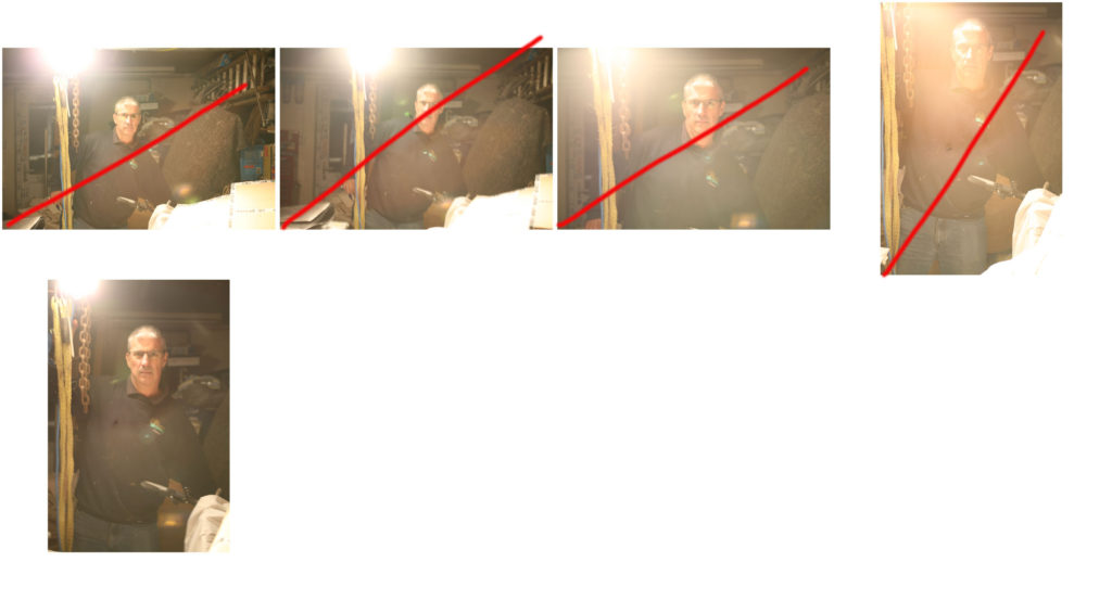
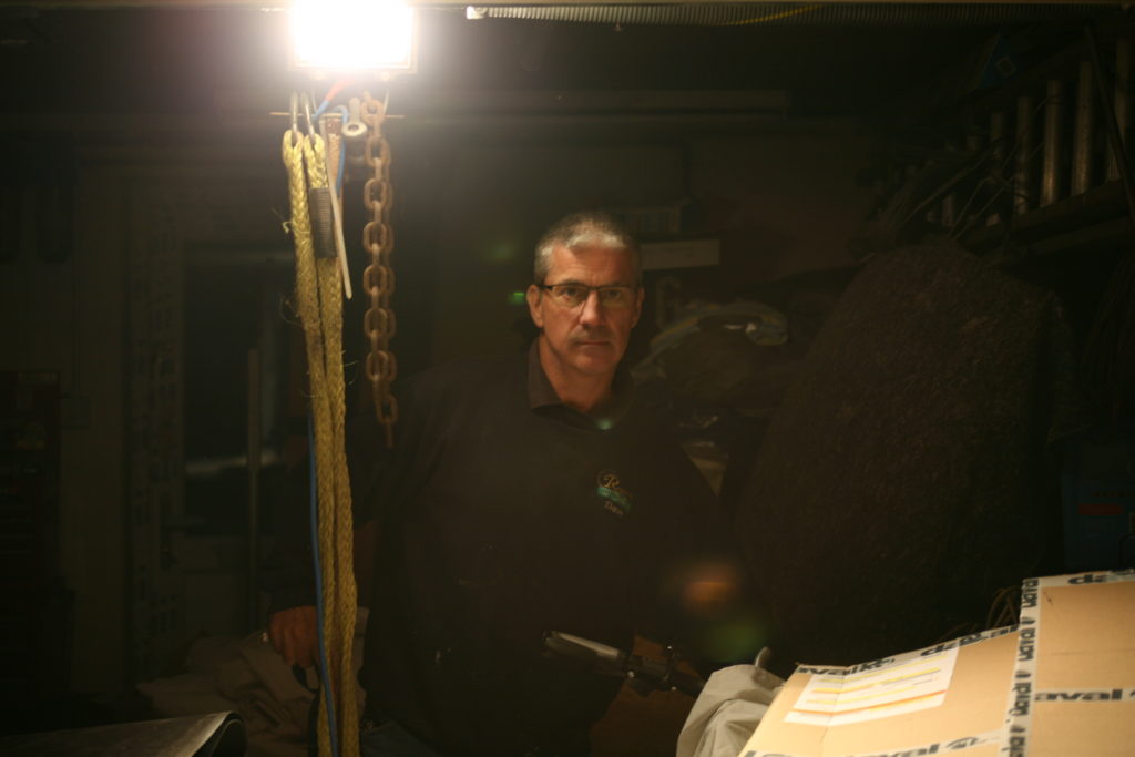
With the aim of creating a more low-key image, using one point lighting, I placed the fluorescent lamp next to the subject which illuminated the right side of his face and created a dark, more intimidating atmosphere surrounding him. The only issue was that fact I included the light within the frame.

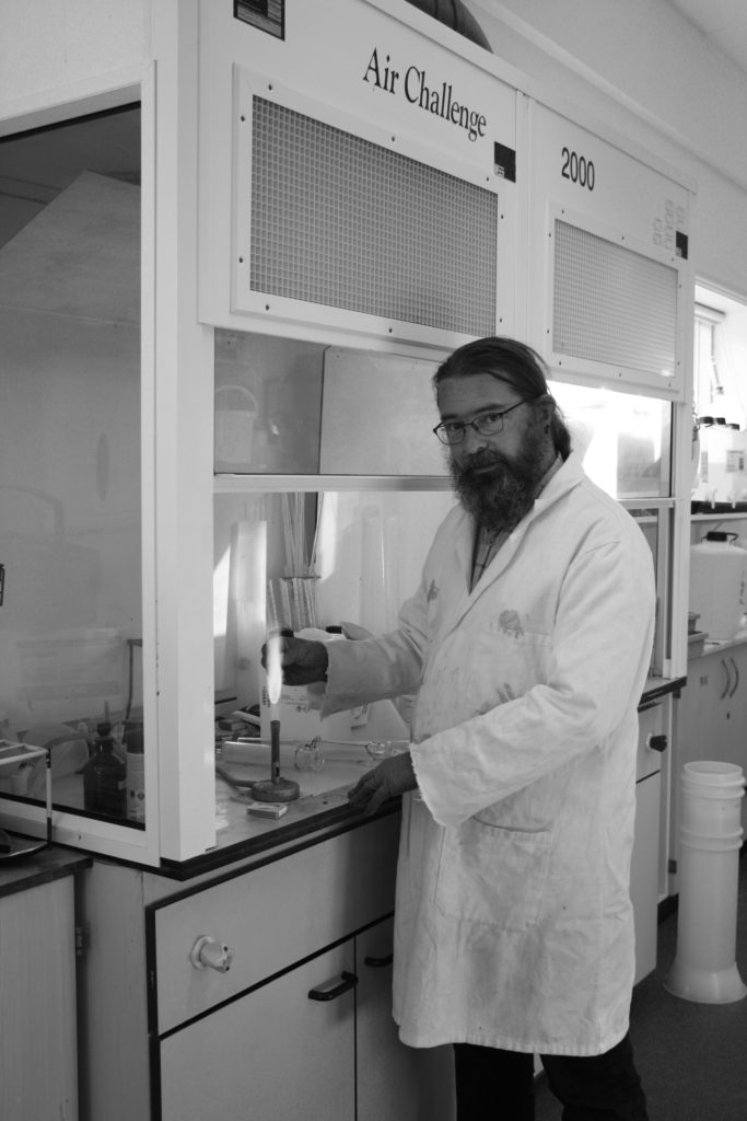
Initially, I decided to make the image monochromatic, however I felt it didn’t make the subject stand out. The laboratory coat and dark features made him merge with the background which is predominantly light.
The blue font on the structure behind was a similar shade to that of the technician’s gloves, making subconscious links to the viewer, causing them to interact more intimately with the image.
Cropping
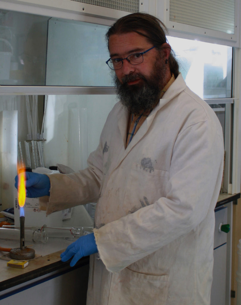
I experimented with half body portraits when cropping the image, this allowed for the focus to shift to the subject’s face. The character’s gentleness can be clearly seen through the positioning of his hands and the positioning of his shoulders and head.
The side stance shows a more submissive nature, compared to my portrait of the builder, who is positioned in a way that dominates the frame. The delicacy of the character ties in well with the occupation as it shows a duty of care and attentiveness to his work
Editing the image to black and white allowed the focus to be more on the subject. By having the facial features and hair of the subject lighter than the clothing and equipment, I’m able to draw the viewers attention to the her face.
Most successful, edited image:
I felt this image was most successful as it incorporates a large range of tones and encapsulates the personality of the subject.
I placed the subject sat on the edge of his work van, with open body-language. This allowed me to show a sense of assertiveness and ownership the subject has. Direct eye contact with the camera also aids in making the subject seem intimidating. This is useful in building some context.
Builders and carpenters have a reputation for being self-assertive and brash on building sites. As my subject is the head of a similar company, I aimed to create a stern look on his face and capture the ownership and dominance he may display in front of his employees.
Dark tones in the subject’s jumper create a contrast against the objects that fill the background, refocusing the viewer on the subject as they analyse the image.
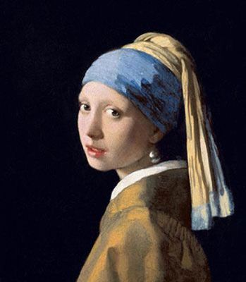
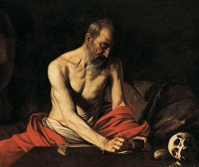
The word chiaroscuro translates in Italian for light and shadow. It is a classic technique used in the works of artists like Rembrandt, da Vinci, and Caravaggio. It refers to the use of light and shadow to create the illusion of light from a specific source shining on the figures and objects in the painting. For example chiaroscuro is present in the painting ‘Girl with the Pearl Earring’ (c.1665) by Johannes Vermeer. This famous portrait shows a young woman, standing in front of a dark background, as she gazes out at the viewer.
The technique was vey popular during the Renaissance, where the term originated from. It involved drawing on coloured paper, where the artist worked from the paper’s base tone toward light using white gouache, and toward dark using ink, body-colour or watercolour.
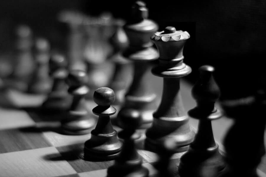
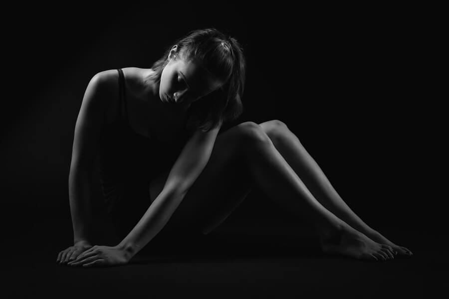
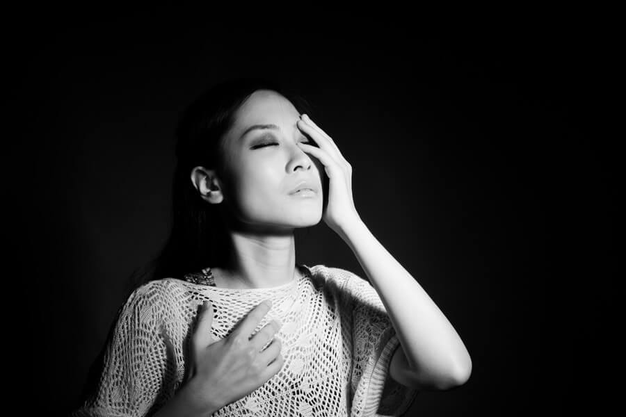
Chiaroscuro in photography is a technique and style often talked about as “clair obscur” or “extreme low key”. This style of photography is often well-suited for portraits, still life, and boudoir, or to give a scene the illusion of being three-dimensional. This technique can be used to light a variety of portraits (full body, headshot etc) and object, such as guitars of chess pieces.
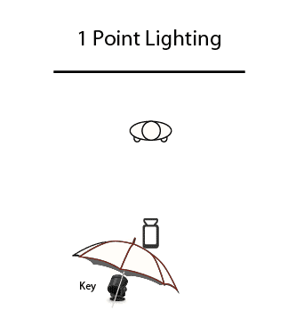
Chiaroscuro is popular in studio photography as the lighting equipment and backdrops available allow photographer to complete the technique accurately. Chiaroscuro usually consists of a 1 point lighting system in a dark room with a back backdrop, so there is only one source and direction of light
Eric Kim is an international street photographer based in Los Angeles. He has traveled the world and shot in cities such as Paris, London, Venice, Florence, Prague and has even taught a street photography workshop in Beirut, Lebanon. His photos consist of mainly black and white photographs and he usually has juxtapositions in his images. The reason that he chose to do this type of photography is because out of all the types of photography out there, street photography is the most pure due to the two reasons: you can capture candid moments of everyday life while showcasing the human condition. In street photography, it is less about the image but more about the story behind it. An effective street photograph will be able to immerse the viewer in a world of awe and wonder, and place them in your shoes. No other genre of photography does that.
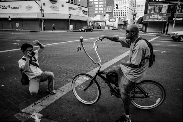
Lighting – the lighting in this photograph may have been flash due to the faces in the photo being well lit although it may just be fluorescent lighting from the street lamps. It is more likely that the photographer used flash as it exposes the faces better in order for the observer to clearly see and observe their facial expressions. Eric Kim may have also wanted to expose their faces so that their hair contrast nicely with their face.
Aperture -The depth of field in this photograph may be shallow as the background of the photograph isn’t as sharp as the models faces. Kim may have done this to focus the observer attention on the faces in the photo rather than the entirety of the photograph.
Shutter Speed – Some parts of the photograph seems to be more exposed than other parts and some parts under exposed giving variation in contrast.
ISO – This photo seems to have a low sensitivity as the picture is very sharp, it also has a variation of tonal range which contrast nicely with each other.
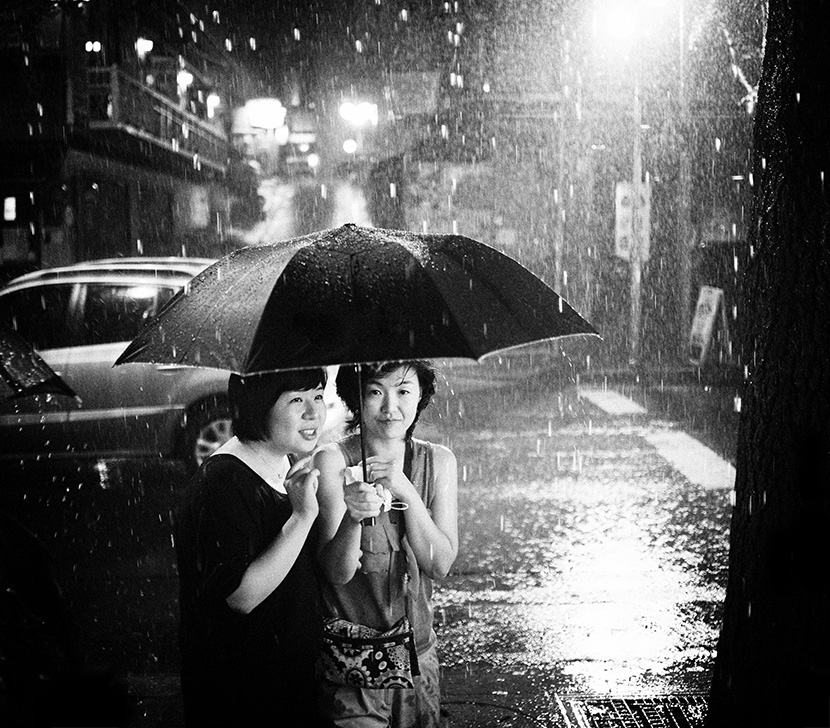
There is a variation of light and dark tones in this photograph and there is also a repetition of extremely exposed parts (rain and water) of the photograph scattered around the photograph. This photograph is nearly a perfect square shape which is pretty standard, the photographer may have done this in order to not distract the observer from what’s being shown in the photograph.
where- photography studio in school
when– during a free period, booked beforehand
who– one or two people to be the model/s and help with light positioning
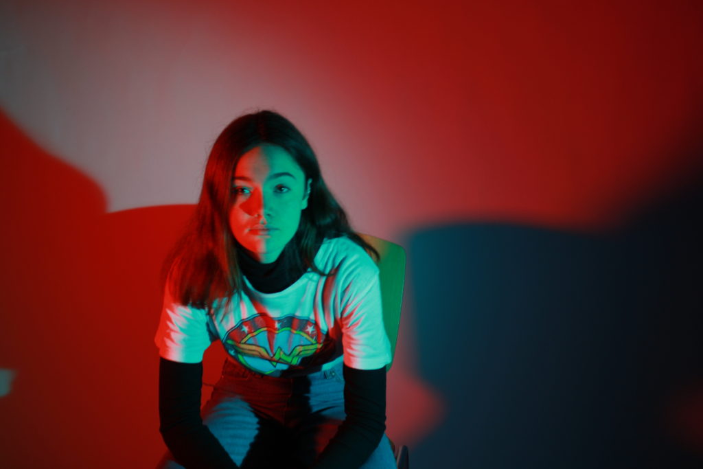
how– use two point lighting with the colour filters to provide two different colours on different angles of the image
any other notes- use red and blue lights to mirror the 3D-glasses effect, maybe go down to a single colour during the shoot as well (?)
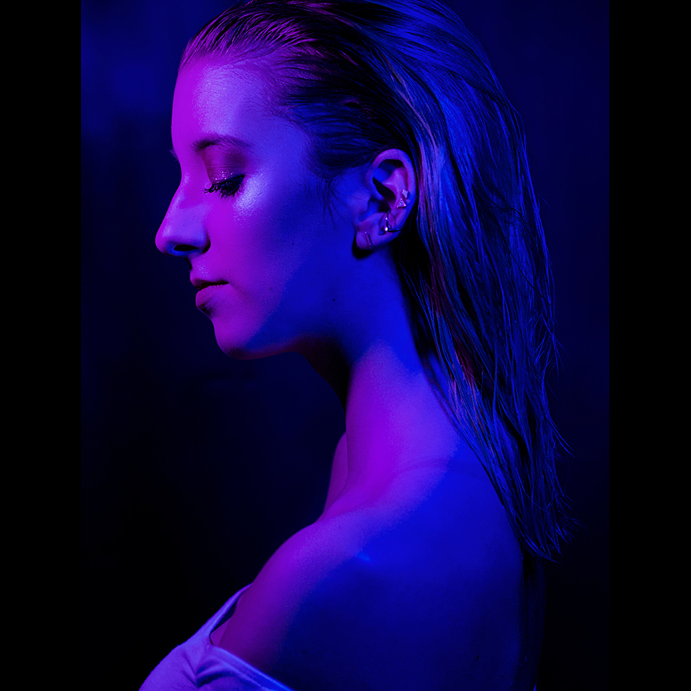
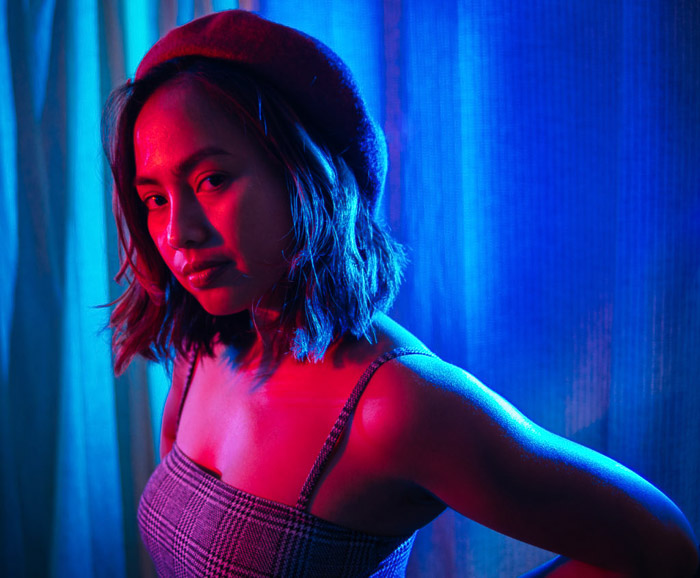
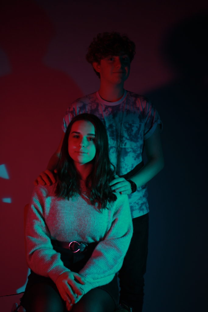
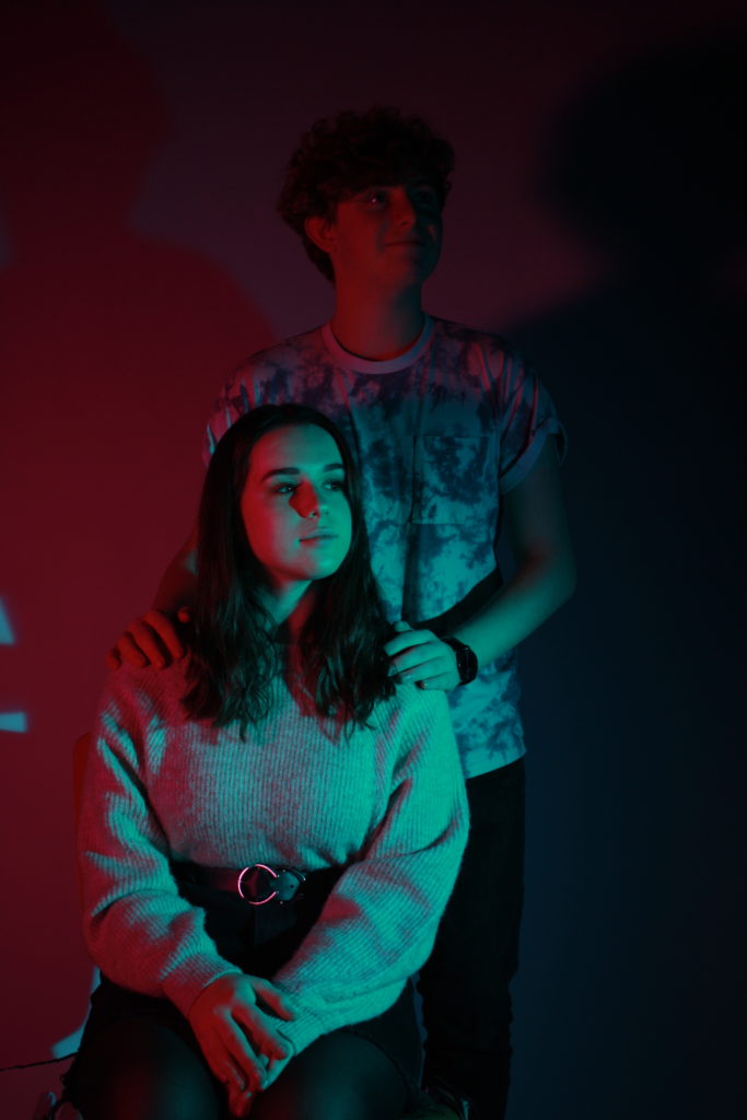


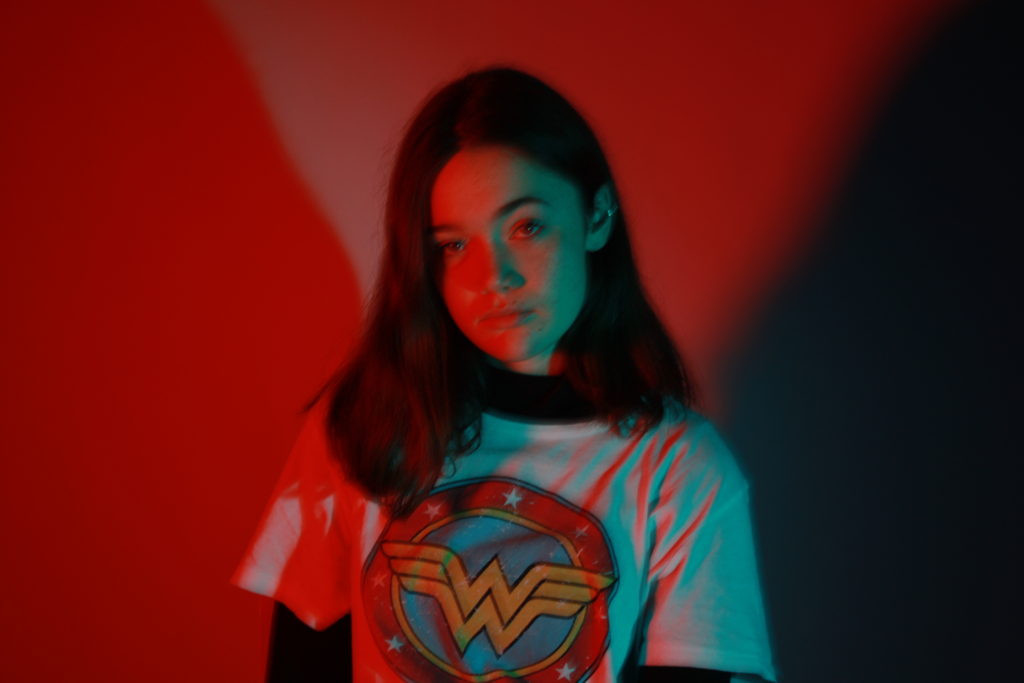
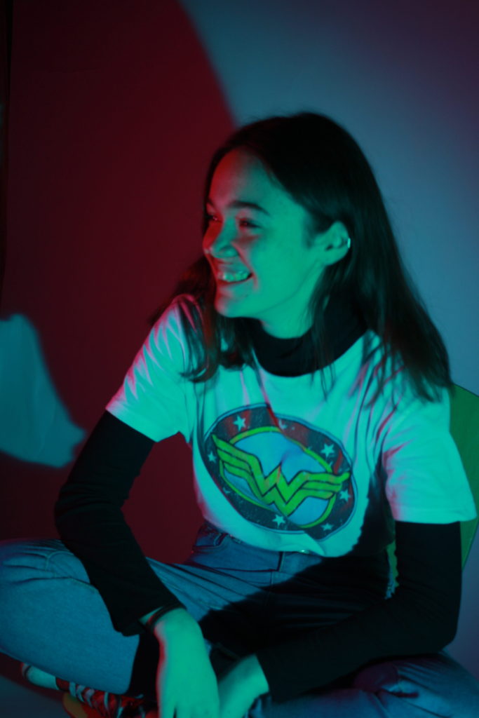
I used two people in this picture because I intended to emulate the “family portrait” style of image but with the modern twist of bright coloured lighting. I had them face towards me and look directly down the camera lens to create a sense of connection with the person looking at the picture, as a result the red light creates an effect mimicking chiaroscuro, as it obscures her face in red.

I really like this picture because the red casts a shadow on the side of her face really well, and it almost completely obscures the guy behind her, creating a contrast. I prefer this image to the previous one in the same style because I feel like them looking off into the distance mirrors more the “family portrait” style of image.
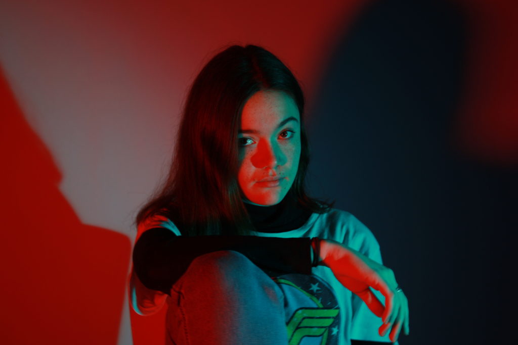
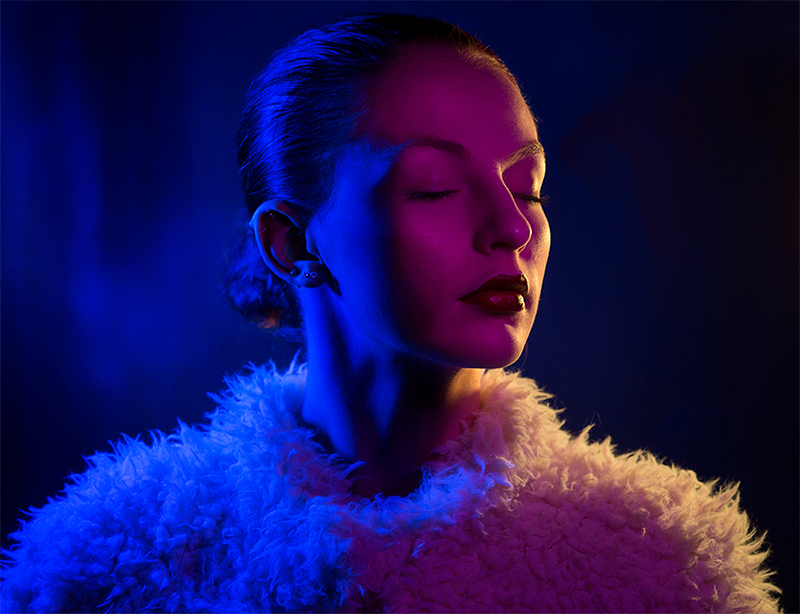
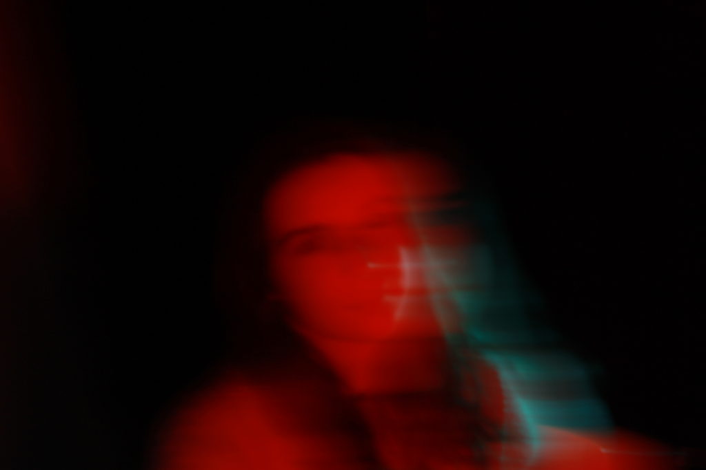
I like the lighting of this image as it has the two-toned colours on either side, so red and blue on both sides of her face, which makes the image interesting to look at. To edit, I covered up the wisps of hair using the spot healing tool, as well as increase the vibrancy of the coloured lights and the contrast, in order to make the shine in her eyes stand out. This photo is, unfortunately, slightly blurry due to a problem I had with the camera, so if I were to improve I would fix that problem.
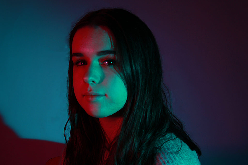
I decided to have my subject turn towards me in this image so that she was almost completely in one colour, expect for her back, which is still lit by the blue. I really like the blur in this picture as it shows more of my own style than imitating the other photographers’ I saw when researching colour portraits, and I feel that it is effective.
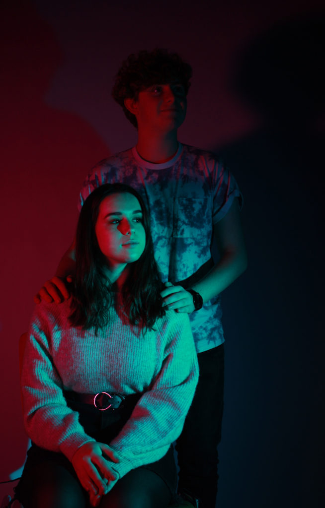
I chose this image because the colour contrast works best and the positions the subjects are in also works best with the lighting positions. I edited it by adjusting the vibrancy and saturation, as well as making small adjustments to the hue in order to maximize the blue and red colours as much as possible. I didn’t want to edit the image too much because it would take away from my own camera skills, which is what my time in the studio was for, and I feel like this image best encapsulates that.
If I were to do this shoot again I would experiment with more colours to see if that changes the overall tone of the image, as well as maybe trying with a single colour only. Additionally, I would make sure all of my images are clear and in focus, and if there is a camera issue I will resolve it before the actual shoot, as I found this was a major obstacle to properly succeed with this photo-shoot.
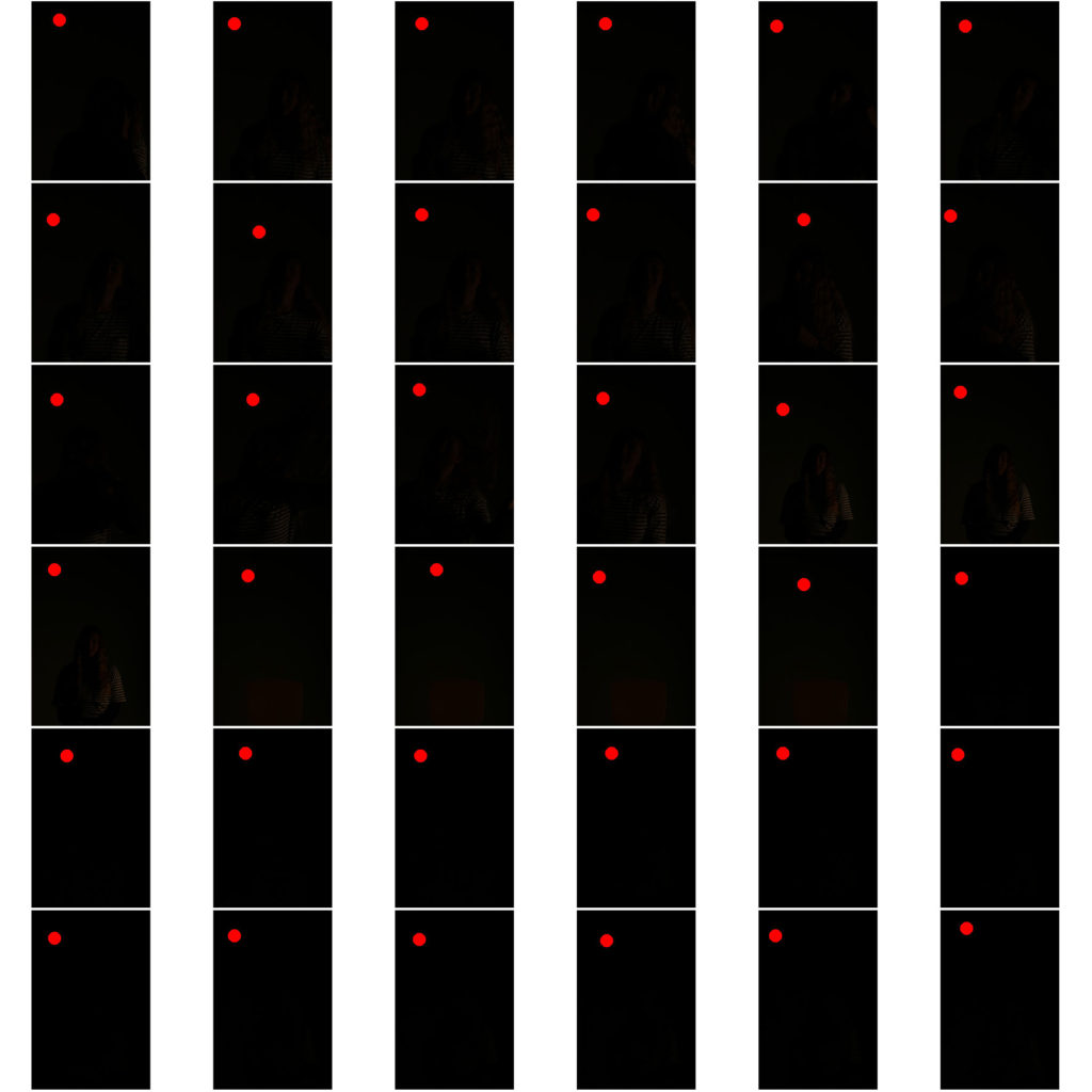
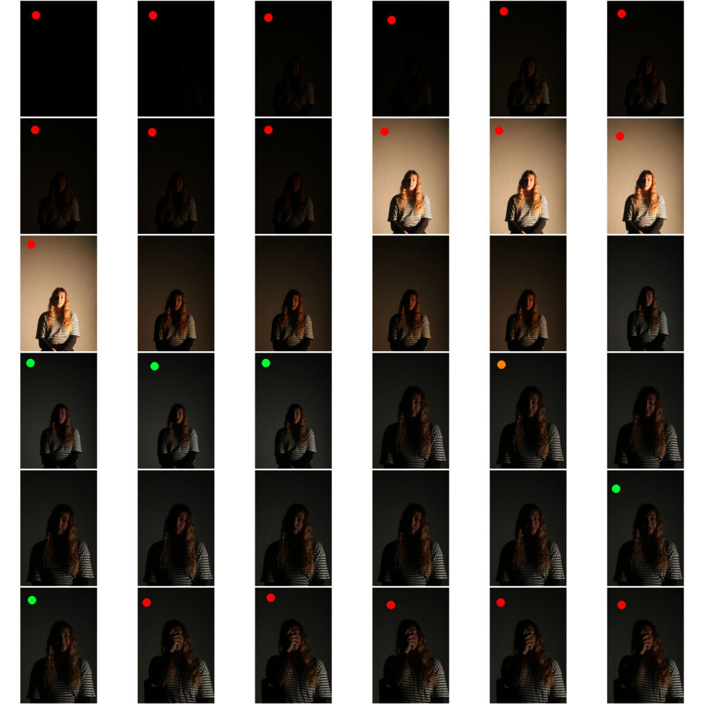
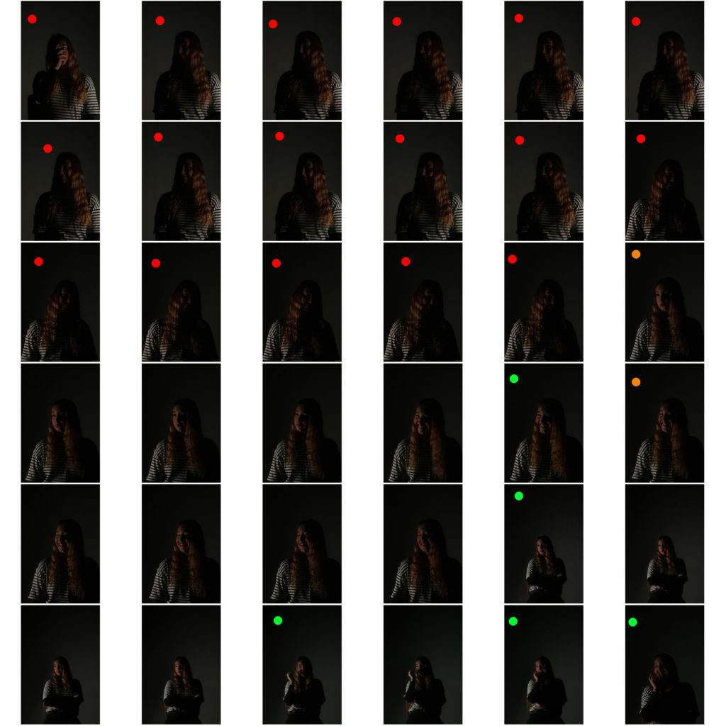
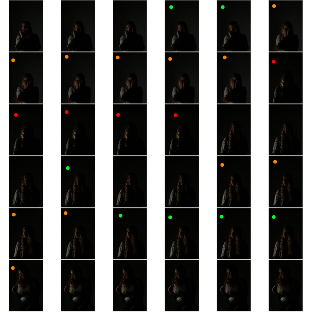
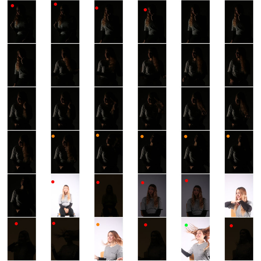
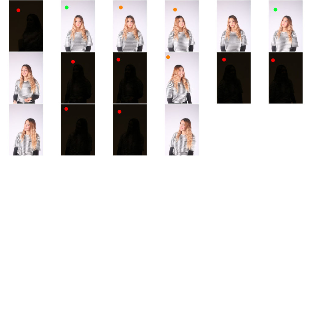
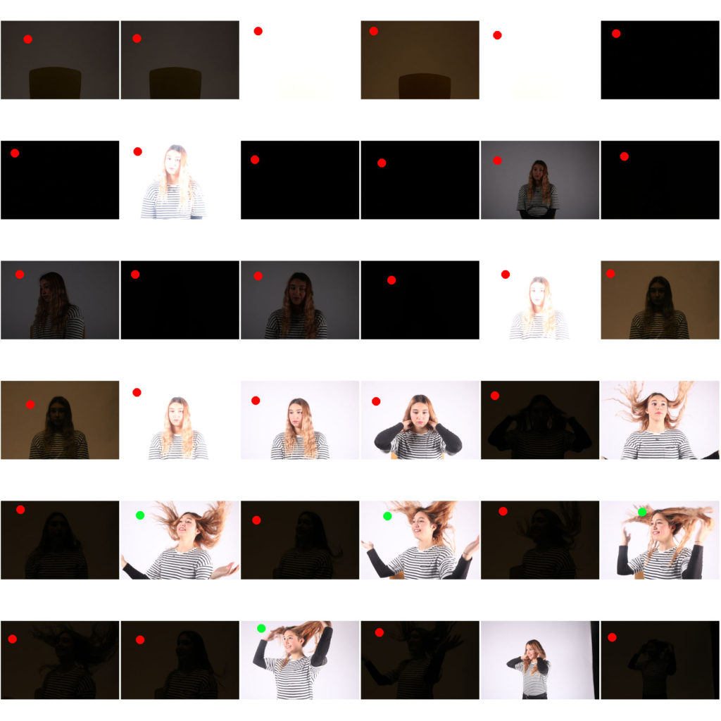
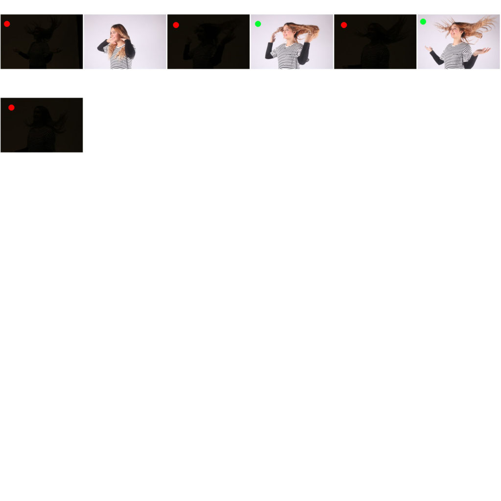
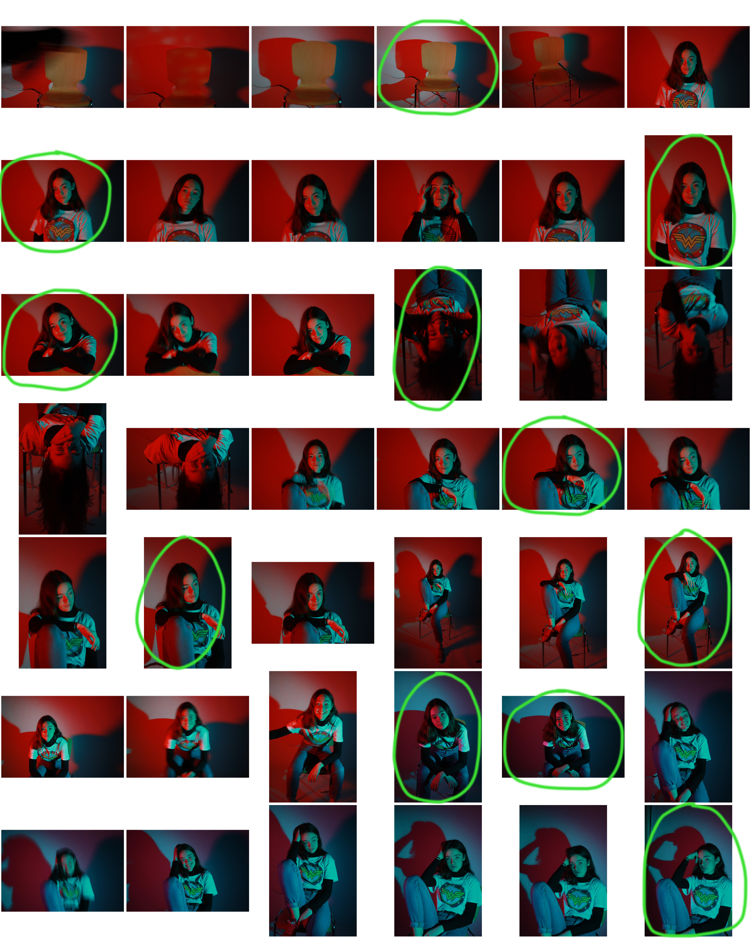
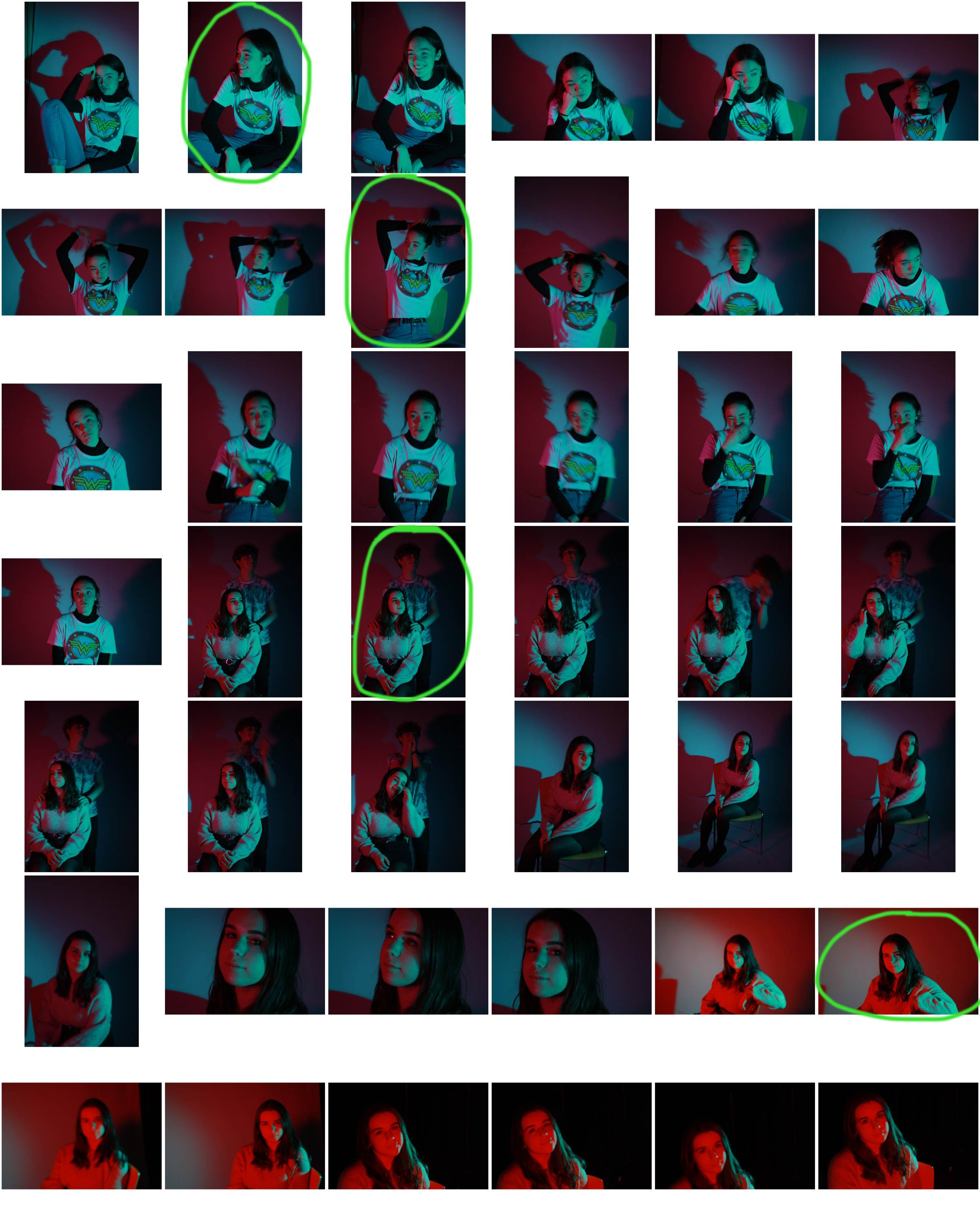
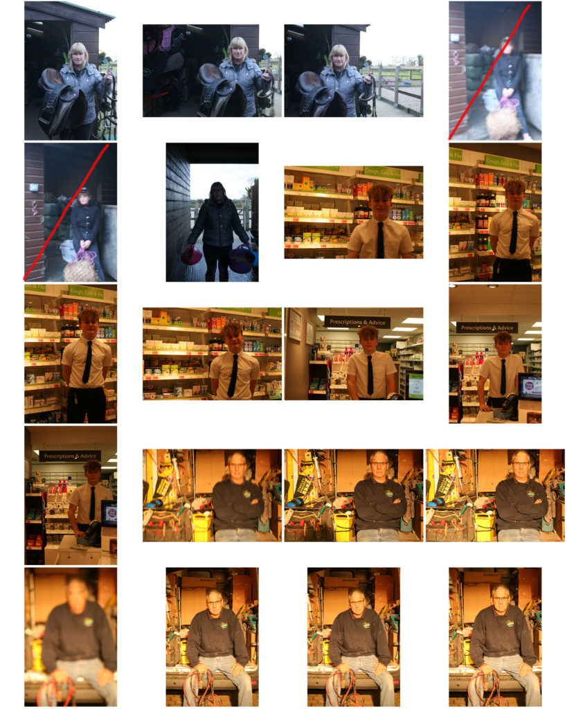
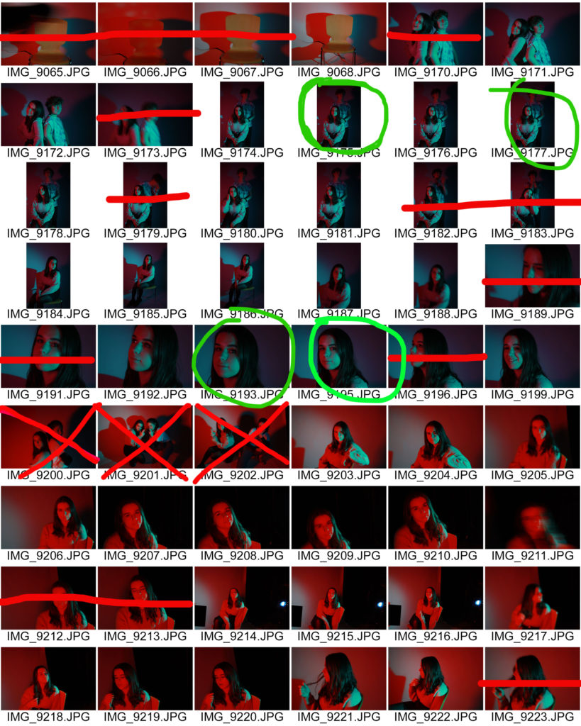
below are the contact sheets from the studio shoot i did with my friend. i have annotated pictures either in red, as i will not include them in my selection, orange, as i will have a look at them further and may add them to my selection, and the ones in green will definitely be added to my selection, as they are my favourites.