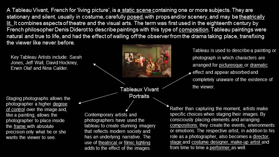

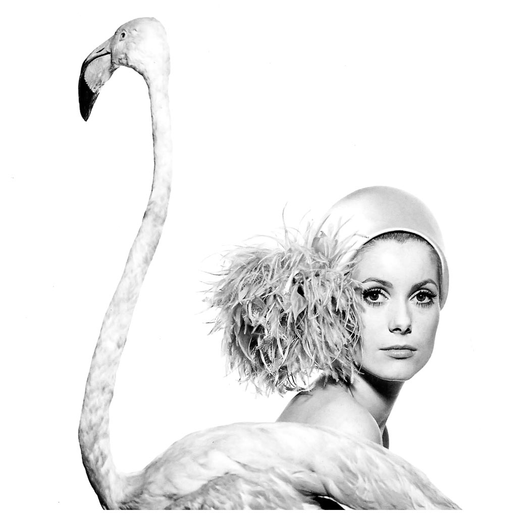
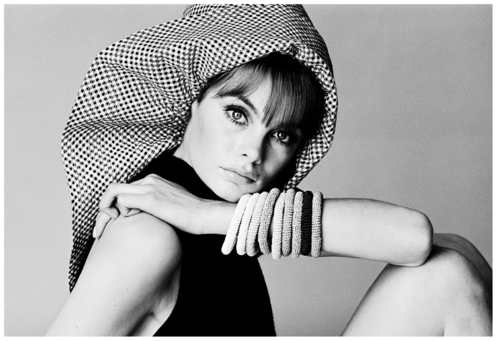
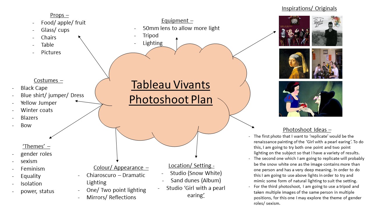
Tableau photography A tableau vivant French for ‘living picture’, is a static scene containing one or more actors or …. The tableau as a form still dominates the art photography market.
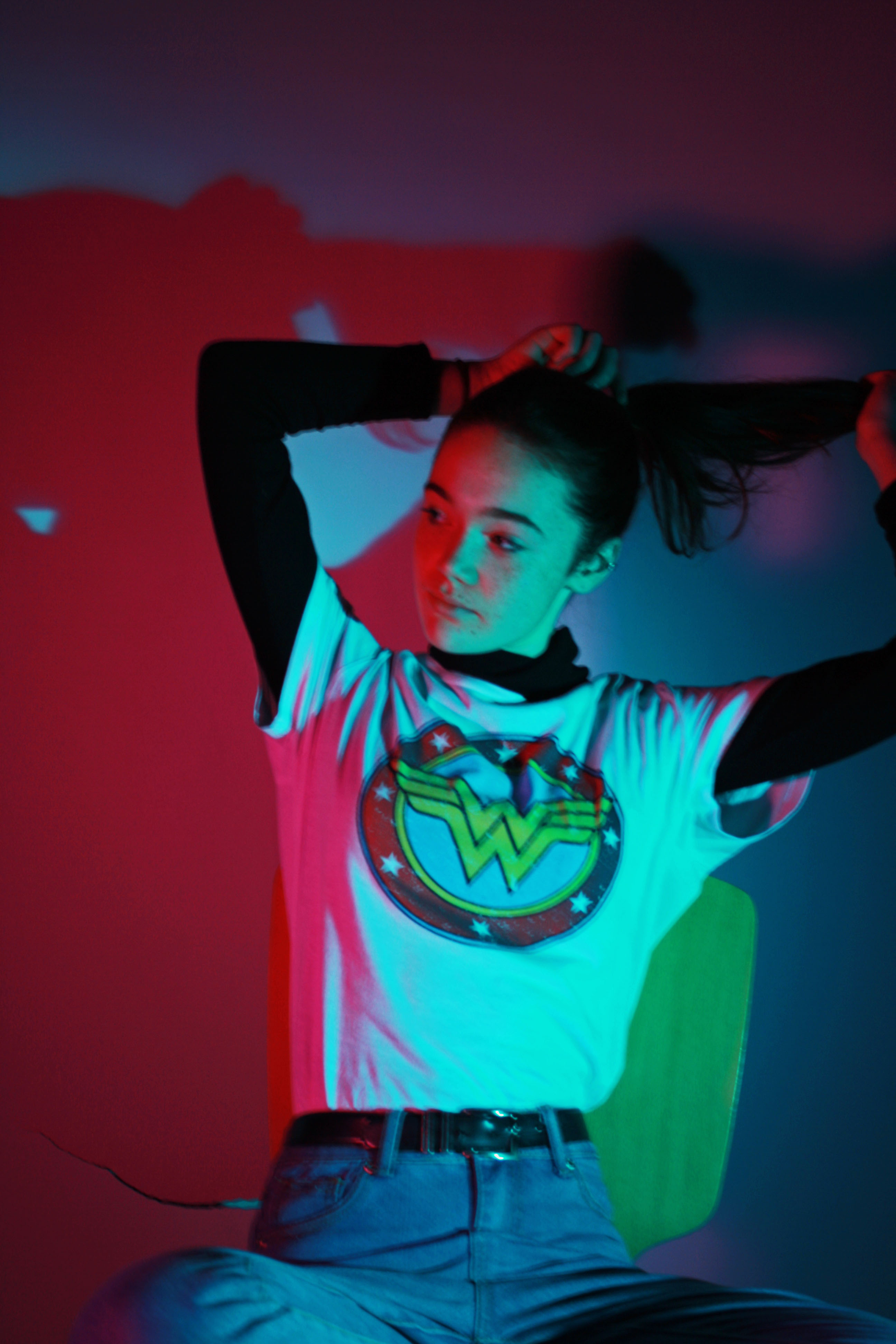
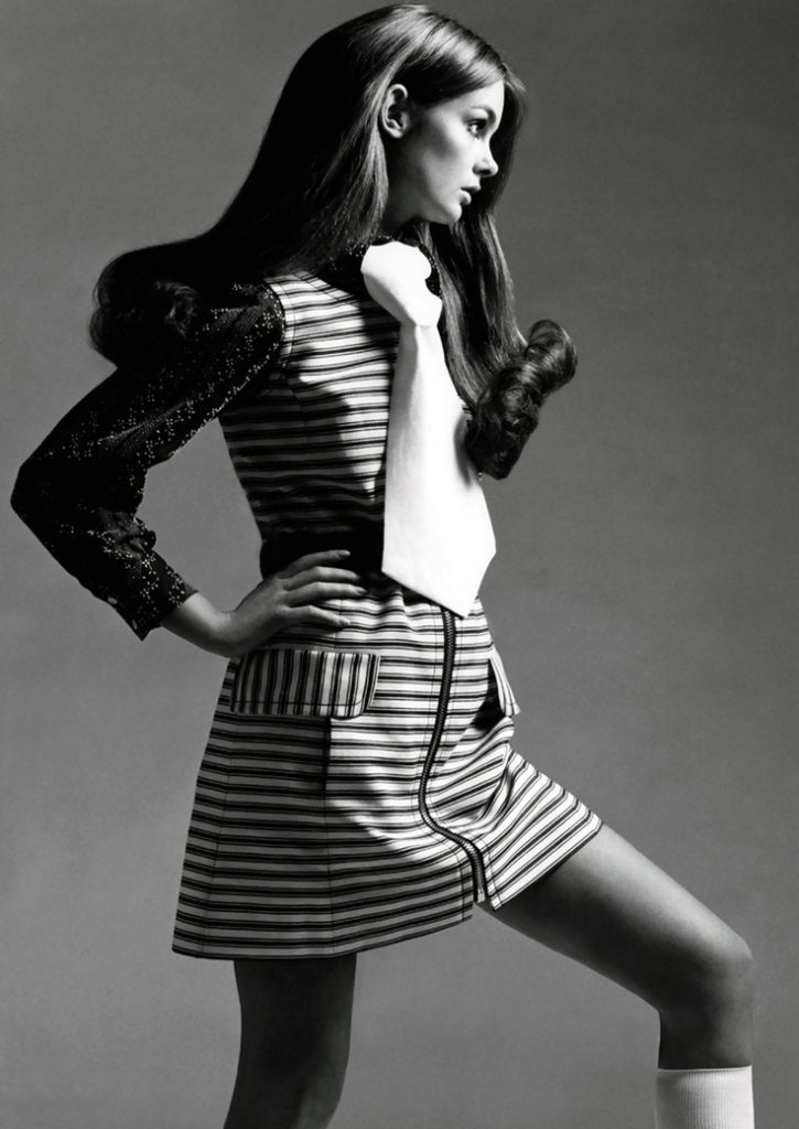
For my tableau photoshoot i have chosen the following photos to recreate.

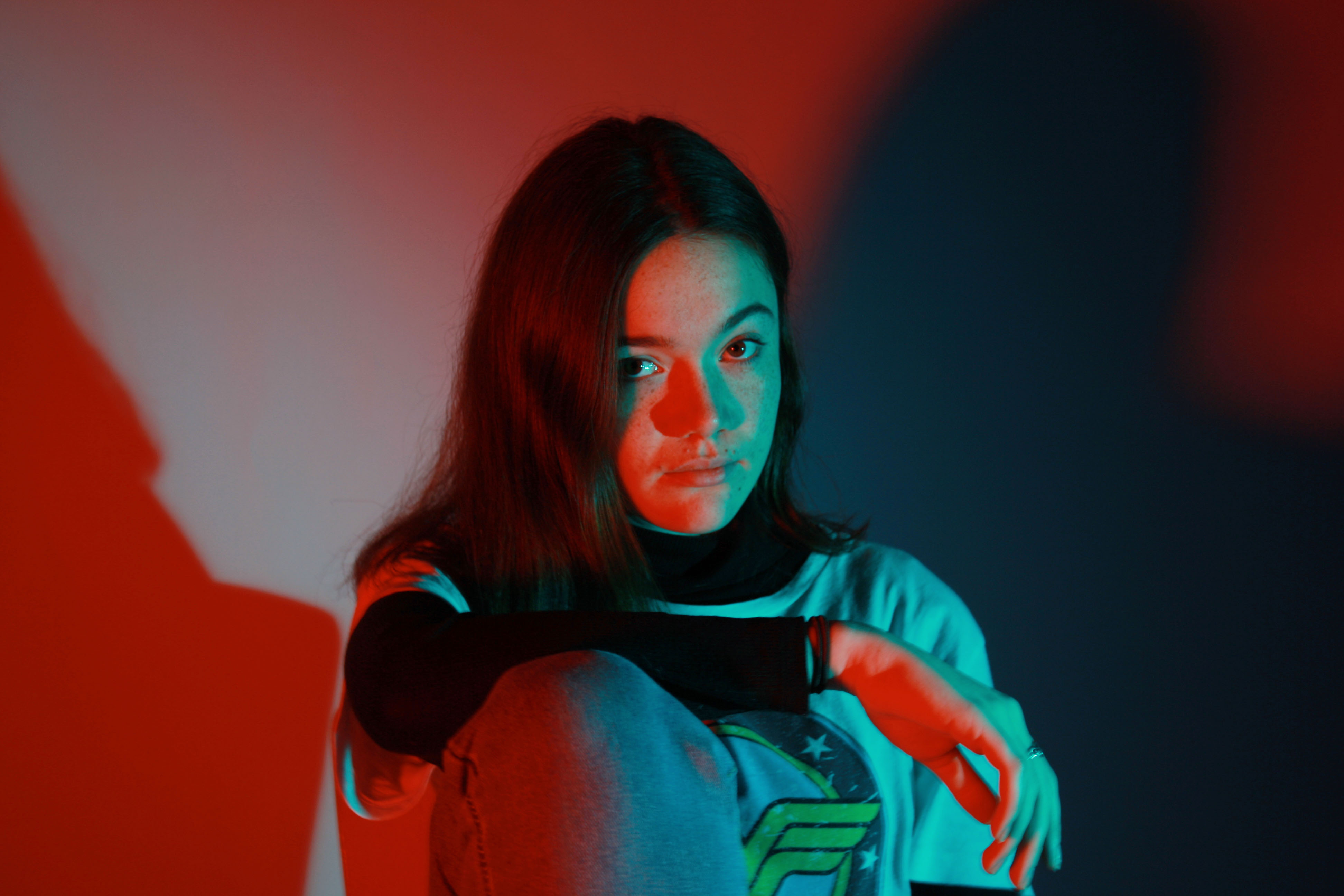
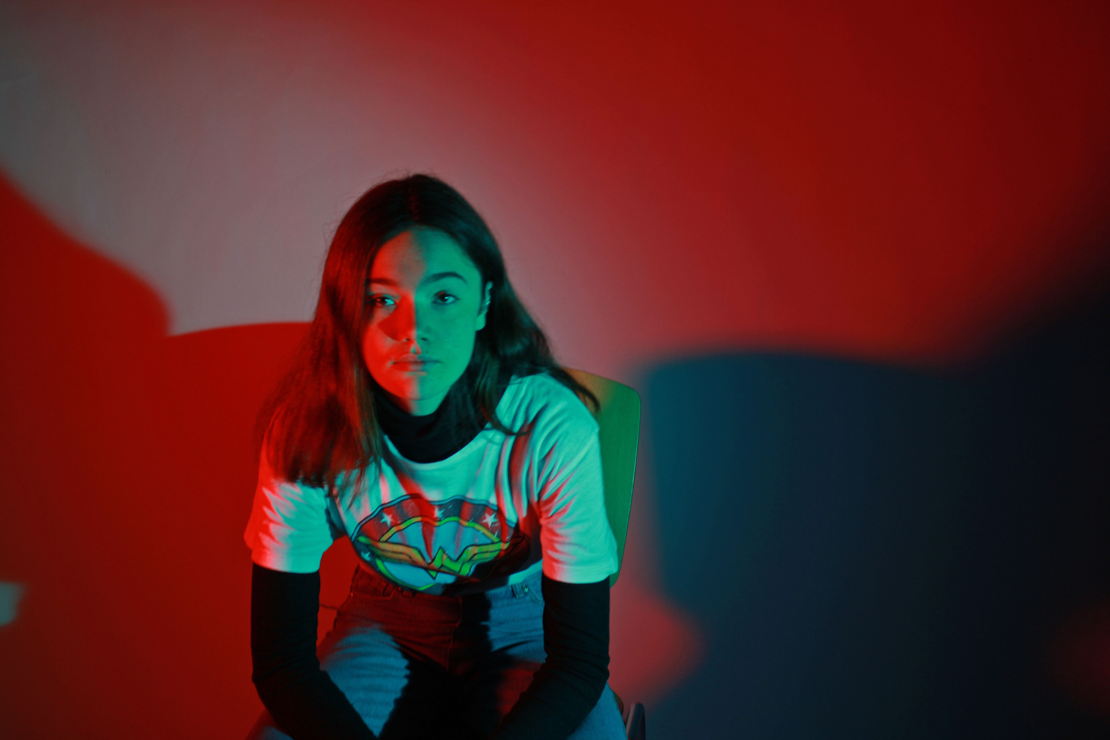
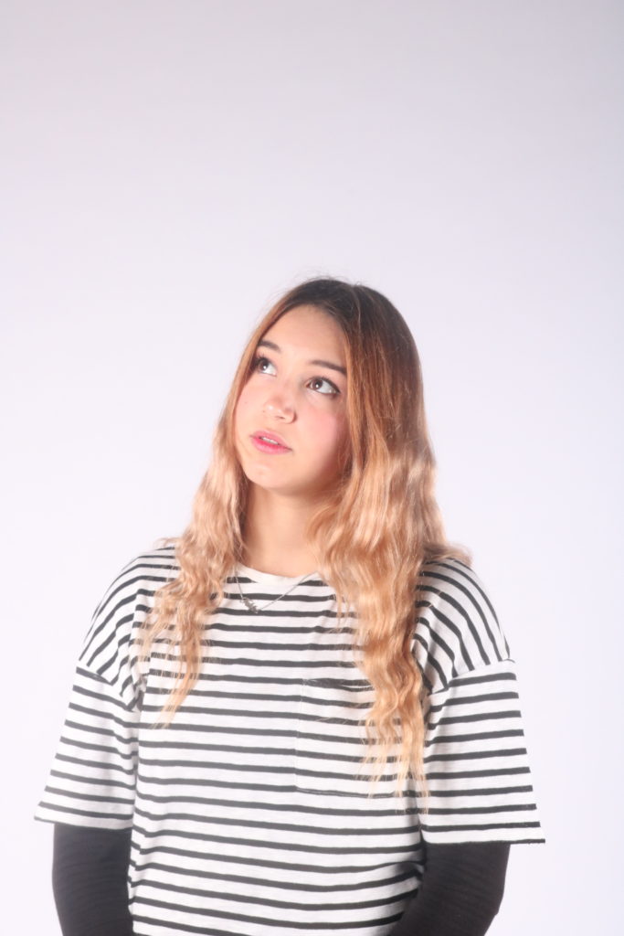
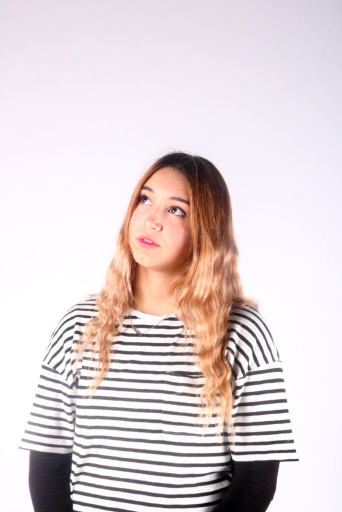
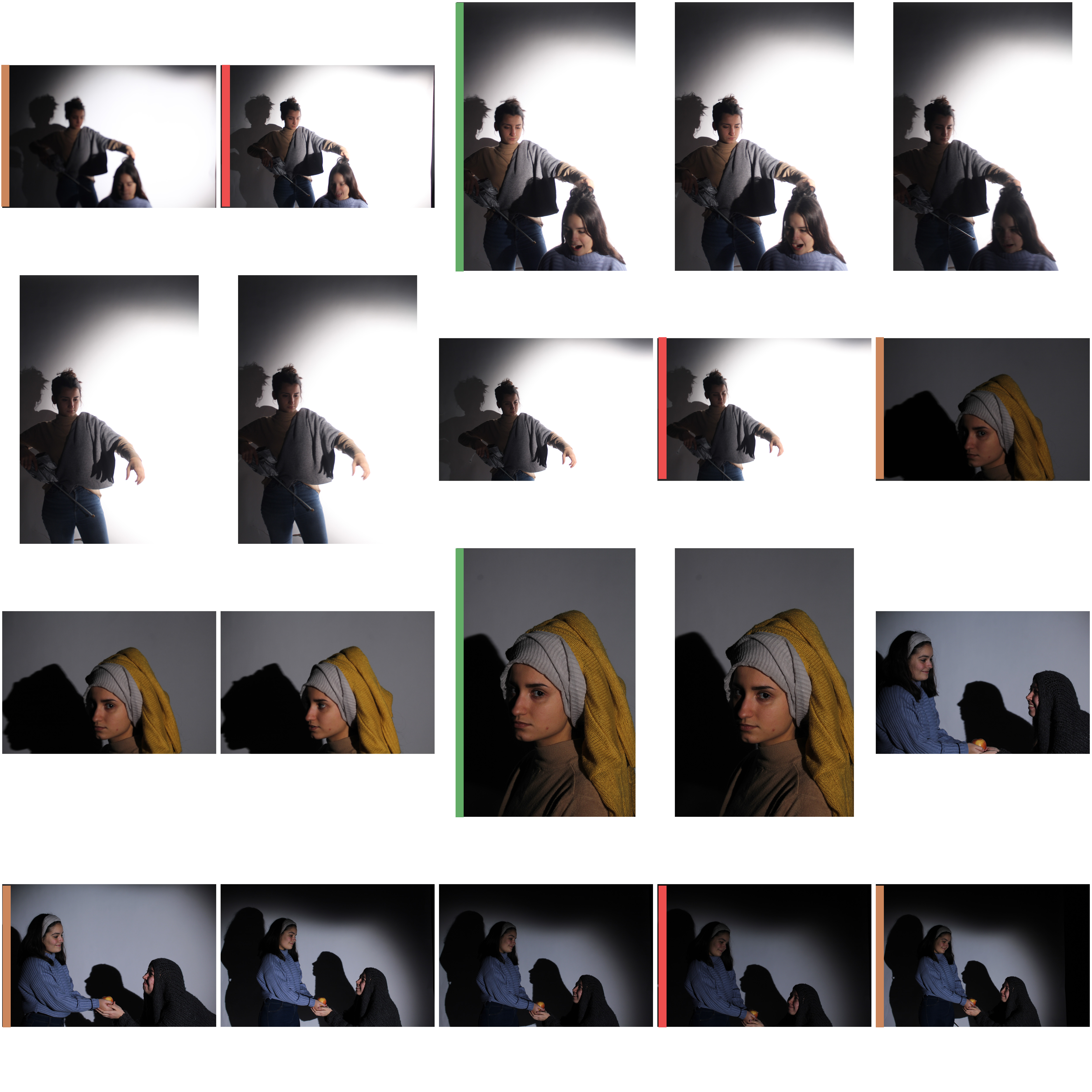
Below are my 3 final images from the studio portraiture shoot. I have chosen these image because they are high quality and interesting to look at for the viewer.
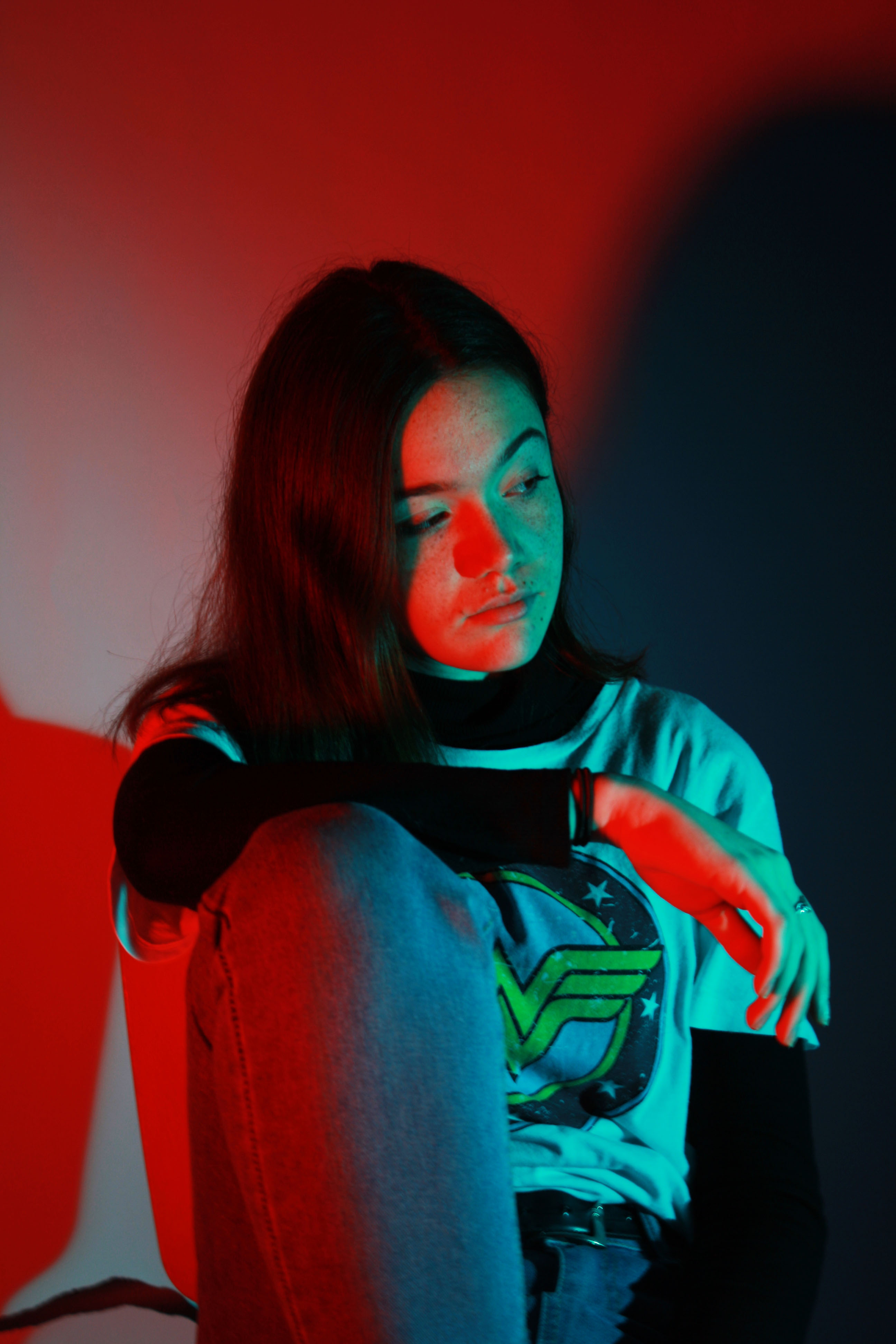
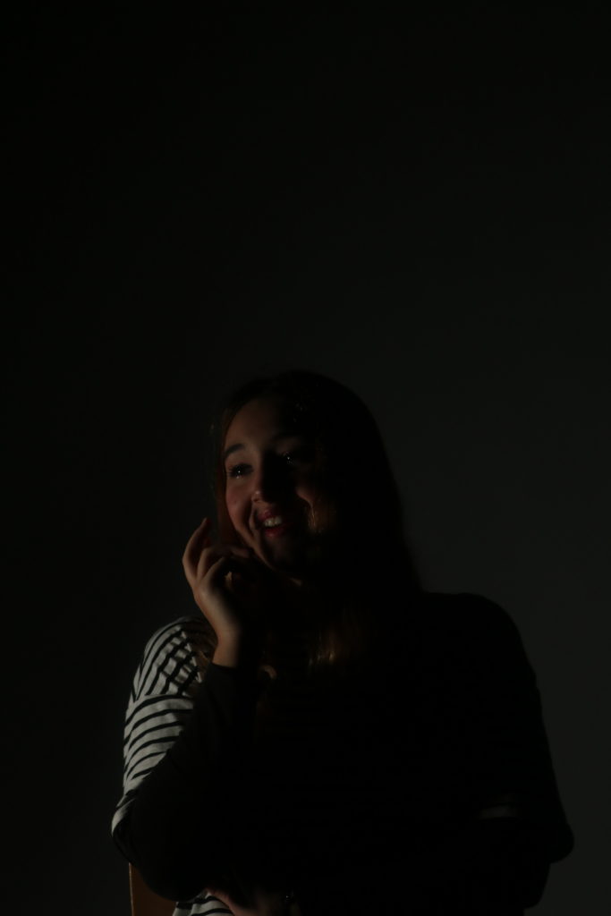
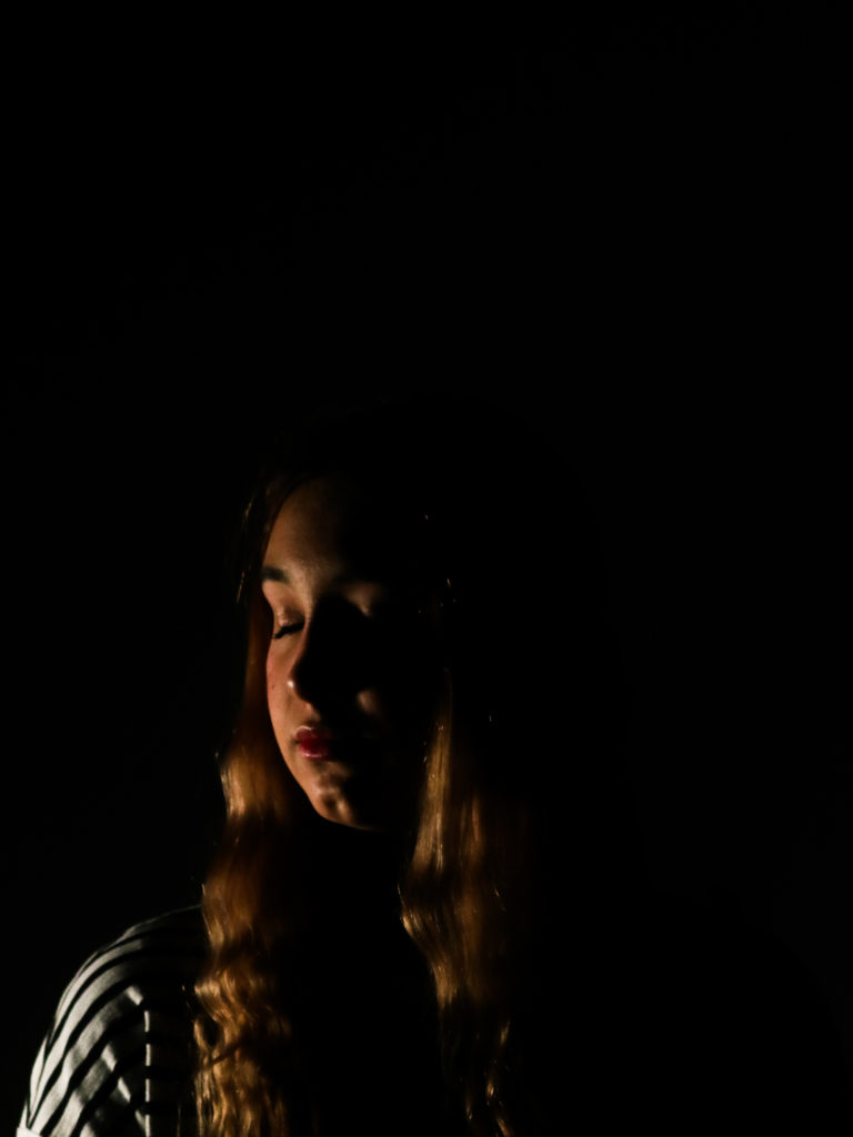
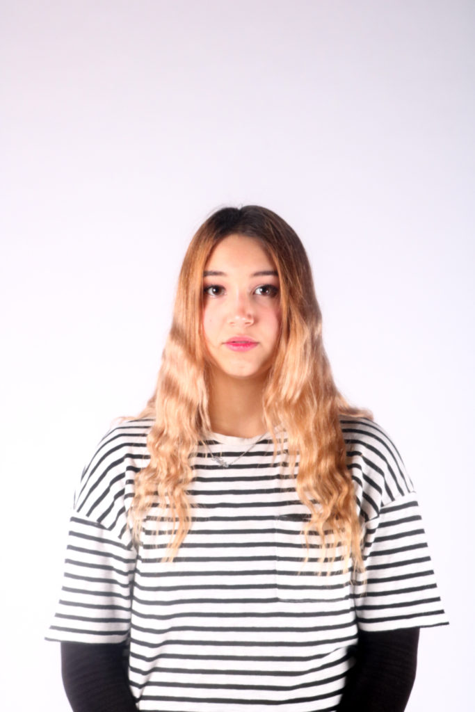
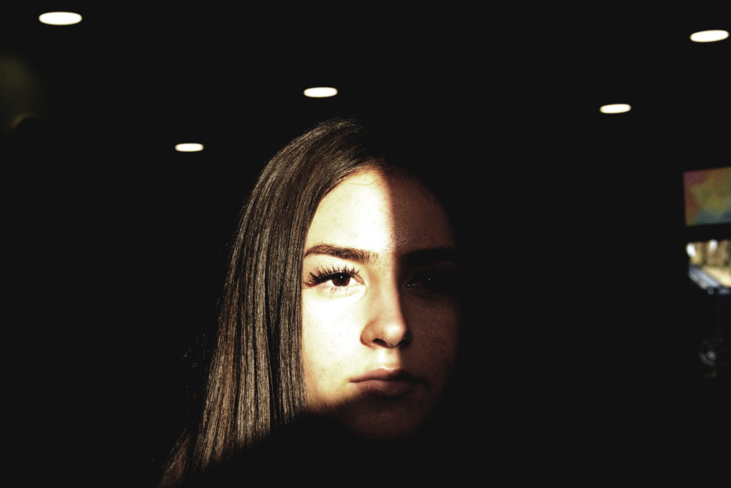
final image one
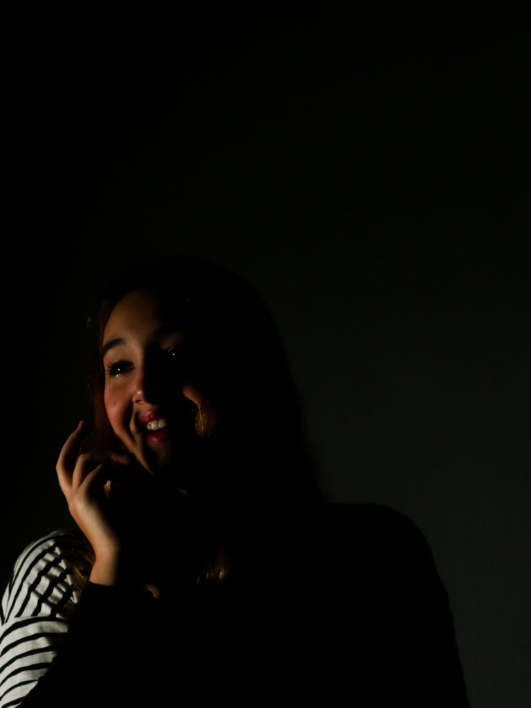
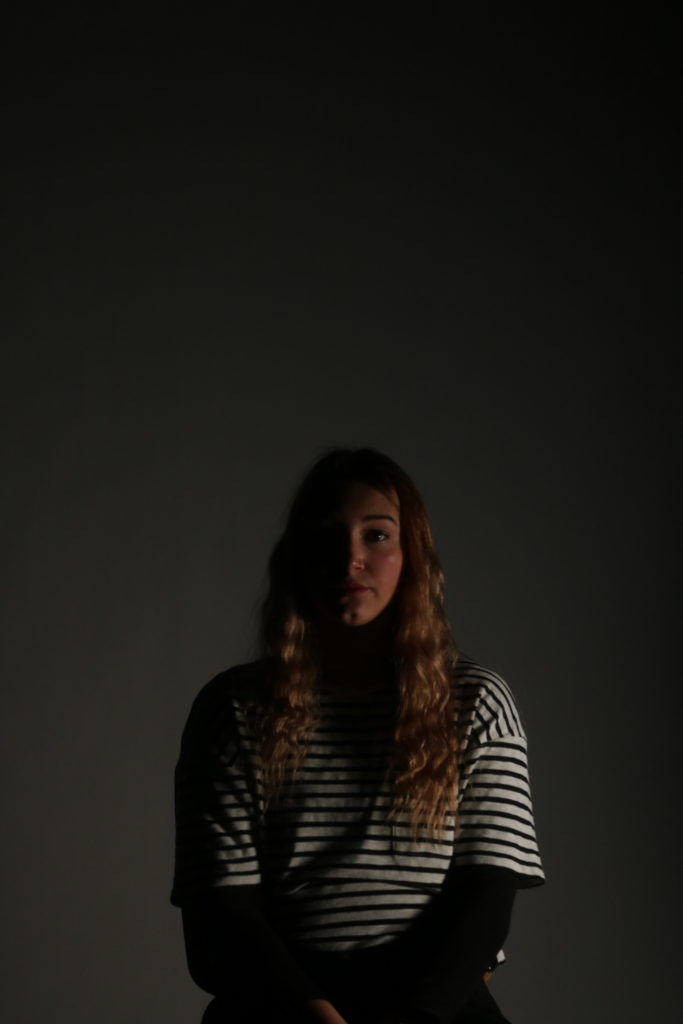
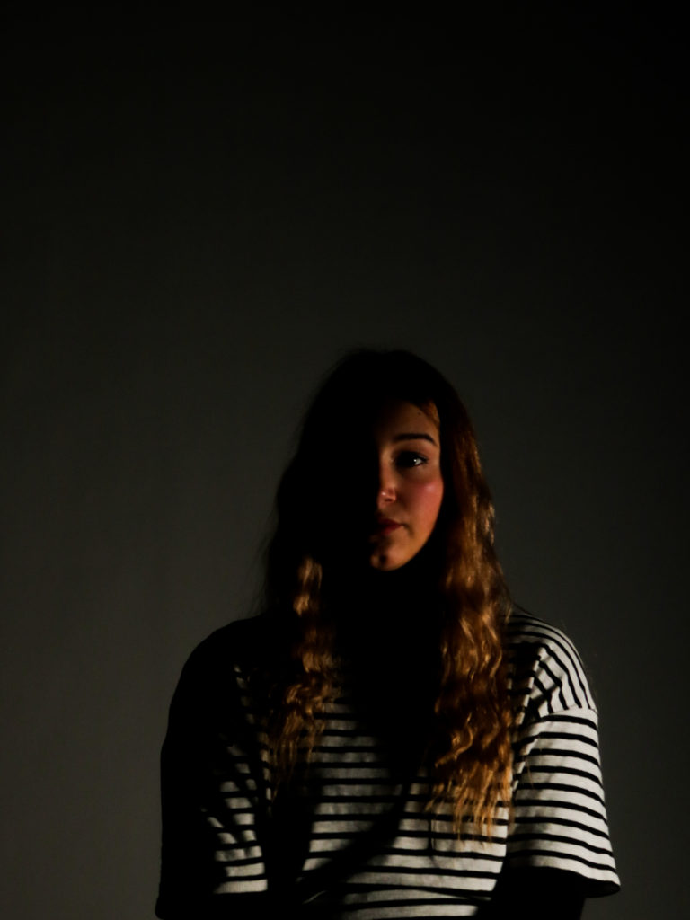
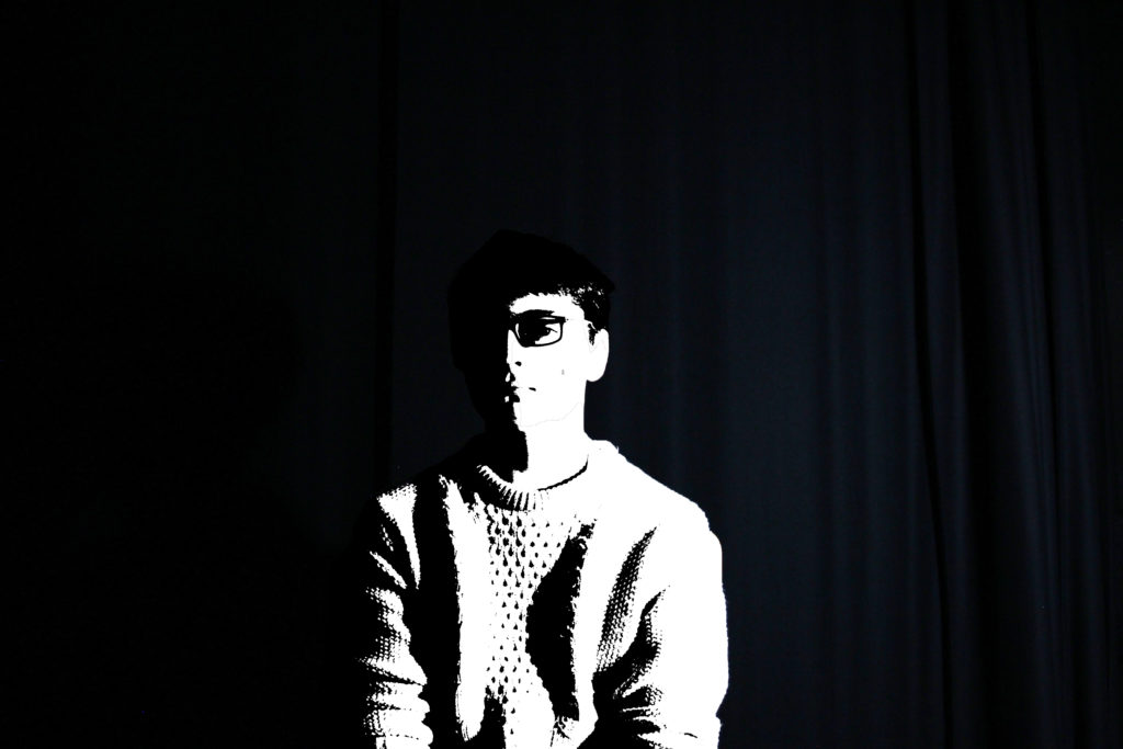
I have chosen this image for one of my finals as it is a strong image in terms of composition and aesthetics, as there is negative space that draws more attention to the individual. The pose the individual did is also effective, as it allows for shadows to be cast on the face and a more interesting pose than a simple straight on shot. The contrast between the light and dark is also very powerful too. This element was captured by placing a continuous light on individuals face, which only illuminated parts of it, to create strong shadows and bright lights. If I were to take this photograph again, I would try to position the light in a way that would mean that the backdrop was not illuminated as much, as it is a little distracting. Having a darker backdrop would also allow there to be a stronger negative space to draw more eyes towards the individuals face.
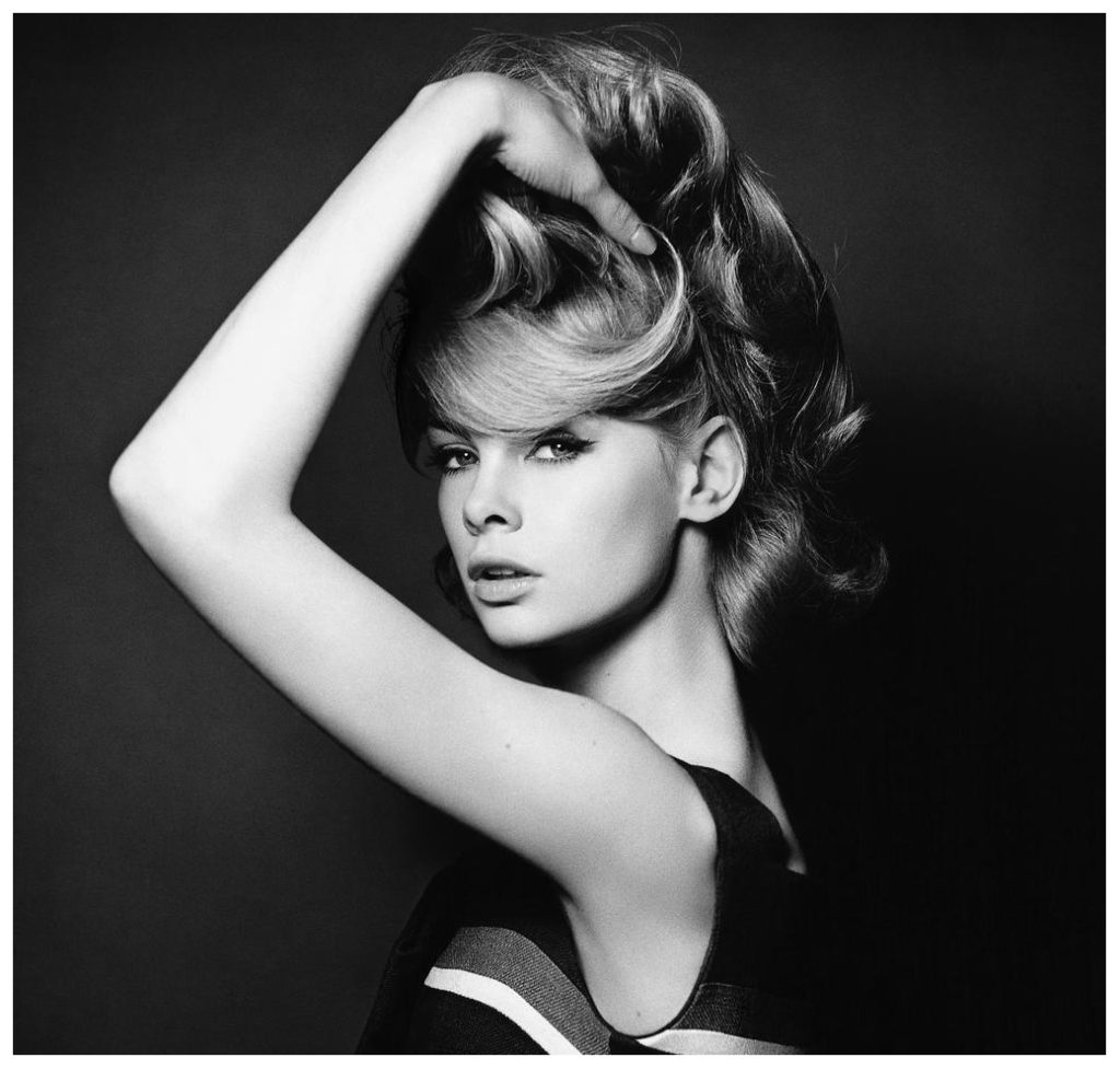
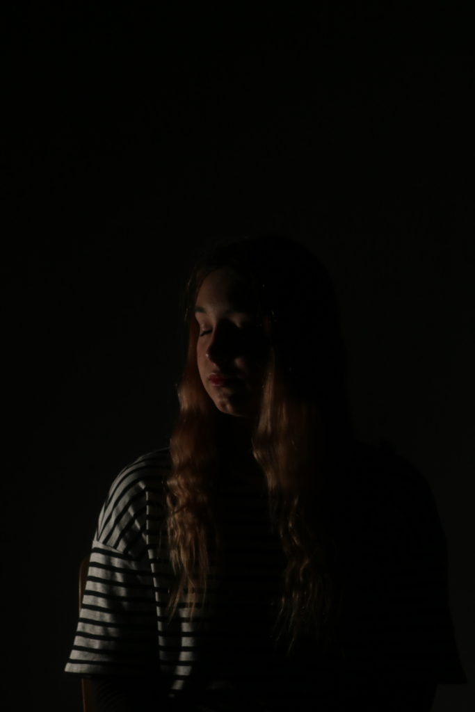
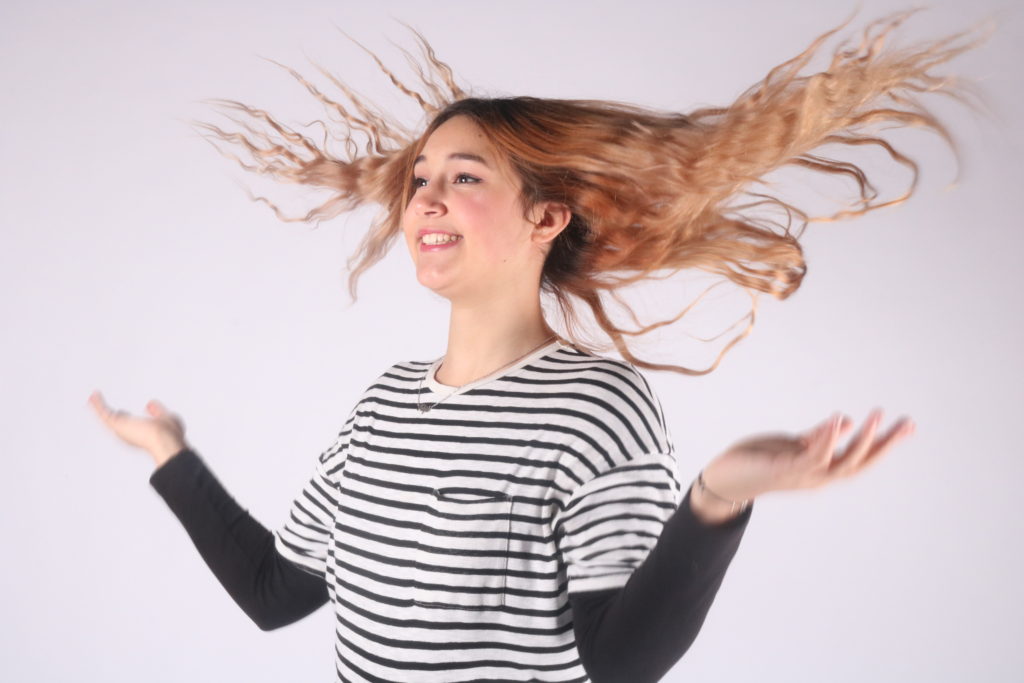
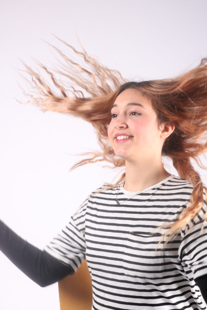
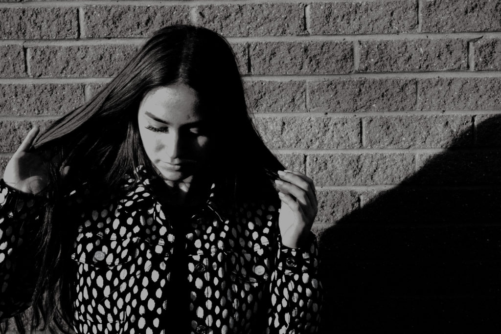
final image two
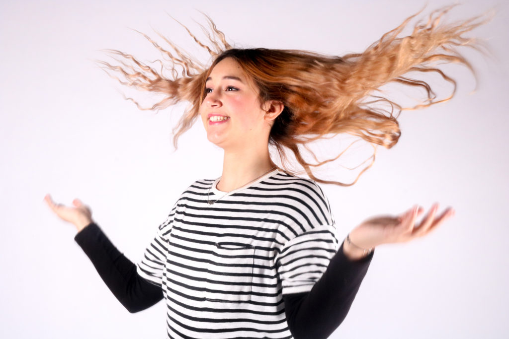
I have chosen this image to be one of my finals because I like the movement of the hair and the way it contrasts and sits against the white backdrop. Even though this photograph contains motion blur it is still a strong image, because the movement of the hands add interest and extra movement to the photograph. The hair stands out well as all the other aspects of the image are black and white. The individuals position is playful and joyful, which relates to the movement of the hair. If I were to take this photograph again, I would have tried to included more of the body, as it would have improved the composition as the photograph is quite full, but having more of the body would have balanced it out.
final image three
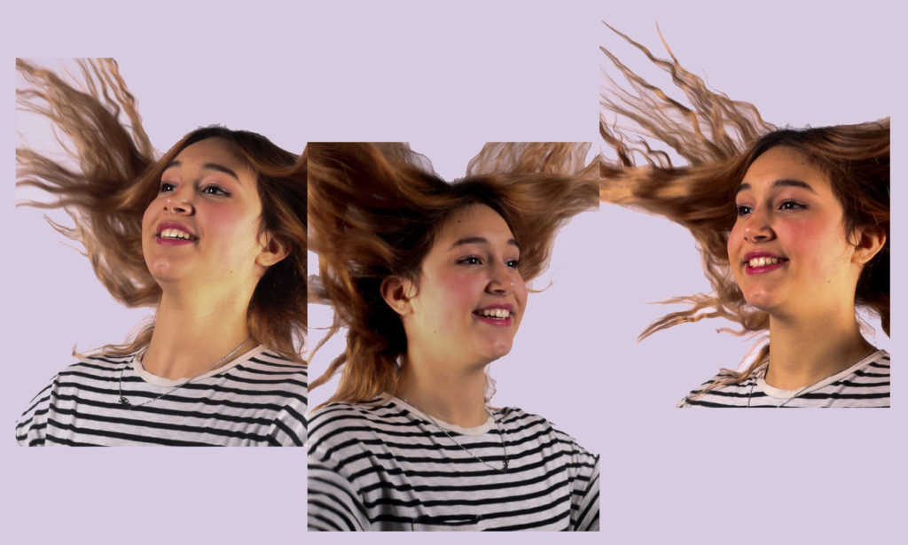
I have chosen this image to be one of my finals as it is creative and includes more than one image doing the same activity. By lining up the photographs in a way to look like they are joined in a way, came to me on the spot, as I liked these images but found they were very similar. However by placing them into Photoshop and playing around with the position of the images, this idea was created. The background colour adds to the creativeness of the image and how fun it is, even though it is only a light colour. I made it a pastel colour so it would not distract from the images. If I were to create this image again, I would try to take the photographs from straight on, so that the hair could flow and connect in a more realistic way.
whole shoot evaluation
Overall I think this shoot was successful and most of my images turned out the way I had wanted them to. It was my first time shooting in the studio, so at first I had to experiment with the camera setting to allow me to get a correctly exposed image at the right shutter speed. But after a few changes I found the correct settings. I have gained more confidence when directing my individual now, and I think this has improved my image quality as the poses and expressions are more interesting. I really like how the two point lighting photographs came out and how eye catching they are, due to the high exposure. If I were to do this shoot again, I would try to get a broader range of angles of the individual, as this will make my selection process easier as there will be more photographs to chose from. I would also try and experiment with the one point lighting by placing the continuous light in different places, to cast more interesting shadows too.
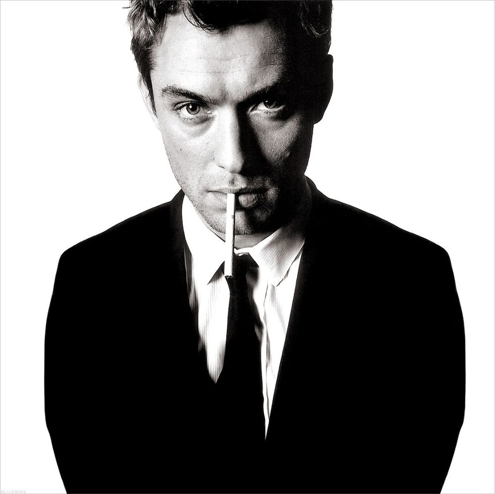
who is DAVID BAILEY and what do they do?
BAILEY is an english fashion and portrait photographer, who was a photographer for british magazine vogue. BAILEY also directed many tv comericals and documentaries. He is a very well known photographer who took photographs of many musicians for their album covers and various other things.
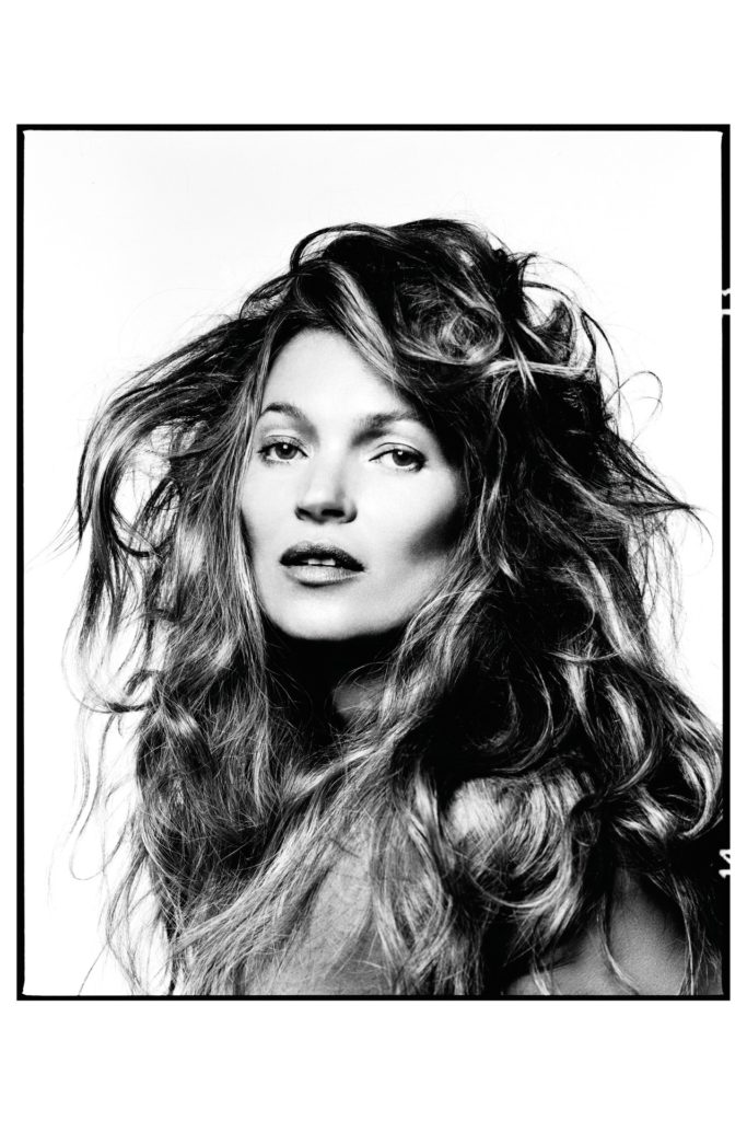
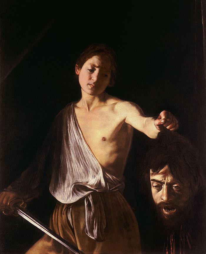
mood board of DAVID BAILEYS photographs

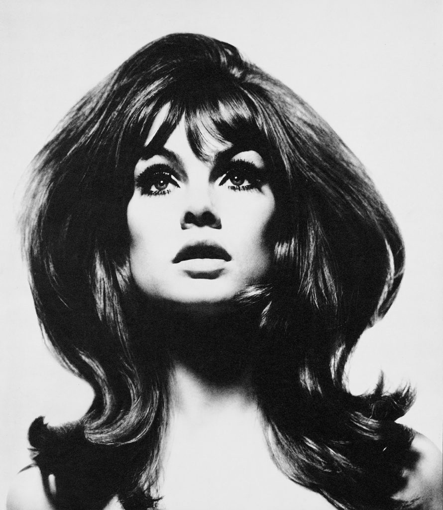
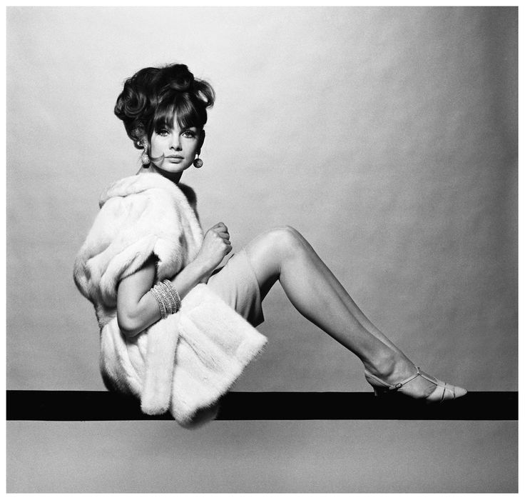
analysis of DAVID BAILEYS photograph
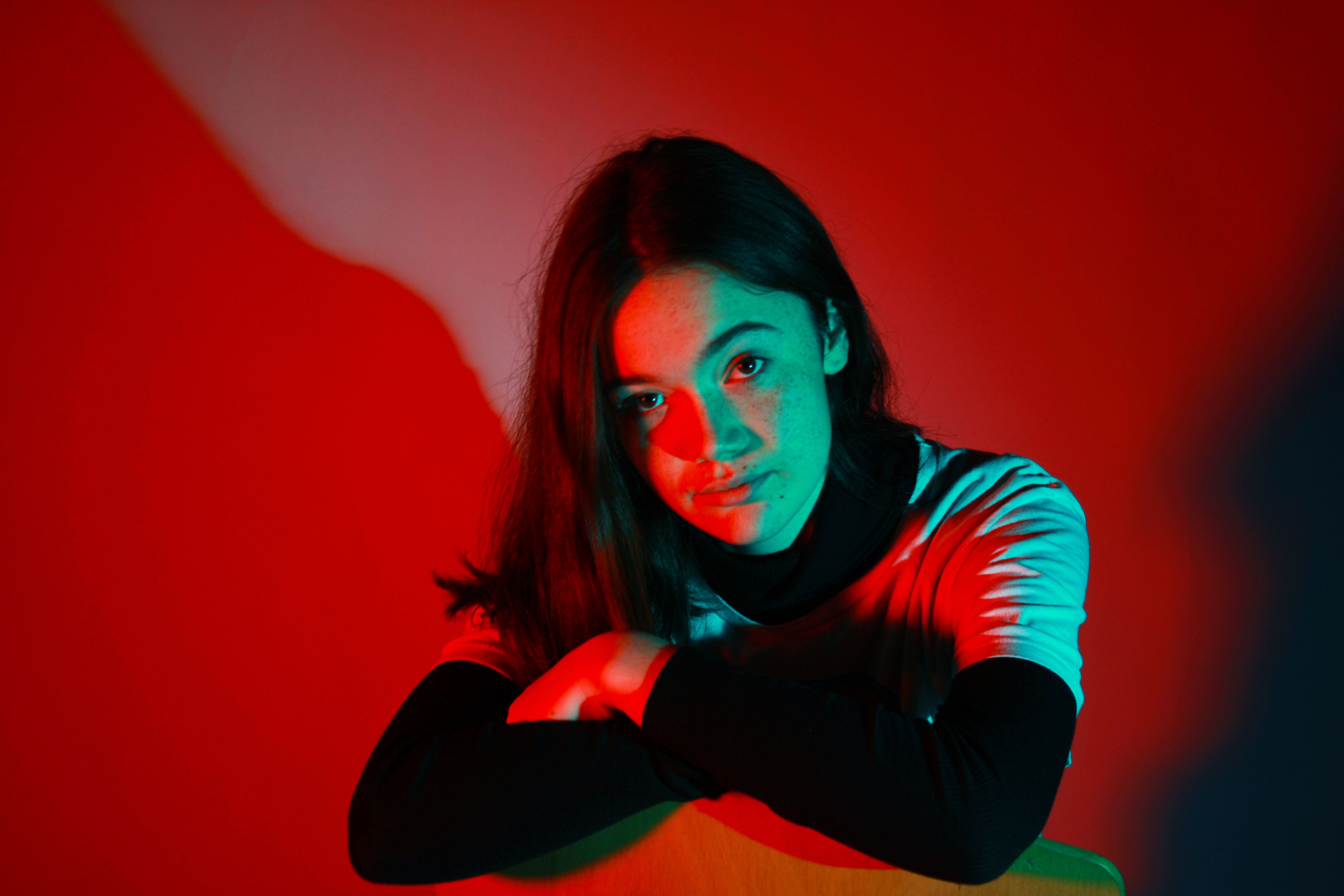
The lighting in this photograph is artificial, as it is controlled by BAILEY to be bright and high. BAILEY has positioned the lighting in a particular way to allow for a successful image. In this photograph BAILEY might have used lighting on the left of the model and behind, to create a high key image, that has shadowing on the right side of the photograph. All of the individuals features are will lit and illuminated, suggesting that is light coming from in front too. The shutter speed would have been quite high, as there are no motion blur or places out of focus. BAILEY has edited the photograph to be black and white, to create a more eye catching and stronger photograph. There is a good balance of light and dark, as the models outfit contrasts with the background, as it is dark. The head accessory adds an interesting texture to the photograph, that stands out and creates interest for the viewer. This texture is also a repeating pattern too, which acts as a drawing point for a viewer. BAILEY must have deliberately used this head accessory for this exact reason.
how am i going to relate to DAVID BAILEY when i take my photographs?
get very bold photographs.
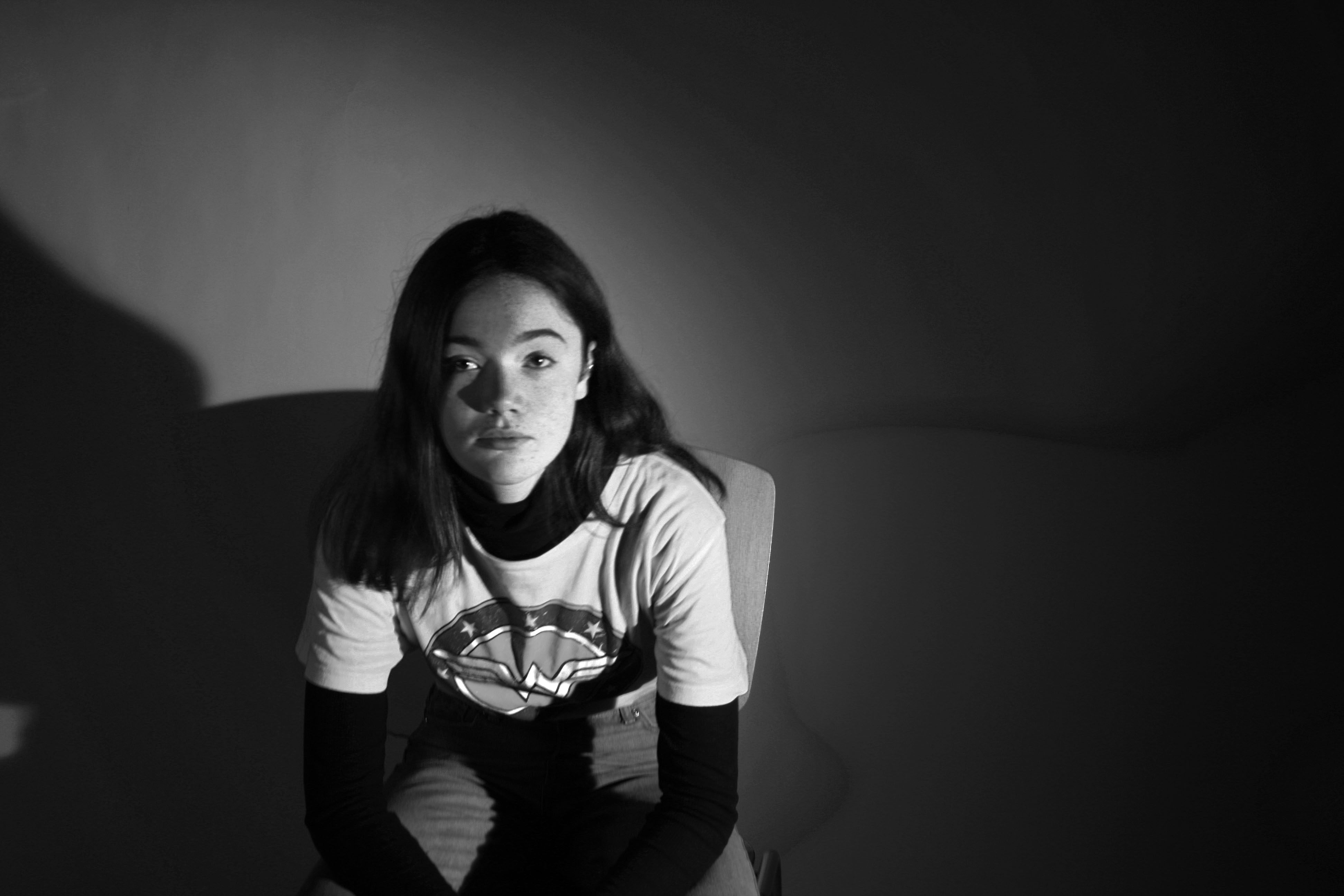
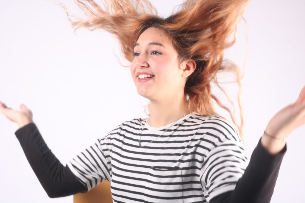
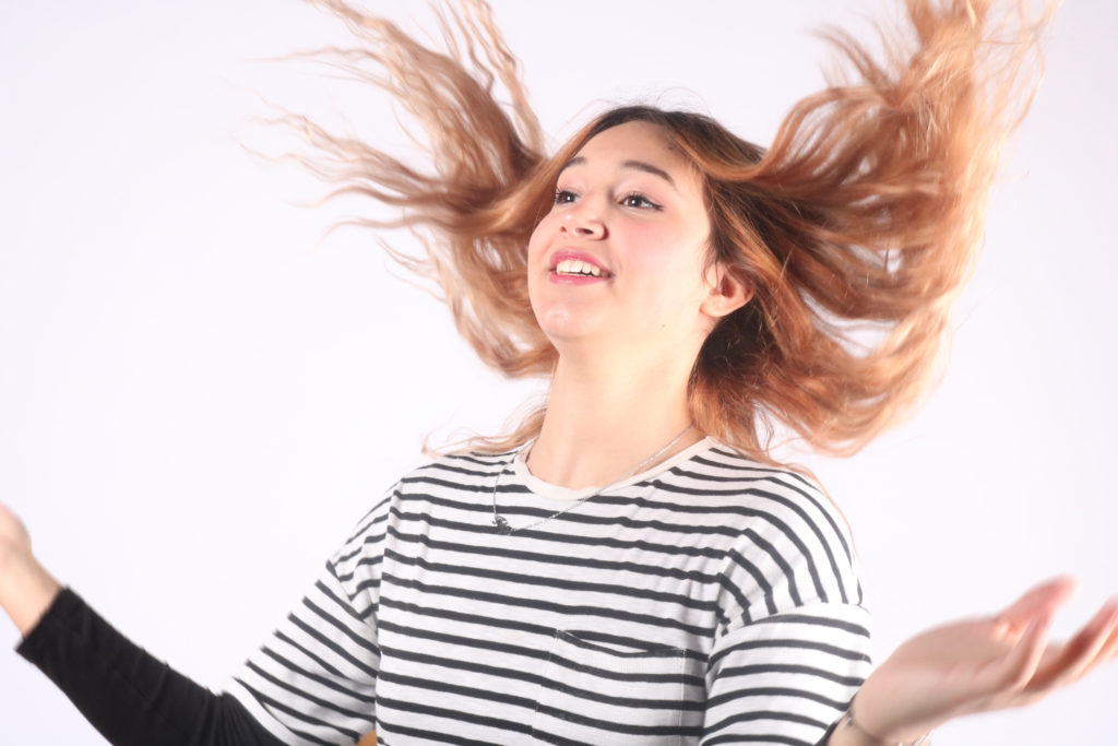
Below are all the images I decided to edit on Lightroom, as they came out the best and were the closest to the image I had wanted to create. They are all strong images which I will select from to be my final images.
image one
For this image, I increased the exposure, as the illuminated areas of the face was a touch dark and didn’t create the effect I had intended to. I then increased the blacks to create a stronger contrast between the lights and darks, to create a chiaroscuro effect. To increase the overall aesthetics of the image I cropped it down, so you could only see the top half of the individuals’ body.
image two
For this image I increased the highlight, to make them brighter so that the illuminated side of the face was more contrasted too. I also increased the whites to make the highlights more profound. I also cropped the image to allow there to be some negative space, that is very effective in this instance.
image three
For this image, I increased the exposure to fully illuminate the half of the face that had the constant light on it, as the original photograph was very flat. This simple adjustment let the photograph become more contrasted and let the tonal ranges become separated. I then increased the blacks to allow the background to blend into the individual’s hair and body. I also cropped the image as in the original there was too much negative space, which distracted the eye away from the individual.
image four
For this image, I increased the whites, to create a high key image, that is very bright. This accentuates all the features and makes them illuminated. I then just increased the contrast to make the features bolder and for the tonal range to increase.
image five
For this image, I increased the whites to allow the features on the individuals face to be more prominent, as it allowed for the highlights to increase. I also increased the contrast to make sure that the tonal range was large.
image six
For this image, I increased the whites to make the backdrop whiter, to allow for a more aesthetically pleasing photograph. Increasing the whites also allowed for the image to be a lot brighter and for the features to be accentuated.
image seven
For this image, I cropped all the images down to allow for there to be a closer and more defined photograph. I increased the contrast, in all the images, to allow the features to become more defined. I then just put them in Photoshop, and arranged them in a way that made it look like the hair connected in a way, kind of. I then filled in the background in a lilac colour, as it is very subtle, and doesn’t distract from the images.
Define and present examples of Tableau Vivants – Translated as ‘Living Picture’, Tableau Vibants is a fixed scene containing one or more models, usually using props or costumes in order to emphasis the reality of the scene but also the modernization of the original scene – representing change in society and ideas.
Dictionary Definition – Tableau Vivants – A silent and motionless group of people arranged to represent a scene or incident.
Dictionary Definition – mise en scène – The arrangement of the scenery, props, etc. on the stage of a theatrical production or on the set of a film.
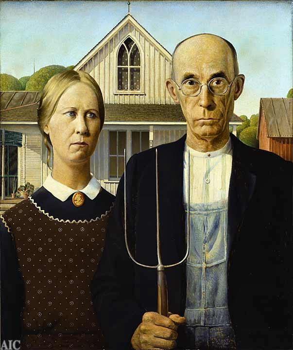
chiaroscuro paintings Inspiration –
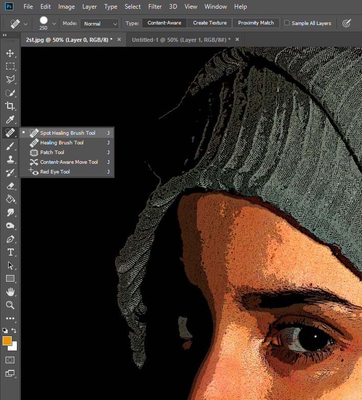
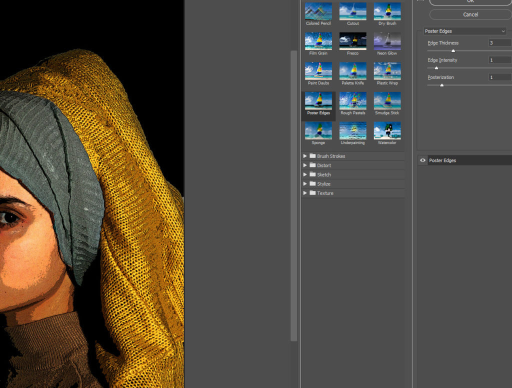
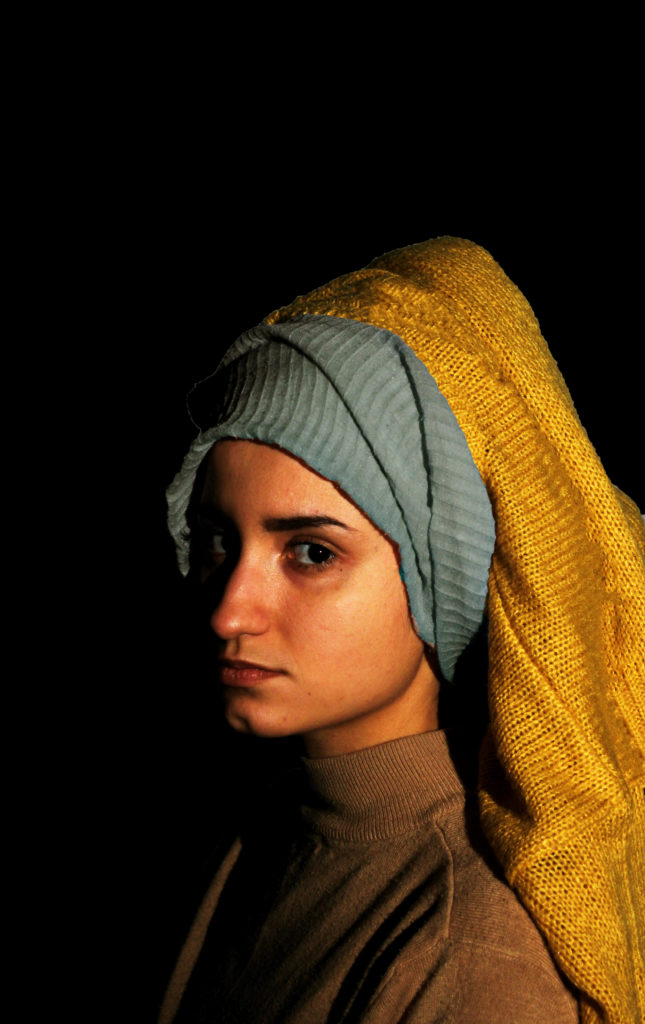
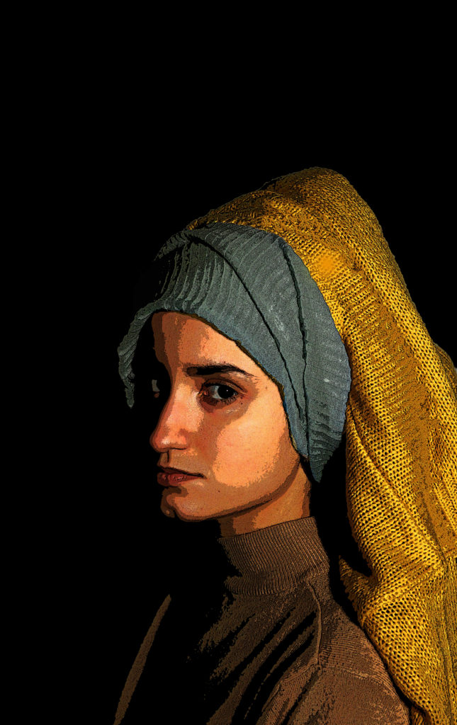
To achieve a similar effect to that of the original painting, I first used the quick select tool in order to select the background, I then used the leveling and brightness tool to make it completely black. To try and make the yellow fabric covering her hair more ‘matte’ I used the spot healing brush tool to smooth out any bumps or creases. To achieve the cartoon effect, I used the filter gallery option – ‘poster edges’ – which allowed the bright areas to be dramatically bright and the dark areas to be dramatically dark. This also allowed for the subjects darker side to be faded out (with the help of the spot healing brush tool) due to one side being very bright as I used a one-point lighting technique to get an effect similar to chiaroscuro.
Studios are used in Portrait photography to capture effects and take pictures of people that photographers wouldn’t be able to capture in an uncontrolled environment, single point lighting and the Chiaroscuro effect for instance wouldn’t necessarily be an option for photographers outside the studio. Studio portraits are often quite powerful and often use shadows, props, colours and lights in ways that make the images stand out or have meaning. There are many different types/effects used in Studio Portraits that can make the subject appear differently as well as there being many different ways to shoot studio photography, with techniques such as single point/multiple point lighting, full body shot, upper body, lower body and headshots, warm or cold lighting, using props, sets or outfits, lighting effects such as Chiaroscuro, lighting patterns or light colour gels.
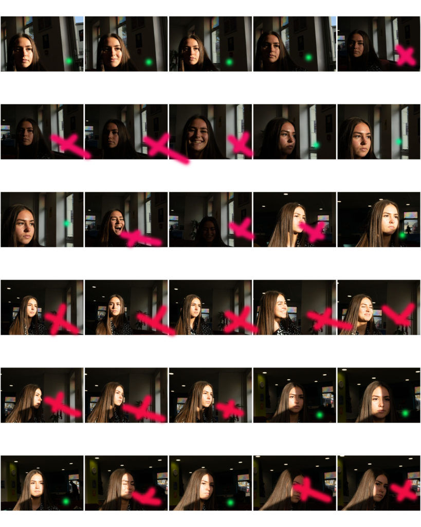
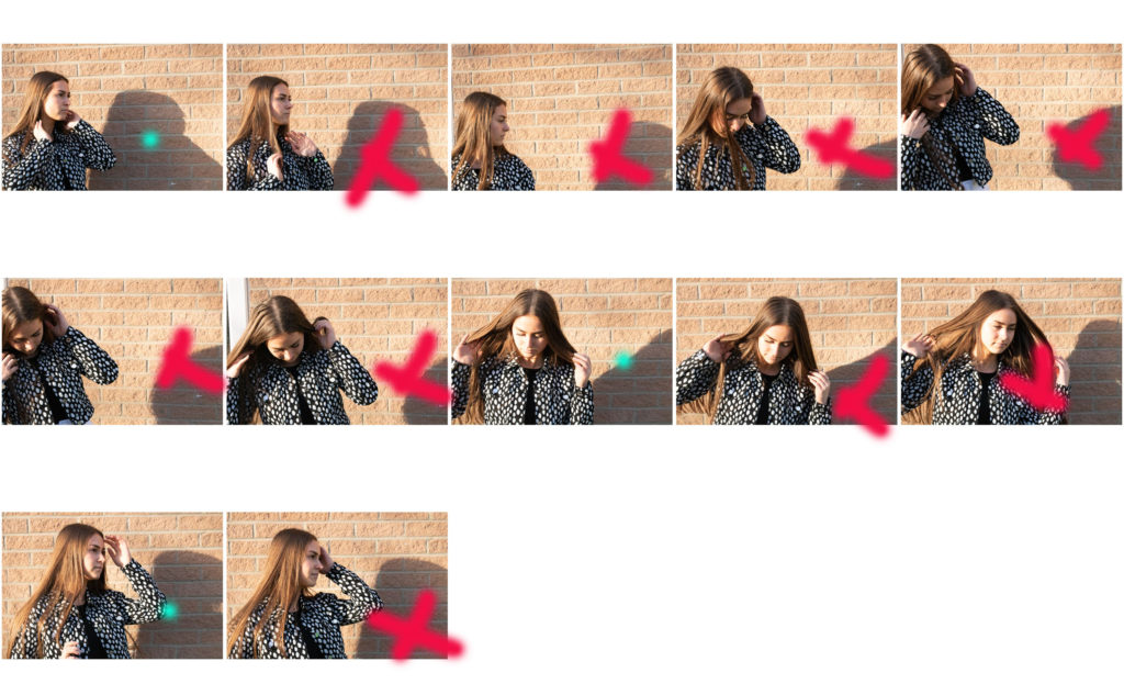
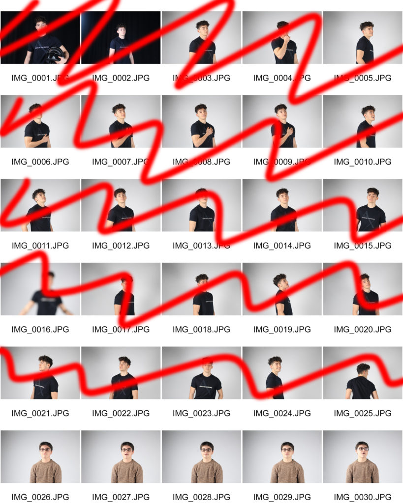
Here is a contact sheet for my Chiaroscuro effect, where I positioned the soft box to one side, emitting light at an angle to the subject of the photograph to create intense shadows that bring out a sharp and distinct contrast.
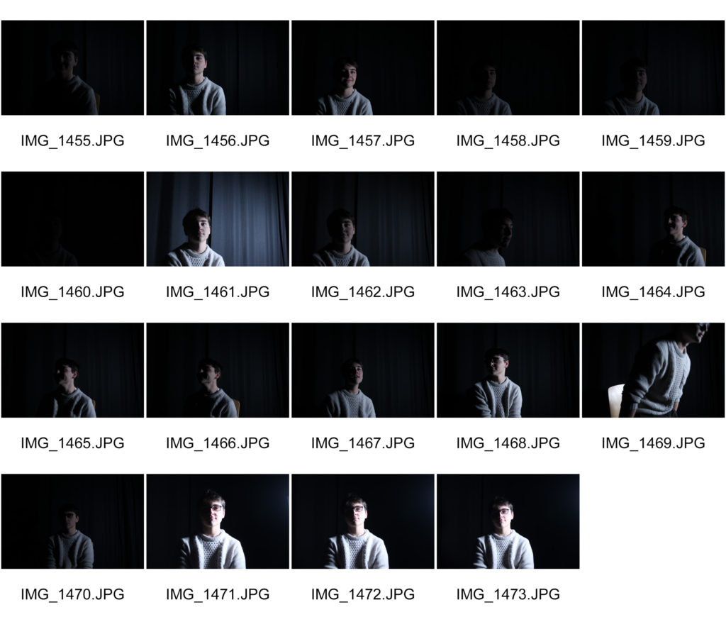
Chiaroscuro is Italian for “lightdark” which refers to it meaning of bold contrast between light and dark, here they usually effect the whole composition within the image. Chiaroscuro first started out in 15th century paintings in Italy and Holland; however what people perceive as “true Chiaroscuro” started in the 16th century in Mannerism and in Baroque art.
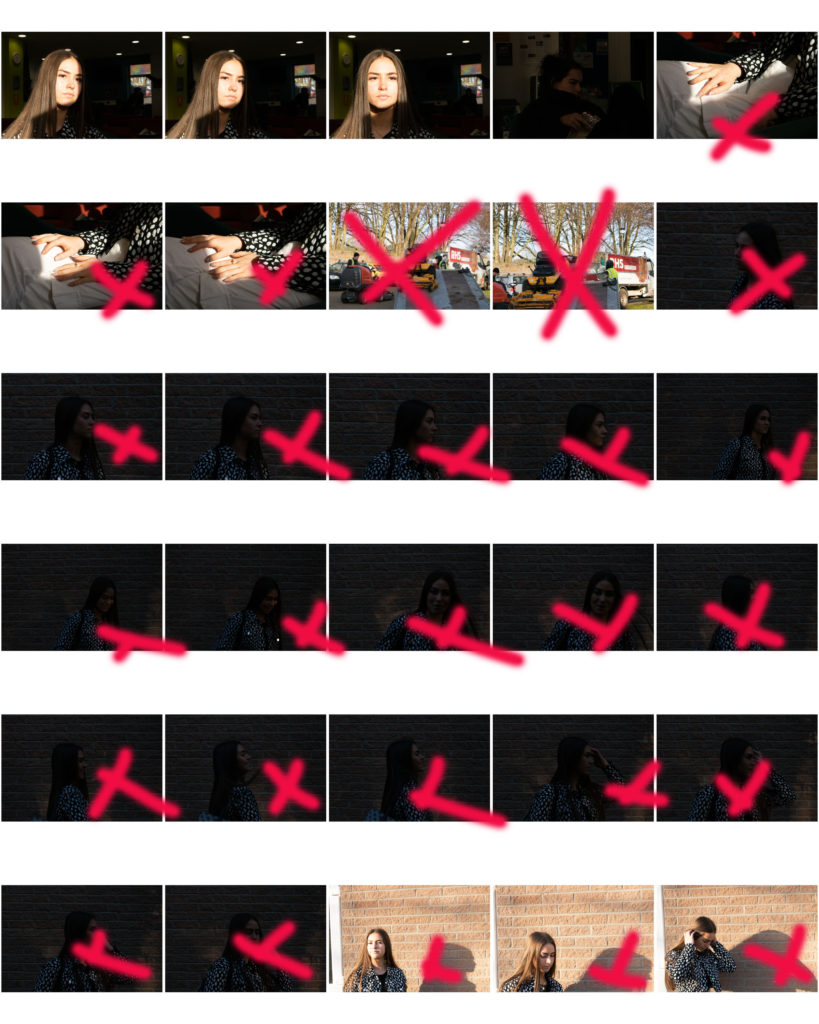
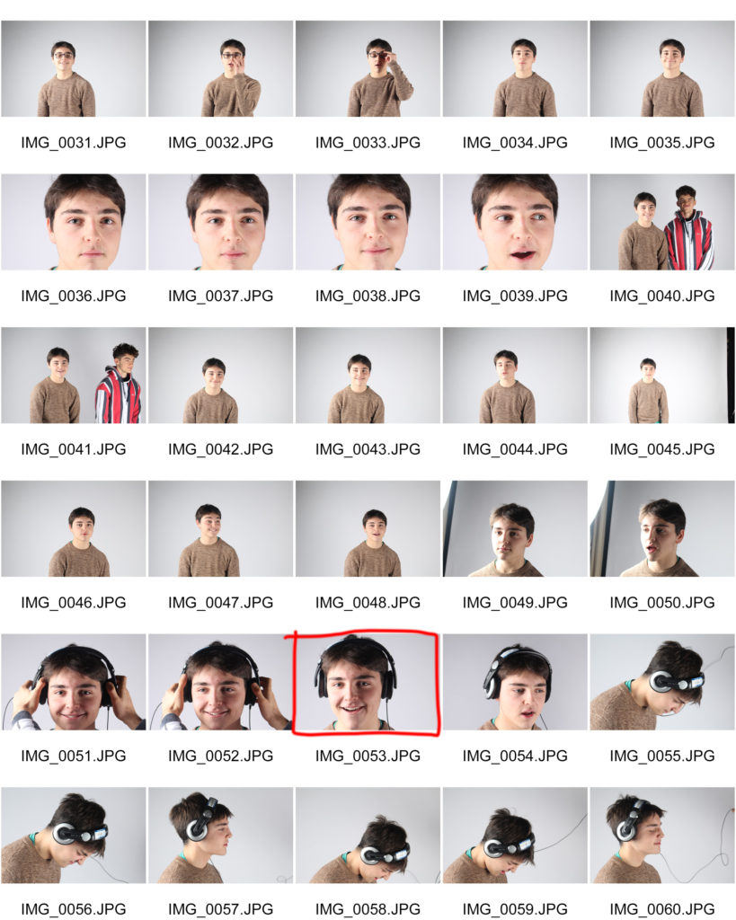
Here are my two point lighting contact sheets, where flash-heads were used by positioning them 180 degrees from each other on opposing sides of the subject in order to fulfill a completely shadow-less image .
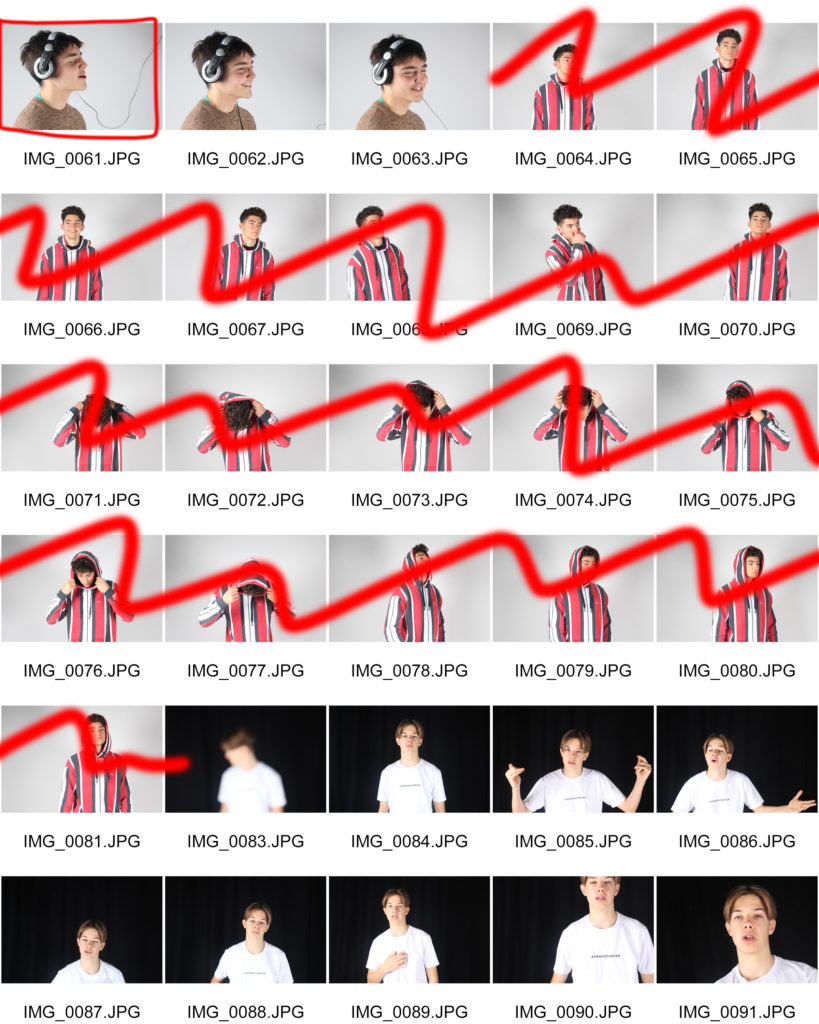
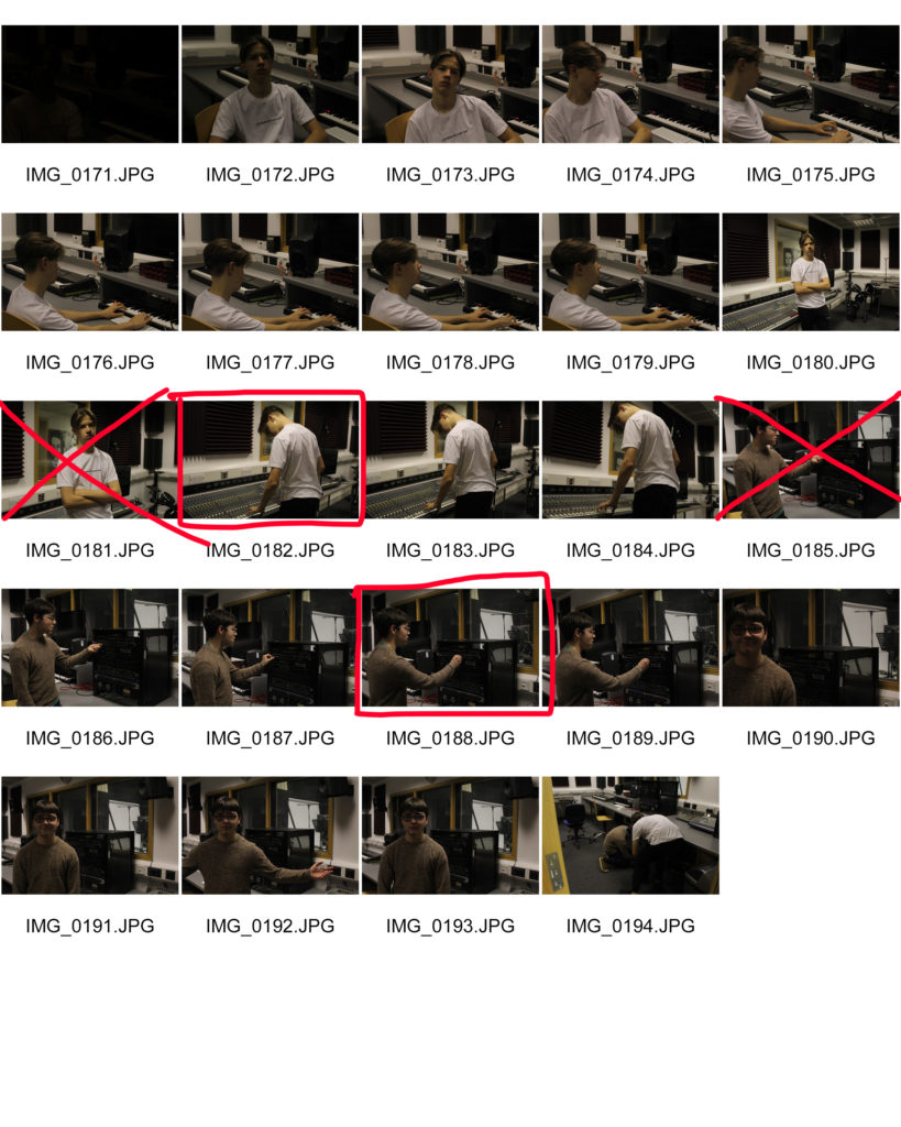
Environmental photography refers to photographs of the natural environment for artistic, research, or monitoring purposes. So in order to achieve this, I captured photos of subjects in a working environment best suited to their interests in order to complete a realistic set of images.
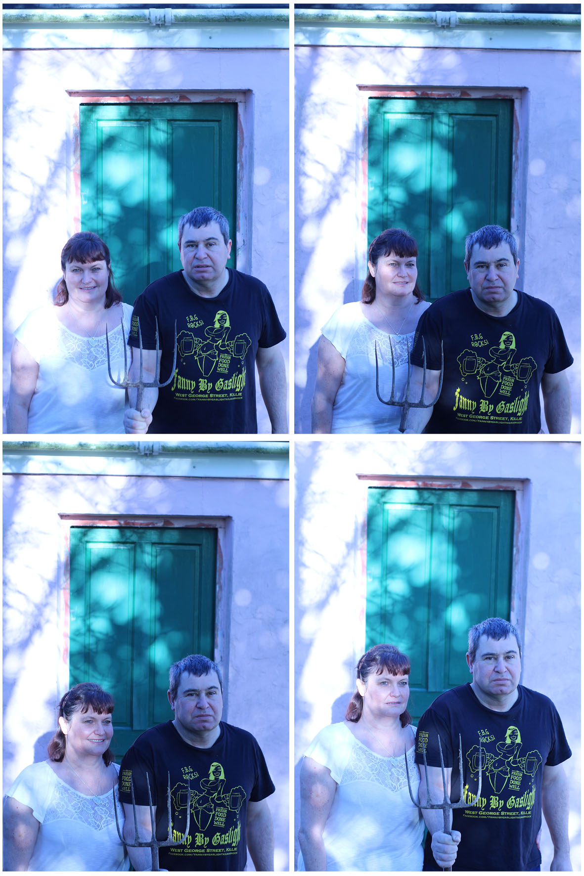
These are a few of my final edited photos of two-point lighting. The photo is staged and formal, two lights were and a white background was used as it was simple and light would reflect off of the white meaning that there would have been a lot of light and exposure in the photograph.
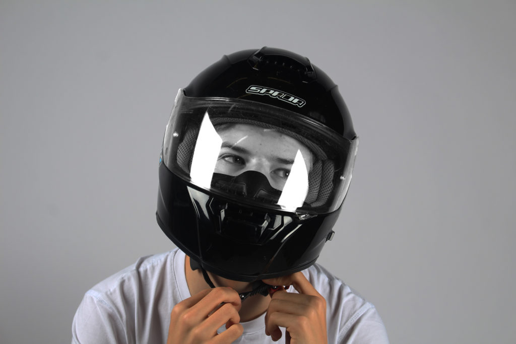
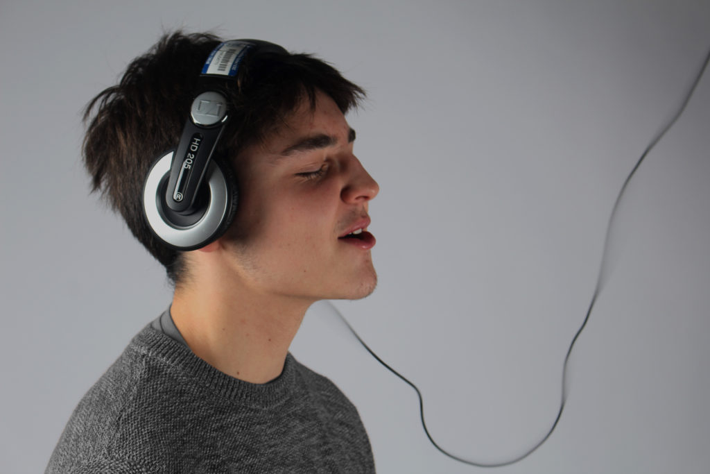
For the first edit I lowered brightness and slightly increased contrast so there would be less exposure in the image which will help bring out the skin tones. I additionally made the subjects face in the hemlmet’s visor grey so it further contrasted with the rest of the image bringing out the lighter tones of his skin and t shirt to stand out more. For the second edit I decided to use the same editing process on Photoshop and made the image darker by decreasing exposure and decreased the brightness. I then increased contrast so the jumper could stand out better as well as changing the colour of it to grey from its original colour of beige which I didn’t think looked as good and blended in too much with the subjects natural skin tone which allowed contrast with the tones and colour of the face and allows it to stand out.