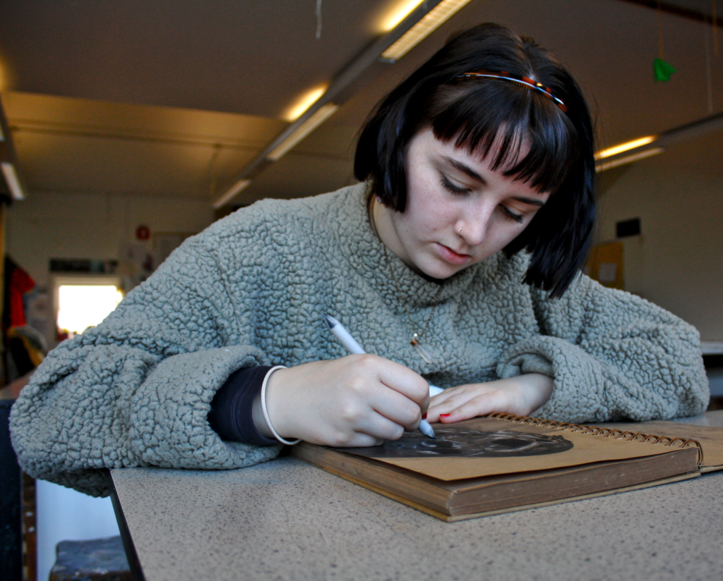
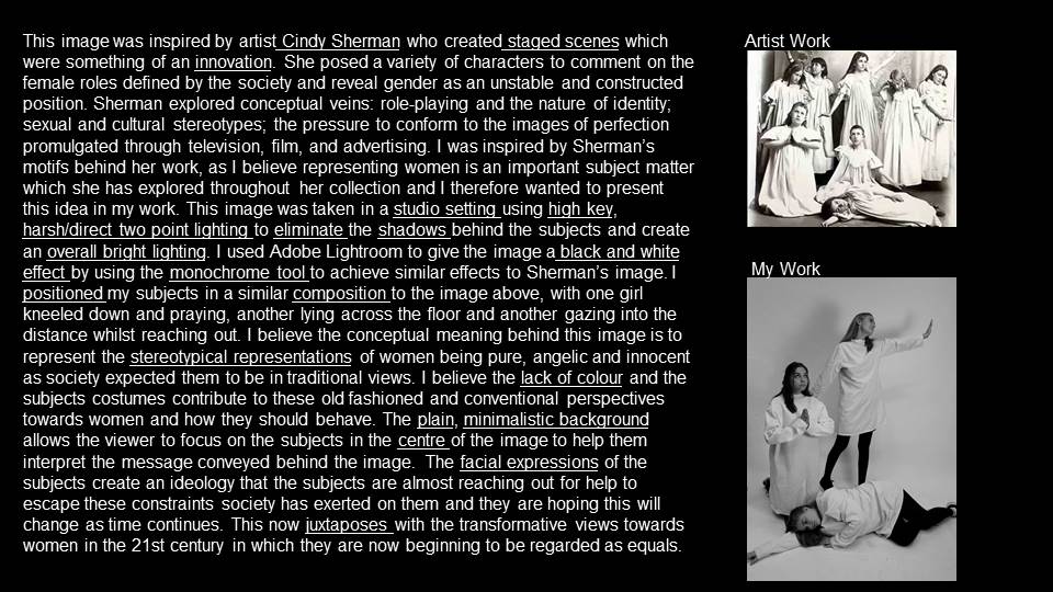
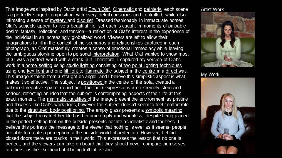
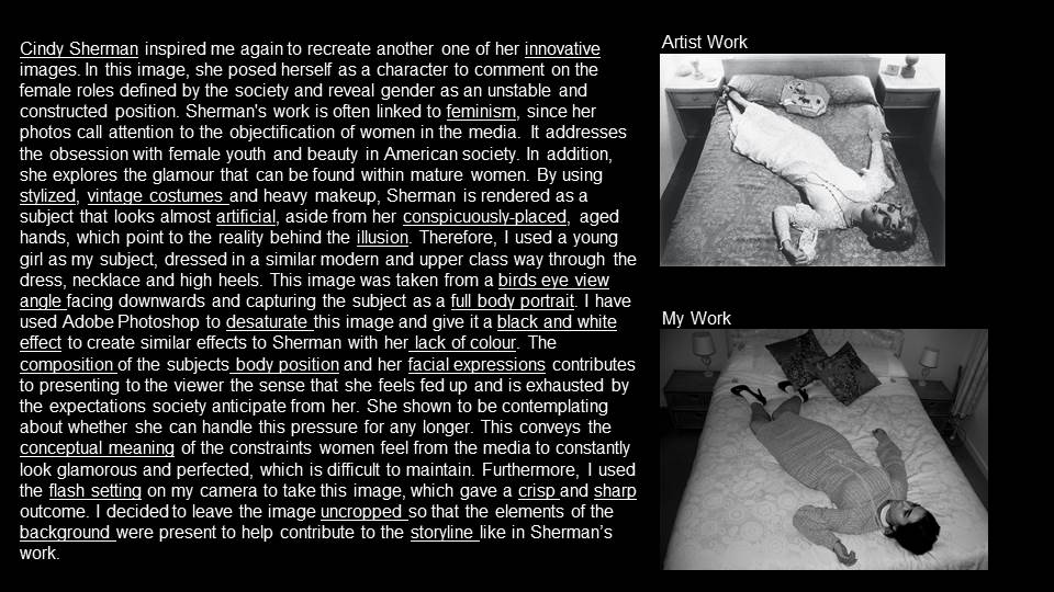
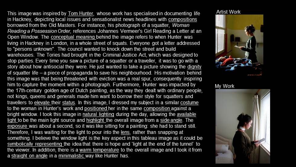
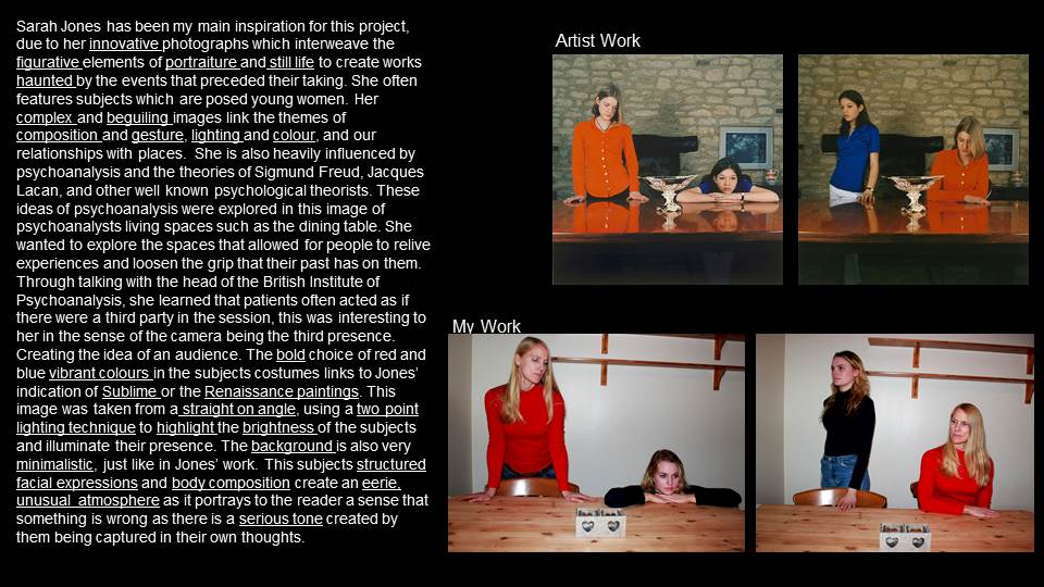
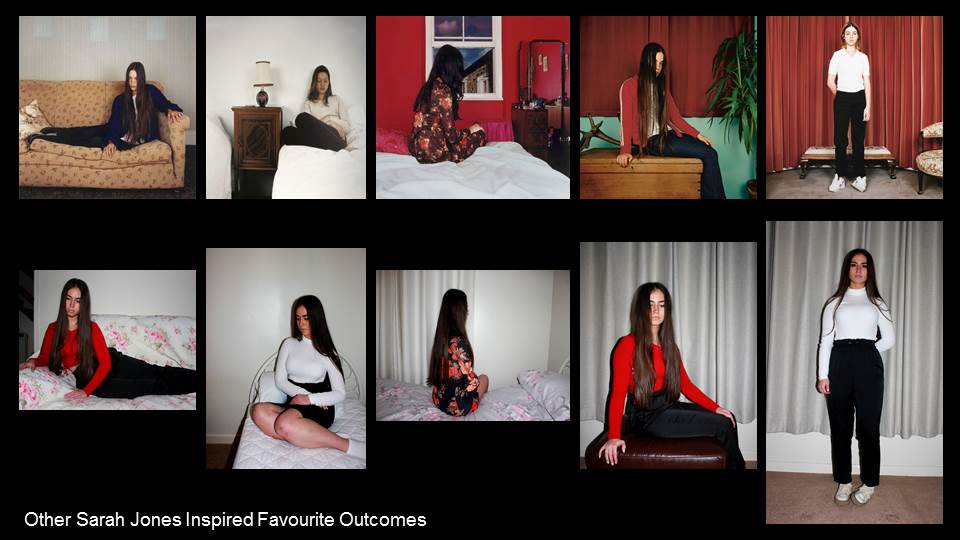
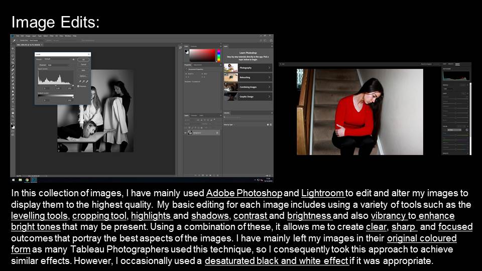
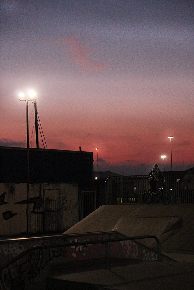
Art Room (Hautlieu)
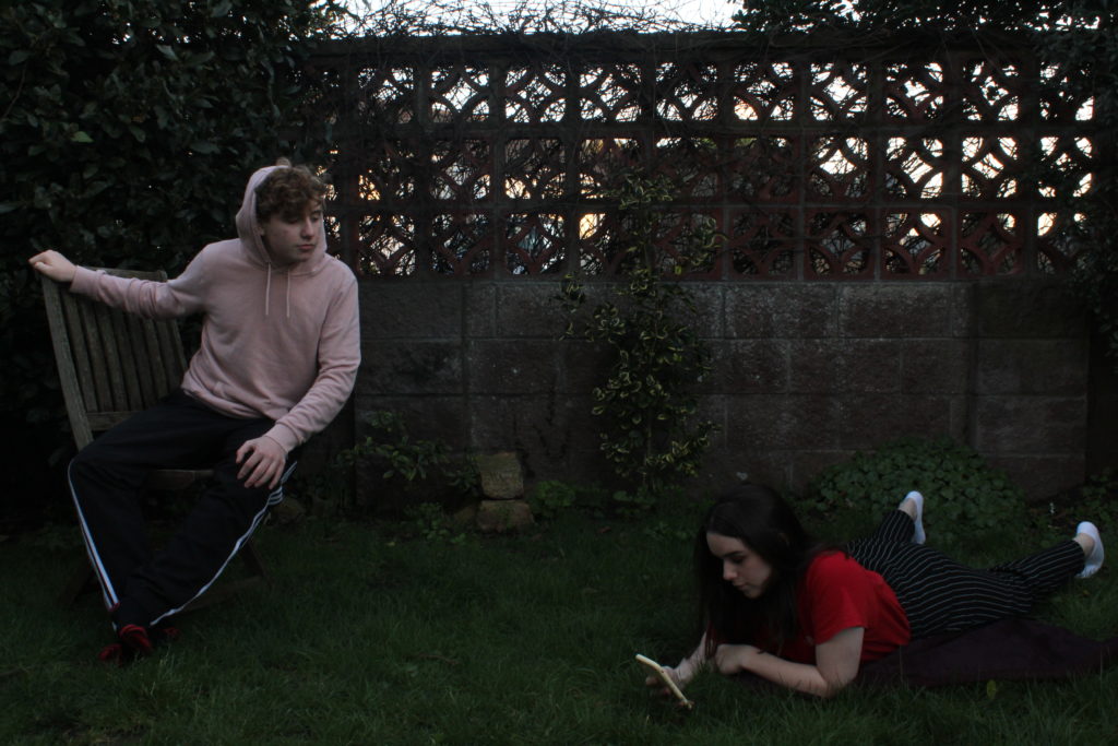
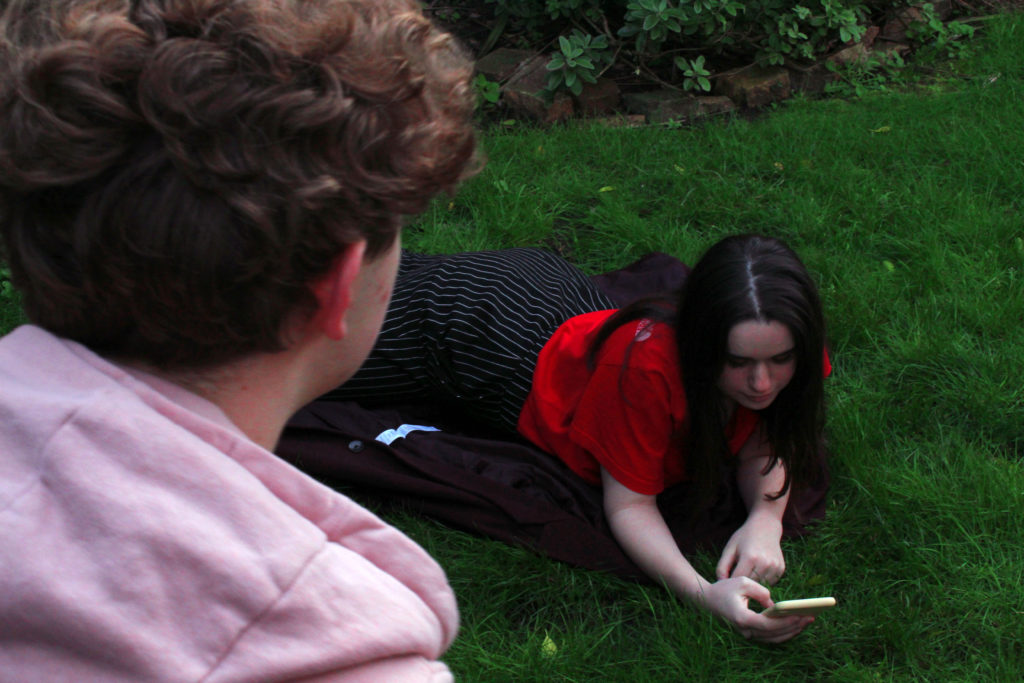
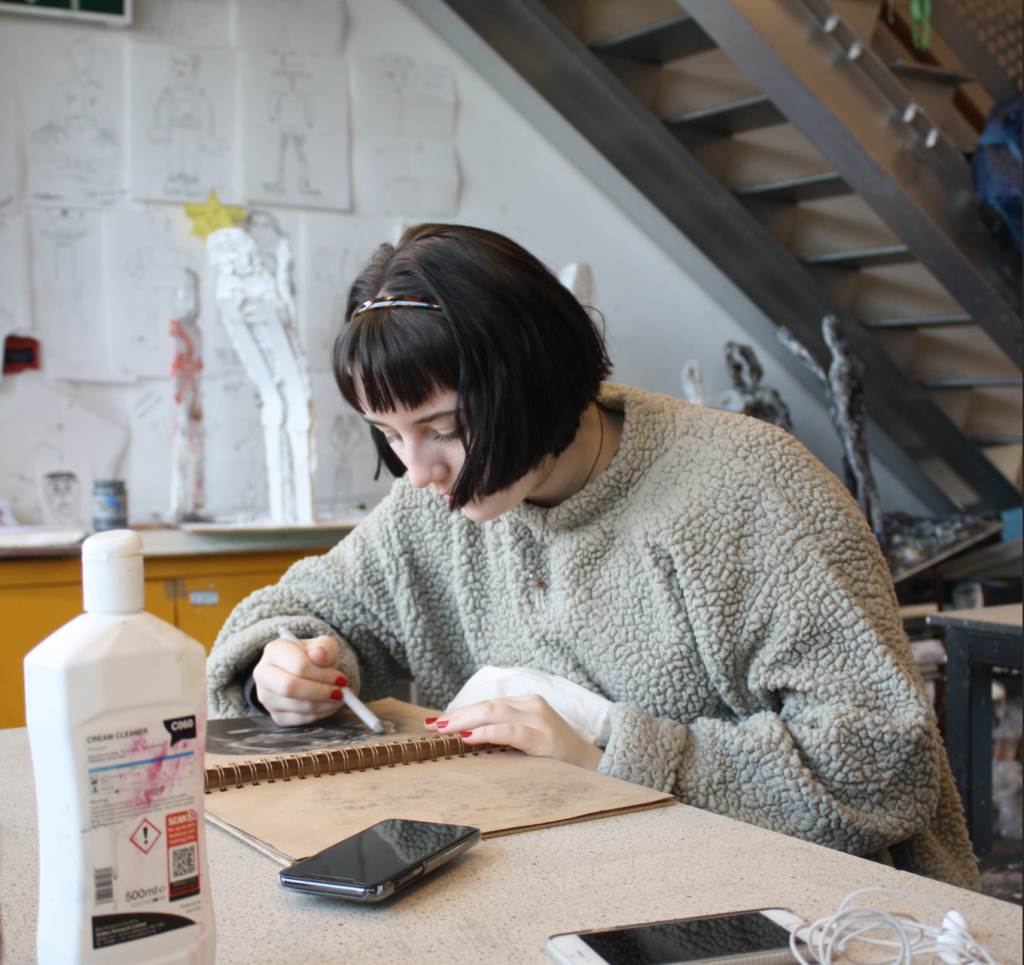
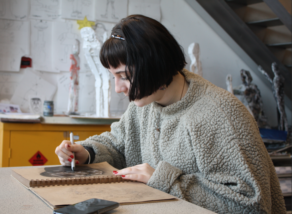
I took my environmental photoshoot in the art department at my school. I chose to take the photos in this particular spot as the large windows allowed a lot of good lighting to shine through into the. room and directly on to the models work and faces. I set the ISO at a lower setting to make the image less grainy to make the photo look as sharp as Anthony Kurtz’s images. In the foreground of the phots I made sure I was taking photos of the models working environment as clearly as possible as it allows the observer to interoperate what the models natural environment is like.I changed the aperture as wells depth of field in the photos are quite shallow to make the most sharpened part of the image is the model, again like Anthony Kurtz’s photography.
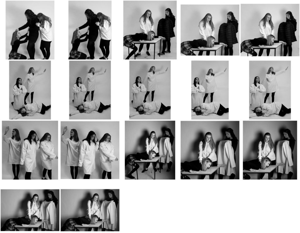
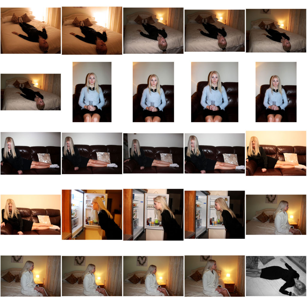
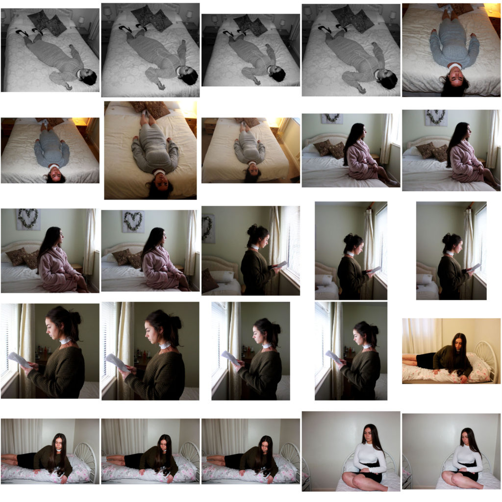
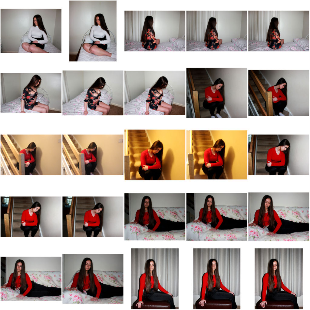
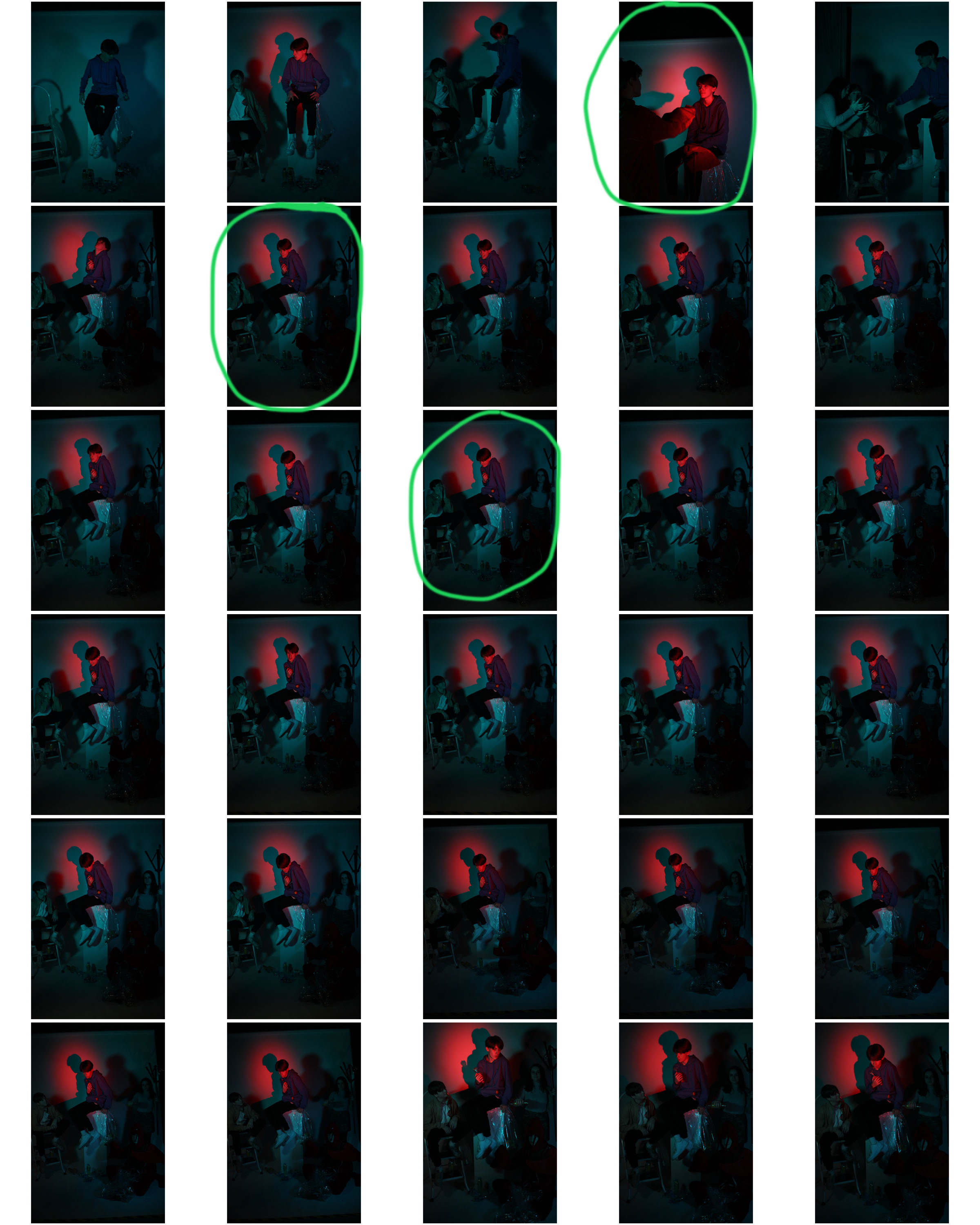
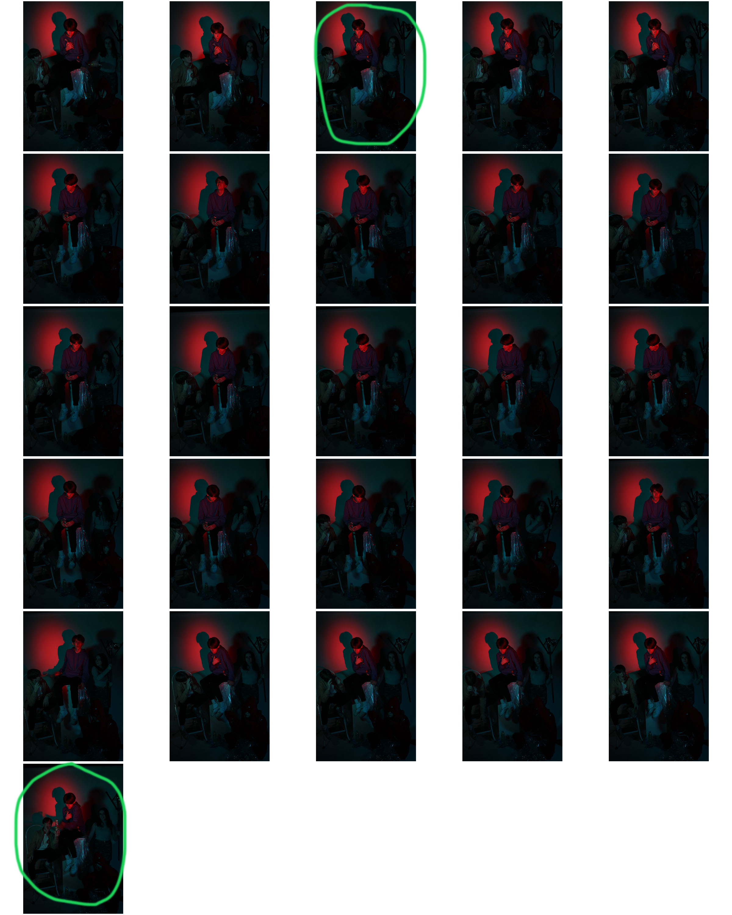
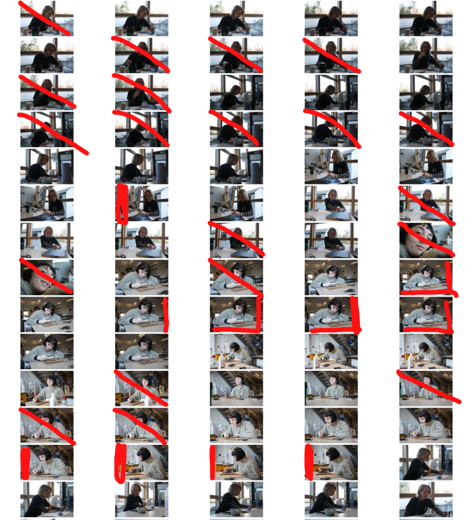
Contact Sheets
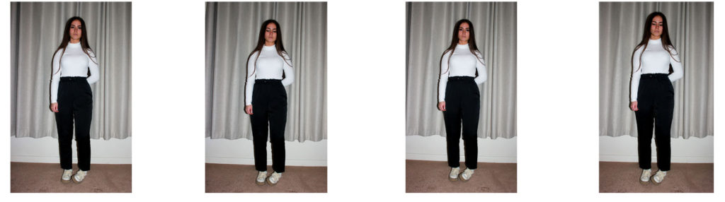
Best Photos
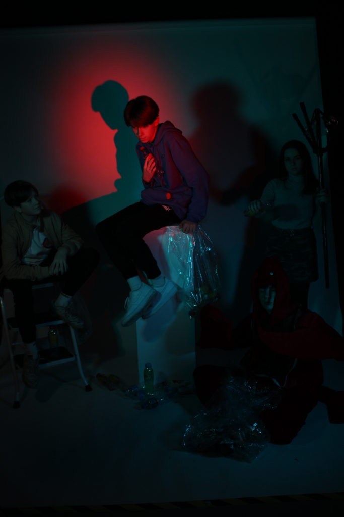
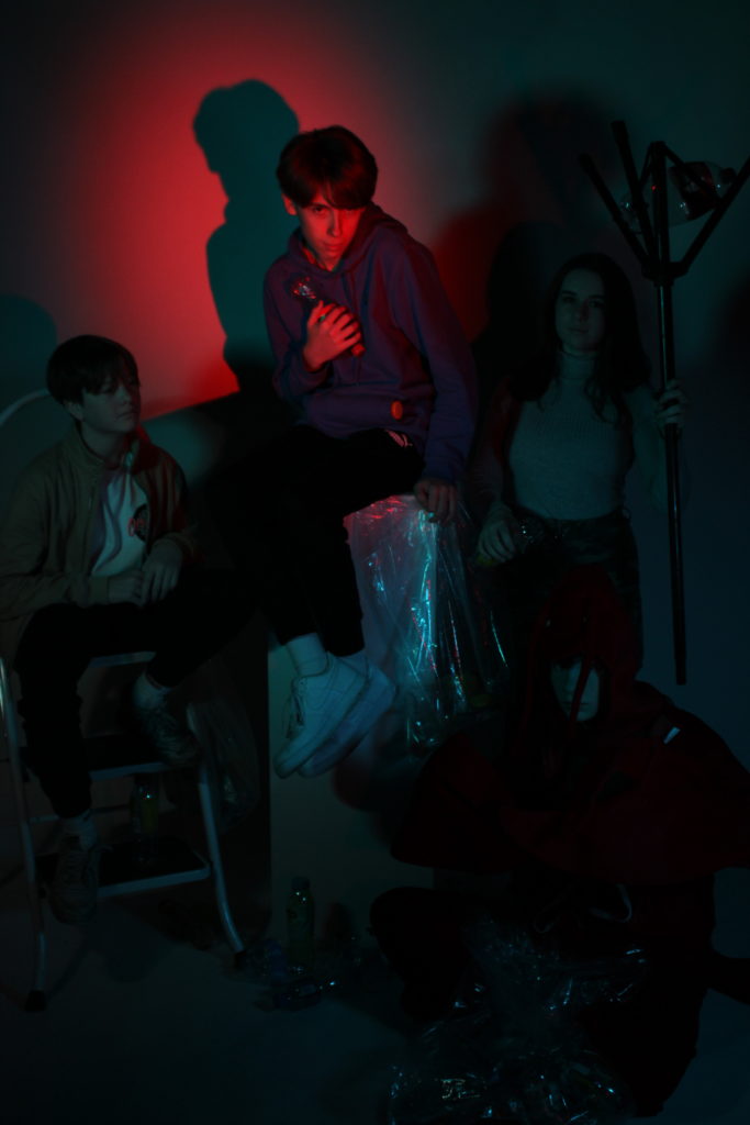
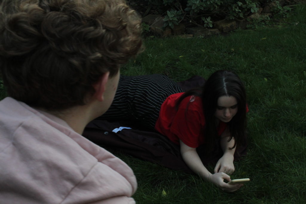
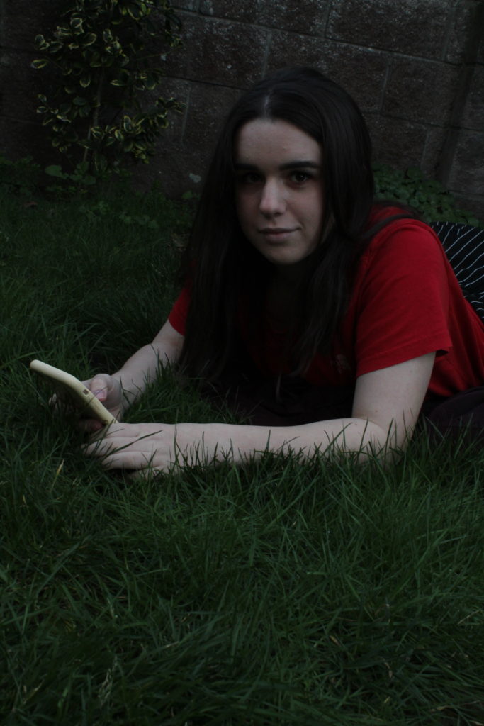
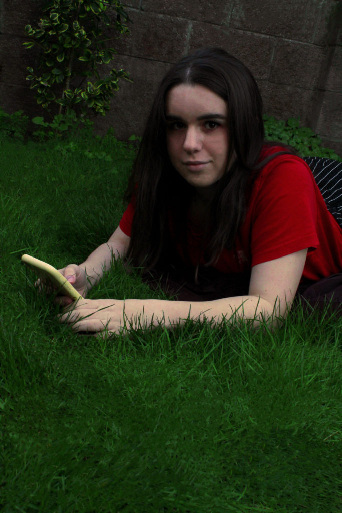
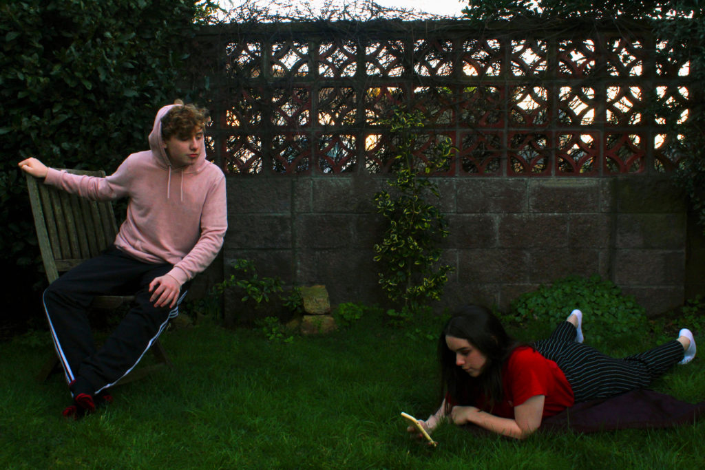
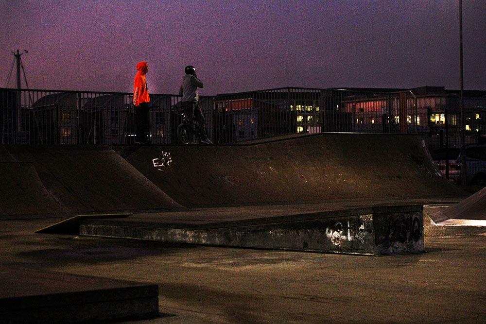
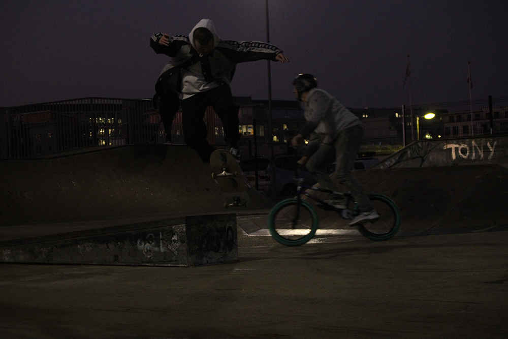
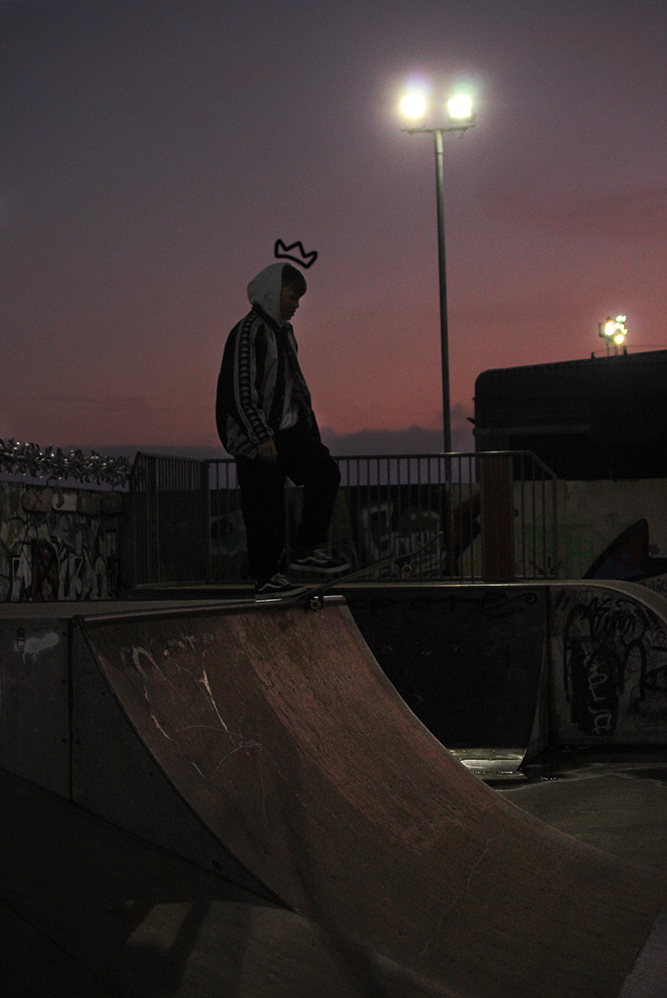
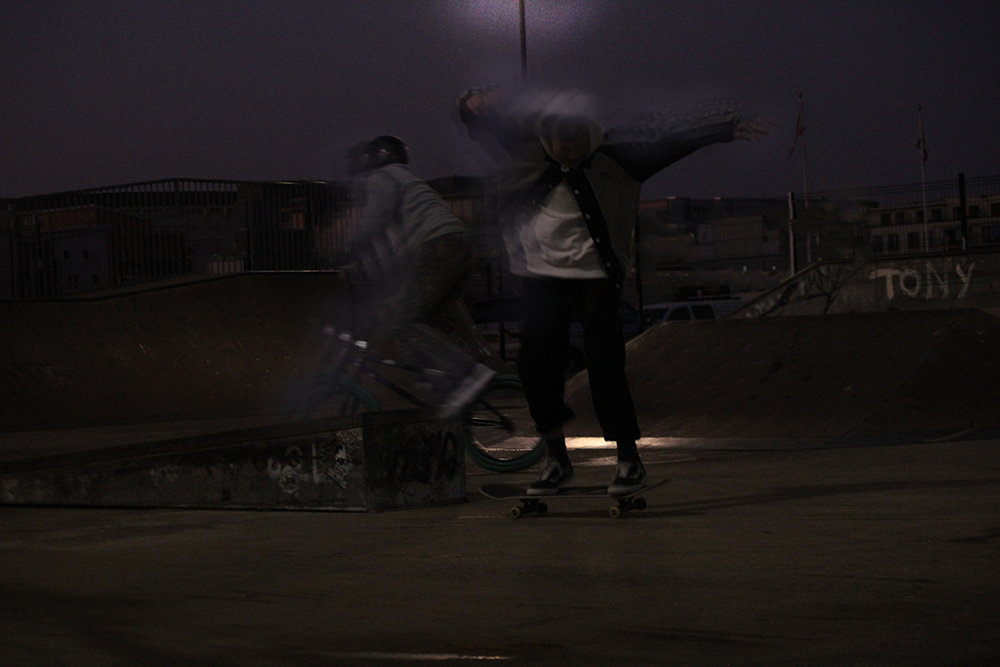
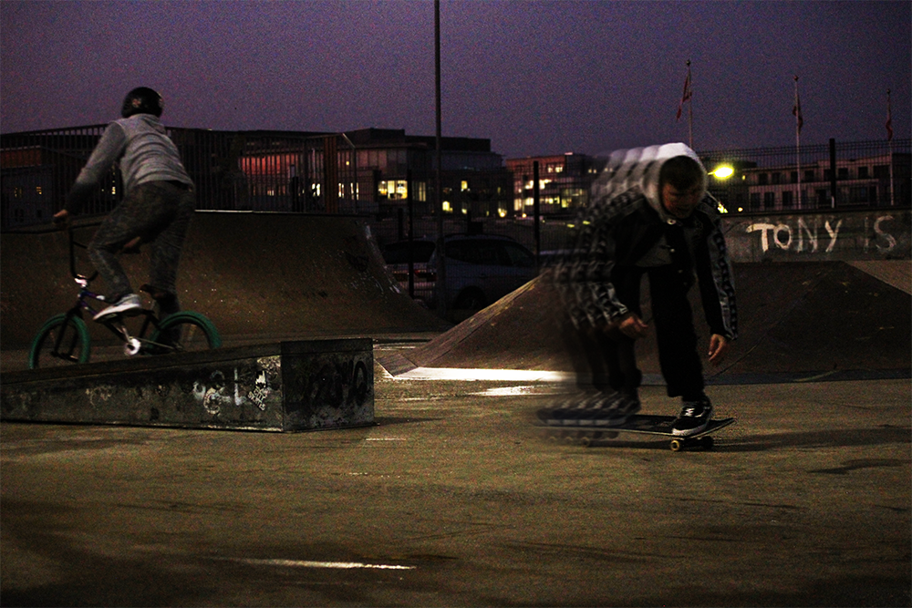
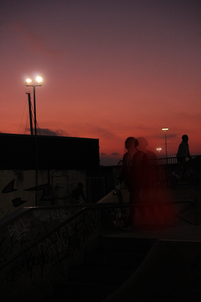
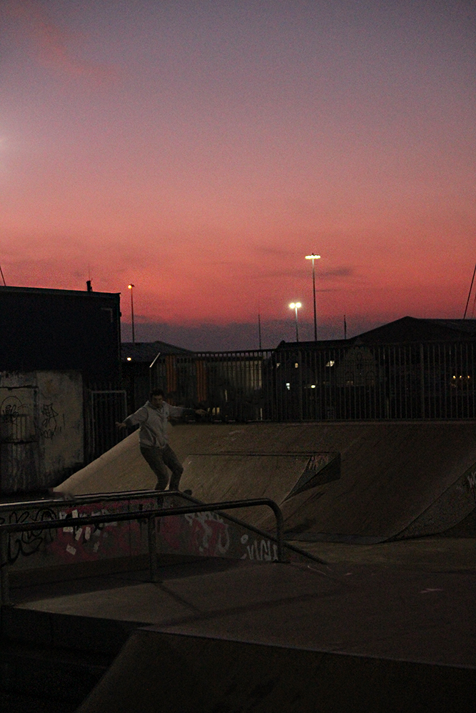
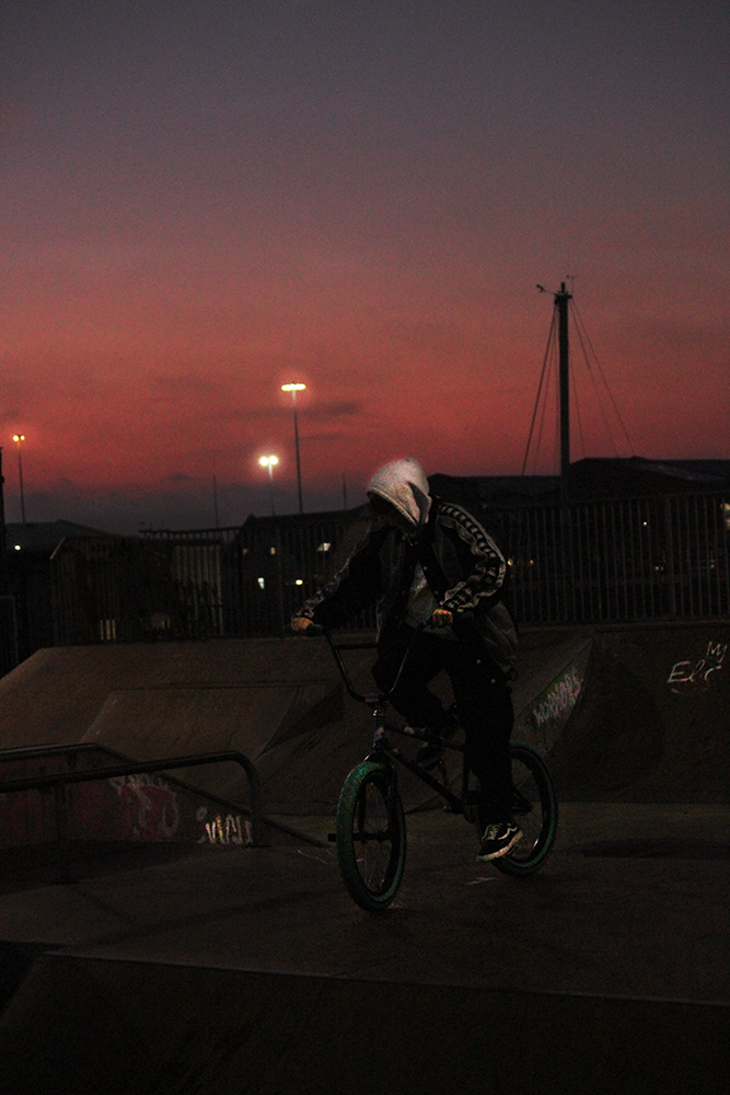
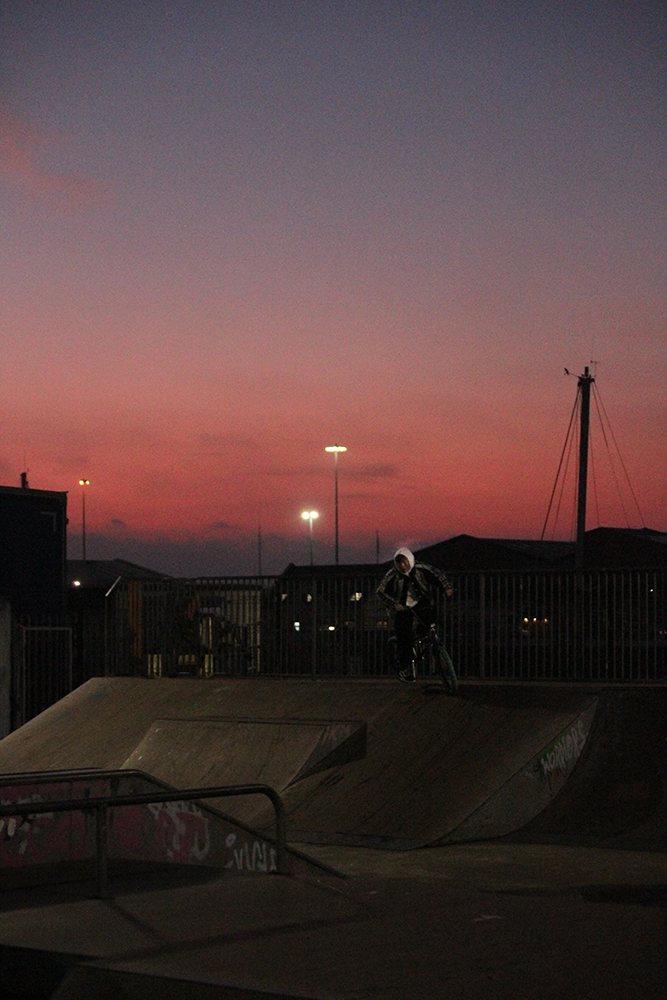
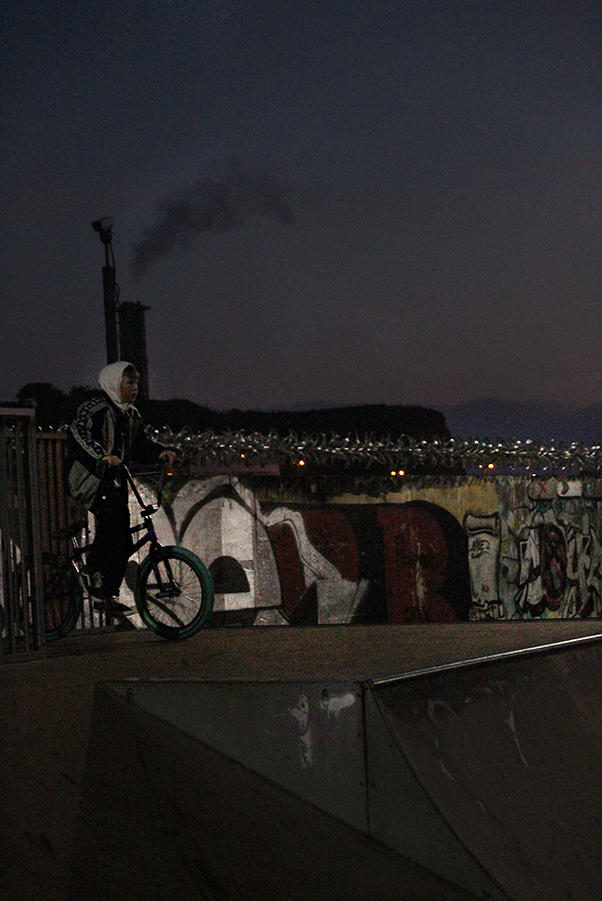
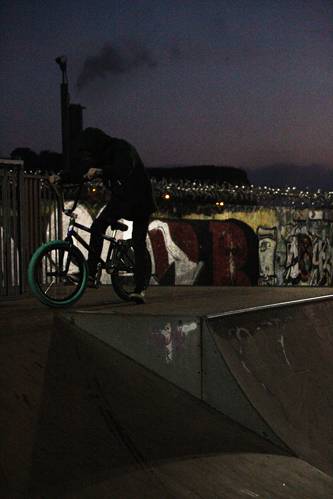
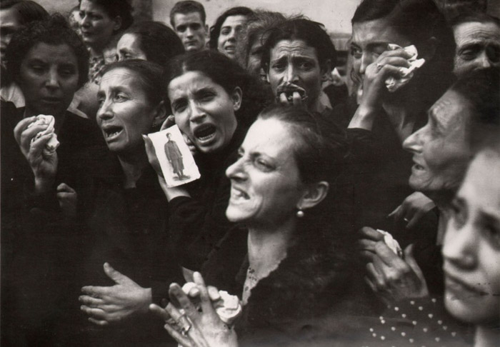
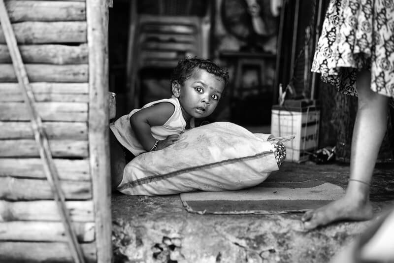
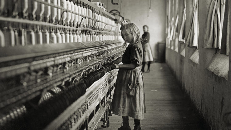
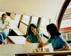
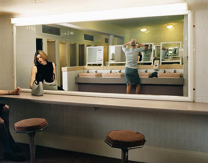
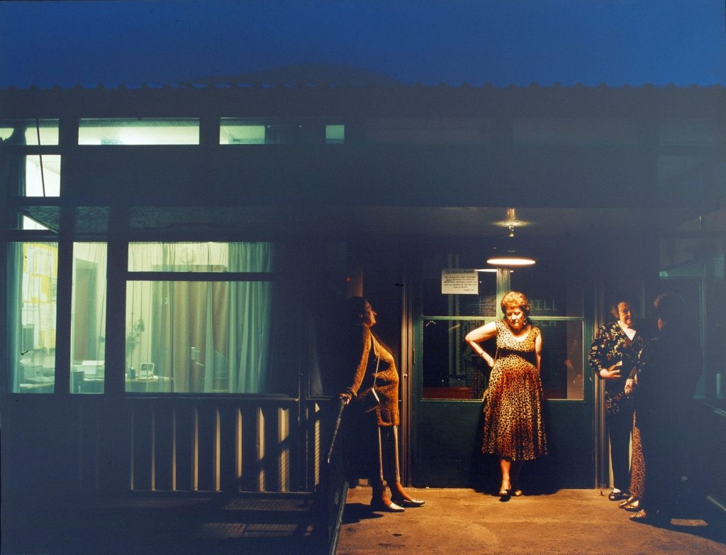
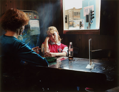
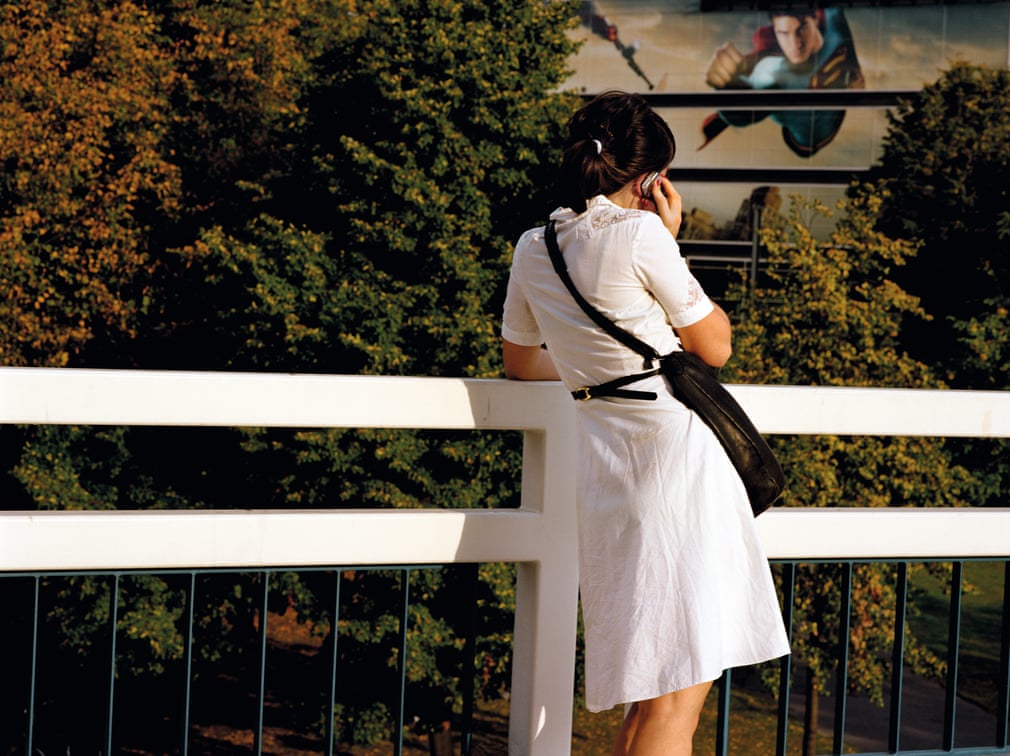
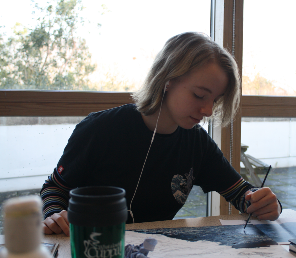
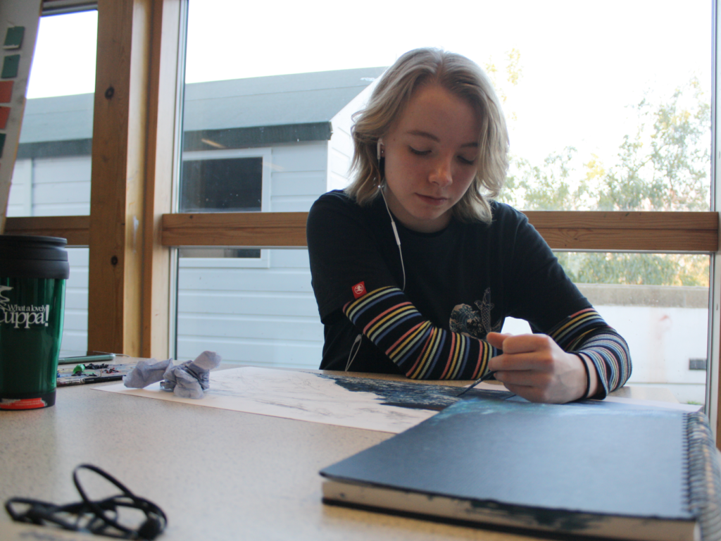
I have carefully selected my best photos out of my photoshoots. The photos I have picked are the ones I think are most related to the photographer Anthony Kurtz as they have a variety off colour and have their environment telling the observer what job they may have. Each photo has something that the eye is automatically drawn to and they each have a main focus which is the individual in the photograph as this is meant to be portraiture photography.
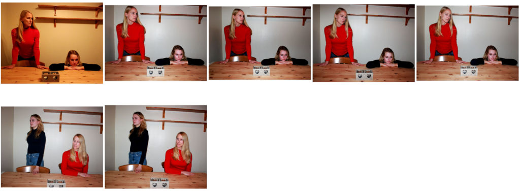
Best Photos
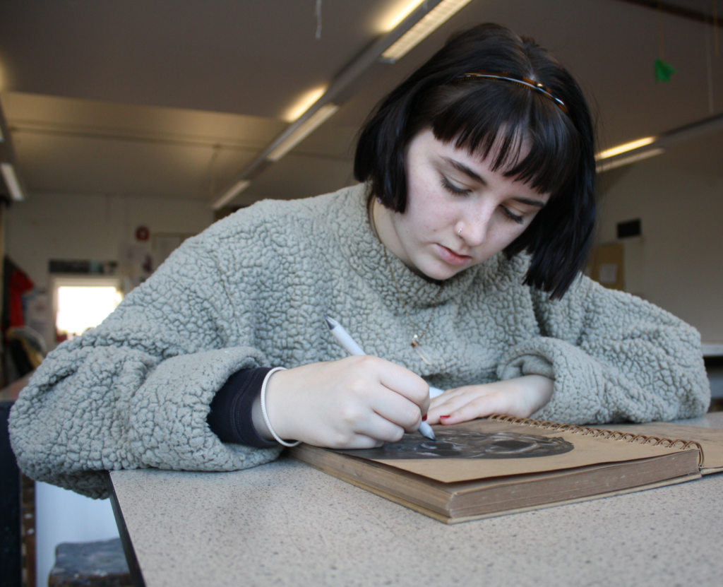
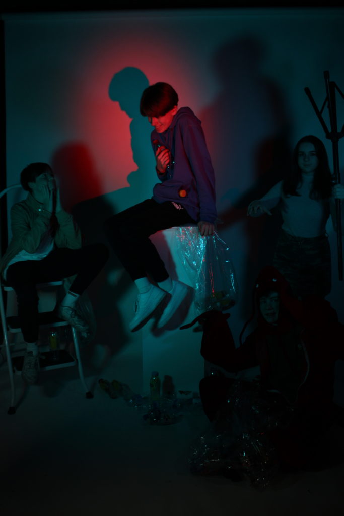
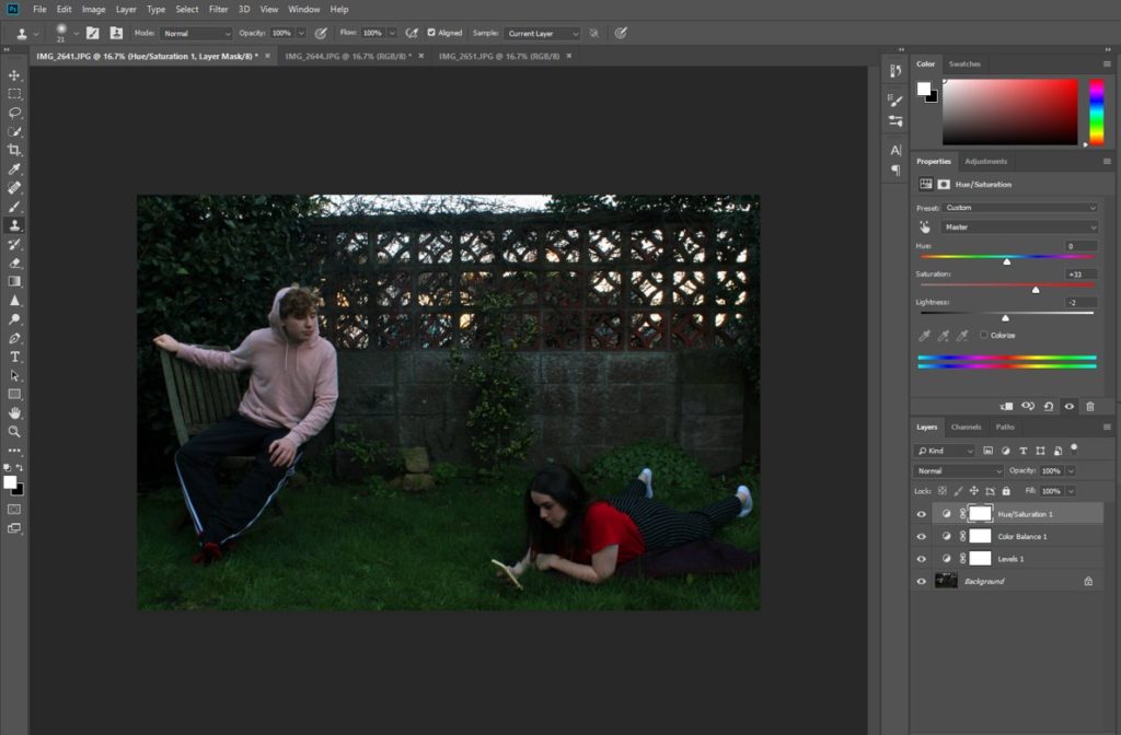
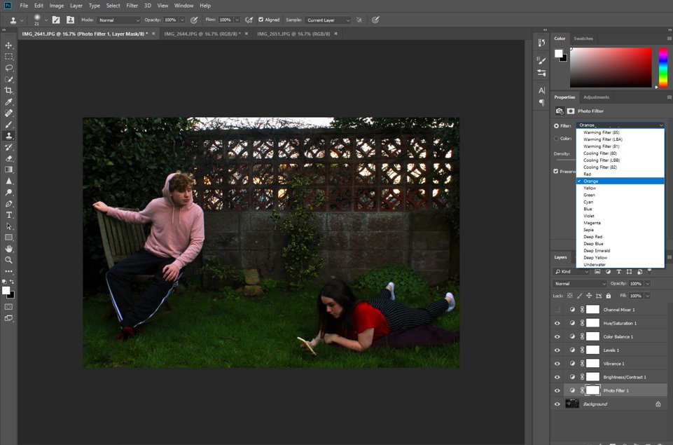
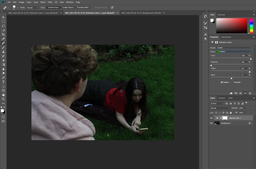
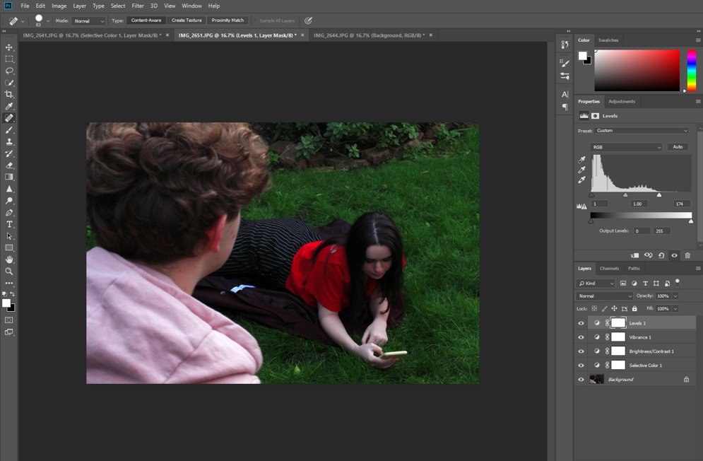
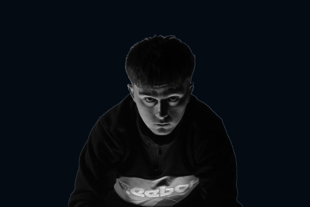
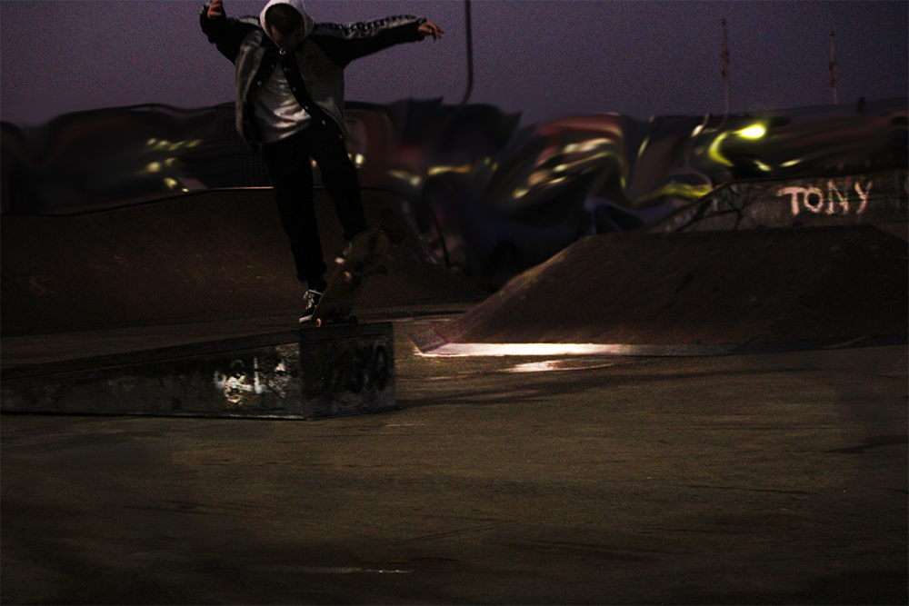
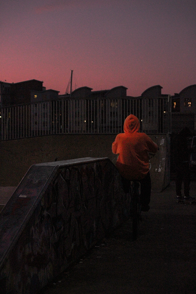
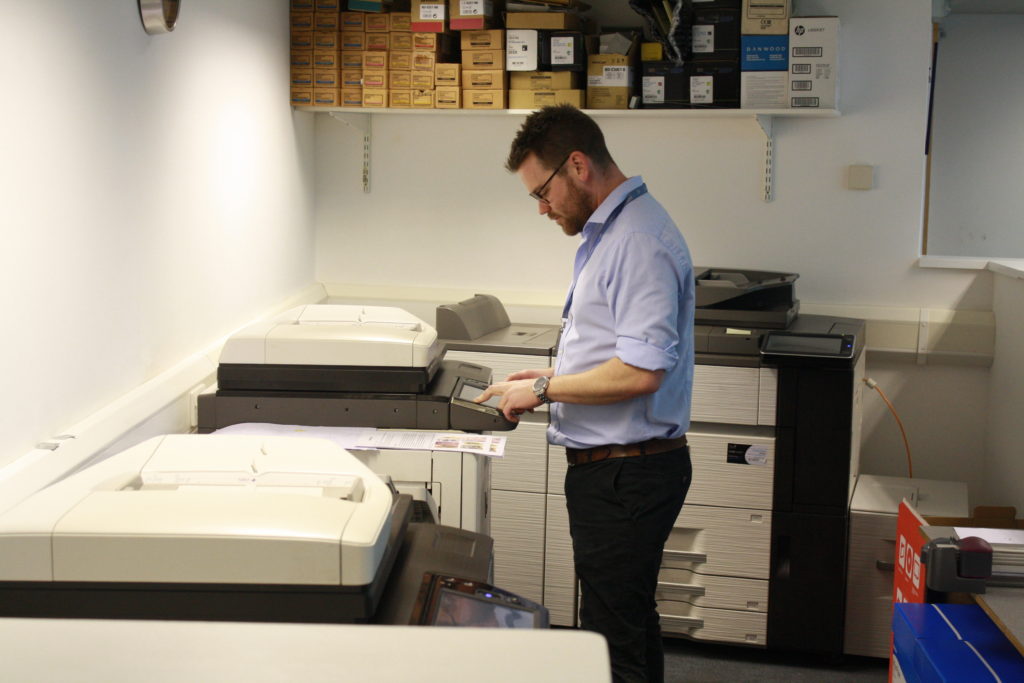
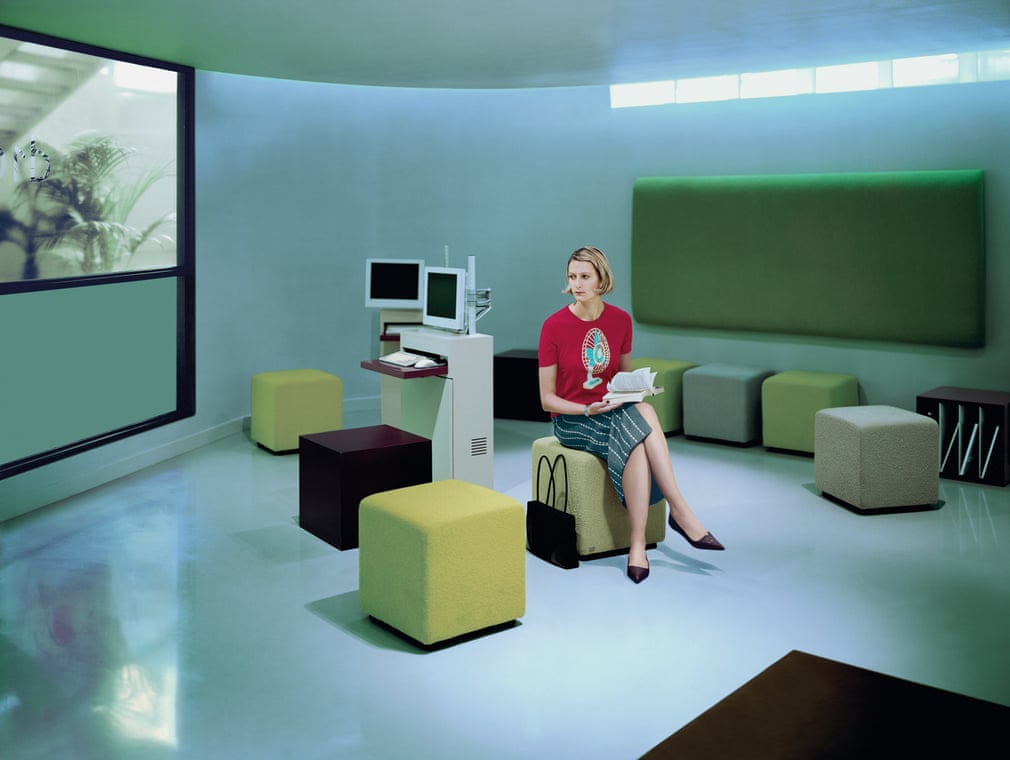
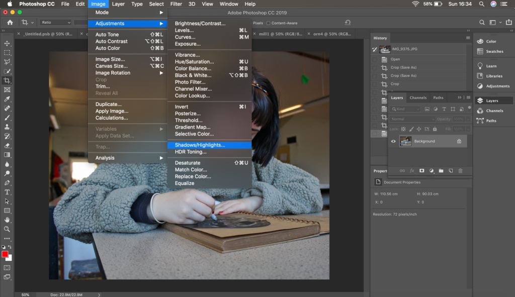
Editing My Best Photo
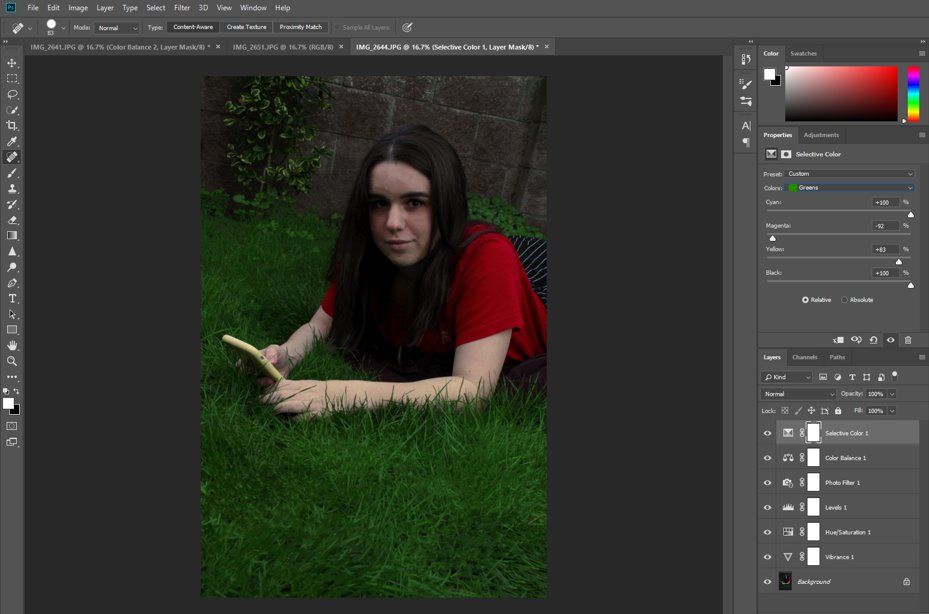
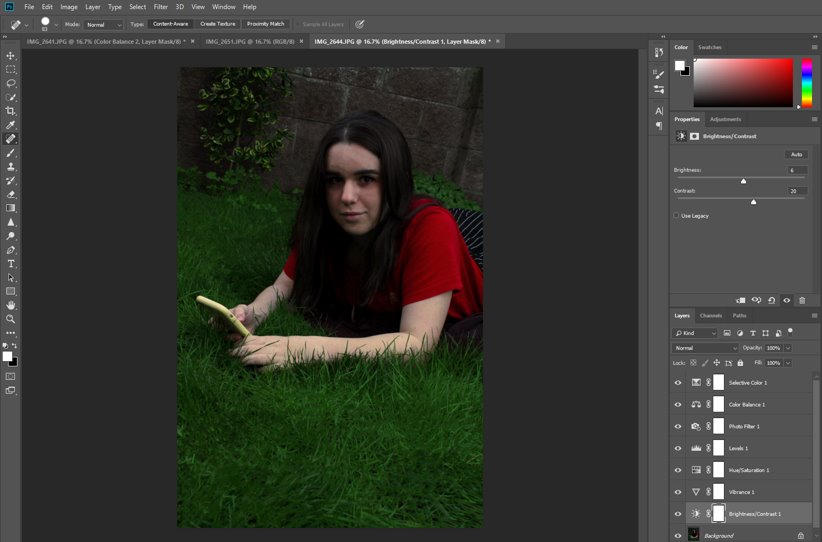
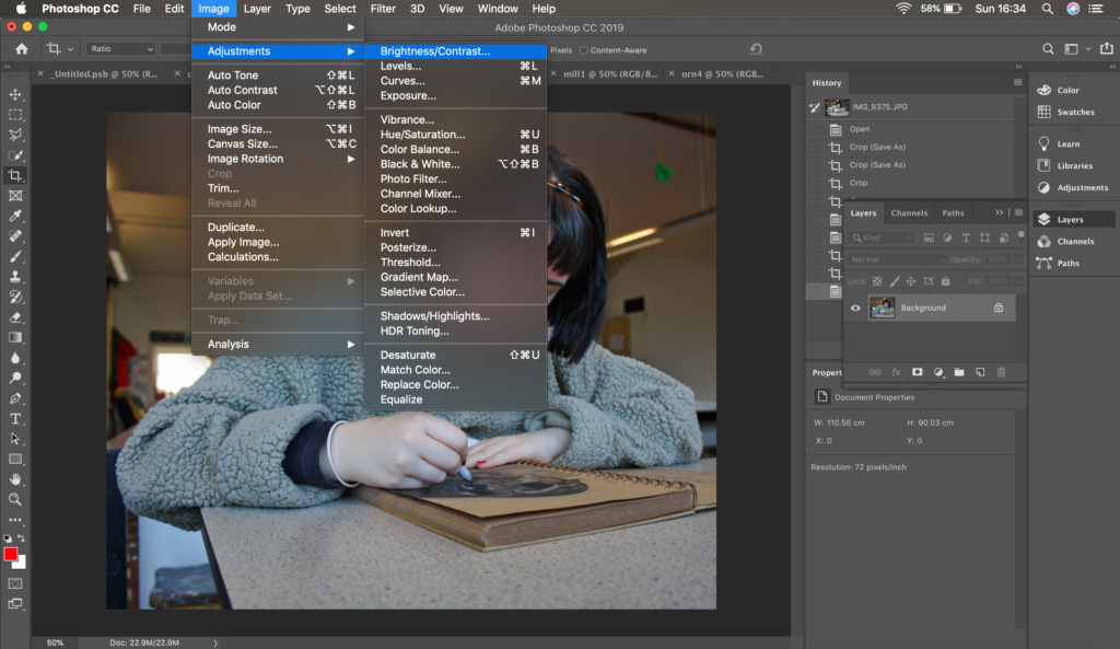
On photoshop I adjusted the brightness to allow you to see the mode more clearly as the image came out quite lighter than I wanted it to. Although I lowered the brightness in the photo I still tried to have a good contrast of the the darker and lighter tones to get the final image I wanted. As well as this I changed the intensity of the shadows and highlights to ensure certain points were more exposed to the viewer as well as drawing their attention to it particular parts of the photo. I also cropped this image on photoshop to allow the model to be in the centre of the photo. I tried to enhance the colours and the vibrancy in the photo to look. more like Anthony Kurtz’s work as his photos seem to be highly saturated/more vibrant.
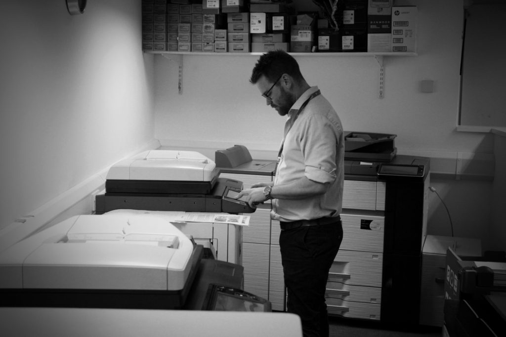
Final Outcome