Jeff Wall was born in 1946 in Vancouver, where he lives and works. Jeff Wall is renowned for large-format photographs, ranging from subjects in urban environment settings, to nineteenth-century historic painting inspired Tableaux pieces. He studied art history at London’s Courtauld Institute – with his interest in contemporary media to create one of most influential ideas in contemporary art. He has exhibited widely, including solo exhibitions at Kunsthalle Mannheim, Germany, touring to Mudam Luxembourg (2018); Pérez Art Museum, Miami (2015); Stedelijk Museum, Amsterdam, touring to Kunsthaus Bregnez, as well and many other destinations.

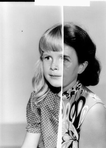
After ‘Invisible Man’ by Ralph Ellison, the Prologue, 1999–2001 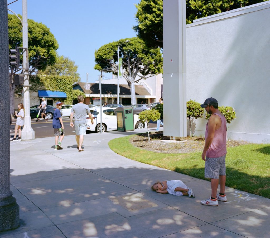
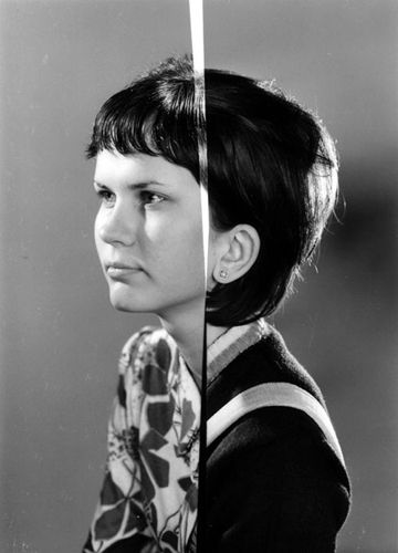
Parent Child, 2018

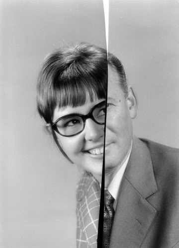
Morning Cleaning, Mies van der Rohe Foundation, Barcelona, 1999
A Sudden Gust of Wind (after Hokusai) 1993
Wall carefully stages the scenes in his photographs, intricately designing every detail to achieve his desired final visual effects. Ironically, the final images often appear to be mid-action, spontaneous, and candid moments such as ‘A Sudden Gust of Wind’ (after Hokusai) (1993). This Tableau was created after Hokusai’s scene in a woodcut print where the painting shows seven individuals caught off-guard in the wind at different points along a narrow path.
ANALYSIS:
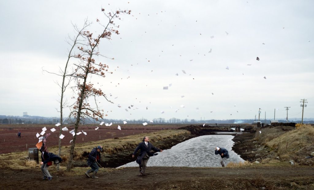
A Sudden Gust of Wind (after Hokusai) (1993
CONTEXTAL/CONSEPTUAL:
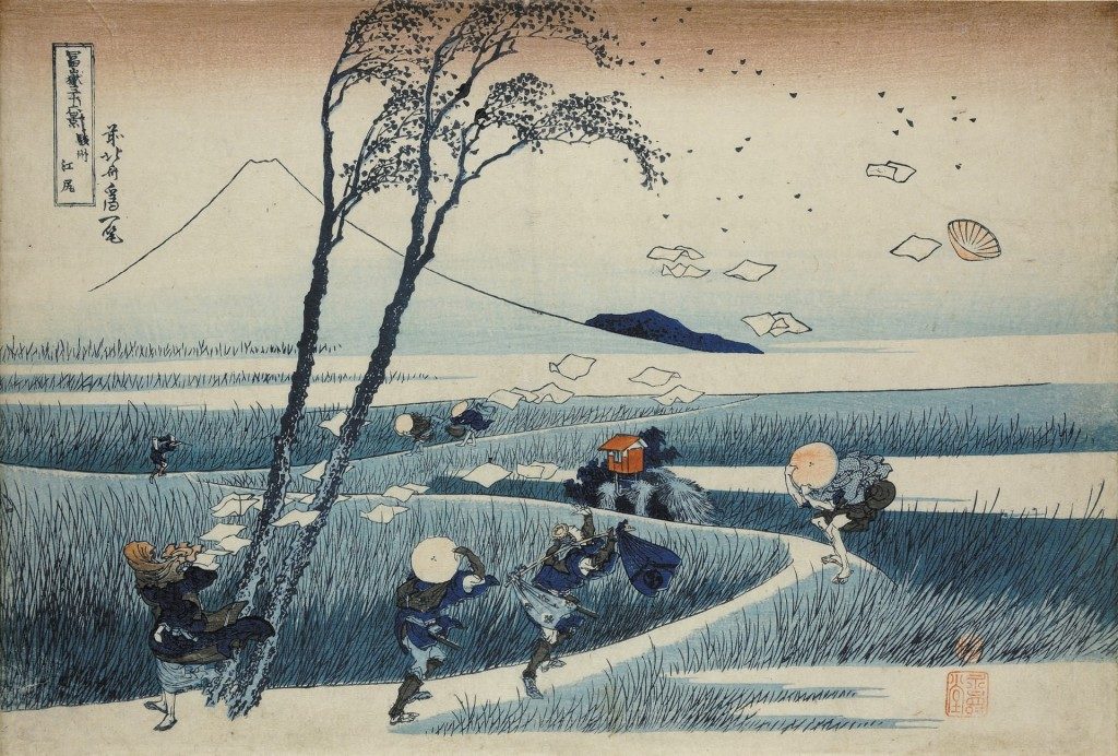
Jeff Walls piece ‘A Sudden Gust of Wind‘ is a response to the work of Katsushika Hokusai (1760-1849), one of Japan’s most famous and enduring artists. Wall seems to refer to Hokusai’s series of 19th century Japanese woodblock prints called ‘Thirty–Six Views of Mount Fuji‘, specifically re-staging ‘Ejiri in Suruga Province’. Hokusai created a series of landscape prints of Mount Fuji as it is a popular subject for Japanese art due to its cultural and religious significance.
TECHNICAL:
The lighting of this image is generally quite light, clearly taken with a daylight source of lighting. You can see this lighting is natural, reflecting the focus of the photograph. The image looks to have been reasonably exposed, with a high contrast between the soft grey clouds in the sky , and the dominant branches of the tree, reddish tones of the ground and deep brown earth edging the river.
The aperture of the photograph looks as if is around f/16 as there is a large depth of field. The shutter speed seems to be quite long, maybe 1/1000 as the image seems to be underexposed and quite focused and sharp, especially with the moving pieces of paper in the air. The ISO also seems to be low as the image was taken in daylight, so probably around ISO200.
VISUAL:
Similarly to Hokusai’s print, on the left, there’s a woman with her scarf blown around her face. Paper is being dispersed by the gust. Two men hold their hats to their heads while a third gazes up into the sky, where his hat is being carried away by the wind. Two narrow trees bend by the force of the wind, releasing dead leaves which mingle with the floating papers. however, Hokusai’s image is a print rather than an image.
The colour of the image is generally quite dull, with very ash tones colours coming from the grey/blue sky and river, as well as maroon reds from the tree leaves and soil in the fields. The contrast seems to be high as shadows coming from the edge of the river seem to be almost black, contrary to the bright white floating papers in the wind. the composition seems to almost exactly reflect that of Hokusai’s artwork ‘Ejiri in Suruga Province’

