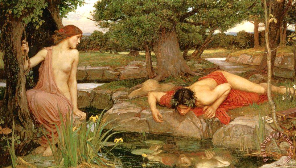
FINAL SELECTION-
#1-
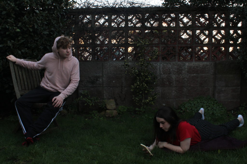
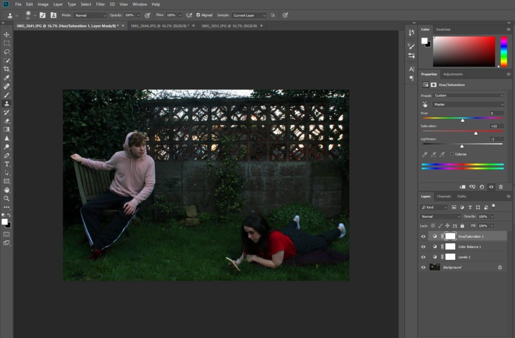
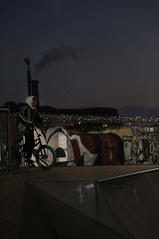
First, I edited the colour saturation of the image, specifically of the red and green shades, in order to make the grass stand out more as well as making the red t-shirt more prominent. I also subtly changed the black and white levels to add more contrast and definition, additionally making the image brighter in order to make it more similar to the original painting.
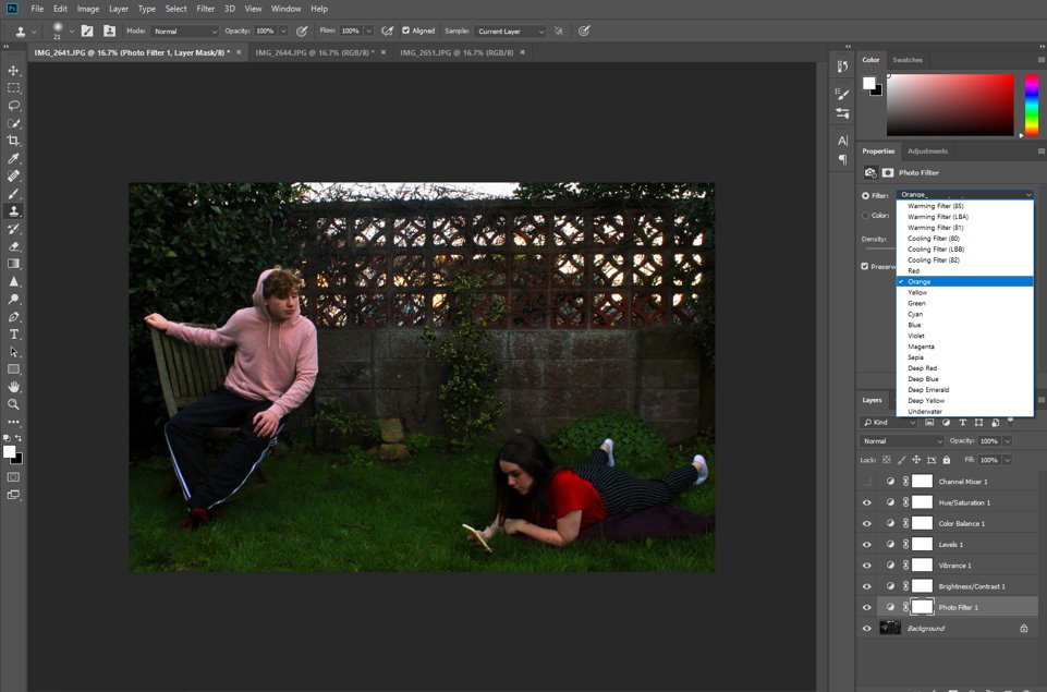
Then, I also added a photo filter in the orange shade, also to increase its similarity to the original painting, which has quite an orange tint. This also had the effect of drawing more attention to the pink jumper, as well as making the sunset behind the wall more saturated.
Finally, I used the spot healing tool to fill in the patches in the grass and bush behind, remove some of the marks on the wall, and smooth out the pink jumper, which was a little wrinkled. I did this with the intention of making the image seem more “perfect,” like the painting, which would have been edited in many little ways whilst being painting, whereas I had to turn to digital editing.

#2-
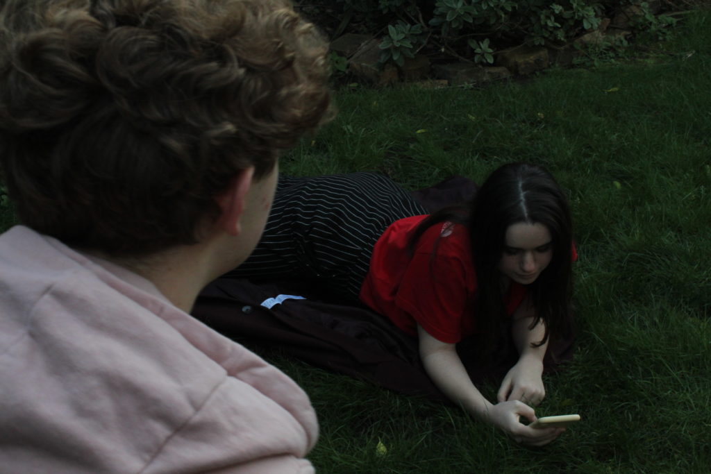
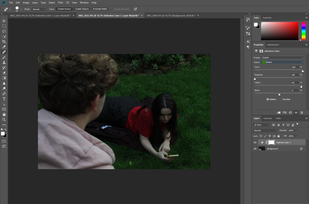
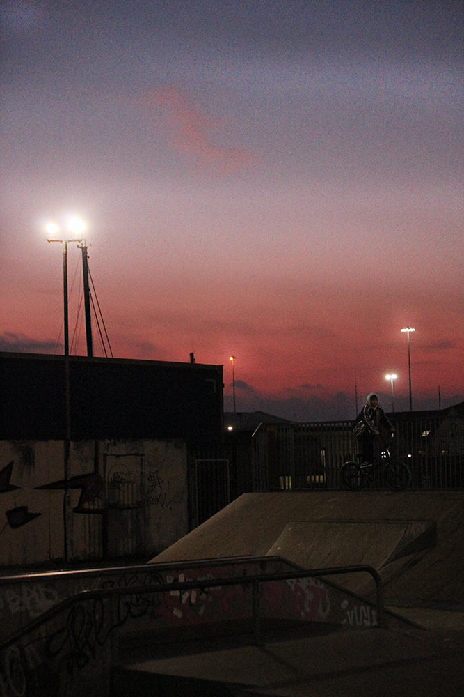
First, I use the spot healing tool to fill in the patches in the grass while still keeping it as natural looking as possible. I also added a green filter in order to increase the saturation of the grass, which was not as green in the image as it was in real life, and also to make it reflect the painting more as well.
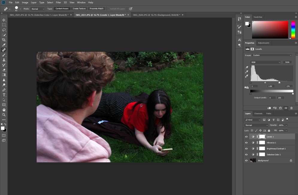
I then adjusted the saturation and vibrancy of the main colours in the image, namely red and green. I also made the image brighter and increased the saturation of the pink hoodie in the foreground.
#3-
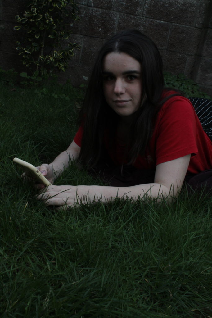
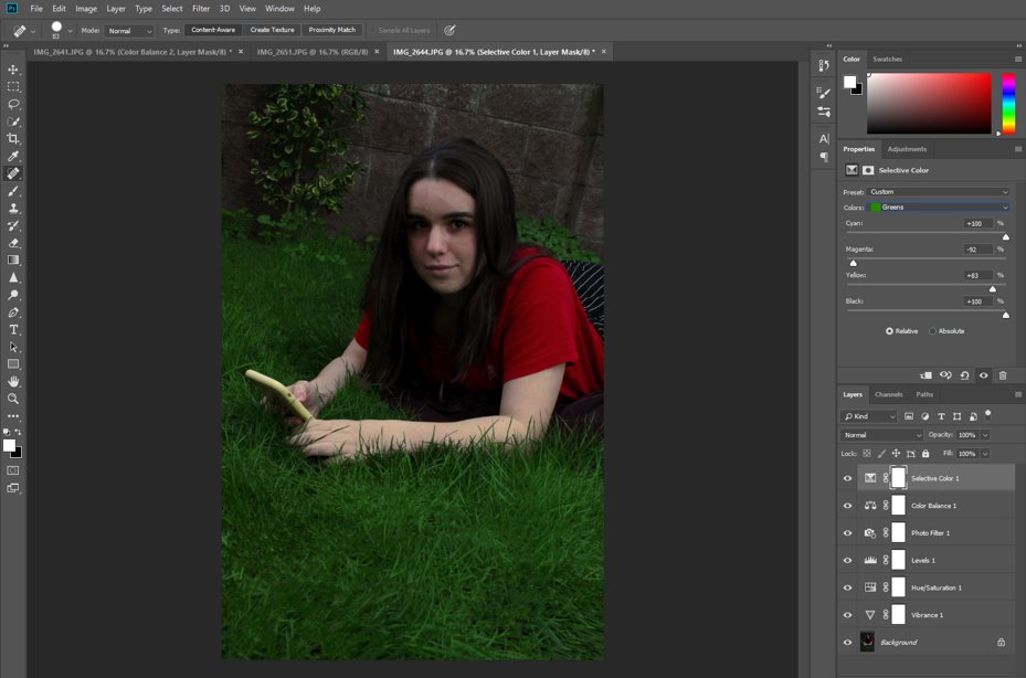
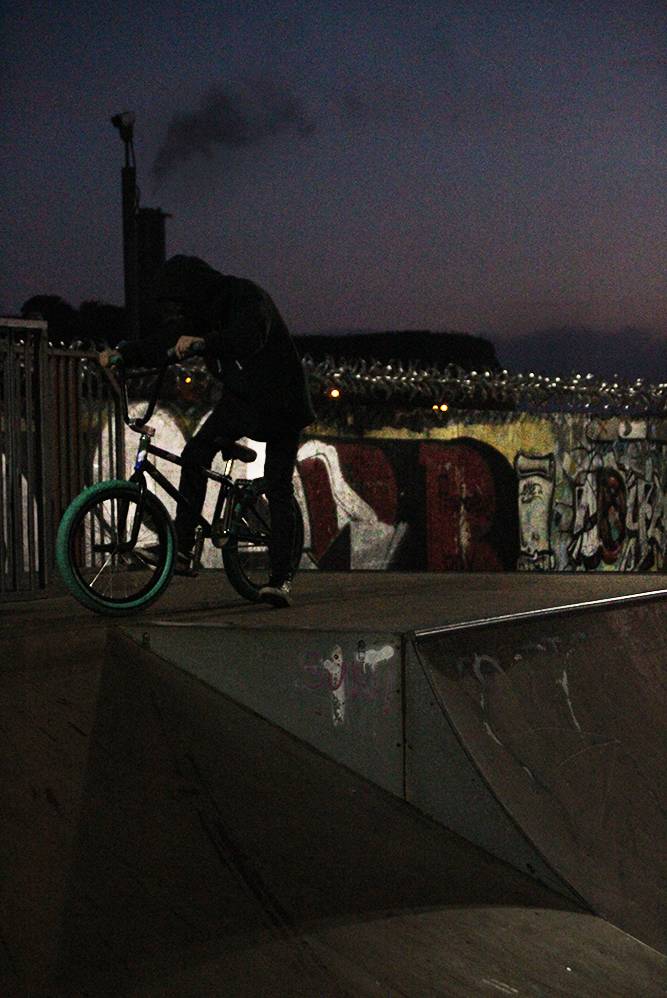
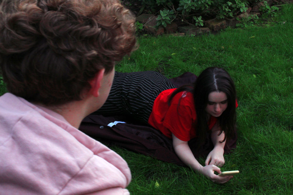
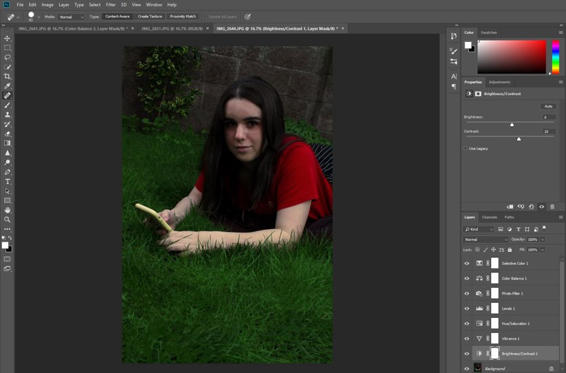
I added a filter, increased the saturation of the green grass and the red t-shirt to make them the focus of the image, as well as making the image brighter and increasing the contrast. I also used the spot healing tool to patch up the grass and smooth out the irregularities in the wall, to make the image more cohesive.
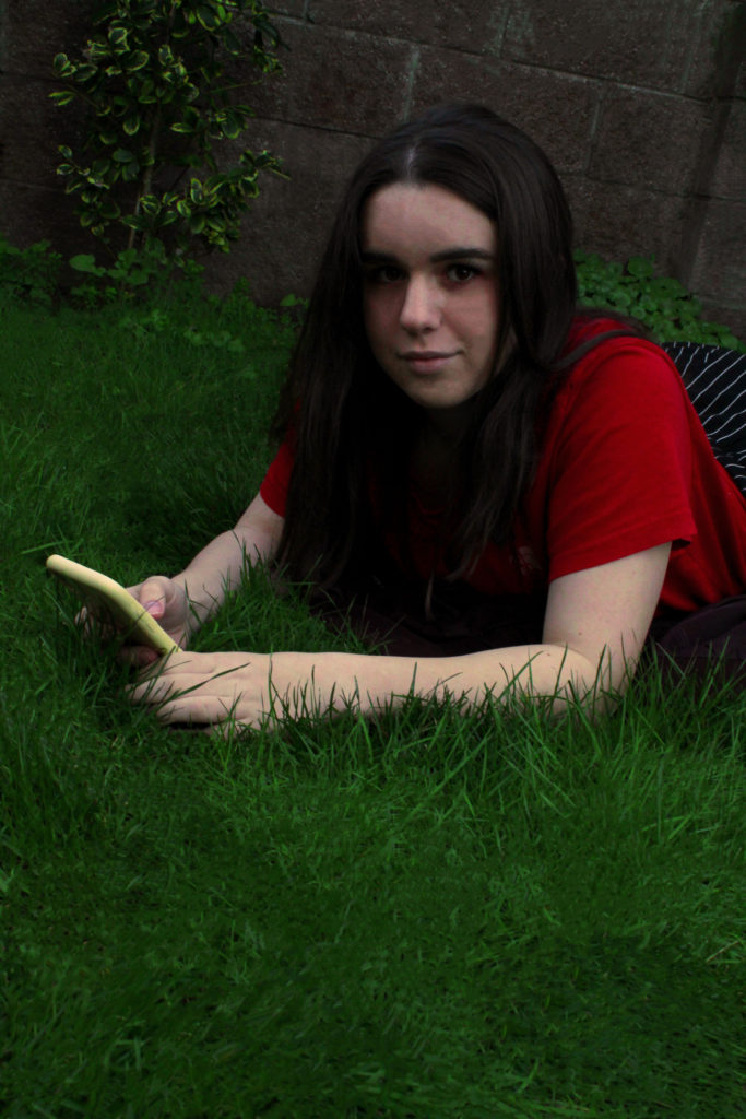
I took this image from a canted angle, which I decided not to change as it adds a little drama to the image and makes it more interesting. I also used the spot healing tool a little on the subject’s face, as well as to smooth out some of the wrinkles on the shirt.
TOP IMAGES-
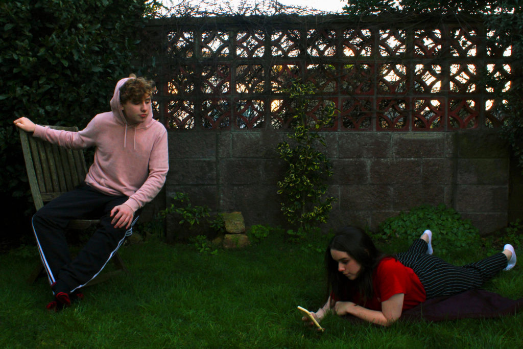
I really like how this image turned out as the composition is very similar to the original painting, and the the colours are saturated but still lifelike and not too over-edited. I feel like gender-swapping the roles made it more modern and relevant to today’s world, while also keeping with the tone of the painting, and replacing the pond with a phone also modernised the photo, reflecting how technology and social media can make people narcissistic and vain. The image has a fairly medium ISO and uses natural lighting, as it was taken outside during the sunset.

