Below are my 3 final images from the studio portraiture shoot. I have chosen these image because they are high quality and interesting to look at for the viewer.
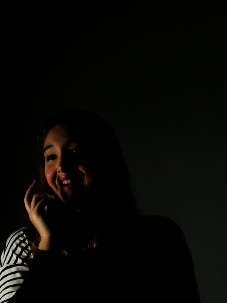
final image one

I have chosen this image for one of my finals as it is a strong image in terms of composition and aesthetics, as there is negative space that draws more attention to the individual. The pose the individual did is also effective, as it allows for shadows to be cast on the face and a more interesting pose than a simple straight on shot. The contrast between the light and dark is also very powerful too. This element was captured by placing a continuous light on individuals face, which only illuminated parts of it, to create strong shadows and bright lights. If I were to take this photograph again, I would try to position the light in a way that would mean that the backdrop was not illuminated as much, as it is a little distracting. Having a darker backdrop would also allow there to be a stronger negative space to draw more eyes towards the individuals face.
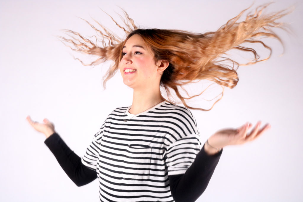
final image two

I have chosen this image to be one of my finals because I like the movement of the hair and the way it contrasts and sits against the white backdrop. Even though this photograph contains motion blur it is still a strong image, because the movement of the hands add interest and extra movement to the photograph. The hair stands out well as all the other aspects of the image are black and white. The individuals position is playful and joyful, which relates to the movement of the hair. If I were to take this photograph again, I would have tried to included more of the body, as it would have improved the composition as the photograph is quite full, but having more of the body would have balanced it out.
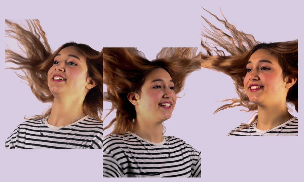
final image three

I have chosen this image to be one of my finals as it is creative and includes more than one image doing the same activity. By lining up the photographs in a way to look like they are joined in a way, came to me on the spot, as I liked these images but found they were very similar. However by placing them into Photoshop and playing around with the position of the images, this idea was created. The background colour adds to the creativeness of the image and how fun it is, even though it is only a light colour. I made it a pastel colour so it would not distract from the images. If I were to create this image again, I would try to take the photographs from straight on, so that the hair could flow and connect in a more realistic way.
whole shoot evaluation
Overall I think this shoot was successful and most of my images turned out the way I had wanted them to. It was my first time shooting in the studio, so at first I had to experiment with the camera setting to allow me to get a correctly exposed image at the right shutter speed. But after a few changes I found the correct settings. I have gained more confidence when directing my individual now, and I think this has improved my image quality as the poses and expressions are more interesting. I really like how the two point lighting photographs came out and how eye catching they are, due to the high exposure. If I were to do this shoot again, I would try to get a broader range of angles of the individual, as this will make my selection process easier as there will be more photographs to chose from. I would also try and experiment with the one point lighting by placing the continuous light in different places, to cast more interesting shadows too.
