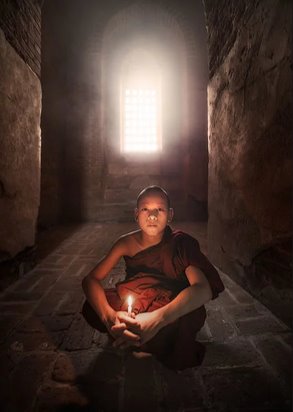
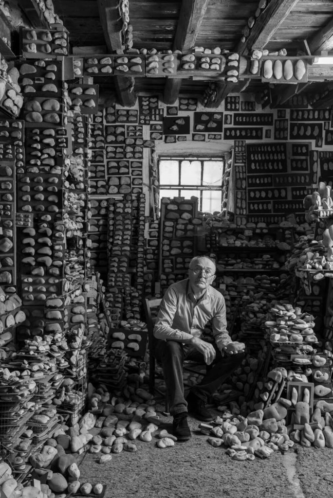
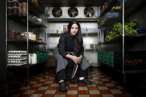
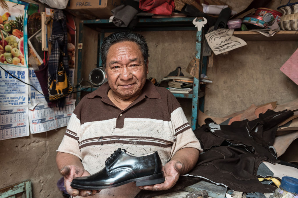
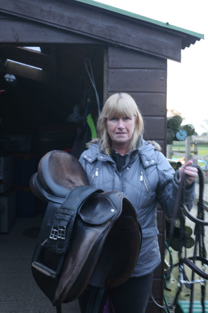
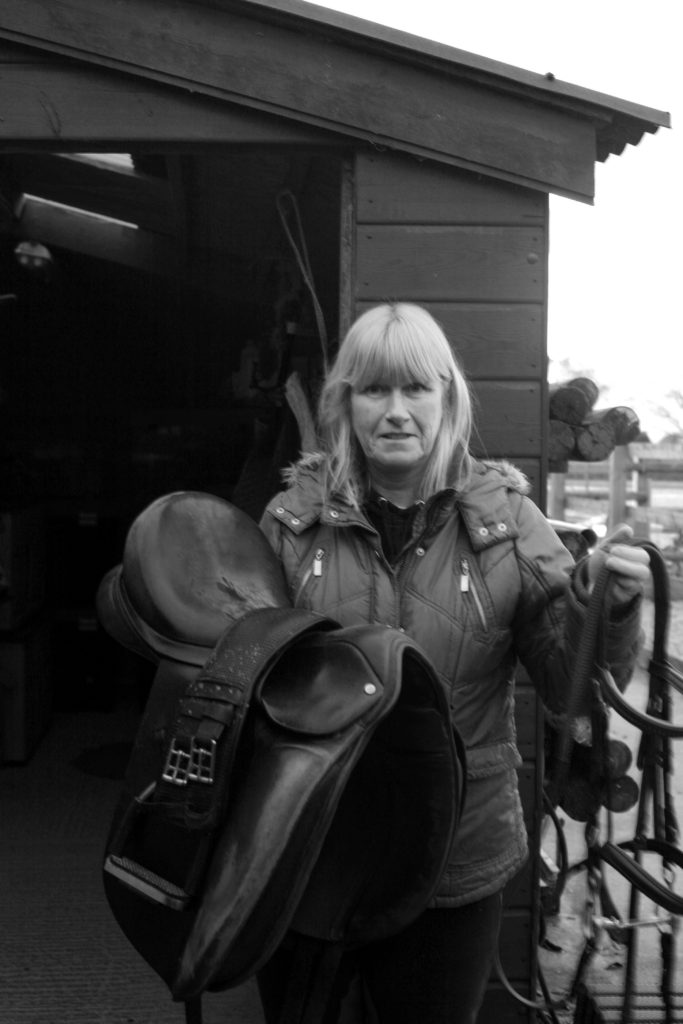
An environmental portrait is a image shot in the subject’s usual environment, such as in their home or workplace, and typically depicts the subject’s life/occupation and surroundings.
Arnold Newman
Newman was an American photographer, best known for his environmental portraits of famous artists, such as Pablo Picasso, and politicians, like John F. Kennedy, as an example. He was, in fact, the founder of the term ‘Environmental Portraits’.
He used features and shapes within his images to portray and symbolise the subject’s life, work or occupation. He usually photographed the individual in their own familiar surroundings with relevant visual elements to represent each subject’s personality and profession
One of his most famous portraits being of musician Igor Stravinsky
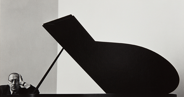
Photo analysis

The wide range of tones Newman uses creates a highly contrasted, striking and successful image. With the lightest tones being on the piano keys, Gould’s occupation is clearly stated.
Newman lined Gould up within the vertical third on the right, appearing indistinctly over the piano, possibly implying a power imbalance between the two objects in frame- a sense of dominance and control from Gould over the instrument.
The position the subject has been placed in also amplifies this idea. The relaxed pose and direct eye contact from Gould shows the ease at which he governs his occupation.
The use of negative space naturally draws the viewer’s inspection towards to the subject. Leading lines from the edge of the keys and from the wall above Gould (having been intently lined up) also aid in the focus of the portrait being on the subject.
Photoshoot plan
Who
- Mutual family/friends
What
Builders, Farmers, Pharmacists, Vicar/priest?, Baristas, Students, Sports students, Science technicians.
Where
Hamptonne egg farm, St Lawrence church, Hautlieu school, science department.
Why
Environmental portraits connect the subject to the place they’re being photographed (home or work place). It tells a narrative about the person’s life story, adding meaning to the portraits.
How
- Full body, 3/4 body shot, half body.
- Colour + Black and white.
- Experiment with angles?
Photoshoot
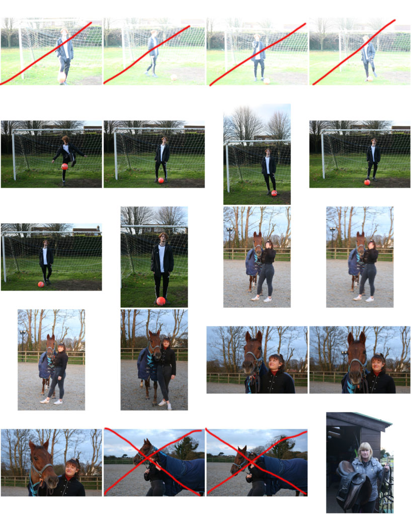
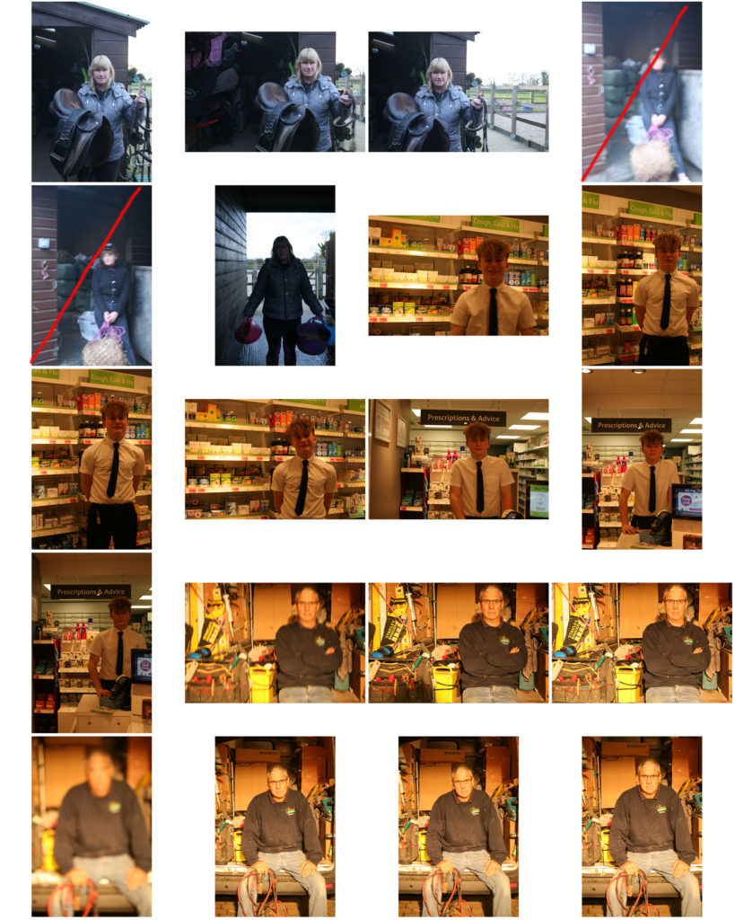
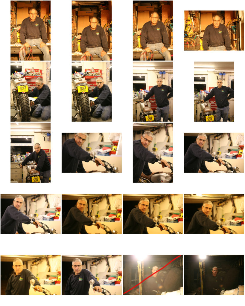
shoot 1:
shoot 2:
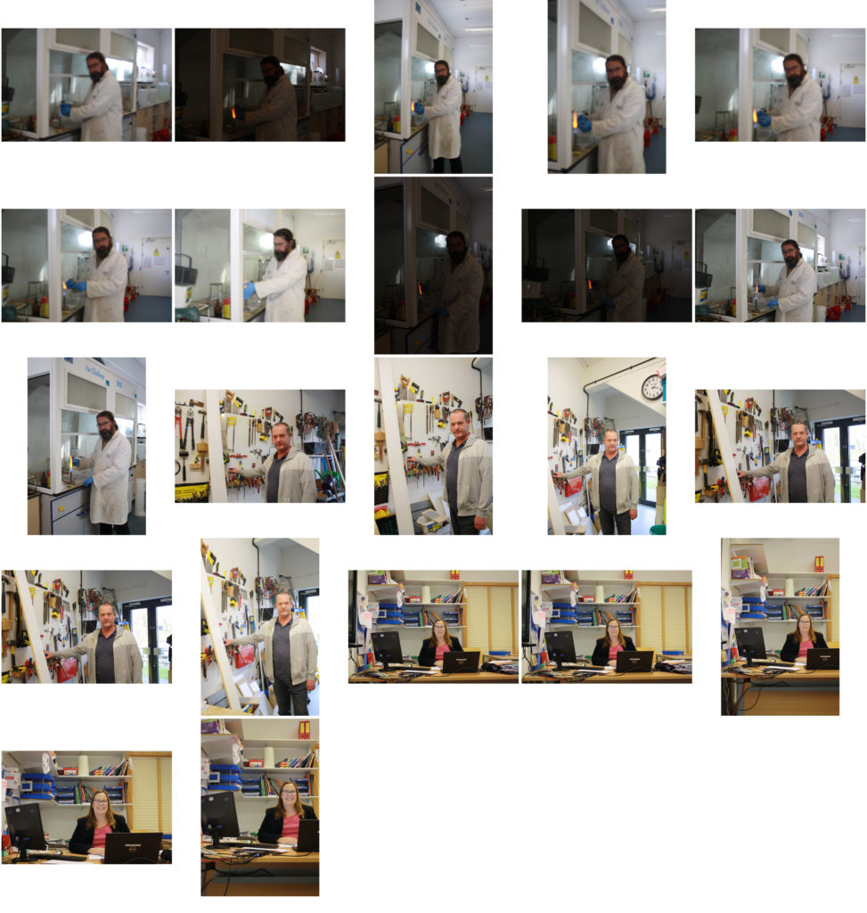
Best images from shoot:
EDITING:
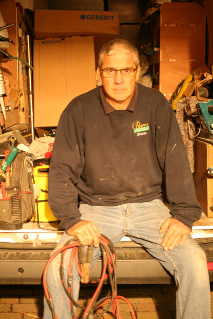
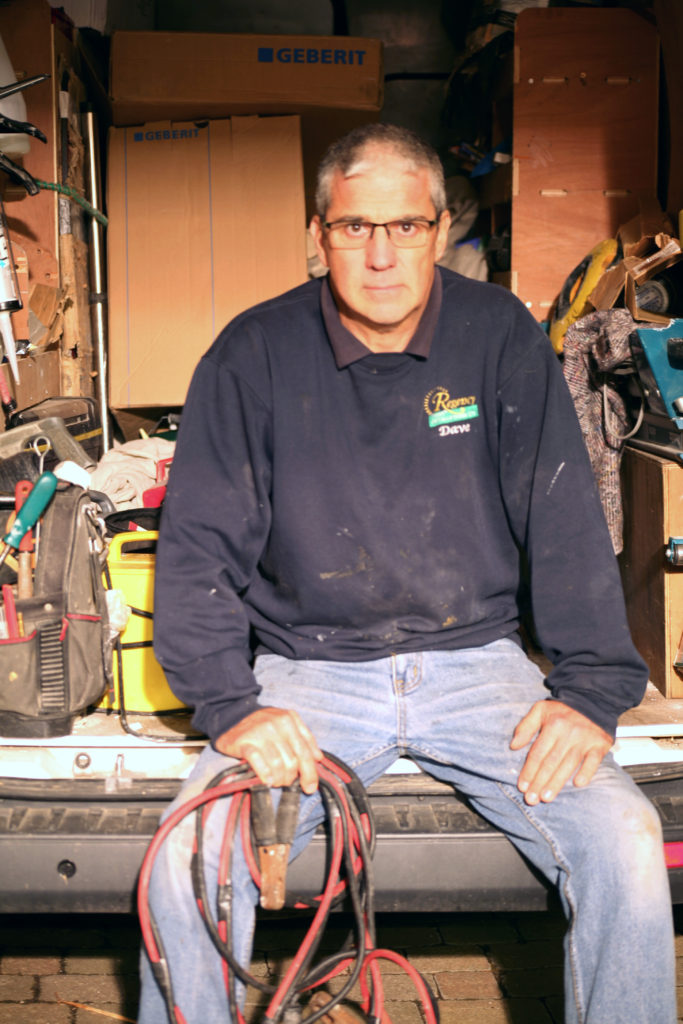
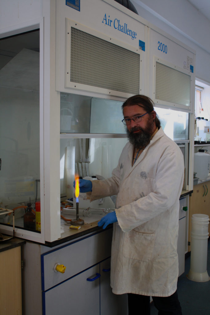
Having failed to adjust the white balance during the photo-shoot, I began by adjusting the color balance of red, green and blue tones within the highlights, shadows and mid-tones of the image to correct how the it originally looked through the view finder.
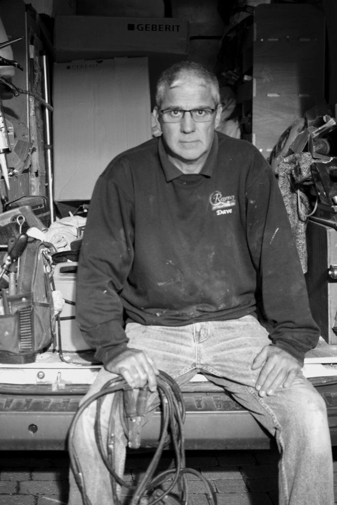
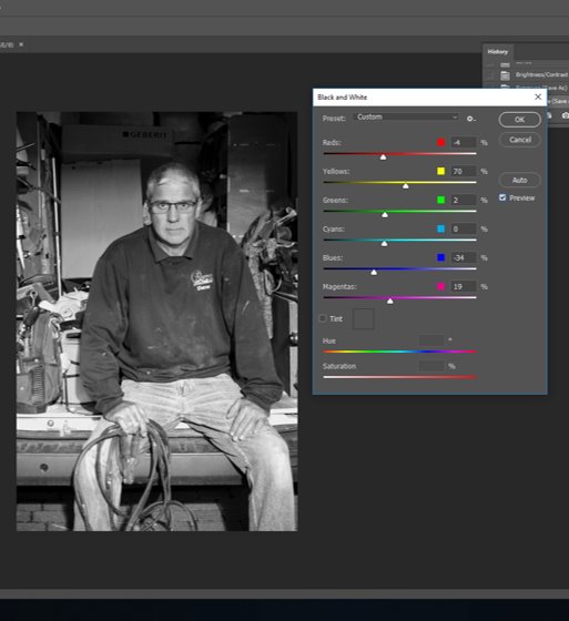
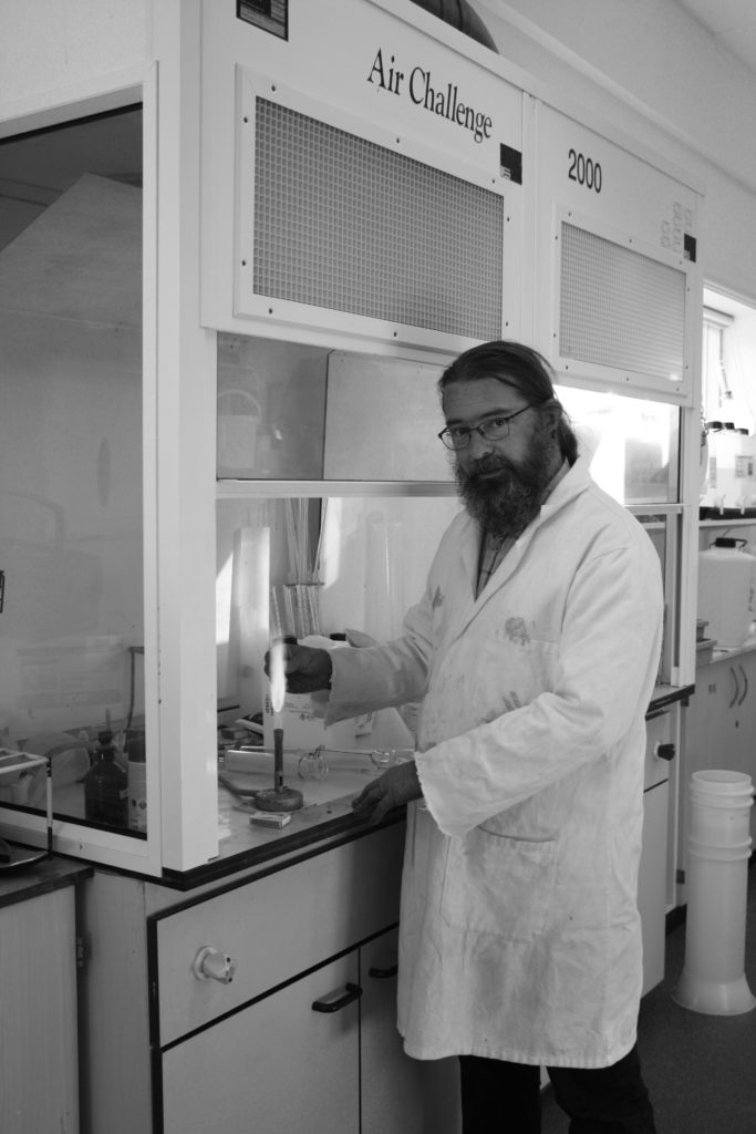
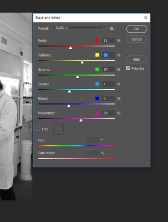
By converting the image to black and white, it gave me some control over what I wanted the viewer to focus on the most. Having made the image monochrome, I was able to shift the focus to be on the the subject in the foreground.
To bring out the main features of the subject I made the red tones darker, bringing out the contours of his face and the cable lead in hand. By making the blue tones darker than the red I could create contrast between the exposed skin (hands, neck face) and clothing, as well as the objects in the background.
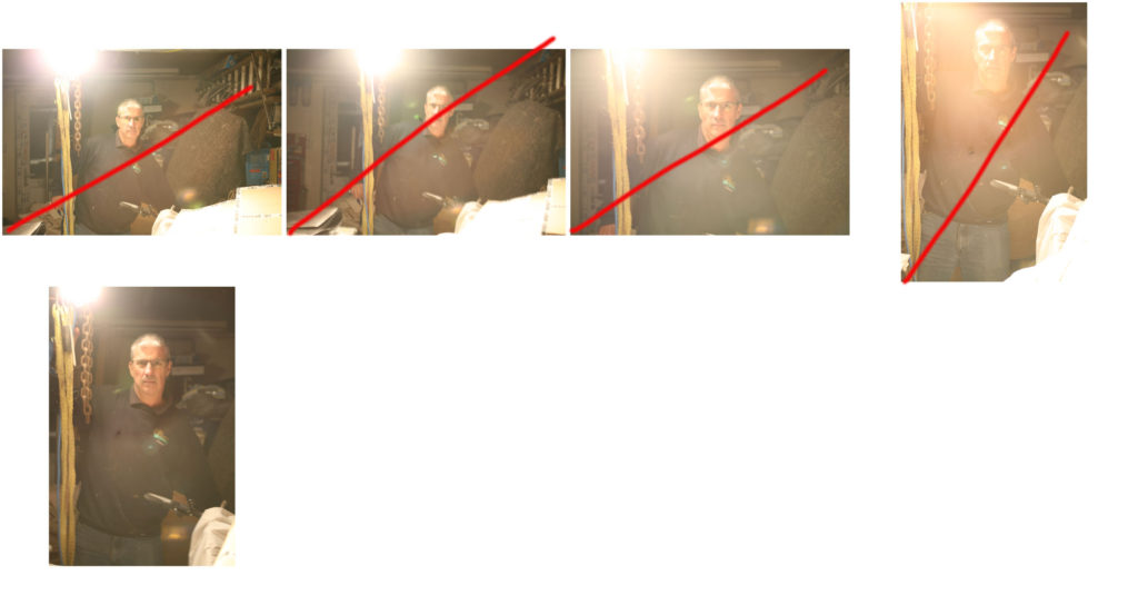
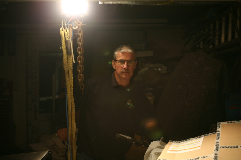
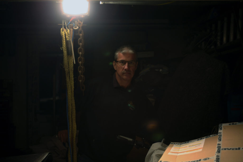
With the aim of creating a more low-key image, using one point lighting, I placed the fluorescent lamp next to the subject which illuminated the right side of his face and created a dark, more intimidating atmosphere surrounding him. The only issue was that fact I included the light within the frame.
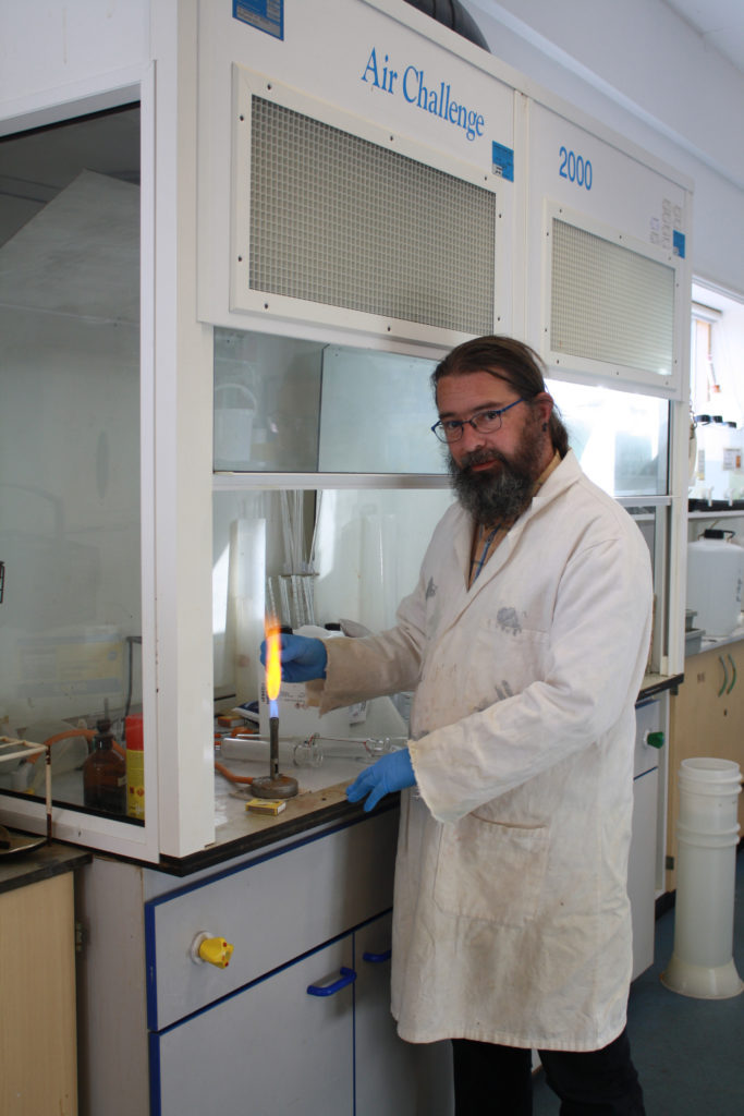
Initially, I decided to make the image monochromatic, however I felt it didn’t make the subject stand out. The laboratory coat and dark features made him merge with the background which is predominantly light.
The blue font on the structure behind was a similar shade to that of the technician’s gloves, making subconscious links to the viewer, causing them to interact more intimately with the image.
Cropping
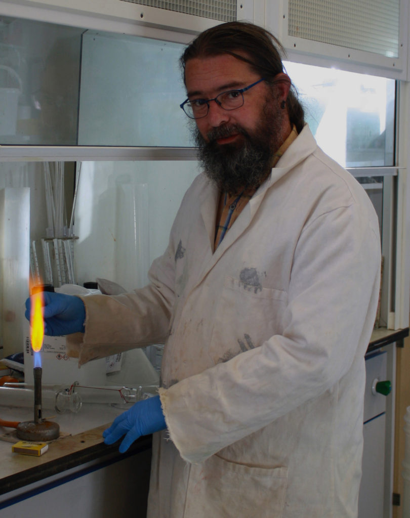
I experimented with half body portraits when cropping the image, this allowed for the focus to shift to the subject’s face. The character’s gentleness can be clearly seen through the positioning of his hands and the positioning of his shoulders and head.
The side stance shows a more submissive nature, compared to my portrait of the builder, who is positioned in a way that dominates the frame. The delicacy of the character ties in well with the occupation as it shows a duty of care and attentiveness to his work
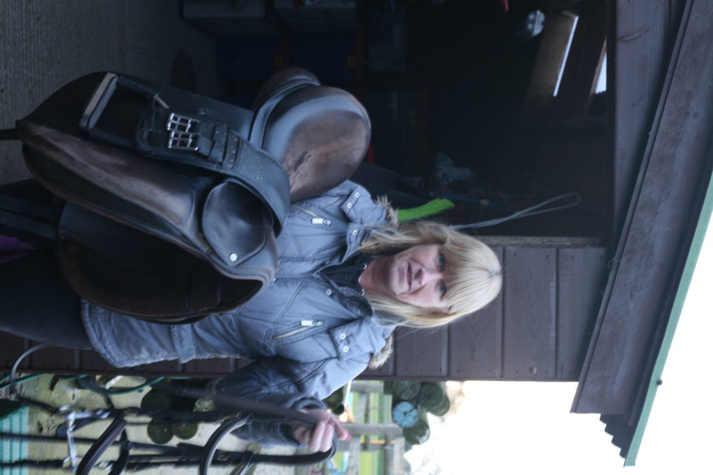
Editing the image to black and white allowed the focus to be more on the subject. By having the facial features and hair of the subject lighter than the clothing and equipment, I’m able to draw the viewers attention to the her face.
Most successful, edited image:
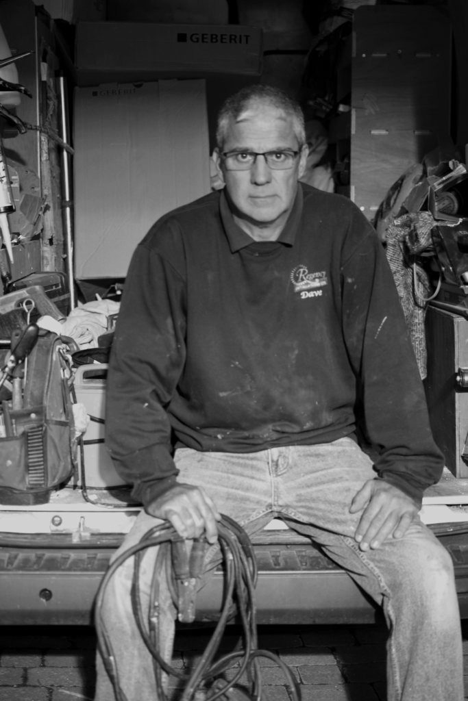
I felt this image was most successful as it incorporates a large range of tones and encapsulates the personality of the subject.
I placed the subject sat on the edge of his work van, with open body-language. This allowed me to show a sense of assertiveness and ownership the subject has. Direct eye contact with the camera also aids in making the subject seem intimidating. This is useful in building some context.
Builders and carpenters have a reputation for being self-assertive and brash on building sites. As my subject is the head of a similar company, I aimed to create a stern look on his face and capture the ownership and dominance he may display in front of his employees.
Dark tones in the subject’s jumper create a contrast against the objects that fill the background, refocusing the viewer on the subject as they analyse the image.

