PORtrait 4- Tableau and staged reality

What is Tableaux Vivant?

Image result for caravaggio re-enacted
Student re-enactment after Caravaggio (The Beheading of St John the Baptist) 1608

CLICK HERE FOR LINK TO TATE DEFINITION

tableau vivant (often shortened to tableau, plural: tableaux vivants), French for ‘living picture’, is a static scene containing one or more actors or models. They are stationary and silent, usually in costume, carefully posed, with props and/or scenery, and may be theatrically lit.

Tableau Ideas and Starting points

  • re-create or re-enact an existing story-based photograph or painting
  • You could …illustrate a poem, story, song lyrics, fable, moral, mythology, legend, dream or historical event
  • You could portray…one or more of The Ten Commandments
  • You could elaborate on…one or more of The Seven Deadly Sins

             Tableau Photography is staged. Think of it like theatre.

  Tableau Photography is dependent on a defined NARRATIVE, theme or storyline

Blog Post 1 / TASK 1 .(extend and complete for homework)

  1. Define and present examples of Tableau Vivants
  2. You must develop and PLAN a story / part of a story that involves at least 1 x character
  3. You must bse your idea on careful planning and RESEARCH — look at other artists for influence.
  4. You could / should explore gender roles, masculinity, forms of social commentary, sexism, feminism, equality, isolation, belonging, alienation, disenchantment, political agendas, hierarchies, power, status, imperialism, bullying, environmental concerns etc
  5. Include props, backgrounds, costumes and outfits and mise en scene that connects to your theme somehow.
  6. Try to introduce symbolism and metaphor in your image(s) and produce a series of images (like stills from a film)
  7. You may want use the lighting studio…or experiment with suitable locations (connect the location to the theme / storyline)

Final Outcomes : a choice of

  1. 3-5 photographs that clearly show your understanding of TABLEAU and STAGED REALITY
  2. Either a group approach – or individual

Blog Post 2 / TASK 2 (minimum 1 x blog post)

  1.  Choose a Tableau photographer to research from the examples below
  2. Analyse, interpret and evaluate a key image by your chosen artist : A CASE STUDY
  3. Demonstrate creative links to your own idea

COMPLETE TABLEAU UNIT BY FRIDAY 20th DECEMBER

Example 1 :

DiCorcia’s working methodology:

  • Dicorcia’s work is a mixture of documentary and staged tableaux for which he is best known
  • Well known for his use of lighting in street photography
  • While shooting Hustlers, he paid his subjects, causing controversy in the photographic community
  • DiCorcia only plans / stages his photographs up to a point and then relies on something unexpected to happen
  • He does digitally manipulate some of his images by removing or adding items
  • He does not direct people
  • Very often he does not know his subjects
  • He usually has his camera on a tripod
  • Sets his photos up so that the viewer can assert his/her own interpretation to the image – open narrative

DiCorcia has no patience for visual passivity. “I’ve been trying to create photographs in which the emotional and psychological content is time-released… From the very beginning, I was fighting against this media-created idea that imagery is so disposable that it’s exhausted within a very short amount of time.” His tendency is to slow time down, an apprehension that has nothing to do with entropy. Instead, it is a seduction into the act of looking.

Example 2 : 

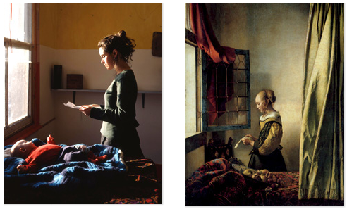
  • He uses a large format camera and tripod
  • He uses polaroids for planning out his scenes
  • Draws inspiration from iconic Victorian paintings and recreates the scenes in a contemporary setting
  • Infuses the mood of the Victorian paintings into his modern industrial settings
  • His work is socially aware and pays tribute to art history
  • He uses well known art motifs in his work, e.g. the window as in Vermeer’s paintings
  • His portraiture pays tribute to the Dutch Renaissance and pre-Raphaelite master painters
  • He simulates similar colours and tones as those used by Vermeer
  • His portraits are of the disenfranchised people living close to the margins of society
  • His work is a blend of fictional and factual
  • He most often replicates Vermeer’s methods of portraiture:

… amongst the art historical references glimpsed within Hunter’s oeuvre, the voyeurism of Vermeer is most discernible. Subjects are often shown full figure, in private spheres (e.g. sites of domesticity), and set in the mid-ground in order to include something of their environment.

Example 3 :

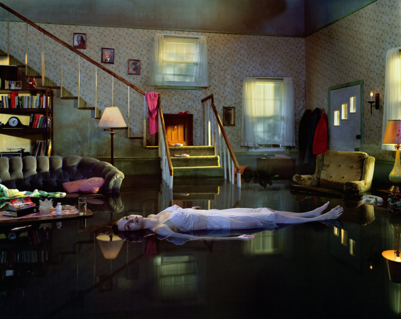
Gregory Crewsdon talks about ‘the real and the imagined’. He works around concepts of place / setting; character; narrative. He is also very clear about the technical aspects of his work, particularly lighting and mise-en-scene, ie the arrangements of objects in his frame. He is a storyteller, using photography to catch a frozen moment in time, that both suggests the back-story (what happened before this frozen moment) and the story that may unfold. It is about ‘bringing the viewer in’. As he says, ‘there are no answers in these pictures, only questions.’


You must show that you know and understand that…

Tableau Photography makes use of symbolism and metaphor.

Allegorical paintings / photographs contain metaphor and symbolism

Pictorialist Photography was the starting point for  Tableaux art

Narrative is vital to successful tableau / staged reality


Here are some examples that could inspire your own ideas…

Research some of these examples…and then re-stage, re-enact and re-photograph
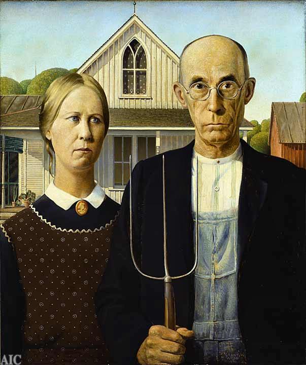
Grant Wood, American Gothic 1930
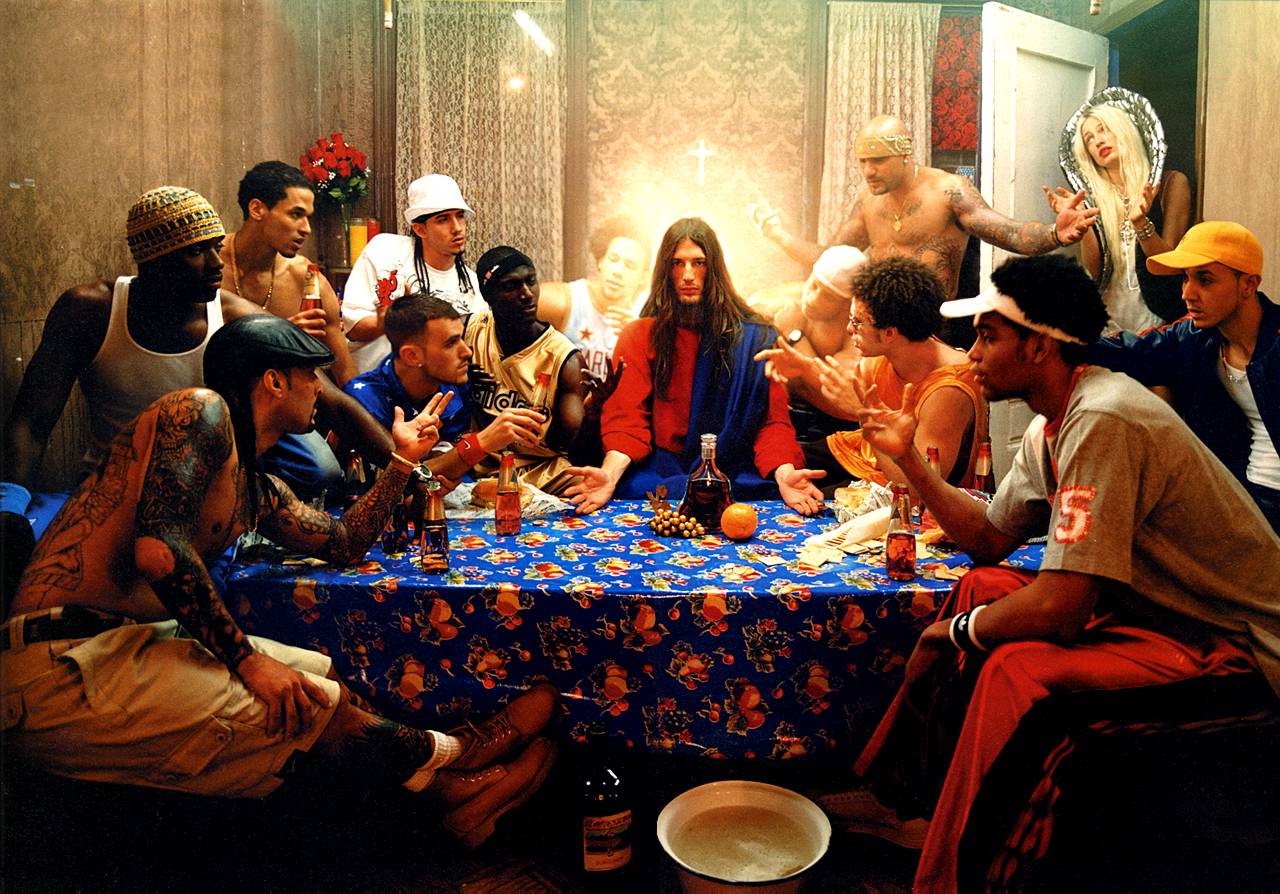
David LaChapelle, Last Supper, 2008
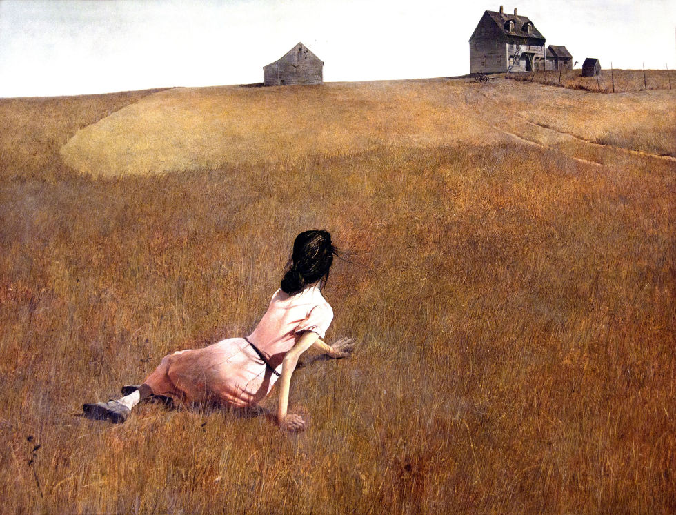
Christina’s World , Andrew Wyeth, 1938
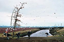
Jeff Wall, A Sudden Gust of Wind, 1993
Image result for edward hopper
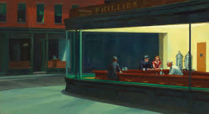
Edward hopper, Nighthawks, 1942
Image result for yinka shonibare photography
Yinka Shonibare,Diary of a Victorian Dandy, 1992
yinka Shonibare, Fake Death Picture (The Suicide – after Manet), 2011
Image result for lottie davies photography
Lottie Davies
Image result for jeff wall
Jeff Wall
Gregory Crewdson - Untitled from Twilight, 1998-2002, Digital C-print, 121,9 x 152, 4 cm
Gregory Crewdson : Untitled (Ophelia) from Twilight, 1998-2002
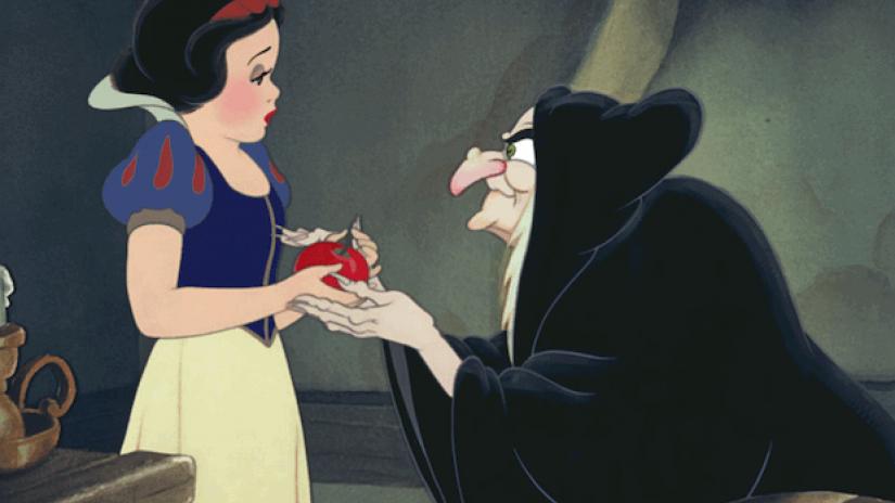
Snow White, 1938, Disney Productions— or other fairytales, myths, fables etc
Image result for paul m smith photographer
Paul M Smith, Lads Night Out
Image result for cindy sherman
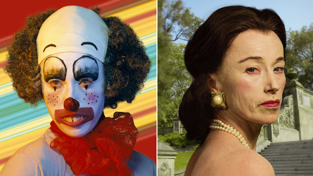
Cindy Sherman, Untitled Film Still, 2003
Image result for ryan schude
Ryan Schude
Image result for philip lorca dicorcia
Phillip Lorca Di Corcia, Cruise, 2015
Image result for Martha Rosler
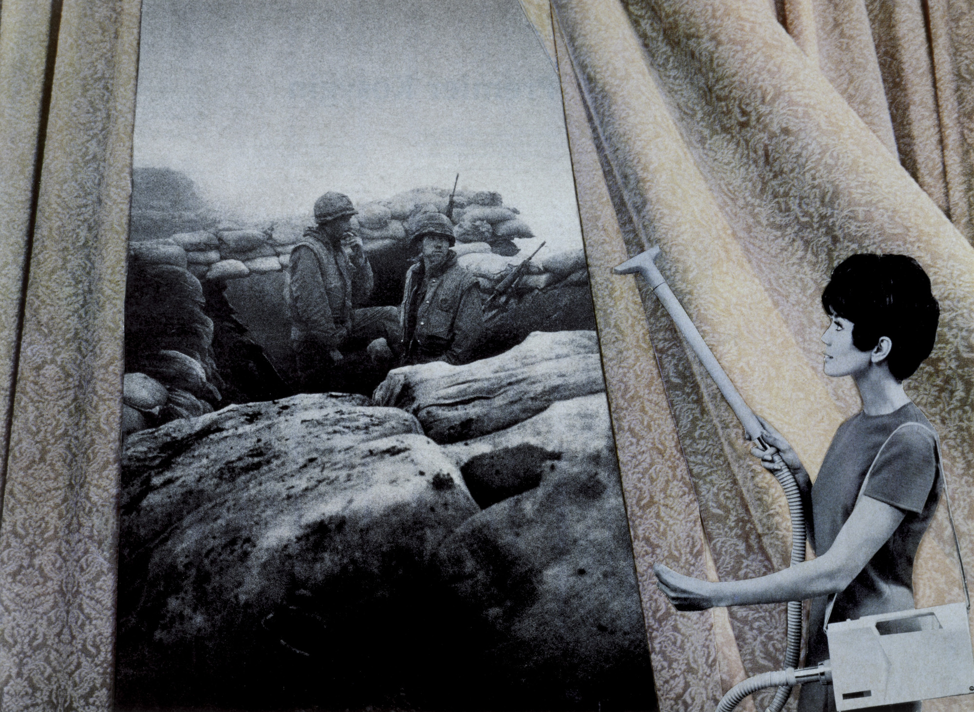
Martha Rosler, Bringing The War Home, 1967-72—Tableau / Conceptual
Image result for hannah starkey
Hannah Starkey, Untitled, 1999—Women in everyday urban setting, from a woman’s perspective
Image result for tom hunter photographer
Tom Hunter, Woman Reading a possession order, 2012 (after Vermeer)
Image result for liberty leading the people
Liberty Leading The people, Eugene Delacroix, 1830
Image result for french tableaux photographer raft of medusa
Gerard Rancinan, Raft of Illusions, 2005

Historical / Contextual Example :

The Raft of The Medusa…Theodore Gericault

https://www.khanacademy.org/humanities/becoming-modern/romanticism/romanticism-in-france/v/g-ricault-raft-of-the-medusa-1818-19


Ensure you have enough evidence of…

  1. moodboards
  2. mindmaps
  3. case studies (artist references)
  4. action plans
  5. photoshoots + contact sheets (annotated)
  6. appropriate selection and editing techniques
  7. presentation of final ideas and personal responses
  8. analysis and evaluation of process
  9. compare and contrast to a key photographer
  10. critique / review / reflection of your work
Picture

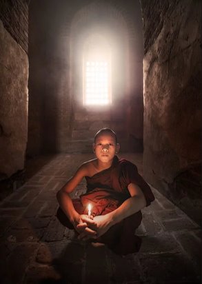
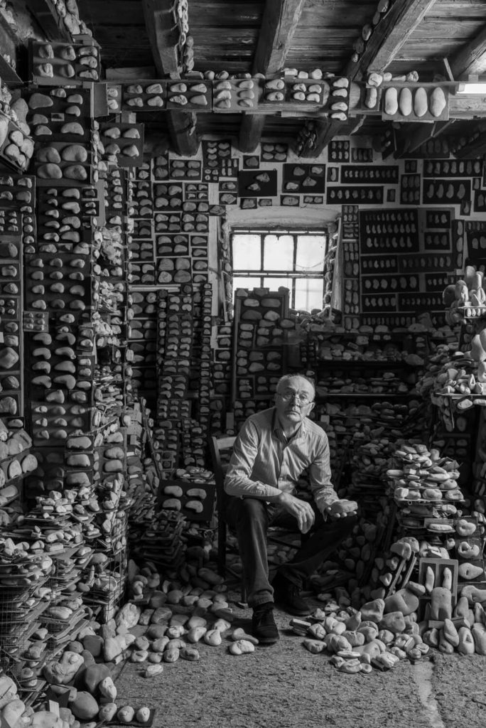
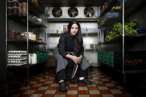
Environmental portraits

An environmental portrait is a image shot in the subject’s usual environment, such as in their home or workplace, and typically depicts the subject’s life/occupation and surroundings.

Arnold Newman

Newman was an American photographer, best known for his environmental portraits of famous artists, such as Pablo Picasso, and politicians, like John F. Kennedy, as an example. He was, in fact, the founder of the term ‘Environmental Portraits’.

He used features and shapes within his images to portray and symbolise the subject’s life, work or occupation. He usually photographed the individual in their own familiar surroundings with relevant visual elements to represent each subject’s personality and profession

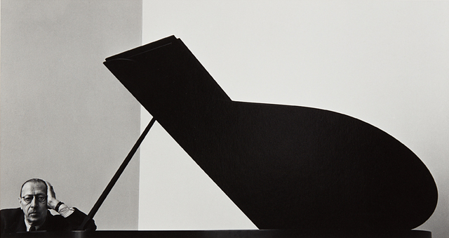
One of his most famous portraits being of musician Igor Stravinsky

Igor Stravinsky 1946 / Arnold Newman

Photo analysis

Glenn Gould, pianist. New York, 1959.
Glenn Gould, pianist. New York, 1959.Credit…Arnold Newman/Courtesy of Howard Greenberg Gallery

The wide range of tones Newman uses creates a highly contrasted, striking and successful image. With the lightest tones being on the piano keys, Gould’s occupation is clearly stated.

Newman lined Gould up within the vertical third on the right, appearing indistinctly over the piano, possibly implying a power imbalance between the two objects in frame- a sense of dominance and control from Gould over the instrument.

The position the subject has been placed in also amplifies this idea. The relaxed pose and direct eye contact from Gould shows the ease at which he governs his occupation.

The use of negative space naturally draws the viewer’s inspection towards to the subject. Leading lines from the edge of the keys and from the wall above Gould (having been intently lined up) also aid in the focus of the portrait being on the subject.

Photoshoot plan

Who

  • Mutual family/friends

What

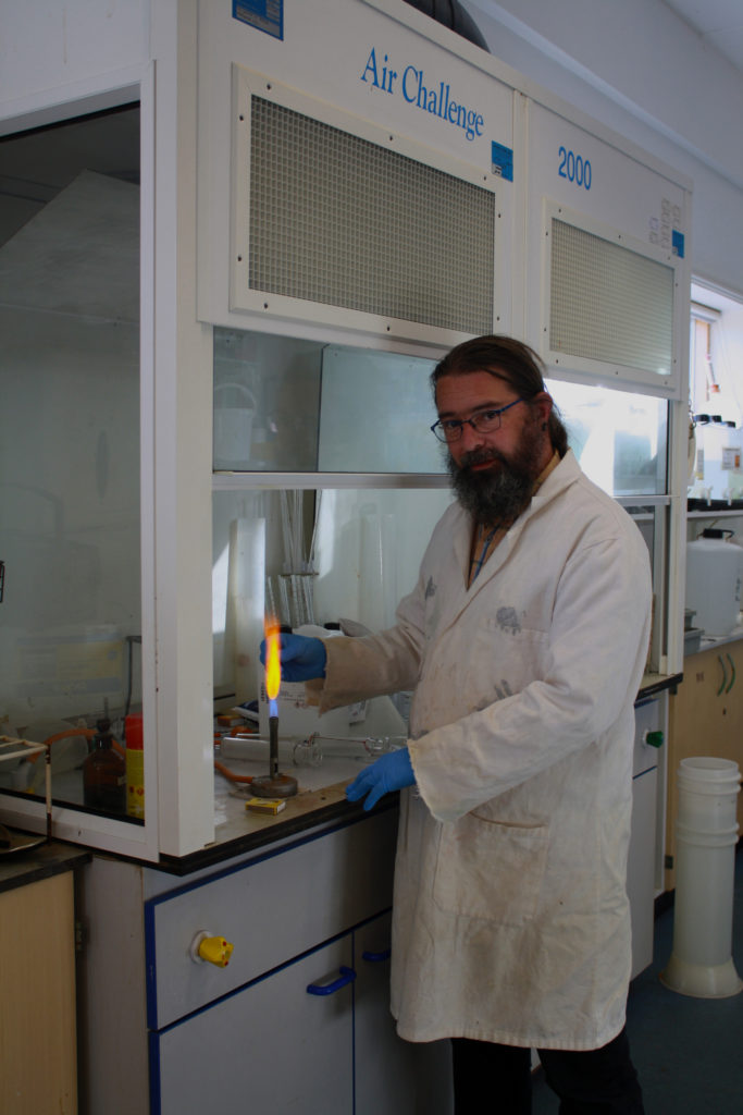
Builders, Farmers, Pharmacists, Vicar/priest?, Baristas, Students, Sports students, Science technicians.

Where

Hamptonne egg farm, St Lawrence church, Hautlieu school, science department.

Why

Environmental portraits connect the subject to the place they’re being photographed (home or work place). It tells a narrative about the person’s life story, adding meaning to the portraits.

How

  • Full body, 3/4 body shot, half body.
  • Colour + Black and white.
  • Experiment with angles?

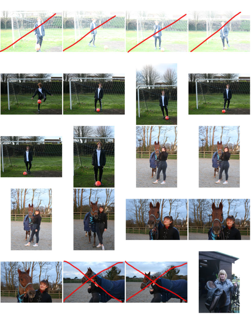
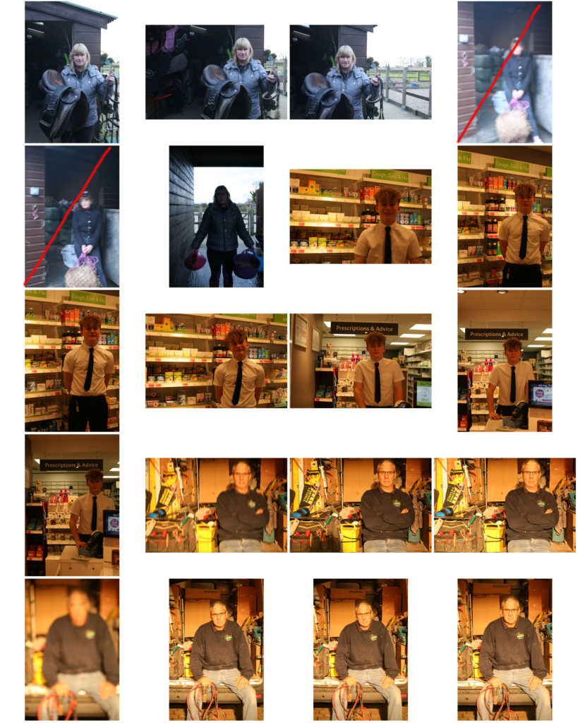
Photoshoot

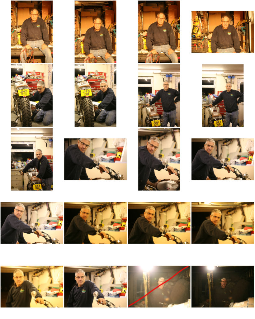
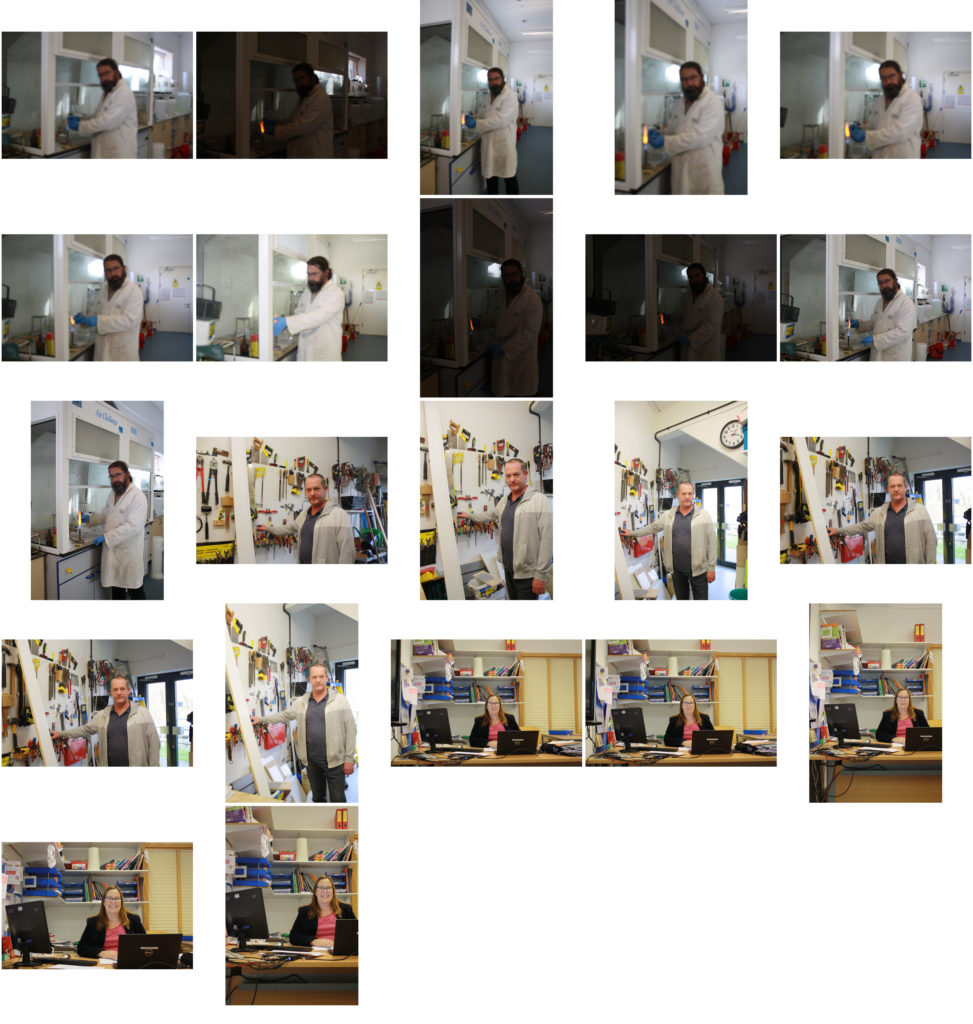
shoot 1:

shoot 2:

Shoot within school

Best images from shoot:

EDITING:

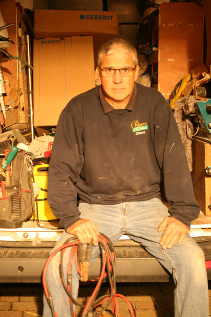
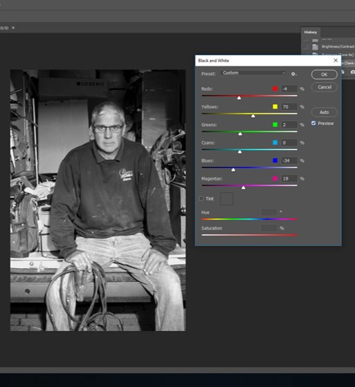
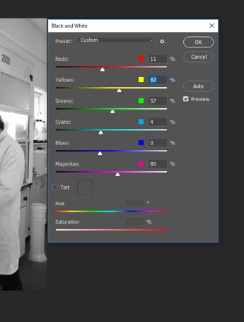
Having failed to adjust the white balance during the photo-shoot, I began by adjusting the color balance of red, green and blue tones within the highlights, shadows and mid-tones of the image to correct how the it originally looked through the view finder.

By converting the image to black and white, it gave me some control over what I wanted the viewer to focus on the most. Having made the image monochrome, I was able to shift the focus to be on the the subject in the foreground.

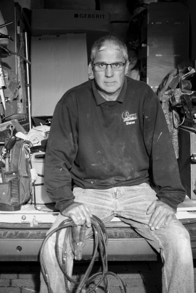
To bring out the main features of the subject I made the red tones darker, bringing out the contours of his face and the cable lead in hand. By making the blue tones darker than the red I could create contrast between the exposed skin (hands, neck face) and clothing, as well as the objects in the background.

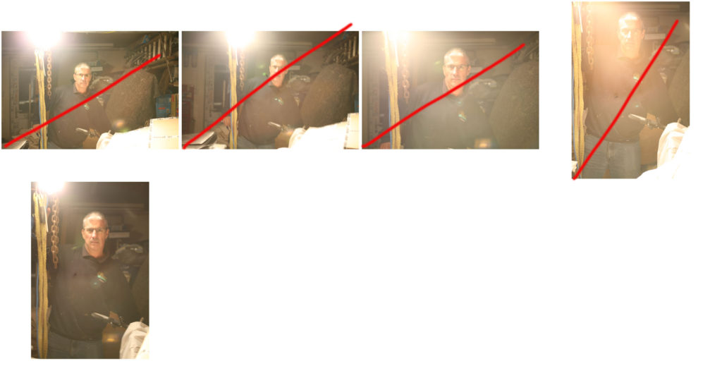
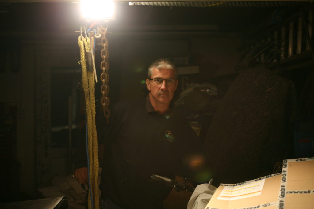
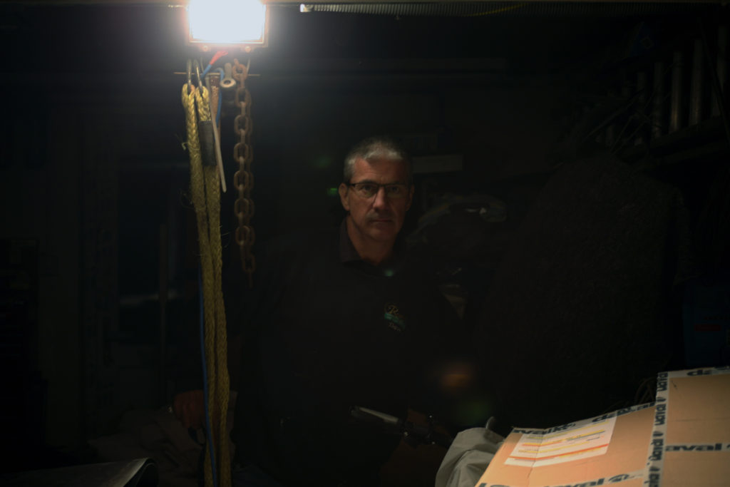
With the aim of creating a more low-key image, using one point lighting, I placed the fluorescent lamp next to the subject which illuminated the right side of his face and created a dark, more intimidating atmosphere surrounding him. The only issue was that fact I included the light within the frame.

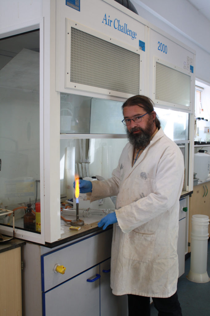
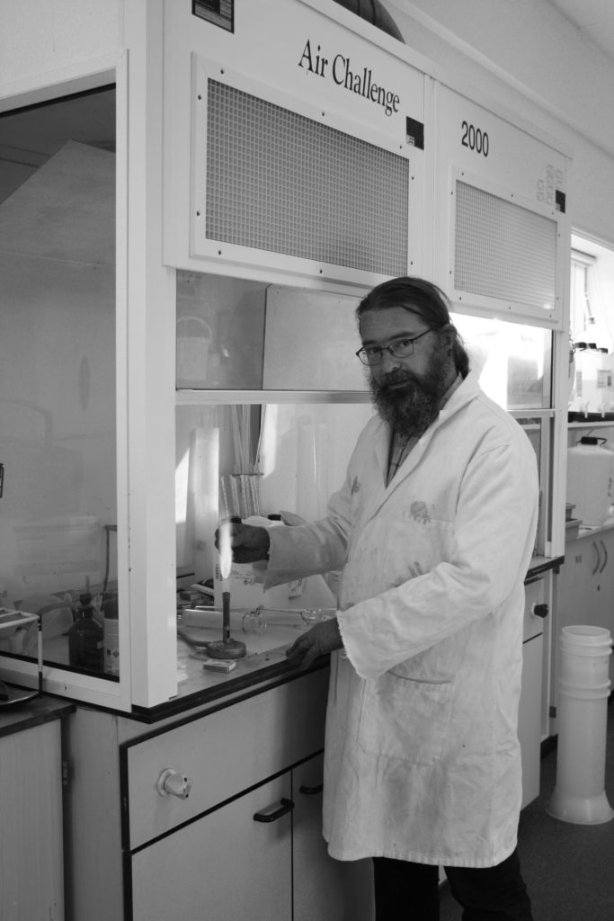
Initially, I decided to make the image monochromatic, however I felt it didn’t make the subject stand out. The laboratory coat and dark features made him merge with the background which is predominantly light.

The blue font on the structure behind was a similar shade to that of the technician’s gloves, making subconscious links to the viewer, causing them to interact more intimately with the image.

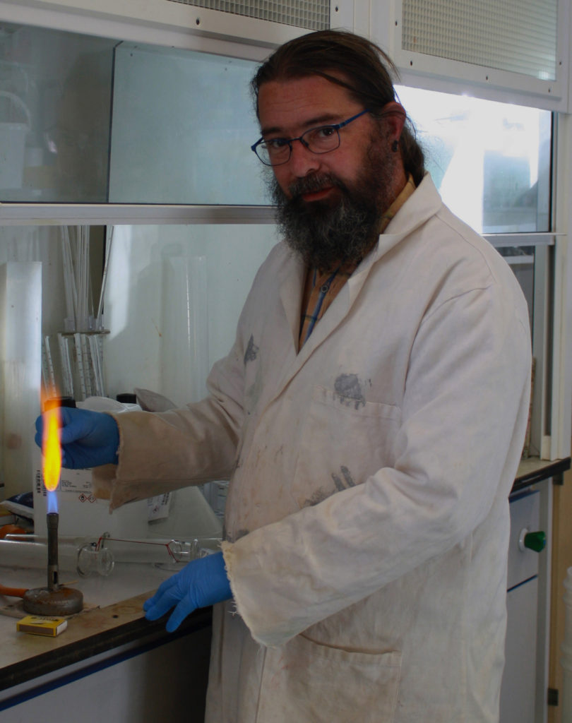
Cropping

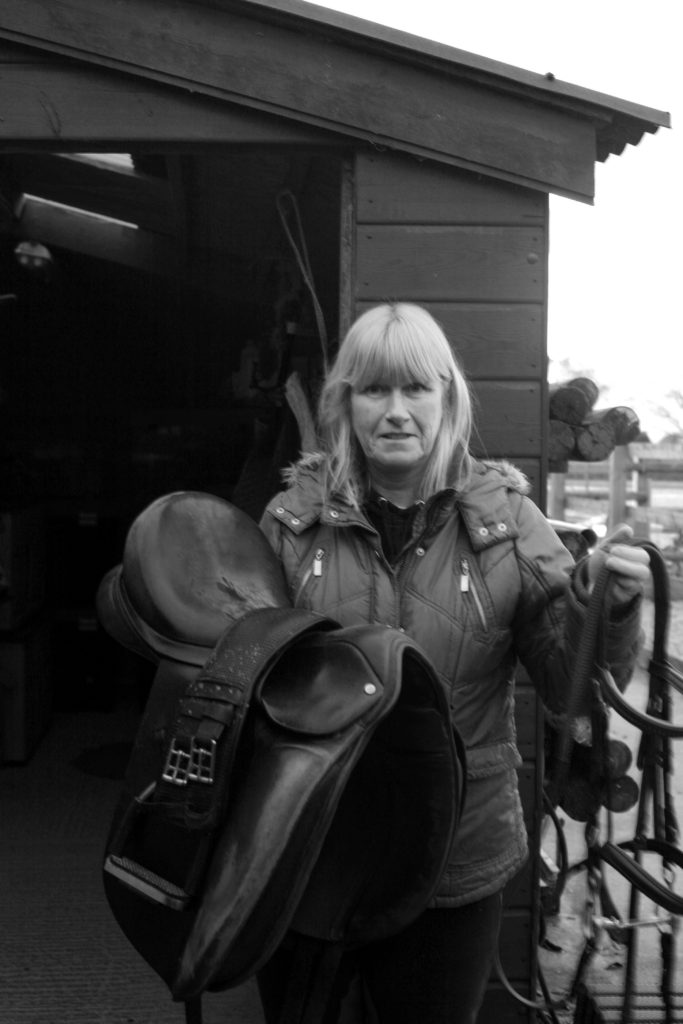
I experimented with half body portraits when cropping the image, this allowed for the focus to shift to the subject’s face. The character’s gentleness can be clearly seen through the positioning of his hands and the positioning of his shoulders and head.

The side stance shows a more submissive nature, compared to my portrait of the builder, who is positioned in a way that dominates the frame. The delicacy of the character ties in well with the occupation as it shows a duty of care and attentiveness to his work

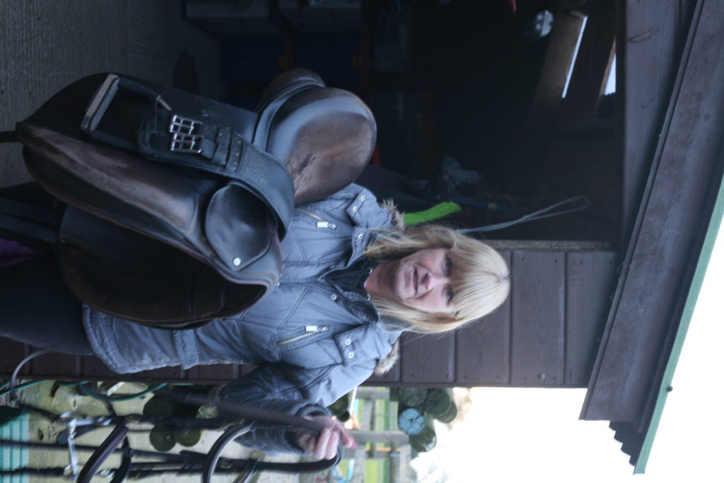
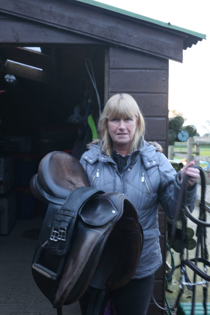
Editing the image to black and white allowed the focus to be more on the subject. By having the facial features and hair of the subject lighter than the clothing and equipment, I’m able to draw the viewers attention to the her face.

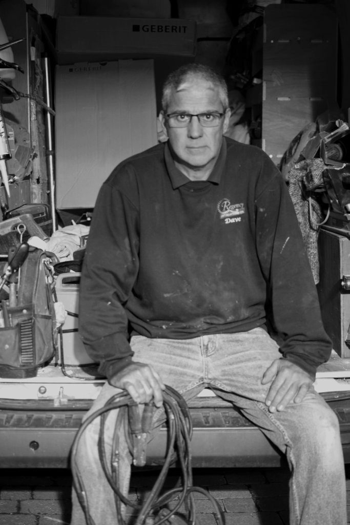
Most successful, edited image:

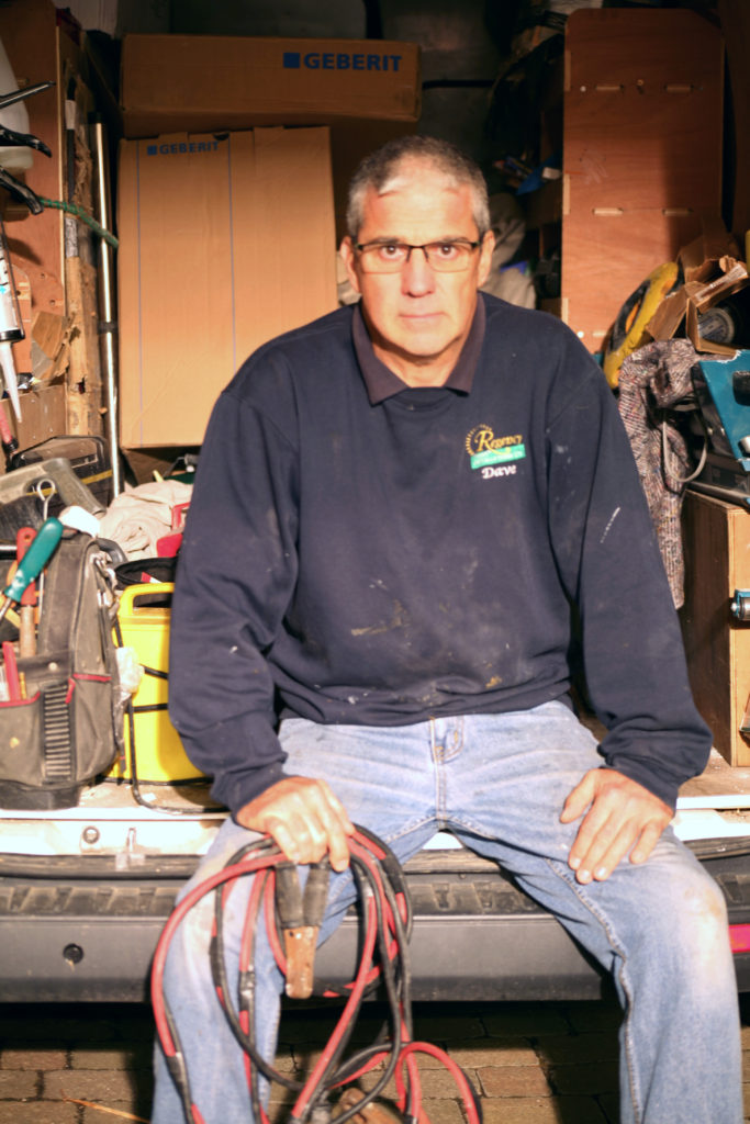
I felt this image was most successful as it incorporates a large range of tones and encapsulates the personality of the subject.

I placed the subject sat on the edge of his work van, with open body-language. This allowed me to show a sense of assertiveness and ownership the subject has. Direct eye contact with the camera also aids in making the subject seem intimidating. This is useful in building some context.

Builders and carpenters have a reputation for being self-assertive and brash on building sites. As my subject is the head of a similar company, I aimed to create a stern look on his face and capture the ownership and dominance he may display in front of his employees.

Dark tones in the subject’s jumper create a contrast against the objects that fill the background, refocusing the viewer on the subject as they analyse the image.