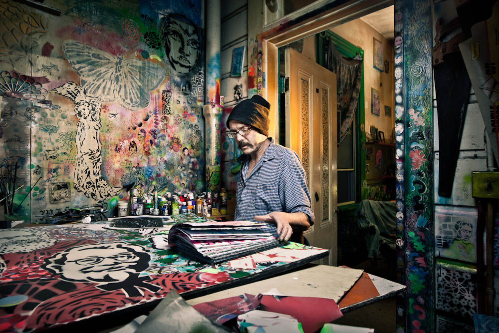
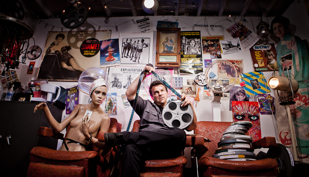
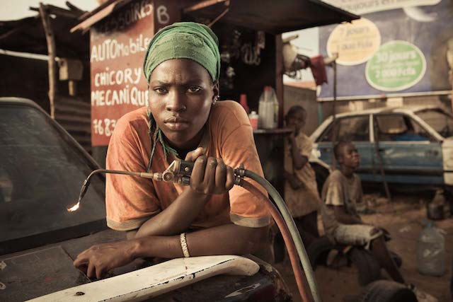
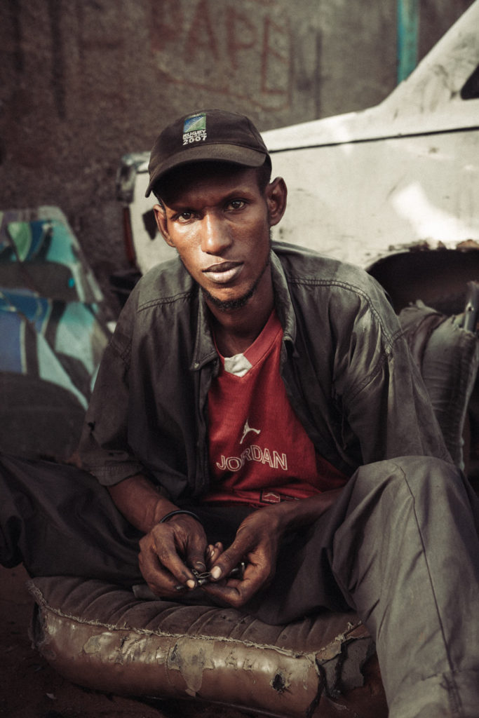
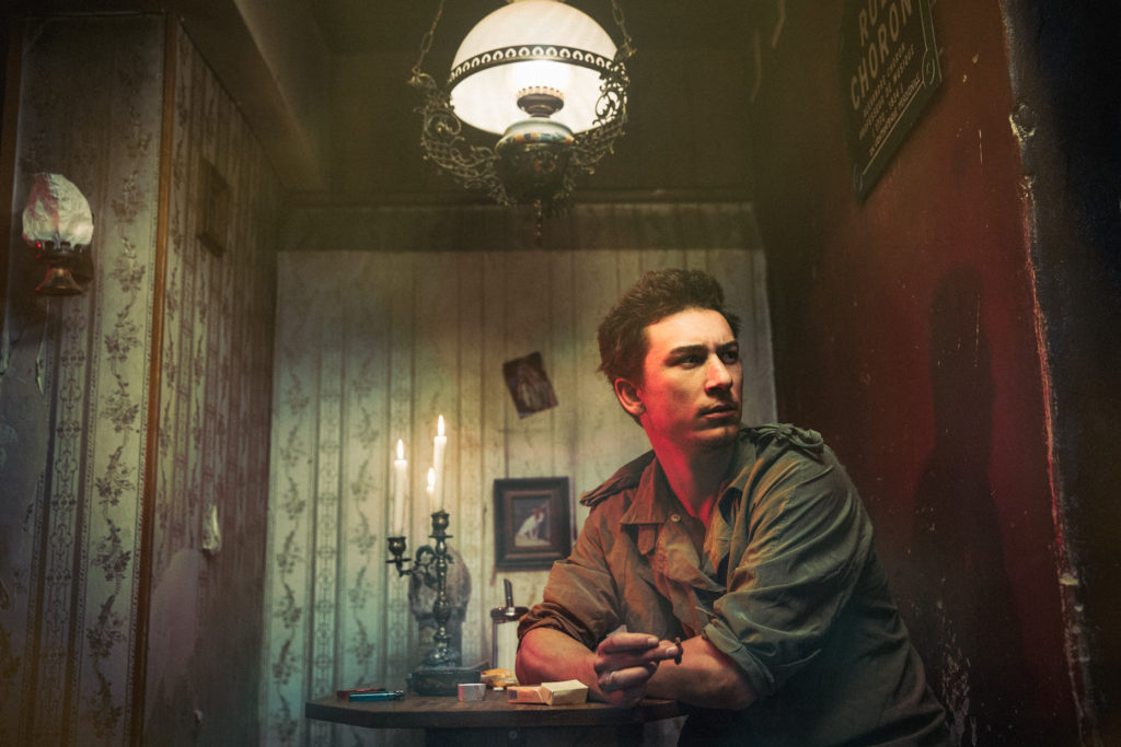
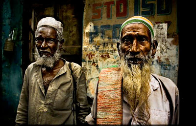
Anthony Kurtz’s works often focuses on marginalization and alienation. He documents people and places that exist on the edges of society, sometimes physically, mentally or both: excluded by choice or by circumstances. Recently in his photographs he has been using control and has been trying to use conformity and has been trying to represent both of these opposing forces within a single photograph. In his photographs there is a lot ideas surrounding our recent generation and he likes to question ideas of democracy, security and progress. The element of time also plays an important role in his work. He often refers to the future societal collapses and a world where humans are no longer in control. The images he captures with a camera are merely foundations upon which he builds by manipulating light, shadow and color to dull out tones or make the colours more vibrant. He also attempts to create a mood and atmosphere, a sort of “hyper-reality” that contains both a sense of mystery and sadness, hope and beauty in each of his photos individually.
I think Anthony Kurtz’s work is very inspiring as the colours that expressed in his photographs usually impact the photo in a dramatic way. In my photos I would like to experiment a lot with colour or even just have a wide variety or contrast with darker tones or lighter tones. I also admire how the photographer tries to make statement about recent society issues in each of his photographs.
Photo Analysis

Technical
Lighting – In this image there seems to be natural lighting in the foreground but a lot of shaded areas in the background that look under exposed. A lot of the natural lighting reflects off the models skin which allows there to be some tonal range and the lighting also brightens the back drop behind her.
Aperture – The depth of field in this image seems to be quite shallow as the most sharpened part of the image is the model.
ISO -The light sensitivity is fairly low on this photo because the image doesn’t look grainy.
White Balance – There are warmer tones in this image.
Visual
There are subtle colours in this image meaning they’re not highly saturated and there is a lot of variation in tones, darker tones towards the back ground. There is also texture on the bench and on the girls dress but its not the sharpest. There doesn’t seem to be any 2D elements in this photo as it’s doesn’t seem to have been photo shopped too much. There is repetition of dull and brown colours in this photo other than the dress and maybe the cup. There is a fair amount of space surrounding the model as well as the cup making those two things the main focus of the image.
Contextual/conceptual
This photo is meant to represent what most young people have in third world countries and what little colour and liveliness surrounds them. By making the model slightly off center, it allows the viewer to focus on the cup also and the lack of cleanliness surrounding her.

