WHAT IS CHIAROSCURO?
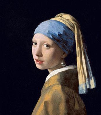
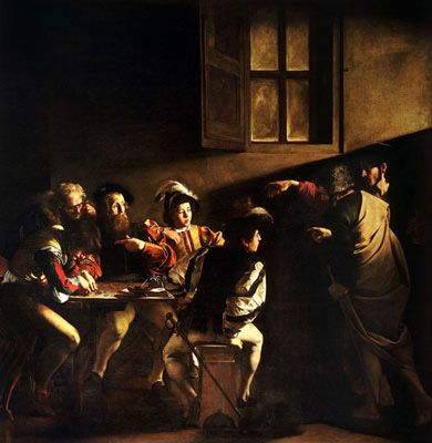
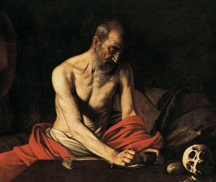
The word chiaroscuro translates in Italian for light and shadow. It is a classic technique used in the works of artists like Rembrandt, da Vinci, and Caravaggio. It refers to the use of light and shadow to create the illusion of light from a specific source shining on the figures and objects in the painting. For example chiaroscuro is present in the painting ‘Girl with the Pearl Earring’ (c.1665) by Johannes Vermeer. This famous portrait shows a young woman, standing in front of a dark background, as she gazes out at the viewer.
The technique was vey popular during the Renaissance, where the term originated from. It involved drawing on coloured paper, where the artist worked from the paper’s base tone toward light using white gouache, and toward dark using ink, body-colour or watercolour.
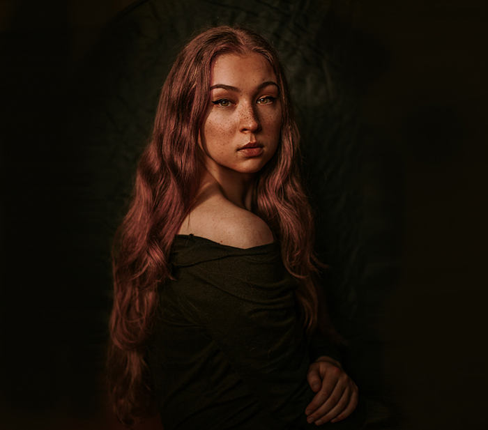
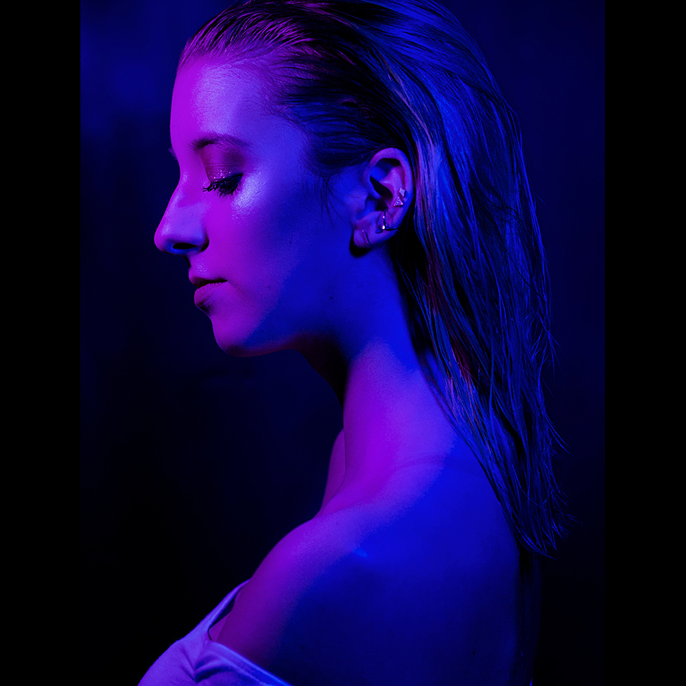
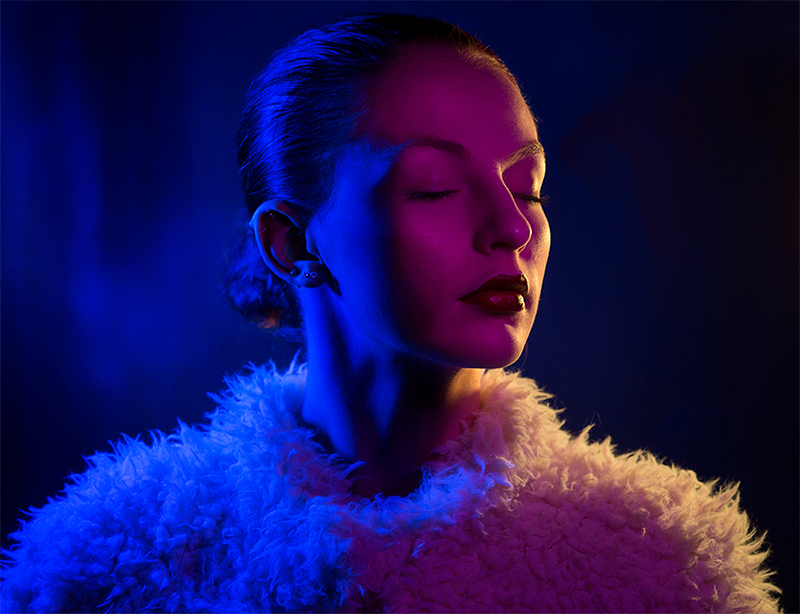
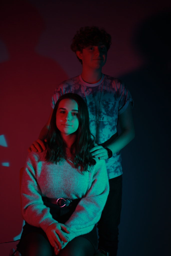
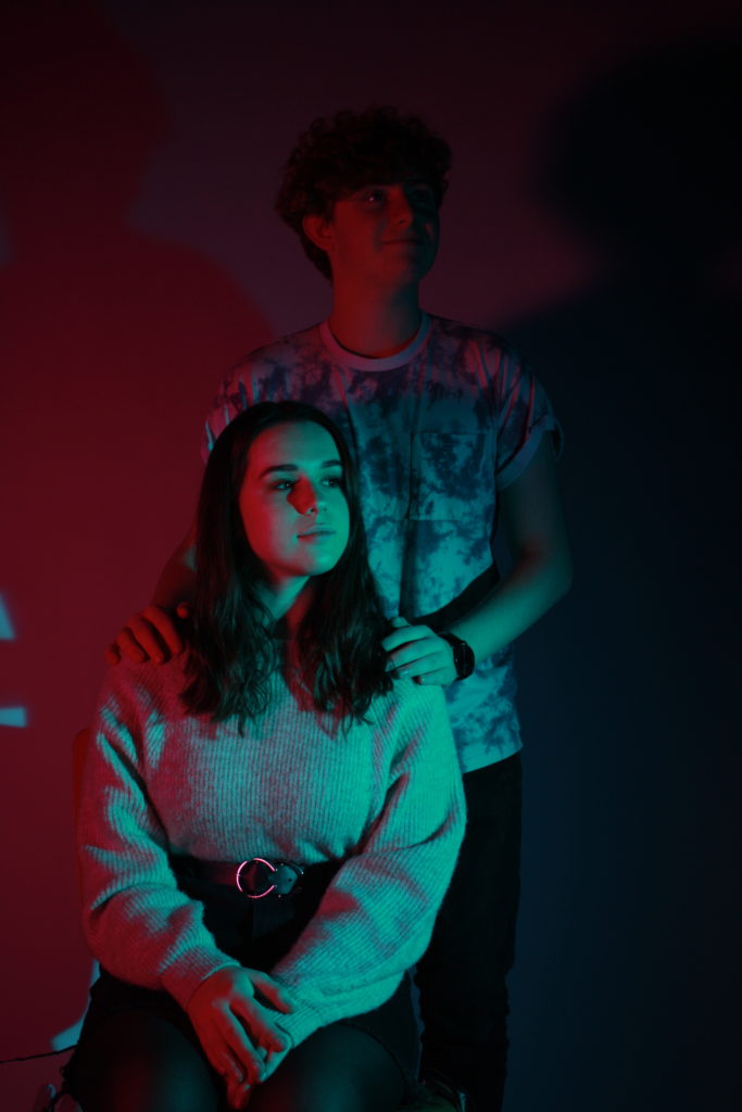
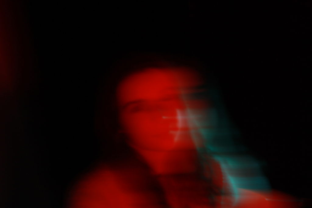
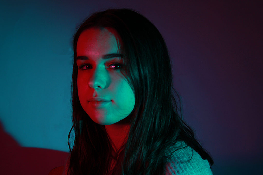
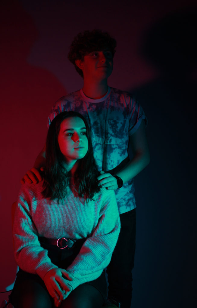
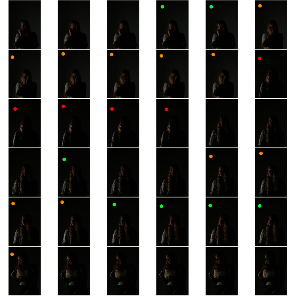
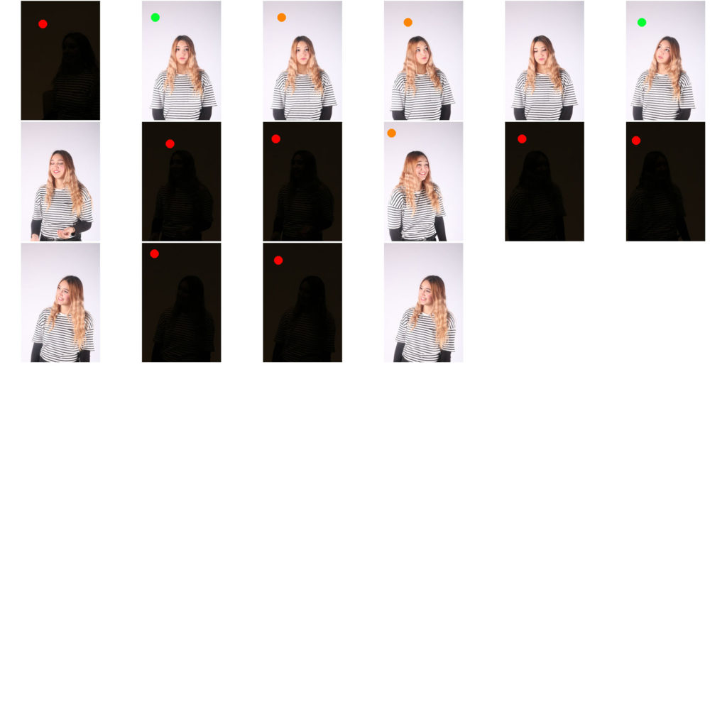
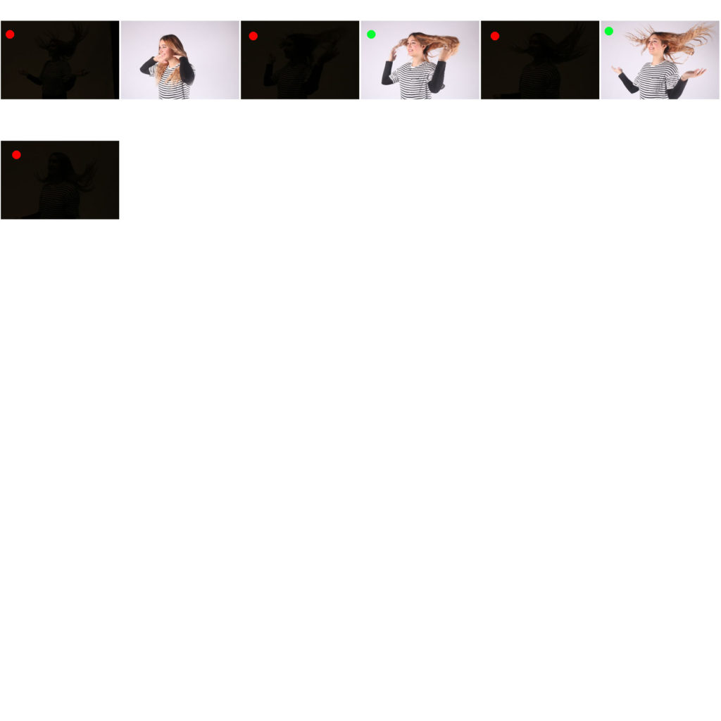
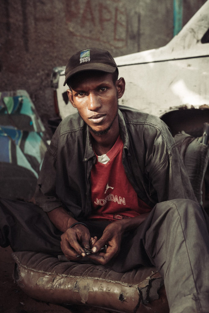
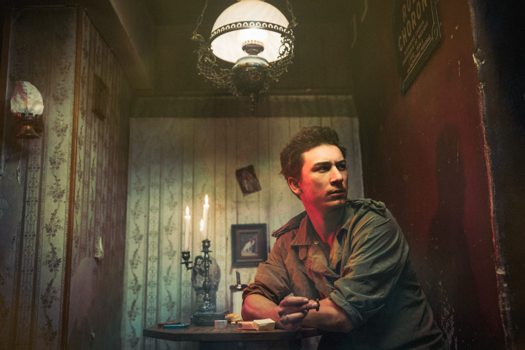
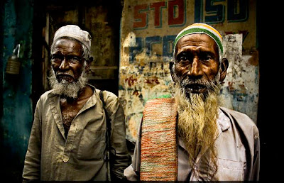
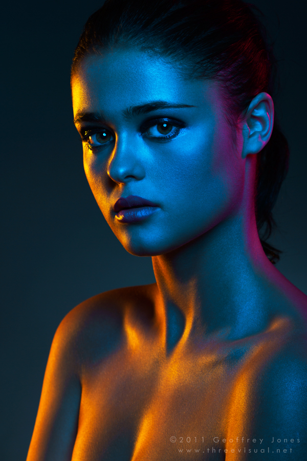
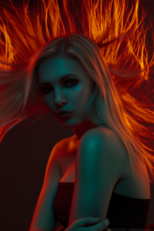
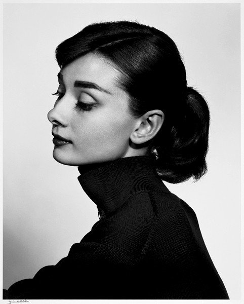
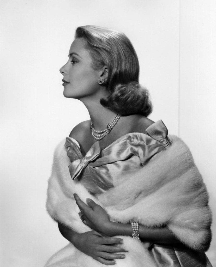
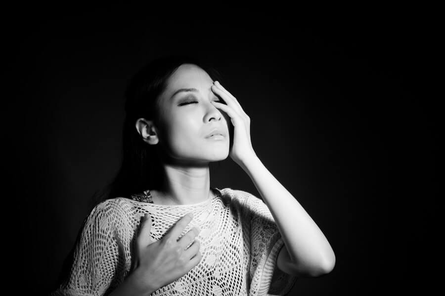
Chiaroscuro in photography is a technique and style often talked about as “clair obscur” or “extreme low key”. This style of photography is often well-suited for portraits, still life, and boudoir, or to give a scene the illusion of being three-dimensional. This technique can be used to light a variety of portraits (full body, headshot etc) and object, such as guitars of chess pieces.
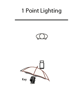
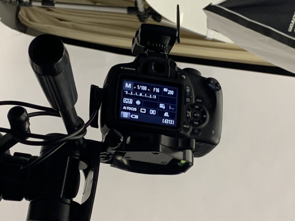
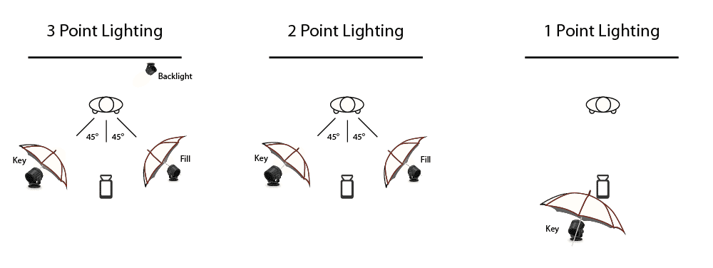
Chiaroscuro is popular in studio photography as the lighting equipment and backdrops available allow photographer to complete the technique accurately. Chiaroscuro usually consists of a 1 point lighting system in a dark room with a back backdrop, so there is only one source and direction of light

Evonne – Esprit de Corps 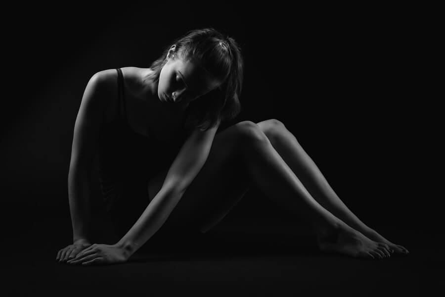
Robert Moran – Kara
IOTA Ext – Mini Chloe