Street Final Outcome

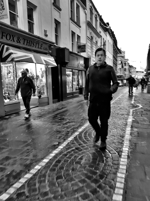
This was my favourite image following the work of Vivian Maier. The main thing that striked me about this image is the man’s expression, I found it interesting as it makes the audience wander what the man is thinking about or what he has seen. Here the repetition of the tiling created a semantic field which brings the attention onto the man in the photo. I think that the tonal range worked well as its clearly shown as the darkest point being the gap for the doorway near Fox and Whistle and the lightest points being the lights in the shop and the brightness in the sky.
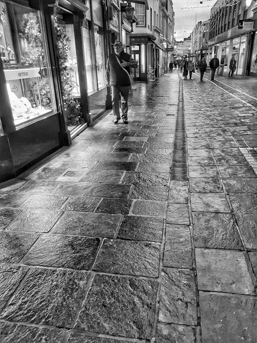
I think that this image well resembles Henri Carter – Bresson’s work. Here I wanted the main focus of the image to be on the texture of the ground and the man’s body language. Overall I think that this is a successful photograph as I tried to keep the angle in which this image was taken, similar to his work; however I still managed to capture the mans body language and his environment. I again quite like the repetition used with the tiling on the floor as although the eye is lead firstly to the different type of tiling on the floor it is then lead onto the man. I find that is resembles this image in which I analysed earlier.
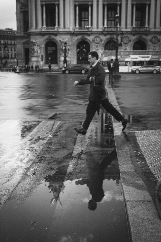
One of Henri Carter – Bresson’s Work

Environmental Portraiture photo shoot plan

Who

People/artists at my school in their natural environment. Most of my photos will be focused on one person in the image like the majority of Anthony Kurtz’ photos but there may be a few where there might be two or more as the art rooms can get quite busy depending on whether there are lessons happening at the time of the photoshoot.

What

The background behind them has to relate to their life/work somehow, whether its art on the wall behind them or just the art room itself.

When

In the day time as that’s when there is the most natural lighting coming in through the large windows. I would also like to go to the art room when it’s not as busy so around 3/4 so I can take photos of people when they are more focused on their work therefore they won’t be distracted by the camera.

Where

I will most likely take photos of my friends sitting at the table drawing or painting in their sketchbook. Some of the photos will be taken from lower angles and others at eye level to make the photo look even more natural.

Why

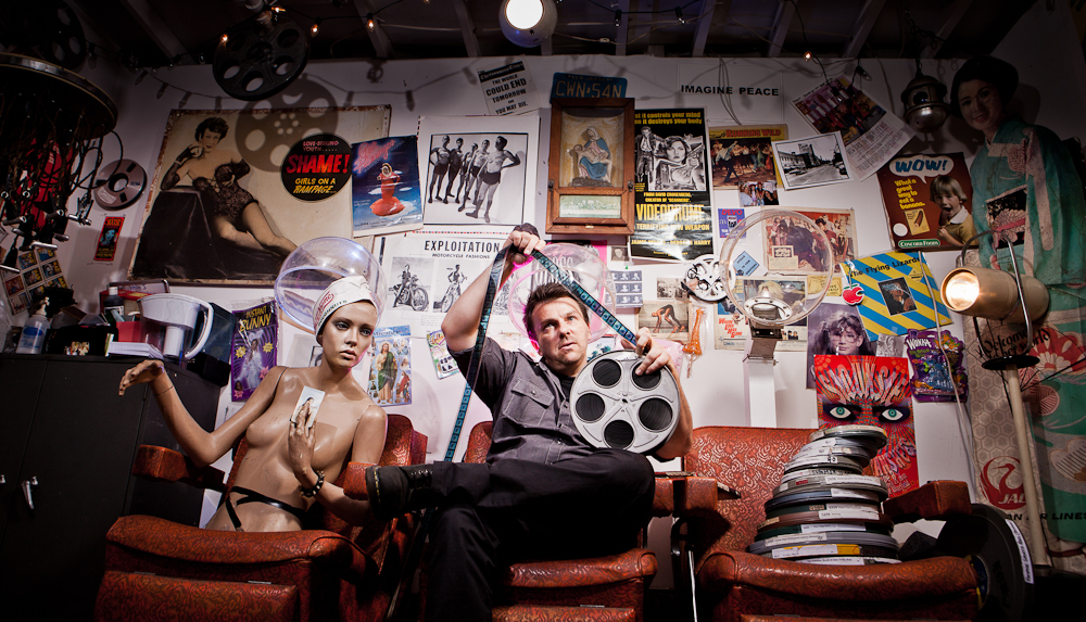
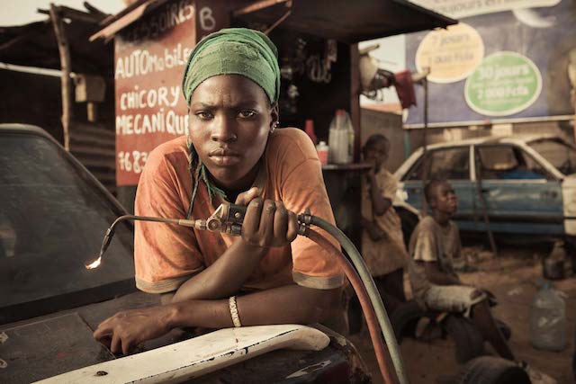
The art rooms are usually vibrant and would add a lot of colours to the photograph like some of Anthony Kurtz’ photos which I was inspired by. I also like how the art rooms are usually quite messy and don’t look like other rooms in the school and the untidiness relates to the majority of Anthony Kurtz’s photos as it expresses how hard work can still occur in cluttered environments.

This is some of Anthony Kurtz’s work that inspired me with my photoshoot:

How

With a normal aperture and I may use a tripod to keep the camera steady. I won’t tell the people/models to pose as they’re meant to be in their natural environment and acting in their natural environment also. I’ll take some photos from lower angles to capture more of the persons body and to capture even more angles of the room the in the photos.