I only edited this set of images very slightly and subtly to keep the integrity of the original images and the true essence of each working environment.
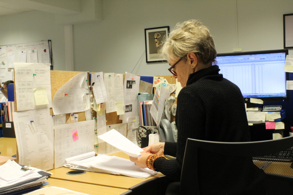
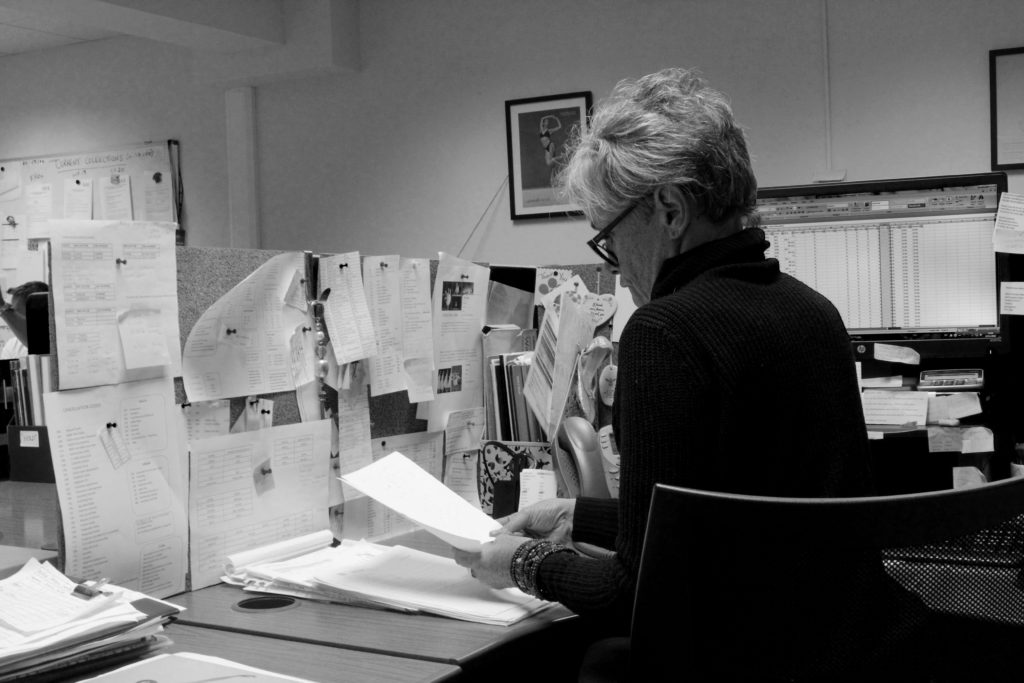
With this image I decided to make it black and white, to tone down the cluttered effect of all the different colours and also to reduce the yellow tone of the lighting. I then edited the brightness and contrast slightly, as well as the vibrancy and tone of certain colours, for example I lowered the vibrancy of the colours used in the pins on the desk wall in order to make them darker and have them stand out against the white papers.
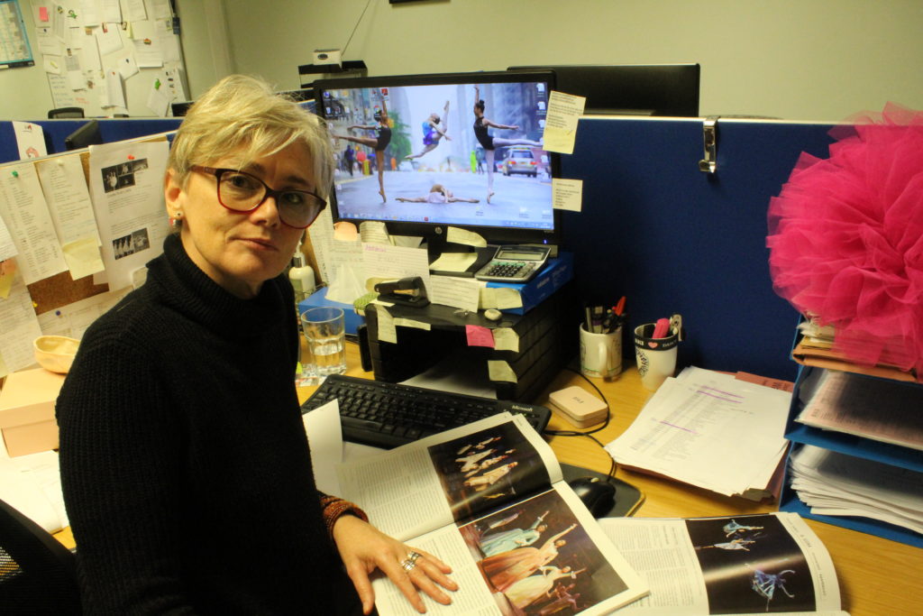
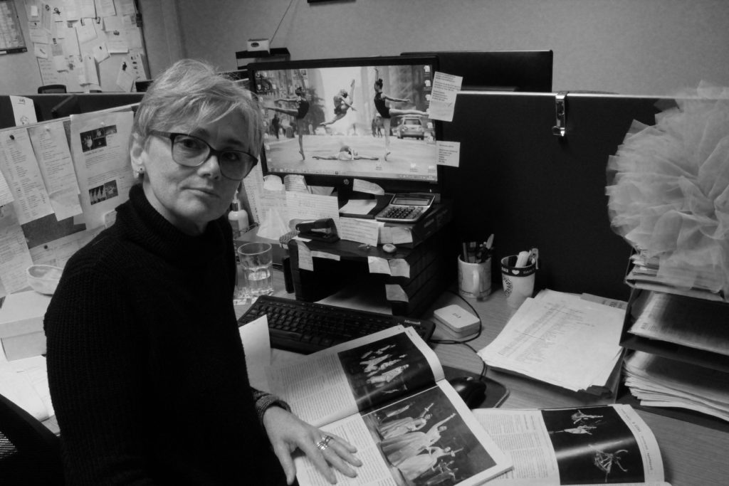
For the second image, I ended up having a slightly chiaroscuro effect, as half of my subject’s face is in shadow, but it is subtle enough as not to obscure the whole image. I had the subject stare directly down the lens to create a posed effect, as well as arranging the magazines to display some of the products that are sold and places they could be sold to. I chose to have the subject wear her glasses to add more structure to the face and tie in with the dark colour of the jumper.
The black and white images above mirror the style of iconic environmental photographer Arnold Newman, so as to show how I used his work as inspiration for my own photoshoots.

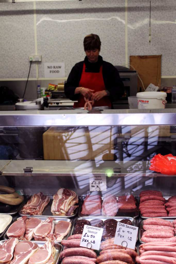
For this image I increased the magenta and red saturation and vibrancy to bring into focus the meat in the foreground and the woman’s apron. This emphasised her job as a butcher and made the image more pleasing to look at. I felt that the reflections of the glass worked nicely to add some highlights to contrast the (unfortunately) dark background of the image, which I was not able to change without drastically changing the colour palette of the photo.

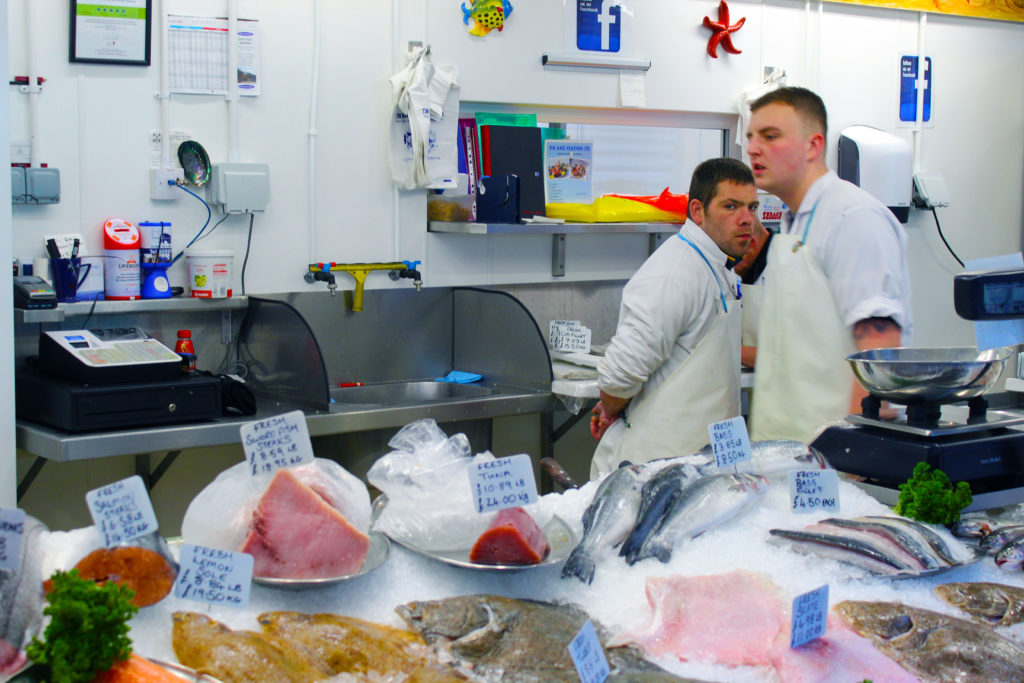
This image is mainly white, so when editing, I made the bright colours stand out, mainly to try and get the pink of the fish in more detail but also to enhance to vibrancy of the various backgrounds objects scattered around that show that this is a workplace. I like the composition of this image, as the fishmonger looking directly into the lens without a posed expression makes the image interesting, and the geometrical feature of all three workers in the same section of the image helps to brings attention to the main worker’s eyes and face.

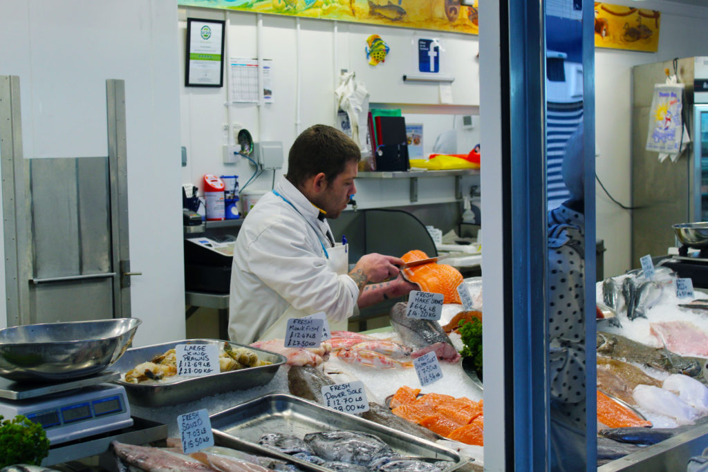
I edited this image in much the same way as the last one, except now I made the fish the man is cutting brighter and the most vibrant part of the photo. This drew attention to his knife and his actual job as a fishmonger, which is obviously the main focus of the image.
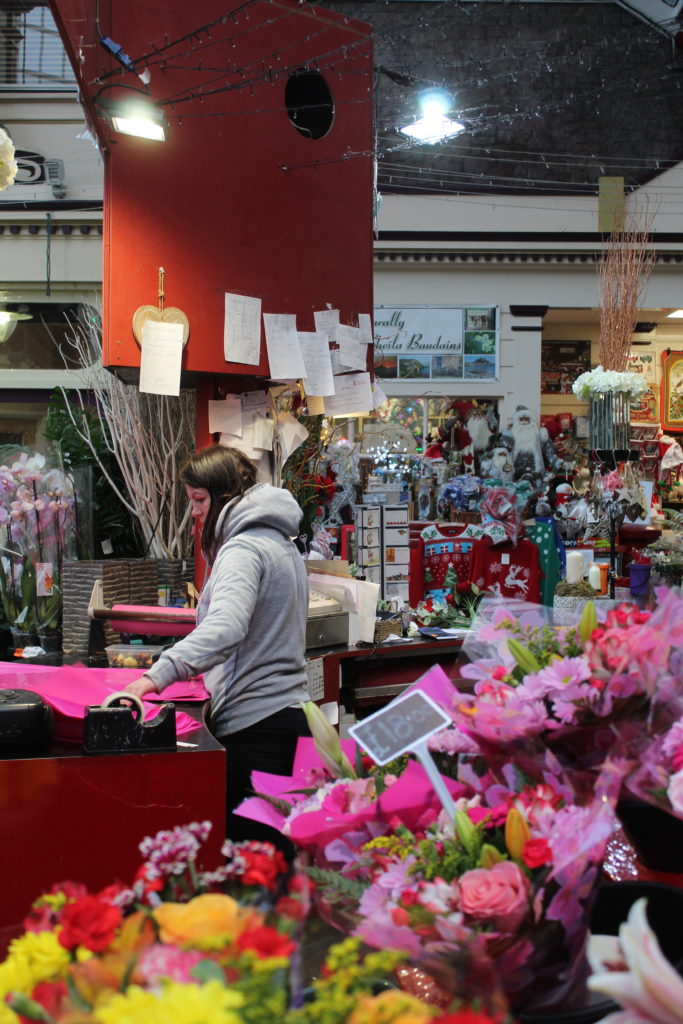
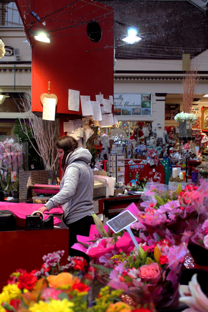
I edited this final image the least, as I felt that the cluttered effect created by the large amount of background objects helped to bring the subject out as the focus of the image, as it is the only vaguely clear part of the photo. I made the colours more vibrant and saturated, however I felt that the flowers were already bright enough so as not to need much editing. I tweaked the levels and contrast slightly also, in order to have the beam of light from above brighter and focus more of the person, as I saw that during the shoot and felt it would make for a good image.
Overall, I feel that I was successful in presenting a range of images of people in various occupations, posed in a manner that reflects their jobs and the way that they work, as well as sometimes adding a more candid feel to certain images by using different angles and capturing natural facial expressions. If I were to do this project again, I would have a selection of more clearly posed images alongside some natural, candid images for each person.
