photograph one
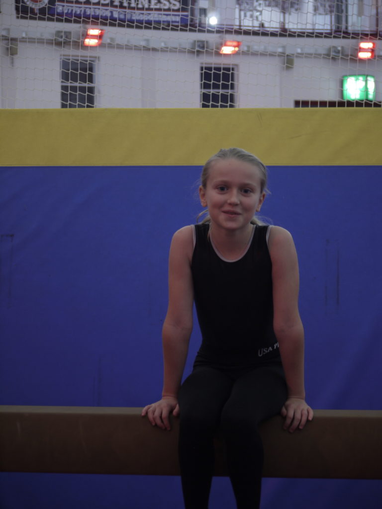
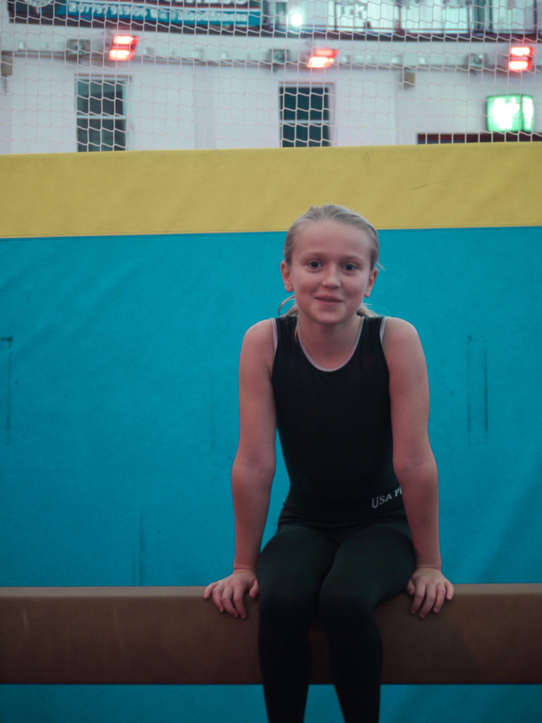
In this photograph I increased the exposure, to allow for the photograph to an overall increased brightness. I also increase the saturation, as all of the tones were quite dull. This increased saturation allowed for the tones to be stronger and more eye catching. I then changed the levels of blue to become a turquoise, because I found it fitted better with the photograph and make it look more interesting. To improve the composition and aesthetic of the photograph, I straightened it out, to allow for the beam to be level, as in the original it was slightly wonky.
photograph two
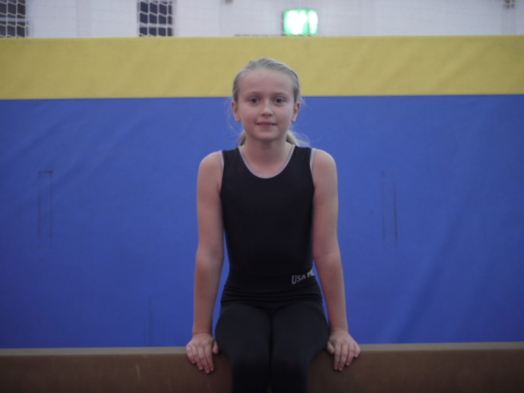
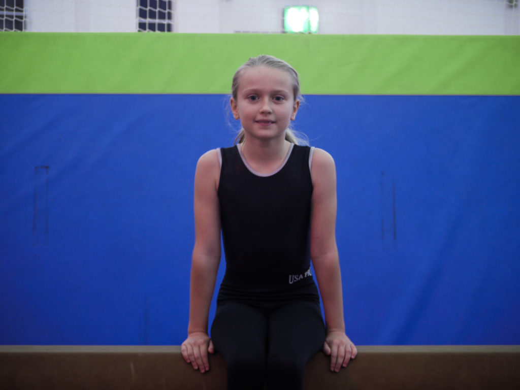
In this photograph, I increased the saturation as the tones were dull, by doing this it allowed for the colours to be released and shown to their full potential. I then changed the levels of yellow to change it to a green to add a more interesting aspect to the photograph.
photograph three
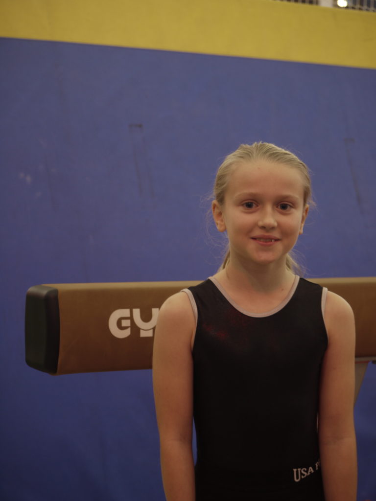
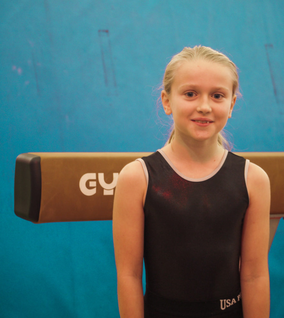
In this photograph, I increased the exposure as the photograph was quite dark. By doing this it allowed for all the features on the face to be illuminated. I then changed the levels of blue to create a turquoise instead, as this added a pop of colour and made the photograph more interesting too. To improve the aesthetics of the photograph, I cropped out the yellow block and the light peaking in from the top, to allow it to look more professional and sleeker looking.
photograph four
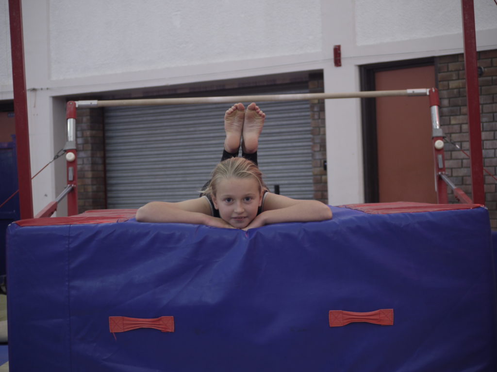
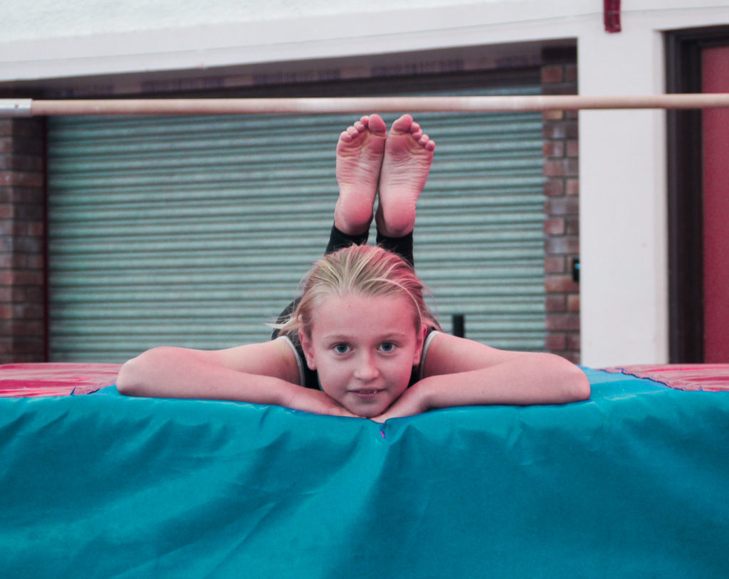
In this photograph, I mainly worked on the aesthetics, meaning it would be more easy on the eye. I straightened the photograph, meaning it is level. I then cropped the image, to remove distracting features such as the metal structure of the bar. I also changed the level of the blue to make it a turquoise, meaning there was a brighter pop of colour and made it more interesting.
