portrait

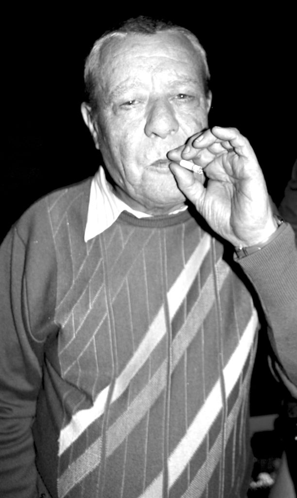
I decided to photograph this person as i felt his age and clothes gave a good vibe. He is a mail man at a finance firm in jersey. I found this interesting as all his colleagues were wearing suits and expensive watches but somehow he was chatting to them as if there was no barrier between the mail man and the directors. The cigarette in his mouth was a good focus for the lens. i choose to make one image black and white as it made the image timeless.

environmental portraiture photography final outcomes and evaluation

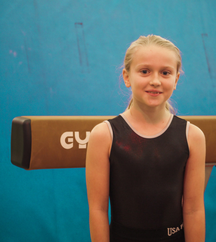
Below are my final outcomes in response to environmental portraiture, as they are interesting and eye catching.

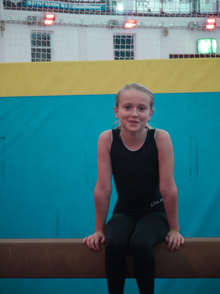
final image one

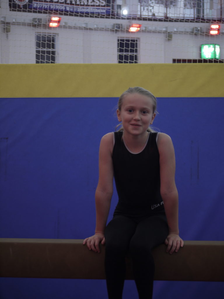
This is one of my final images, as I think is very eye catching and the pose the individual is in is interesting, and also relates to the environment they are in, which is the gym. The eye contact is very strong, which I also think is a striking element part of this photograph and adds interest for the viewer. The composition is also strong to as the bar is framing the photograph. If I were to take this photograph again, I would shoot it in front of a better background, as this one is kind of distracting, and doesn’t really relate to the gym.

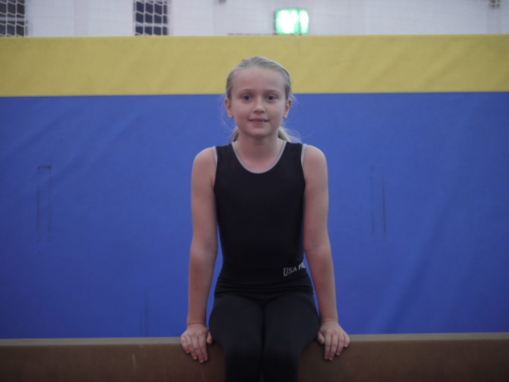
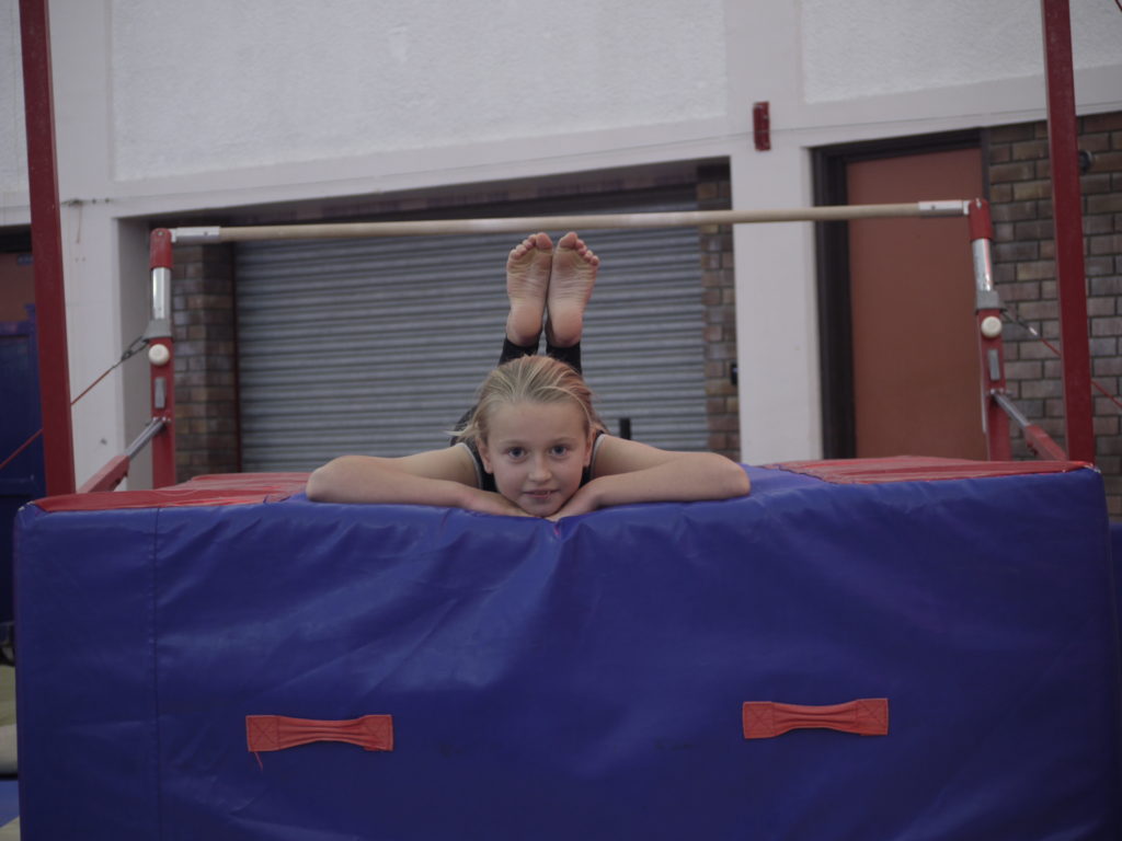
final image two

This is one of my final images, as I enjoy the linear aspects of the photograph as it is very aesthetically pleasing, and easy on the eye. The individual is captured straight on, which also is nice to look at and relates to documentary portraiture too. Overall I think this is a very nice photograph as there are no distractions, the individual is holding eye contact and the colours are prominent and bold. If I were to take this photograph again, I would try and get more of the legs in, as then it would include more of the linear aspects into the photograph.

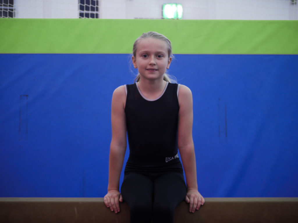
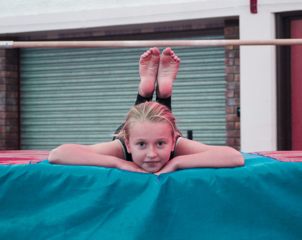
final image three

This is one of my final images, as I find it has the best background, which relates to my individuals environment, because it shows most of the gym. Although the gyms layout is not very aesthetically pleasing, it shows the best response to the environmental portraiture. If I were to take this photograph again, I would focus more on the face as it is slightly blurred, which brings down the overall quality of the image.

whole shoot evaluation

Overall, I felt these photographs came out quite well. This was my first time using my camera to take pictures of people, so I was impressed with my own camera skills. I don’t think the closely related to ARNOLD NEWMAN, but I think that is because I was nervous to tell the individual to change their position and go to another area of the gym.

Image result for arnold newman
arnold newman image

If I were to conduct this shoot again, I would try to get more shots at different areas of the gym, meaning when it came to the selection process, I would have more of a choice of backgrounds. This means that I would have more of a varied array of photographs. I would also try and focus the camera better, as some of the photographs came out blurred. Next time, I would try to direct my individual in a more efficient way, as some of the photographs didn’t really come out well because the individual wasn’t where I wanted them to be.

Candid Edited

Unedited
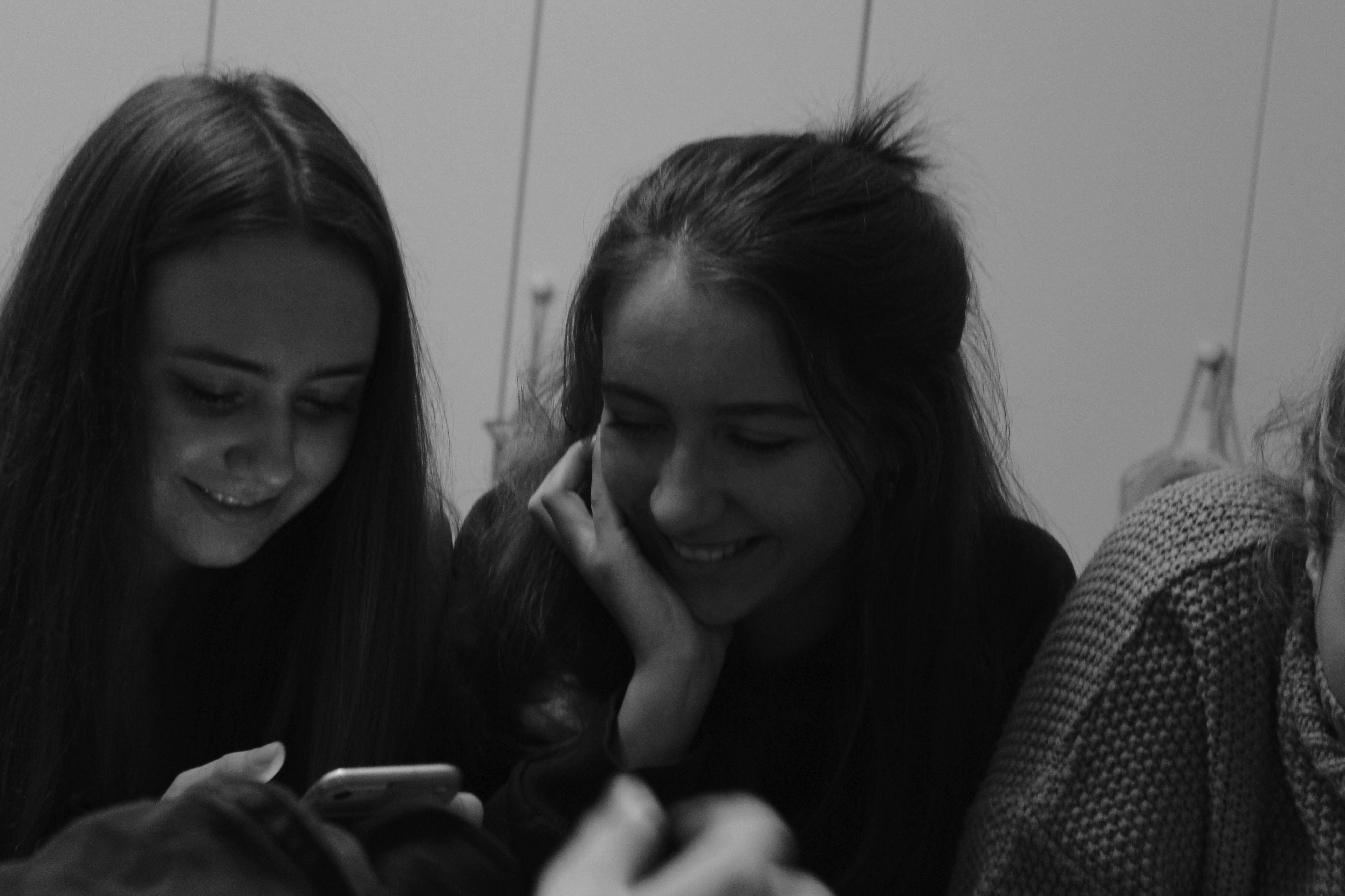
This was my favourite candid image, as its clear that the image captured a pure, joyful moment . I only edited the lighting and contrast, as i thought the picture didnt need any major changes
Unedited
I made this image black and white as i think it created a causal and classic look, that the moment also exerted
Unedited
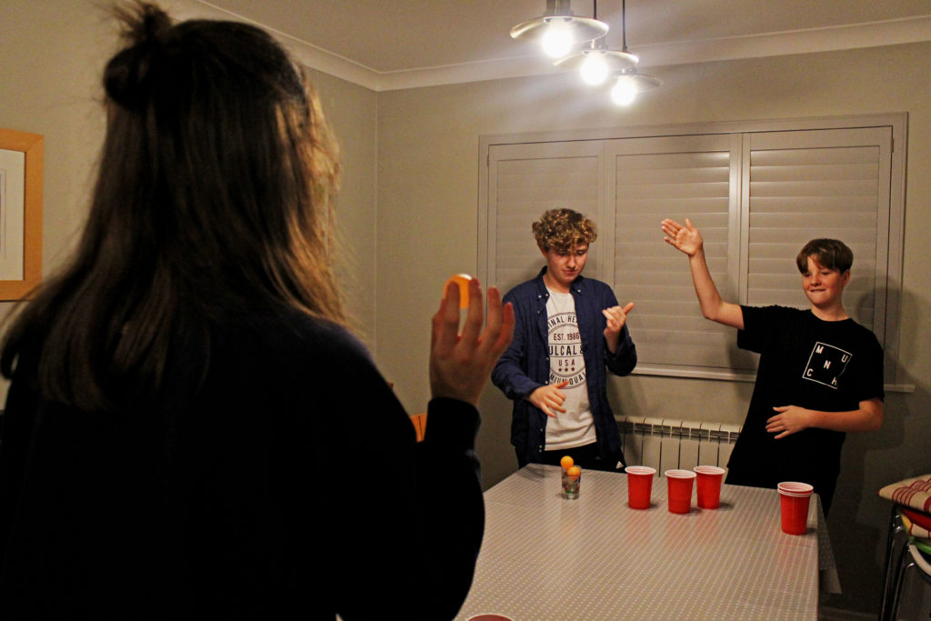
For this image i adjusted the contrast and lighting settings, but i also used an app called Picsart to add a thin white outline to the two people in the image, as i thought it added some definition to the characters positions. I like this image because it captured a genuine moment of celebration.
Unedited
I like this image because it captures the chilled vibe of the moment, showing 2 people dancing candidly. I edited the brightness of the lights to add a shine and adjusted the contrast and saturation

Adobe Photoshop Skills

Adobe Photoshop is an incredibly powerful program that allows you to do professional grade image manipulations and adjustments. It’s a critical tool for designers, web developers, graphic artists, photographers, and creative professionals.

Image Adjustment and enhancement

Adjust the Brightness slider to change the overall brightness of the image. Adjust the Contrast slider to increase or decrease image contrast. When you click OK. The adjustments will appear only on the selected layer.

Experiment by adjusting the sliders. The Vibrance slider affects the intensity of colors. It has the strongest effect on muted colors in the image.

The Saturation slider increases the color intensity of all colors in the image. by adjusting the Hue, Saturation, and Lightness sliders. Your changes will affect all the colors in the image.

The Hue slider changes the colors in an image. The  Saturation slider affects the intensity of colors in an image. The Lightness slider affects the brightness of colors in an image.

To affect only a specific color with these sliders, first go to the drop-down menu at the top left of the Hue/Saturation dialog box and choose a color range, like Yellows. Then adjust the Hue, Saturation, or Lightness sliders. These changes will only affect the selected color range, wherever that color appears in the image.

When you click OK. The adjustments will appear only on the selected layer.

Cropping methods

Where possible, you should always edit your photos non-destructively. This means that you can edit your image as much as you like, but can always undo any change, and always revert back to the original file if you need to.

The crop tool also enables you to straighten up the horizon in your shots. Click the Straighten button in the options bar and draw a straight line along the horizon in your image. Straighten works by rotating the image and cropping out the corners.

Whenever you’re cropping, make sure the Delete Cropped Pixels box is not checked. This enables you to crop non-destructively. You’ll only see the image as you’ve cropped it, but the extra pixels will not be discarded. If you want to change the crop later, you can.

Use of selection tools

It  provides selection tools for different kinds of selections. For example, the Magic Wand tool can select an area of similar colors with one click.

The Selection Brush tool lets you paint your selection. So in general you would use the Magic Wand and Quick Selection tools when you have clearly defined colors or tones. The Lasso tool basically lets you trace around an object to select it.

This basically makes your life much easier and helps improve the photo to your desire.

Cut-n-paste methods

This tool allows you to duplicate things.

Layers and blending methods

The way to do non-destructive editing in Photoshop is to use layers. Layers are like a series of transparent sheets stacked on top of your image. 

Ideally, every single edit should be saved on its own individual layer. This enables you to adjust the edits later, make them more or less visible, or remove them entirely by hiding or deleting the layer.

Adjustment Layers allow you to make changes to your image’s tone and color in a non-destructive way. Adjustment layers give you additional editing flexibility. They allow you to re-edit image adjustments you’ve made, and protect your original image from direct changes.

Currently, there are 27 Blending Modes in Photoshop. 30 Blending Modes if you include the two extra Blending Modes for the painting tools (Behind and Clear) and the extra Blending Mode for groups (Pass Through).

Some Blending Modes are:

  • Normal,
  • Dissolve,
  • Darken,
  • Multiply,
  • Color,
  • Burn,
  • Darker Color,
  • Lighten Screen,
  • Color Dodge,
  • Lighter Color,
  • Overlay,
  • Soft Light,
  • Hard Light,
  • Difference,
  • Exclusion,
  • Hue, Saturation,
  • Color, 
  •  Luminosity.
environmental portraiture photography – edited

photograph one

original
edited

In this photograph I increased the exposure, to allow for the photograph to an overall increased brightness. I also increase the saturation, as all of the tones were quite dull. This increased saturation allowed for the tones to be stronger and more eye catching. I then changed the levels of blue to become a turquoise, because I found it fitted better with the photograph and make it look more interesting. To improve the composition and aesthetic of the photograph, I straightened it out, to allow for the beam to be level, as in the original it was slightly wonky.

photograph two

original
edited

In this photograph, I increased the saturation as the tones were dull, by doing this it allowed for the colours to be released and shown to their full potential. I then changed the levels of yellow to change it to a green to add a more interesting aspect to the photograph.

photograph three

original
edited

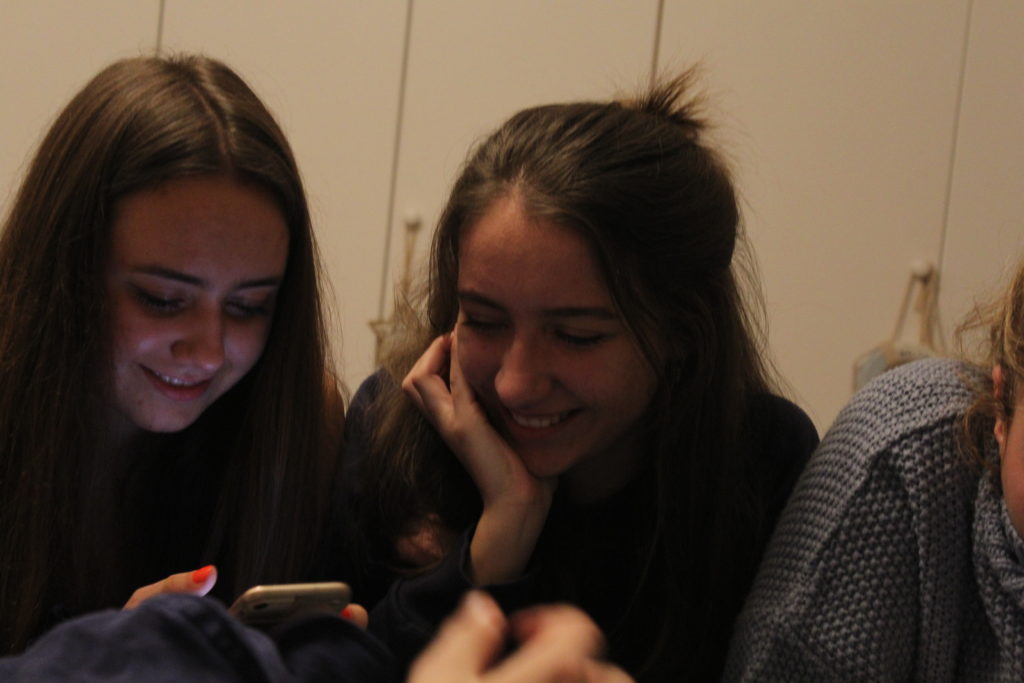
In this photograph, I increased the exposure as the photograph was quite dark. By doing this it allowed for all the features on the face to be illuminated. I then changed the levels of blue to create a turquoise instead, as this added a pop of colour and made the photograph more interesting too. To improve the aesthetics of the photograph, I cropped out the yellow block and the light peaking in from the top, to allow it to look more professional and sleeker looking.

photograph four

original
edited

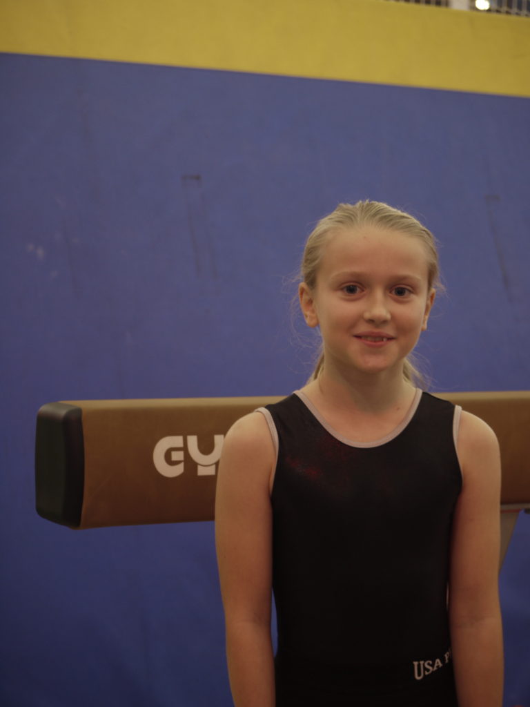
In this photograph, I mainly worked on the aesthetics, meaning it would be more easy on the eye. I straightened the photograph, meaning it is level. I then cropped the image, to remove distracting features such as the metal structure of the bar. I also changed the level of the blue to make it a turquoise, meaning there was a brighter pop of colour and made it more interesting.

street photography

what is street photography?

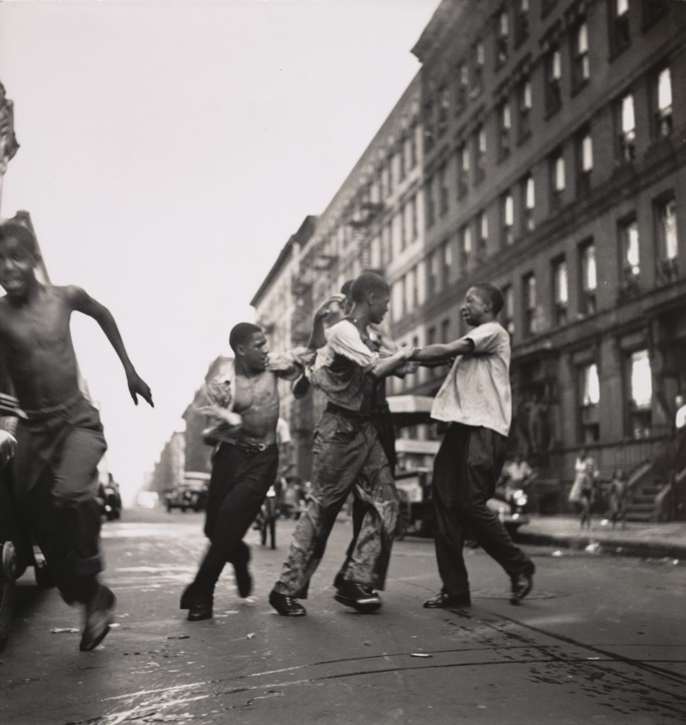
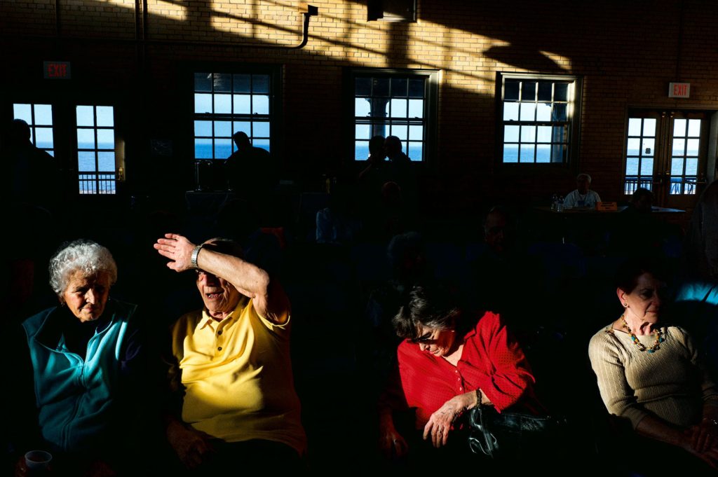
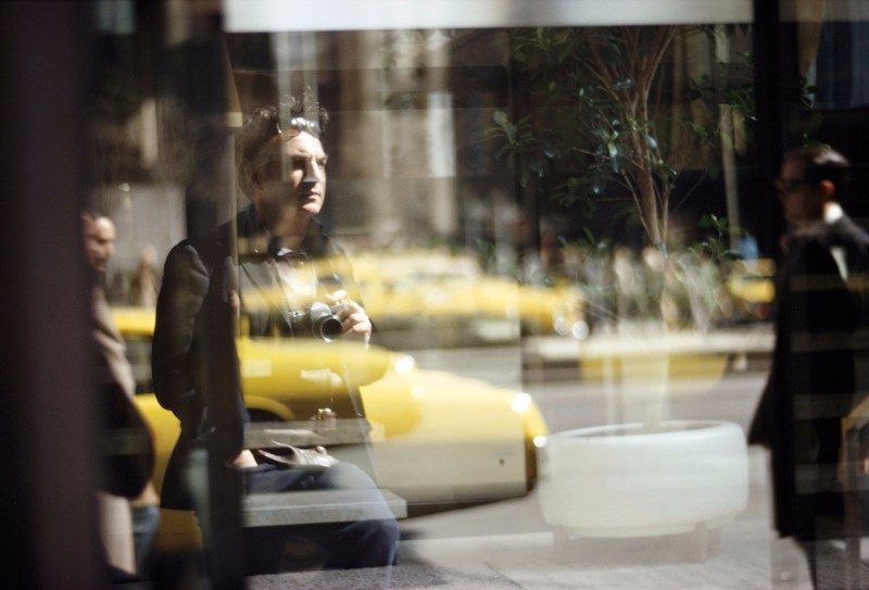
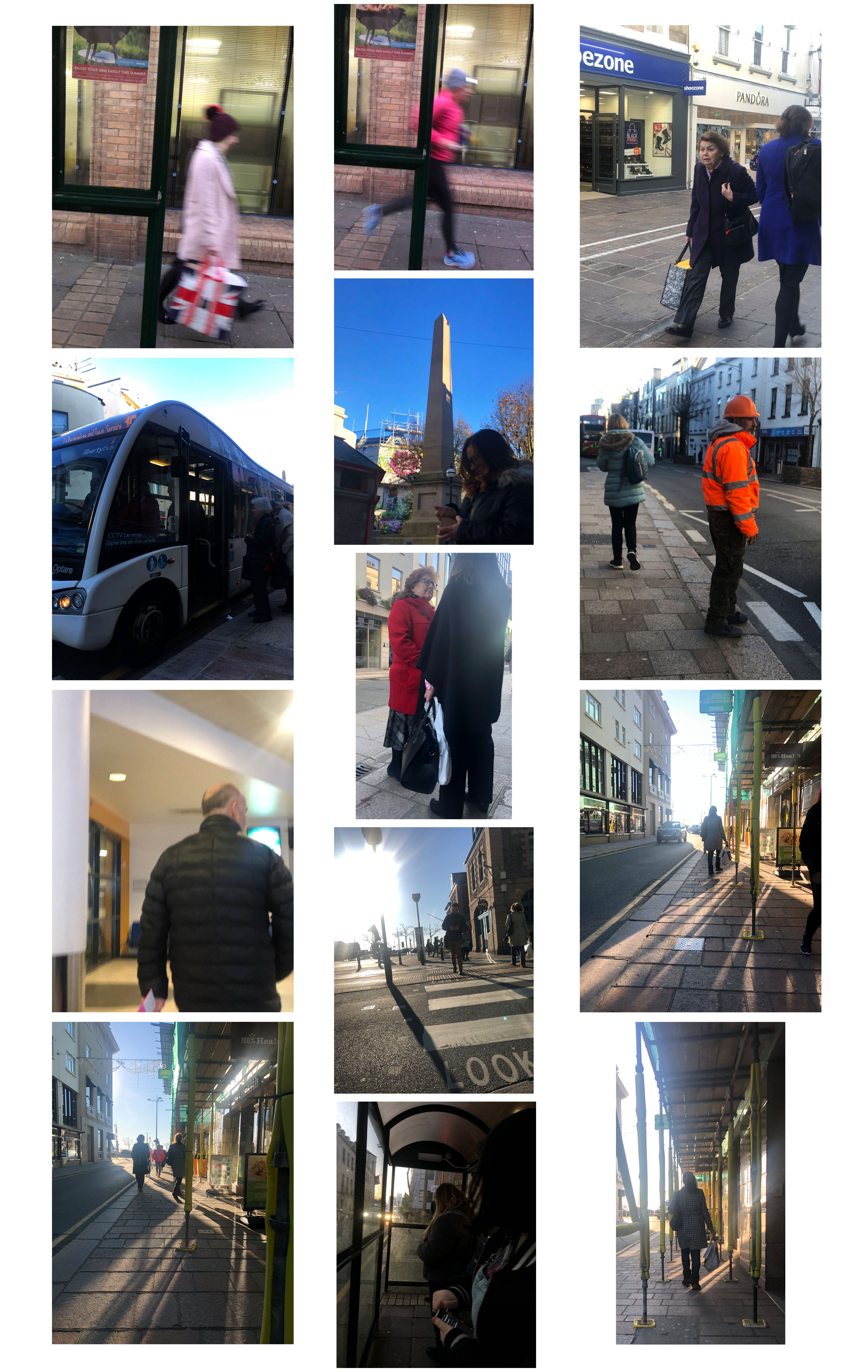
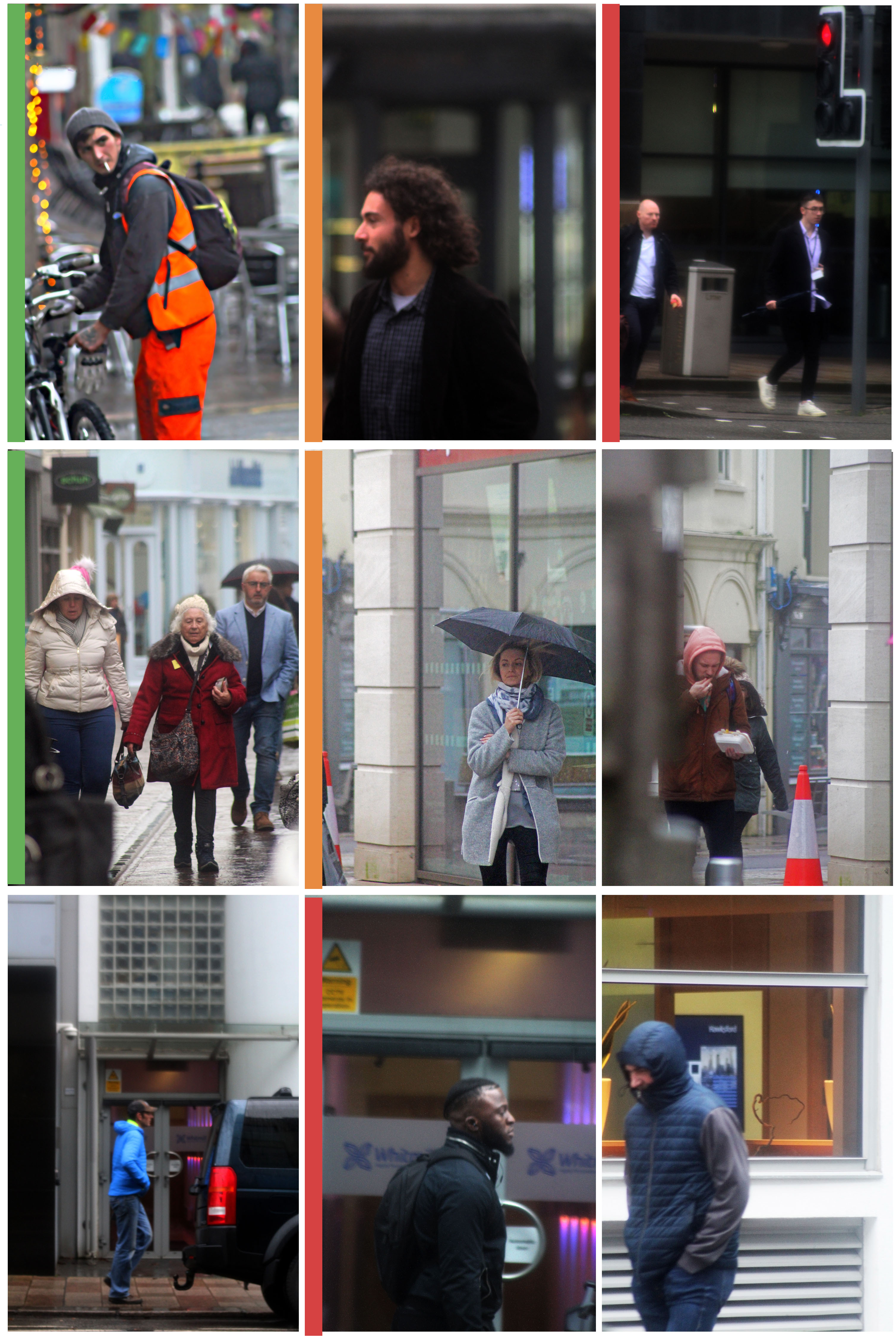
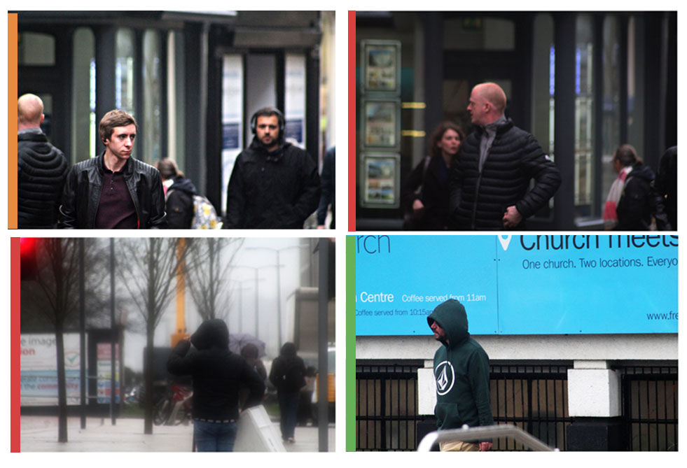
street photography is the capturing of photographs by chance of people in an urbanised, built up area. The individuals in the photographs are essentially unaware they are having their photograph taken. Street photograph produces an idea of peoples attitudes and behaviour in public. This type of photography may look like it is breaking ethical boundaries, but if you are out in the public, you almost always have the possibility of being looked at, and in this case photographed.

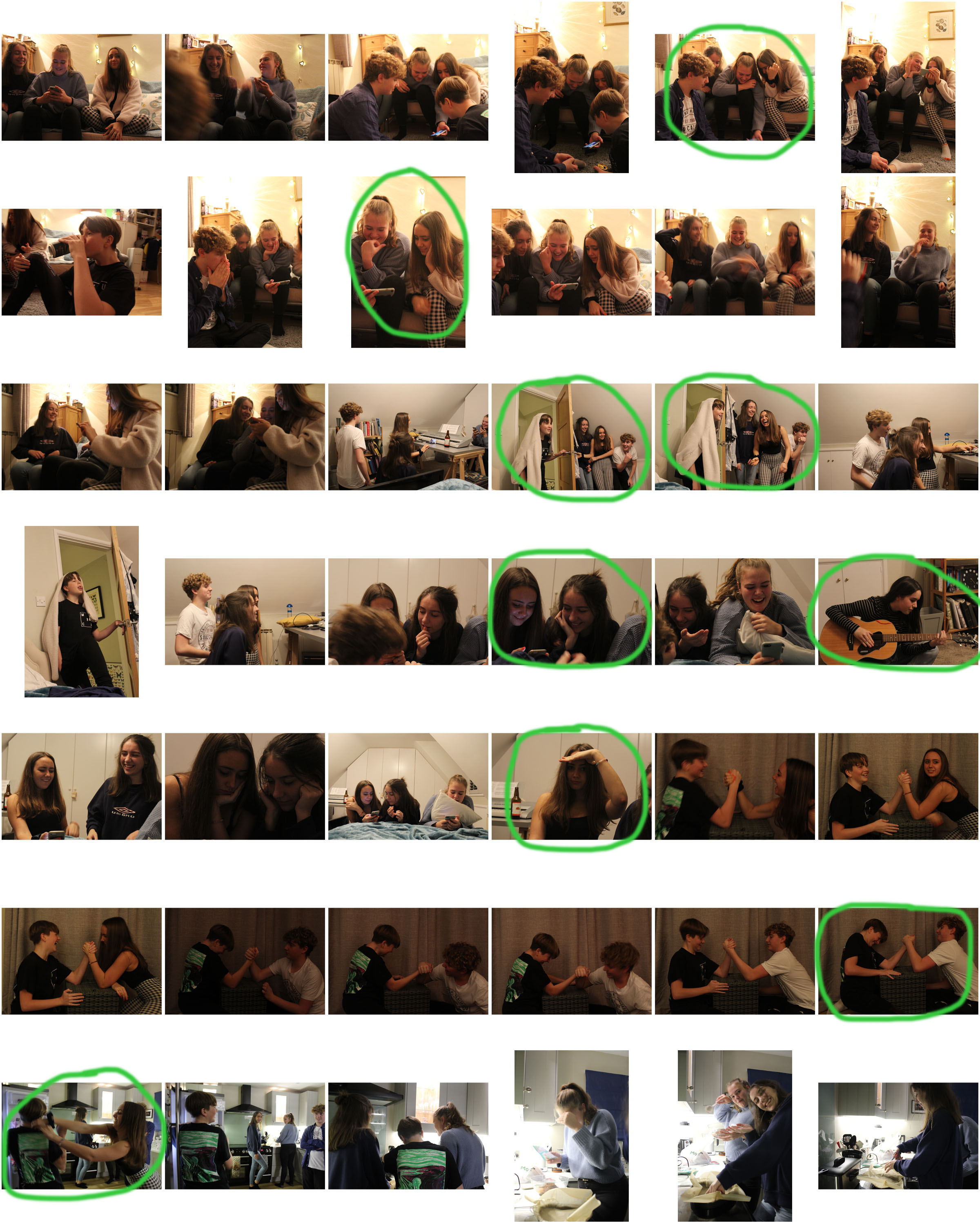
mood board of street photography

above are photographs from various photographers, that i would like to relate to and try to take some inspiration from. the photographs annotated with ‘+’ are from photographers I am going to have a closer look at as I find their photographs very interesting.

street photography

Street Photography Definition –

Also referred to as candid photography, street photography focuses on unique chance encounters of people during every-day life (public).

Street Photography Intro –

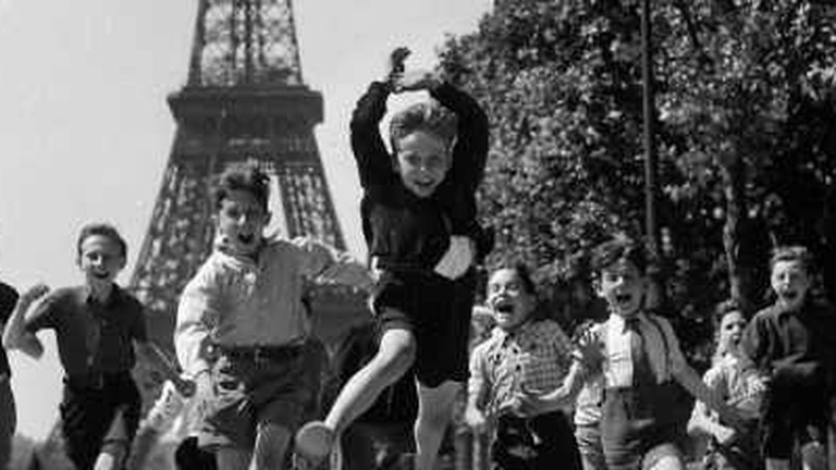
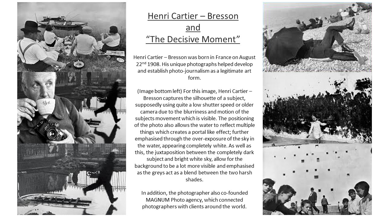
Sharing some themes with candid photography, street photography is a vehicle used to record everyday life in a public space (street), most of the time without the subjects knowledge in order to increase the photos reality. First emerging in the 19th century, Eugène Atget photographed the busy streets if Paris, and it’s major change in weather. Although, Henri Cartier-Bresson is most known for popularizing the sub-genre street photography and ultimately Photo Journalism.
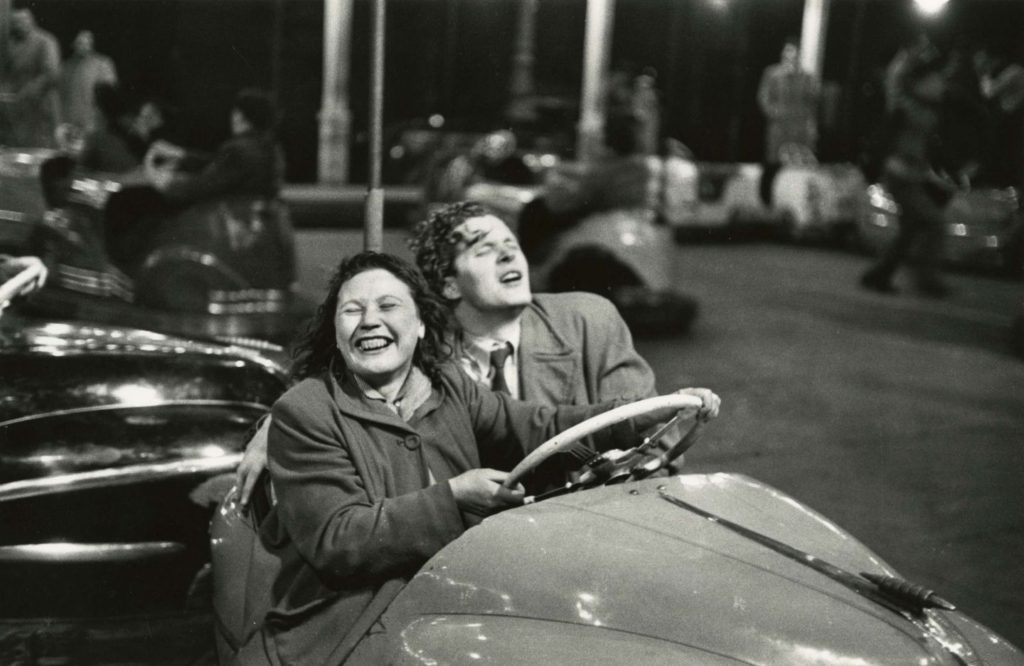
Many of the ‘original’ or most know street photographs are in black and white, in contrast to how we see the world, which could be to allow more political messages such as the effects of war to impact the viewer rather than bright colours which could distract from the serious/ intended message. However, during the 1960s and more recently, street photography does emphasize bright colours in order to show change and modern society and life.

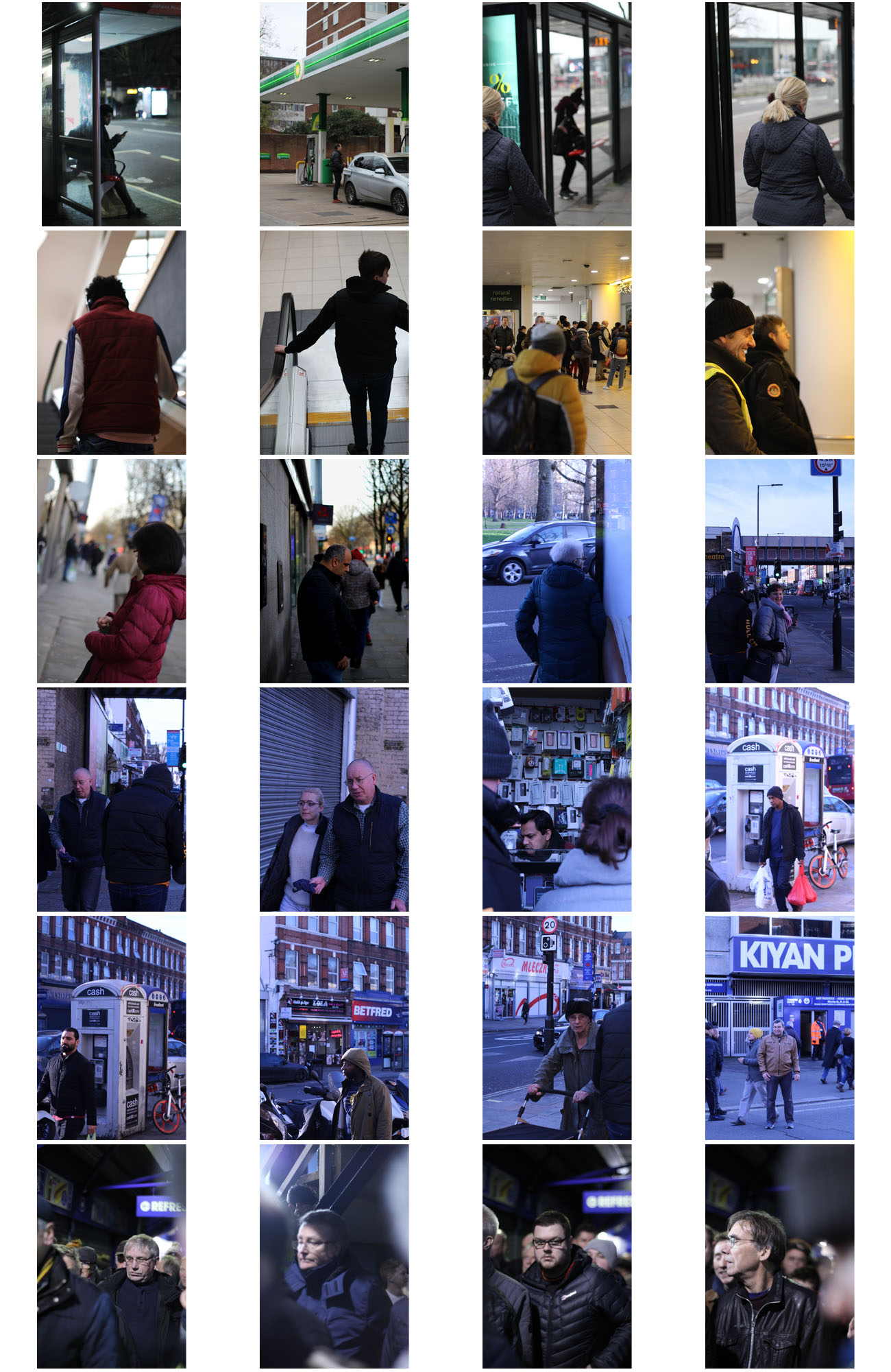
Street photography – London

How I edited my images into a glitch effect –

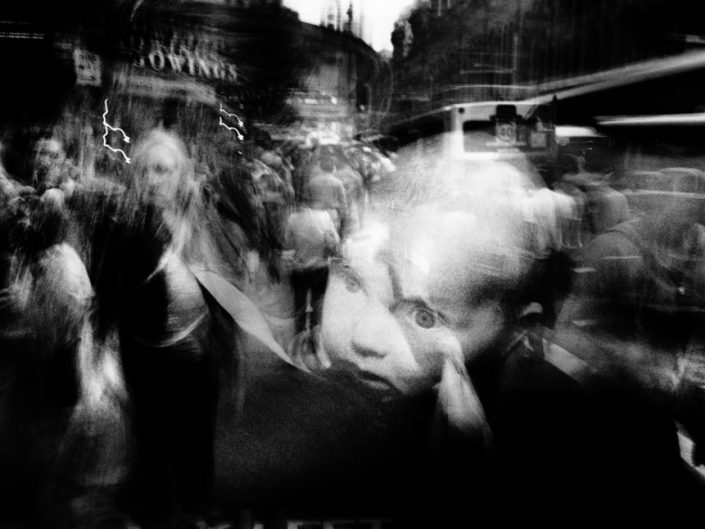
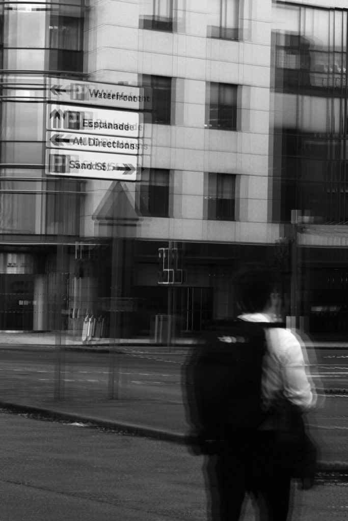
This edit and effect was inspired by artist such as – Sophie Calle and Henrik Malmstrom, photographers who purposefully reduce the quality of their images in order to make a ‘CCTV’ effect, which I tried to replicate in this idea.

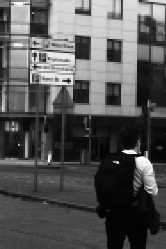
In order to gain the glitch effect I used a few techniques from the website which I linked below, where I used the rectangular maquee tool in order to select an area of the image and then move it slightly to distort the image. (I repeated this multiple times copying the selected area onto a new layer each time) I then merged ll of the copied parts of the image and selected blending options and unticked the ‘R’ button so that these sections were coloured. Finally, I changed the main image to black and white and increased the levels, noise and sharpness of the image in order to reduce the quality.
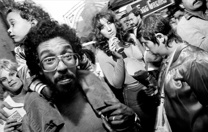
Useful Sources –

How make a glitch effect in Photoshop

Ode to Surveillance

Final Outcomes –