

For this photoshoot I had to choose these two images as I could not decide between them.
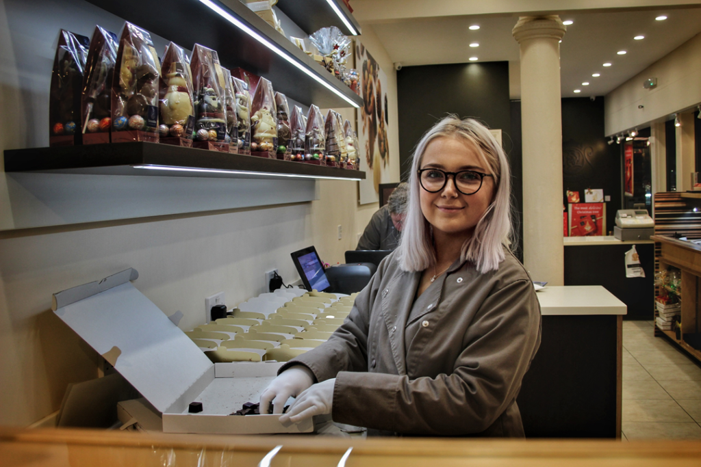
I chose these images as they are striking and dramatic which is exactly what I wanted to achieve from the beginning. Here my first image is full of different yellows and browns which ties into the chocolate theme, and helps to remind me of famous chocolatiers. Whereas in the second image, their is a variety of vivid colours which help to represent all of the different items that are available to be purchased at this shop, they help to create a sort of pattern within the image. I think the “Face Spotlight” worked very successfully as they allowed the attention and the eye of the audience to be lead towards the person, despite of their busy everyday background. Overall, I feel as though both the image and the editing worked hand in hand to help create these images and I am quite happy with their outcomes.