Evaluation-
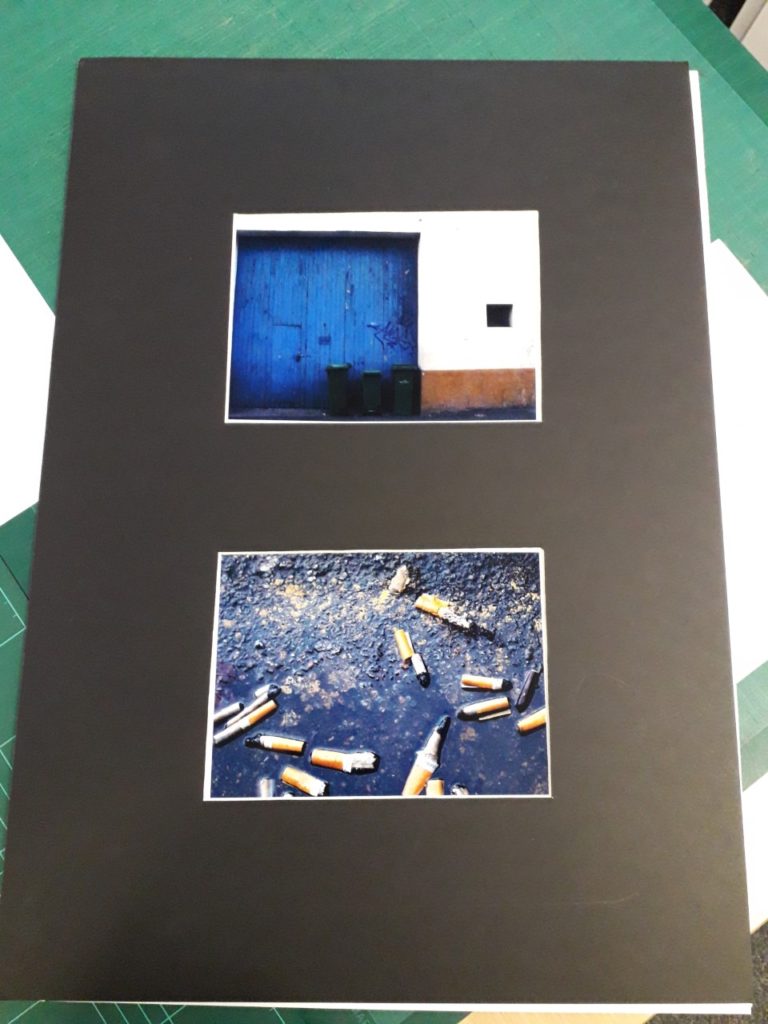
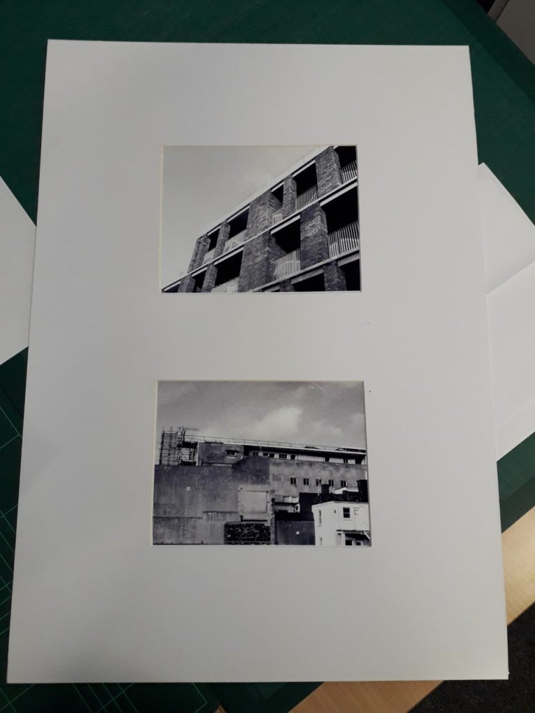
After having finished displaying them, I believe that my final images were the correct ones to have chosen and mounted. They complemented each other while also contrasting and showing the range of my capabilities as a photographer and editor. Before mounting the images I felt that I preferred the pair in colour, but after seeing them finalised and in the window mount, I actually feel like I prefer the black and white pair, as they go better with the window mount card, but I do also think that the pair in colour are successful also.
I feel that the execution of my window mounts themselves could have gone better, but after the first one I feel like I improved significantly, as I knew where I had gone wrong and I was more confident with the equipment. If I were to do the project again, I would have printed the images off bigger to show more of the detail, but I do also believe that the large border of card helps to draw the onlooker’s eye in and only focus on the images themselves.
For inspiration during the urban landscape part of the project I used Robert Adams mainly, as his work in the ‘New Topographics’ exhibition was instrumental to my mindset when I went out on my photoshoots. His goal was to show the beauty that could be found in the mundane and ordinary scenes you could find in the modern world, and I used those beliefs to inspire my own work, during the shoots that provided all of my final images.


