FINALISING AND DISPLAY

For my final images I selected the images from a variety of photo-shoots

  • Black Light
  • Romanticism
  • Urban/ The New Topographies
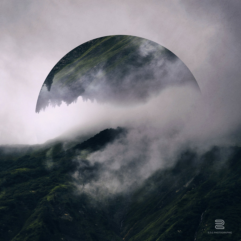
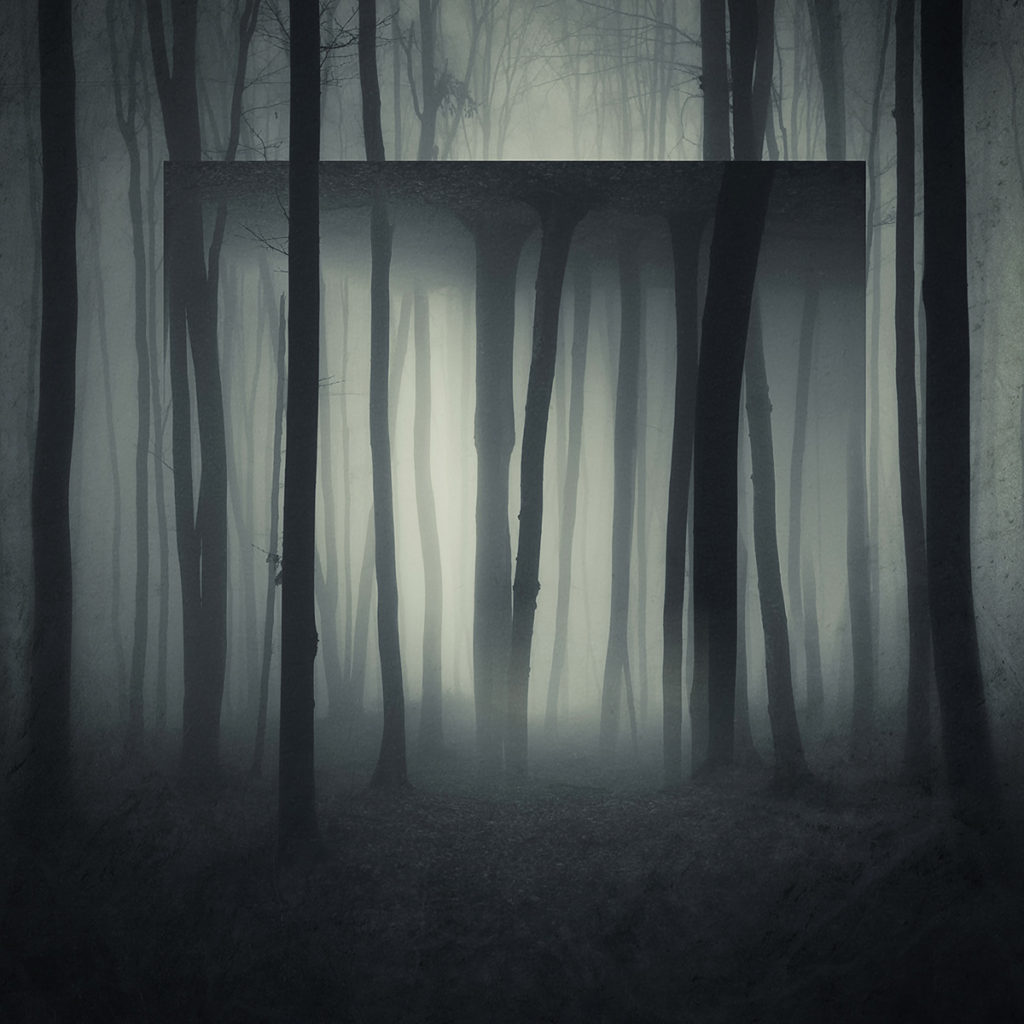
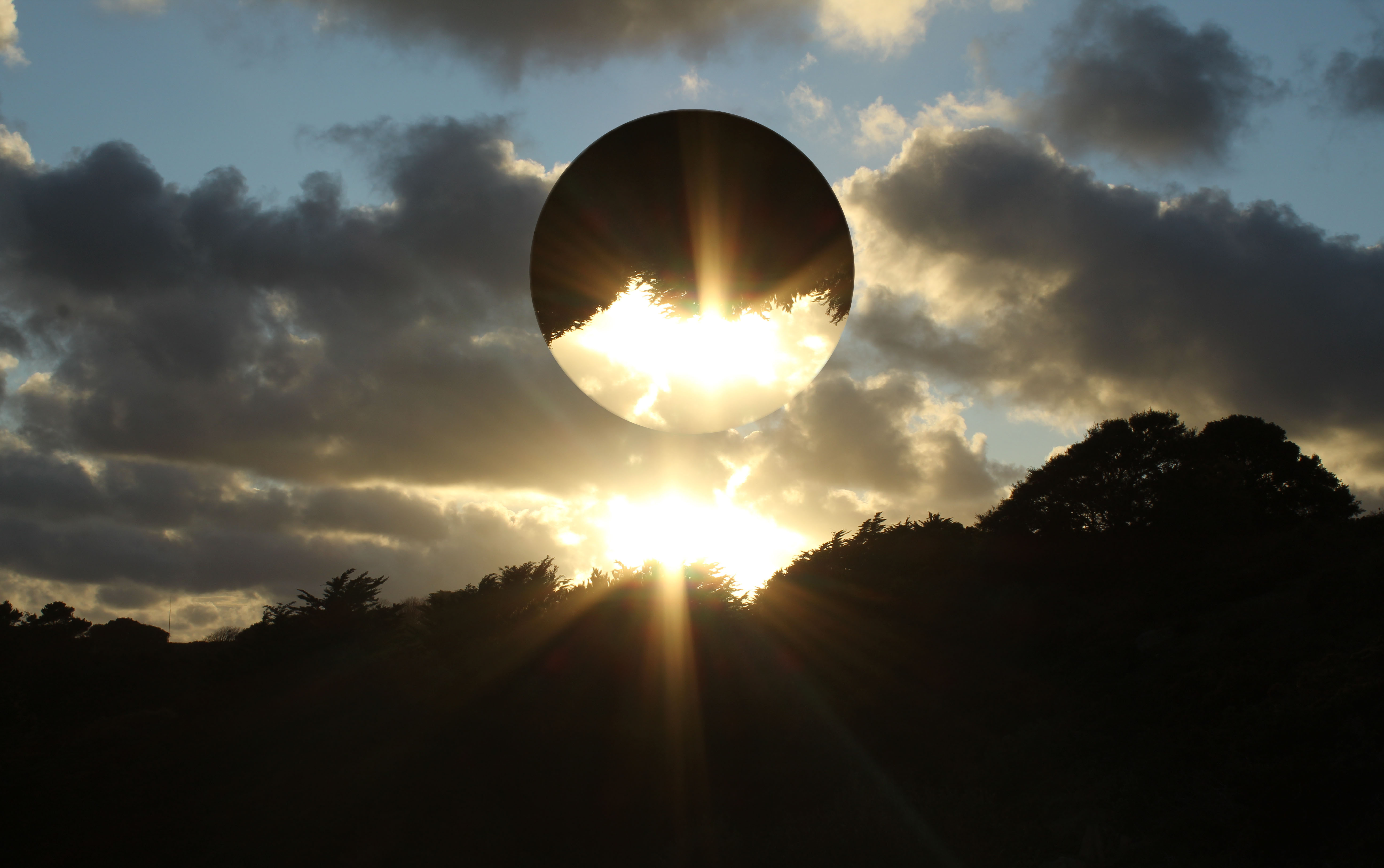
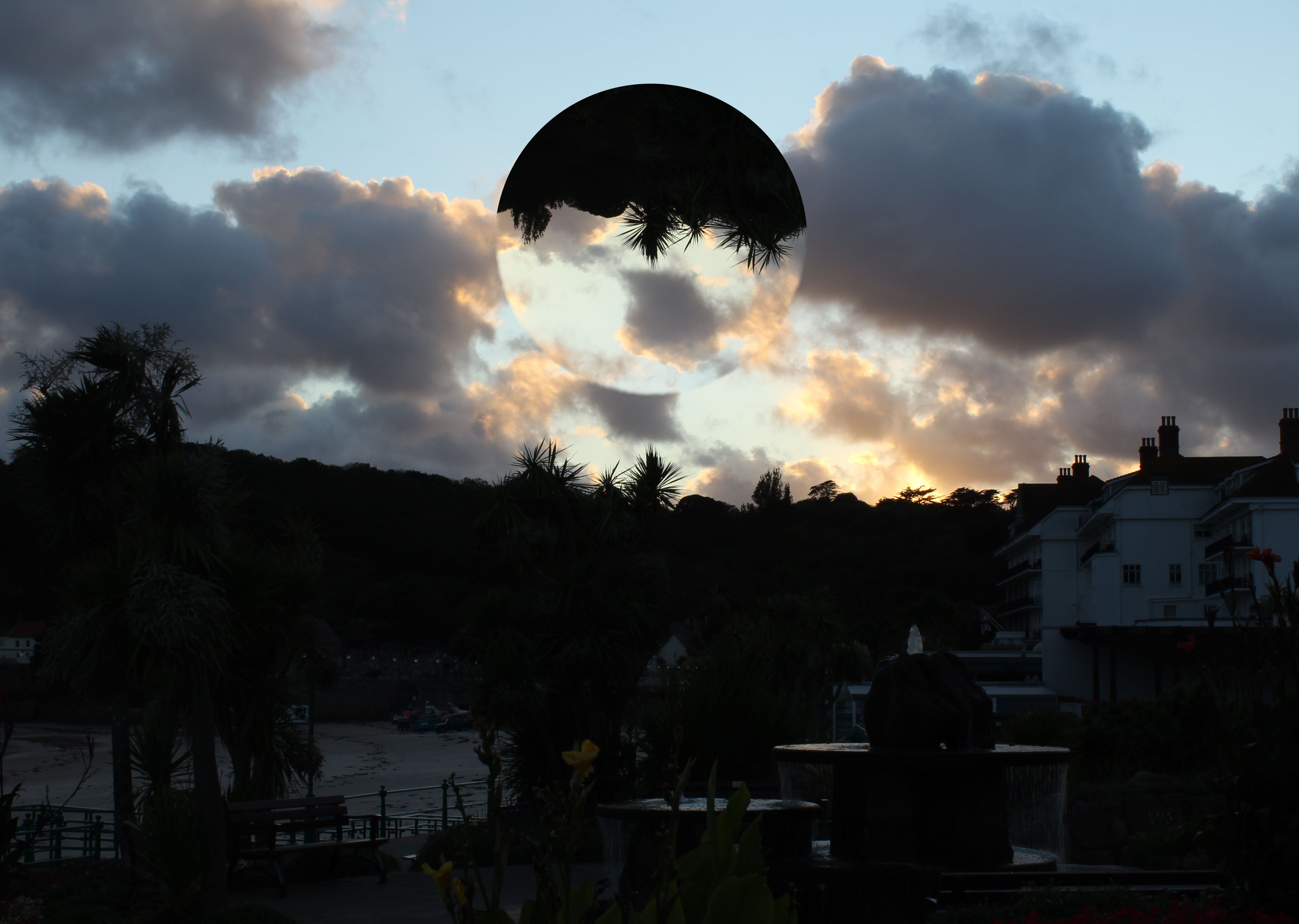
Black Light

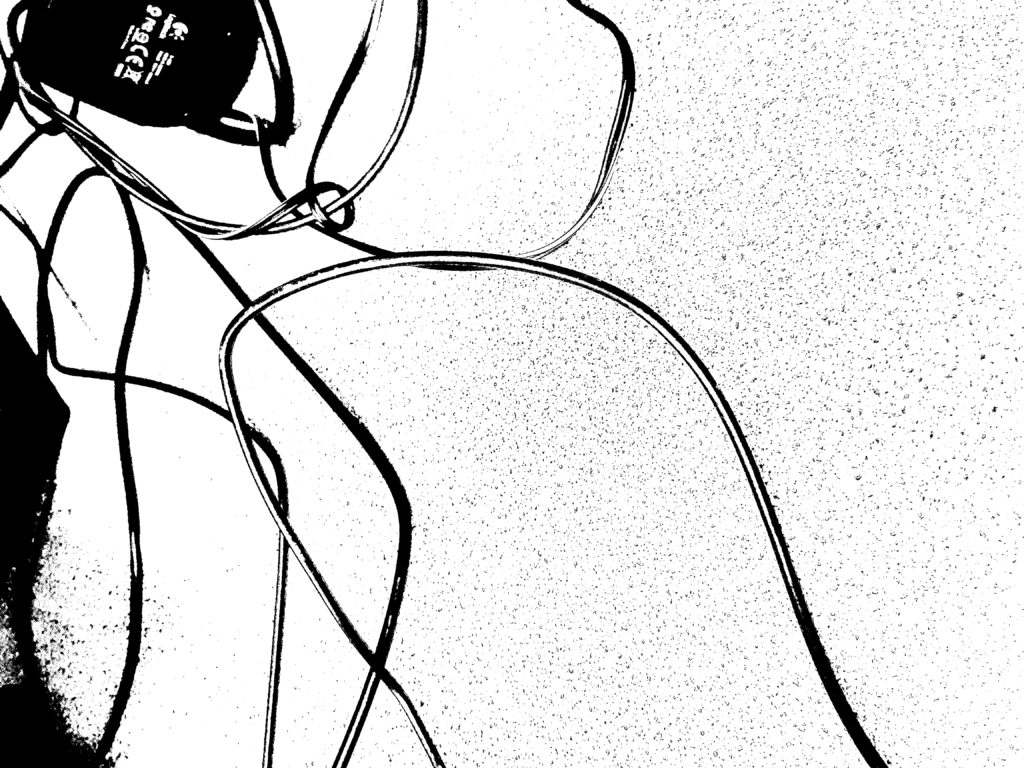
I chose these Blacklight’s images as I liked the contrast shown; I also thought that these were the pictures that worked the best as they have the right amount of detail and texture. I also think that these pictures resemble my photographer as especially my first two images look abstract.

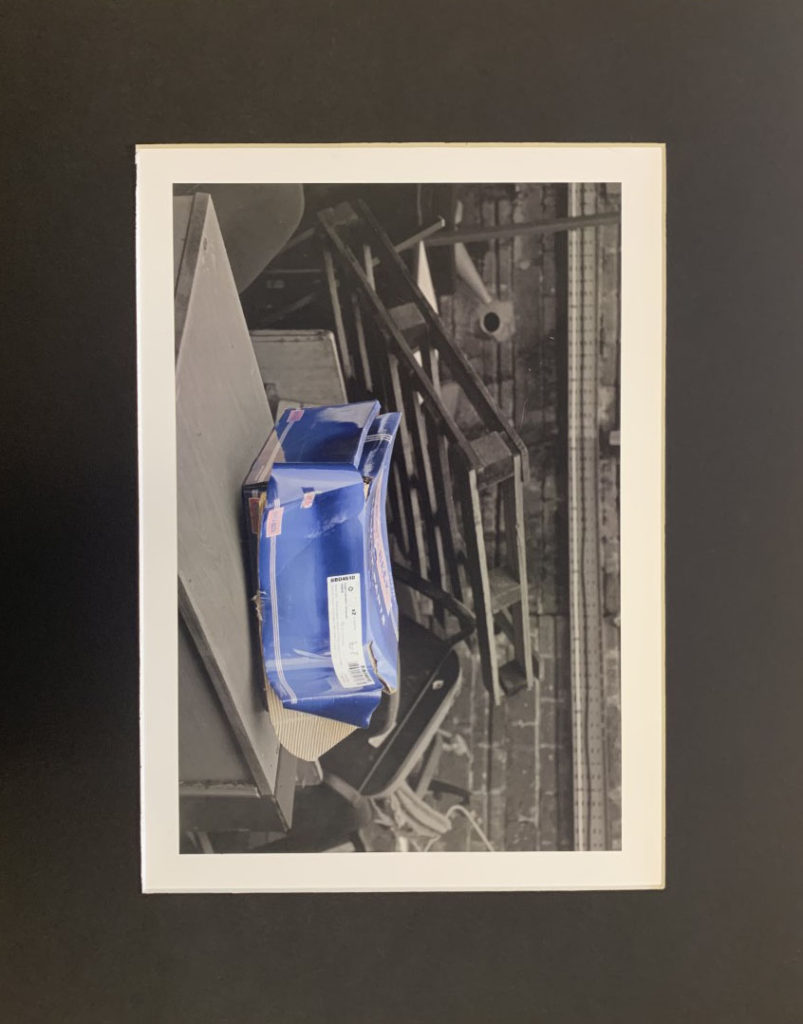
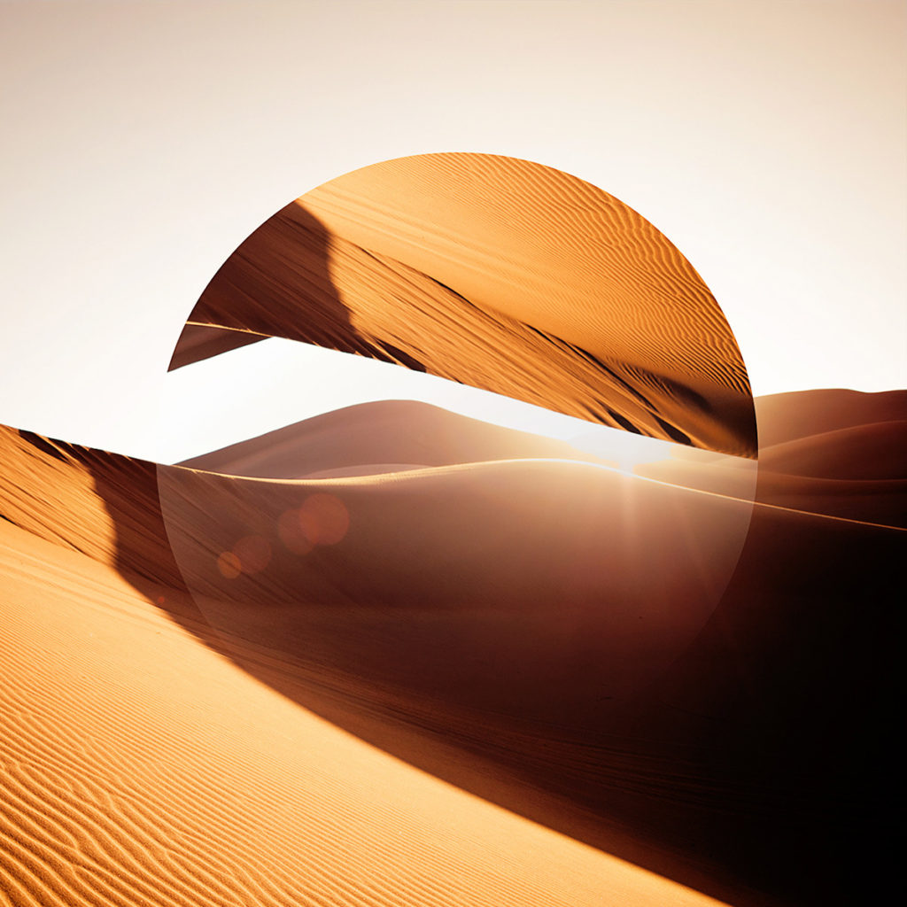
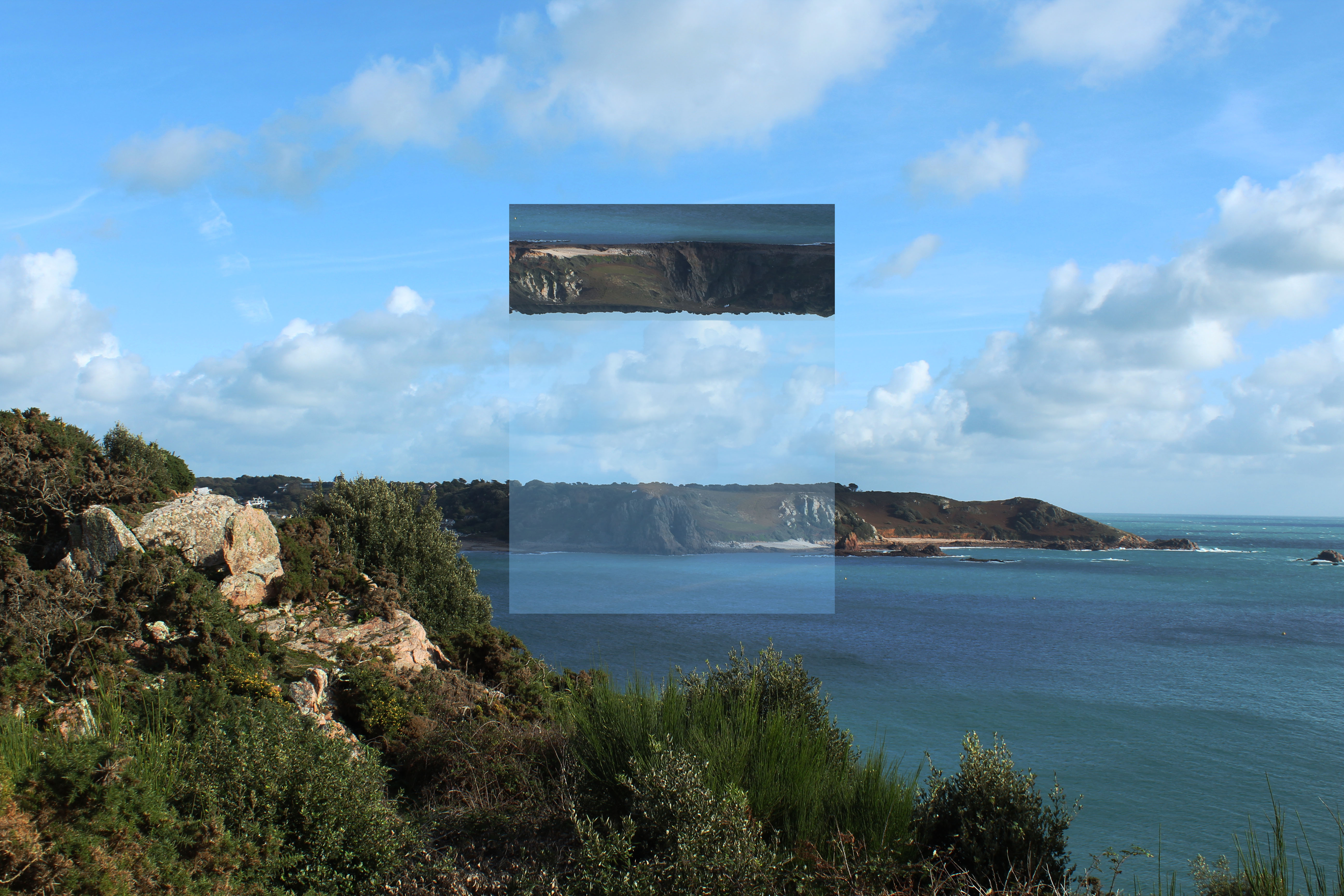
Urban / The New Topographies

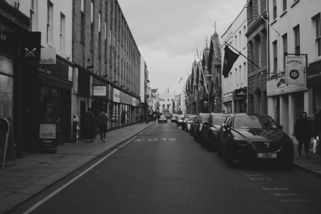
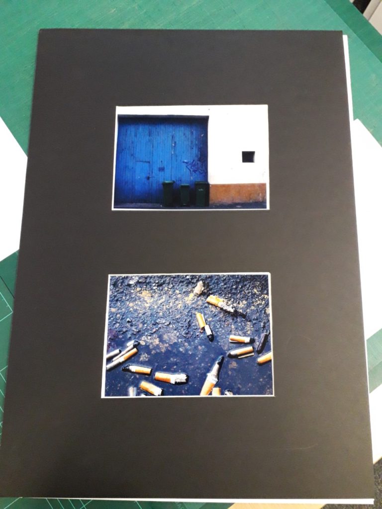
I chose this as one of my final images as I thought it worked the best from my Urban photoshoot. I think this resembles Thomas Struth well due to the symmetry of this image, similar to his work, Struth shows the beauty of urban landscapes through the use of geometric shapes; which I think I have shown in my image.
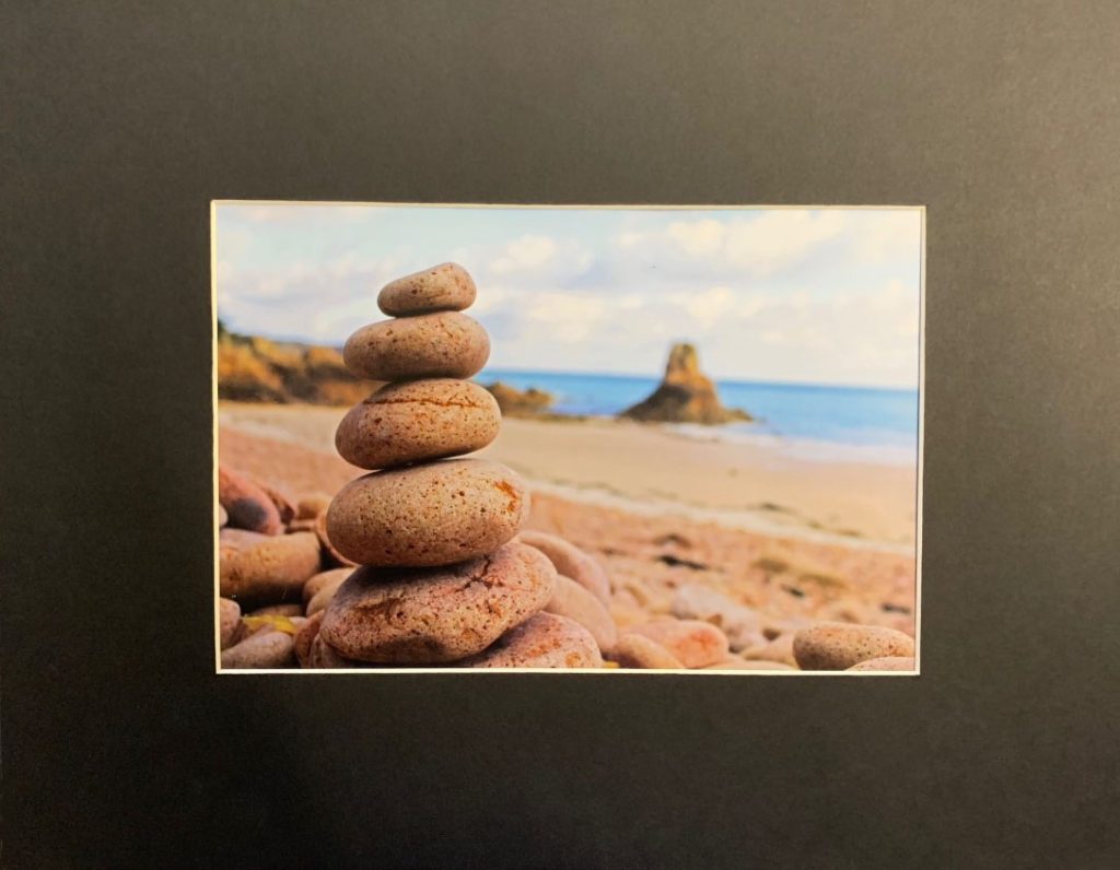
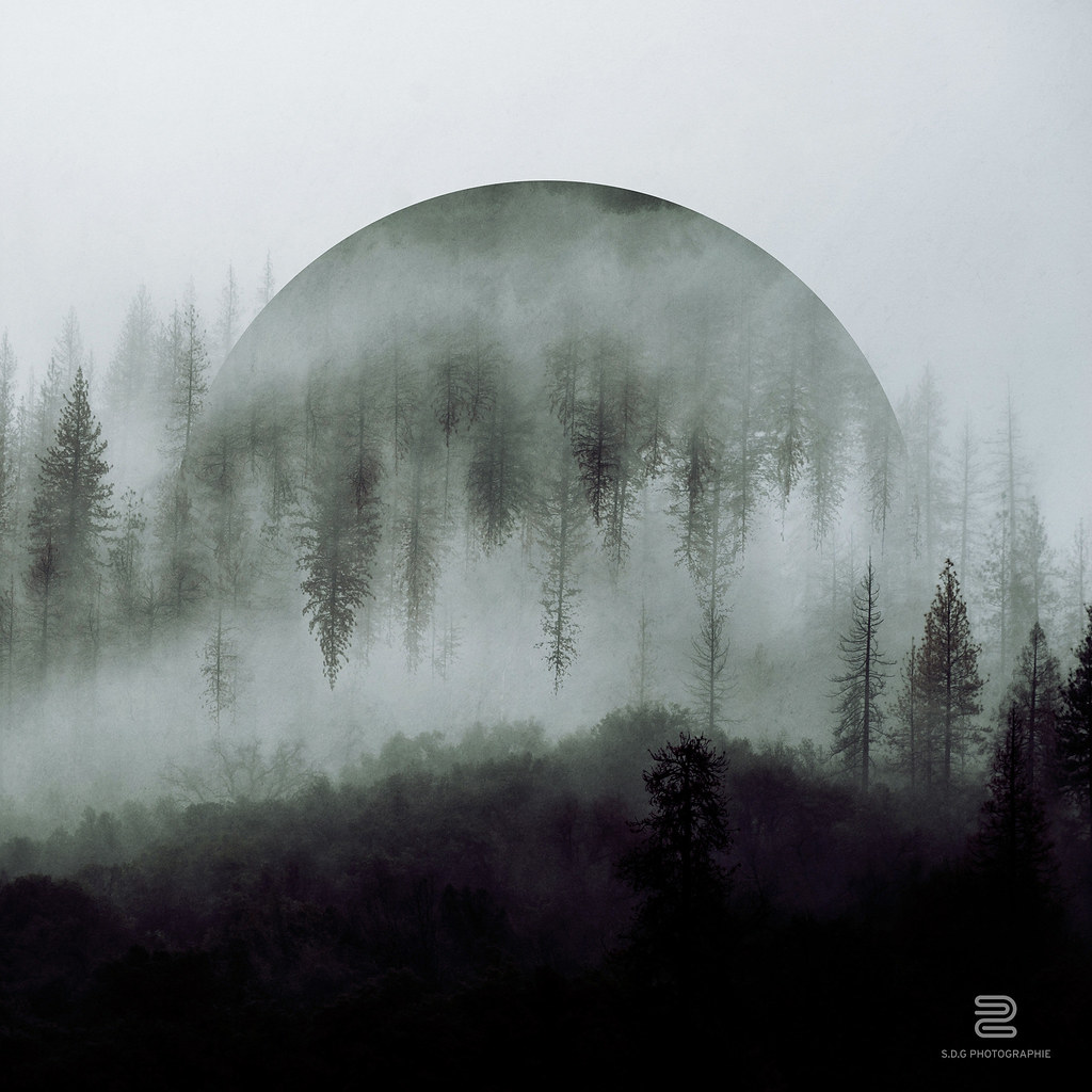
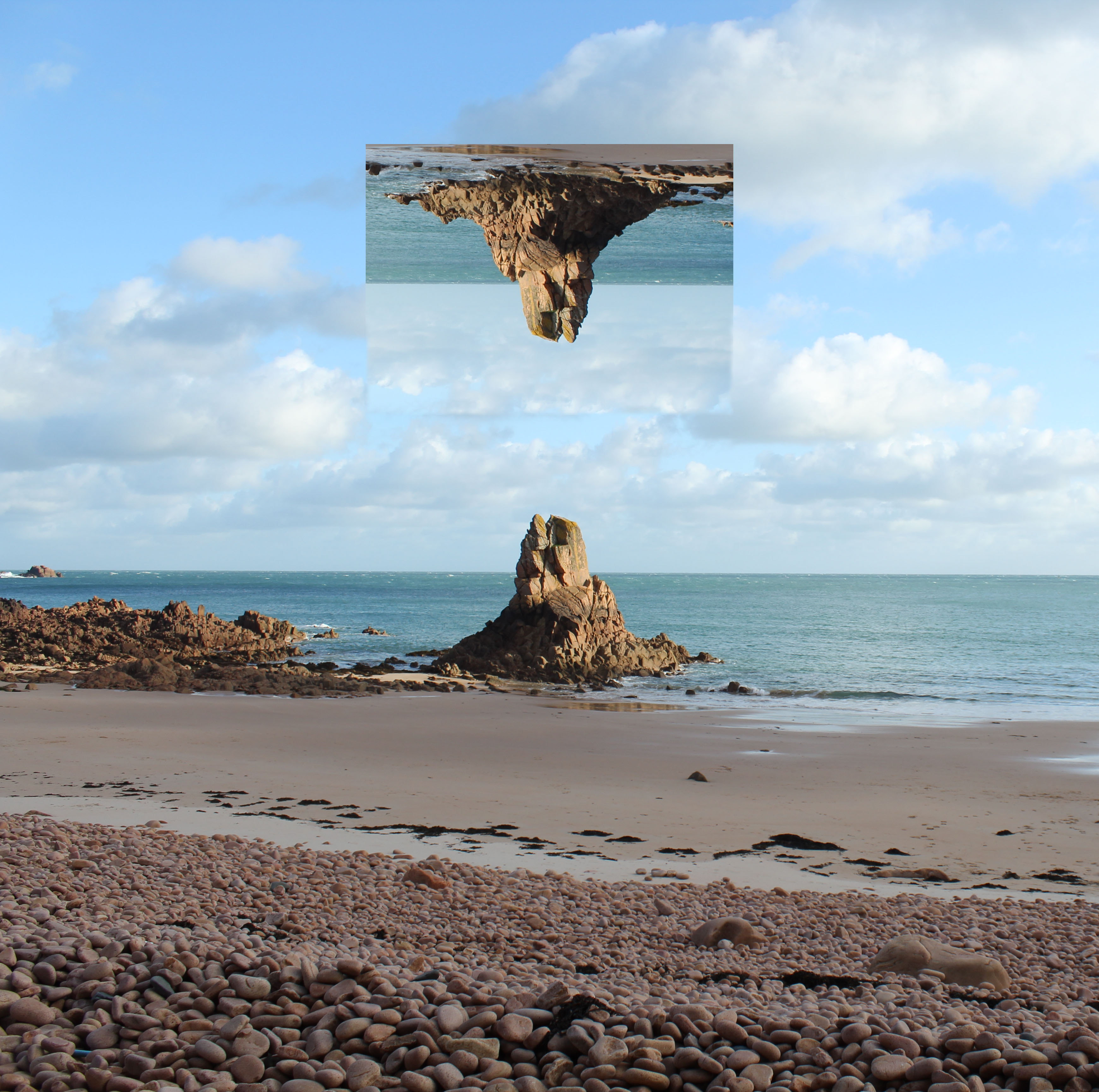
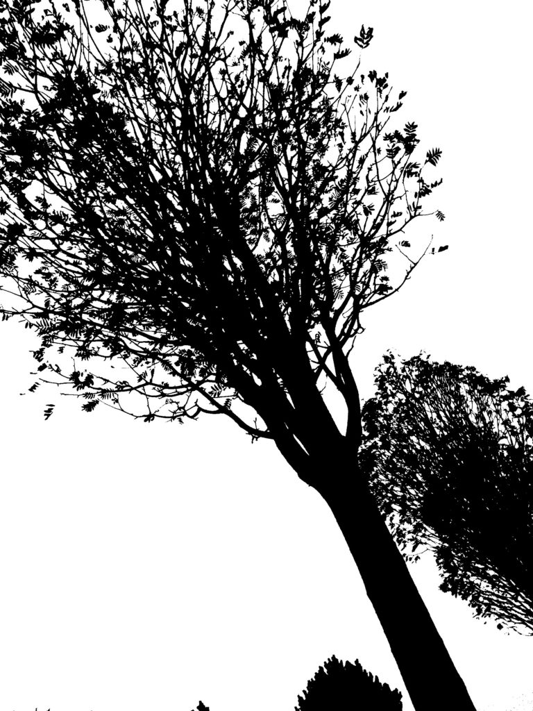
Romanticism

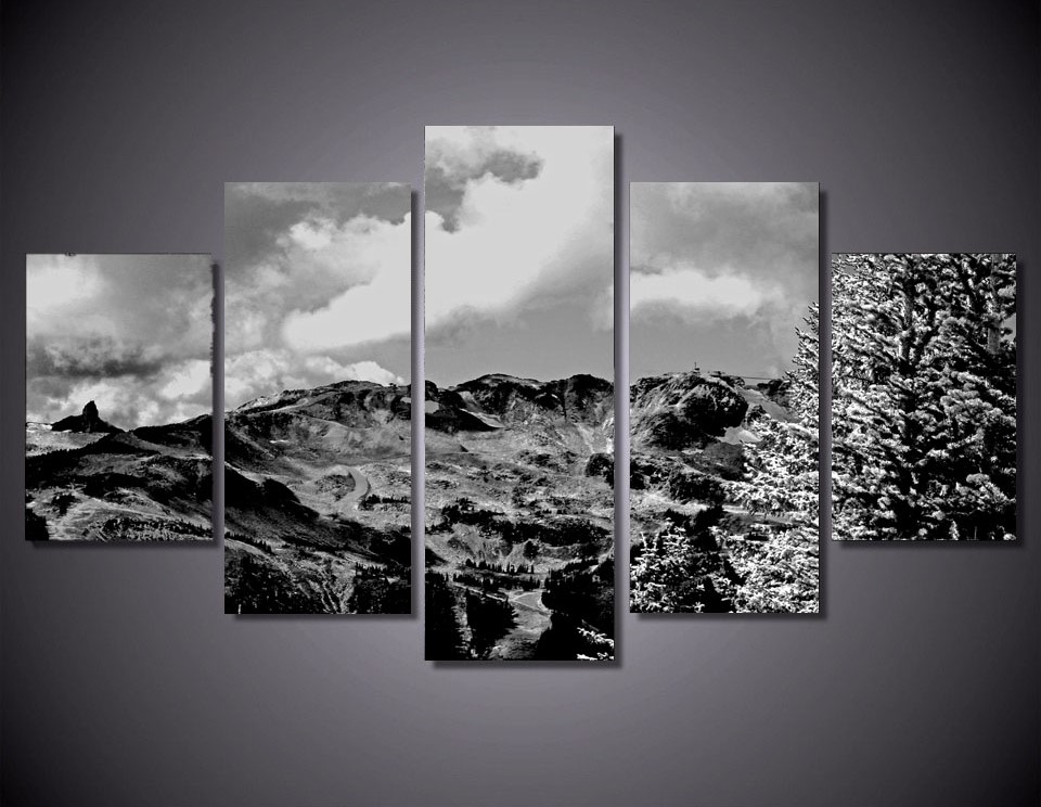
I chose the this image as I think this was my best image through my entire process until now. Similar to Micheal Kenna’s work, he uses striking and contrasting images in order to convey the idea of the power and beauty of nature.

The Final Outcomes

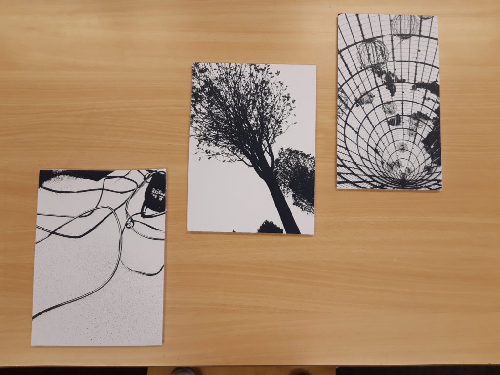
For my Black Light images I decided to place them onto foam boards as this made them stand out compared to just printing out these images. I think this worked well as it makes the images look 3D. I decided to take this photos together in this format as it outlined the geometric shapes of the photographs.

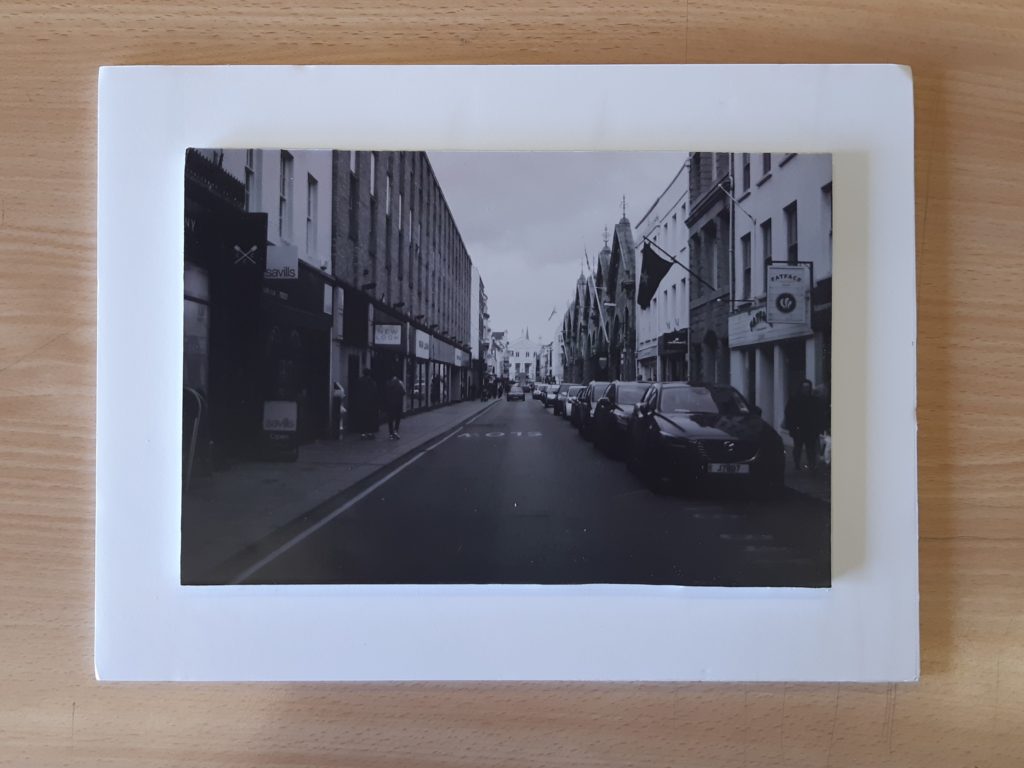
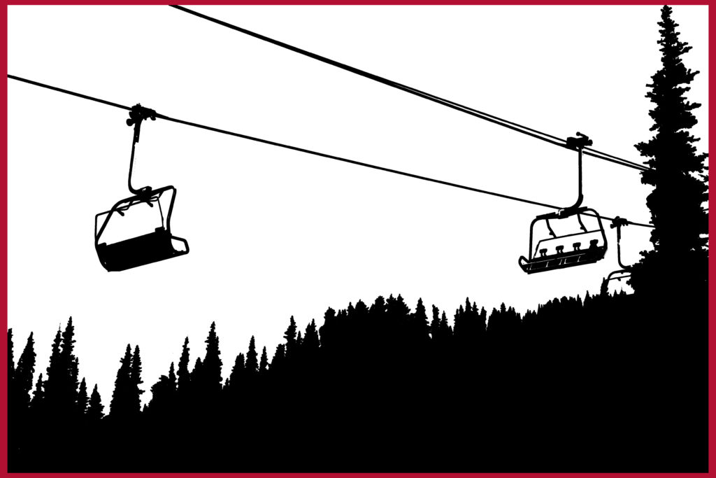
For this image, I decided to create a foam boarder, here I placed foam onto the back of my image then placed it on the another piece of foam. This also adds a 3D effect onto my image due to the shadows shown.

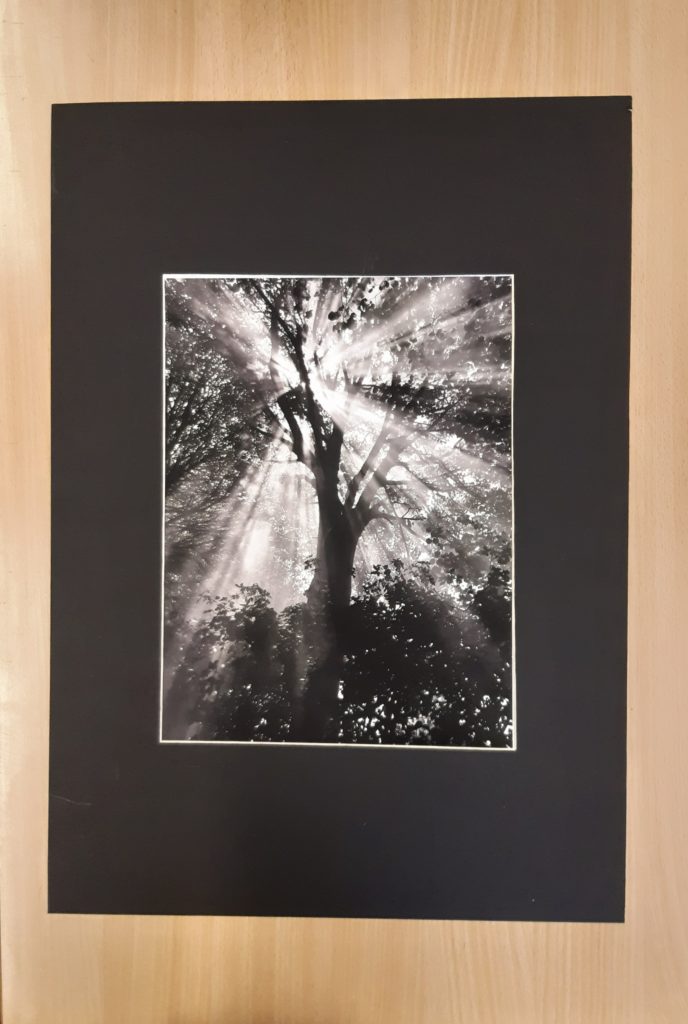
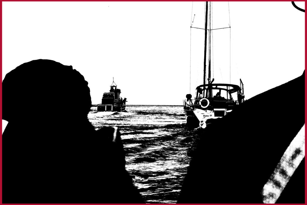
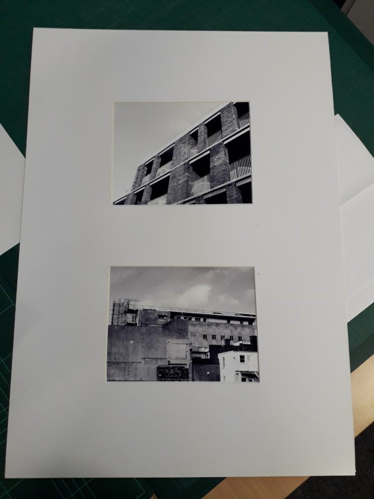
For this image I decided to use a Black window mount, I think that this worked really well due to the contrast between the highlights in the image and the black window mount. I think that this is a simple but effective method as it allows the audience to focus on the image without getting distracted from anything else that might have been added.

Intro to Portrait photography-

Portrait photography by definition is a photograph of a person or group of people that holds a meaning or shows their personality by use of lighting, background, props or poses.

Contemporary photography is very similar, except it focuses more on portraying our own modern values, challenges, and world views of this era. The image on the bottom left below is a contemporary portrait as it breaks the traditional mould of portraits through the use of editing software, most likely Photoshop.

Here I have demonstrated the wide variety of styles of portraiture and the range of techniques one could use to achieve a certain goal, as well as showing that using programs such as Photoshop can help to achieve a photographer’s final vision.

Here is a link to a website that explains some of the basics to think about when starting portrait photography:

https://www.thierrybornier.com/blog/introduction-portrait-photography

Altered Landscapes – Del Grosso Inspired

Sebastian Del Grosso is a french photographer who publishes all his work online. He created a photography project called ‘Geometrica’ that was inspired by Einstein.

He uses a landscape picture and geometric shapes and plays around with its orientation, opacity and position copied onto the image. Some have clear altered shapes with hard lines and often mirrored, whereas others are only slightly resized or moved with soft lines.

Some other attempts inspired by Del Grosso

Landscape evaluation

Tilt Shift Urban

All my tilt shift work was done in photoshop as i do not own a tilt shift lens. Therefore my images were not at as high a quality of most tilt shift photography but still showed a reasonable nudge towards the idea.

Natural Landscape

My best example of natural landscape was taken in September in Canada. The large scale mountains and tree lines add to the dramatic and romantic effect of the image. With this particular image i tried to match the style of Ansel Adams and draw an emotional response from the people that see it.

Keld Helmer Peterson

I had an unorthodox approach to Keld Helmer Peterson’s work as I did not use a fully urban style and aimed to integrate natural elements. With this image I increased the threshold and followed through with the black paint tool to cover any white spots or gaps in the tree line especially.
Similar to my previous photo this is another example of an uncommon take on Peterson’s work emphasising the nature over the man made. Again, I used the paint tool to fill spots and gaps to create a smooth and clear image .

Final Images Displayed-

Evaluation-

After having finished displaying them, I believe that my final images were the correct ones to have chosen and mounted. They complemented each other while also contrasting and showing the range of my capabilities as a photographer and editor. Before mounting the images I felt that I preferred the pair in colour, but after seeing them finalised and in the window mount, I actually feel like I prefer the black and white pair, as they go better with the window mount card, but I do also think that the pair in colour are successful also.

I feel that the execution of my window mounts themselves could have gone better, but after the first one I feel like I improved significantly, as I knew where I had gone wrong and I was more confident with the equipment. If I were to do the project again, I would have printed the images off bigger to show more of the detail, but I do also believe that the large border of card helps to draw the onlooker’s eye in and only focus on the images themselves.  

For inspiration during the urban landscape part of the project I used Robert Adams mainly, as his work in the ‘New Topographics’ exhibition was instrumental to my mindset when I went out on my photoshoots. His goal was to show the beauty that could be found in the mundane and ordinary scenes you could find in the modern world, and I used those beliefs to inspire my own work, during the shoots that provided all of my final images. 

first pair of final images displayed using the window mount technique
my second pair of final images displayed using a window mount