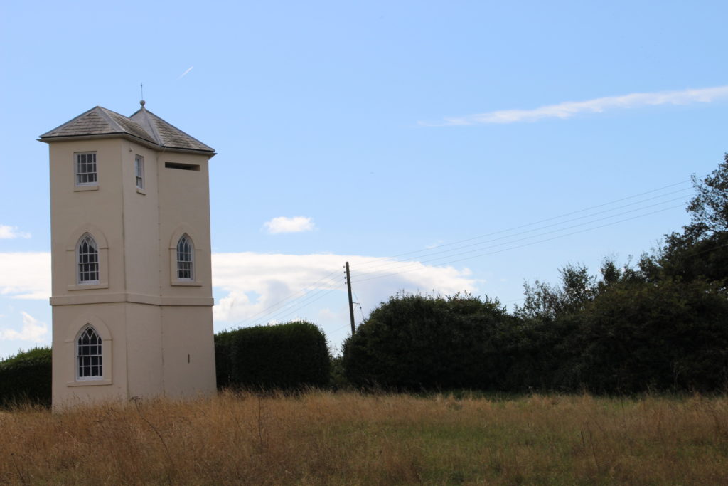

I decided to use the lighthouse as a focus point, while making sure not to place the focal point in the middle of the picture as I felt the picture needed the open blue sky to show the eeriness of the tower.
I changed the gradient map to improve the sense of warmth and get rid of the creepiness. I felt having a warm colour would expose the audience to a sense of love rather than a sense of darkness. The bright tower has a pop art feel and could be interpenetrated by the audience in ways of variety.
