Below are my edited images from both my urban landscape shoots. I have enhanced the photograph to make them more eye-catching and interesting.
photograph one

original 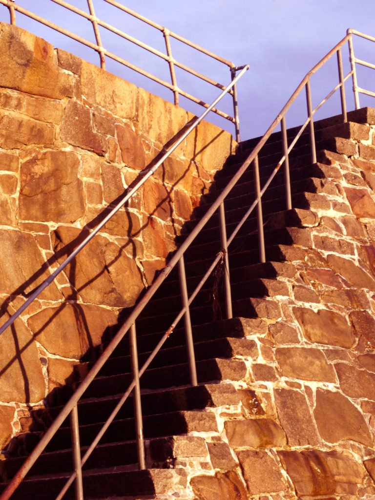
edited
I decided to enhance the contrast to make the shadows on the steps bolder and darker, to create harsher lines. I also found the original was very yellow, so I changed the colour levels, saturating the red, to make the rock more of an orange colour.
photograph two
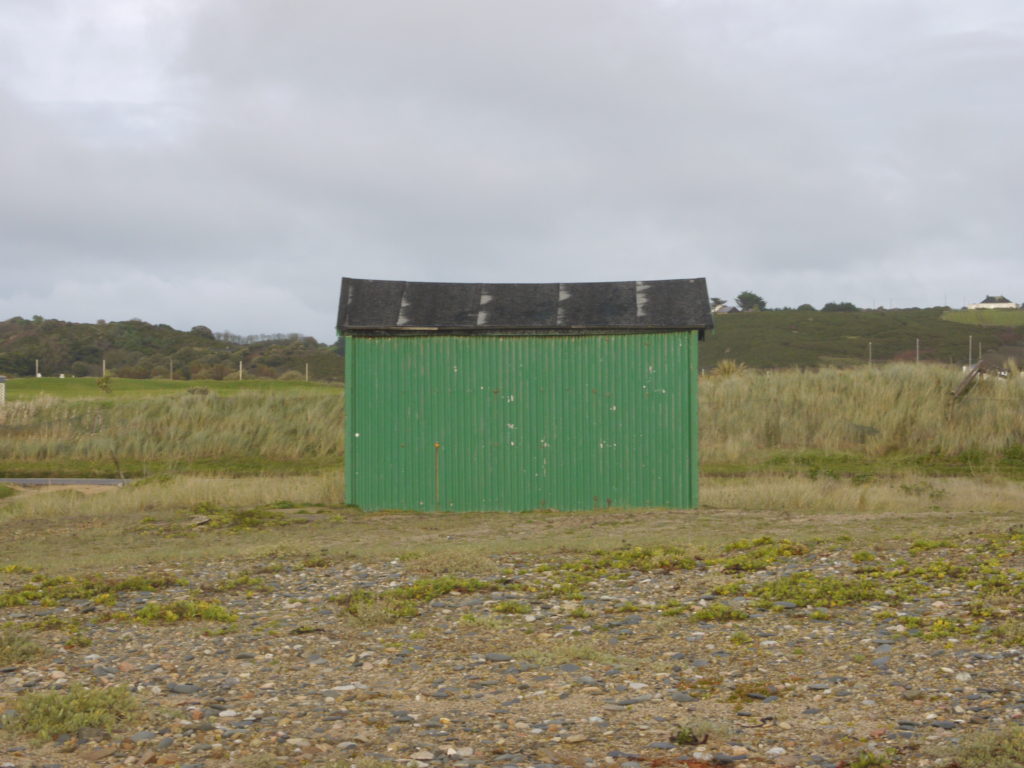
original 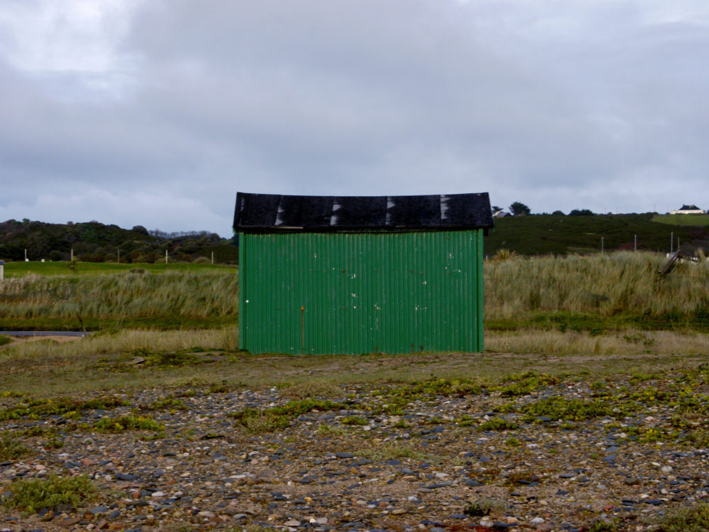
edited
I decided to only change the saturation, to make the shed more of a greener, meaning it would blend into the scenery. This idea kind of goes against the theme of urban landscapes, as I wanted to make it fit into the background and look natural, even though it was not.
photograph three

original 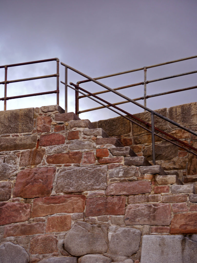
edited
I decided to increase the contrast, to allow the structured metal fixtures to stand out on the grey skies, and be more of a promenant feature in the photograph. I also increased the saturation of the whole photograph to allow the rock to become more of a red colour and the sky to become more moody and slightly purple.
photograph four
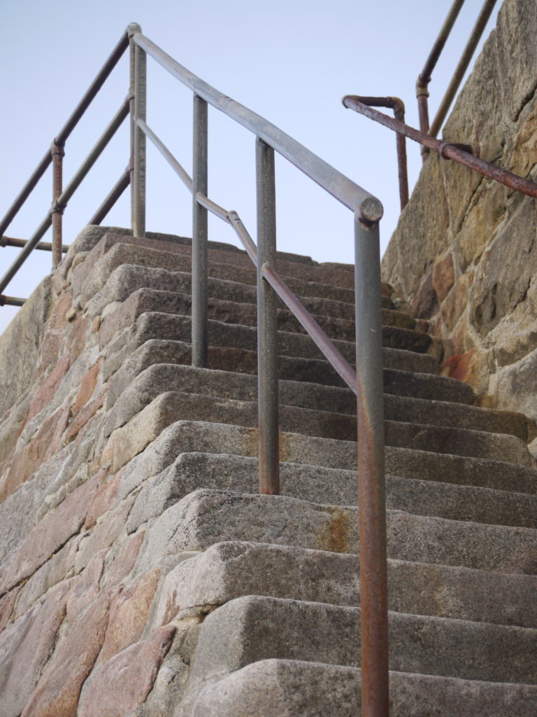
original 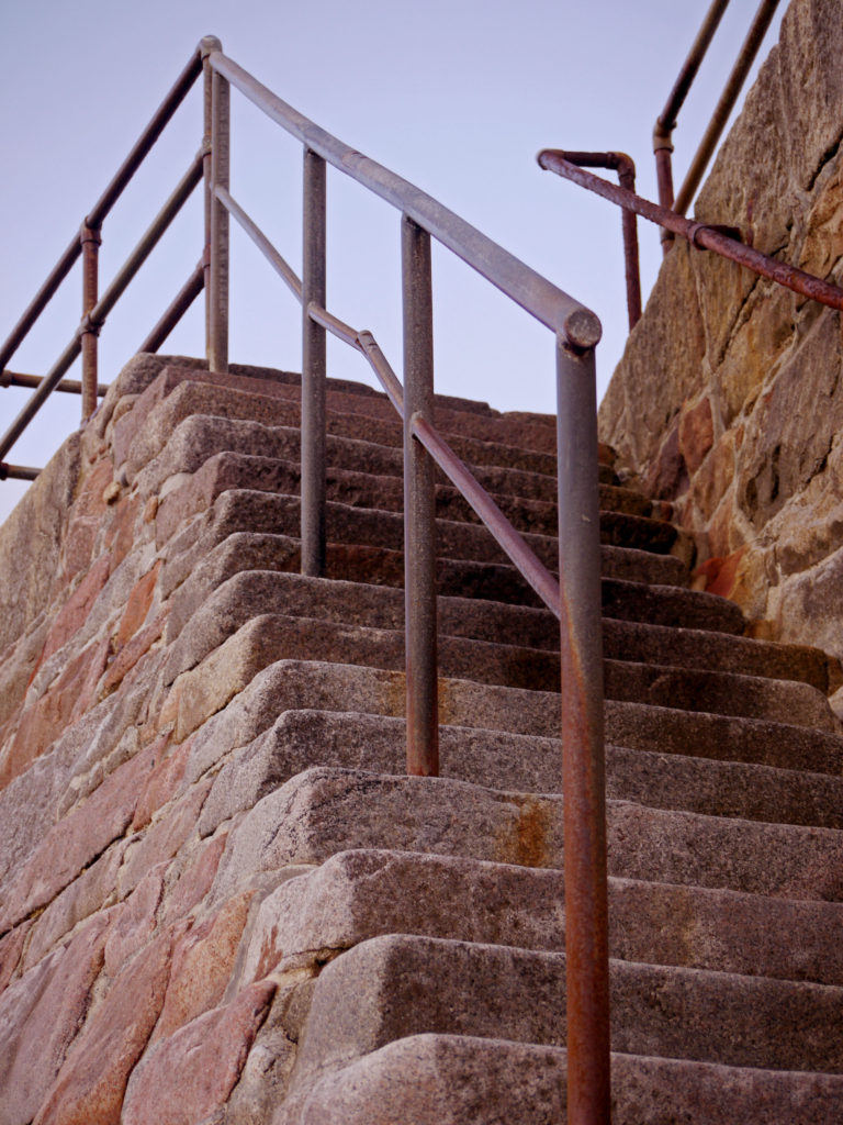
edited
All I did for this photograph was change the colour levels, and I increased the saturation for the red colour, allowing the rocks to become more of a red and orange colour. This allows the photograph to be more eye-catching.
photograph five

original 
edited
For this photograph, I increased the contrast, which meant that the blacks become darker. It also allowed for the mesh fence to stand out and be more visible.
