Selection Process-
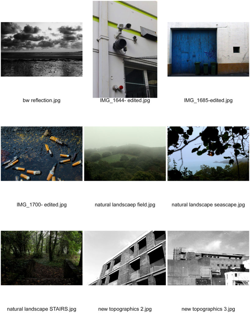
I decided to pick my personal favourite images out of several shoots to compile a large-ish group of images, from which I can then select my final 2-4 to print and mount.
I took images from my romantic landscape, natural landscape, New Topographics, and urban landscape photoshoots, then I decided to make a series of contact sheets to properly visualise all these images and refine them down to my final selection.

I already knew that I wanted to have two sets of two A4 images, within which the two images had a similar aesthetic and complemented each other. From there, I studied the contact sheet and tried to narrow down any outliers or images that I just didn’t particularly feel stuck with my vision.

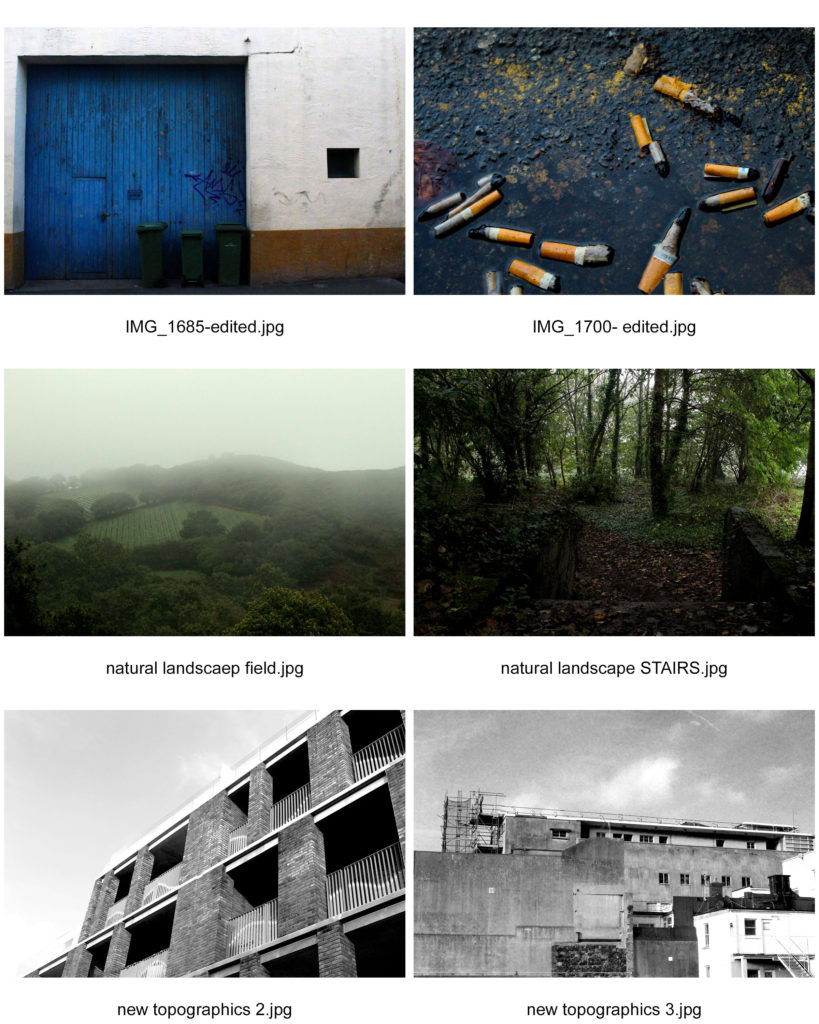
Here I paired the remaining images together with the other images I felt complemented them the best, and then I had to decide which two pairs to select for the final printing. At this point I decided that I would use two window mounts to display these images, because this method would showcase them best next to each other.
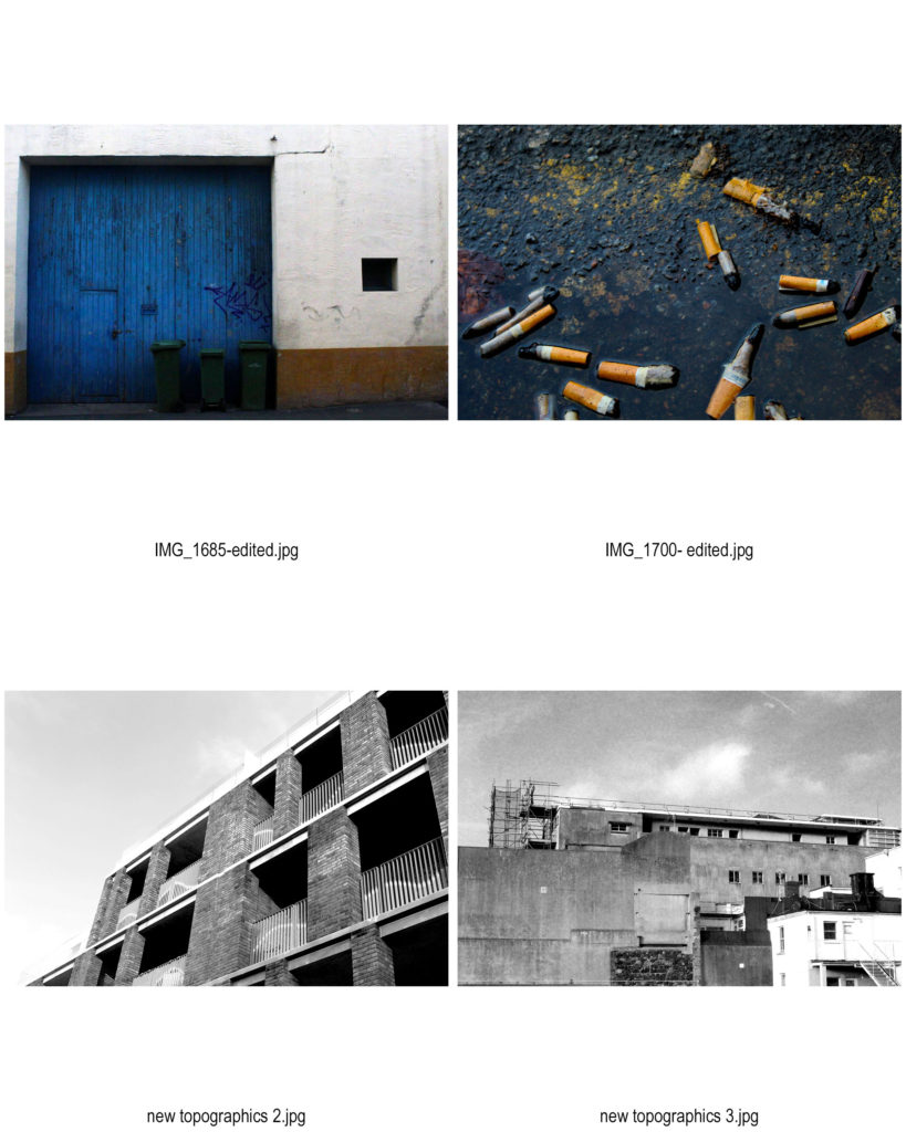
Finally I felt that the top and bottom pairs of images best went with each other, as they both represented different aspects of urban landscape, which was my preferred part of this landscape project, as well as contrasting the other pair due to the fact that one pair is in black and white and the other in colour.
Final Images-

Evaluation-
The top two images are more of my own style rather than following another photographer’s work, and my overall intention was to keep the colours vibrant and show how everyday scenes can be seen differently, with a photographer’s eye. I used Photoshop to edit these images subtly and they turned out successful.
I chose the bottom pair of images because I felt that they were the best representations of the ‘New Topographics’ era of photography, particularly the style of Robert Adams, who I studied before going out on a photoshoot. I kept with his style when shooting, as I only shot scenes I felt were bleak and “banal” enough to show how beauty can be found within urbanisation, which was a clear theme of Adams’ work and the ‘New Topographics’ exhibition in general. I also used his work as a guide when editing, by keeping the sky partly grey and not completely over-exposed, by making the image black and white, and also by adjusting the contrast to increase it but also keep the essence of the image clear.
