urban landscapes outcomes and evaluation

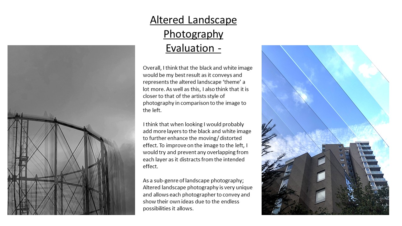
Below are my favourite outcomes from the urban landscape project. I like how they were shot and how they have edited to enhance the photograph.
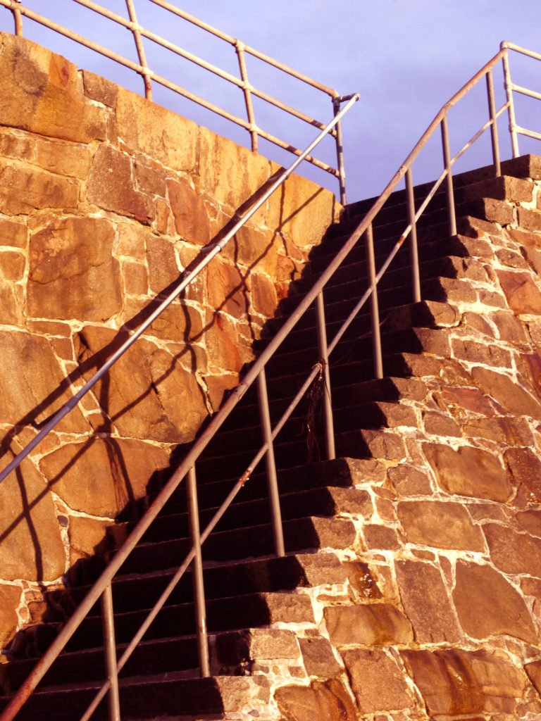
outcome one

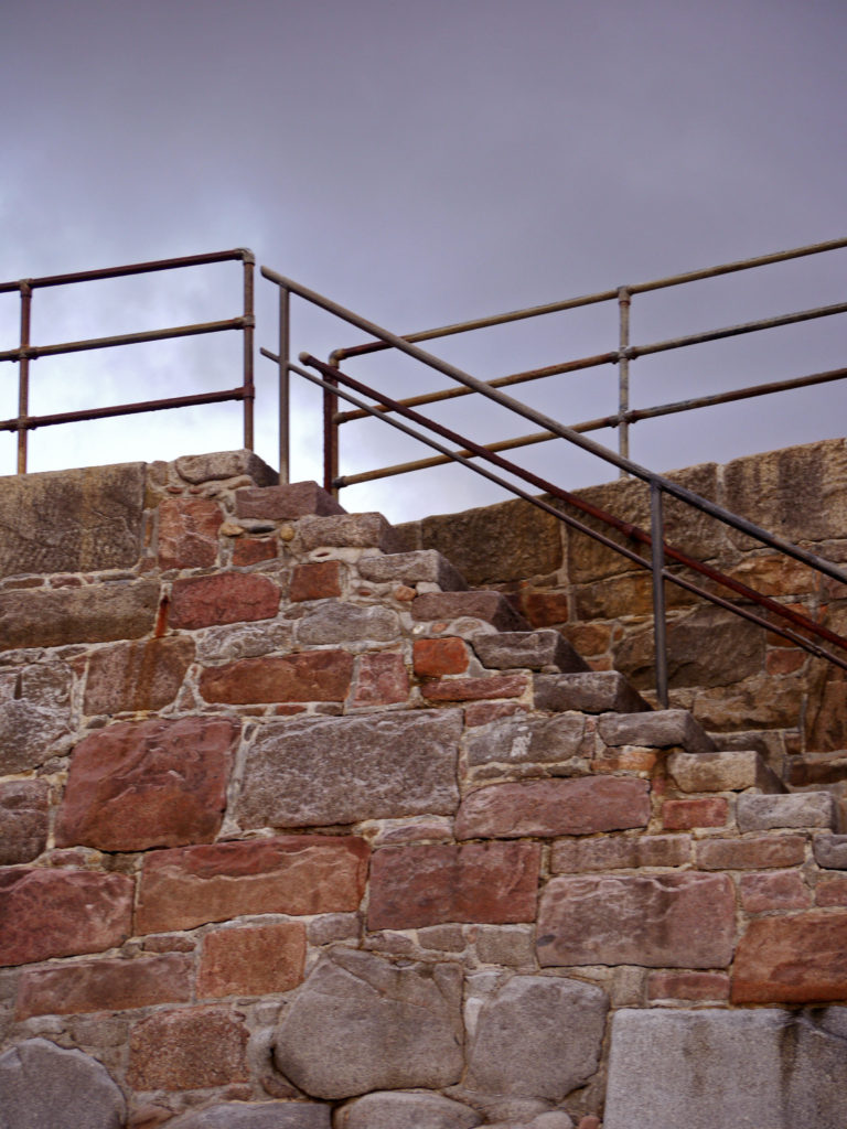
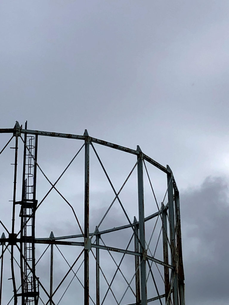
I chose this photograph as one of my favourite outcomes, because I like how the metal contrasts with grey sky. I also think the colour of the rocks is interesting and eye-catching. If I were to take this photograph again, I would try and get more of the sky into the photograph to improve the composition and balance the photograph out.
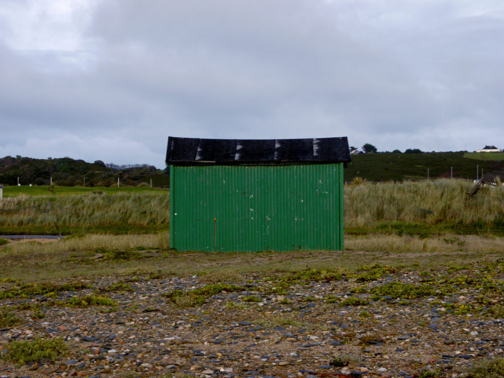
outcome two

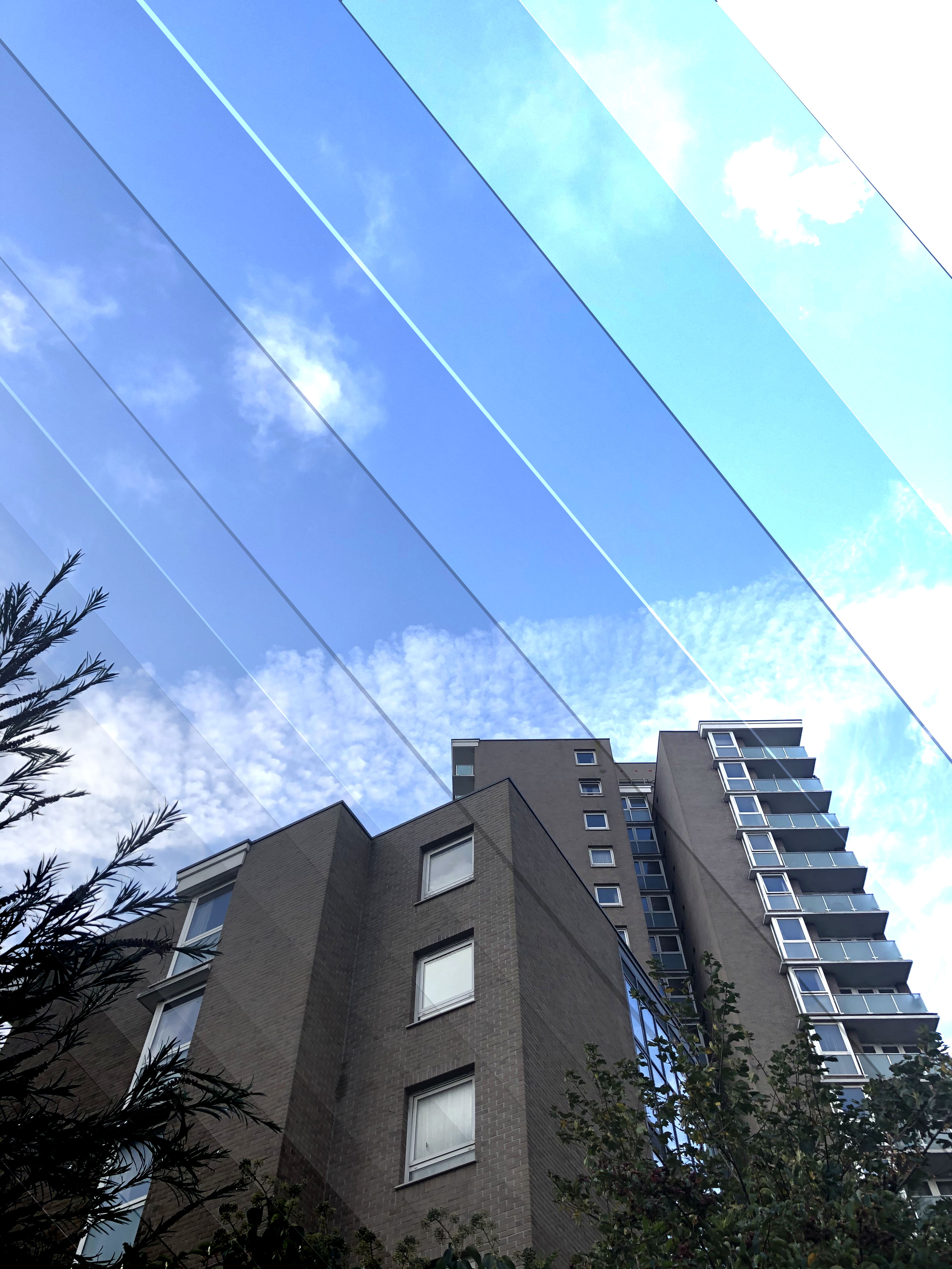
I chose this photograph as one of my favourite outcomes, because I like the lettering on the tank and the way it stands out against the army green tank. The fencing adds dimension too, which I like. If I were to take this photograph again, I would try to centre the writing to make it more aesthetically pleasing.
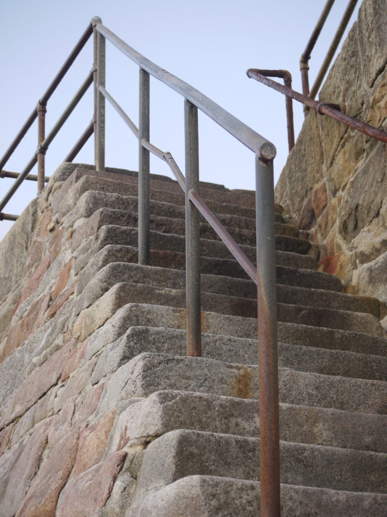
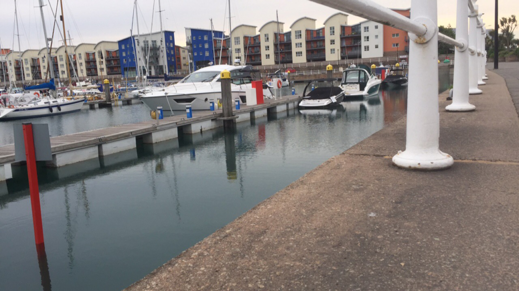
outcome three

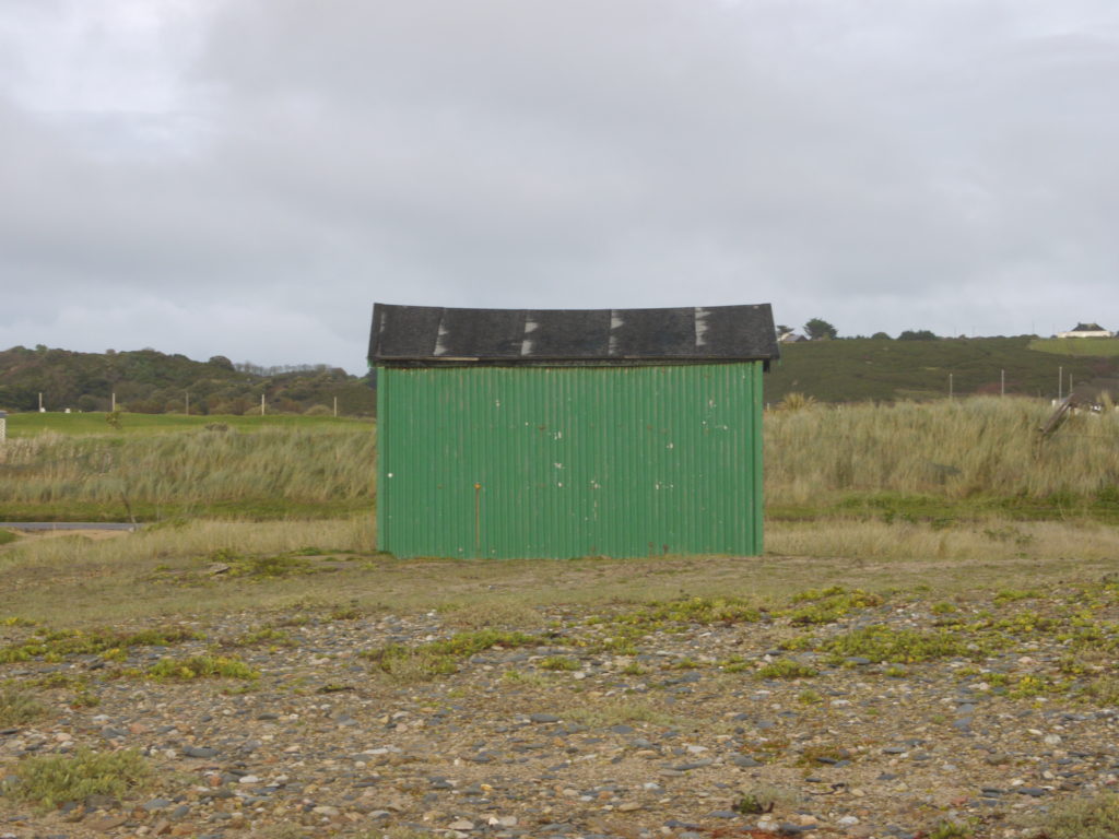
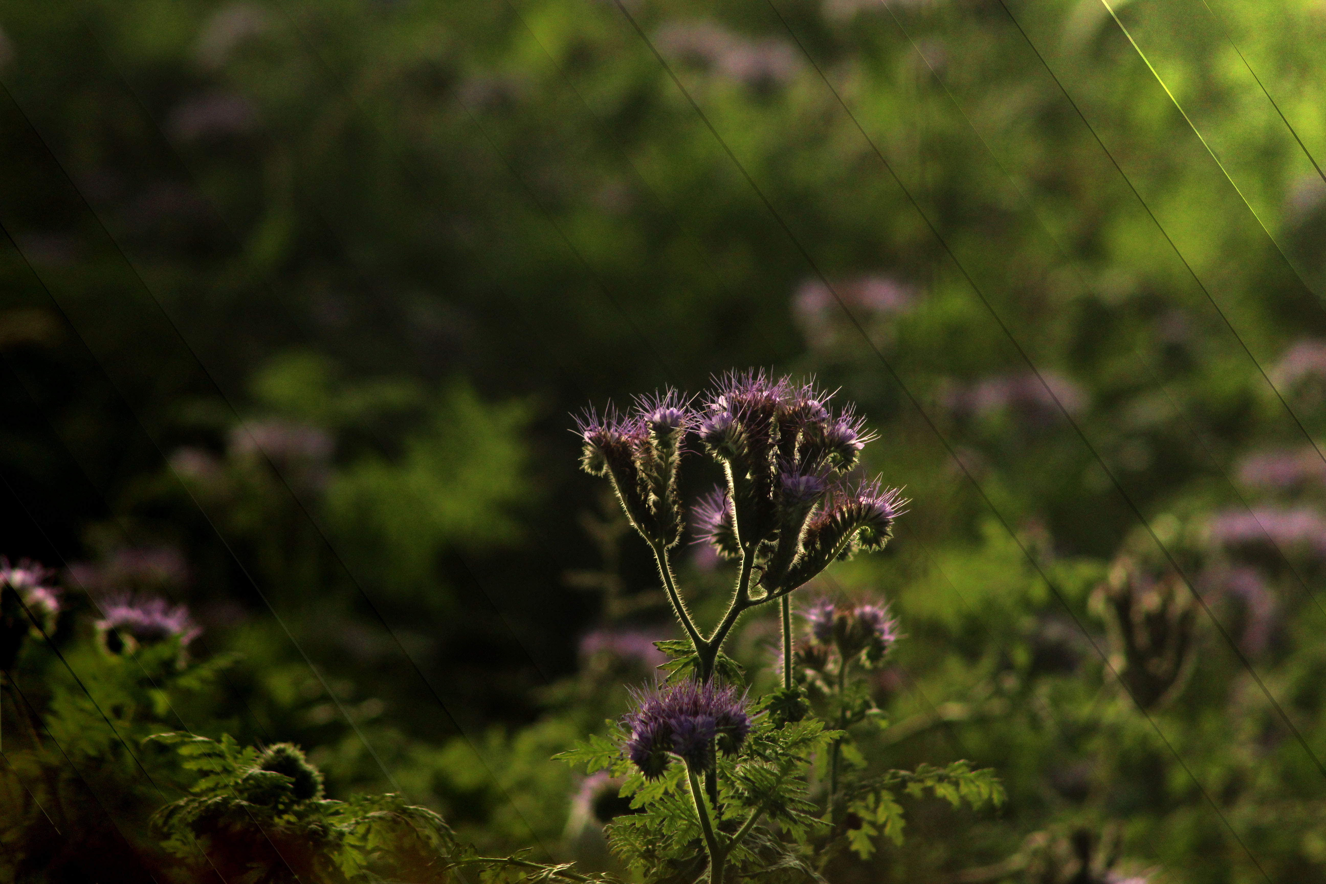
I chose this photograph as one of my favourite outcomes, because I like the simplicity of the shot. The composition is simple but effective as it is very easy to view. If I were to take this photograph again, I would try to centre the horizon line to get a balanced shot.

evaluation

I found that most of photographs that i took didnt turn out very well, because they were either too under or over exposed or they werent in focus. I also didnt think they fitted in with the urban landscape genre or were very interesting. I really enjoy the more simplistic shots that I took, because I like the way they look.

urban photographs – edited

Below are my edited images from both my urban landscape shoots. I have enhanced the photograph to make them more eye-catching and interesting.

photograph one

I decided to enhance the contrast to make the shadows on the steps bolder and darker, to create harsher lines. I also found the original was very yellow, so I changed the colour levels, saturating the red, to make the rock more of an orange colour.

photograph two

I decided to only change the saturation, to make the shed more of a greener, meaning it would blend into the scenery. This idea kind of goes against the theme of urban landscapes, as I wanted to make it fit into the background and look natural, even though it was not.

photograph three

I decided to increase the contrast, to allow the structured metal fixtures to stand out on the grey skies, and be more of a promenant feature in the photograph. I also increased the saturation of the whole photograph to allow the rock to become more of a red colour and the sky to become more moody and slightly purple.

photograph four

All I did for this photograph was change the colour levels, and I increased the saturation for the red colour, allowing the rocks to become more of a red and orange colour. This allows the photograph to be more eye-catching.

photograph five

For this photograph, I increased the contrast, which meant that the blacks become darker. It also allowed for the mesh fence to stand out and be more visible.

Robert Adams study case

Robert Adams is an American photographer who has focused on the changing landscape of the American West. His work first came to prominence in the mid-1970s through his book The New West and his participation in the exhibition New Topographics: Photographs of a Man-Altered Landscape in 1975. Robert Hickman Adams was born on May 8, 1937 in Orange, New Jersey.

In 1963, Adams bought a 35milimeter reflex camera and started to photograph mostly architecture and nature. He joined classes at Colorado Springs Fine Art Center and studied about photography techniques by a professional, Myron Wood.

In 1964, Adams began photographing and after three years he started teaching it to others, however only part-time so that he could invest the rest of the hours in his projects.

In 1969, four prints by Robert Adams were bought by Museum of Modern Art. A year later, he put all his time and effort in photography.

In 1973, he became an associate at John Simon Guggenheim Memorial Foundation. He was awarded the MacArthur Foundation Fellowship in 1994.

Adams has worked on American West landscapes for more than 38 years, covering Oregon, Colorado and California. He uses his camera to express his love for landscapes. Also, to understand how industrial and urban growth has transformed it.

Adam’s work and his style gained inspiration from photographers like, William Henry Jackson, Lewis Hine, Dorothea Lange, Timothy O’Sullivan, Ansel Adams, Edward Weston, and Carleton Watkins.

Stephen Shore

Stephen Shore is an American photographer who was born October 8, 1947. He is known for his images of bland and somewhat boring scenes and objects in the United States, and also for his pioneering use of colour in art photography. His books include Uncommon Places (1982) and American Surfaces (1999). These photos were taken on road-trips during the 1970’s. They show juxtaposition and capture the beauty in the boring landscapes. Stephen Shore was instrumental in the ‘New topographic movement’. This movement was about showing the contrast between man and nature and the blandness of some of the American towns.

Image result for stephen shore new topographics black and white
This photo by Stephen Shore is apart of the ‘New Topographics’ movement. I was drawn especially to this image because of multiple reasons.

Visual: Looking at this image I can see that the photo is quite flat and dull in colour. However there is accidents of colour especially in red, white and blue. This photo in a lot of ways is quite boring and uninteresting but it is the subtle things that make it interesting.

Contextual: This photo is part of the new topographic’s movement which was a group of photographers including the likes of Stephen Shore, Robert Adams and Lewis Baltz. This image helps to represent the impact of man on the landscape and shows the contrast. At the time of this photo being taken, the idea of the ‘America Dream’ was a big thing that a lot of people

Conceptual: This image is dull other than the accents of red white and blue, which I think Stephen Shore has used to represent the nation of there United States as the USA flag is red, white and blue. This could be linking to the theme of ‘Man altered landscapes’ as the red, white and blue may be representing the people of the United States that have in a sense created this image.

Technical: Because this photo was taken in the 70’s it was likely to be taken on film because it has quite a flat look however digital photography had been invented and was growing in popularity. But the principles are still the same. The shutter speed would have been quite high because the photo is very sharp, but there is not much detail in the shadows and highlights.

Finalising + Display-

Selection Process-

I decided to pick my personal favourite images out of several shoots to compile a large-ish group of images, from which I can then select my final 2-4 to print and mount.

I took images from my romantic landscape, natural landscape, New Topographics, and urban landscape photoshoots, then I decided to make a series of contact sheets to properly visualise all these images and refine them down to my final selection.

I already knew that I wanted to have two sets of two A4 images, within which the two images had a similar aesthetic and complemented each other. From there, I studied the contact sheet and tried to narrow down any outliers or images that I just didn’t particularly feel stuck with my vision.

Here I paired the remaining images together with the other images I felt complemented them the best, and then I had to decide which two pairs to select for the final printing. At this point I decided that I would use two window mounts to display these images, because this method would showcase them best next to each other.

Finally I felt that the top and bottom pairs of images best went with each other, as they both represented different aspects of urban landscape, which was my preferred part of this landscape project, as well as contrasting the other pair due to the fact that one pair is in black and white and the other in colour.

Final Images-

Evaluation-

The top two images are more of my own style rather than following another photographer’s work, and my overall intention was to keep the colours vibrant and show how everyday scenes can be seen differently, with a photographer’s eye. I used Photoshop to edit these images subtly and they turned out successful.

I chose the bottom pair of images because I felt that they were the best representations of the ‘New Topographics’ era of photography, particularly the style of Robert Adams, who I studied before going out on a photoshoot. I kept with his style when shooting, as I only shot scenes I felt were bleak and “banal” enough to show how beauty can be found within urbanisation, which was a clear theme of Adams’ work and the ‘New Topographics’ exhibition in general. I also used his work as a guide when editing, by keeping the sky partly grey and not completely over-exposed, by making the image black and white, and also by adjusting the contrast to increase it but also keep the essence of the image clear.

Altered Landscape photography

Altered Landscape Research –

First being popularized via The Nevada Museum of Art in the early 1990’s which had a section directly focused on ‘new’, contemporary landscape photography. Nearly two decades later, the Altered Landscape collection which the museum holds is over 600; it’s largest landscape photography ‘sub-genre’.

During it’s early days, the ‘Altered Landscape’ genre was heavily focused on natural landscapes and the beauty it presents with photographers such as Ansel Adams and Edward Weston leading the ideas and type of connotations landscapes/ their images conveyed. However, during the mid 70’s the Altered Landscape style of photography changed dramatically due to it’s newer influencers such as Bernd and Hilla Becher. This new style of photography focused on landscapes and the effect man-made structures, such as caravans, had on it’s appearance and meaning.

In some ways, modern day Altered Landscape photography acts as a visual source of history combining both old – landscapes and new – houses, buildings, gas stations; conveying quite an emotional feeling towards viewers, forcing them to ask questions like – ‘Is this for the best?’ or ‘Are we ruining our planet?’.

From my research on some artists and altered landscape images, I would say that by under-exposing the images the actual landscapes are even more highlighted due to the emphasis on things such as texture and shadows. This also allows the landscape to be the main focus of the image as no ‘blinding’ light or colours ‘distract’ the viewer from the actual image.

Artist Research –

Photoshoots –

Stephanie Jung Inspired –

 Fong Qi Wei Inspired –