
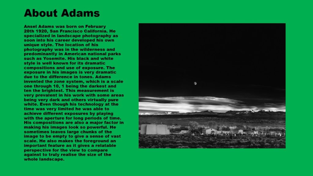
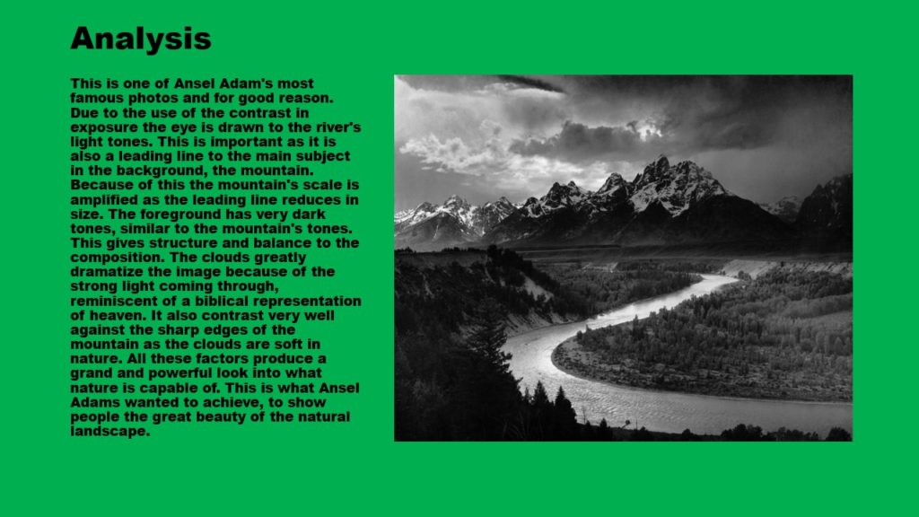


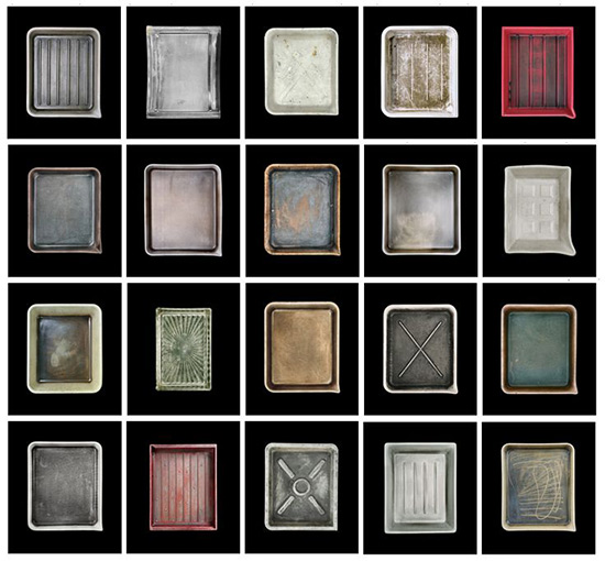
A photographic typology is a study of types, a photographic series that prioritizes collecting rather than stand-alone images. It’s a powerful method of photography that can be used to reshape the way we perceive the world around us.
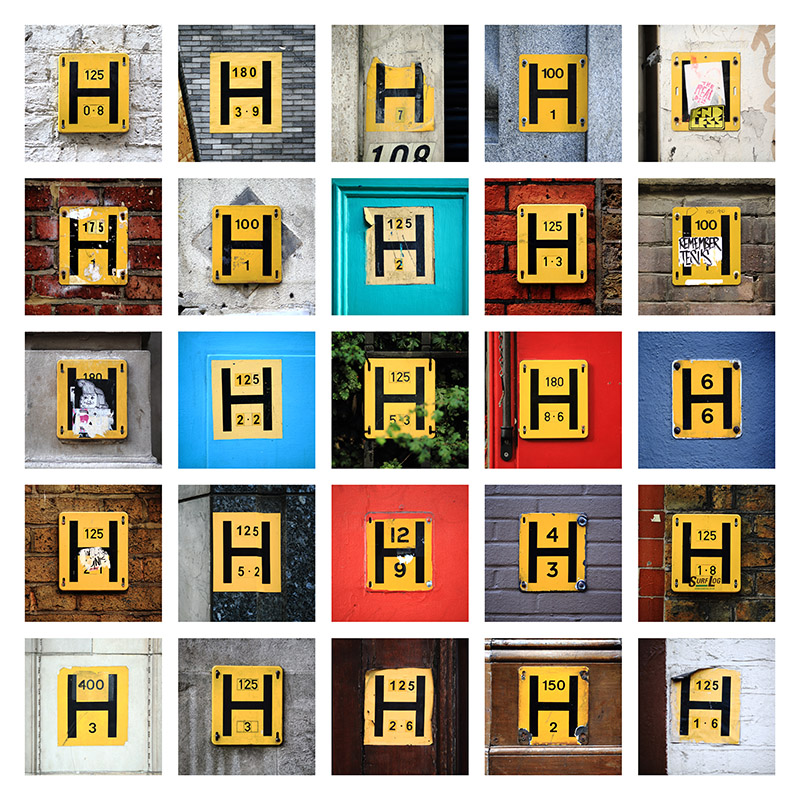
One of the first photographic typological studies was by the German photographer August Sander. Sadly, 40,000 negatives taken for his project ‘the people of the 20th century’ in the 1920s, were destroyed during WWII in a fire. Sanders categorized his portraits according to their profession and social class.

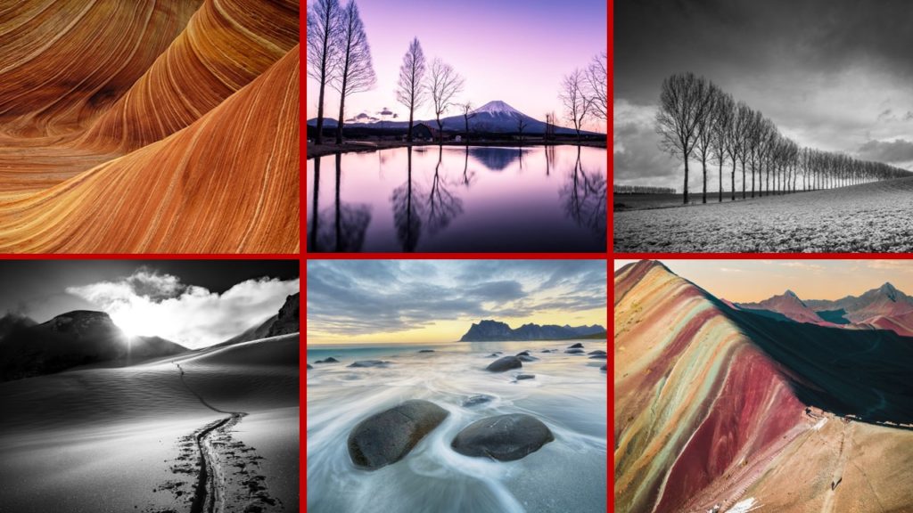
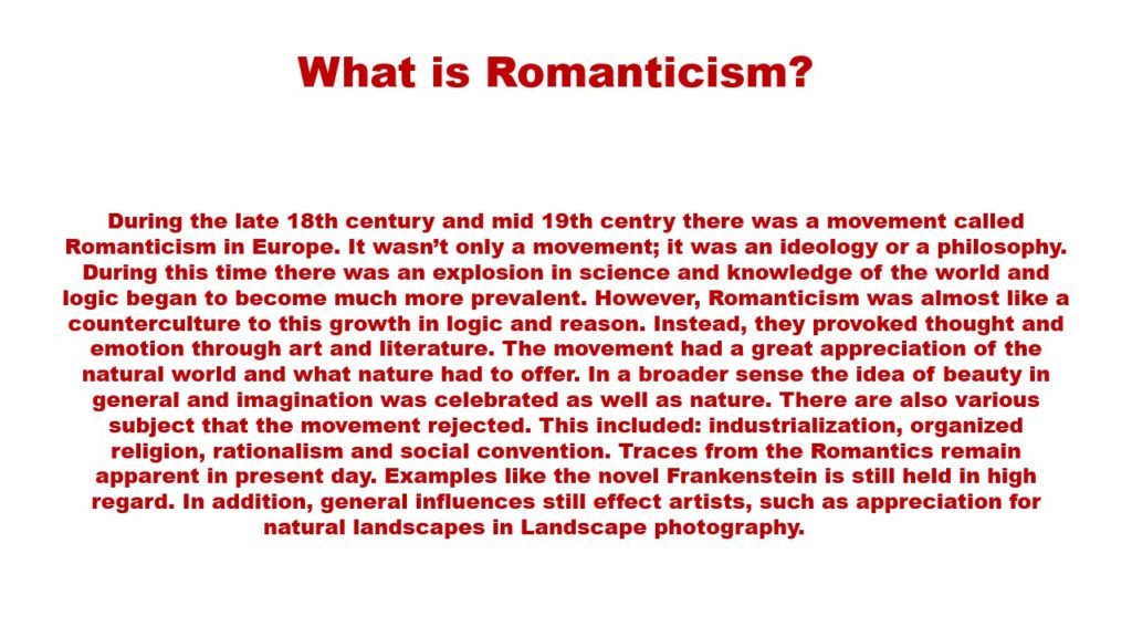
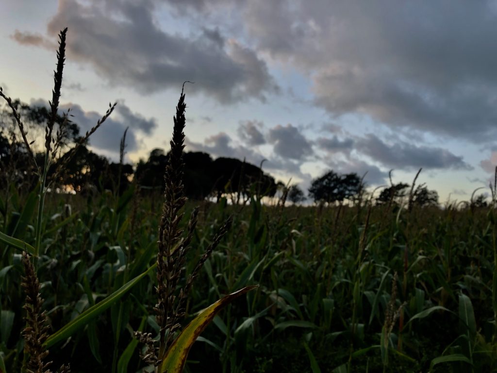
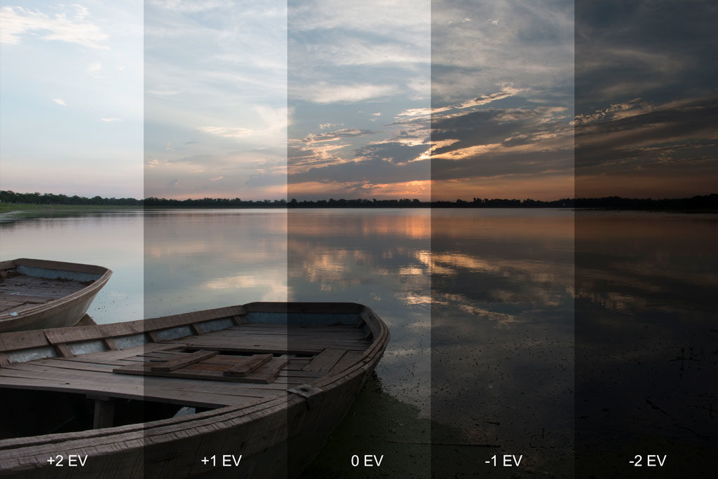
I took these photos before the sun went down to get the sun to shine through the trees and corn fields. I changed the exposure for some of the photos (exposure bracketing) to see how to the contrast/tonal values changed. I’ve selected my favourite images and decided which ones I won’t use.
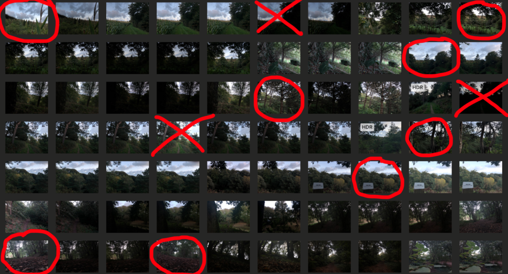

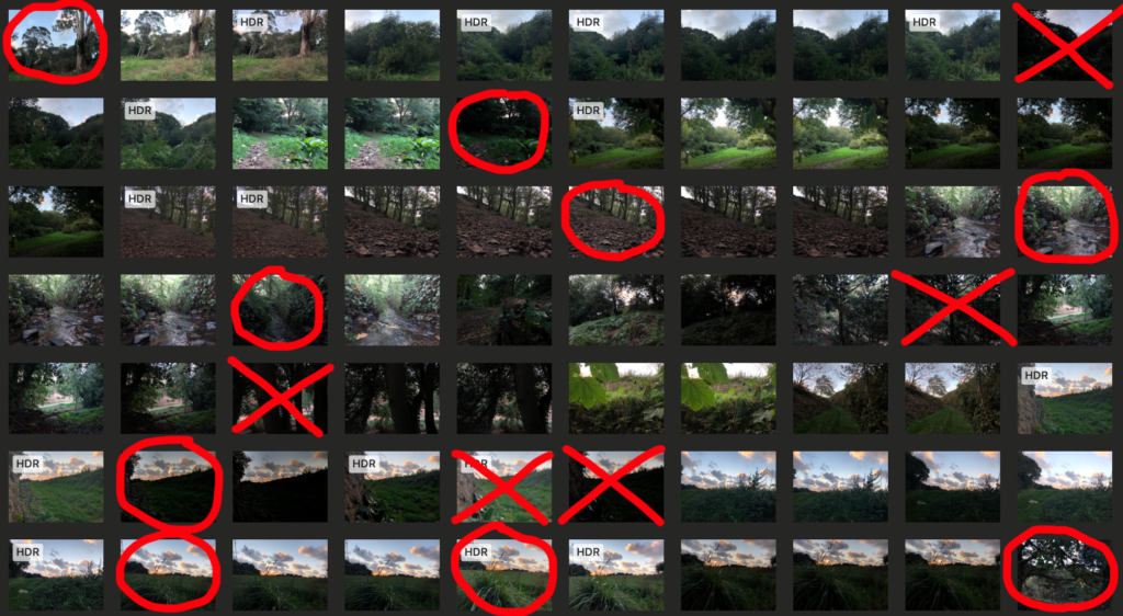
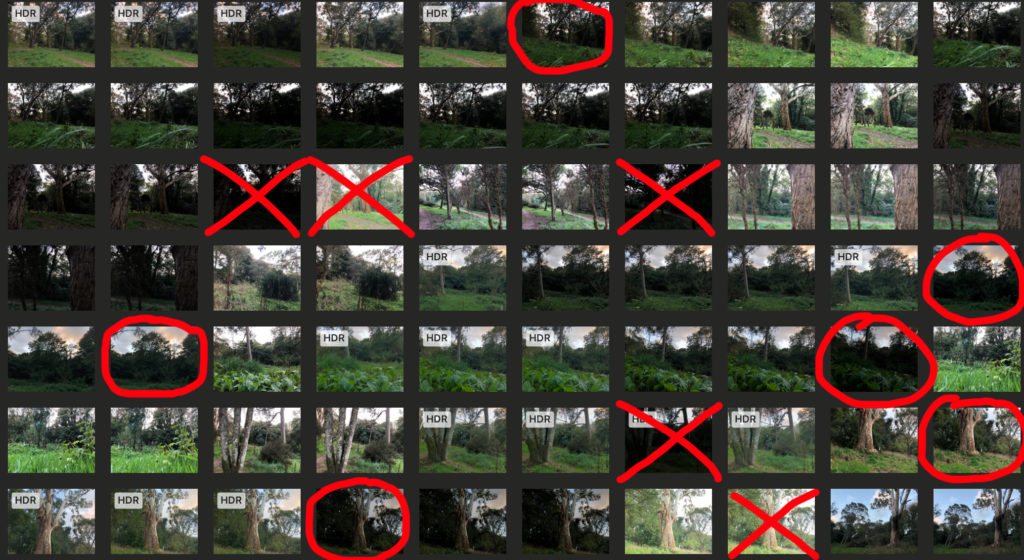
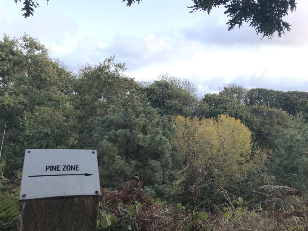
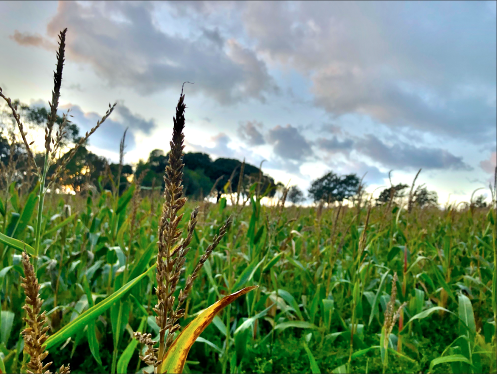
I picked these images because each of them are different from each other and have something unique about them whether it’s the angle they’ve been taken from, the lighting or the scenery/individual trees. Each photo has something that the eye is automatically drawn to and they each have a main focus. Some things to point out about the uniqueness of some of the photo are: the corn in the first photo is the main focus and the background is blurred due to this, in the second photo I took the photo from a atmospheric perspective, in the third photo I took the image from a linear perspective and in the fourth photo I attempted to use the Fibonacci curve.
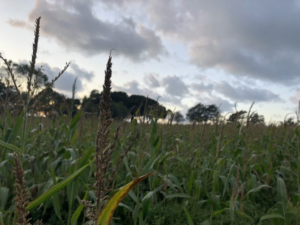
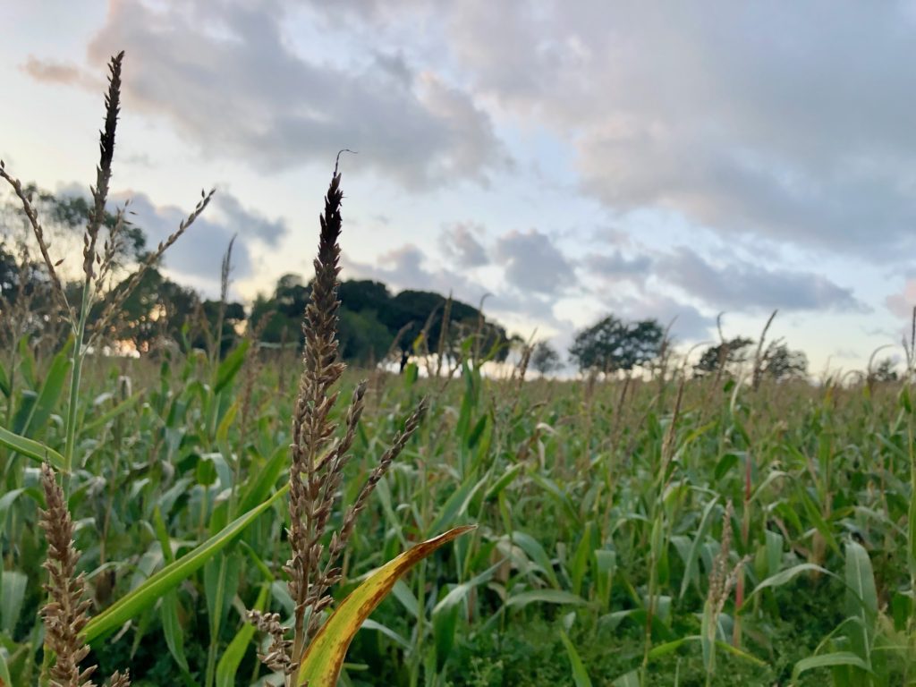


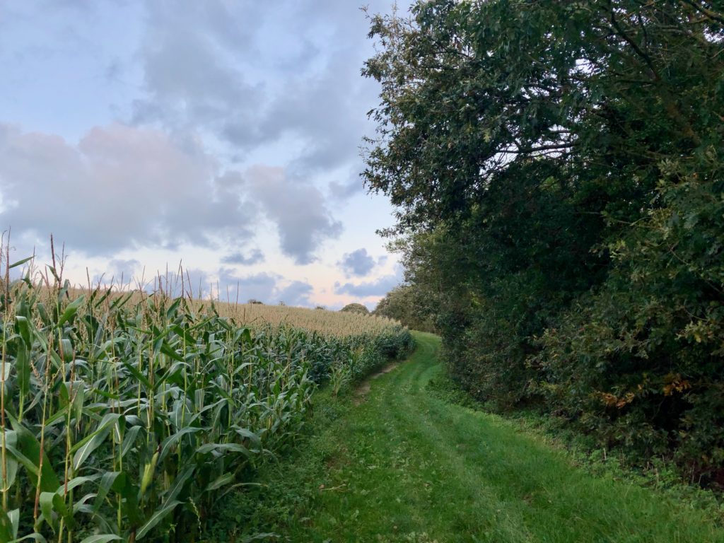
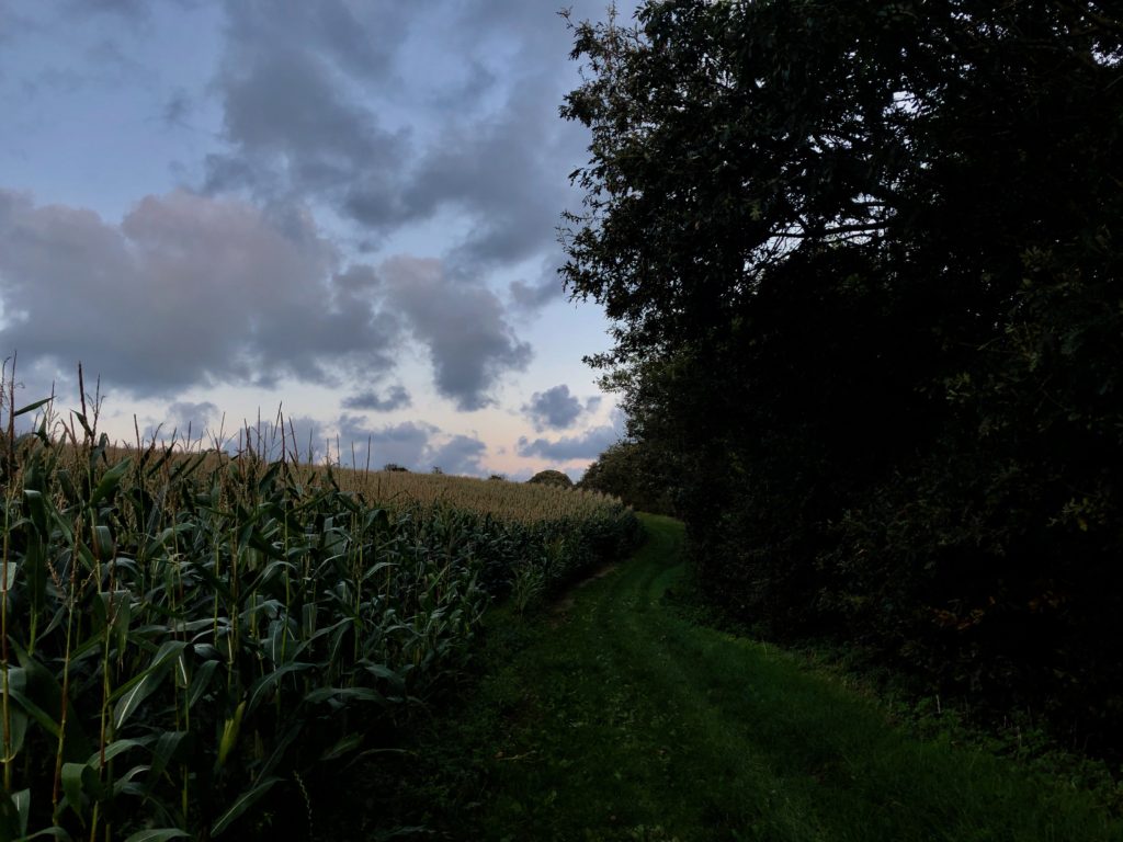

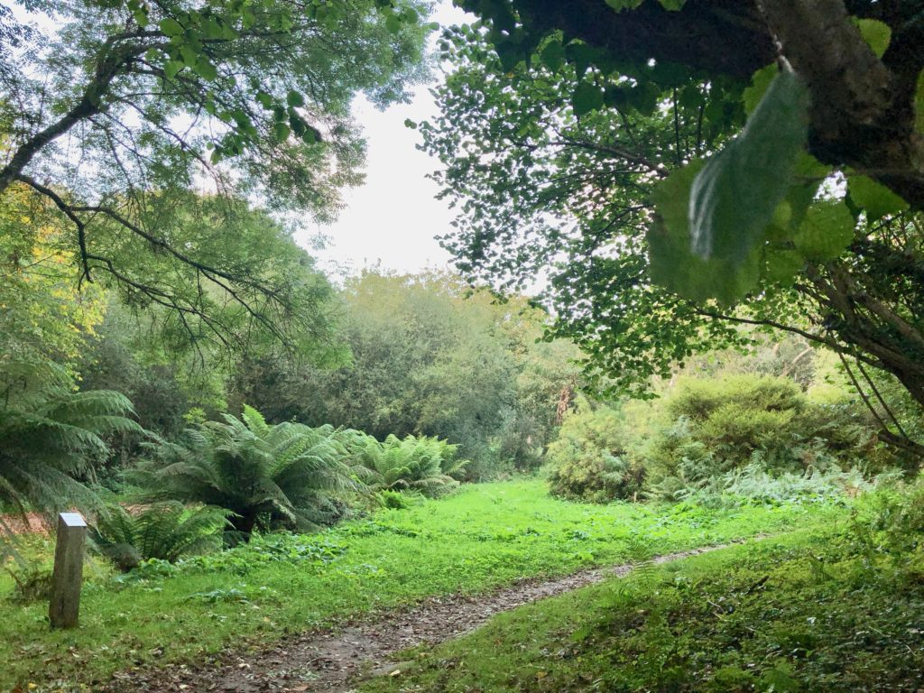
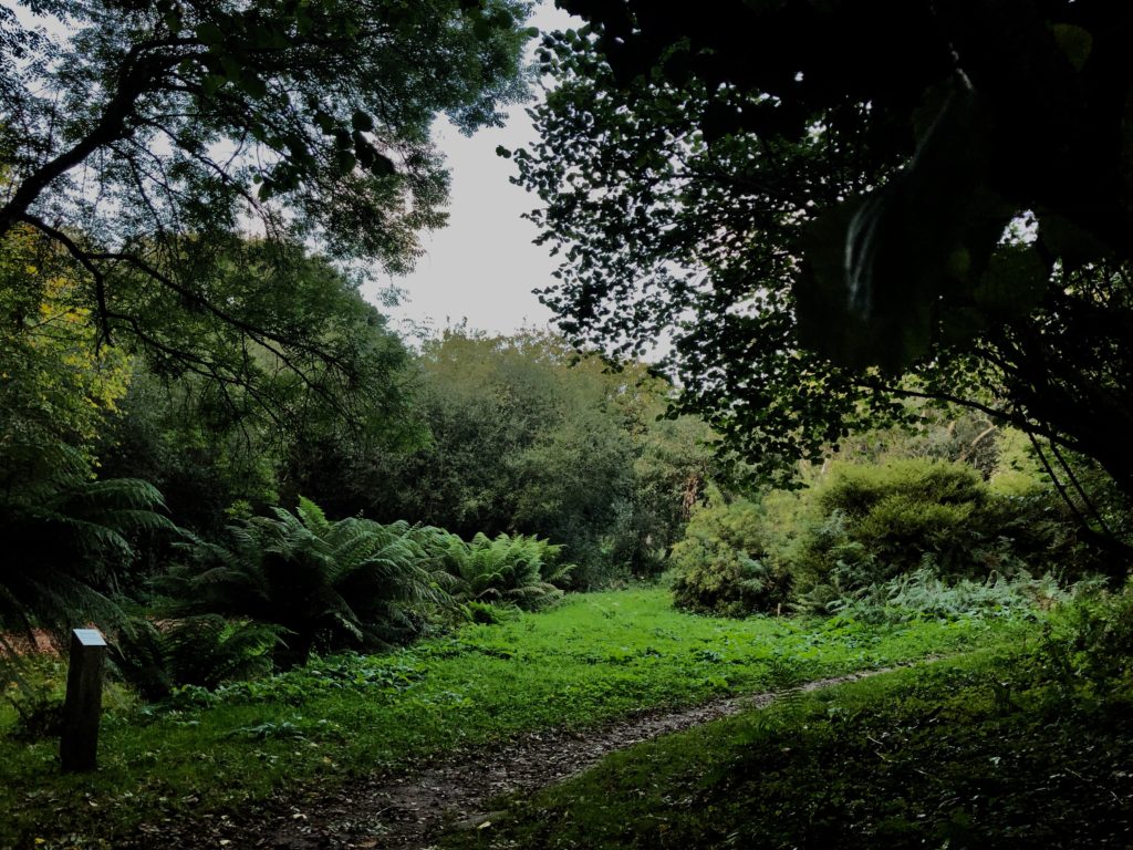
In this edit I used HDR toning to bring out the best colours and tones from high and low exposure and from the original photo. I like this photo because the depth of field is shallower than the rest of the photos.
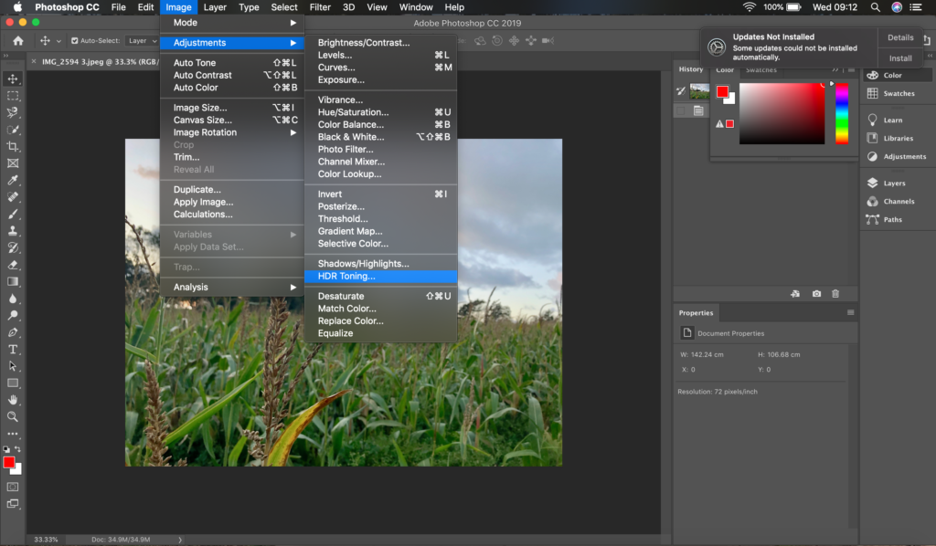

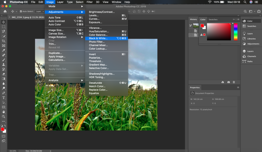
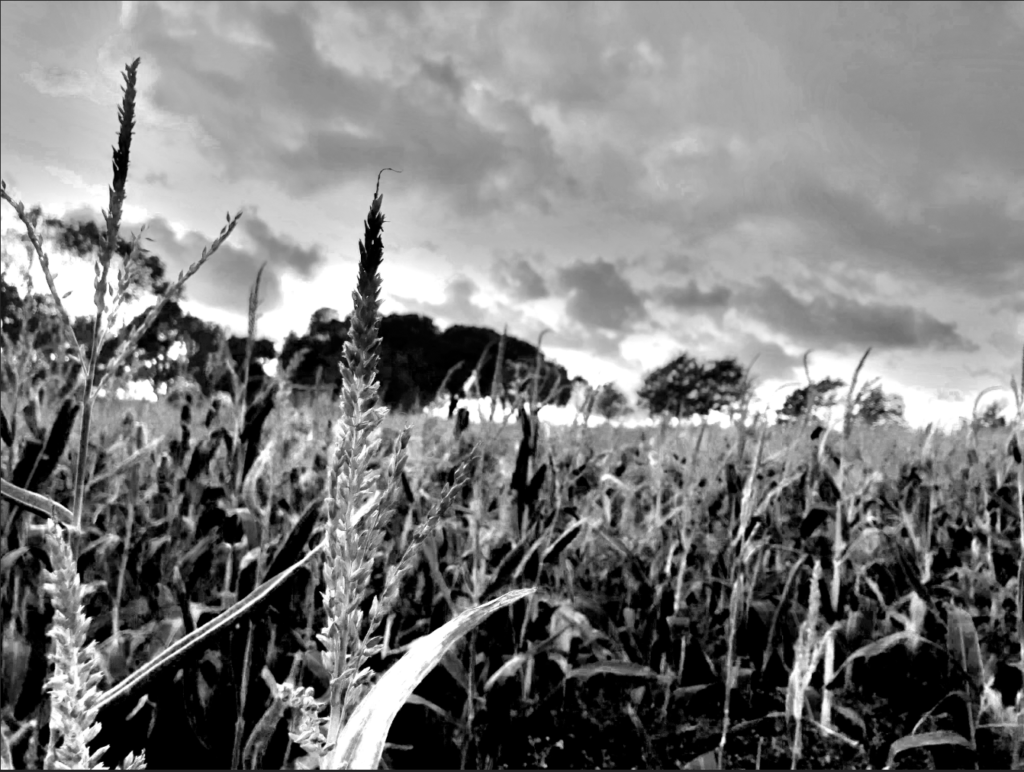
I adjusted the photo to black and white and I got inspiration to do this from Ansel Adams and I tried to get every shade in Adams’ zone system.

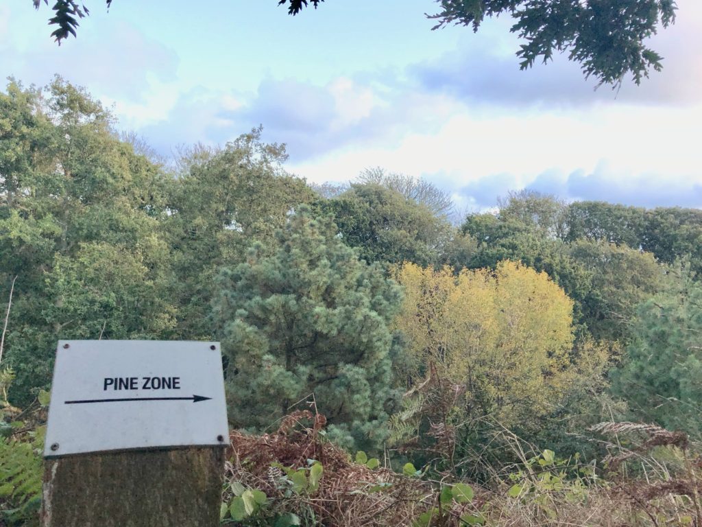
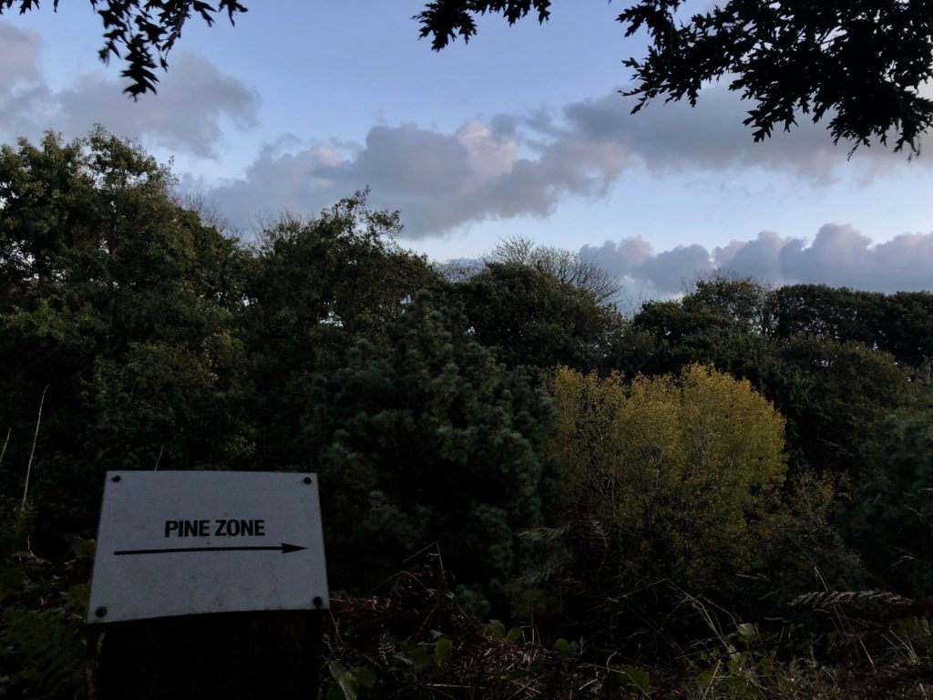
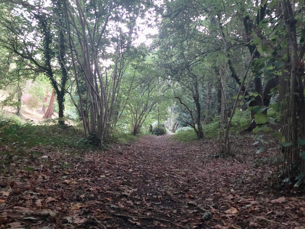
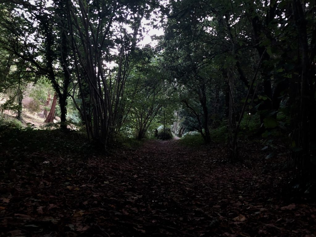
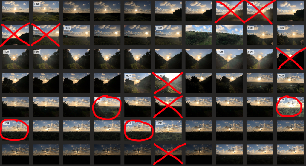
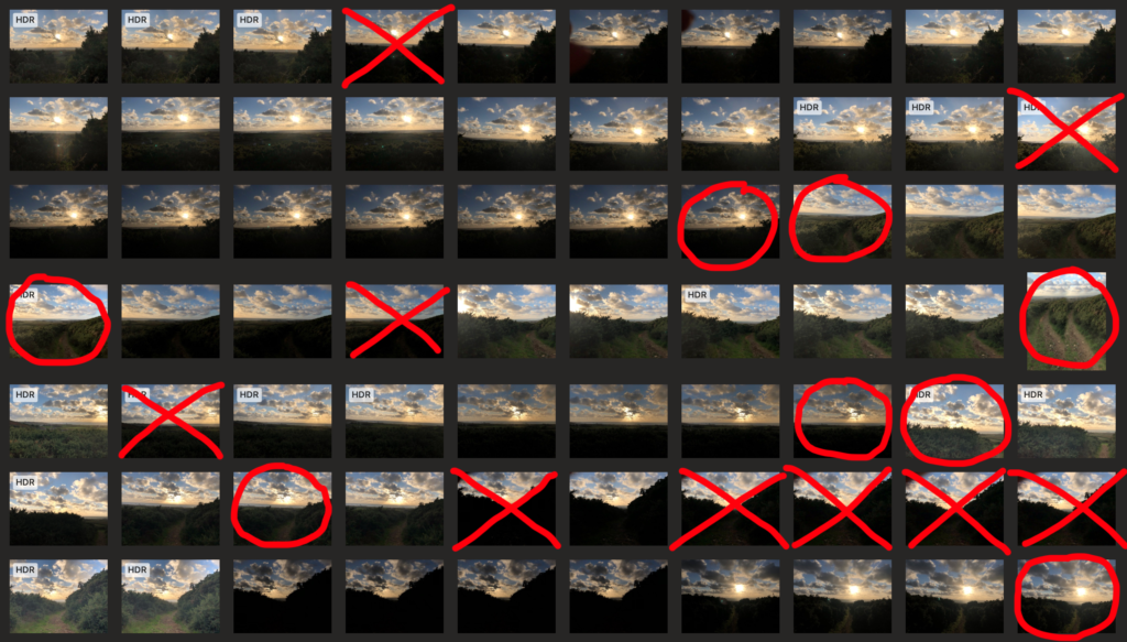
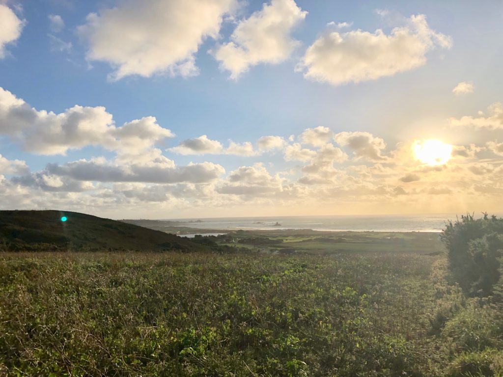
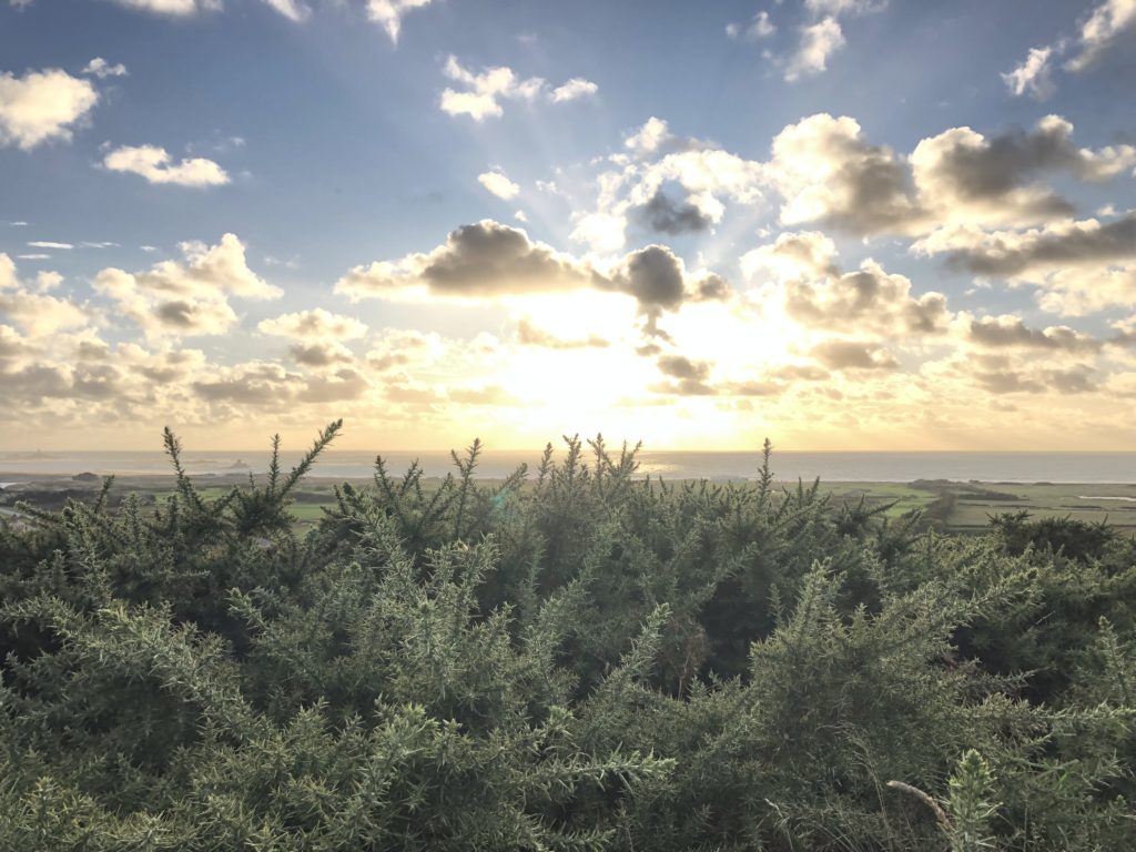
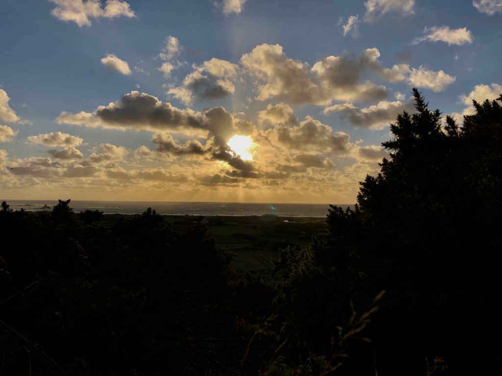
These photos were taken just before the sunset. I also changed the exposure on some of these images to get different contrasts. I’ve selected my favourite images and decided which ones I won’t use.

I picked these images because each of them are different from each other and have something unique about them whether it’s the angle they’ve been taken from, the lighting or the scenery/individual trees. Each photo has something that the eye is automatically drawn to and they each have a main focus. Some things to point out about the uniqueness of some of the photo are: the bramble leaves in the first photo are the main focus and that is exaggerated even more due to the natural lighting from the sun shining through them, in the second photo the bushes each side of the path make the photo more or less symmetric and the light from the sun contrasts nicely with the darker looking hedges.
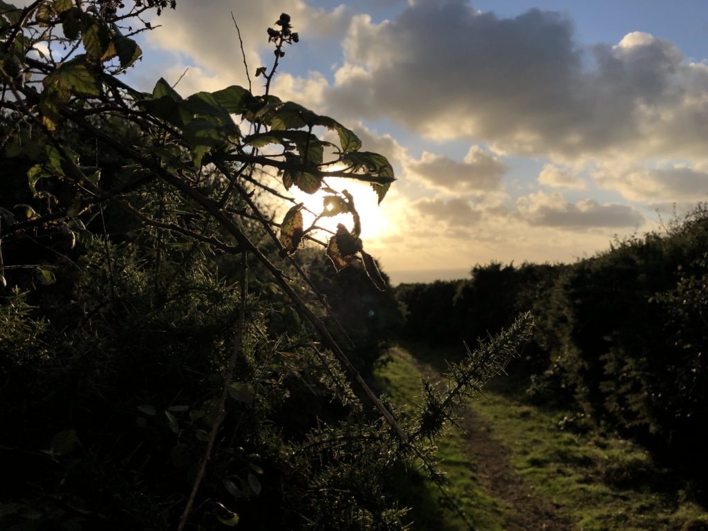


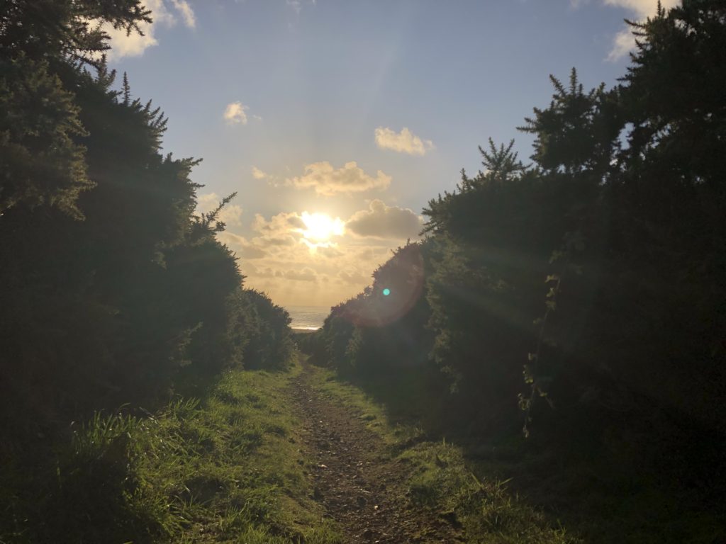
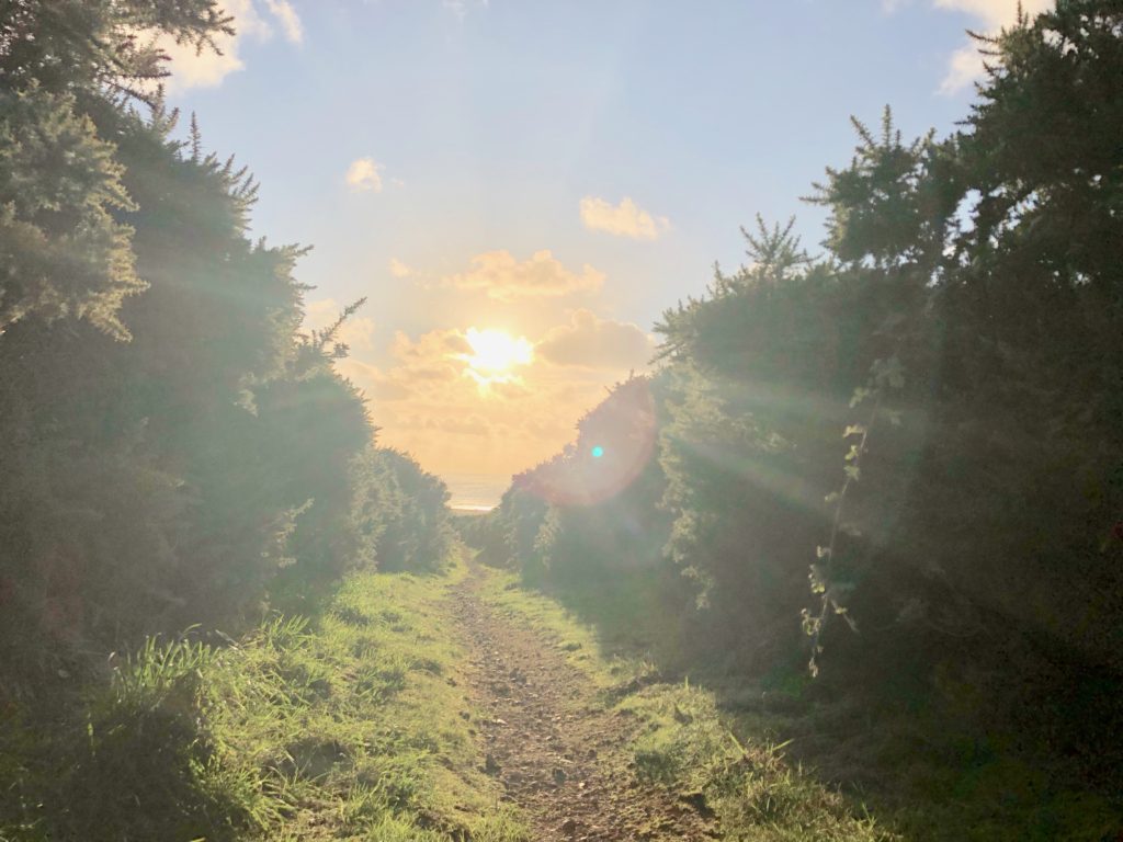
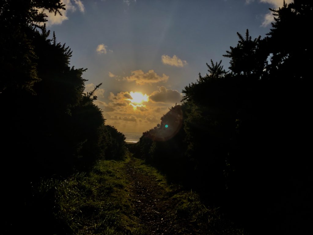


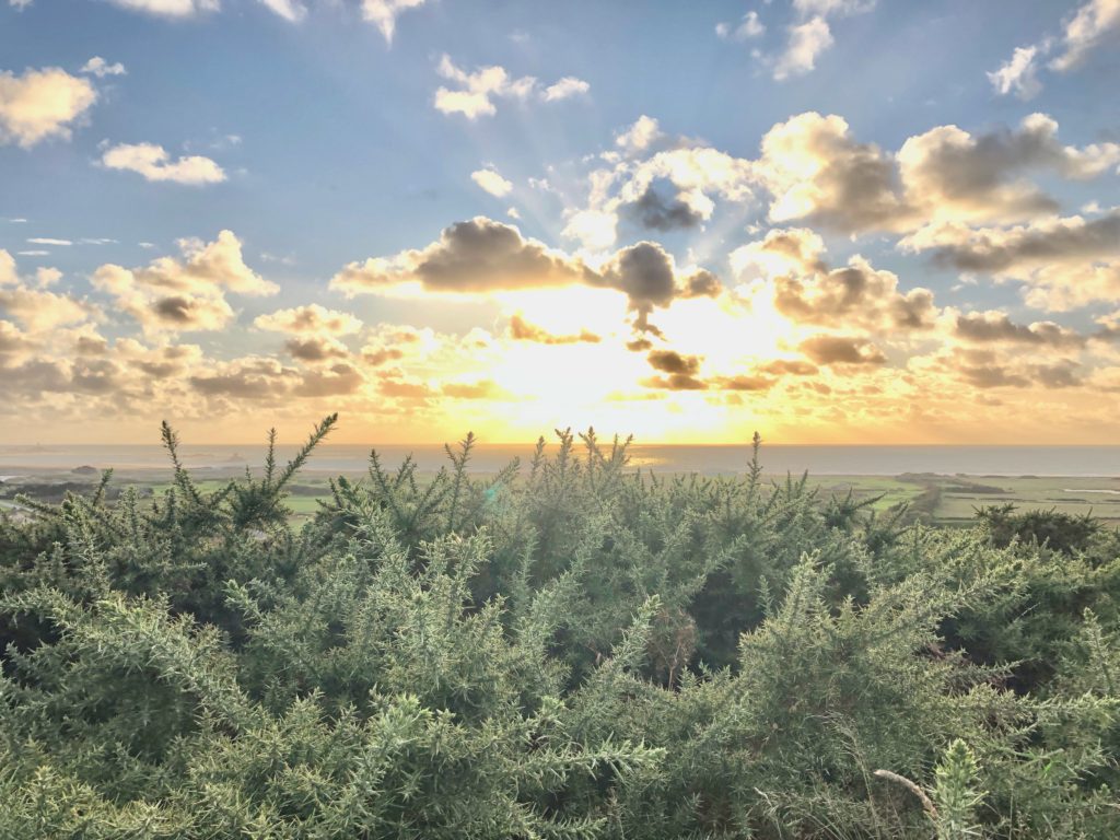
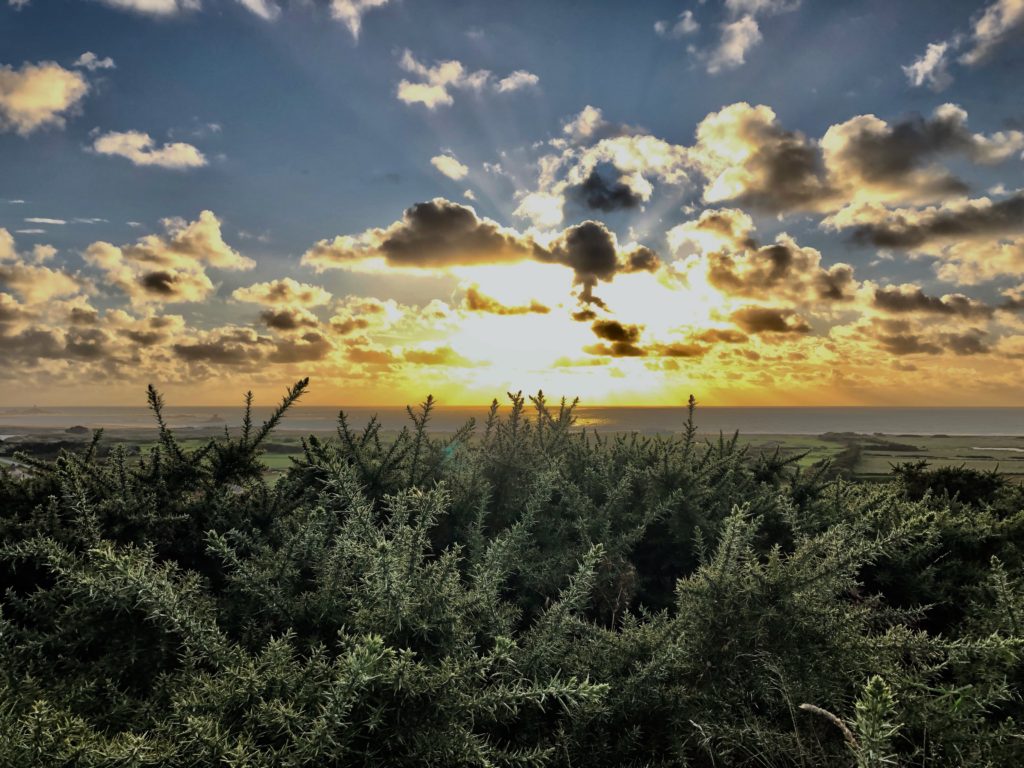

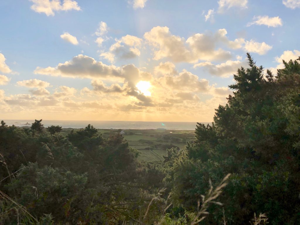
In this edit I used HDR toning to bring out the best colours and tones from high and low exposure and from the original photo.
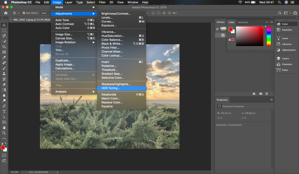


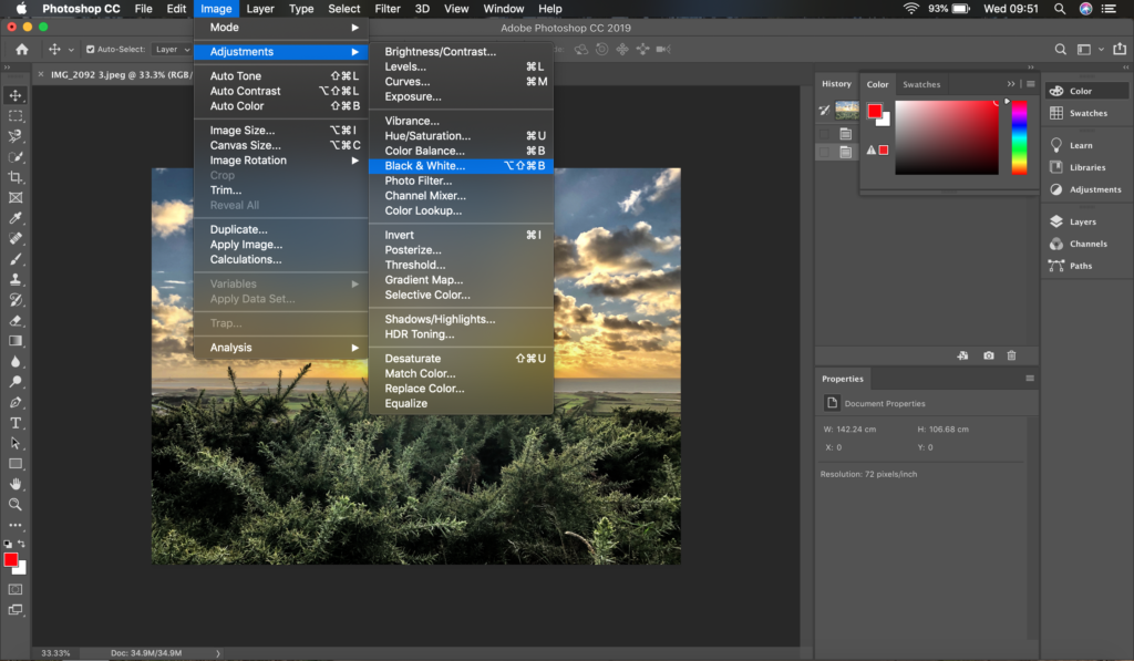
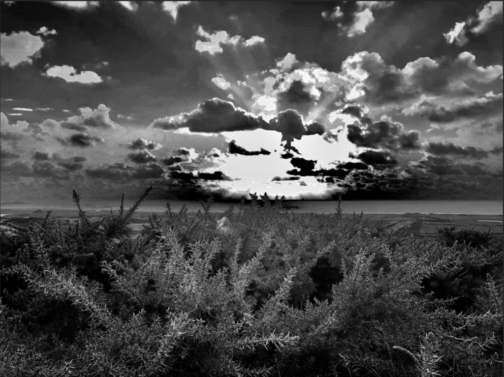
I adjusted the photo to black and white and I got inspiration to do this from Ansel Adams and I tried to get every shade in Adams’ zone system.

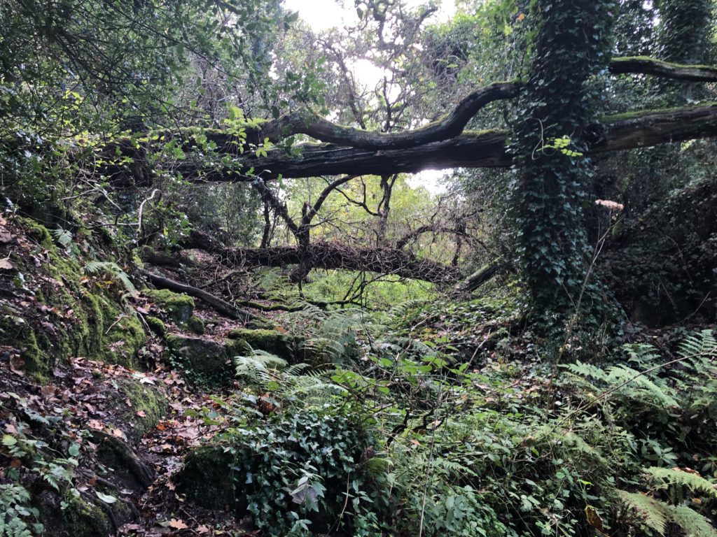
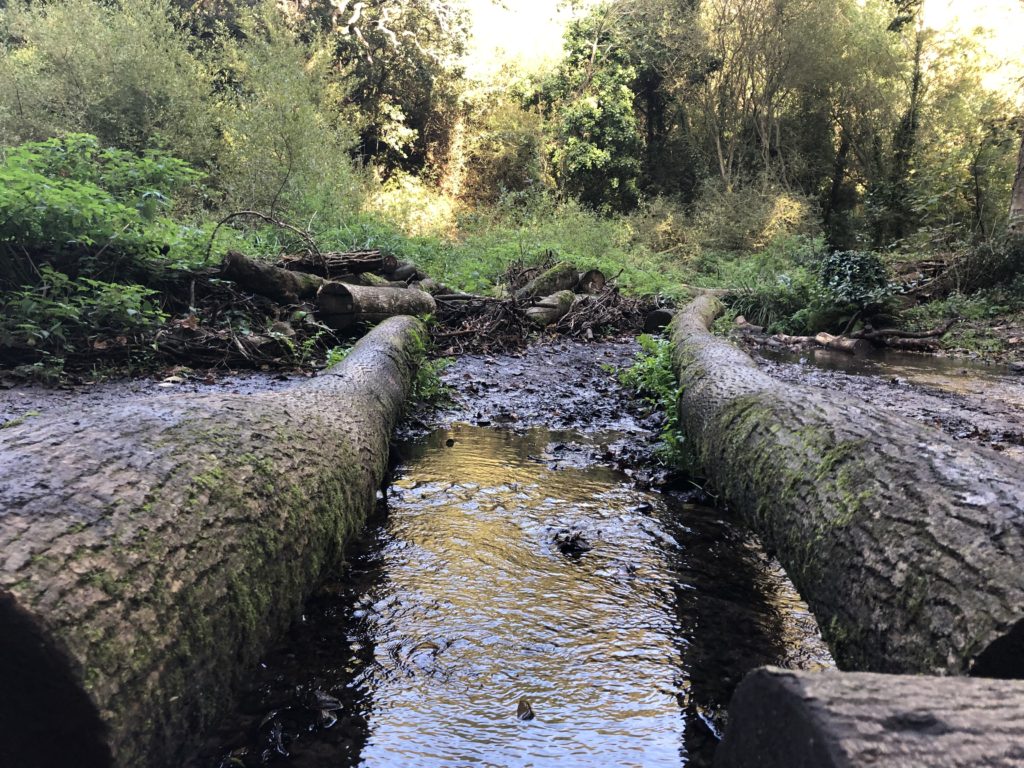
I took these photos at around midday and there weren’t any clouds over the trees so I managed to get some good images with the sun shining through the trees. I changed the exposure for some of the photos (exposure bracketing) to see how to the contrast/tonal values changed. I’ve selected my favourite images and decided which ones I won’t use.
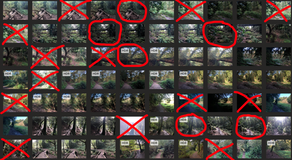
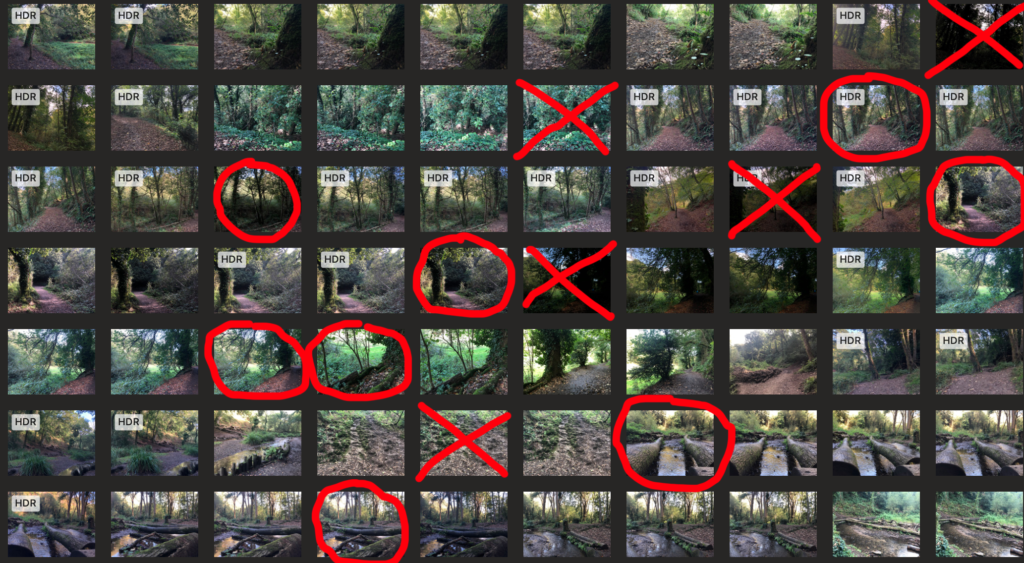
I picked these images because each of them are different from each other and have something unique about them whether it’s the angle they’ve been taken from, the lighting or the scenery/individual trees. Each photo has something that the eye is automatically drawn to and they each have a main focus. Some things to point out about the uniqueness of some of the photo are: that the first photo has two logs which are symmetric (rule of thirds) and the third photo has repetition of the the two balancing logs, both of them are taken from linear perspectives, as for the fourth photo, it’s taken from an atmospheric perspective.
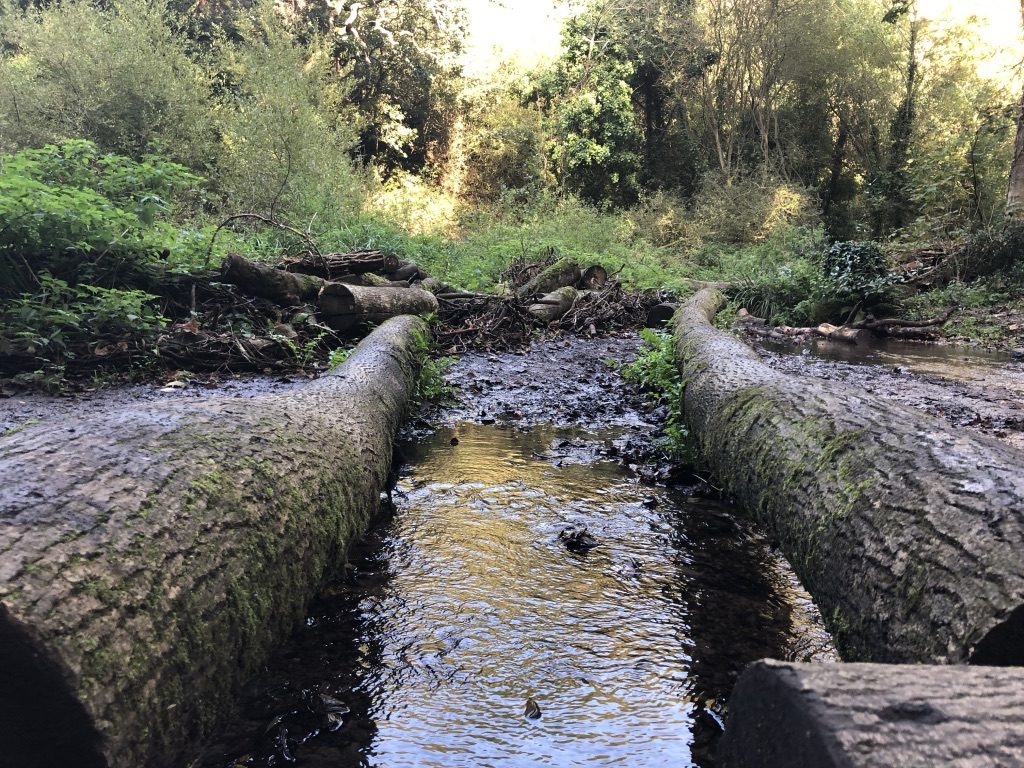
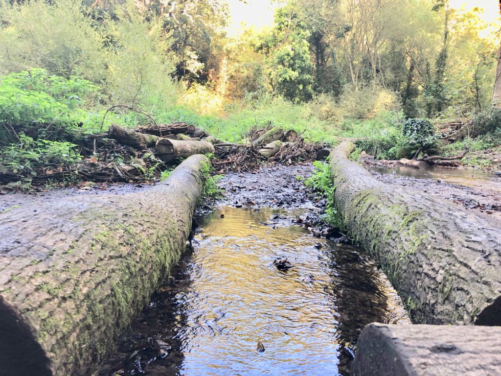
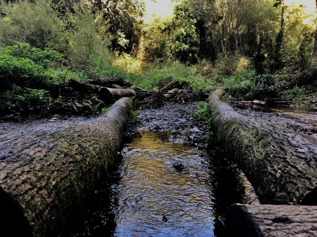
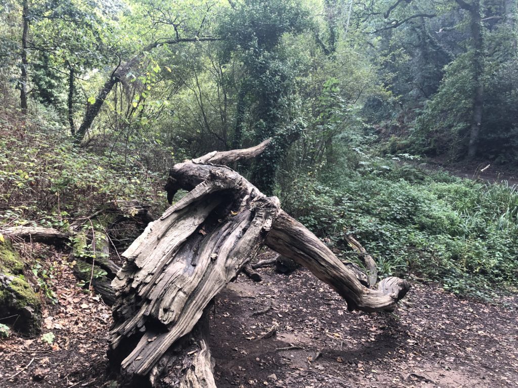
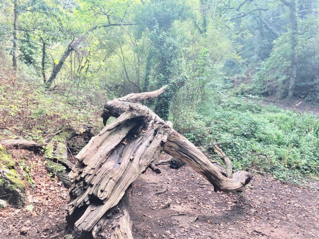
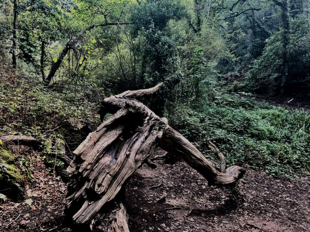

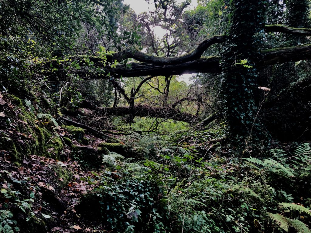
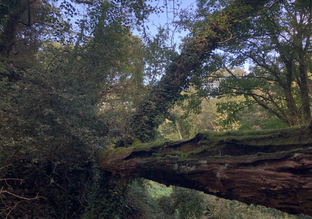
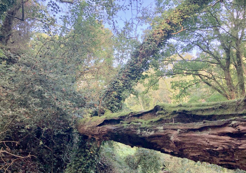
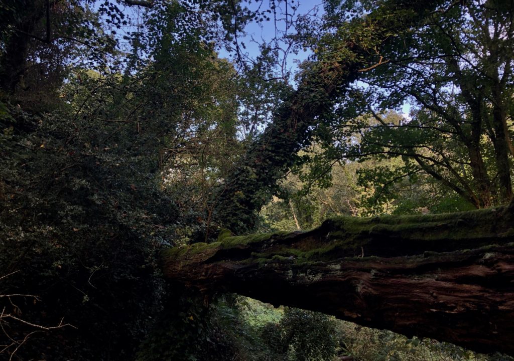
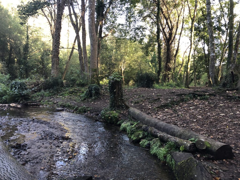
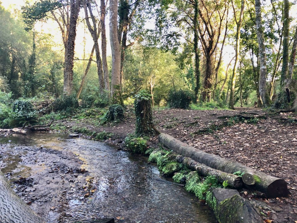

In this edit I used HDR toning to bring out the best colours and tones from high and low exposure and from the original photo.
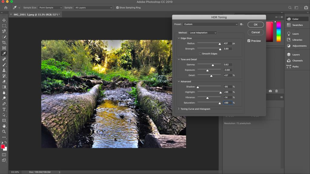

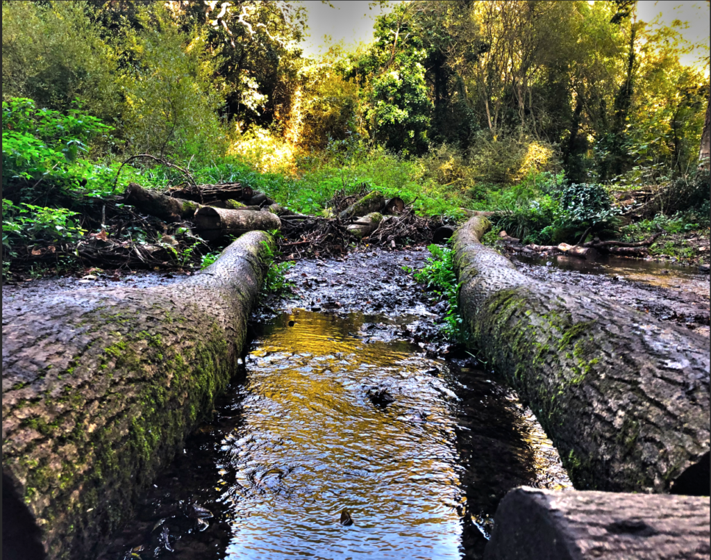
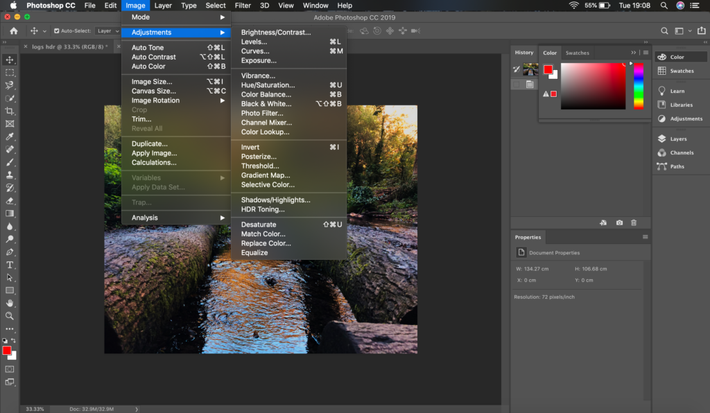
In this edit I sed my own adjustments to make the picture look more eye-catching and vibrant. I also enhanced the warmer tones in the photo, lowered the light intensity slightly and sharpened the image to show the textures of the bark better and to show the movement of the waters surface more clearly.

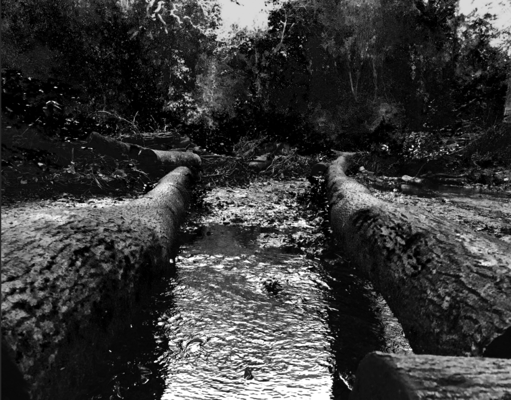
I adjusted the photo to black and white and I got inspiration to do this from Ansel Adams and I tried to get every shade in Adams’ zone system.


Who
I won’t be taking photos of anyone in this project as it is about taking photos of natural landscapes with no man made structures and preferably no people either.
What
I will be taking photos of woodlands/fields/beaches/cliffs, some of the photos will have a main focus, others won’t. I will also be changing the exposure on the camera to get a variety of tones, highlights and shadows. I will also attempt to focus on one particular part of the image (shallower depth of field) e.g. flowers in the foreground, then having the landscape showing e.g. trees, as the background.
When
Throughout the next two weeks, I will try and take photos of natural landscapes where the sun is rising or setting, I will most likely take photos of the sunset in St.Ouens because that’s where the sun sets. I will try and get some photos at night of the moon reflecting off the sea. As well as this, I will try to take some images at midday in the woods to get streaks of light shining through the trees.
Where
St.Ouens, St.Cathrines woods and St.Peters valley. I will take the photos from high points and lower points to get variety.
Why
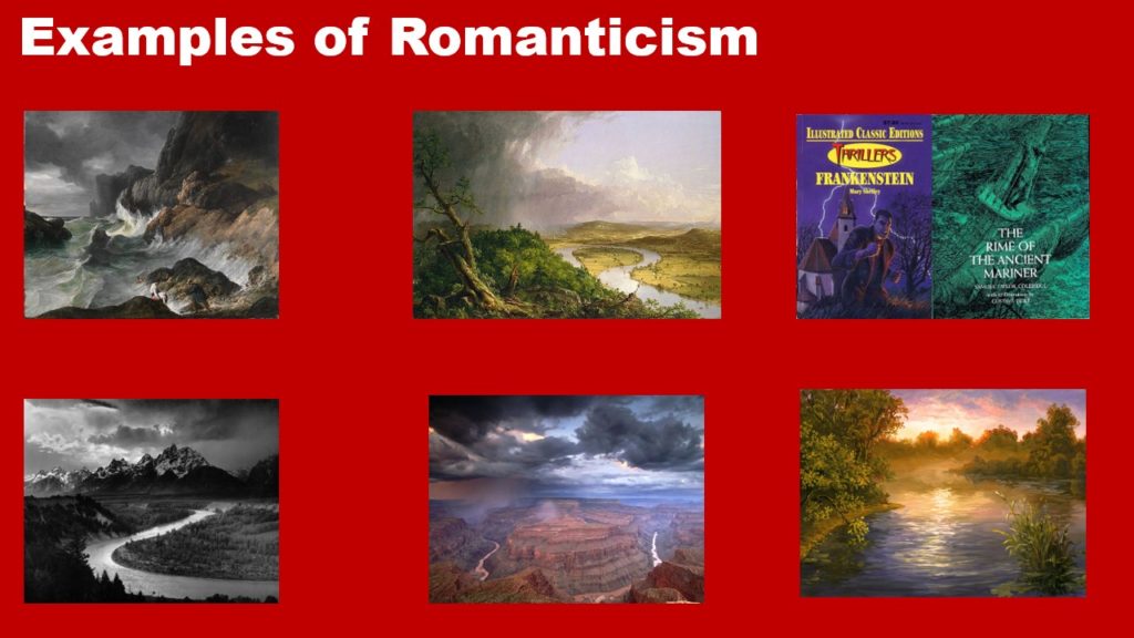
I will be taking photos of different landscapes at different times to get a variety of different photos. Photos taken at sunset will have warmer tones compared to a night time shoot with colder tones. I will also be trying to capture images and make them relate to the theme of Romanticism.
How
I will use a tripod and steady structures to take images at a balanced and steady position. I will also use the rule of thirds to line everything up right for some of my photos. I will change the exposure bracket to get more variety in my images and so I am able to make HDR images.
‘New Topographics’ was a term created by William Jenkins in 1975 to describe a group of American photographers (such as Robert Adams and Lewis Baltz) whose pictures had a similar banal (ordinary) aesthetic. They were formal and mostly black and white prints of the urban landscape. Parking lots, suburban housing and warehouses were a main focus for many of these photographs.
The group consisted of 8 young, american photographers that Jenkins chose- Robert Adams, Lewis Baltz, Joe Deal, Frank Gohlke, Nicholas Nixon, John Schott, Stephen Shore, and Henry Wessel, Jr. He also included the German couple Bernd and Hilla Becher.
The New Topographics responded to man’s impact on the land by casting a somewhat ironic or critical view on what American society had become. Each of them had presented urban and/or suburban landscapes that were under expansion, gentrification or other changes.
They all discovered a sense of beauty within the ordinary ugliness of functional land use- a banal aesthetic.

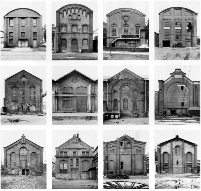
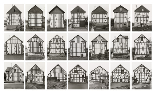
Bernd and Hilla Becher stood out from the New Topographics group, creating series of images called Typologies. A photographic typology is a study of “types”. It’s a photographic group that collects certain types of photographs rather than creating stand-alone images. It’s a powerful method of photography that can be used to reshape the way viewers perceive the world around them.
The Becher’s mainly photographed derelict and abandoned buildings, mostly in Bernd’s childhood town which was to be a victim of devastation. They took images of this area to preserve memories and the urban beauty of the town.


Technical
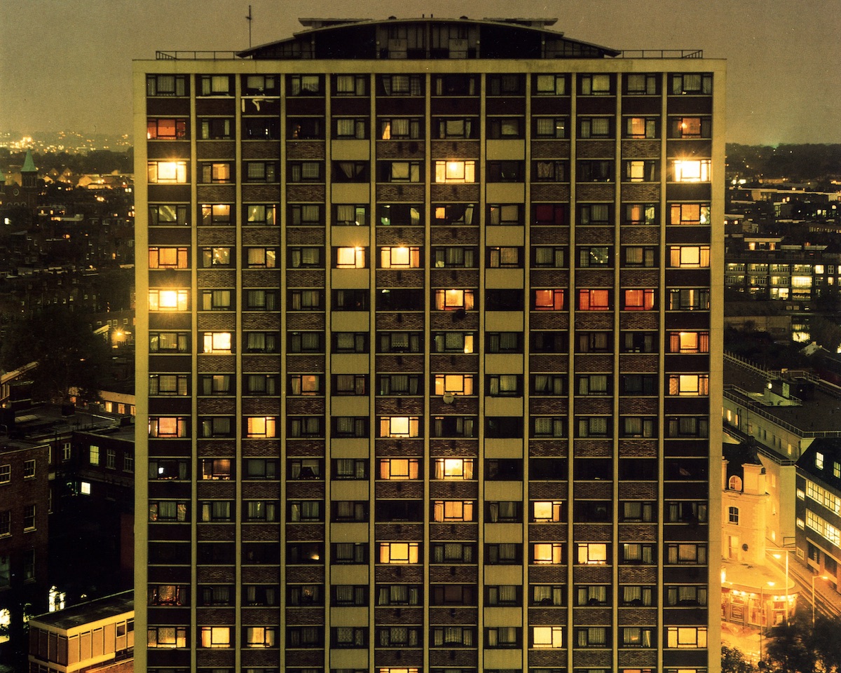
This, along with the majority of Luxemburg’s work, was taken at night, with only urban light illuminating the scene. The image has a warm, yellowish toned wash over it, with glares and intense yellow light coming from windows on the building and street lights. The camera focus is on the building structure, which is photographed head on, and the rest of the landscape appears grainy.
Visual
This image was taken from a height level with the building in the center of the image, which visually is the most striking aspect. This angle can make the building appear o be 2D as you can see no depth or sides of the building. The windows create a form of repetition, and they are structured in perfect rows showing a pattern, however it is interrupted by the different levels of light given off by each window. It is arranged to highlight the building in the foreground, however with the 2D aspect and colour over wash of the whole image, the structure can be seen to blend in with the background.
Contextual
Rut Blees Luxembourg moved from Germany to London in the 1990s to study at the London College of Printing. She was interested in urban areas of London city, capturing each area or the city with its realistic state, and its layered building structures. Luxembourg was known for taking images at night, often with edited green and yellow tones.
Conseptual
This image shows the replicated alignment of the urban building, which is pleasing to the eye. The idea could be that although industrial areas can look similar, they all have unique aspects and things that don’t fall into an organised pattern, and that urban areas look how they do with the impact of the people that live there – with the people living in the building choosing to have the lights on or of, which affect the lighting ad look of the image
