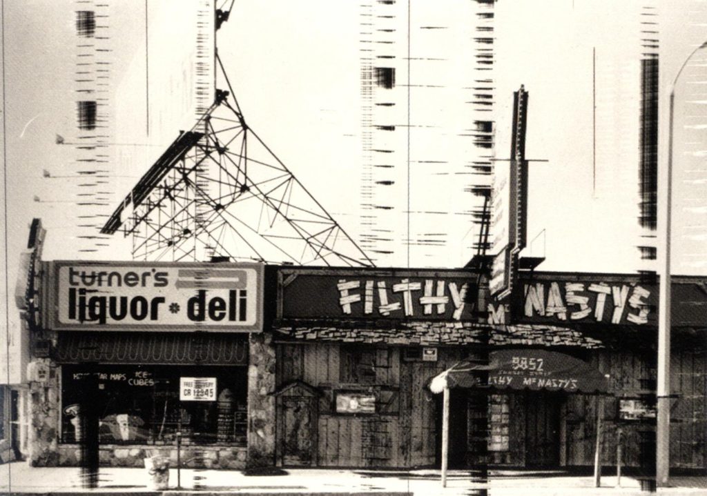
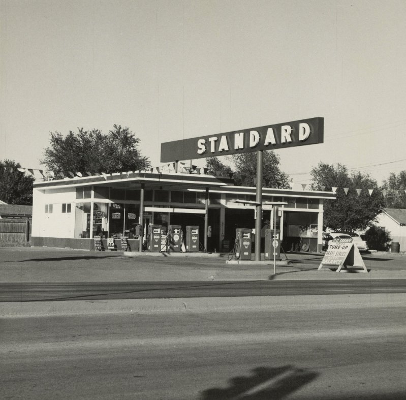
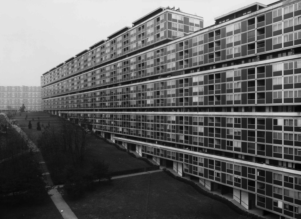
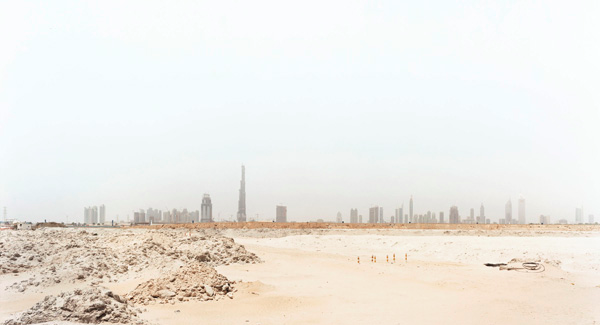
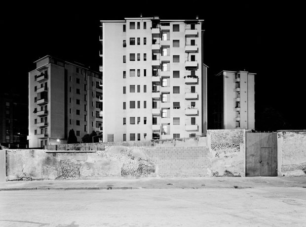
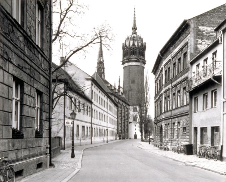
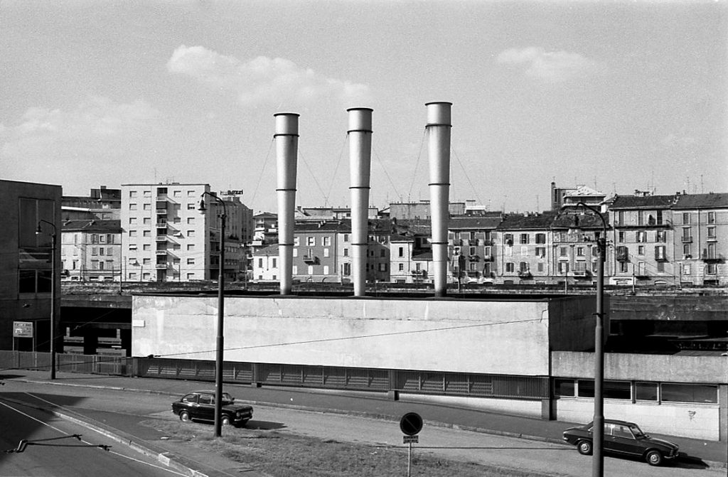
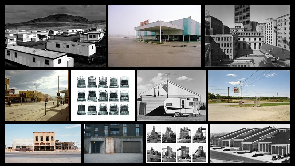
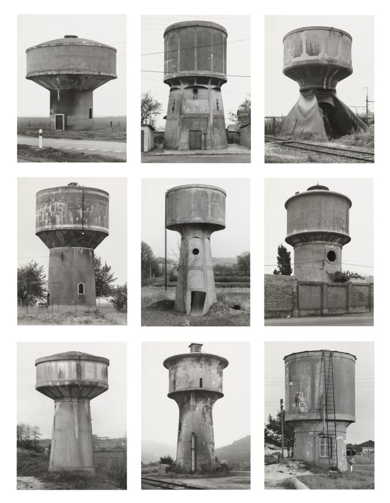
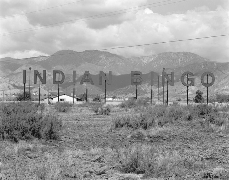
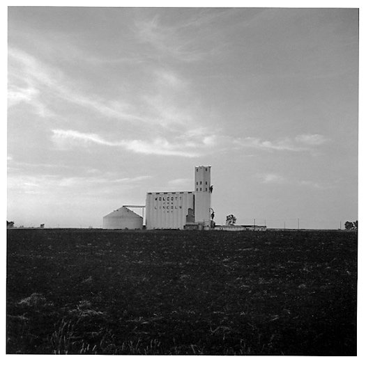
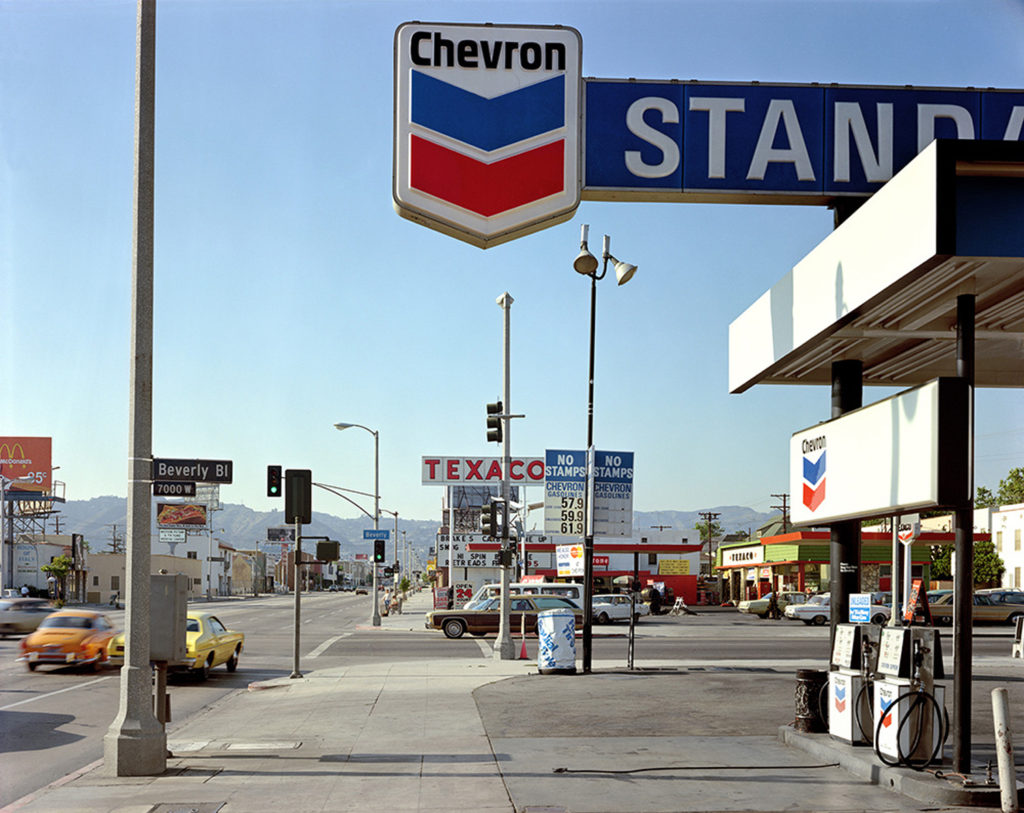
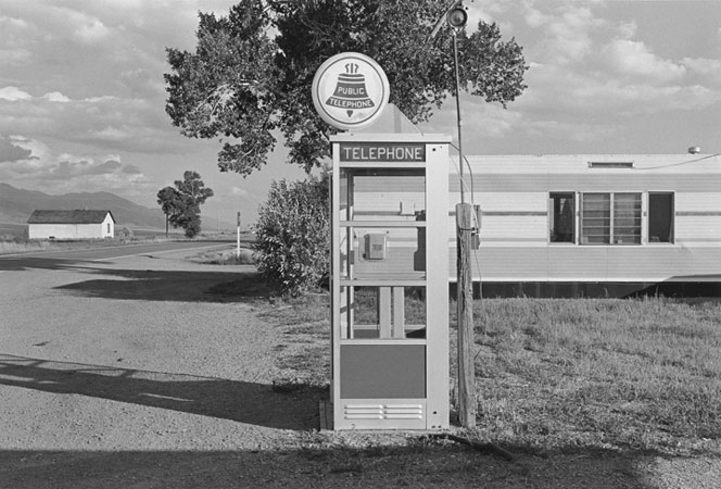
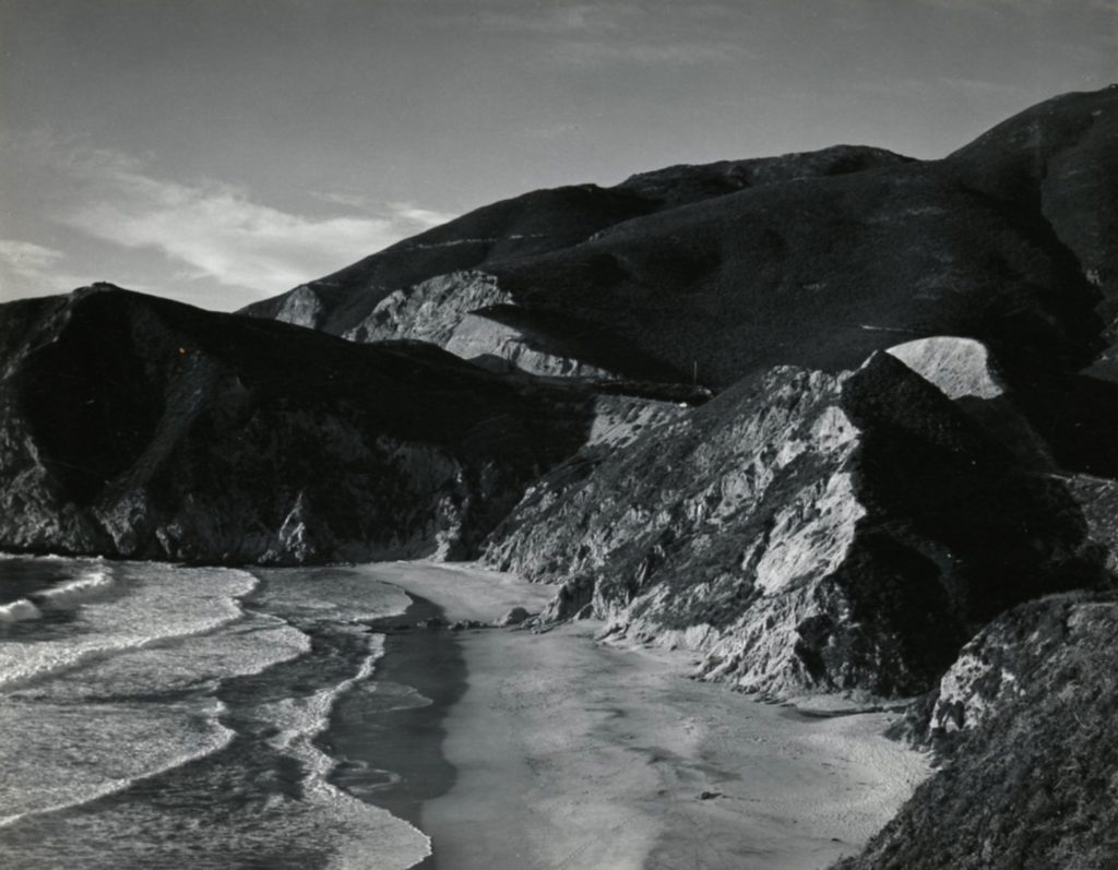
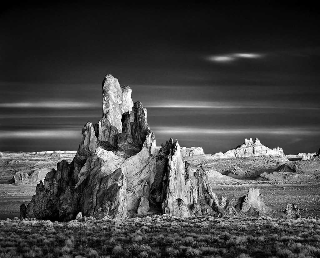
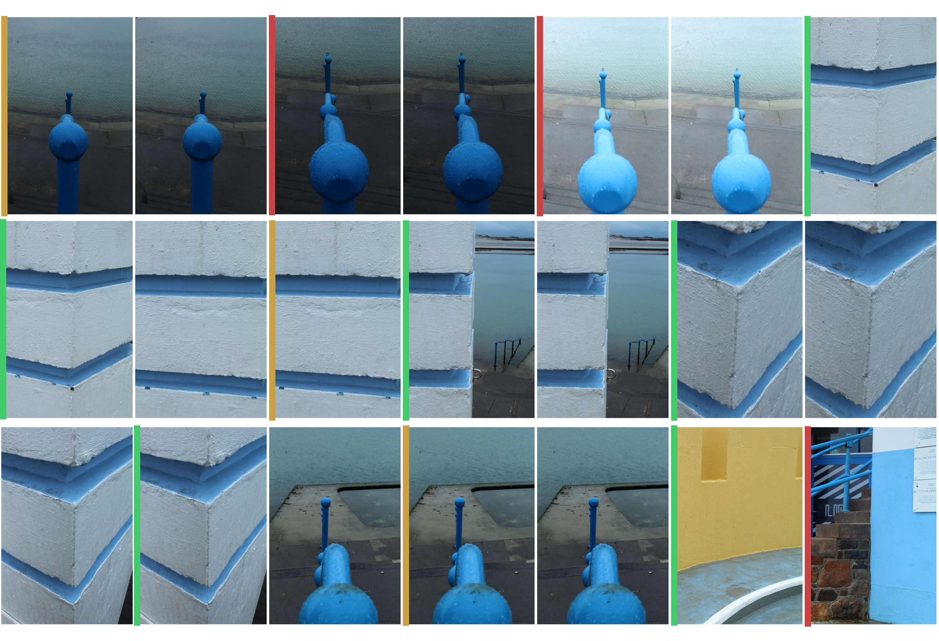
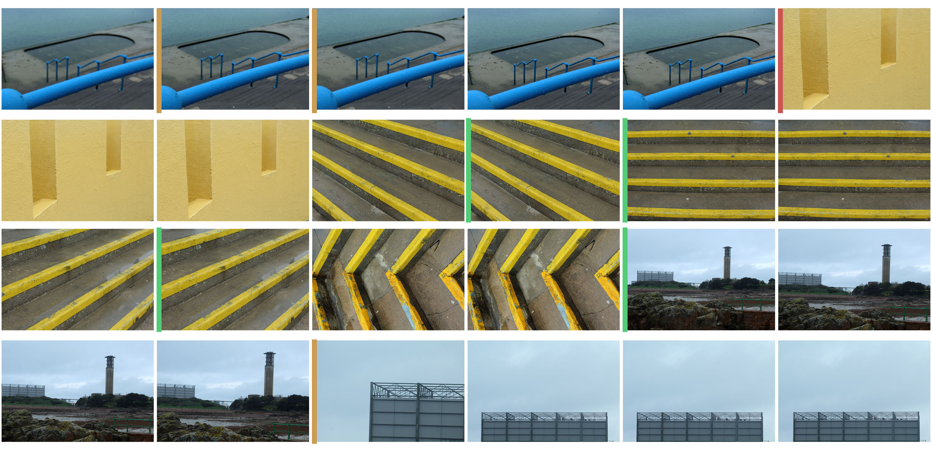
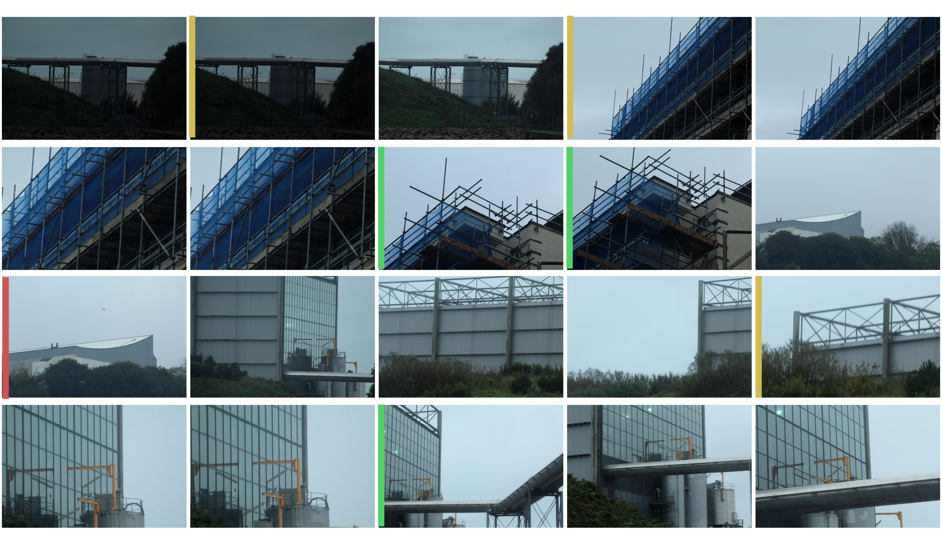
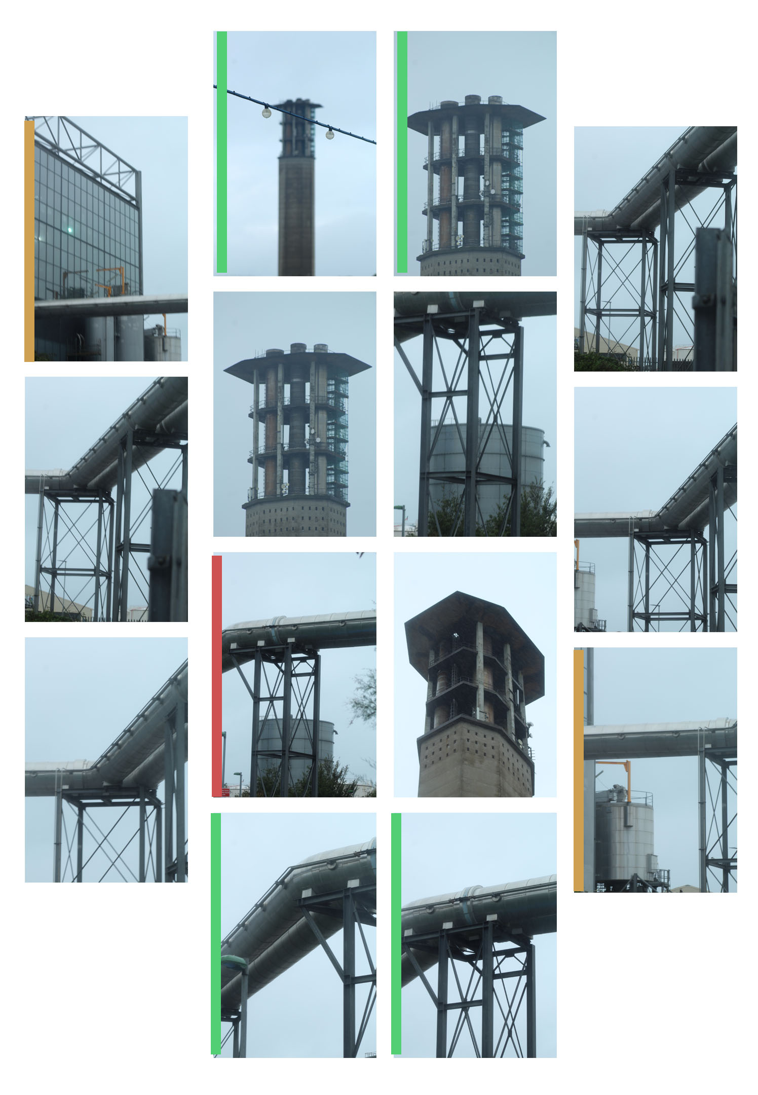
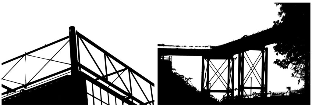
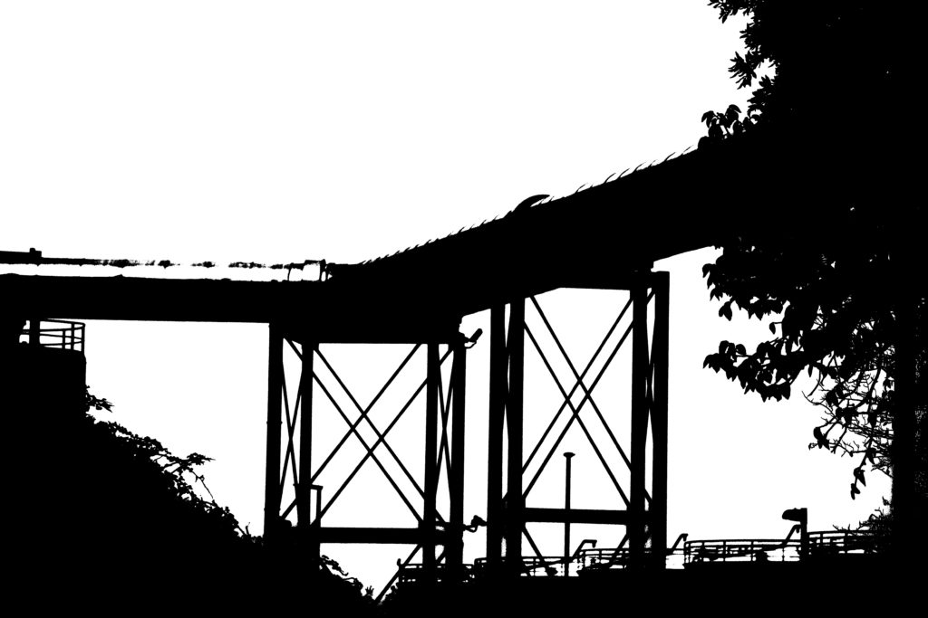
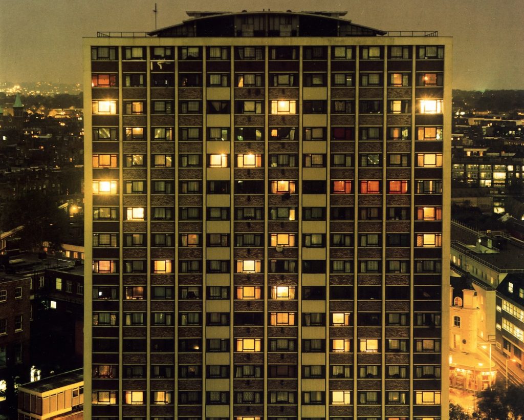
MOOD BOARD – URBAN LANDSCAPES

Photographers I like:

  • Gabriel Basilico
  • Sze Tsung-Leong
  • Thomas Struth
  • Ed Ruscha
  • Rut Blees Luxemburg

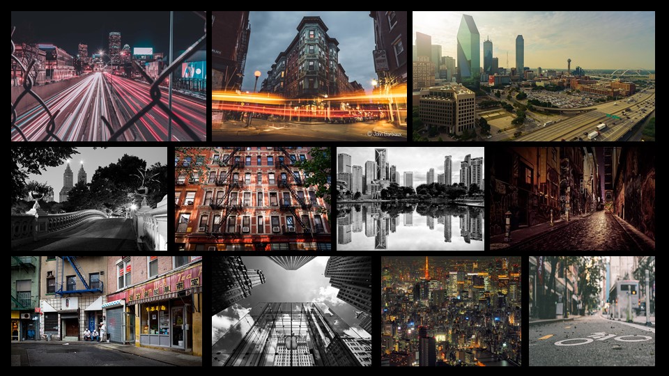
I enjoy of these photos, as I like the way they are taken, in the sense that they are very observational and more for documentation, and not very creatively taken. In the sense that they were taken for documenting than being taken for being aesthetically pleasing.

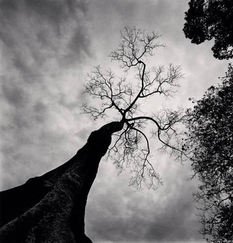
ANALYsING one of Micheal Kenna’s photographs

Visual: This image seems to be 3D due to the dimensions of the image and the position of the camera as the tree trunk is closer to us than the tree branches and leaves. The eye is drawn from the tree bark all the way up to its branches and leaves. Although there is a lot of negative space due to the sky, I actually quite like it due to the texture of the clouds and the contrast as the the clouds have quite a high sensitivity compared to the rest of the image.

Conceptual: I think that the main idea behind this image is again the power and graciousness of the tree and nature in general. Due to the cameras angle it looks like we have to look up to the tree which shows that we should respect nature and treat it well.

Technical: The lighting used in this image is natural lighting, this is shown due to the different coloring of the clouds. Here is the image was taken from a low angle close to the ground however the camera was pointing up towards the tree, this makes the tree look large powerful and intense, showing the power of nature and how it is stronger than humans. Tonal range is clearly shown here through the under exposure and the sharp contrasts of the highlights in the clouds and the shadows in the trees and leaves giving the tree a menacing look. Here the focal point seems to be on the tree, especially the tree bark as that is the sharpest point of the image. There is a low ISO which is shown through the sharpness of the image and the fine grain. Due to the Black and white filter, the colours are only present in the form of black, white and grey this adds to the tonal range as the contrast between these colours are more evident.

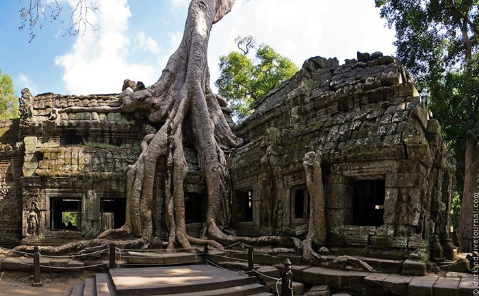
Image result for Ta Prohm Tree

Contextual: This is called the Ta Prohm Tree in Cambodia, it is a well known tourist attraction in Cambodia due to its roots growing on top of the Ta Prohm temple which was built in the late 12th / early 13th century; however it is interesting that instead of focusing on the temple and the tree roots, he decided to focus on the tree itself. Kenna took this image in 2018 on his trip to Cambodia.

THE NEW TOPOGRAPHICS

who and what do THE NEW TOPOGRAPHICS do?

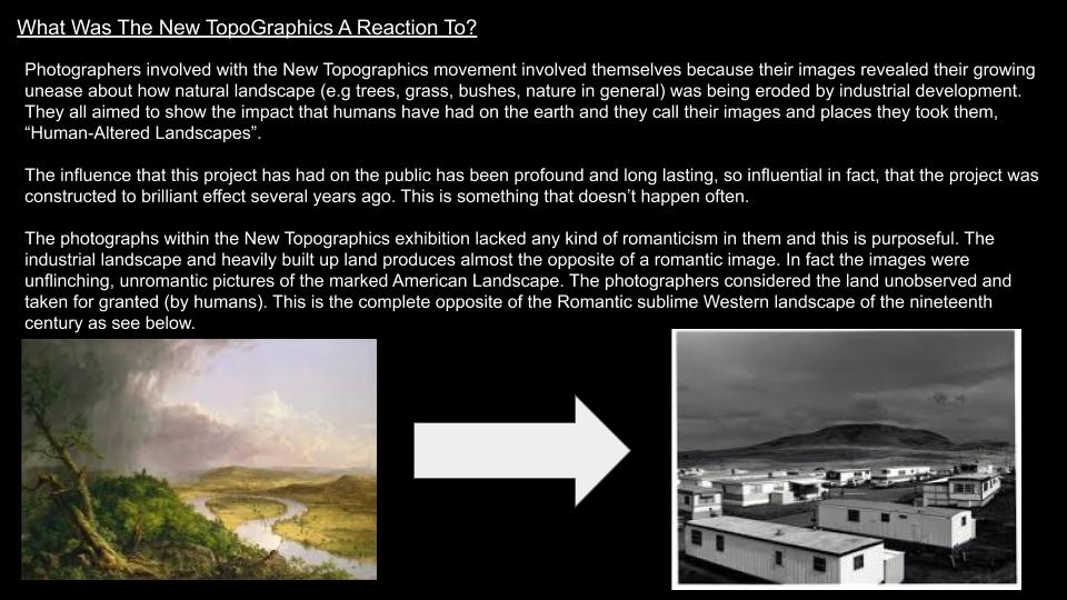
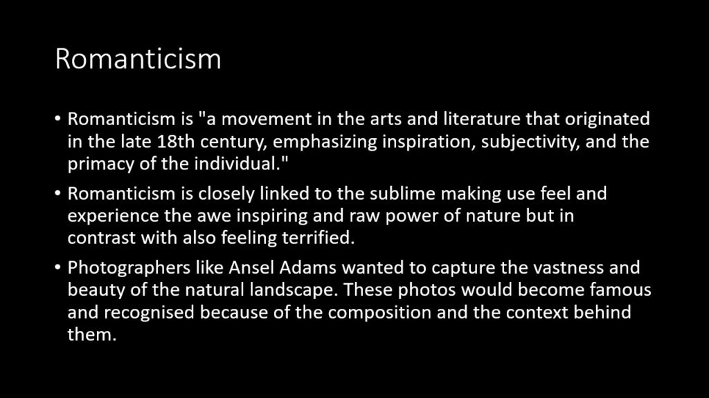
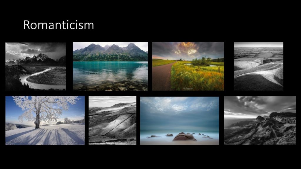
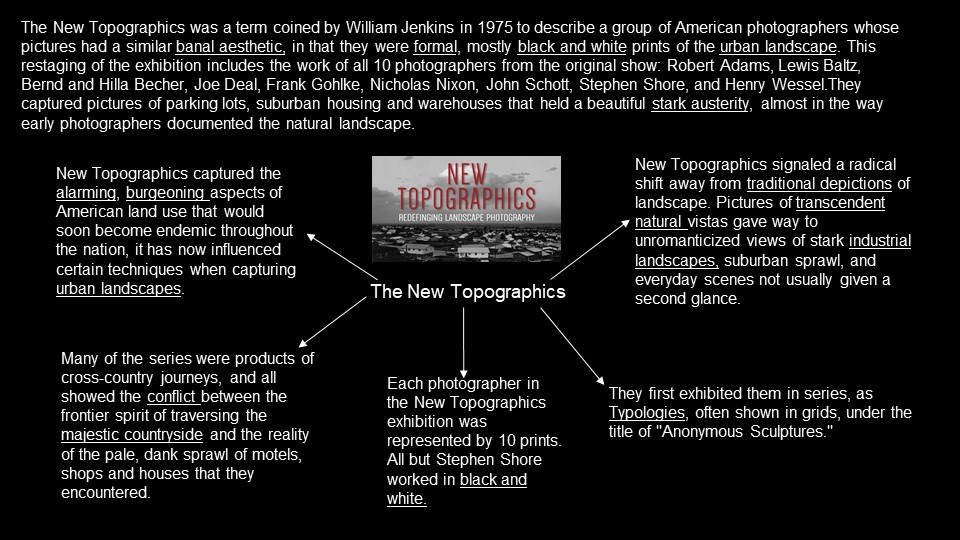
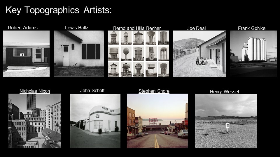
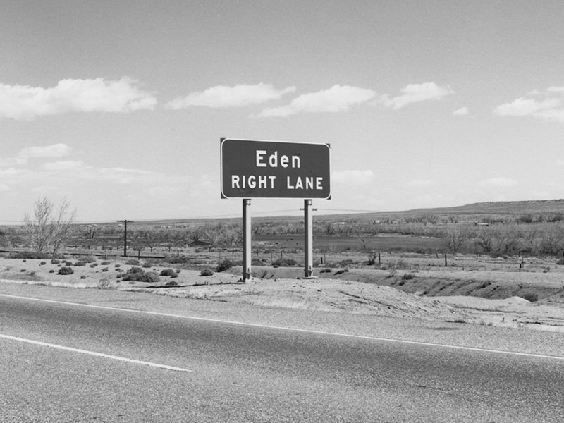
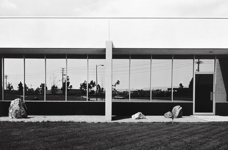
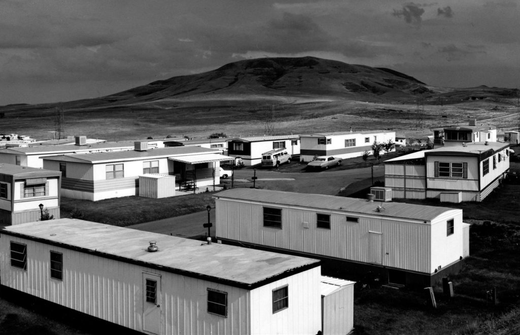
THE NEW TOPOGRAPHICS was started by a group of 10 photographers, who are inspired by nature and how it is impacted by man and man-made structures. The group staged an exhibition of all their work which was inspired by the idea of man controlling nature. They have shifted away from the idea of romanticism and traditional landscape photography. They tend to capture everyday scenes, such as car parks and industrial spaces, which contrasts to the photograph MINOR WHITE takes.

the photographers part of THE NEW TOPOGRAPHICS

Robert Adams

 Lewis Baltz

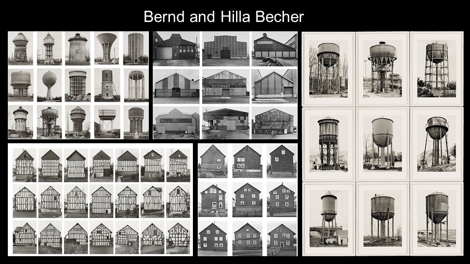
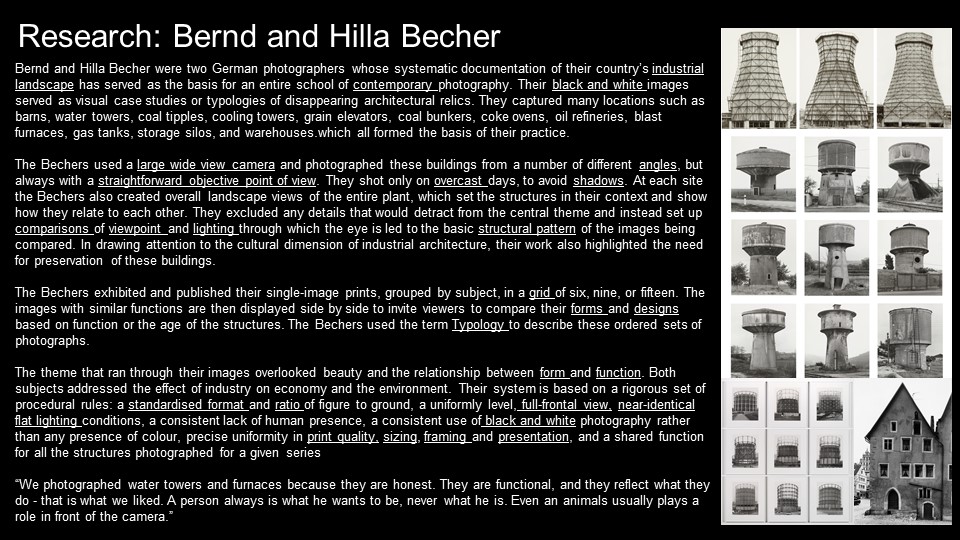
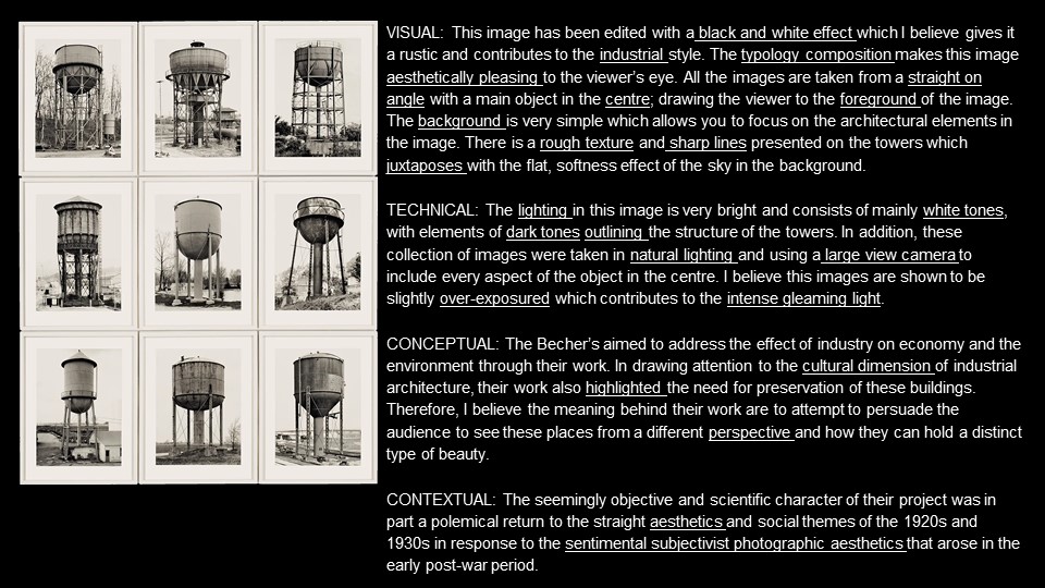
Bernd and Hilla Becher

Joe Deal

Frank Gohlke

Nicholas Nixon

John Schott

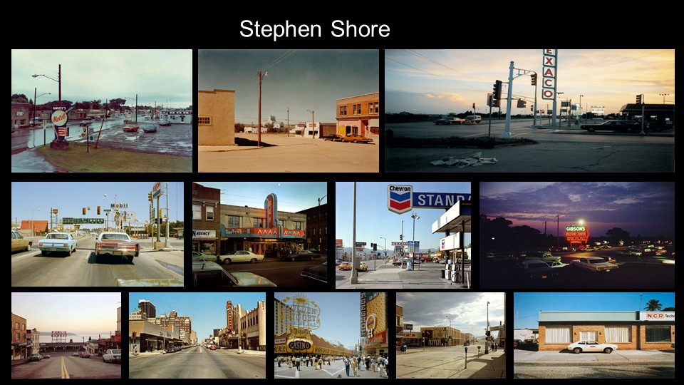
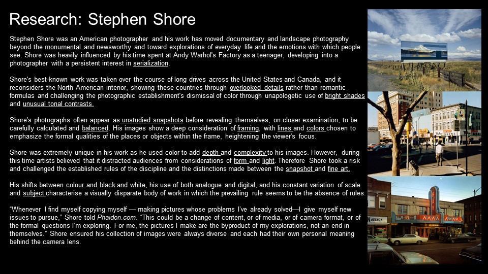
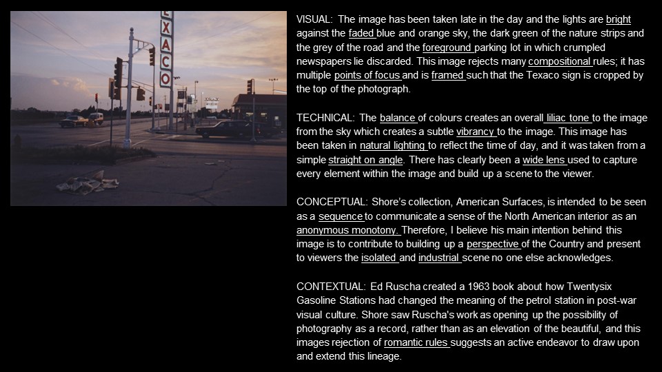
Stephen Shore

Henry Wessel

QUESTION: WHAT DID THE NEW TOPOGRAPHICS RESPOND TO?

They responded to how man made and industrial aspects have taken over the natural world.

MINOR WHITE

who is MINOR WHITE and what does he do?

MINOR WHITE was born in America in 1908 and died in 1976. WHITE was a photographer, who took black and white photographs of, landscapes, people and abstract objects. When he died he was hailed as Americas greatest photographer. During WW2, WHITE served in the US army. After the war he moved to New York. Many times WHITE wrote a piece of text, to go together with his photograph, which he hoped would influence the emotions and mood of the viewer. In 1946, he moved to San Francisco, and worked closely with ANSEL ADAMS, and was inspired by his idea of visulisation. In 1952, WHITE moved back to New York and became the editor of the magazine ‘Aperture’. He then became a teacher in 1965.

my favourite pieces from MINOR WHITE

I chose these as my favourite, because I like how the contrast of the photos. Each photo have interest and parts that I enjoy. MINOR WHITE has captured things I like to take photos of, which has really inspired me to go out and take photos similar to his, and use his style when I take pictures.

analysis of MINOR WHITES piece

technical

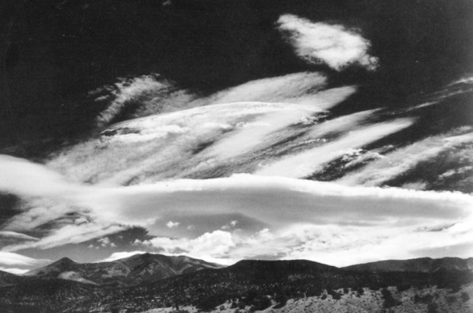
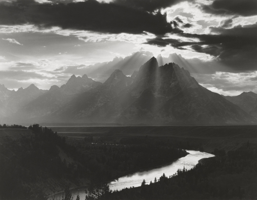
The lighting MINOR WHITE has used is natural, as he has taken the photo outside and has used no other artificial lighting. In this photo, the lighting is very intense in the top half, where the sunlight is peaking through the clouds. This particular light enhances the photograph and helps increase the contrast. MINOR WHITES photograph has, very dark darks and very bright lights, which is very enjoyable for the eye.

visual

This particular photo is captured in black and white, and allows for there to be intense darks and lights and therefore a strong contrast. In the distance, you can see the mountains which have a craggy and detailed texture, which also adds interest for the viewer. The light from above allows this texture to be seen. MINOR WHITE has composed this photo well, as he has got a foreground and background, which alludes to a 3D photo. WHITE has used the composition style called ‘leading lines’, which is seen in the river that leads the eye round the photo and towards the mountains and the light from above.

contextual

This photo contextually links to the time in which it was taken, in the sense that WHITE was inspired by nature and how beautiful it is, which contrasts with the time of the industrial revolution. This period of time was particularly important, as it was the time where nature was changed and industrial building were built, which changed landscapes.

conceptual

MINOR WHITE clearly wanted to capture a romanticised landscape that embodied the beauty and awe-inspiring sense of nature. The way WHITE has captured the photograph in black and white also links to the romantised landscapes too.

LANDSCAPE PHOTOSHOOT 2 PLAN:

PHOTOSHOOT PLAN:

WHO

I will be taking the photos, however with no human focal point, or any human make infrastructures, since landscape photography uses primarily nature only.

WHAT

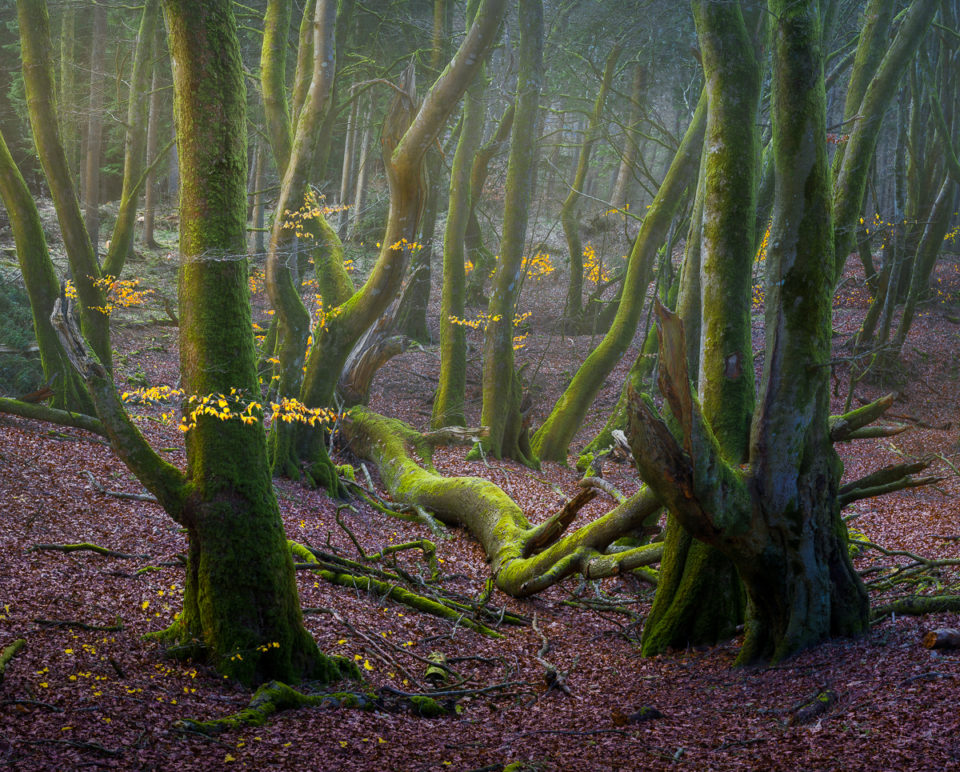
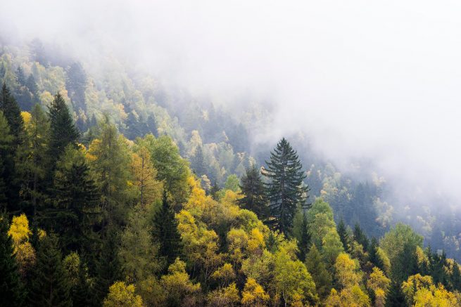
My photoshoot will focus on trees and Forrests, also consisting of marshes and lakes, as oppose to my last photoshoot in Jersey, Plemont where I took photographs off the headland and cliffs and the coast. As it is Autumn the leaves and colour of the trees should give my photos character.

WHERE

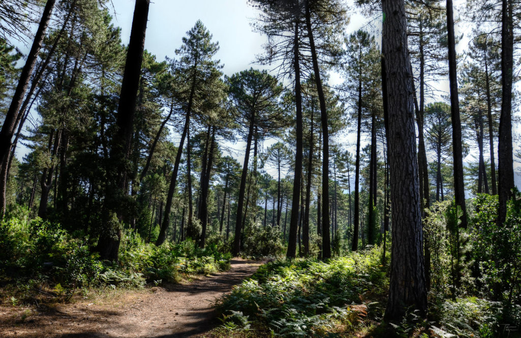
My photoshoot will take place within the Polish forests surrounding the town of Klonowo. I will be walking through the forest entering a very isolated and rural area, barely touched by humans, accept for the occasional road.
WHEN

I will take this photoshoot on the 27th October, during the morning, between 7am and 11:30am, the weather seems to look clear so the sunrise will provide beautiful natural lighting.

WHY

I have chosen this time as it will give my photos more variety of colour as the light will reflect off the leaves and trees. I have chosen this time period being Autumn as there may be some sun in the morning, altering the colour of objects in my photos. I also enjoy this location as its reflects a ver natural landscape and the are is very isolates, further having minimal human influences

HOW

Due to the constant moving around that I will be doing during the photoshoot, in order to complete walking through the forest, my photos may become blurred and I will be taking photos while walking (not using a tripod). To prevent blurred and unfocused images, I will change the camera settings, to a hight ISO of 1600, a fast shutter speed of 1/320 and an aperture of f/14. This will also make sure that any wind moving the leaves and trees, which will blur the focus, is minimised and photos will be taken quicker.

INSPIRATION:

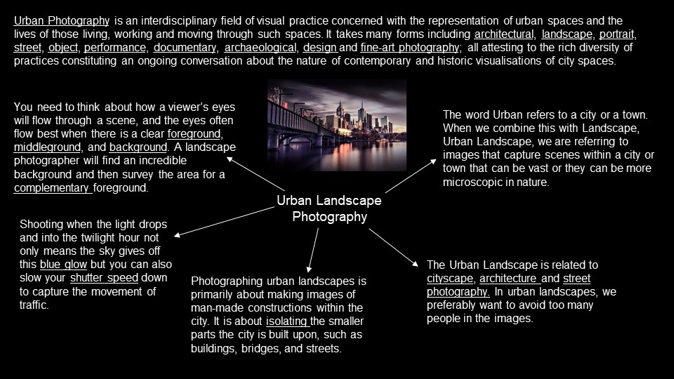
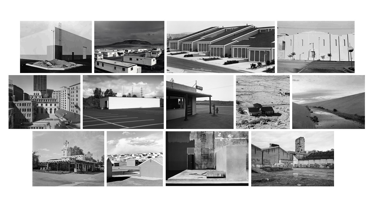
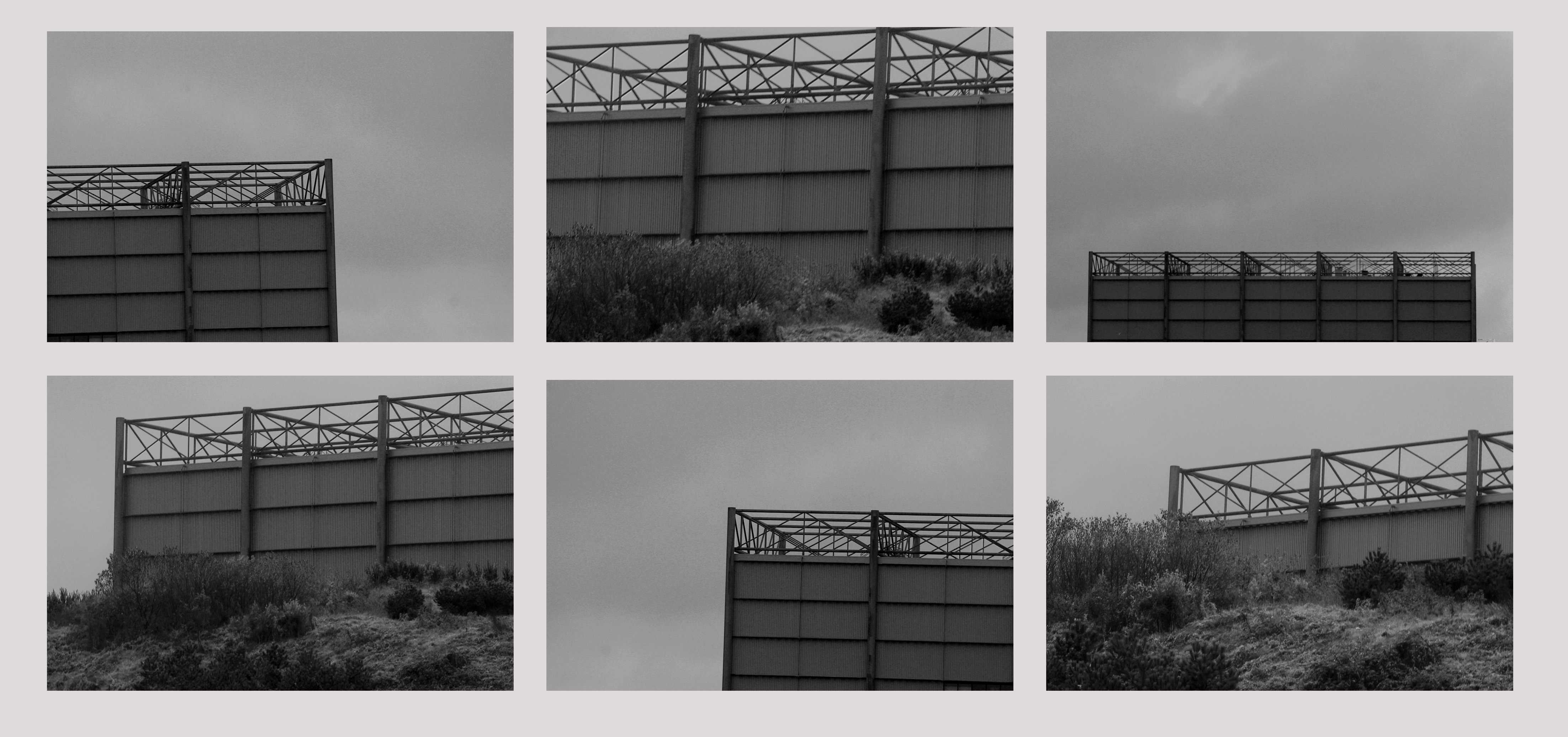
Urban Landscapes

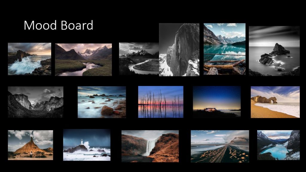
Mood-board –

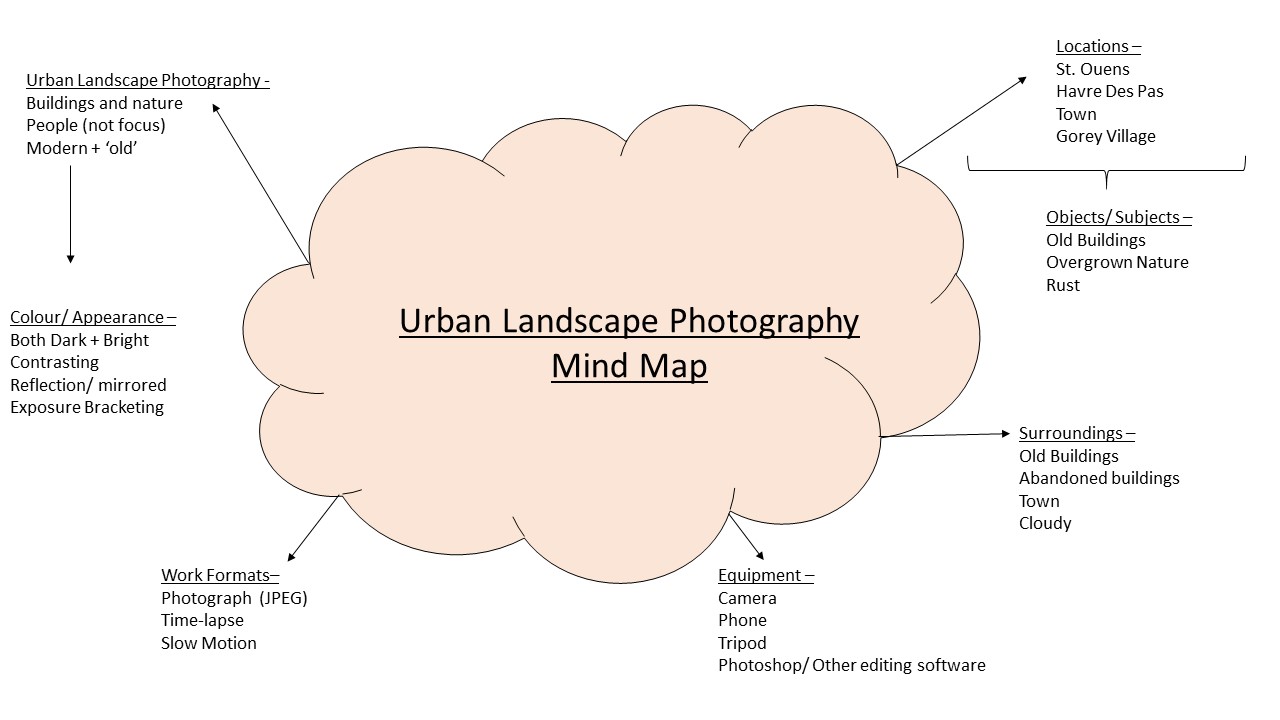
Urban Landscape Research –

Taking influence from multiple photographic genres, Urban lanscape photography could be defined as a romanticised mix of architectural and street photography. Unlike many other forms of photography, people shouldn’t be used as the subject of an urban landscape photo as it fraws the attention away from the main focus. However, people, as they are an integral part of society, can serve as a story telling tool for the images.

‘Urban’ refers to citys or towns. Therfore ‘Urban Landscape’ can be referred to as a combination of new and old – citys (buildings) and nature in order to convey multiple messages.

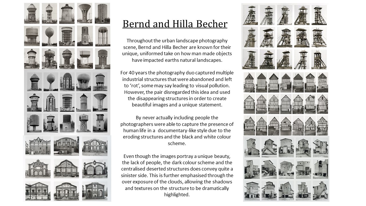
Artist Research –

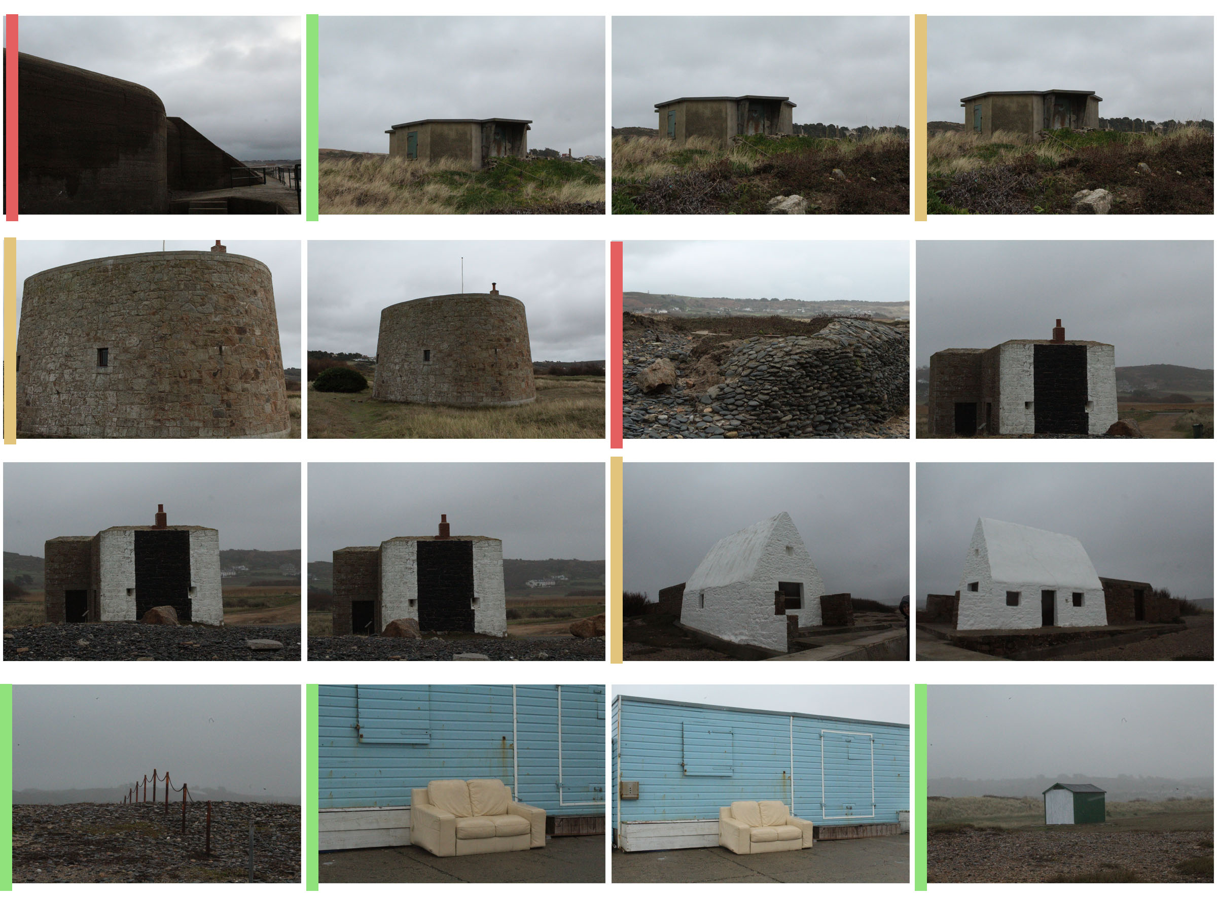
Photoshoot 1 – St Ouens

Photoshoot 2 – Havre Des Pas

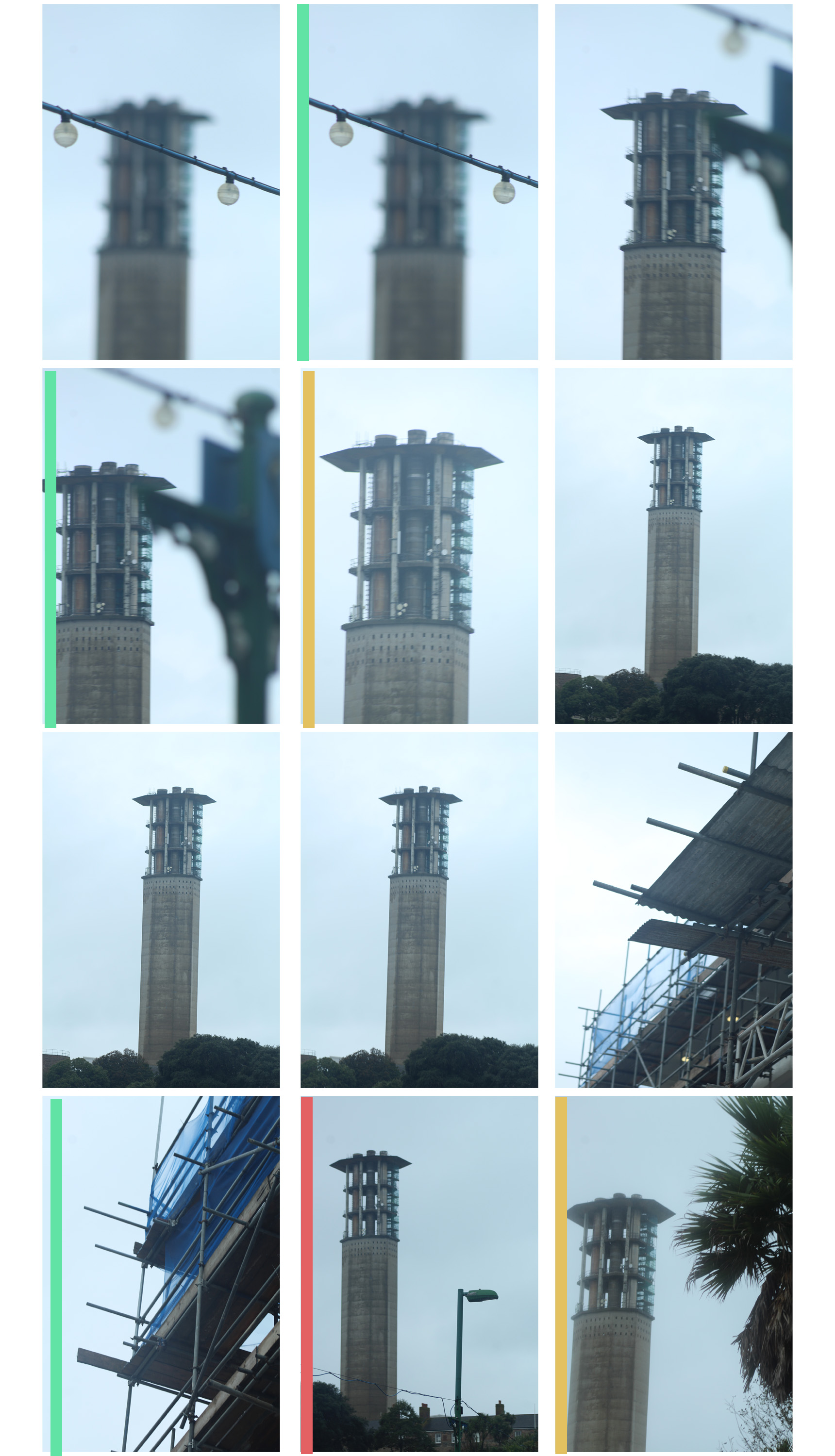
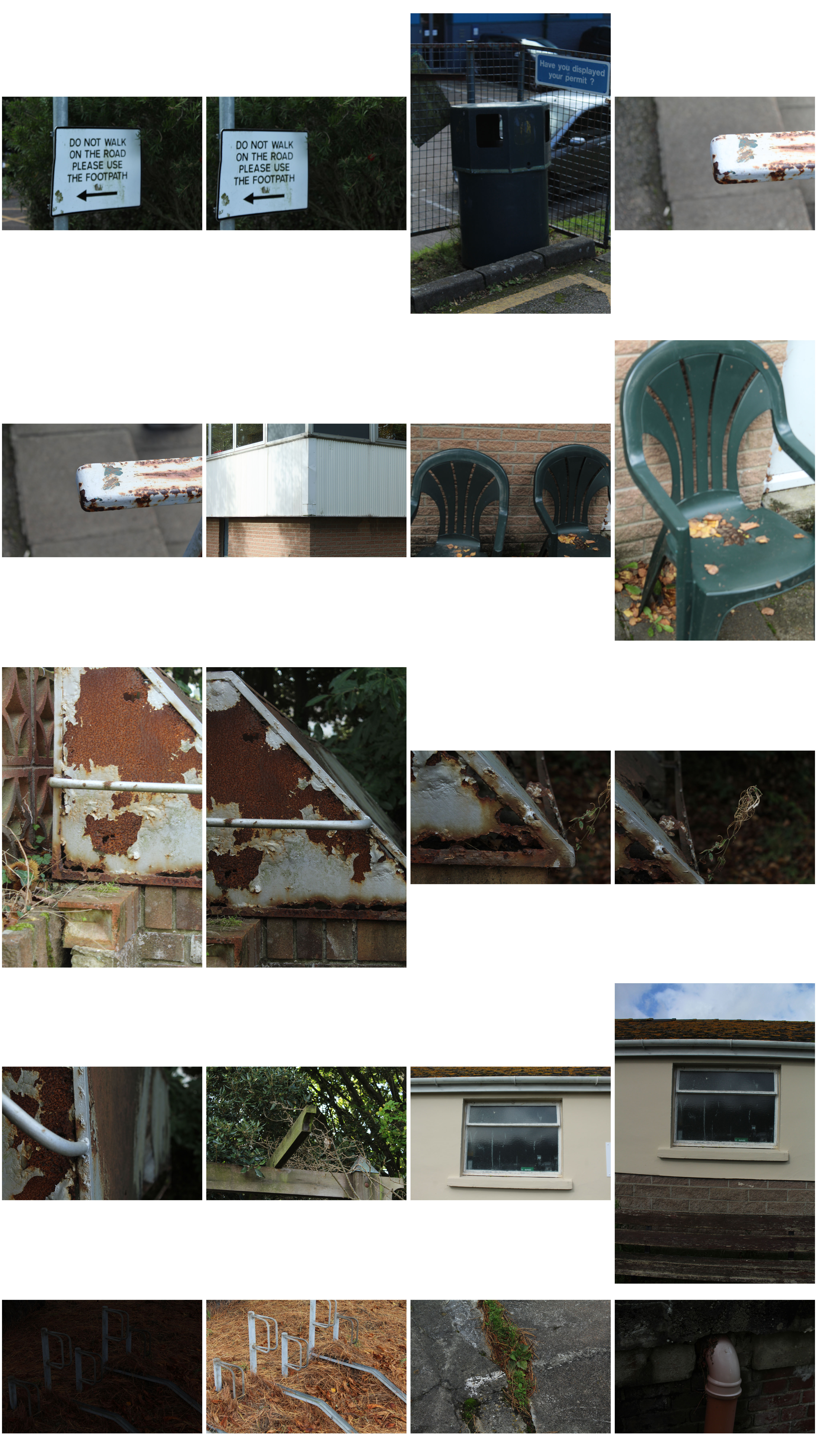
Urban Topography Photoshoot –

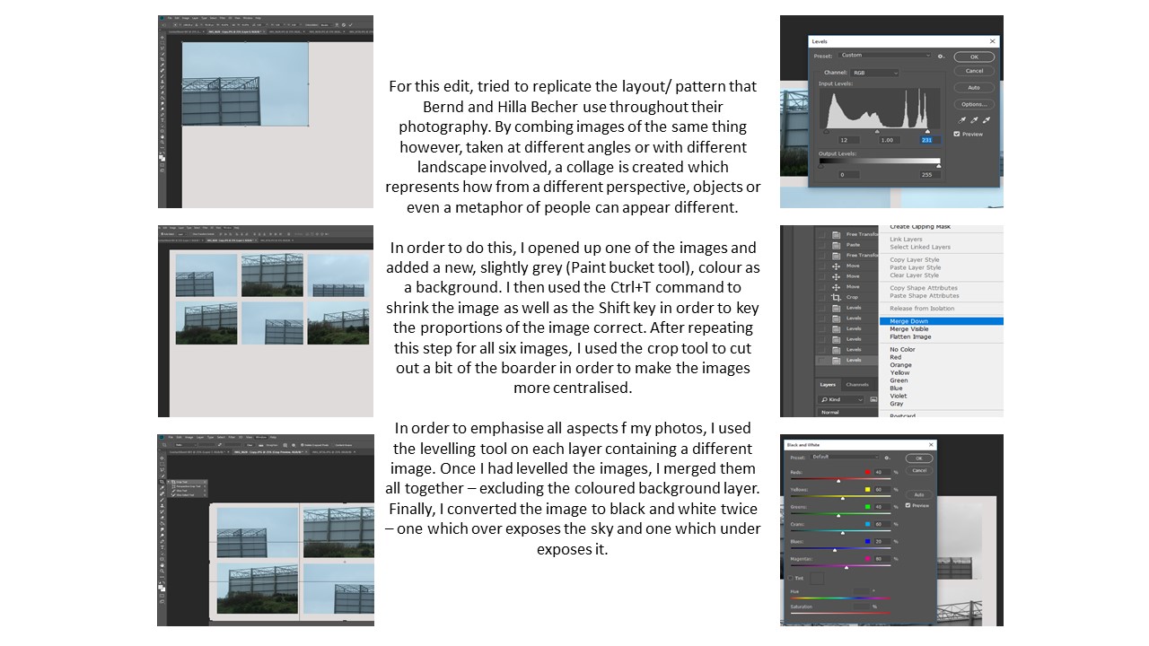
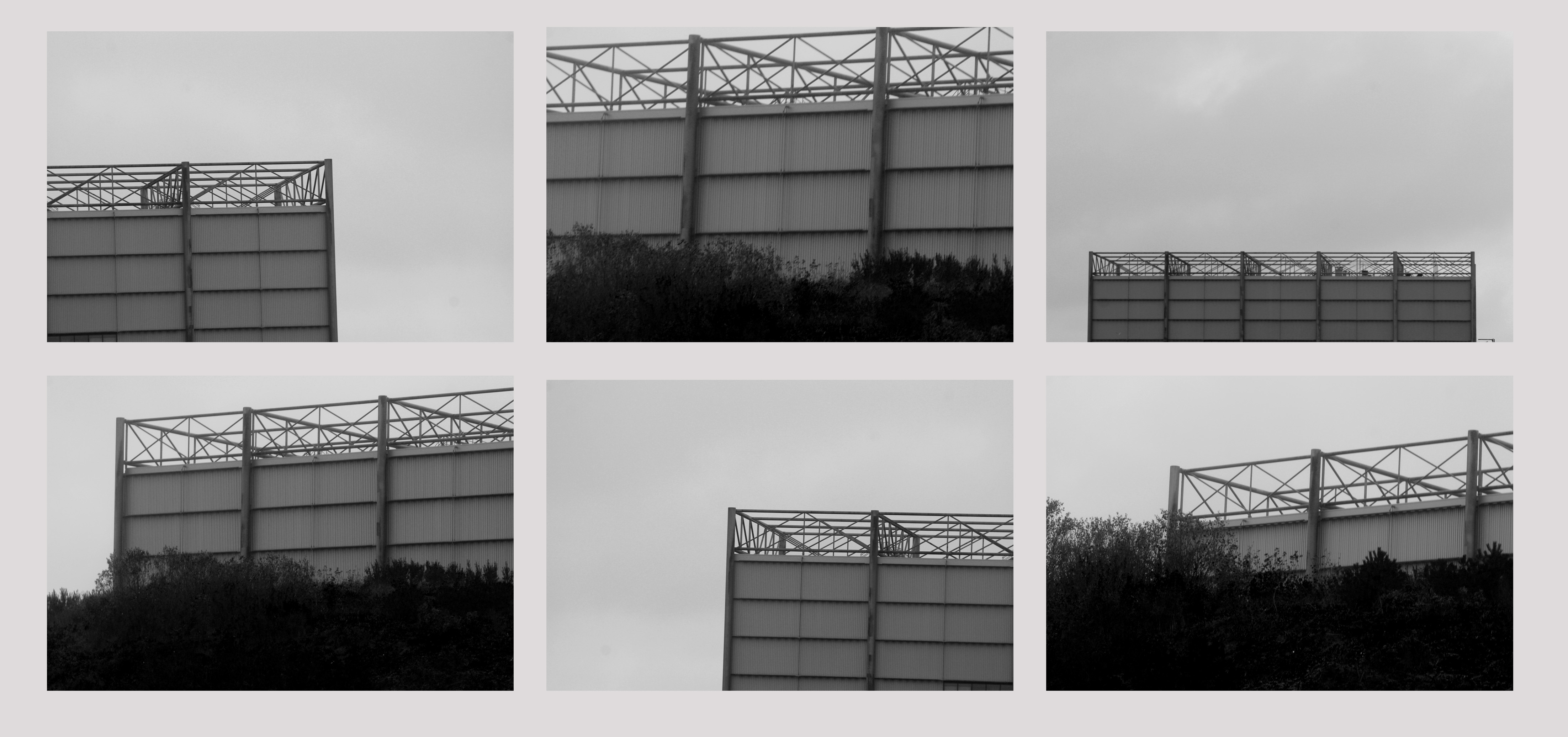
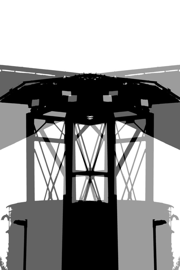
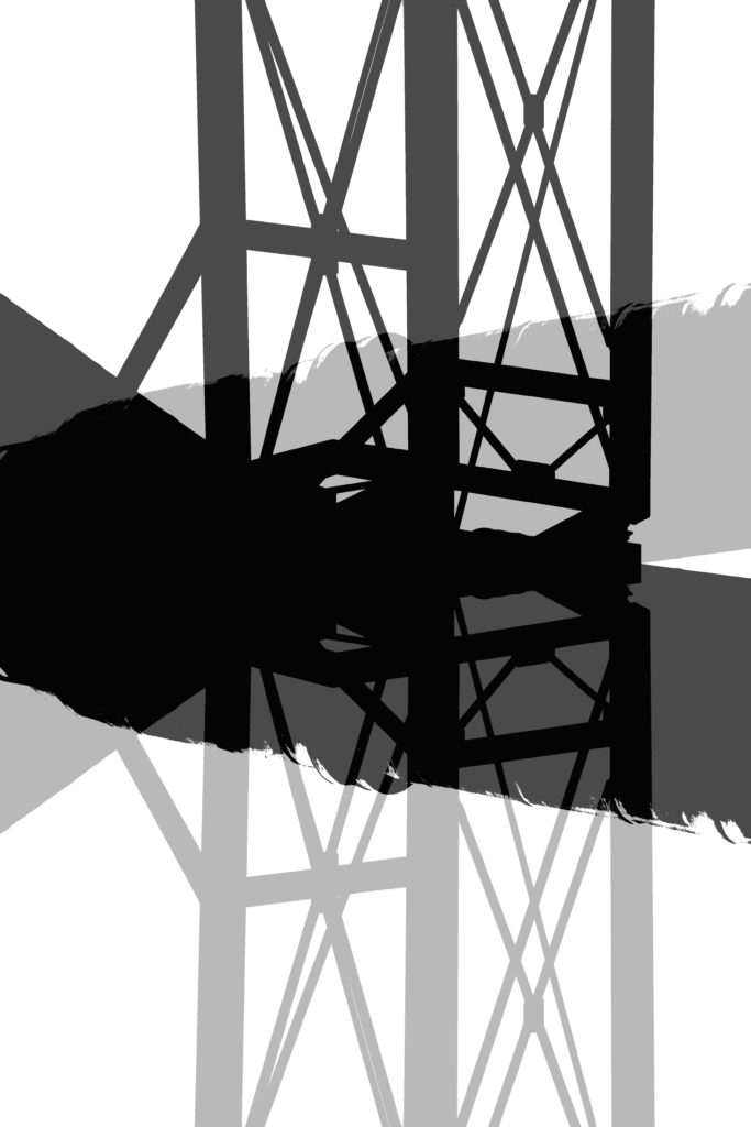
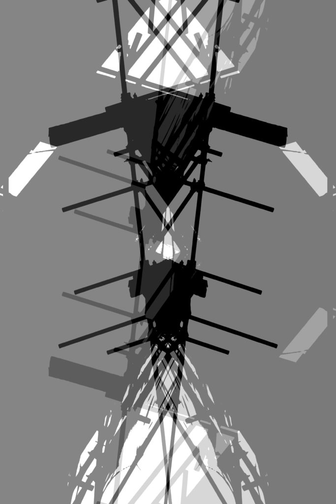
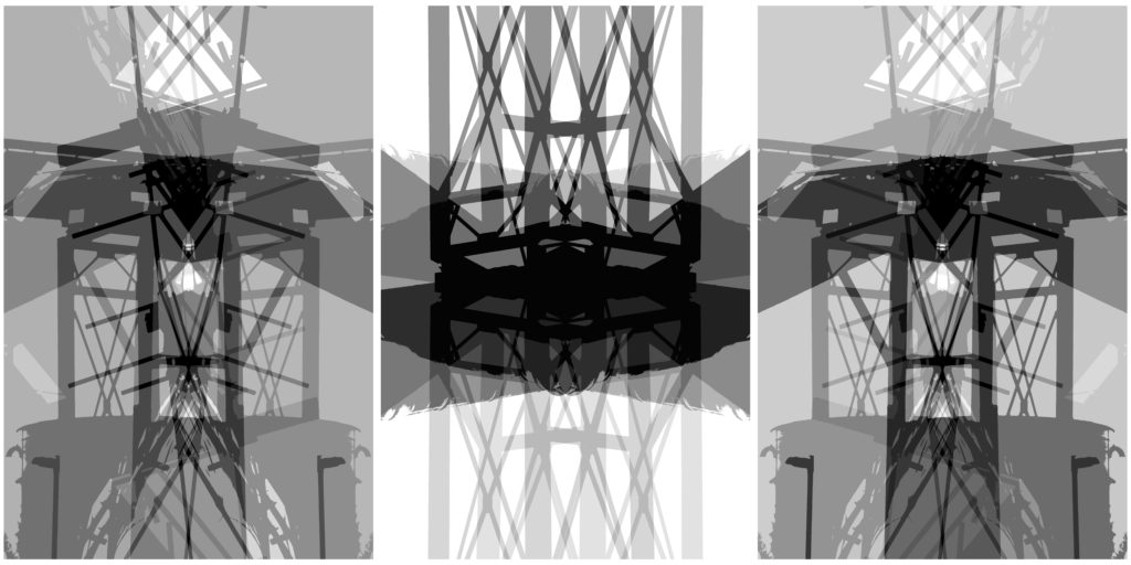
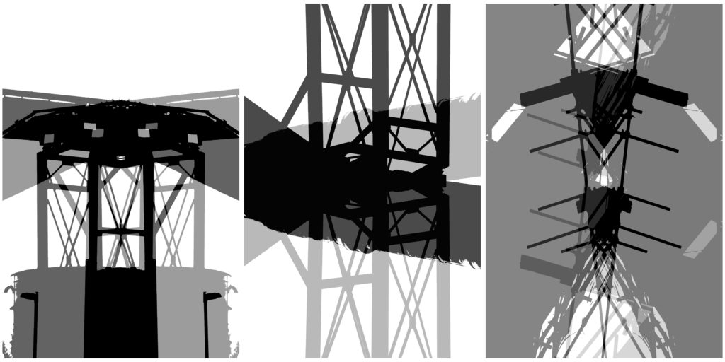
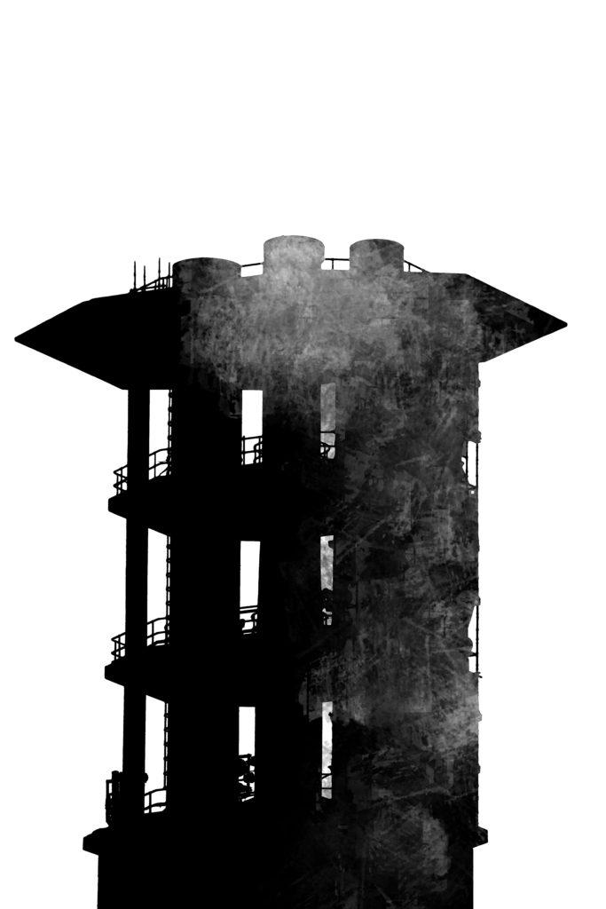
Photoshop – Inspired by Bernd and Hilla Becher

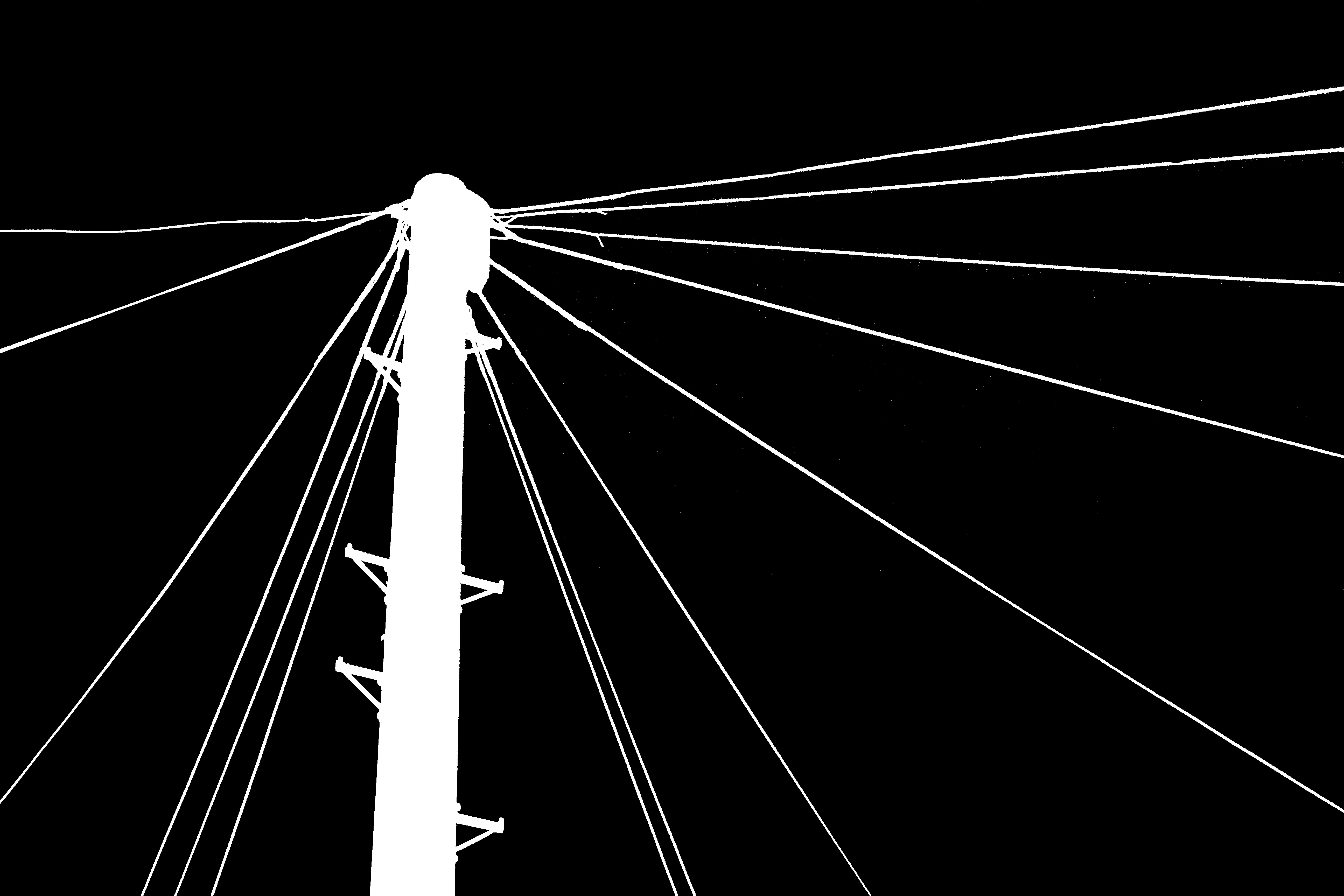
Photoshop 2 –

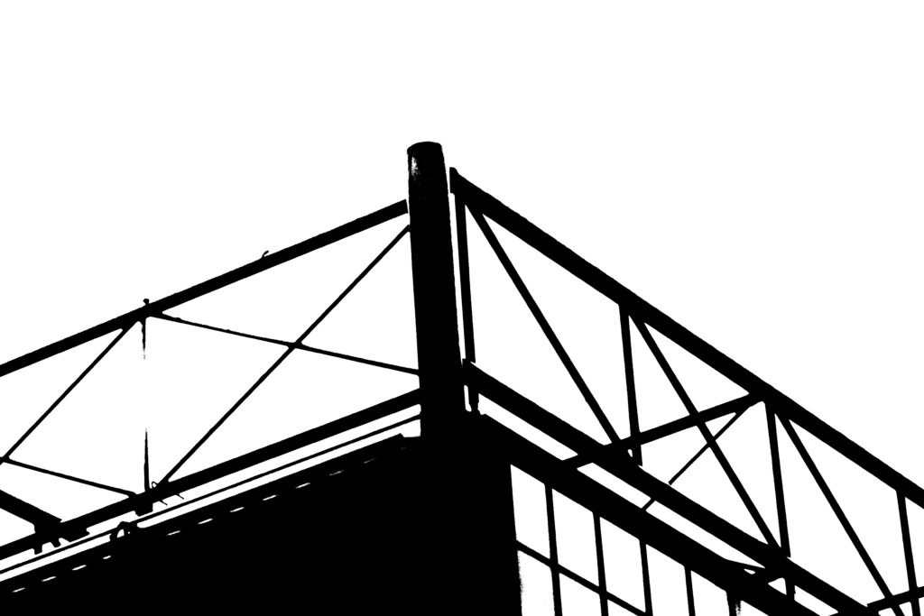
Threshold Inverted