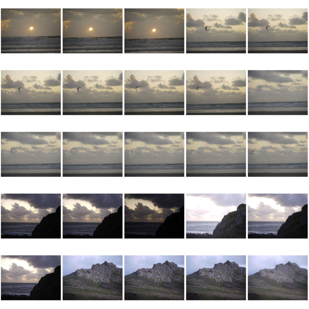
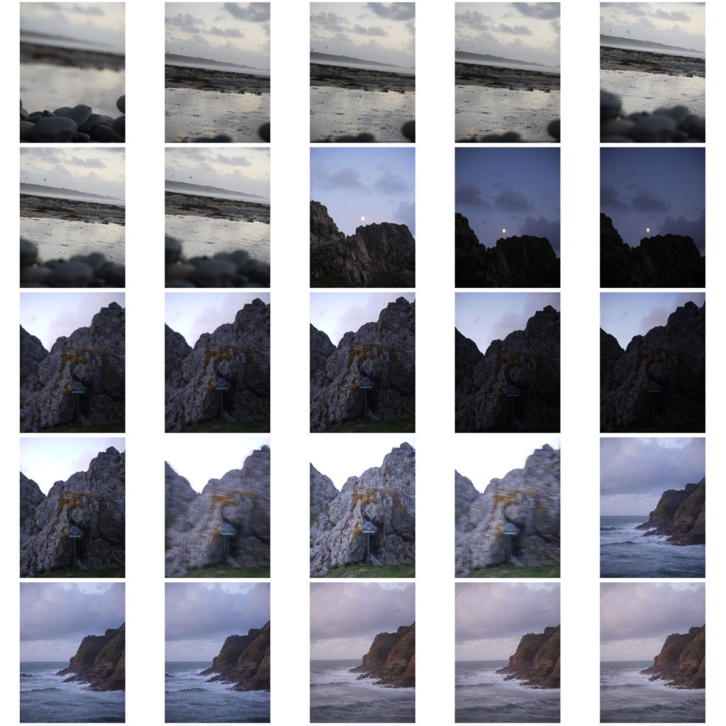
White Balance

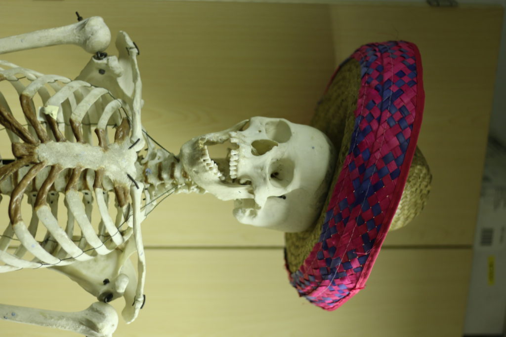
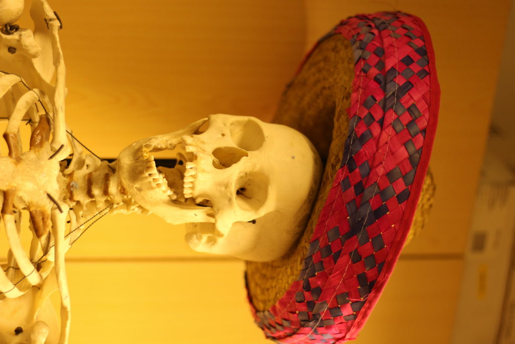
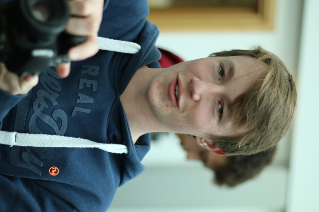
In this lesson we were learning how to adjust the white balance depending on the lighting of the environment. The white balance is the process of removing unrealistic colour casts, so that objects which appear white in person are also appearing white in your photo. On a DSLR the white balance can be change by using either WB presets or by changing the colour temperature manually. The colour temperature is measured in K Kelvins.

For example if we are shooting in a situation where there are yellow halogen lights then I would set the white balance to the tungsten preset which will set the kelvins to 3200k which makes the white parts of the image bluer therefor making the white balance ‘correct’.

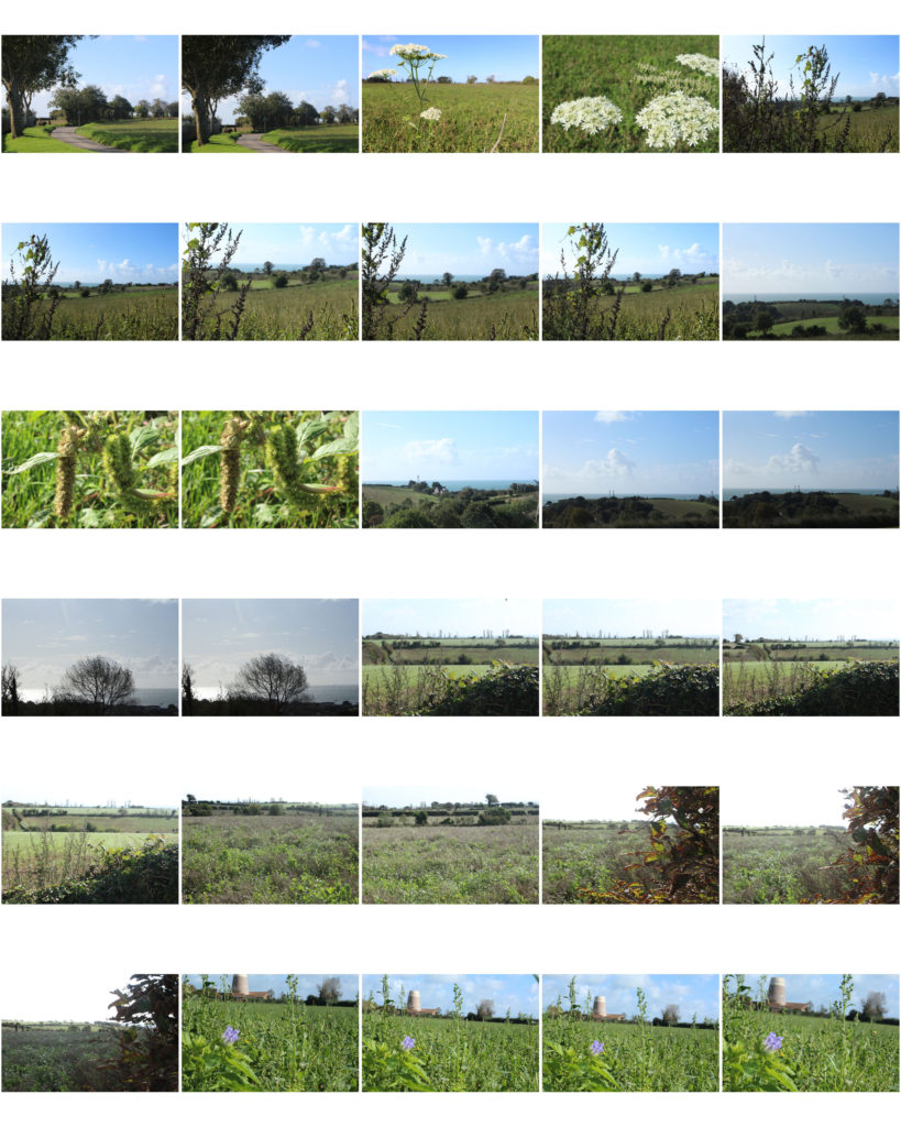
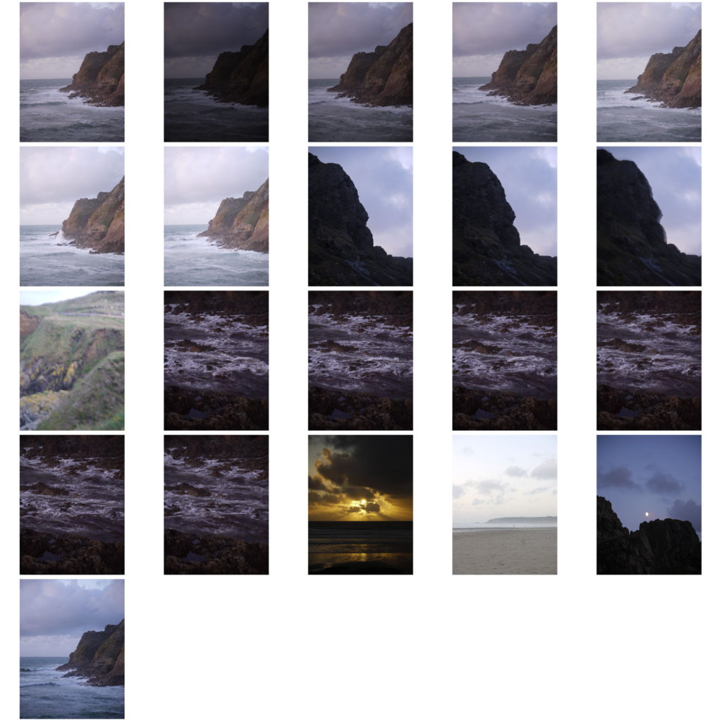
landscape practical – exposure bracketing

I used the dial on my Camera to increase or decrease the exposure. The dial controls how much light is entered into the lens; the more light entering, the higher the exposure, the less light entering, the lower the exposure.

I used different f-stops to control how much light was entering which was controlled by the dial. Often, I used f/22 to really get the colours in the sky to come out and look bolder.

One thing I should’ve done differently when taking different images with the same f/stop is to take the images from the exact same angle and position. Maybe a tripod would’ve been helpful.

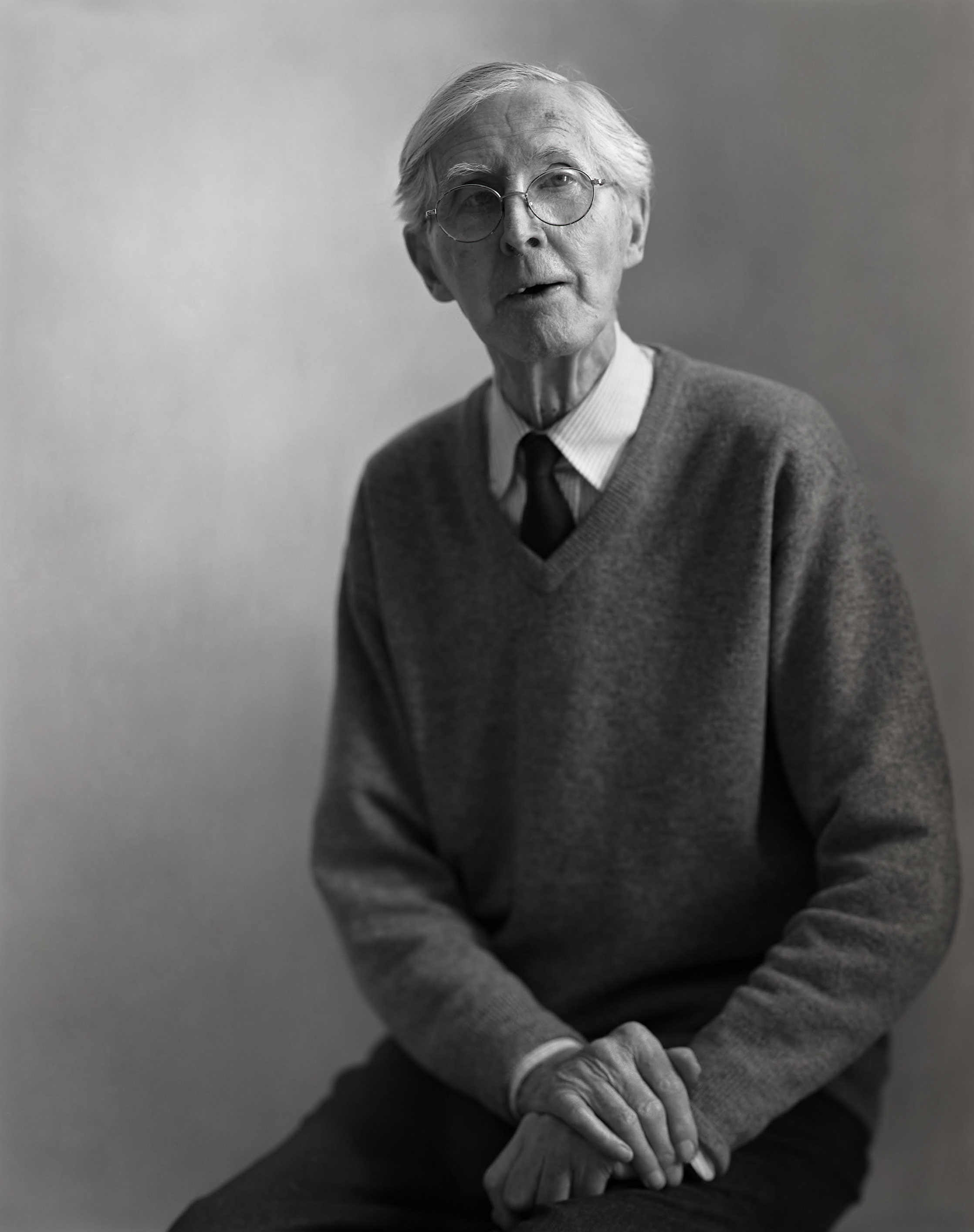
Keld Helmer-Petersen

Keld Helmer-Petersen by Björn Dawidsson

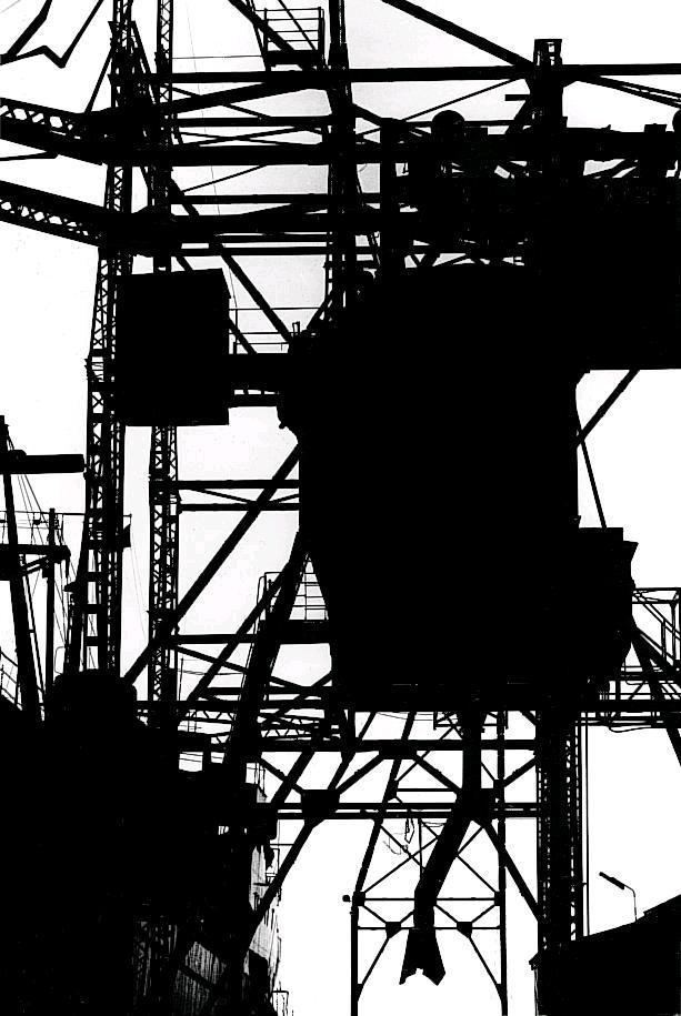
The pioneer of Danish Modernist photography, Keld Helmer-Petersen (1920-2013), is internationally acclaimed for his images of structures, patterns and details found in industrial areas, cityscapes and nature.

He started photography in the late 1930s and first made his name with 122 Colour Photographs in 1948. This book is especially well known due to its innovative use of colour in thoroughly composed photographs of patterns in landscapes and buildings. During the 1950s and 1960s he established himself as a photographer of architecture and design. Simultaneously, his artistic work shifted towards the more abstract, as he found inspiration in German and American photography as well as international abstract art.

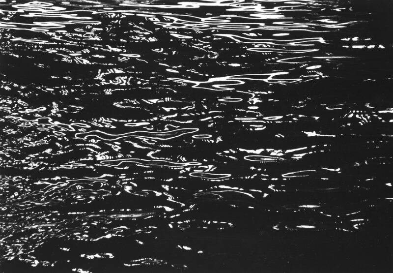
His Work

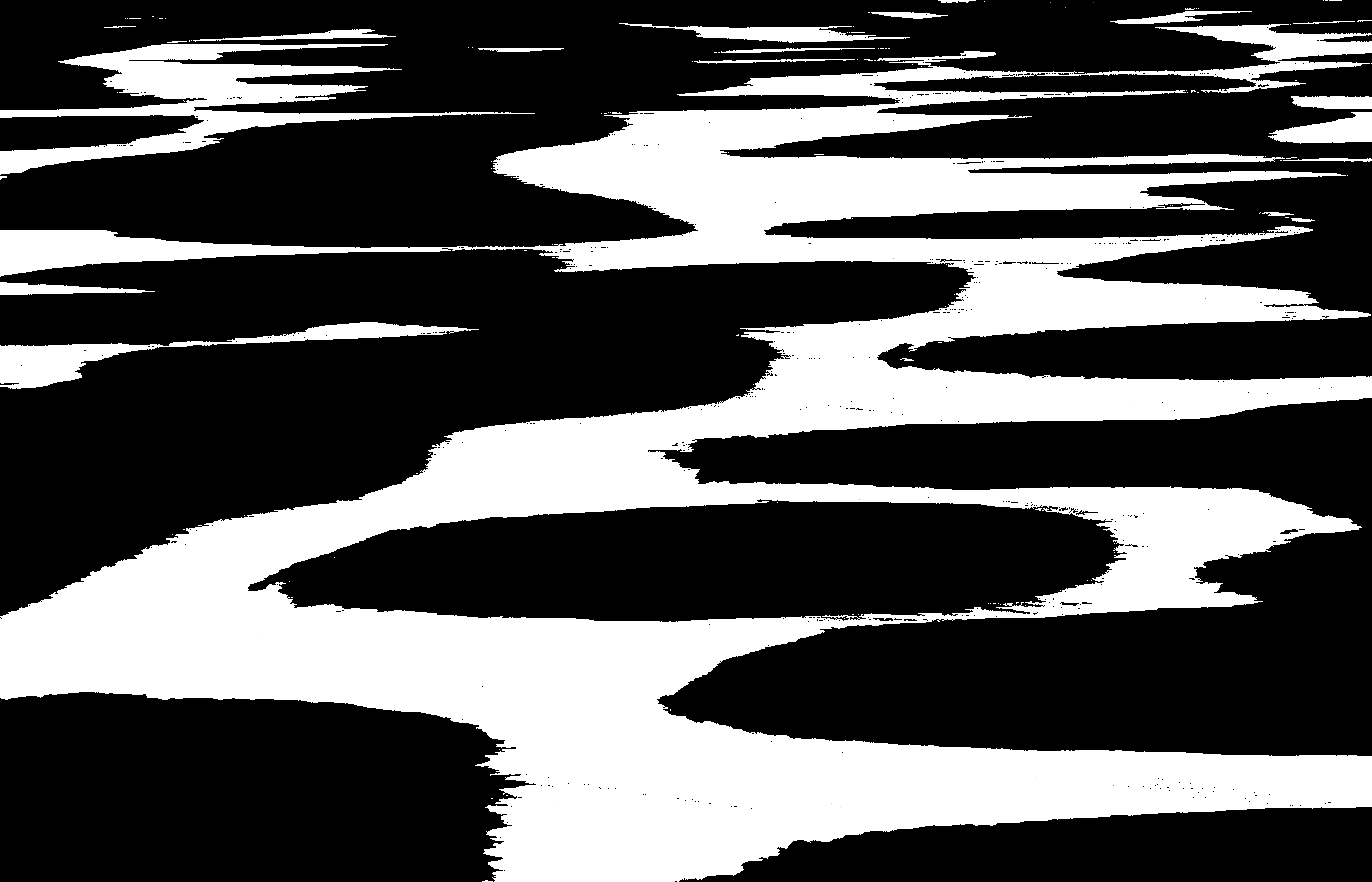
1965, “Set i vand” collection

Urban Landscapes Photo Shoot Plan

Who

In these photo shoots I will not be trying to take photos of anyone in particular, I may have to take photos of crowds if they are surrounding the urban landscape that I want to take a photo of.

What

I will be taking photos of buildings/signs/graffiti/streets etc, I will also be changing the exposure on the camera to get a variety of tones, highlights and shadows. I will also attempt to focus on one particular part of the image (shallower depth of field) e.g. a road sign. Hope fully I will take some photos of buildings with graffiti on the side of them to add more colour to my images.

When

Throughout the next two weeks, I will be taking photos of urban landscapes at midday to have natural lighting, hopefully I will take a few photos at night to get photos of street lights and buildings lighting up the streets and maybe some photos of buildings at sun set to try and get some water tones from the the sun, such as: oranges and reds, reflecting off the windows of the buildings.

Where

I will be taking the majority of the photos in town/St.Helier as there are many urban landscapes in this area. Fort Regent may be a good place for a photo shoot as I can see all of town from that point of view.

Why

I will be taking photos of different landscapes at different times to get a variety of different photos. Photos taken at sunset will have warmer tones compared to a night time shoot with colder tones.

How

I will use a tripod and steady structures to take images at a balanced and steady position. I will also use the rule of thirds to line everything up right for some of my photos. I will change the exposure bracket to get more variety in my images and so I am able to make HDR images

LEWIS BALTZ case study

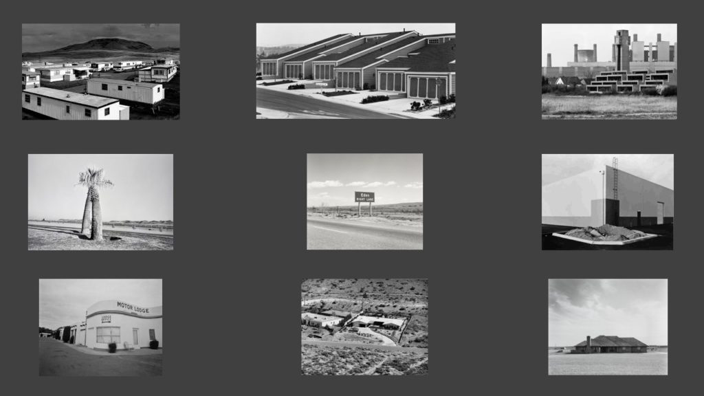
Lewis Baltz was an american artist and photographer, born in 1945, who became an important figure in the New Topographics movement in the late 1970s.

His work is focused on searching for beauty in desolation and destruction- banal aesthetic. Baltz’s photographs show the architecture of human landscape, including: offices, factories and parking lots. His images reflect the control, power and influence of human beings on the environment.

At the time Baltz was a very young photographer but later became a central figure in the New Topographics movement.

Image result for lewis baltz new topographics

New topographic photographers incorporated urban architecture and spaces into their images, differentiating themselves from natural landscape photographers who focused primarily on the sublimity of nature and completely avoided the effect man had on the environment surrounding them.

Baltz’s image has a large tonal range. In the bottom third of the image, the ground has darker tones compared to the top two thirds. The shadows apparent in the door-like feature and the darker tones of the trees create a further contrast against the white wall behind them. This creates a striking image that provokes the viewer’s eyes.

There are multiple patterns and textures within Baltz’s image that play a subservient role in the composition. The vertical lines on the door and at the top of the image add to the contradiction in the photo. It leads the viewers eyes up and down the image and creates another contrast against the softness and smoothness of the walls and the ground.

Leading lines towards the door create dynamic tension, drawing the viewer’s eyes and focus to the center of the frame. The also aid in creating a sense of depth in to the center of the image.

The plainness and almost symmetrical structure of Baltz’s image is broken by a group of trees lined up on the right, creating a ‘spot‘. This deliberate use of opposition forces the spectator to look over the photo multiple times.

The use of lighting in Baltz’s image is fairly natural. The photo’s been taken in the day, creating shadows of the trees and on the floor, implying there’s another man made or natural structure obstructing the natural light path that the viewer can’t see.

This unknown structure adds to the ambiguity of the image. The lack of sky and other landscape features, such as mountain ranges or naturally occurring plantation and earth, could possibly be Baltz’s criticism of human technology and how it’s enveloping and taking over the natural landscape that would otherwise be present in the image.

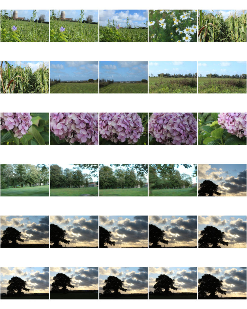
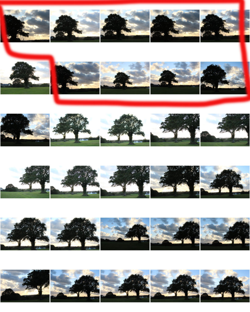
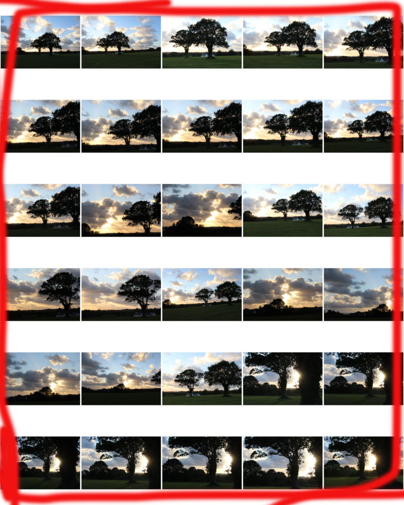
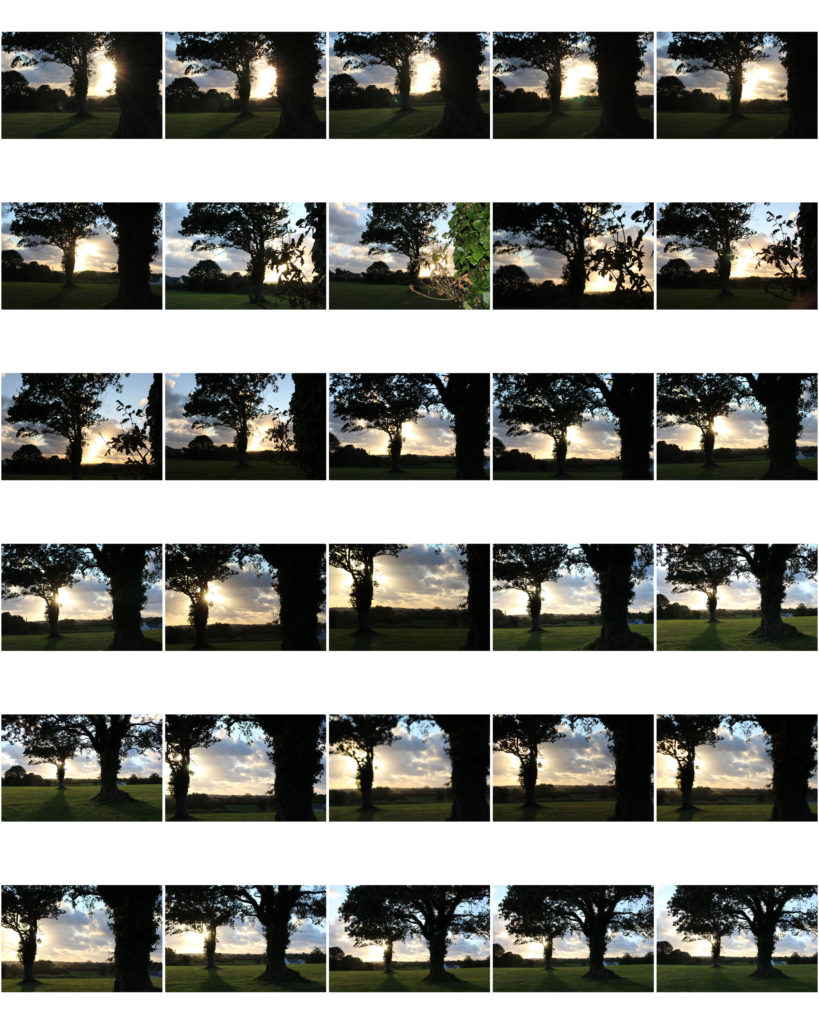
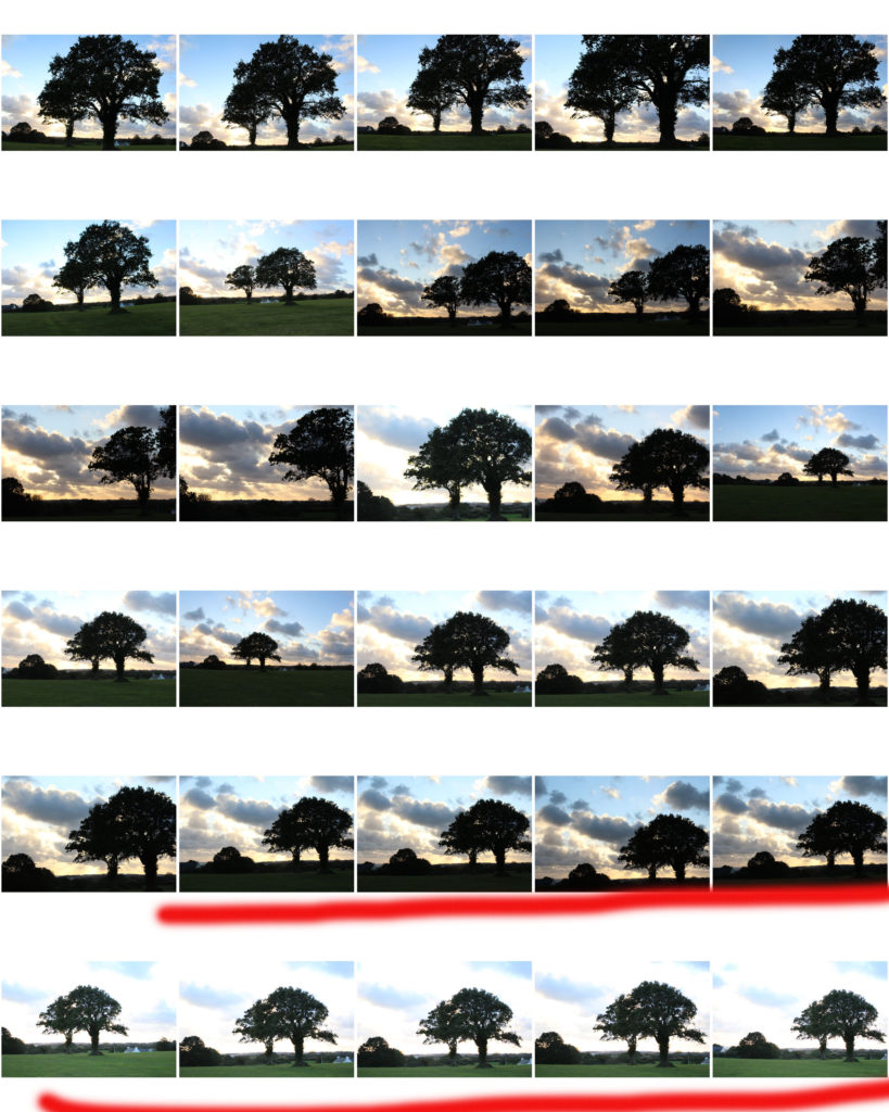
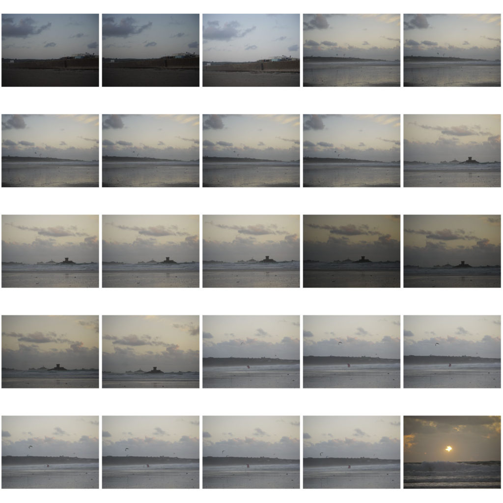
roManticism landscape Contact sheet and final outComes

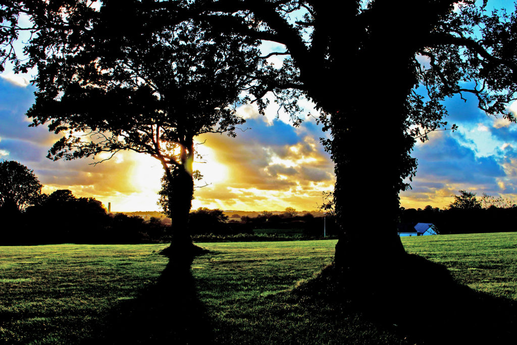
FINAL OUTCOME 1
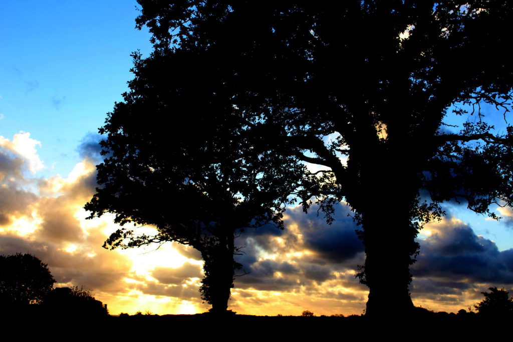
This is one of my favorite outcomes because of the composition of the image. I love how the two trees are placed perfectly beside each other and i’m also fond of the angle I used when picturing this landscape. I tried to get both trees into the frame and allow the viewer to empathize with the depth of field. After the shoot, I placed the images within Photoshop and leveled them to my preference.
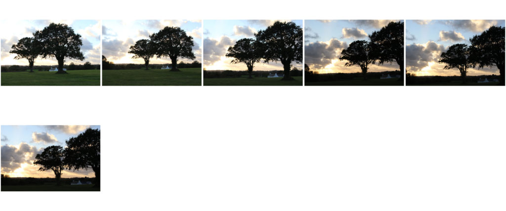
I increased the contrast so that the trees would look silhouetted and enhanced the vibrancy of the image to bring out the colors in the sky.
FINAL OUTCOMES 2
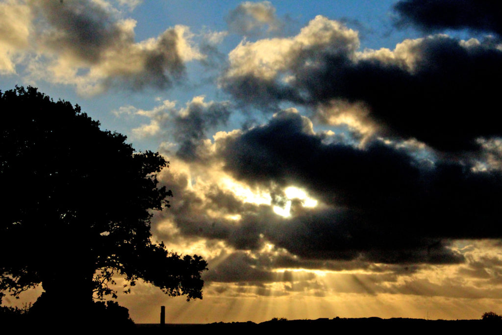
This is one of my favorite outcomes because of the elements within the photo. I absolutely love the rays of sunshine that pop out from behind the clouds. I leveled this image in Photoshop so that the sun rays would appear more intense and so that the silhouette of the trees and landscape would contrast against the bold colours of the sky. I increased the contrast and the vibrancy of the image which helped with the boldness of the image also.
FINAL OUTCOME 4
This is one of my favourite outcomes again because of the elements that appear within the sky. The sky within these similar images create a really romantic atmosphere which fits in with the theme of romanticism. I again leveled this image in Photoshop so that the colours in the sky would pop and so that there would be a clear contrast in colours. I also love again the angle of which I took this photograph at; from a lower angle which makes the trees appear strong and powerful making a mysterious, intriguing image.
FINAL OUTCOME 5
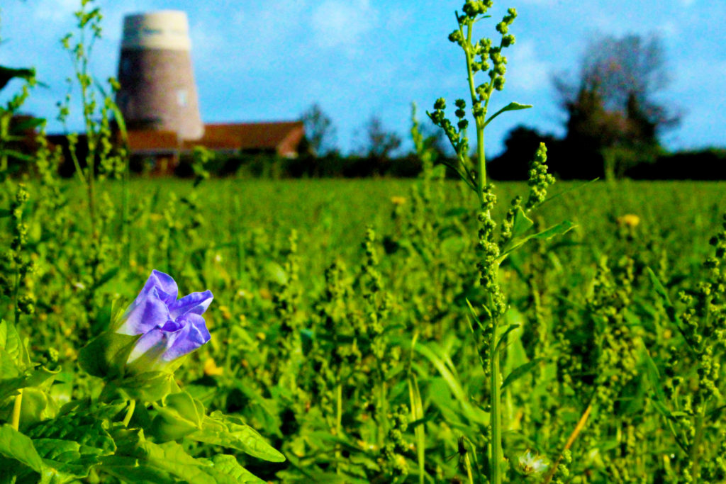
This is one of my favourite outcomes within the landscape shoot because of the manual focus technique that I used when shooting. I managed to focus the one, blue flower that was stood among green grass into the foreground so that I could emphasis again, the contrast in colours. I made the background out of focus since it includes man-made items. I almost wanted to create a message of the beauty of nature and the bleakness of man-made scenery.

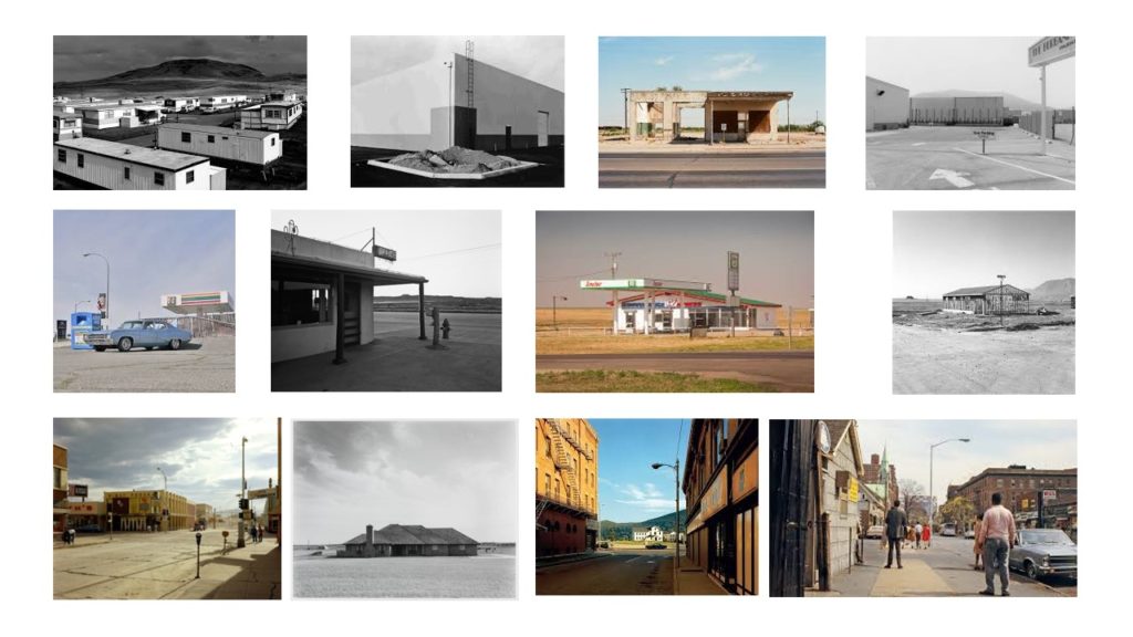
New Topographics

New Topographic’s is a movement of Urban Landscape photography started in the 1870’s by photographers such as Frank Gohlke, Nicholas Nixon, John Schott, Joe Deal, Robert Adams, Stephen Shore and others. They began shooting and capturing images of what seemed to be regular (ugly) building or places, but they had a an unnoticed beauty with mountains in the backgrounds. Their photos were often considered dull and plain as they were taken straight on at the subjects, however, they were significant because of the meaning behind them.

These images show juxtaposition because of the ordinary everyday architecture that is placed in amazing beautiful scenery. This could be controversial because of the personal perception of the images

Urban Landscape

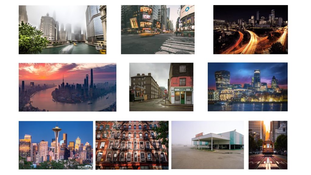
Urban Landscapes are landscape shots capturing the cities or towns. They often are shot in a way that shows a meaning or trying to tell the people something. This form of photography is a very wide genre. Urban landscape can include pictures of skyscrapers, high streets or even roads. Urban landscapes can also include ‘normal’ landscapes with bits of urban building or industrial things in it. With this type of photography, both closeups and wide shots can be taken, with people or without people.Often Urban Landscapes photography can be used to show the environmental impact of the industrialisation and huge amount of structures built or being built.
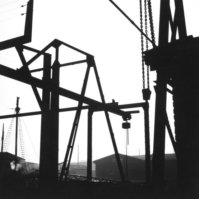
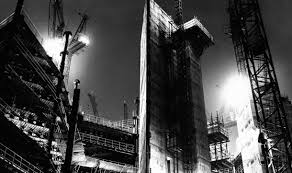
Photographer Lewis Bush took a series of black and white photographs that could be interpreted to be showing the negative impact of the development of building in cities. This series was called Metropole. They are in black and whit and have a lot of contrast.