URBAN LANDSCAPE PHOTOSHOOT: annotated contact sheets

Final Images-

I liked the colour contrast and simplicity of this image, with the modern straight lines and right angles jutting out against the clear and bright blue sky in the background.
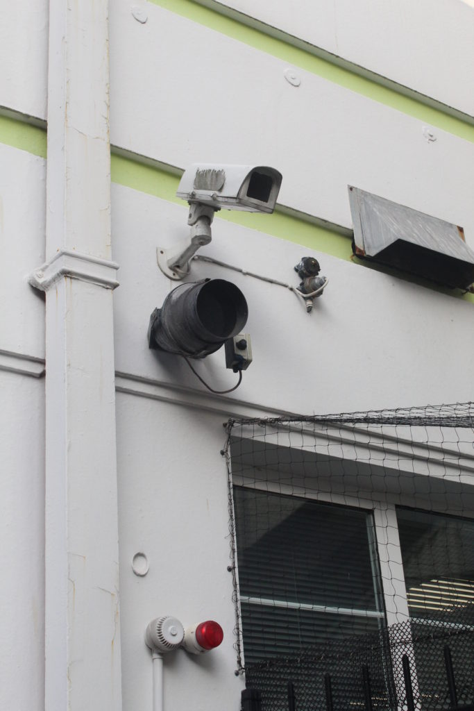
I felt that this image fit in very well with the urban theme and I especially liked the lime green stripes of colour contrasting against all the black, grey and white.
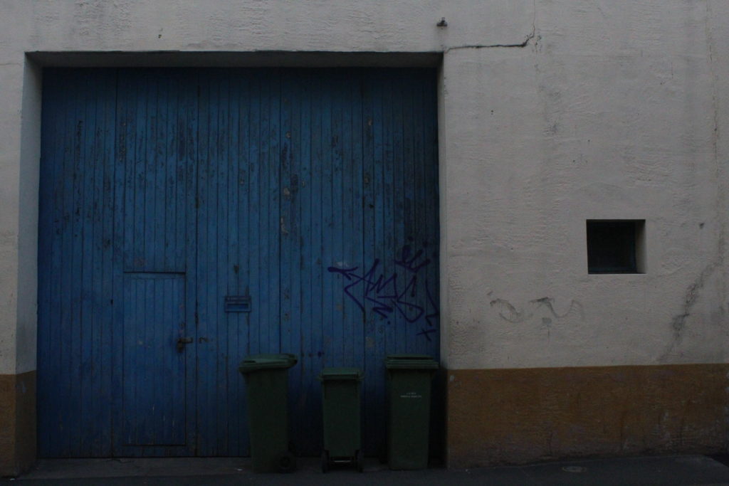
This is quite possibly one of my favourite images, I really like the composition and the placement of the graffiti just above the bins in the centre of the image and the blocks of different colours around.
I like how I managed to capture the detail of the cigarettes in the puddle, and also how the water highlights the rough texture of the tarmac underneath.
This image was chosen due to the particularly saturated yellow lighting and how it adds interest to the image.
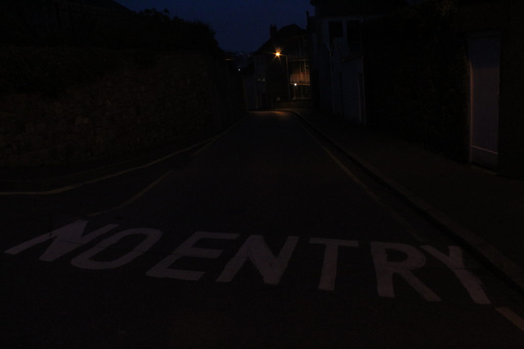
I liked the lettering across the foreground of this image, additionally the lone yellow streetlight in the background, almost like a star of some sort.

In the end I decided not to use the image of the street sign up close, IMG_1768, as I felt it did not fit within the overall theme of the rest of the shoot, even though I did like it as an image.