

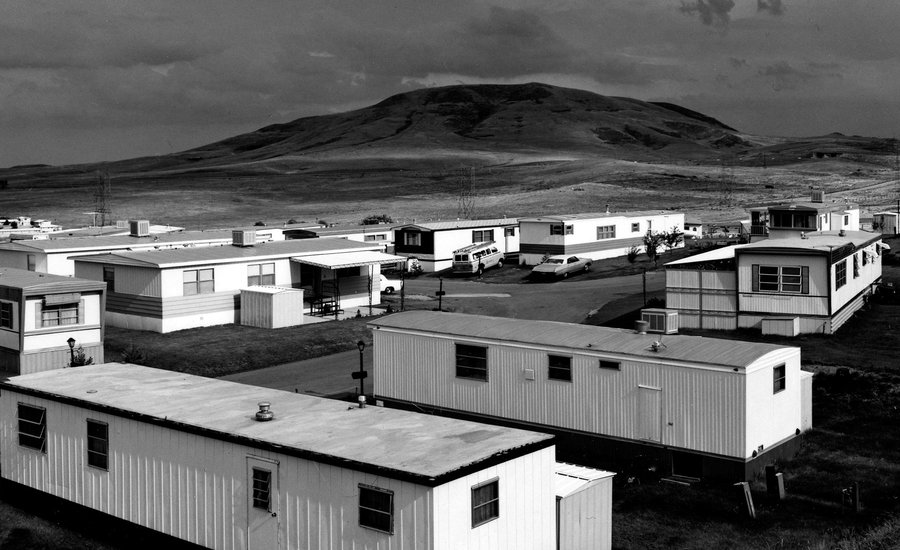
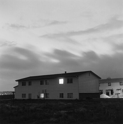

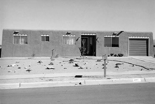
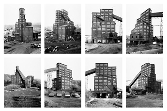
After the Romanticism movement, photographers soon tuned to “The New Topographics”, here photographers focused on buildings and anything that have been altered by man.
This new movement started in 1920s/ 1930s, in central Europe. Artists like El Lisstzky were the first to change from taking photos based on Romanticism, Here artists focused on the limited ranges of colours and geometric shapes. However the main focus was to find the beauty in our man altered landscapes.
Later on in 1975 which marked a further landmark in photography, an exhibition called “The New Topographics: Photographs of a Man-Altered Landscapes” became a turning point in the history of photography. This took photographers like Robert Adams, Lewis Baltz, Bernd and Hilla Becher, Joe Deal, Frank Gohlke, Nicholas Nixon, John Schott, Stephen Shore, and Henry Wessel. They then displayed 150 photos showing how “The New World” isn’t as bad as it seems and there is beauty behind it.
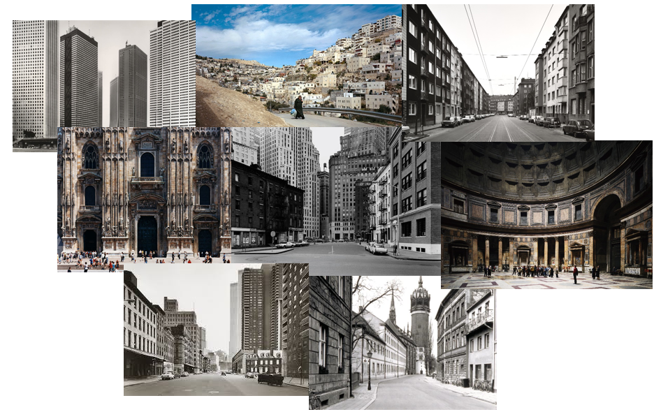
Thomas Struth is a German photographer which was born in 1954. He is best known for his Museum photographs, Family portraits and his 1970s black and white street photos in New York and Germany.
His mum, Gisela Struth worked as a ceramic potter and his dad, Heinrich Struth was a Bank Director, they both lived in Geldern, Germany which was where Thomas Struth was born.
In 1973, Struth initially studied painting; however, in 1974 he began to become increasingly drawn to Photography which is where his passion commenced.
In 1977 Struth was awarded a scholarship by Kunstakademie, which allowed him to live in New York City. This lead to his progress in unusual images of streets devoid of people, traffic, and the unceasing movement typical of a major metropolis.
His work is well known for his attention to detail, He wants to show the intricacy of the landscapes he captures to show that there is more than meets the eye. He is also well known for printing at a large scale; for example after vising places like Europe, Asia and America he created mural-sized colour photographs of up to 4 meters long, these were of dockyards, pharmaceutical plants, and physics institutes.
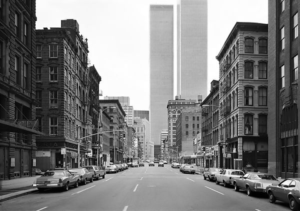
Visual: Here in this image the eye is lead down the road and into a sort of “never ending” view of buildings, this allows the image to look 3D. I like the use of repetition with the buildings, as although there may be quite a few similar buildings at first glance, when you take another look it is clear to see the detail and the contrast shown between all the buildings. The colour in this image is clearly black and white which allows the audience to focus on the image itself without getting distracted by all the colours. All items such as buildings and cars seem to have been placed in neat little lines pointing towards the centre background of the image, which further leads the eye to each and every building before the audience I able to take a further glance.
Contextual: This photograph is called “West Broadway” due to the location in which it was taken. It was taken in 1978 at West Broadway, Tribeca, New York. This image is currently in The Metropolitan Museum of Art in New York.
Technical: This picture has used Gelatin silver print which is an image suspended in a layer of silver gelatin, but on a paper substrate. The lighting is natural due to daylight. This photo was taken in the middle of this road which is shown through the symmetry of the image. Tonal range is shown in this image by the the different tones from Black-Grey-White. The photo also seems to have low sensitivity giving a better quality image. Warmth and temperature are not shown dut to the image being in Black and White.
Conceptual: I think the main idea behind this photograph by Thomas Struth is similar to the New Topographics movement in that he is trying to show the beauty in this new man altered world. This gives depth and meaning to the image as it is not another photo of New York to show of that he has viszited that place; but an image to show a different side of New York that many people may not be aware of.
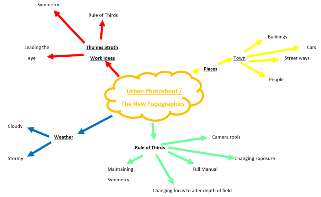
What? I will be taking photographs for my Urban Landscapes project. I will also be following Thomas Struths style to create a symbolic urban photoshoot.
When? I will be taking these images on Friday 18th October 2019.
Where? I will be taking most of my images in St. Helier, Jersey as it’s the most urban place in Jersey due to the high street and new financial buildings being built every year, it is also well populated, similar to many of the locations that Thomas Struth took images at.
How? I will be using the Cannon 750D to take my photographs, I will also be using natural lighting as I will be taking the photographs outdoors, I will then edit my photos using photoshop in order to make them look more like my photographers work.

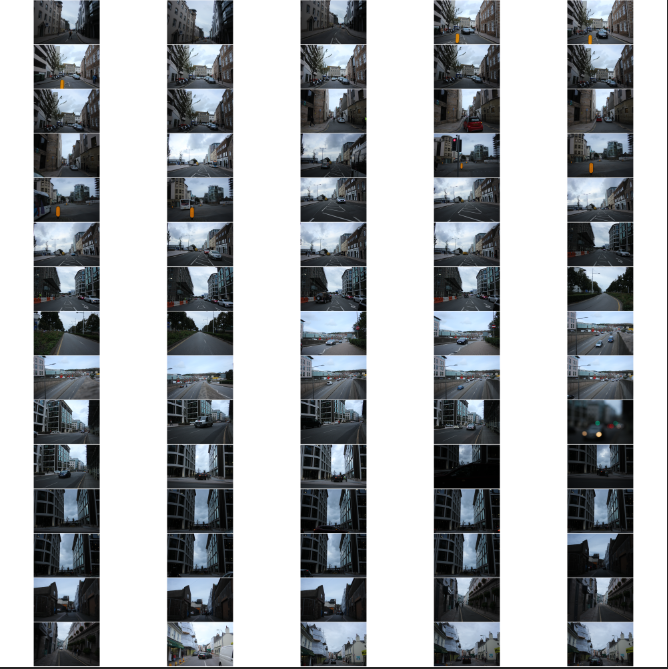
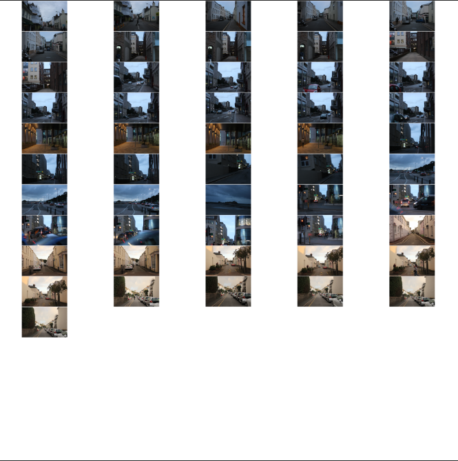


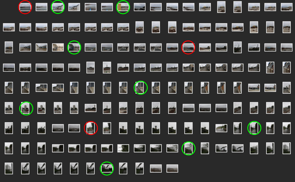
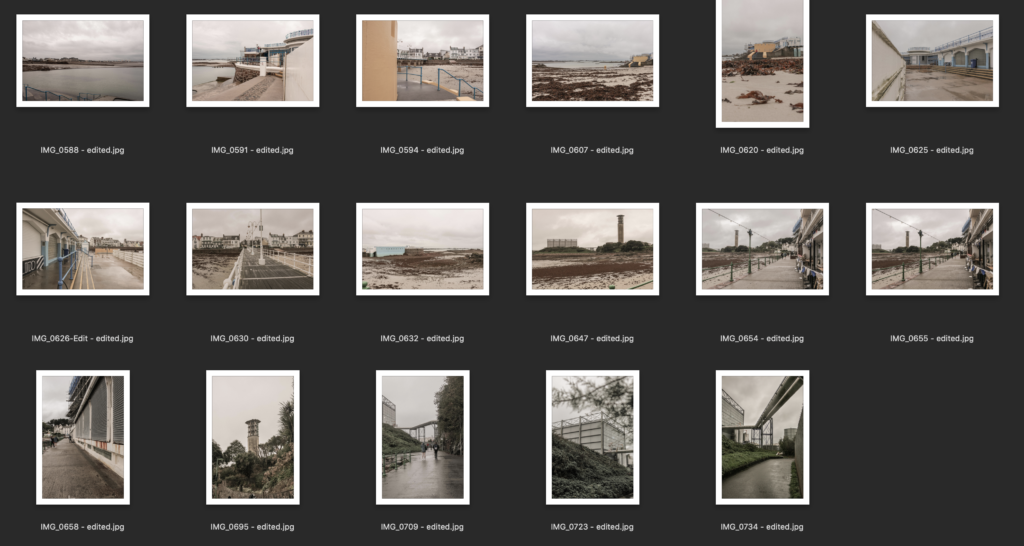
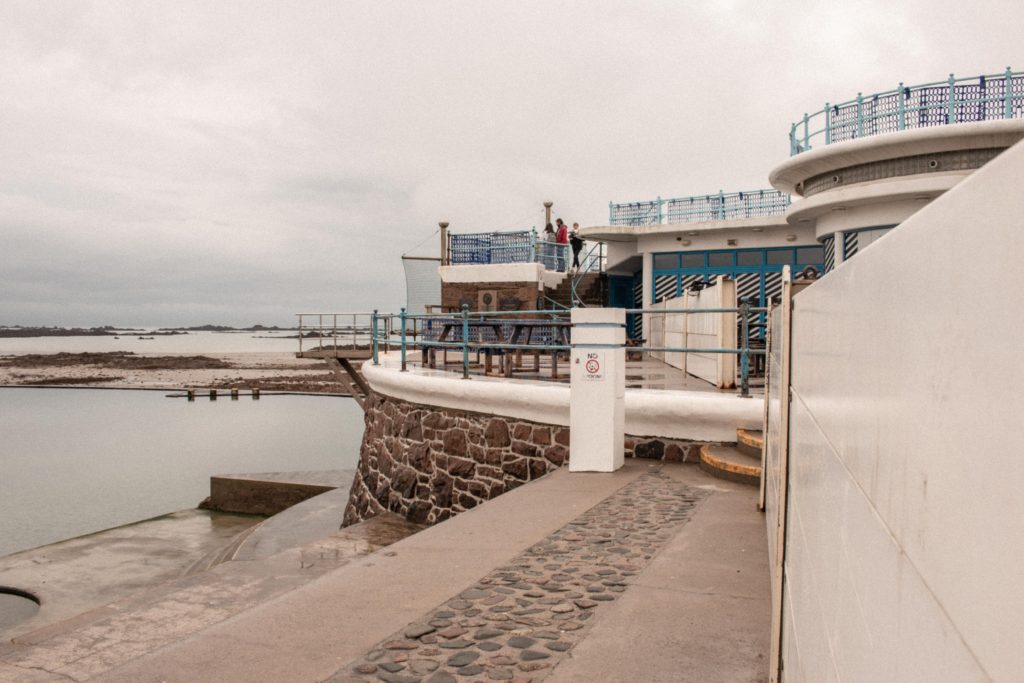
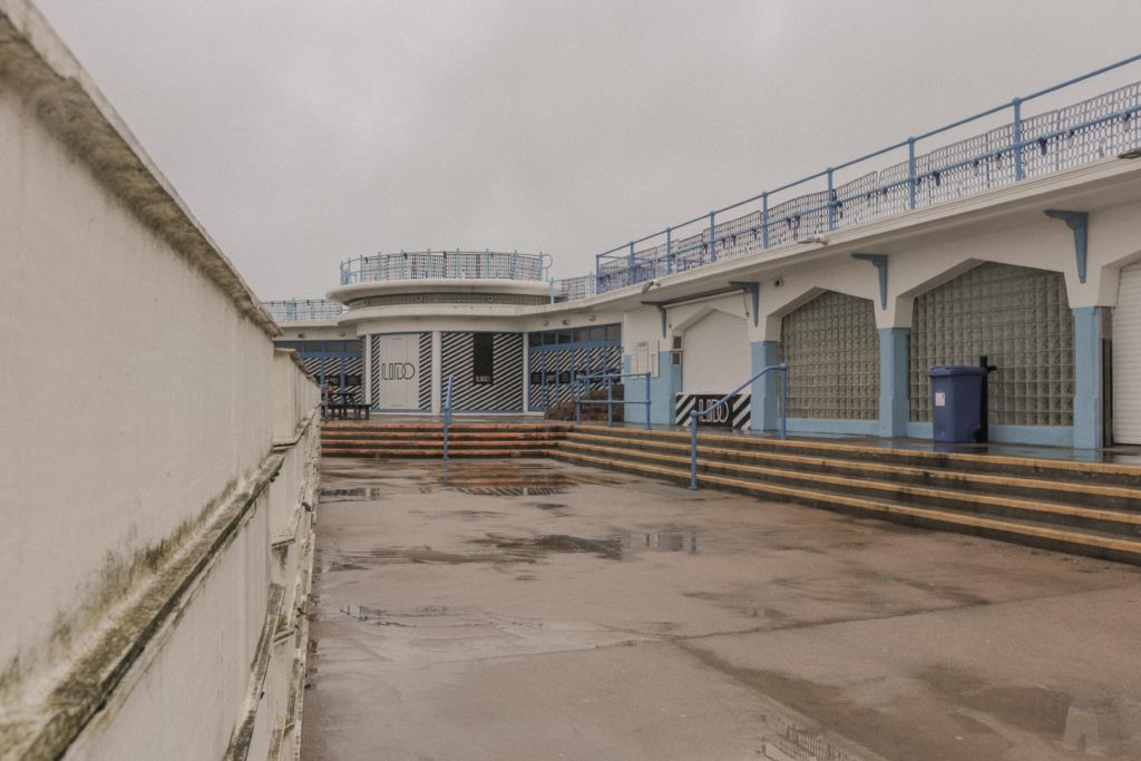
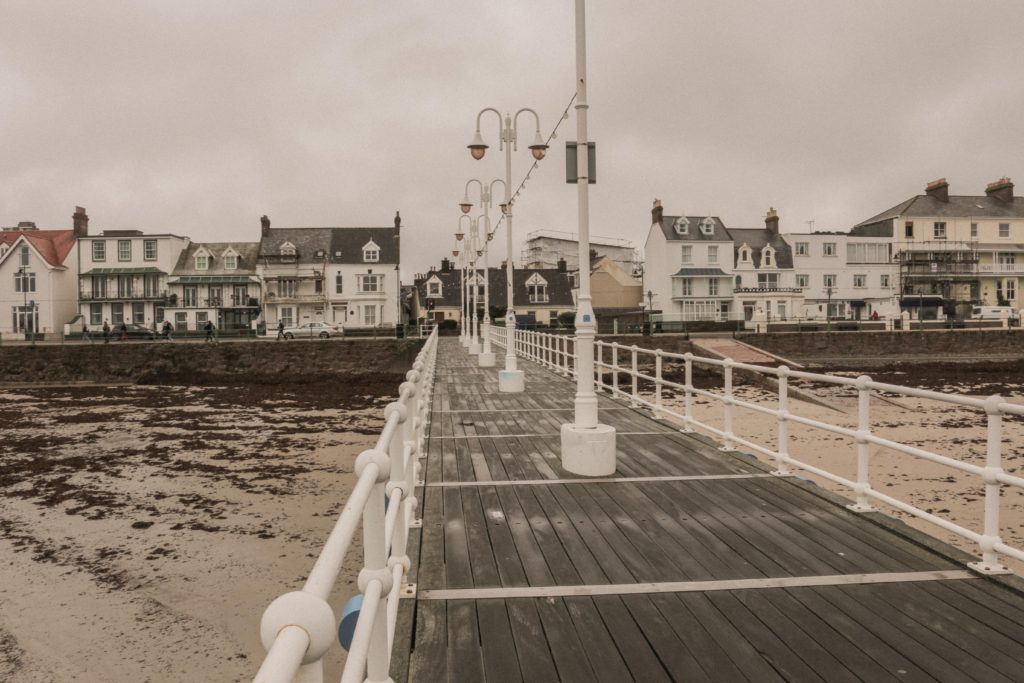
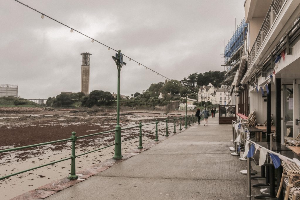
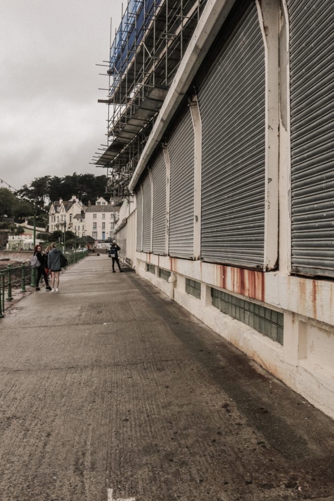
These are my best images that I think really show the new topographic and the contrast between the natural beauty of the coastal landscape and the urban structures that are taking over the landscape. I edited these images in Lightroom by choosing the style and final outcome I wanted then created my own preset. During the edit process I first cropped and resized the images to get the horizon lines straight and focus in on parts of the image that I wanted to stand out. I then upped the kelvin/temp sliders to make the photo warmer to replicate the look from the new topographic photos. I then increased the vibrance to make the colours more visible but lowered the saturation dramatically to make the image more flat. This was instrumental in creating the vintage 1970’s look.
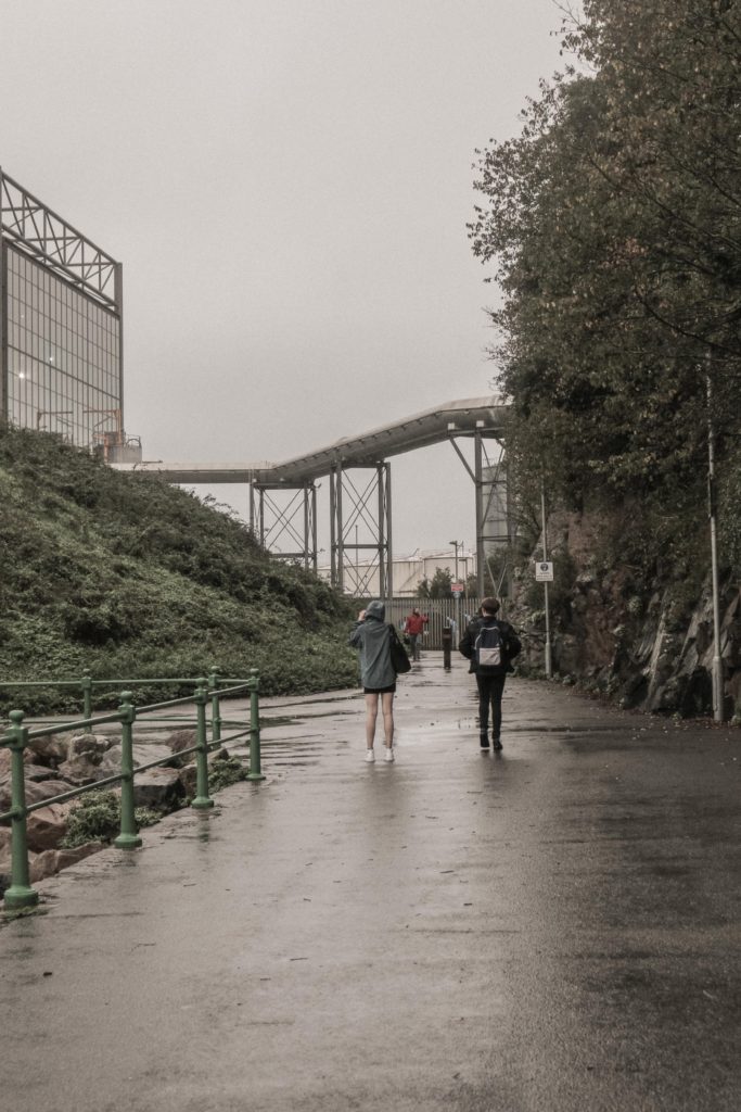
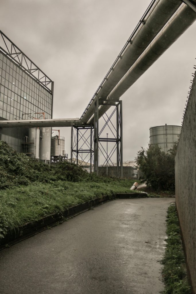
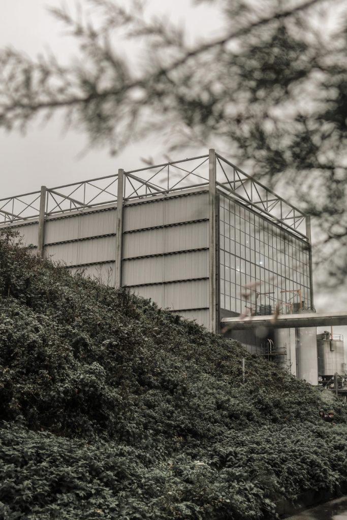
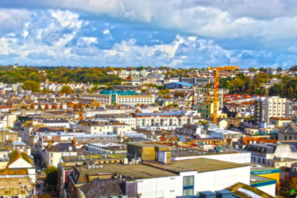
who is MICAH DANGES and what do they do?
MICAH DANGES, born in 1979, pushes their photographs to the limit. DANGES uses optical distortions to create abstact pieces. They also print on unusual textures, including silk and cotton.
favourite pieces of MICAH DANGES
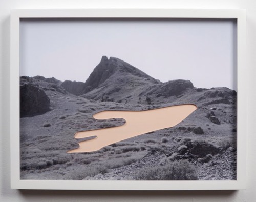
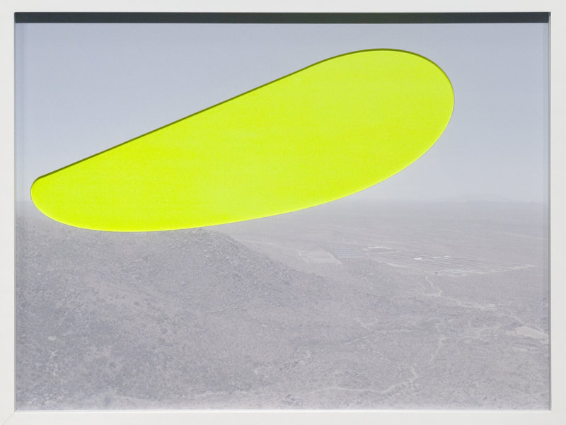
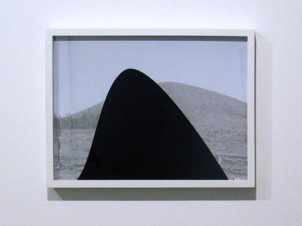
analysis of MICAH DANGES piece

The lighting of the photograph is flat, meaning there is no contrast or definition of the background. DANGES may have digitally lowered the contrast, to create this flat light image. The photograph is perfectly exposed, and is not overexposed in any areas.
MICAH DANGES works with black and white images, to allow the colour blocks to really stand out and be a focus for the viewer. The colour block mainly covers the whole of the photograph, this is interesting for the viewer, as they will not know why it has been covered. The shape allows the viewer to think and pick out what they want the photograph to be.
my experiments inspired by MICAH DANGES


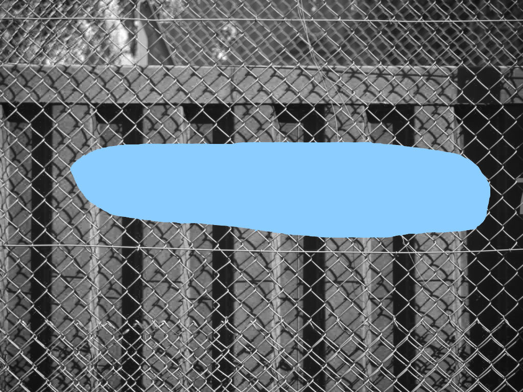

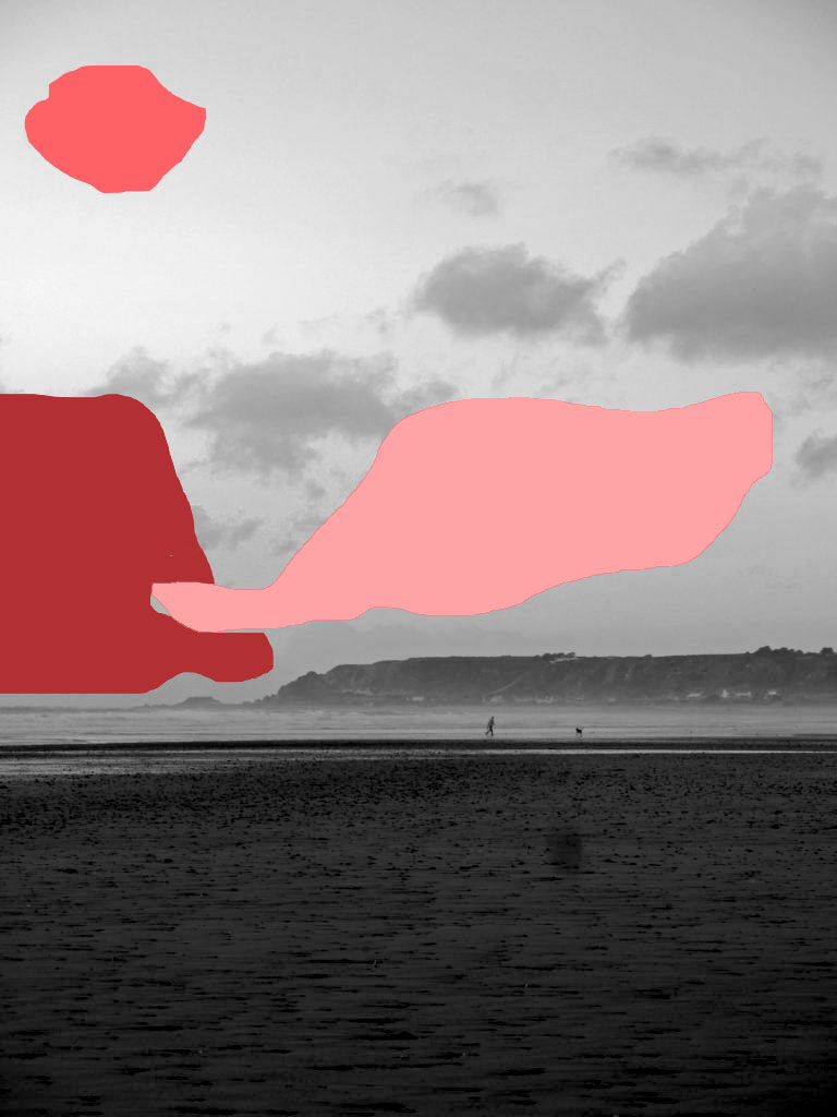
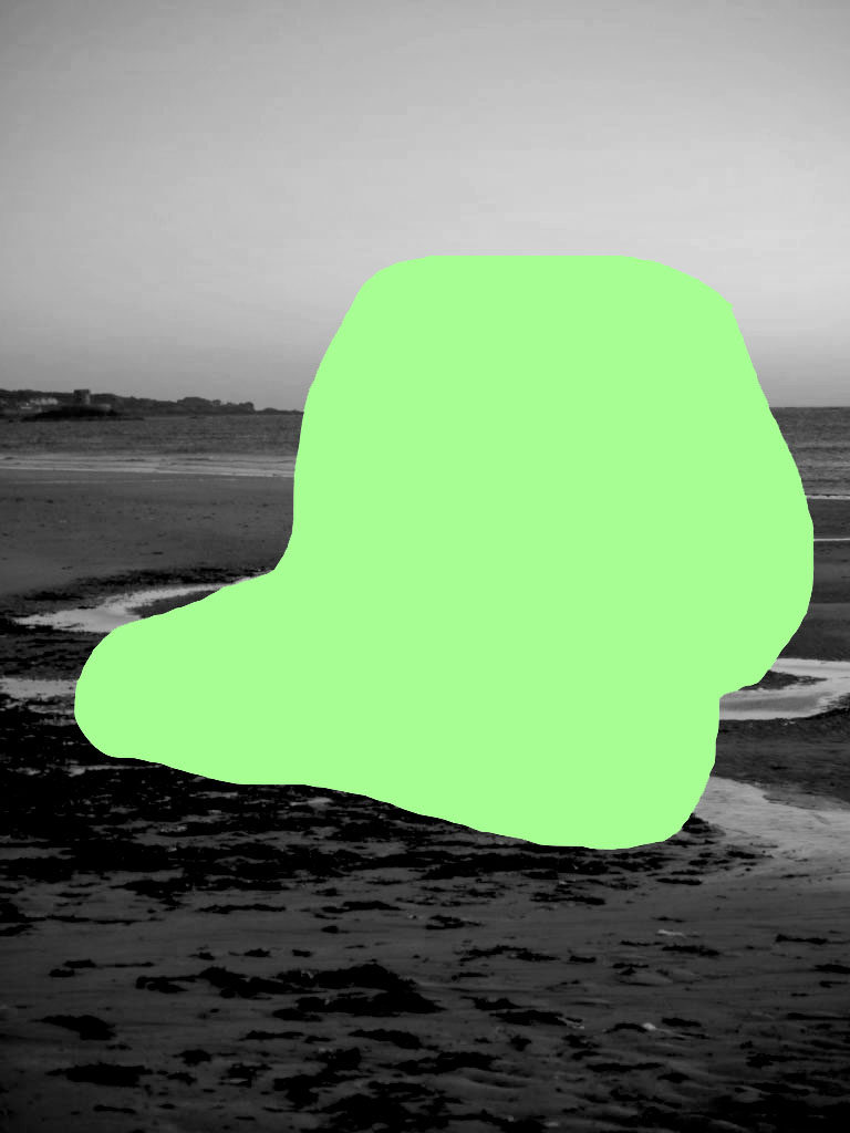
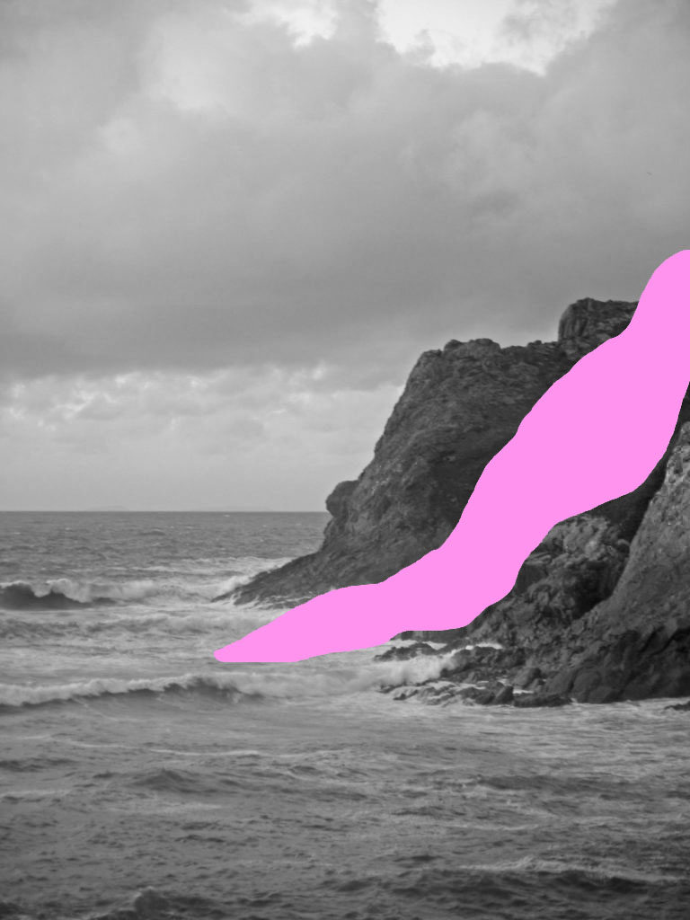

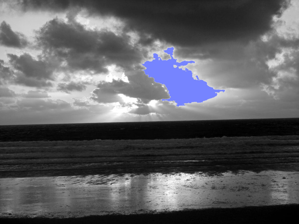
I think some of these experiments have turned out very well (ones annotated ‘successful’). This is because they look similar to MICAH DANGES pieces and interest me too. They also have a completely different meaning and intention to the original did.
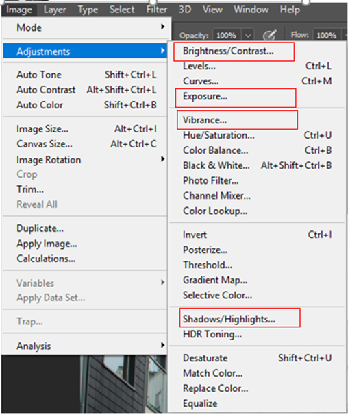
For all my images I followed the same process by using these tools on Photoshop ^^^^
I found that the combination between these editing tools allowed me to reference my chosen photographer and also make my images look more professional.
E.g. I just changed the amount “Vibrance” for each picture depending on what looked best.
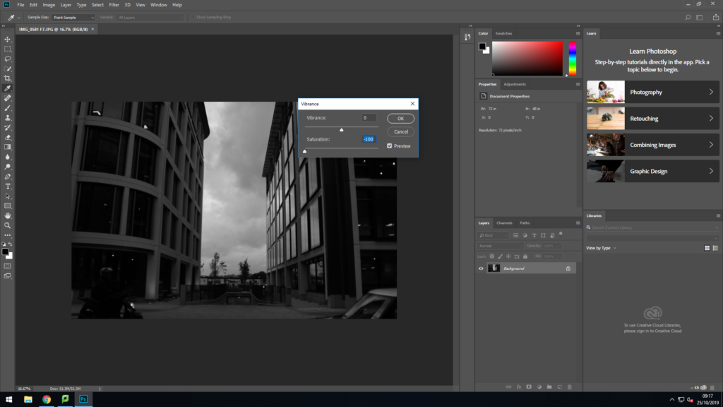
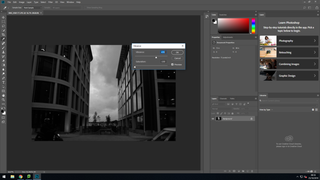
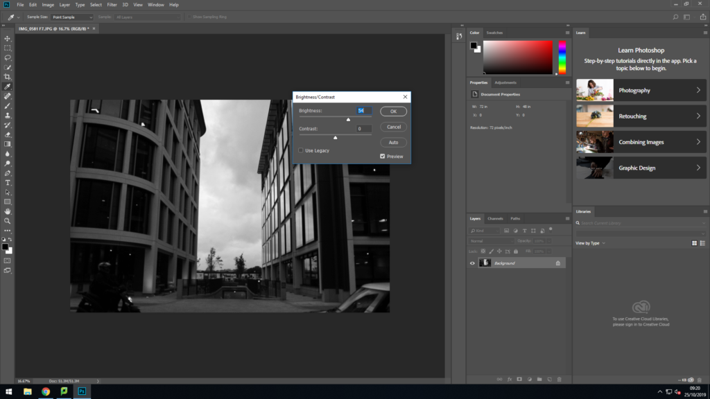

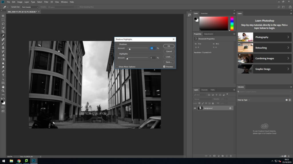
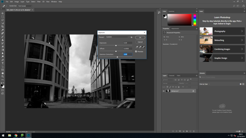
For the last image I followed the exact same process; however, at the start I used the “Spot Healing Brush tool” to get rid of a person that was in the middle of the road.

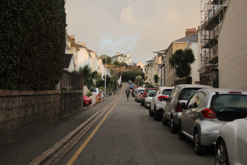
Above is the original image with the man standing in the middle of the road, here I found that he was distracting and took the focus away from the buildings and the cars.
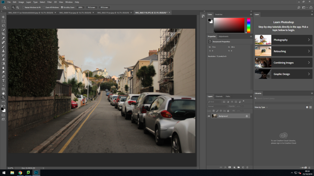
This is the image after editing out the person, here the eye is lead to the end of the road without being distracted by the person which is what I wanted to achieve.
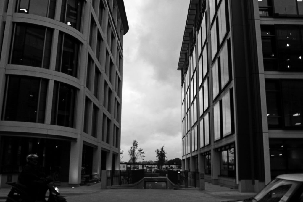
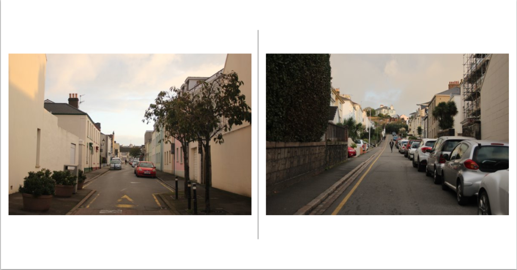
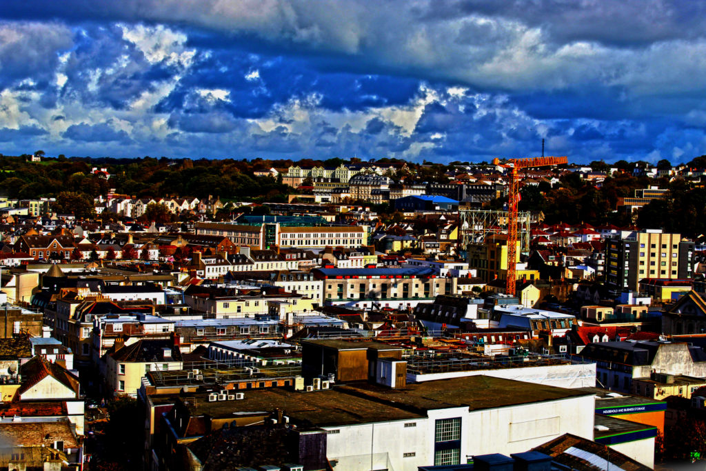
I really like this image as it really shows the power of urban landscapes whilst still showing its unconventional beauty. I quite enjoy the sunlight shining on the windows of the building on the right. This photo was quite hard to capture due to the ongoing traffic; however it made any photo that I made unique and interesting. I tried to still incorporate abit of nature into the image through the use of texture in the clouds, as this made the photo look like a stormy day which further brings the attention onto the contrasts in the buildings. I also quite liked the symmetry between the image due to the buildings as it shows the similarity between the buildings however the differences are still strongly present.
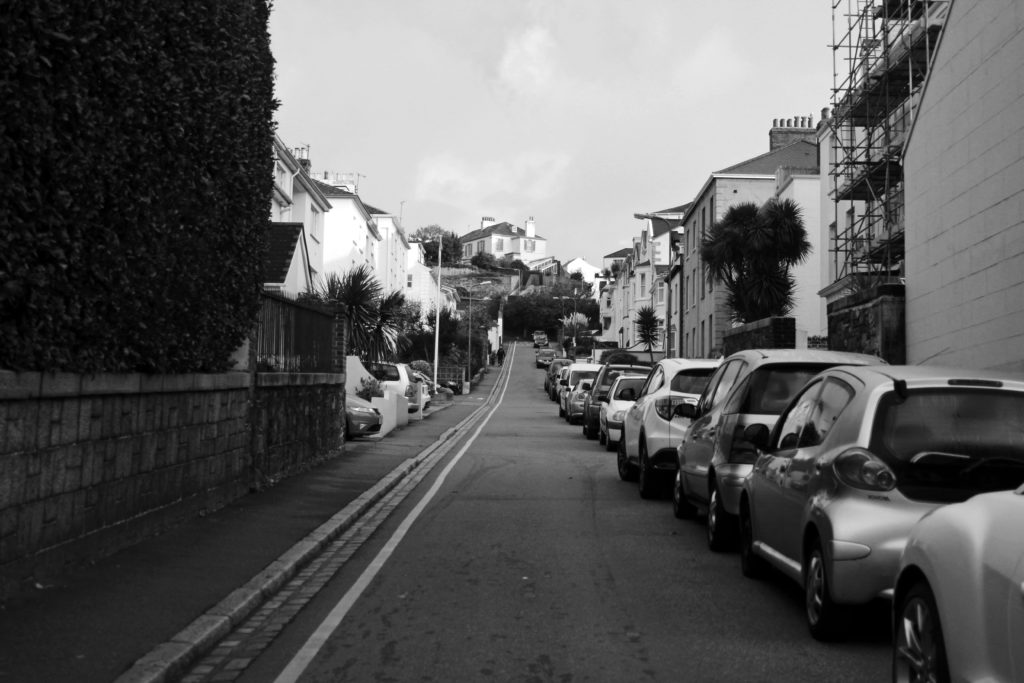
I quite like this this image due to the tonal range used which helps to contrast the buildings and the cars. I used natural lighting due to the fact that this image was taken outside and in daylight. Here due to the editing process, the eye has been correctly lead to the end of the road which allows the audience to look at all of the different buildings on the way.
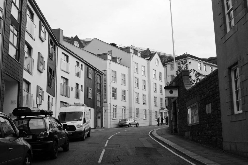
Although this image doesn’t follow Thomas Struths conventional approach to his photographs, I thought this was a good image to include due to the aspect of mystery. Similar to Struths work, the eye is lead to the end of a road allowing their to be a certain element of mystery due to audience is then left to question what lies beyond that image; here as the eye is lead by the road markings it is also cut off by the wall. This however; is intentional, parallel to Struths work the audience is left with question as to what lies behind the wall. This also allows the audience to focus on the man-altered landscape which is what Thomas Struth tried to portray in his photographs.
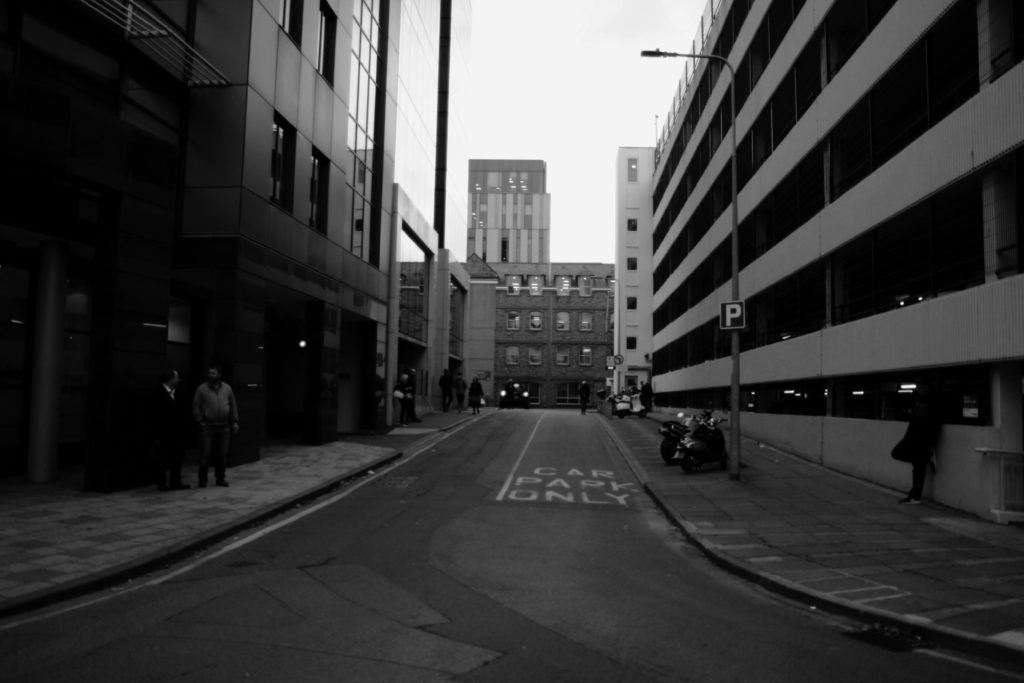
This image was taken near a parking lot, my main aim was to try and add beauty into this image as this wasn’t an amazing location. I think that I have added tension through the shadows in which I have manipulated. I tried to focus on the contrasting colours however I think I have made the image too dark in that process. Personally, I think this image refers too much to an alley way, therefore not showing the beauty in the buildings shown.

I think that this image refers to Thomas Struths work well due to the almost identical symmetry in the buildings. Due to the fact that I took this image at the high street all the buildings are slightly different giving detail to the image. I think this image I took away too much of the highlights as overall the is well edited however the highlight in the front white building on the left doesn’t look well balanced compared to the other white buildings.
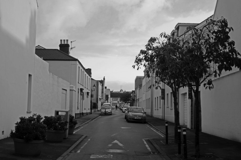
Here I think that the detailing in the clouds compared to the detailing in the buildings contrast, showing that nature and man altered landscapes can co-exist together. I also like the difference in the positioning of the cars as they are at different points in the image allowing the photo to show depth.

I really like think image due to comprehensive detail of all the bricks, especially the contrast between the lightness of the bricks on the floor compared to the bricks on the actual buildings. I tried to take this image in the middle of the road to create the same lines that Thomas Struth uses in his works, in that due to the lines that are heading towards the centre of the background.
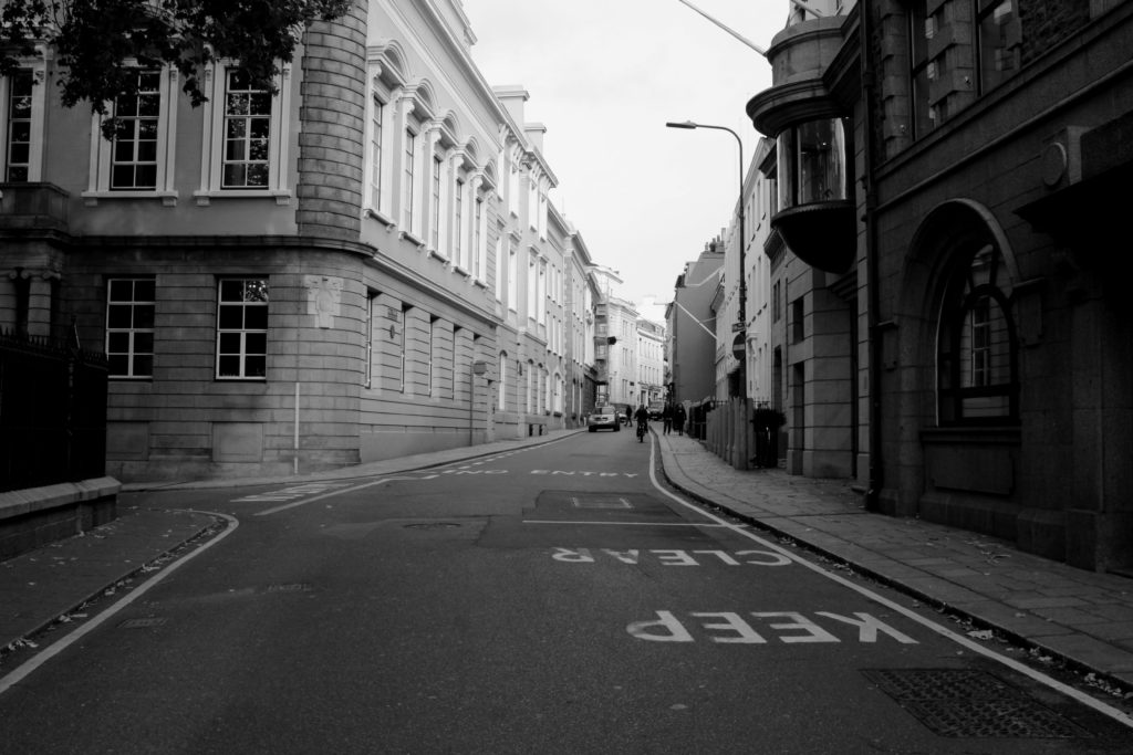
This image shows the wideness of the road showing its ability to be multi-functional, which is similar to Struths image of “West Broadway”. Here the focus is again on the different detailing on the buildings and cars which is why I tried to contrast the colour of the buildings so that they would stand out and look different. I quite like the tonal range that I was able to use as it again allows the detailing to be shown and well represented.
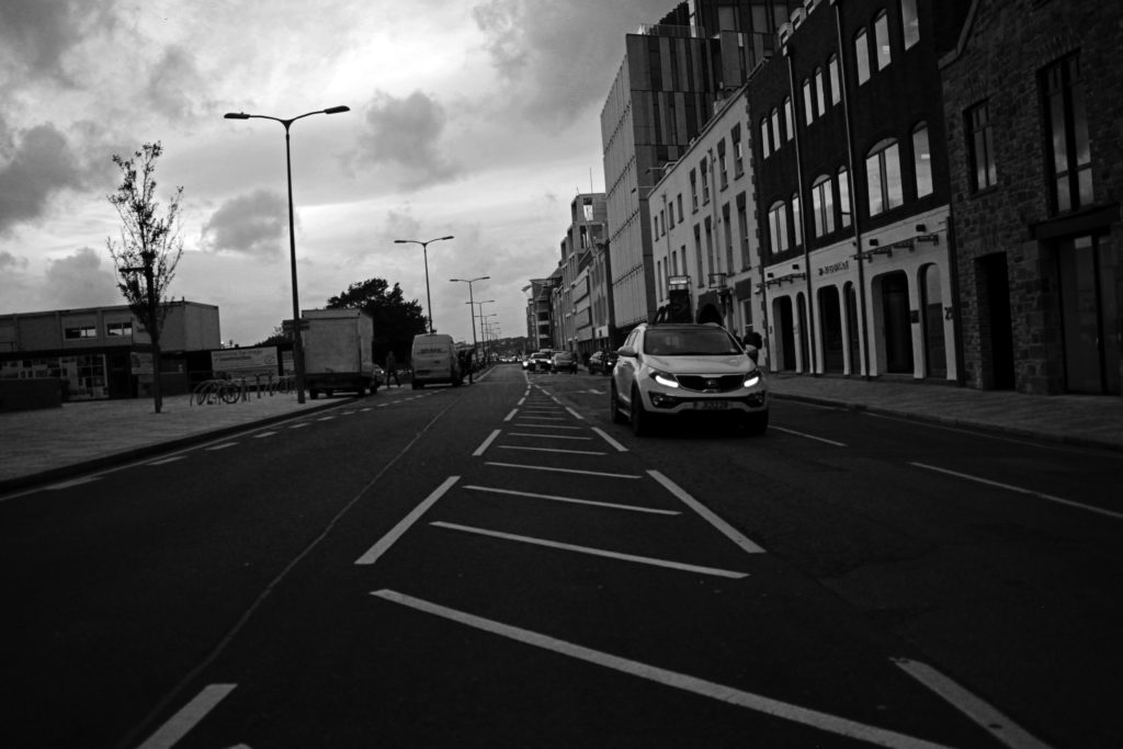
I love this image as it reminds me of a car advert, the contrasting colours make the image look professional and well polished. I like the light shining on the windows of the building as it allows the intricacy of the buildings to show and contrast. I also really like the texture and irregular shapes of the clouds. Although I think that this is an overall successful image, I don’t think it represents Struths work as well as I would like, as the idea of symmetry is lost due to the “missing” buildings on the left side.
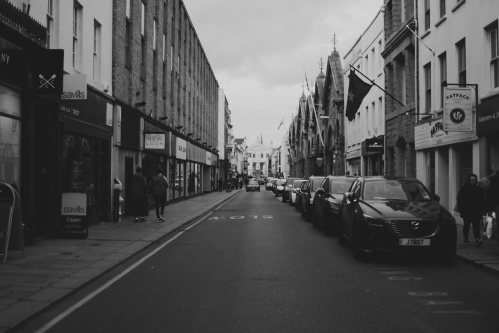
I think that this image works well due to the symmetry of the buildings, as although they are all slightly different, you can almost draw a line on the top of the buildings showing their balanced layout. This image is slightly unfocused; however, I think that this adds to the image as it makes the photo look more old fashioned. Similar to Struths work, due to the stationary cars I think that this image represents the still life similar to Struths “West Broadway” as all the traveling cars are placed in the background were they no longer seem to be traveling. In my editing made my images black and white parallel to Struths work. I think that as I decided to take this image in the middle of the road, this allowed their to be depth in my image making it look 3D. This allows the eye to successfully lead to the centre background of the image which is comparable to Struths work.
