
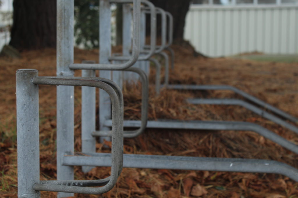
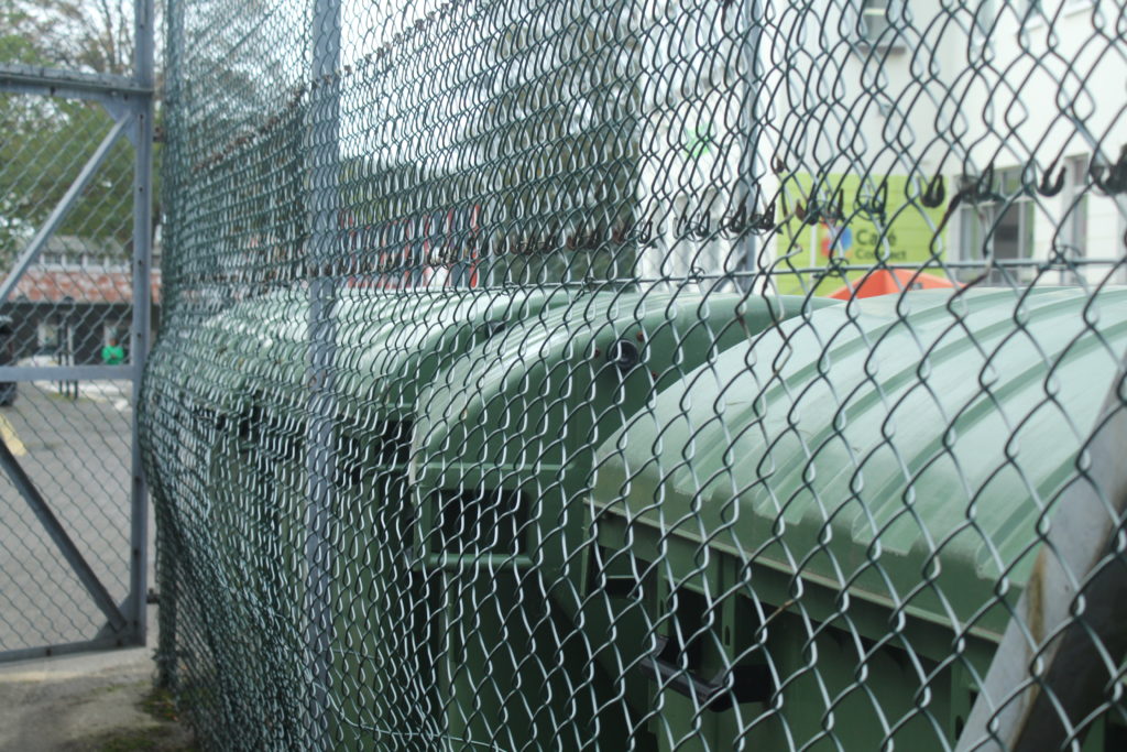
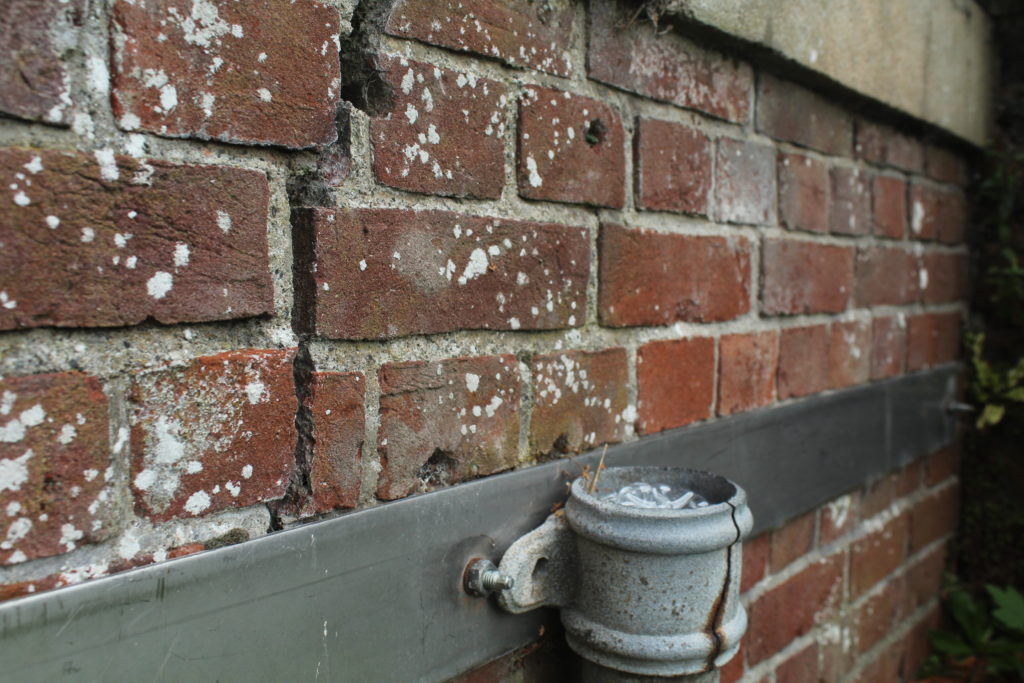
Urban landscape – contact sheet 2


Final Outcomes

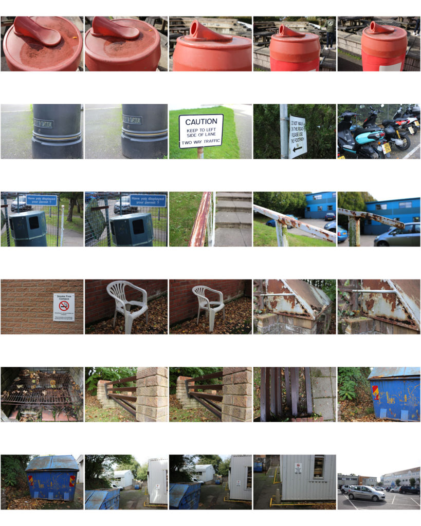
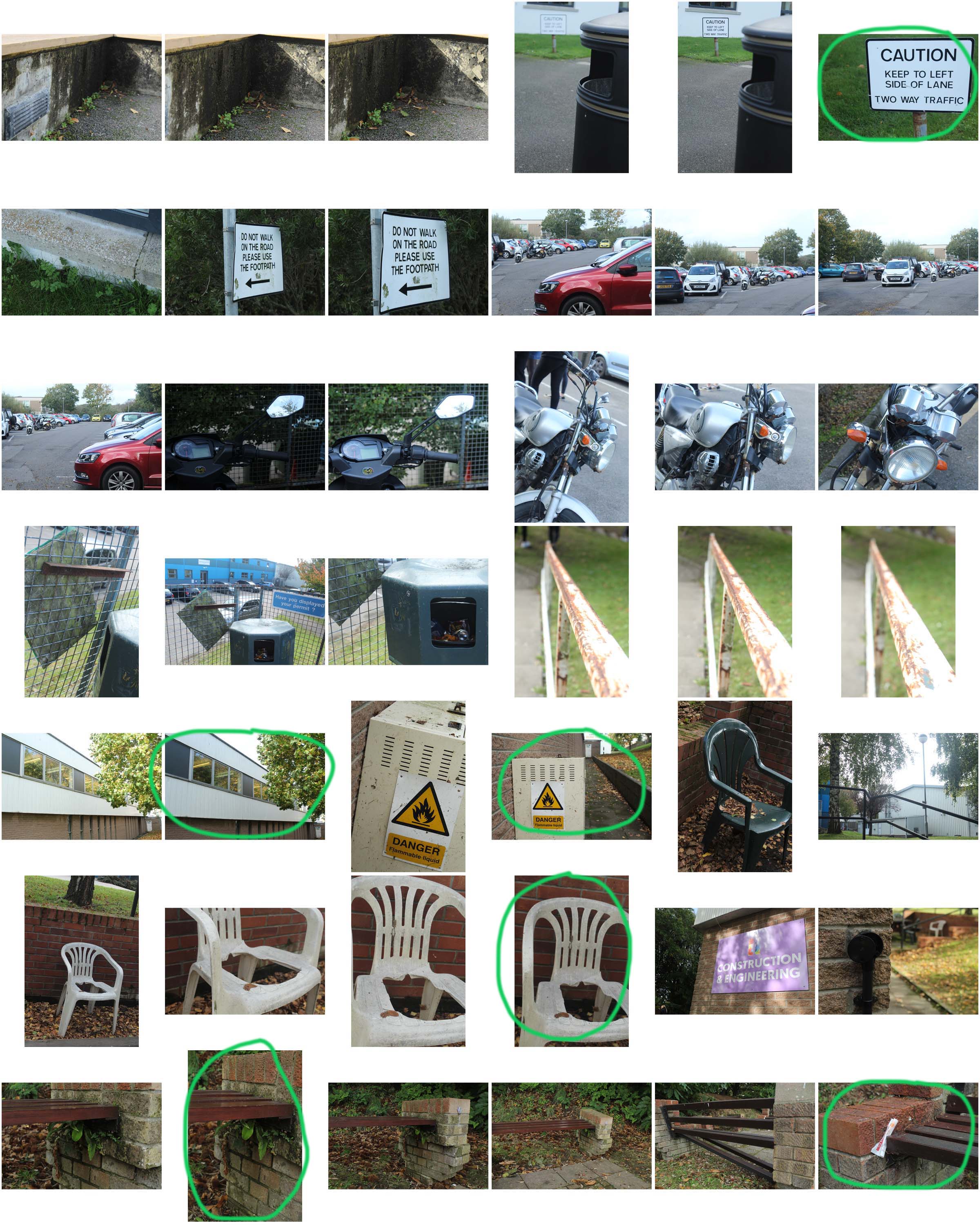
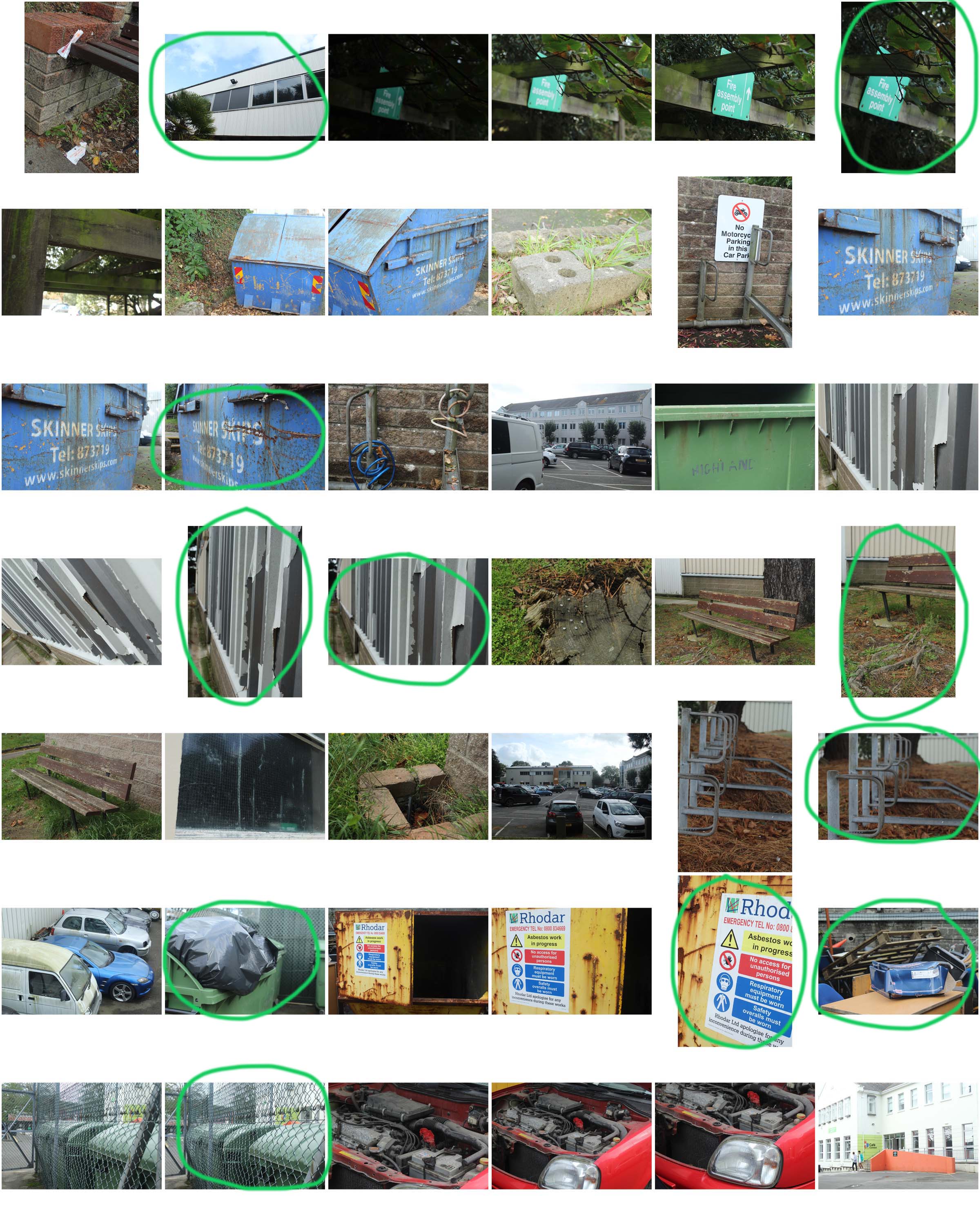
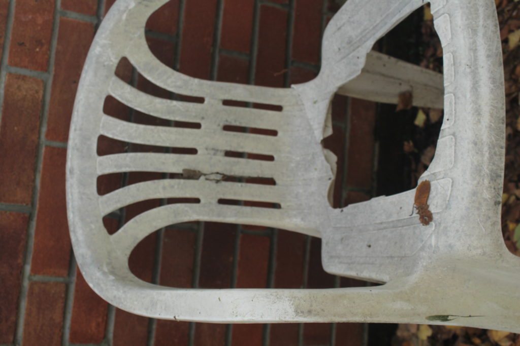
This is one of my favourtie final outcomes because of the atmosphere of the image. Although, the object within the photo is what creates that eerie atmosphere. The hole within the chair creates a derelict atmosphere which emphasizes the creepy vibe. The leaves also give the atmosphere of abandonment, since it looks like it has been a long time since anyone has been in this area. I levelled this image in photoshop. I increased the contrast of the image to enhance the atmosphere and also lowered the brightness for that same reason.
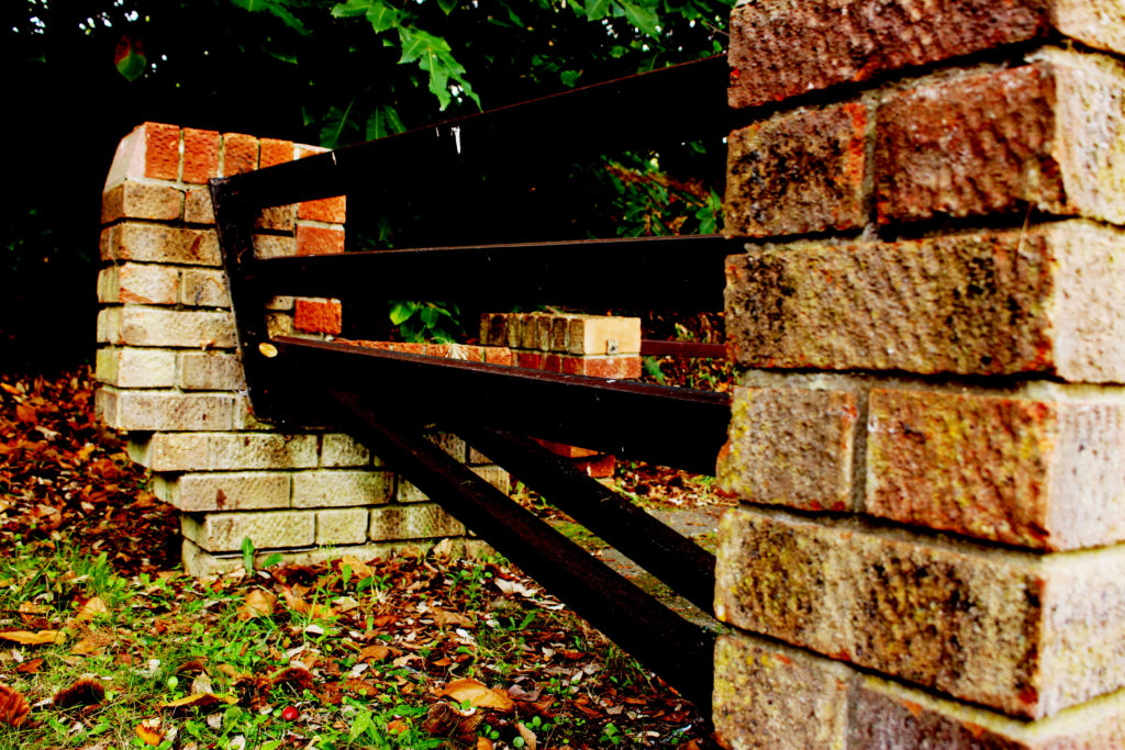
This is another one of my favourite final outcomes again because of the atmosphere of the image; abandonment. The bench is broken which gives the audience the impression that no one has been here for a while and there is no one to take care of it. The leaves, again also emphasize the atmosphere created. I levelled this photograph in photoshop by increasing the contrast and the vibrance of the image in order to bring out those ‘old’ colours that show the decay of the objects.
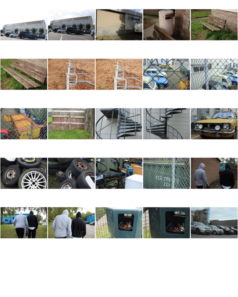
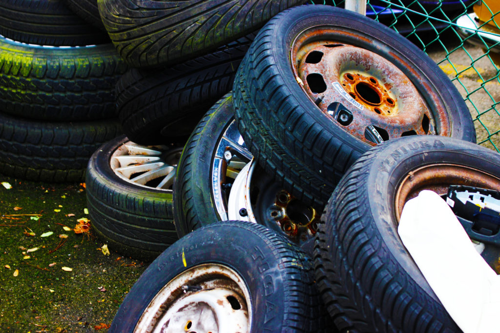
This is another one of my favourite final outcomes because of the composition and colouring of  the image. I find it intriguing how perfectly placed the tires are upon one another, although this was probably accidental since it looks as though the tires have been there for a long time. Also, I like the angle of which I took the image as it shows most of the elements that the tires hold. The placement of the tires also looks aesthetically pleasing. I levelled this image in photoshop by increasing the contrast and increasing the vibrancy and slightly the saturation in order to bring out the aged but vibrant colours that lay on the tire.  
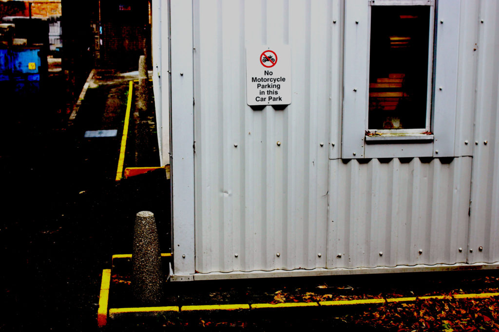
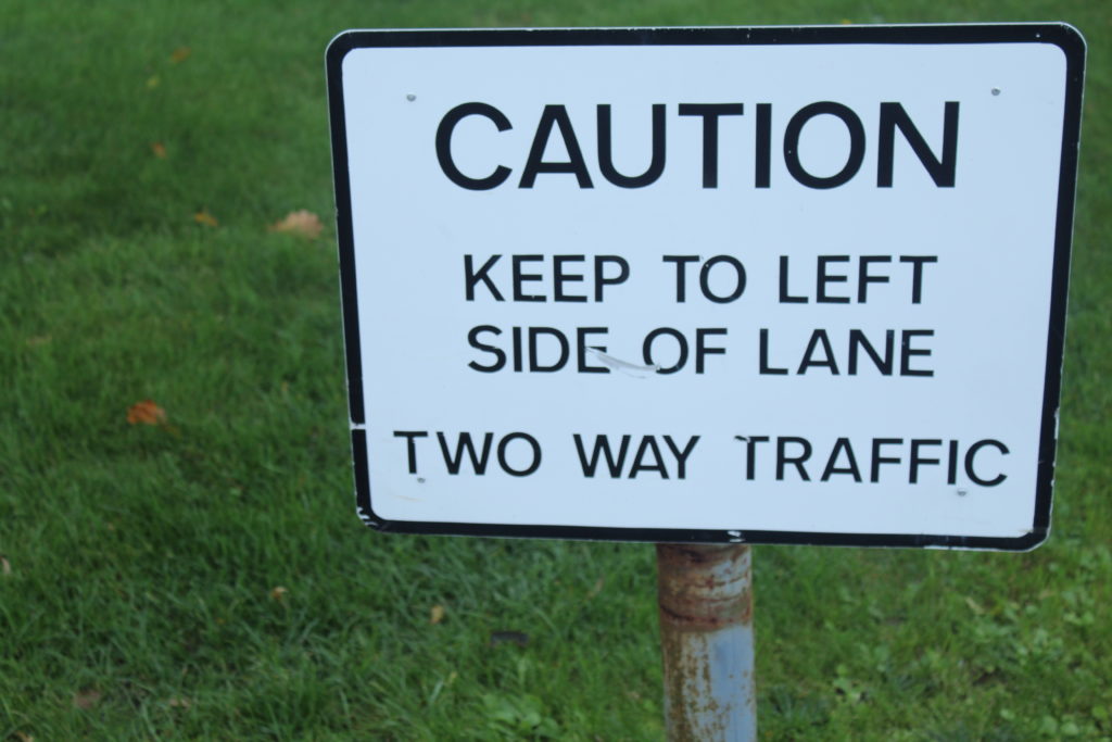
This is one of my favourite final outcomes because of the dramatic contrast in colour within the image. I levelled this image in photoshop and increased the contrast so that an eerie, creepy atmosphere would be conveyed. Increasing the contrast of the image allowed the dark concrete to darken and appear dramatically different from the yellow lines that are on the ground. I also like this image because it shows the industrial, bleak, buildings that man now creates. Because the area looks unpleasing; it sends a conscious message to the audience just as it did in the New Topographic’s Exhibition.

Keld Helmer-Petersen

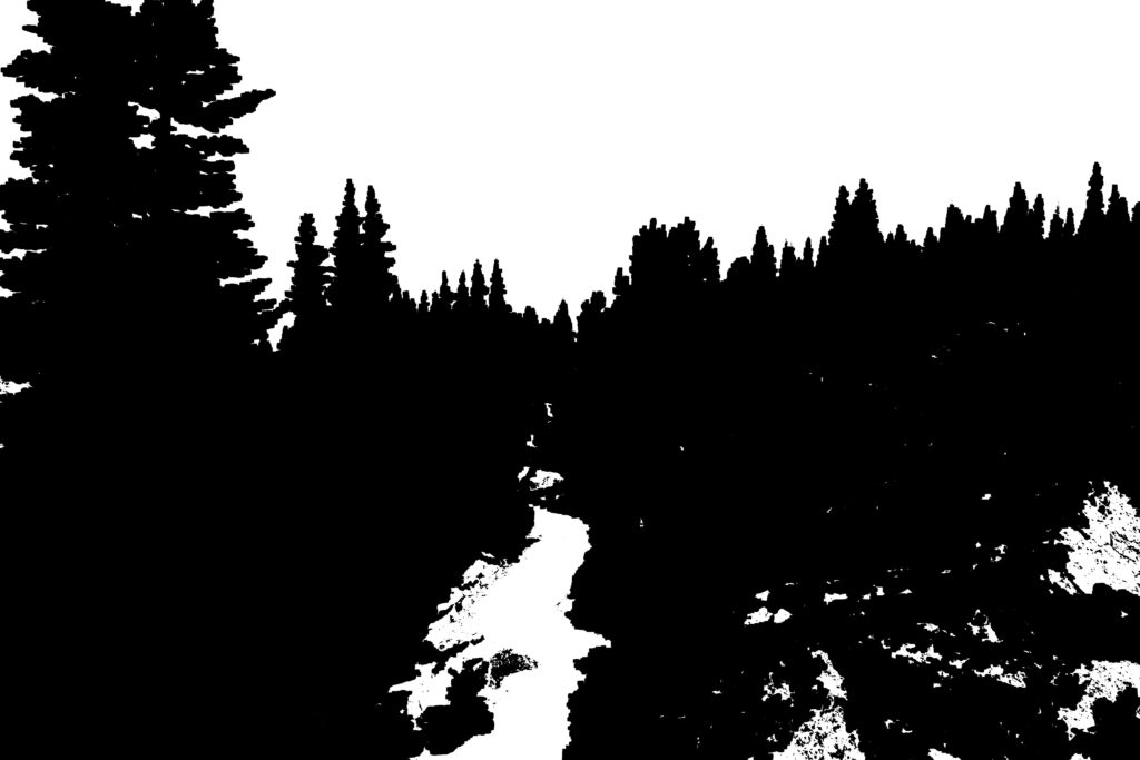
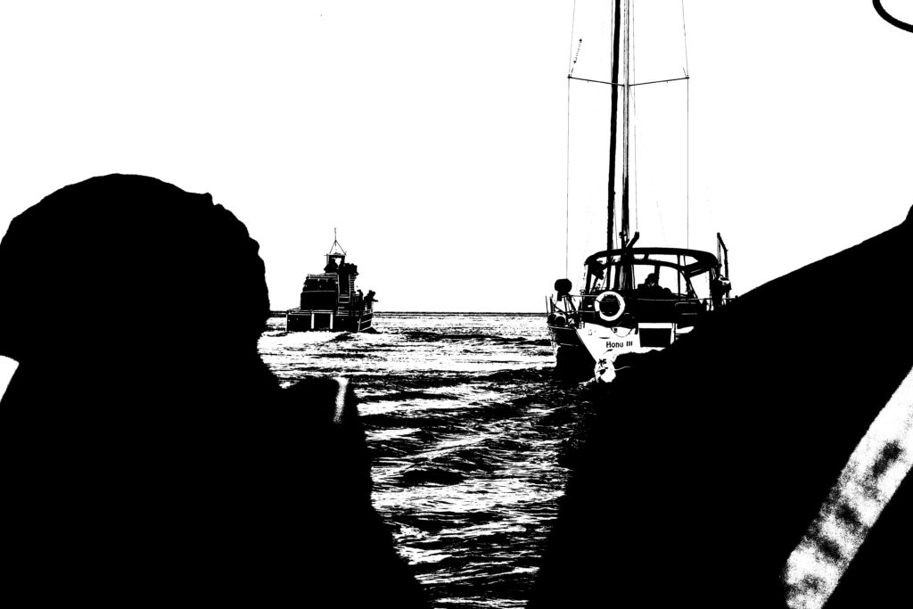
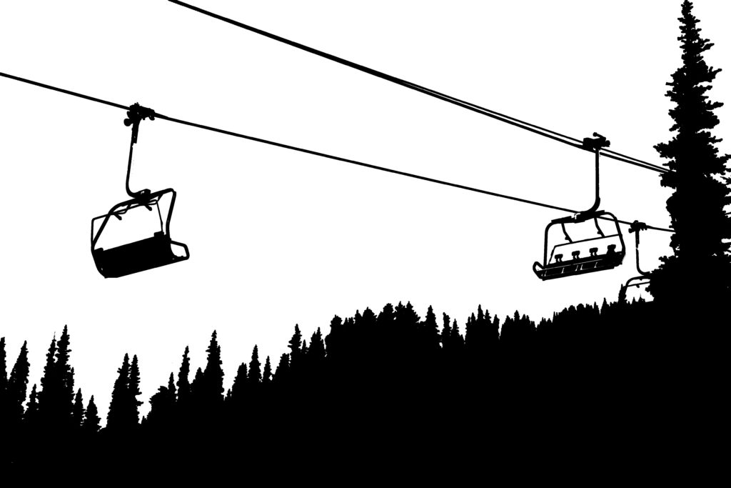
Petersen was a Danish photographer, renowned for his work with abstract colour photographs. The prime of his work was during the 1940/50’s. He studied at the institute of design in Chicago and was taught by Harry Callahan. Petersen experimented with all his work and pushed the boundaries of ‘normal photography’. In the early 2000s, Helmer-Petersen was rediscovered when 122 Colour Photographs was presented in volume one of Martin Parr and Gerry Badger’s three volume survey of the most notable photo-books.
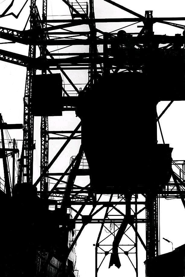
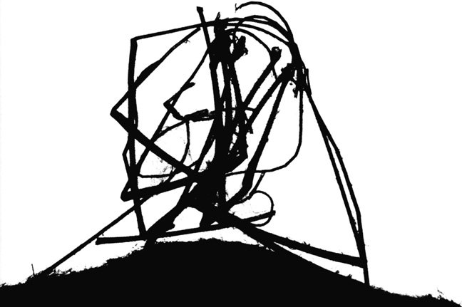
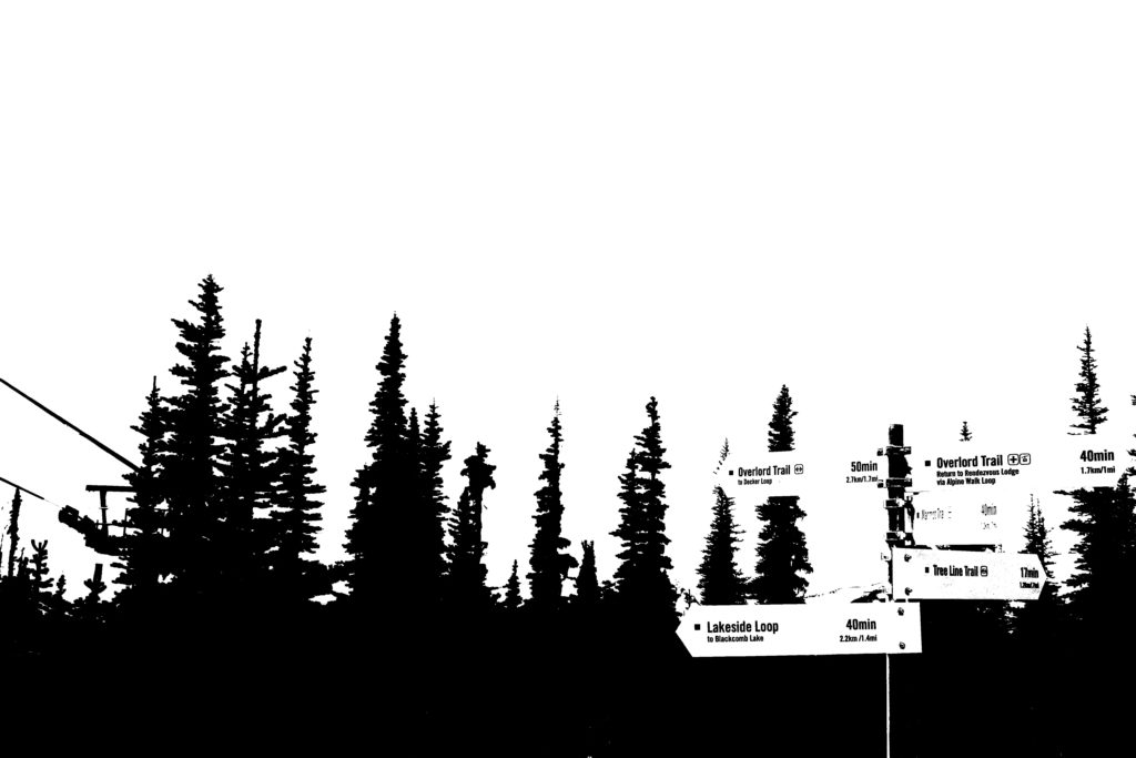
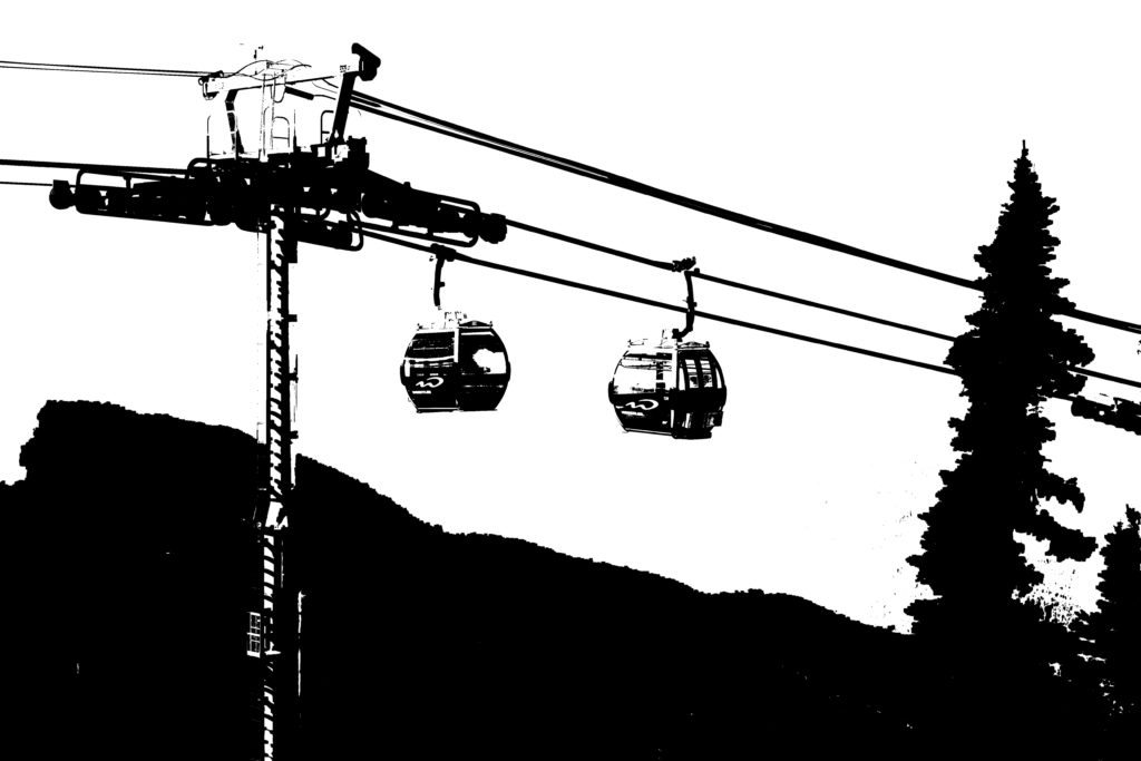
I attempted to recreate Petersen’s iconic style with some of my own images by experimenting with the threshold. I also used the paint bucket tool to fill in gaps in the black areas to make the images more smooth and clear.
URBAN LANDSCAPES PHOTO SHOOT PLANNING

WHAT:

Urban landscapes, built up/man made areas around Jersey.

WHEN:

Anytime of day as urban landscapes seem to prosper in all kinds of conditions, however overcast afternoons allow for a grayish tone that contrasts with the foreground, ideal for new topographics.

WHERE:

Various locations around St Helier such as La Collette, Town Centre, Fort Regent and the Waterfront. Other urban areas out of the town may include building or telecommunication complexes as well as bunkers dotted around the Island.

WHY:

I am planning to capture these places as my decision was heavily influenced by famous photographers such as Robert Adams by focusing on New Topographics, as well as Kled Helmer-Petersen and his back light photography. I will try to best capture pictures in the same style as these photographers that I have studied, aiming to highlight similar meanings and attitudes through my photography.

HOW:

When in process of taking the photos for the landscape project, I will emphasize the theme of urban landscapes in my photography by venturing to built up town areas and seeking to find man-made and ideally abandoned, “ugly” structures. I will achieve this with the help of a tripod in order to help me align a suitable composition as well as preventing blur as a result of a loss of focus to occur. I will also aim to take photos during overcast weather conditions and they best imitate the photos of both Robert Adams and Keld Helmer-Petersen.