This week we will be focusing on selecting your best images from your first 2 x landscape photo-shoots and then enhancing, manipulating, printing and displaying your final images. Some of you will be adding to these this week.
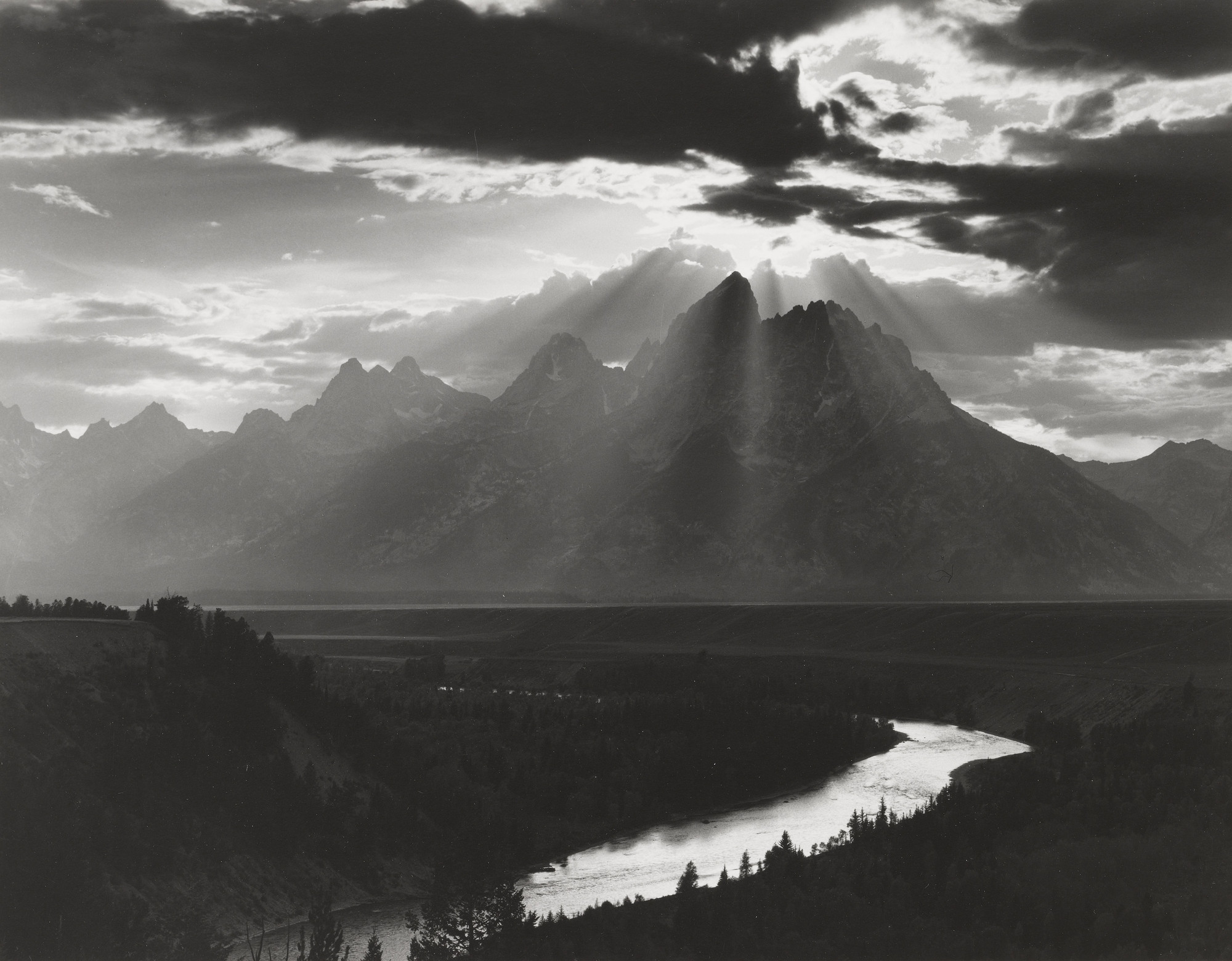
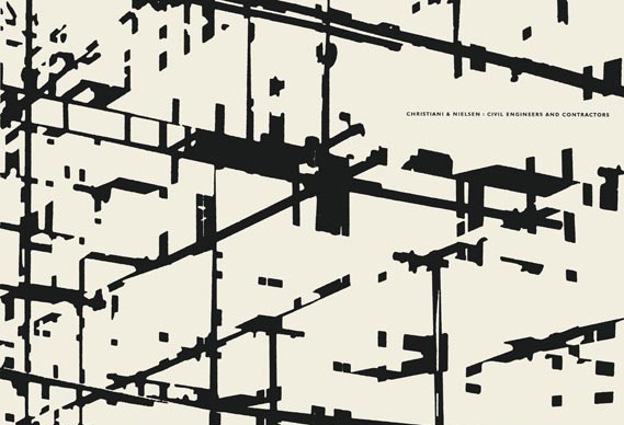
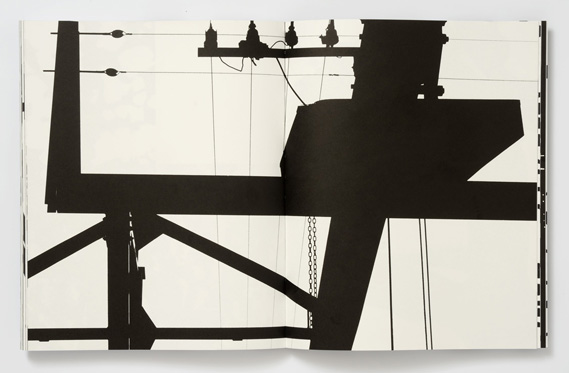
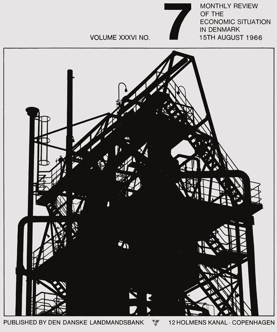
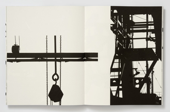
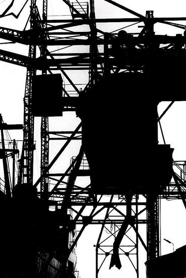
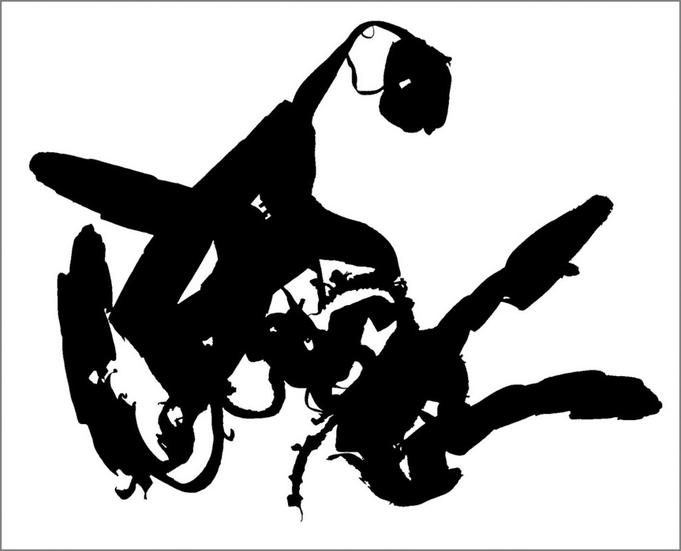
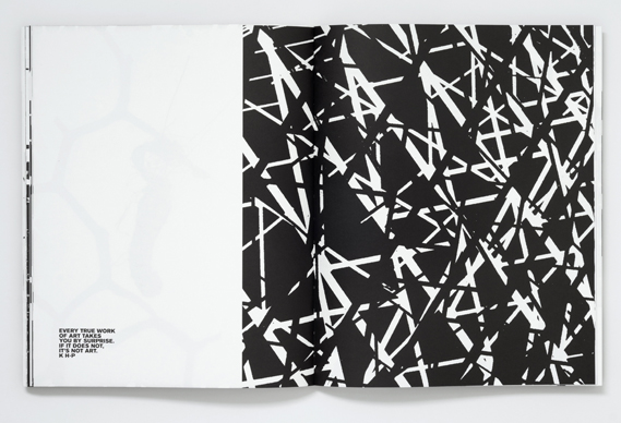
Keld Helmer-Petersen was a Danish photographer who was inspired by Albert Renger-Patzsch, the experiments at The Bauhaus in Germany and by Harry Callahan and Aaron Siskind at the Art Institute of Chicago. He achieved fame for his colour photographs but he also published several books of black and white images that explore dramatic contrasts of tone. In some, we are only presented with images that are black and white. All mid tones have been removed. He created and found these images, using both cameras and flat bed scanners to achieve the effects he was looking for. These books are beautifully designed and encourage us to consider the space around the image and the accompanying text as integral to the meaning of the work.


Your task:
- Create a blog post about Keld Helmer-Petersen
- Include a selection of images relating to his work with high contrast black and white images (including the books he designed and which feature his work).
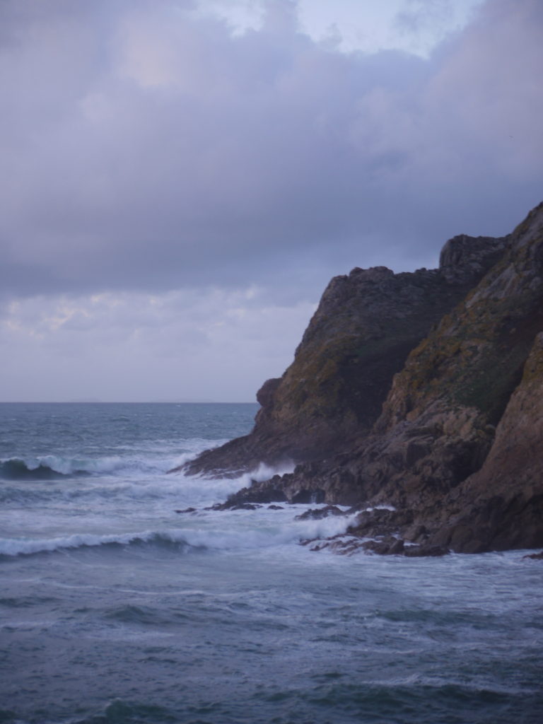
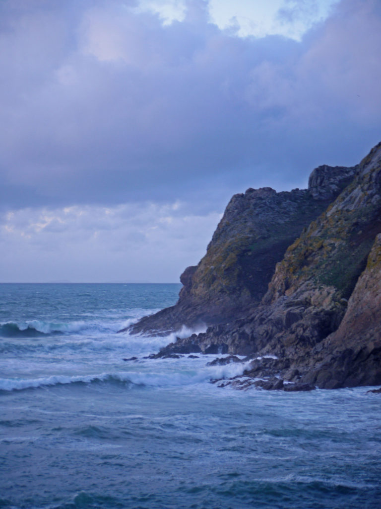
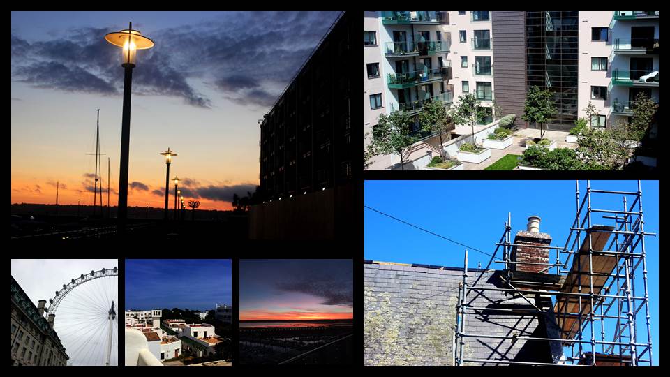
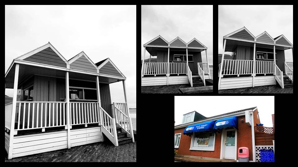
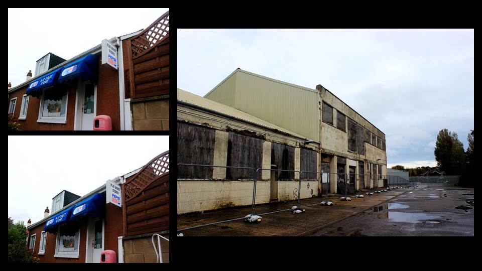
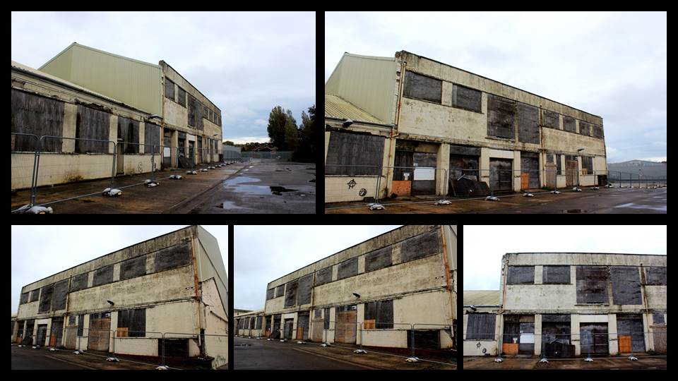
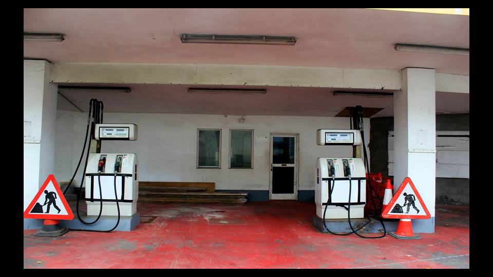
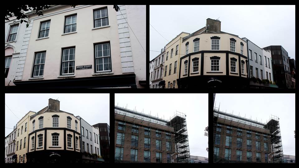
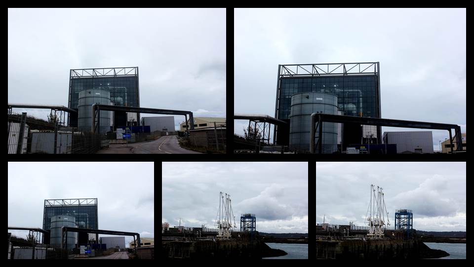
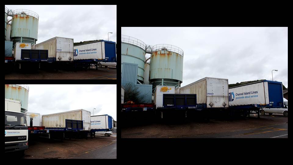
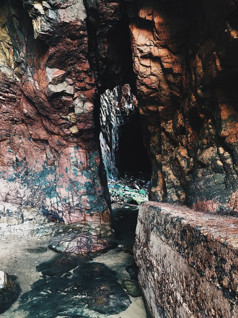
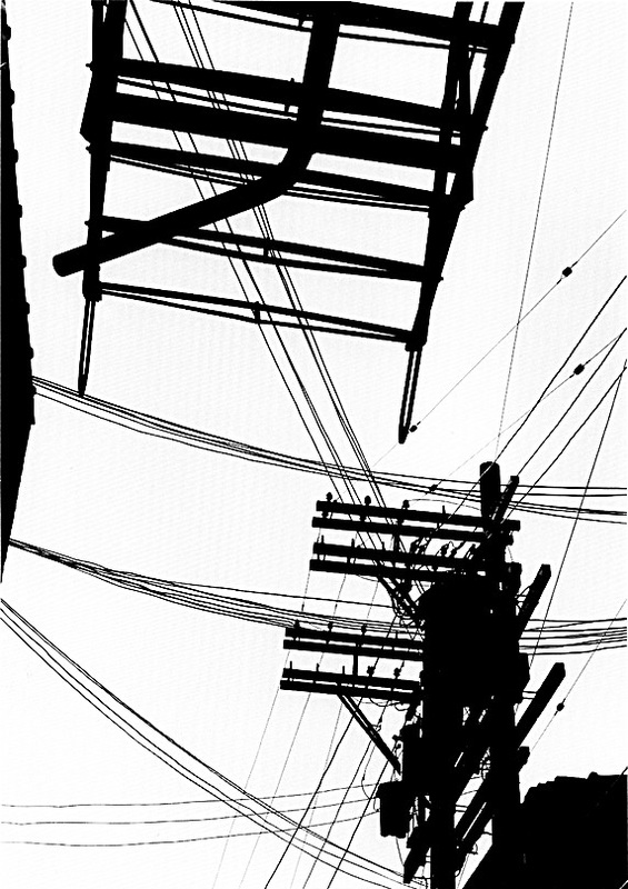
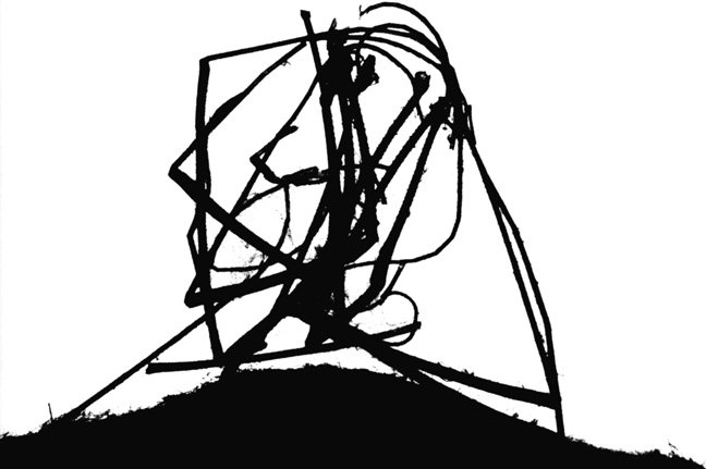
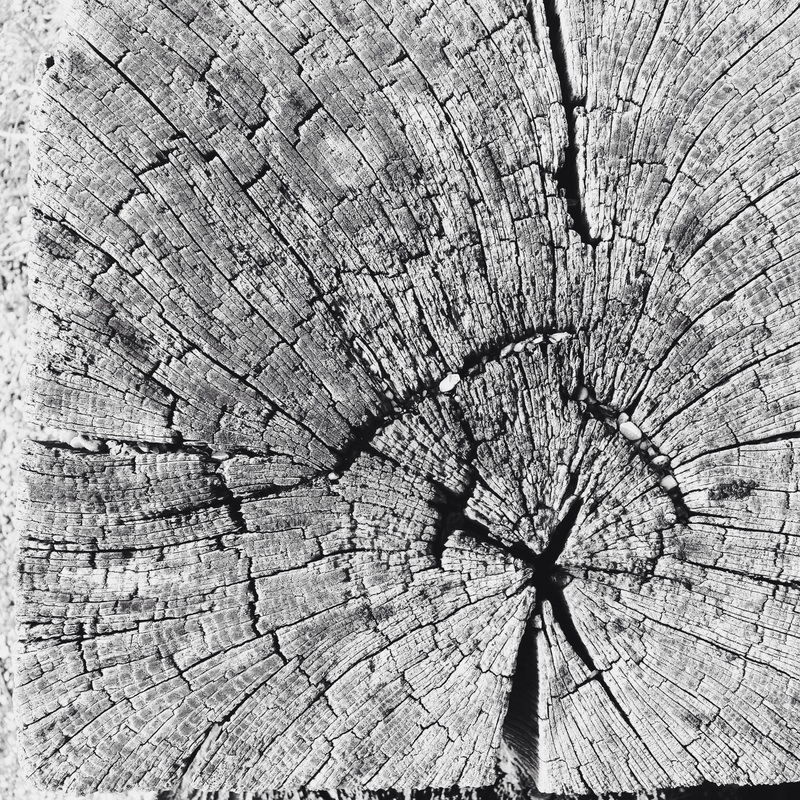
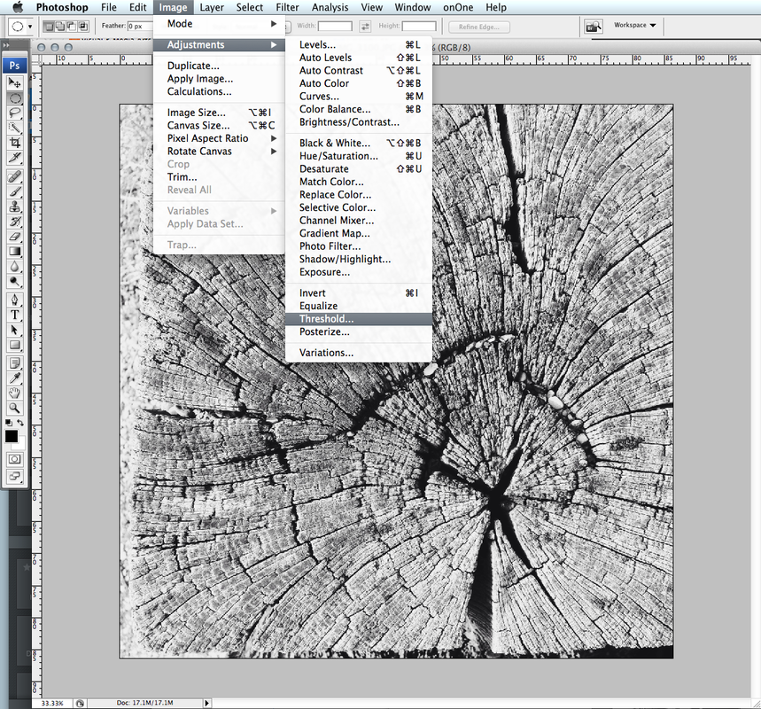
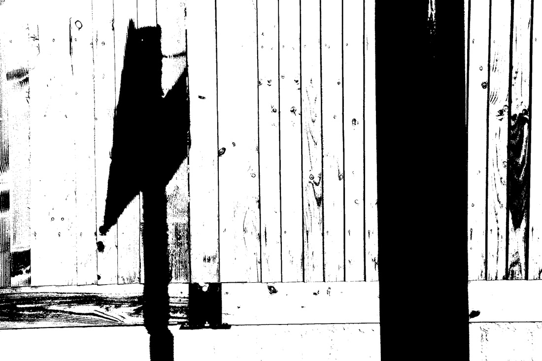
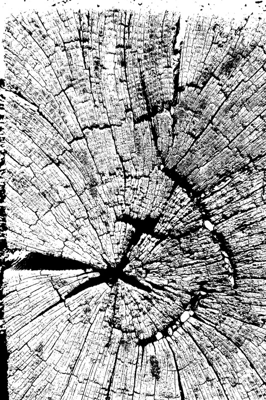
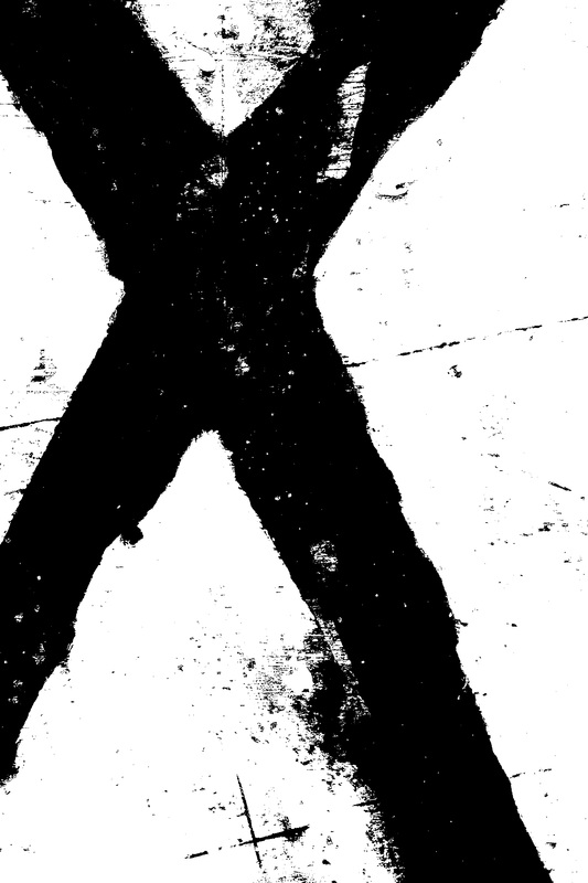
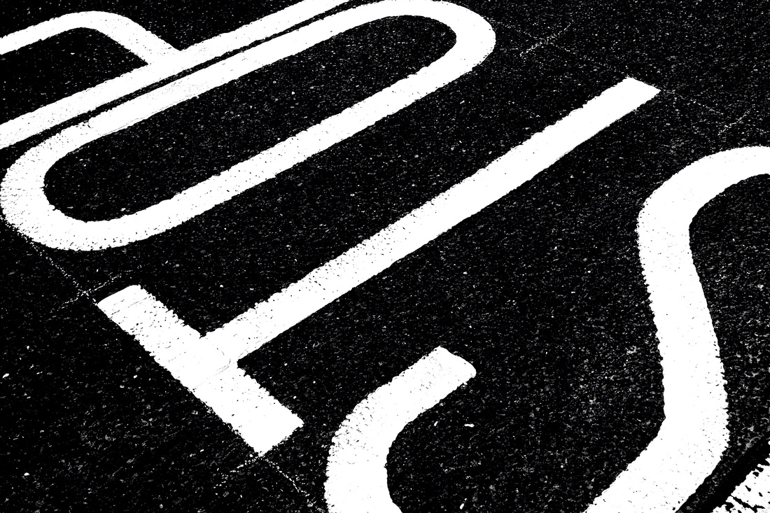
- Choose a set of images from one of your URBAN PHOTO-SHOOTS
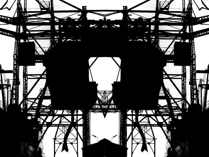
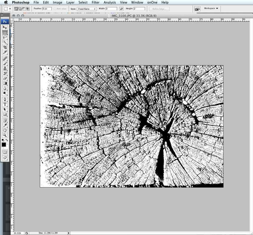
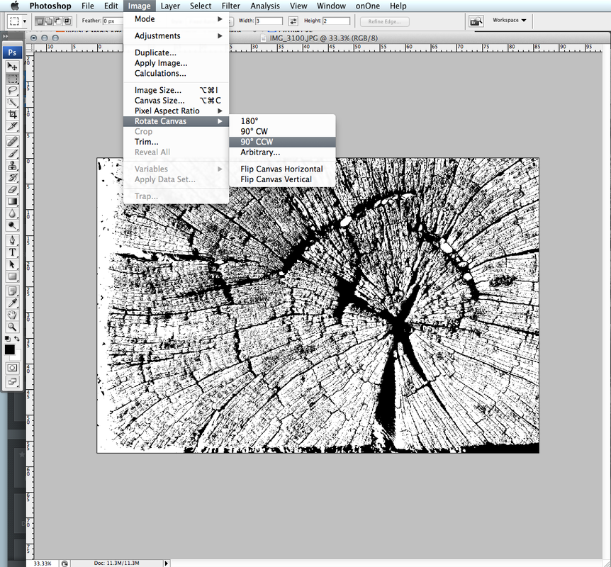
- Edit them using the THRESHOLD TOOL in Adobe Photoshop as shown below…
- Print the images A4 size to Printer : Photography
- Share what you learned about how to create and manipulate the images for your outcomes and evaluate the final product. What worked well? What could have been even better?
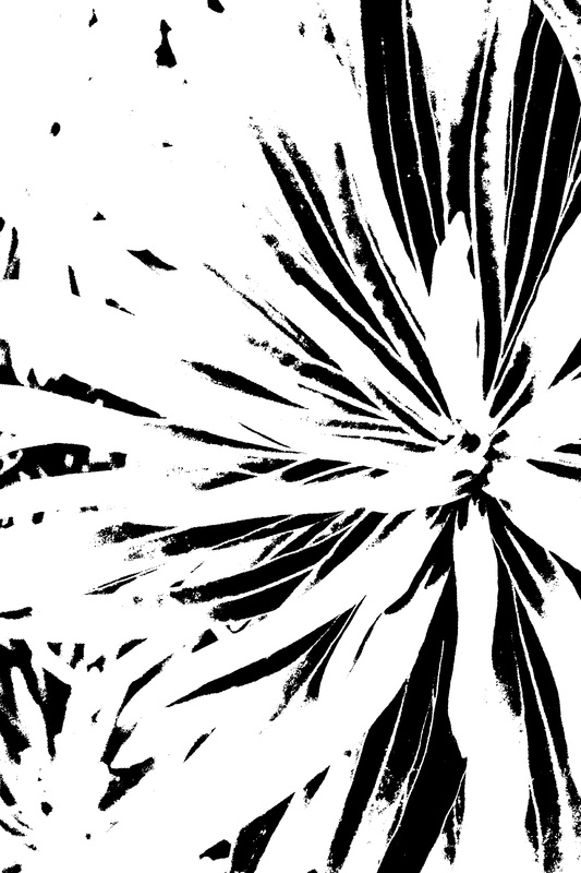
Example


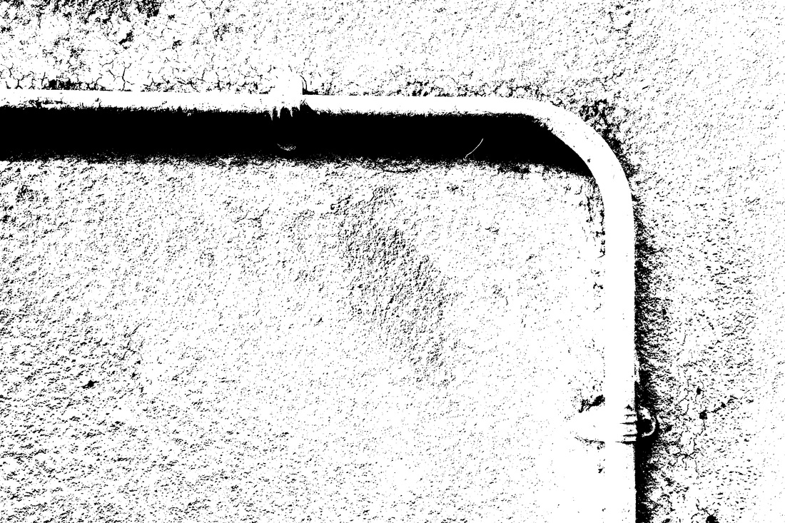
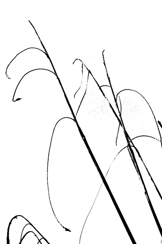
Edited images


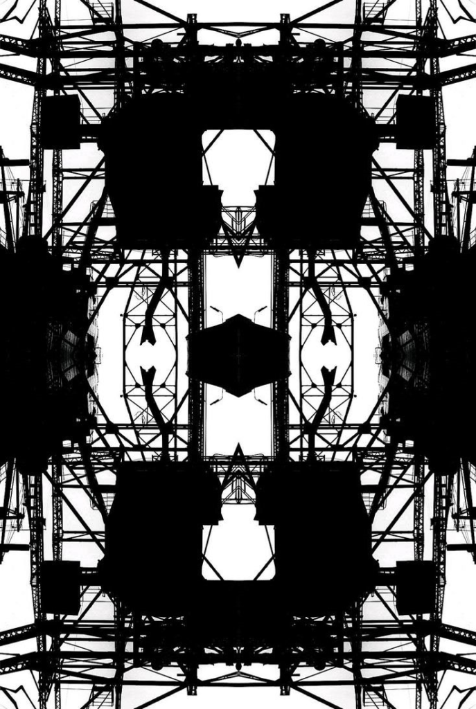
Extension Task
- Multiply, flip and mirror your image to create a kaleidoscopic / abstract / symmetrical design…
- Adobe Photoshop > open image > canvas size > double the width value > set anchor to the left > select the image using the marquee tool > click ctrl j > then click ctrl t whilst holding down the shift key > drag the image over to the right side of the canvas and position > click enter > use the cursor keys to line up your image and achieve symmetry > then go to LAYER > FLATTEN IMAGE
- Repeat the process so that you mirror your design underneath your current image
- Show your process…