When editing this image I simply increased the saturation of the blue background as well as adjusting the levels and contrast to make the straight lines and angles of the black and white building stand out more in the foreground against the simple blue background.
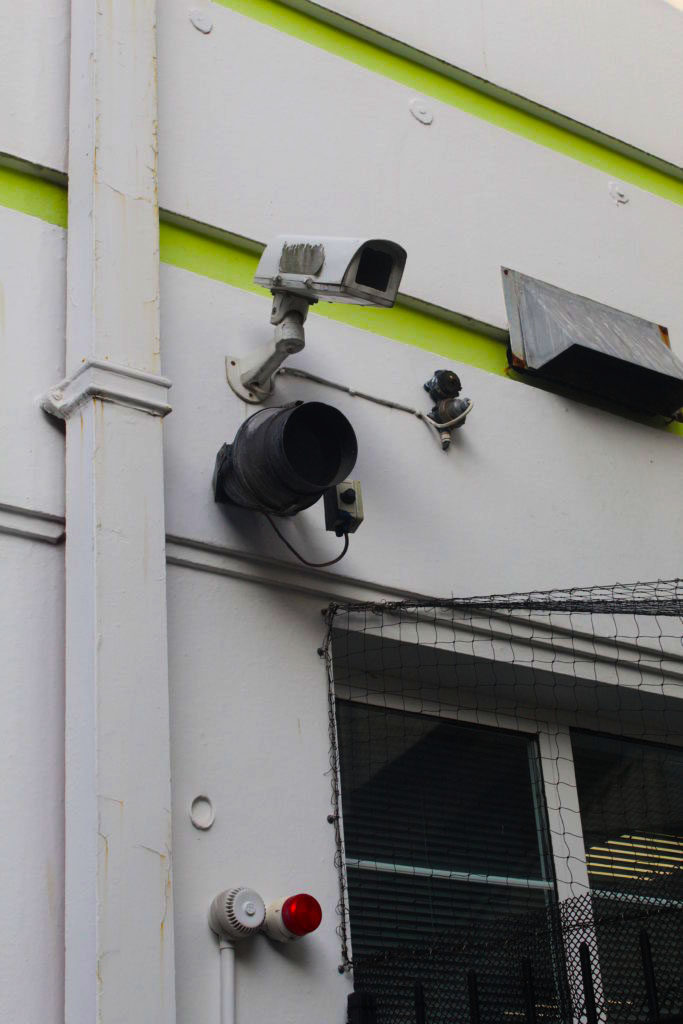
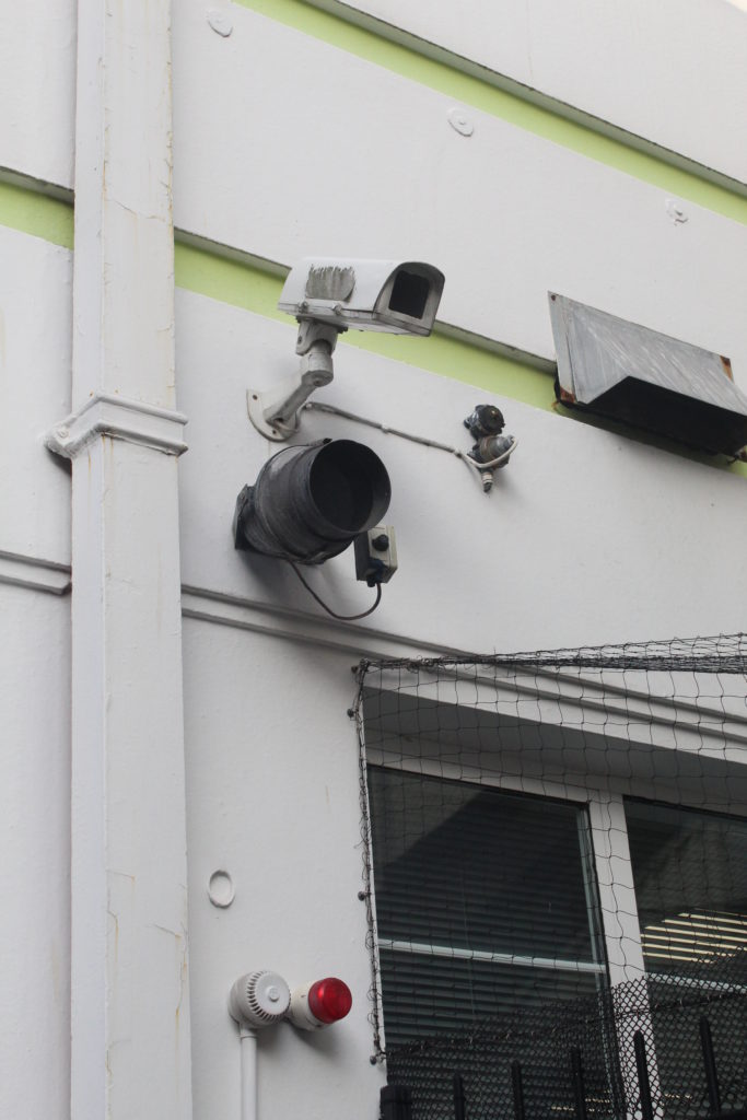
I intended to keep the security camera as the main focus of the image but I didn’t want the image to become boring and grey, so I over-saturated the green paint stripes in the background and also the small red light at the bottom of the image. This gave an otherwise grey-tinted image some pops of colour and made it seem more modern and urban.
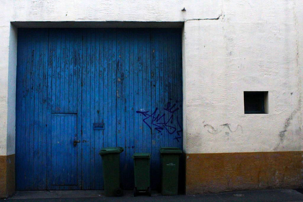
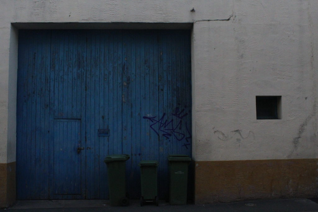
This turned out to be my favourite image as I love the composition and placing of the bins and graffiti in the centre. I also edited the picture so that the blue of the doors became more vibrant and bright, and I also made the orange of the wall a little more vibrant as well, as blue and orange are contrasting colours.
This is quite possibly my second favourite picture from this shoot as I feel that it really stays within the theme of urban landscape, as it takes a banal and everyday sight, cigarettes left on the ground, and finds the beauty in this image. I adjusted the levels of this image to increase the highlights in the water’s reflection, as well as increase the yellow-orange colours to stand out more vibrant against the black tarmac.
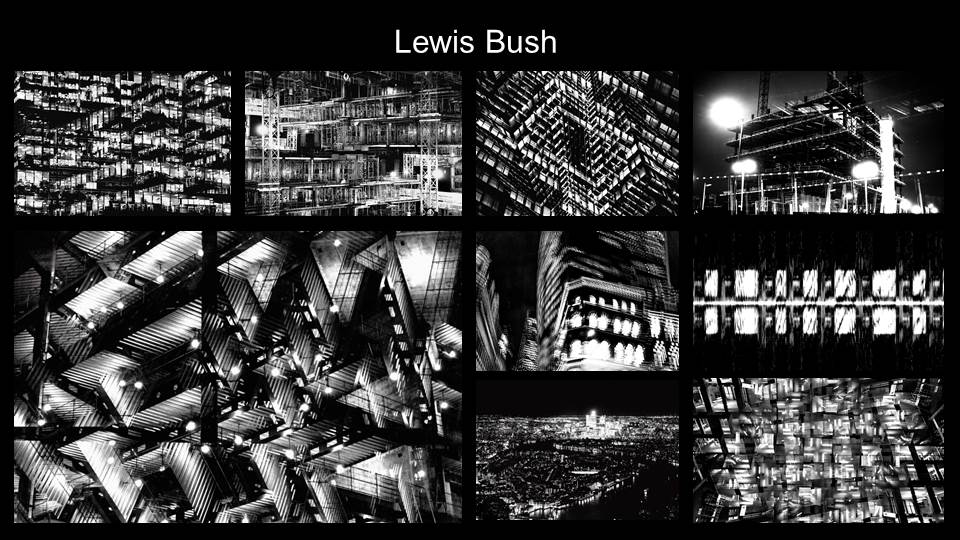
Analysis-
Overall I feel that the first four images all fit well within the theme and explored aspects of urban landscape photography, as well as working well with each other and having similar colour palettes and lighting. However, the last image finished by feeling anomalous and not very cohesive with the rest of my final images. This is why I have decided to exclude it from my final selection, reducing my image count from 5 to 4, but I have shown it and my brief analysis of it below, just to demonstrate why I did not include it.
With this picture I used photo filters on Photoshop to make the lamp’s light as yellow-tinted as possible while still keeping the colours of the rest of the image. I feel that this also contributed to the grain of the image, which was unintended but I believe it works well.
Firstly, to create my Paul Reiffer Images, I selected some images that I had taken previously of urban landscapes that I thought would look aesthetically pleasing as a ‘little world’. I then downloaded the app ‘roll world’ in order to recreate Reiffer’s photographs and I thought this would be the best option since Reiffer also downloaded apps onto his iphone in order to create his images. I played around with the app until the urban landscape appeared to look like a ‘little planet’ and this was quite easy to do and the app was very easy to use.
Final Outcomes
This is the final outcome created from the first image seen above. I also leveled the image in order to make the landscape a lot more vibrant and old; creating an aesthetically pleasing image. This is a second final outcome image from using the roll world app. I used a different urban landscape image and again played with the app until I was happy with the shape of it. I again also leveled the image in order to make the landscape appear more vibrant and to enhance the colors of the sunset.
I liked the colour contrast and simplicity of this image, with the modern straight lines and right angles jutting out against the clear and bright blue sky in the background.
I felt that this image fit in very well with the urban theme and I especially liked the lime green stripes of colour contrasting against all the black, grey and white.
This is quite possibly one of my favourite images, I really like the composition and the placement of the graffiti just above the bins in the centre of the image and the blocks of different colours around.
I like how I managed to capture the detail of the cigarettes in the puddle, and also how the water highlights the rough texture of the tarmac underneath.
This image was chosen due to the particularly saturated yellow lighting and how it adds interest to the image.
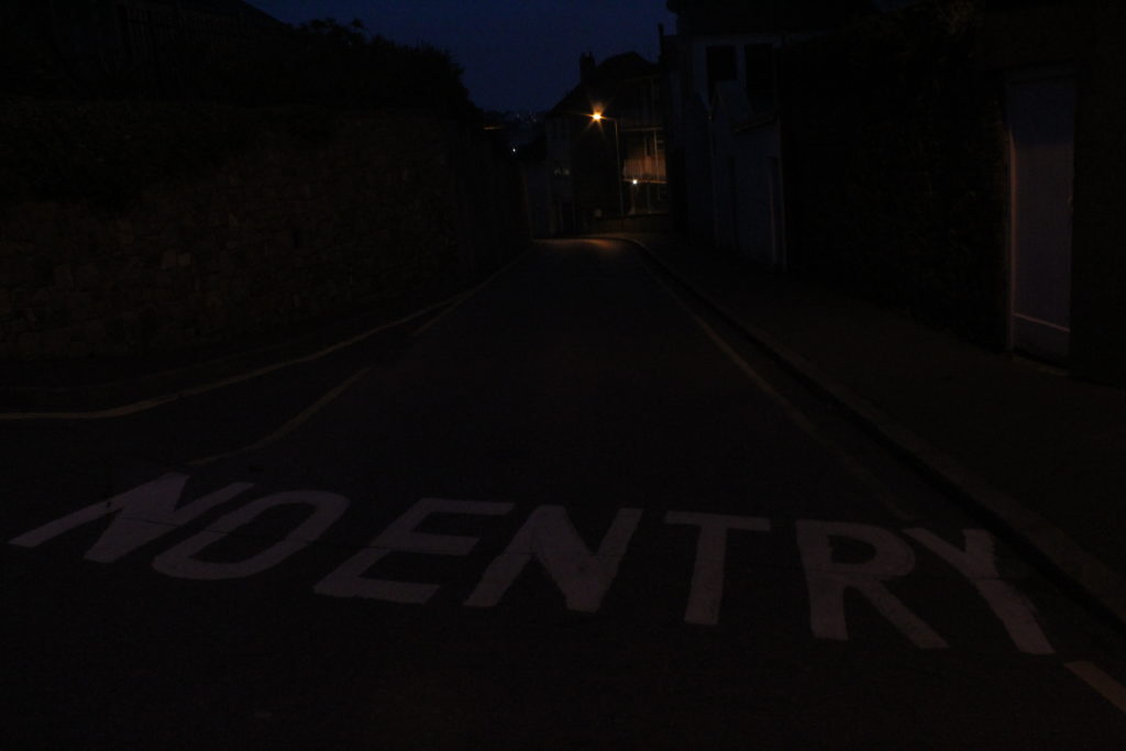
I liked the lettering across the foreground of this image, additionally the lone yellow streetlight in the background, almost like a star of some sort.
In the end I decided not to use the image of the street sign up close, IMG_1768, as I felt it did not fit within the overall theme of the rest of the shoot, even though I did like it as an image.
I’m planning to take photographs of industrialised areas and buildings for urban photography.
When you conducting the shoot?
I am going to take the photographs over the weekend at around 4:30 when it starts to get darker to give the photos a gloomy effect.
Where are you working?
I will be going to La Collette and the harbour.
Why you designing this shoot in this way?
I’ve designed this way because there will be enough daylight to get good quality photographs and enough darkness to add to the urban landscapes effect.
How are you going to produce this image?
In order to take the photos I will be using my iPhone camera.
This could be in the style of Tanja Deman as in its a landscape and urban picture stitched together, but isnt in her classic black and white, and is less dramatic
This is in the style of some dude i cant remember but i liked the extreme use of reptition, that makes the image confusing and difficult to understand
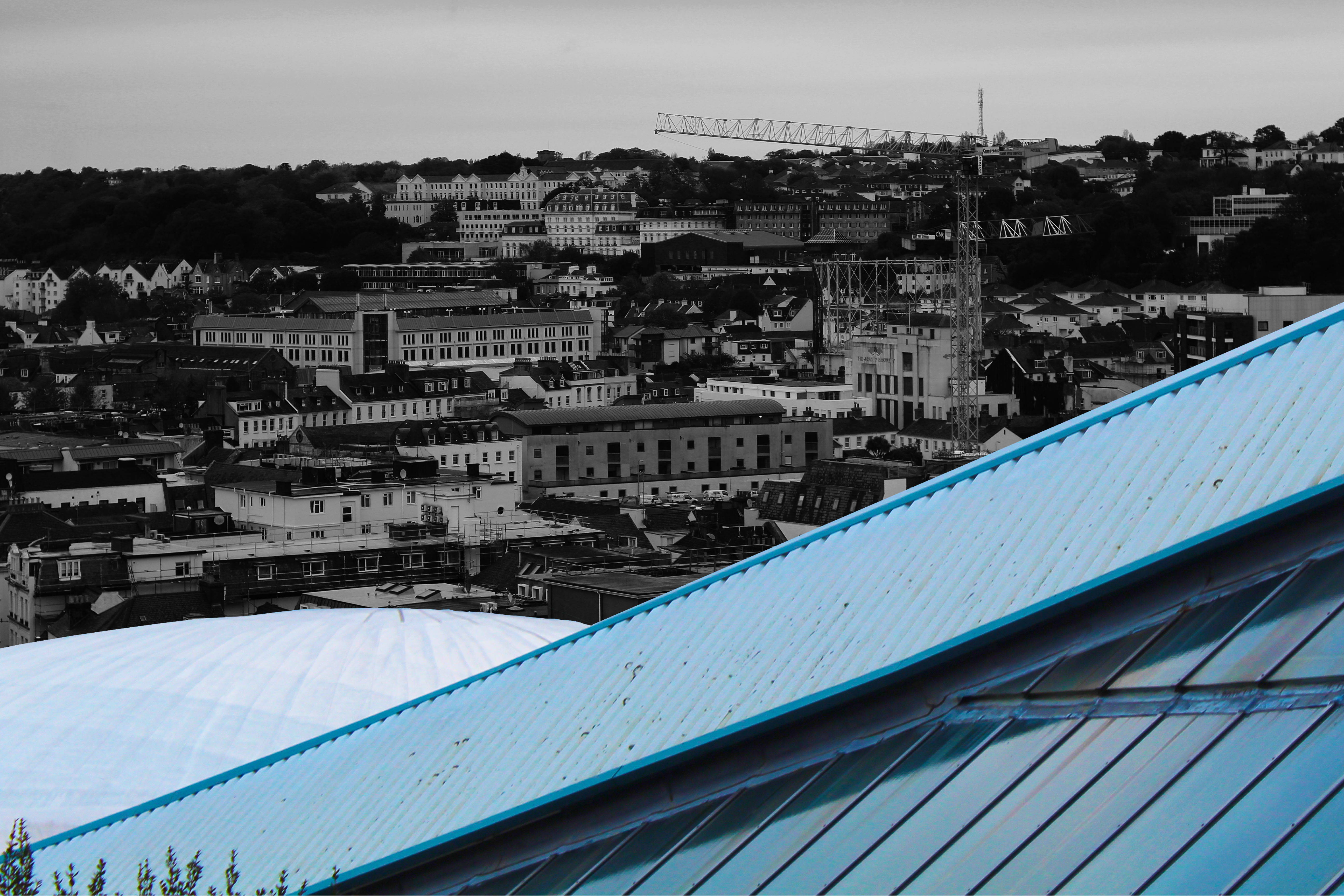
This isnt inspired by anyone but i wanted to incorporate lines and colour contrast, with the black and white busy background cut by the bright triangle and dome of the fort regent building
For this image i took inspiration from Keld Helmeder-Petersen and his black light style, using it to darken the center of the scaffolding to slowly get lighter outward, but still stand out from the grey sky behind
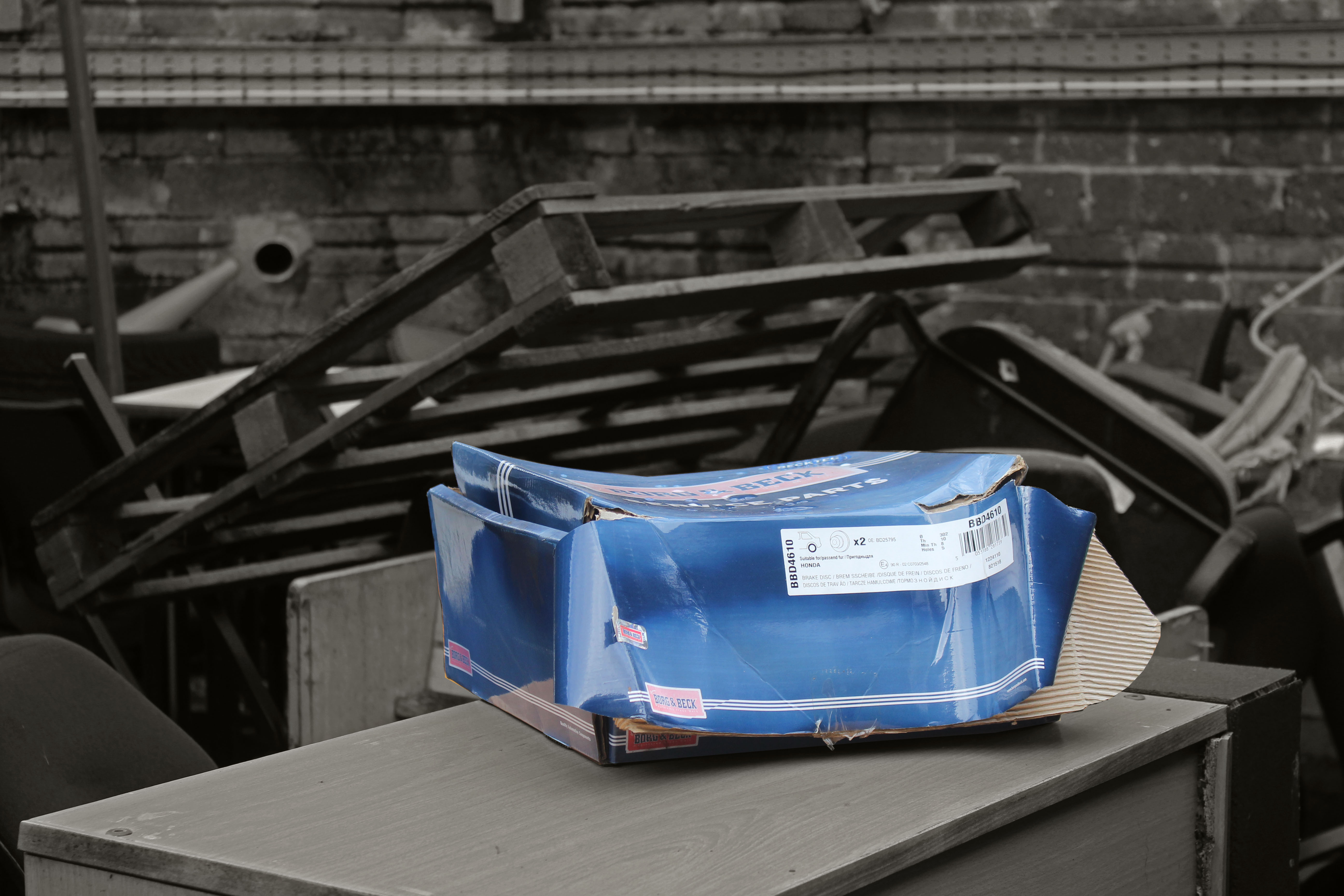
In this image i liked how cluttered it was in the background, and so thought by focusing on the box in the center,, and further leaving it unedited, would bring immediate attention to the worn out shoe box in the foreground
For this image i selected specific areas in the busy urban landscape, and changed the vibrance and contrast to highlight them, and then slightly enlarge them to further emphasize. My favourite section is the white building near the front as its very vibrant, and also the Victoria college building as its on the horizon and was easy to pick out, especially above the greenery.
I liked the focus of the lettering on this image, through the cage as the repeating lines add a nice effect with the highlight of the white on the text and the side of the wire