

The photographer, Arnold Newman, was an American Jew, giving the photo a string meaning because the main focus in the photo is Afried Krupp who was a German who was accused of slave labour (manufacturing trains) in the Nazi regime. The inspiration for the photo most likely came from this and the reason as to why he made the man in the image look so evil and why he made the photo look so ominous. The negative image Newman gave Krupp was to show Newmans hatred towards him and the Nazis overall.
Welcome to the course!
During your first lesson or two you will be expected to submit and display your summer task. As a group we will discuss the merits and limitations of the mini-projects, and your work will be assessed soon and you will receive feedback too. Your Summer Task will then form the start of your coursework (Component 1 / 50% of overall mark).
(If you have not completed a Summer Task as a new recruit…then you have until Friday 13th September to complete the task appropriately.)
We will also discuss your thoughts and feelings / knowledge and understanding of…
Photography’s function(s)
Photography as an art-form
Photography as a science
The difference between the study of photography and the practice of photography
Henri Cartier-Bresson once said…”Your first 10,000 photographs are your worst”
What do you think Cartier-Bresson meant by this…? Discuss
Other…
Blog Overview
Sharepoint Overview
Adobe Photoshop
Adobe Lightroom
Demonstrating a critical and contextual understanding of photography can be tricky, especially if the subject is relatively new to you in Year 12. The following activities have been designed to encourage you to reflect on what you know already about photography. Hopefully, some of the prompts will encourage you to further develop your understanding of photography through additional pondering and research.
In small groups, discuss the following questions and create a poster / brainstorm with your findings and answers…
Watch this short film in which the photographer William Klein discusses his contact sheets. Make some brief notes. What does he help us to understand about photography?


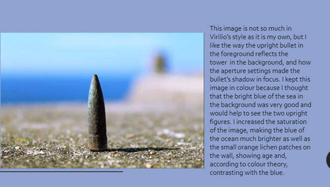


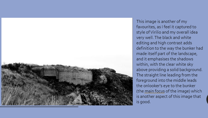
Evaluation:
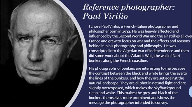
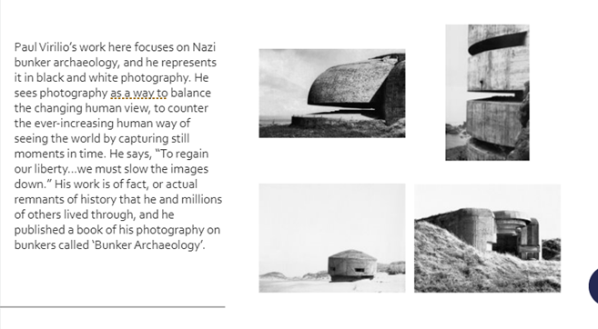
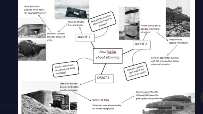
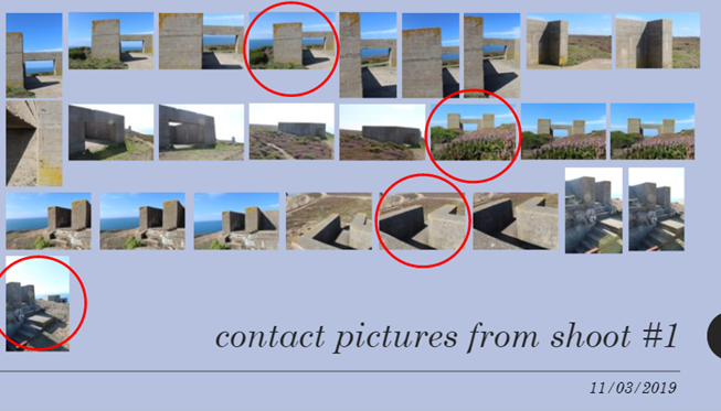
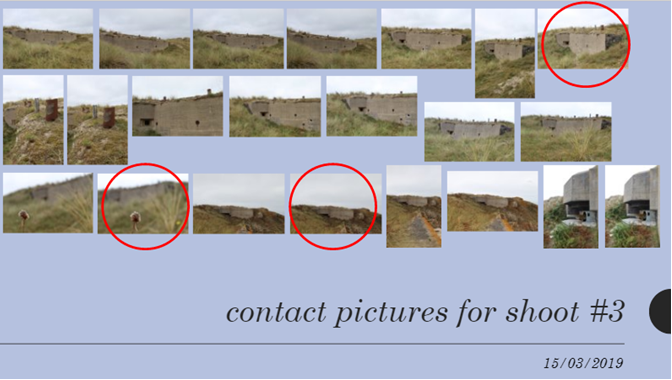
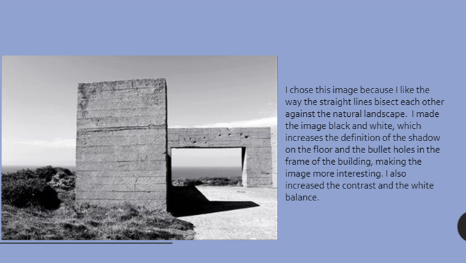
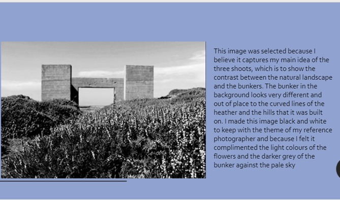
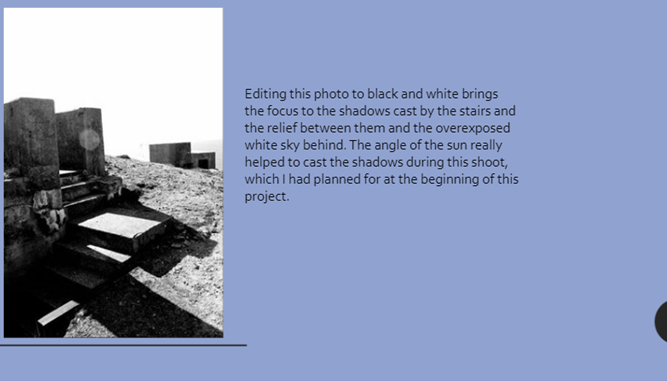
I believe that my work was successful in that it followed the style of the reference photographer, Virilio, but also I made time for some of my own personal ideas. My overall idea for the three shoots was inspiration taken from how I interpreted Virilio’s work, so the contrast between nature and the man made archaeology of the bunkers. I believe I was most successful in simulating Virilio’s style in the first shoot, and the last image of the 3rd shoot, as they are highly contrasted, in black and white, and use line to draw the eye to the image. I believe I was most successful in imitating Virilio’s use of contrast because I was able to use the sky and the natural lighting to my advantage and bring definition to the shadows and the highlights in each of the black and white images. I think that as I kept some of the images in colour, this reflects how I am able to use adapt own style and take my own ideas into the work of photography, even if the artist’s style is somewhat different. I also think that another area I was successful in was being able to frame the photographs in such a way that provided a background without completely overrunning the image with white, which was not how Virilio did it, and would have potentially ruined the images.
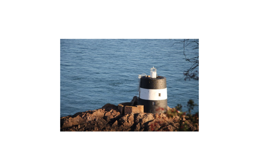
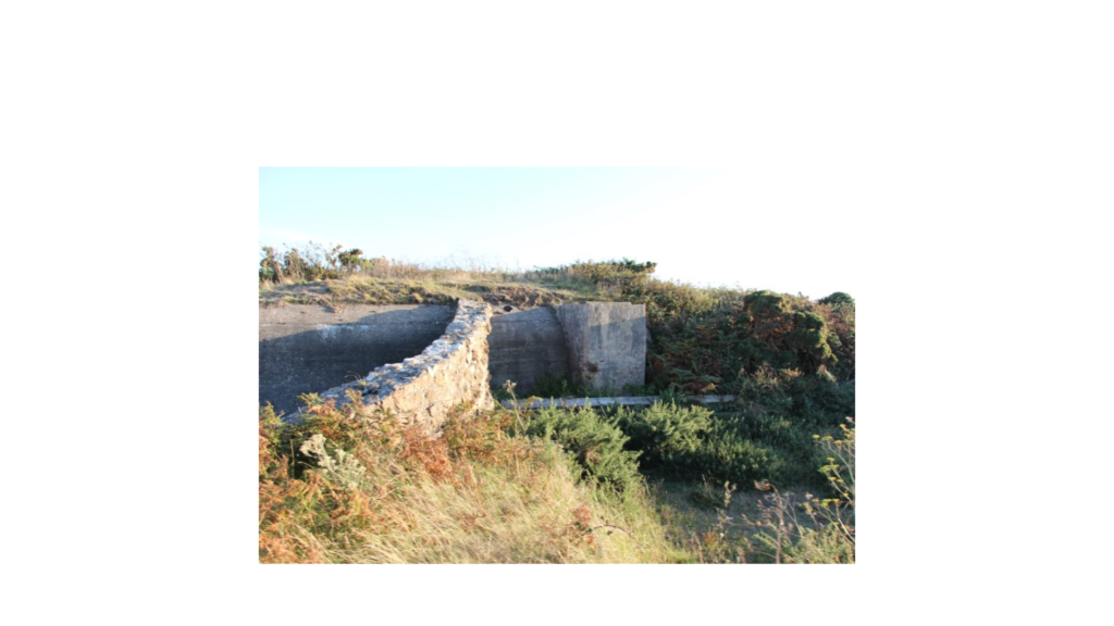
When I went out and actually took the pictures, I was attempting to think about how Virilio viewed war, how he had a personal experience of it, and how he viewed photography as a way of slowing down the rapid human thinking process and giving humanity more freedom through a simple series of still images. This led to a few of the final images being very similar to his style, and even the shoot by the bunker tower, which he had taken pictures of a tower exactly like it. I was trying to communicate the idea that over time, the bunkers had become part of the landscape and do not reflect the tragedy of recent history, as they would have done when Virilio did his series of bunker photographs, but that they show further back in history, and how the past can shape the landscape of the future. Additionally, I was trying to show how nature was taking over in some of the shoots, especially the final one, where the grass had almost completely obscured the bunker wall from view, from certain angles leaving only a few chimneys.
To improve the project I could have taken more shoots and attempted a wider variety of angles or styles of bunker to shoot in, which would have more effectively followed Virilio’s style. I see one reason to my success as the range of different bunker structures I visited: the tower, the square roofless bunker, the wall embedded into nature. This created more interest in my images as they are not all identical, and it also reflects the history of bunker archaeology, another area that the reference photographer was keen in and wrote about extensively.
To take the project to a higher level I could have done more research into how Virilio actually carried out his photographs, his mindset and his editing techniques, and applied them to my own work for a more authentic and accurate representation of his style. This would have involved reading more of his actual work and conducting more extensive research into his life and his work in photography.
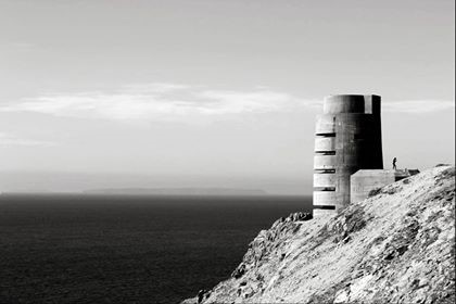
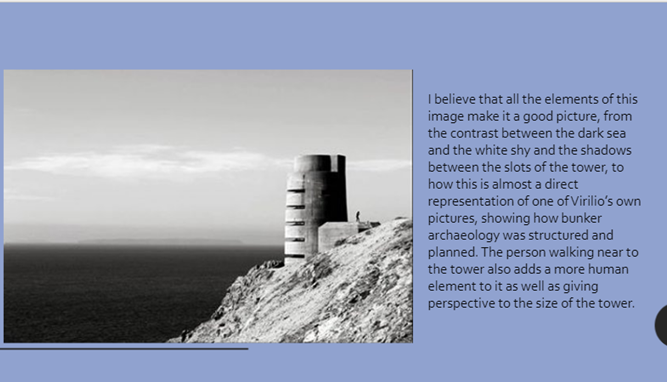
I chose this image as my best one because I believe that all of the elements tie together and show not only my own style and idea for these shoots, but also the style of the reference photographer, Virilio. The dual black and white background adds dimension and interest to the image, as most of my other images do not show the sea at all and it was a very important aspect of the Occupation and the bunkers (and the Nazis) actually being here on the island. The black and white is flipped in the right of the image, with the black shadow on the tower being on the top and the grey-white of the cliffs being on the bottom. This makes the image good to look at and provides contrast for the smaller shadows from in between the rectangular slots of the tower itself. This angle and editing was planned, but I did not plan for the person standing next to the tower, which is another reason why this is my best and favourite image, as I see the person as an addition to the idea of humanity and nature and also this adds a sense of reality, as this image could look rather dystopian to someone who was not familiar with the Occupation and how it affected everyone on the island. It also shows the size of the tower and therefore the vastness of the ocean behind it. I believe that my editing was also successful in this image as it follows Virilio’s style of a high contrast, black and white image, with dark shadows and bright white highlights. To improve this image I think that I could try without the person, as that would suit Virilio’s style better, but I do actually believe that it compliments my own style as well as his own, and makes this image my best.