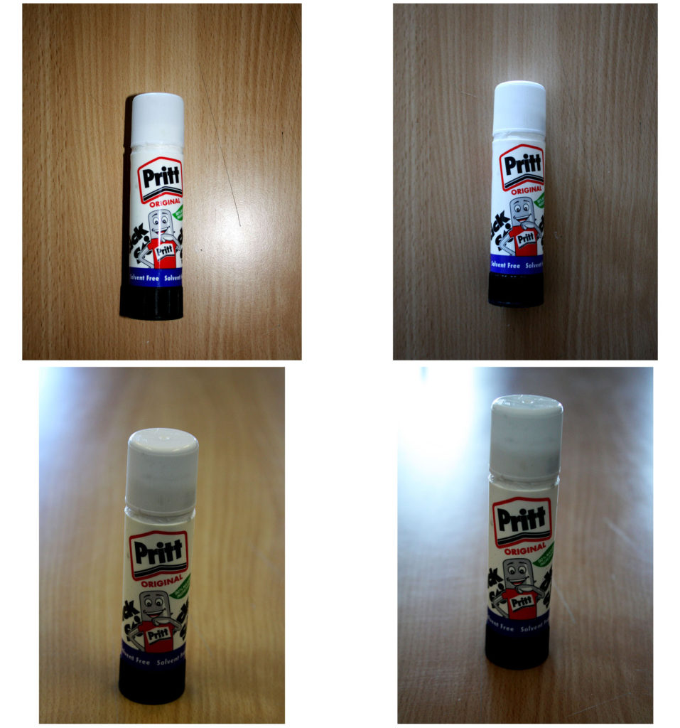
Fully automatic with/without flash and manual focus.

Using Manual Focus take 20-30 photos on the theme of ‘Mathematics’. Upload all your photos as a contact sheet. Select your favourite 3 images and post them up as separate / individual images. Finally, write about why you like these ones best.
Aperture and depth of field. This is quite hard to achieve with a standard lens, so please try to take photos with a portrait lens as well as a standard lens.
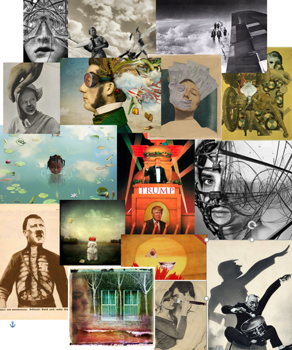
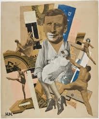
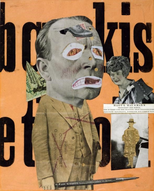
Photo-montage is the process and the result of making a composite photograph by cutting, gluing, rearranging and overlapping two or more photographs into a new image. Sometimes the final image is then photographed so that it appears as a seamless photographic print. Photo montage today is often done digitally, using editing software such as adobe Photoshop, instead of physically cutting up and arranging images together.
The first example of photo-montage was an image by Oscar Gustave Rejlander in 1857, called “The Two Ways of Life” This technique was quickly adopted by many other artists, including Henry Preach Robinson in 1858 with “Fading Away”

Photo-montage was first used to express political messages, for example in 1915 it was used by the Dadaists for their protests against the First World War. Dadaists were artists named for their participation in the Dada Art Movement, revealing the reaction to horrors of war. It was later adopted by the surrealists, using the possibilities of photo-montage to combine a wide range of images to reflect the ideas of the unconscious mind.

An environmental portrait is a portrait of a person taken in their usual environment, such as in their home or workplace, typically highlighting the person’s life and surroundings.

Arnold Newman was an American photographer, well known for his environmental portraits. In 1963, Newman had been asked by the Newsweek magazine to take a portrait of a German industrialist (Alfred Krupp), to which Newman initially declined, due to the fact he was Jewish and Krupp had been a supplier of machinery and railway systems for the Nazis in WWII. Krupp had later been convicted for crimes against humanity and was sentenced for 12 years imprisonment.
When Newman finally accepted the job, having been given the opportunity to get a sense of personal revenge against the Nazis, he had told others that his aim was to make Krupp look like the devil.
The visual aspects of the image come together to create an eerie and unnatural effect with the overlying green tint adding to this. Newman focused on the tone of the image, using light to highlight the sides of Krupp’s face, leaving dark shadows underneath his hands and the center of his face, this extreme contrast helped Newman to achieve a sinister portrayal of Krupp. Newman’s placement of Krupp allows him to create depth within the image. In the foreground of the image, Krupp has been framed using two concrete pillars on either side of him. He only takes up around half of the image, leaving the upper half to show his environment.
The smart suit and watch and clasping of Krupp’s hands gives the viewer the impression that Krupp is in control and thriving off of what’s surrounding him. The rustic and industrial-looking architecture aids in the inference that Krupp’s line of work is corrupt and disreputable.
The conceptual idea behind this was to depict the pure evil Newman saw in Nazis and the people associated with them. Considering Newman was Jewish, his view on extremist Germans was highly pejorative and this image was used to as a method of retaliation from him.

The lighting is coming from behind, from the overhead lighting and the windows too, this adds light to the background, allowing it to be seen. There is also light coming directly from in front, which illuminates his features and casts eerie shadows across his face.
The colours in the photo are warm tones, as they are mostly browns and oranges. This creates a sinister mood.
The tone is dark, as most of the objects are dark.
The texture of the piece is rough, as the objects are worn and craggy.
As for the composition, the character is placed directly in the center of the photo, this creates a sense of importance and authority. He is placed in front of a window, which allows us, as a viewer, to see into his life and what he does. The window also frames him too, which adds to the importance and authority he has.
Contextually, the man in the photo is called Alfred Krupp. He was a German, who owned factories that made trains, railways and railway systems. The photographer, Arnold Newman, was an American Jew. The idea behind this photograph was to gain revenge and to frame the German for his input in the war, that killed millions of Jews. Years later he was found linked to the death of millions of Jews, and this is why this photograph is so famous. C
What is photo montage?
To combine photos for artistic effect, to show more subject than a single photo can do. You can make a photomontage either by hand, by cutting and sticking, or digitally, on photoshop.
Brief history of photo montage
Photomontage became popular during the Victorian era, but it was then called combination printing. The idea was created by Oscar Rejlander, who was a pioneering photographer. Photomontage was used in WW1 to capture men at war departing to war with their families seeing them off. It was also used to protest war and politics.
Artists I like;
ideasw

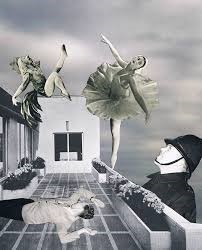
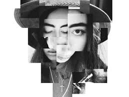
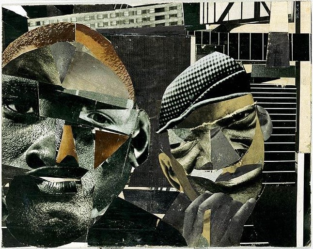


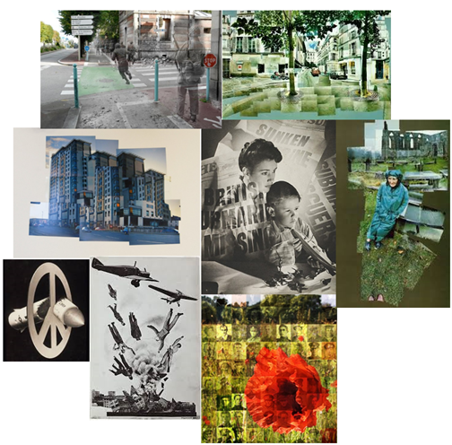
Photo montage is a combination of images designed to send a message to their audience. This can be done physically using magazines and newspapers by cutting, rearranging and gluing images close together, however this can also be done digitally.
Photo montage was originally called “combination printing”. In 1916 George Grosz and John Heartfield started to place pictures together this later developed in what we call “photo montage” today. This term became more publicly known after World War 1, (around 1918/1919), this was used as propaganda or a way for people to express themselves. Photo montage was also used to Protest against World War.
Later on, in 1923, a Russian constructivist called Aleksander Rodchenko started to experiment with Photomontage by creating thought-provoking and socially engaging images.
Other artists such as a German artist called John Heartfield, started to reconstruct images which he got from the media in order to protest against the German fascist regimes. Also artists such as Paul Kennard, who explored the controversy in police brutality, economic inequality and many more.

For this project I decided to follow David Hockney’s work on photo montage.

David Hockney was born on the 9th July 1937, he is known for being an English painter, stage designer, print maker and photographer.
As a young artist his paintings were mainly about literacy learning, here he also started to in cooperate his homosexuality in his art, this was present in the painting “We Two Boys Clinging Together”
He studied in Bradford College of Art from the years of 1953-1957, although at this time most men was obliged to join the army, Hockney decided to spend his 2 mandatory years helping at the hospital.
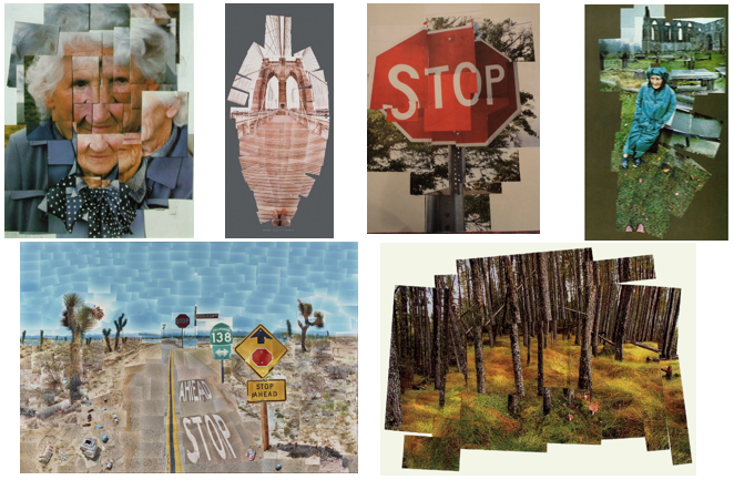
Later on in his career he started to gather Polaroid pictures that he had taken and make them into a bigger picture, this began his path into photo montage.
These are just a few examples of his work on photo montage:
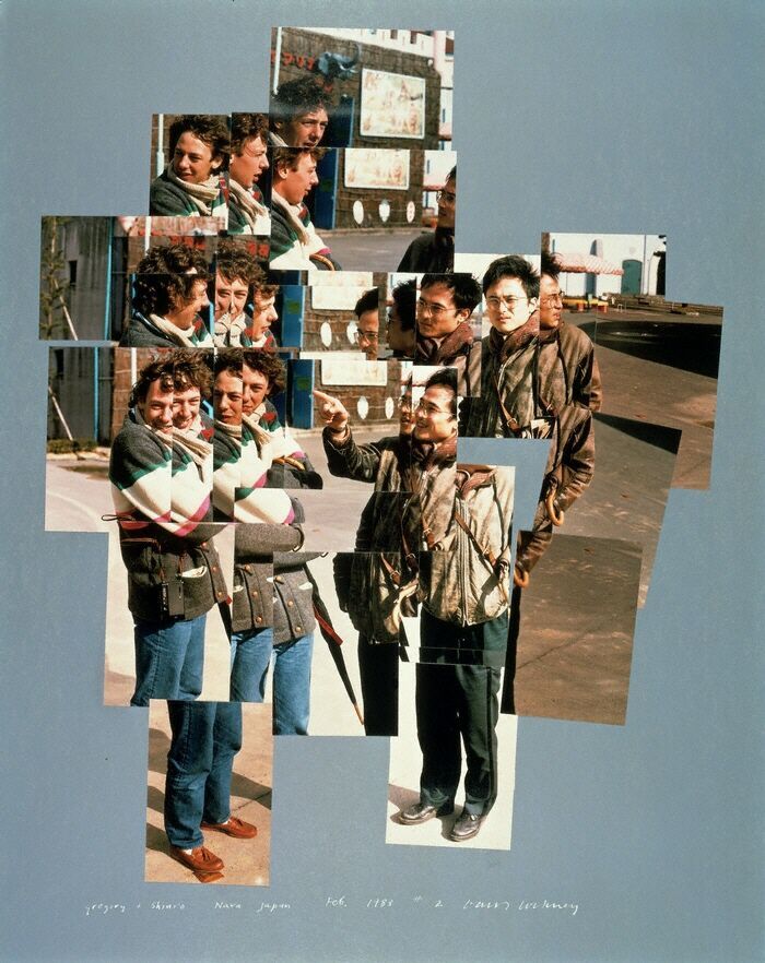
This image is an example of how David Hockney took the idea of photo montage and interpreted it into his own work.
Visual: The colour scheme is mainly an autumnal theme with browns, oranges and green. The shape of the image is 3D due to the overlapping of images, this shows the “photmontage” effect in the photograph, this also shows the scattered layout of the image as this disorientated set up allows the audience to see multiple “scenes” in one image. Here due to the distance of which the photo was taken, I suspect that many of these photos were cropped in order to create this scattered arrangement. This also allows the image not to be over crowded as although there are alot of images these have been cropped to make this effective. Their is no certain viewpoint in the image for the eye as the audiences eye will continuously be moving in order to comprehend the photograph which is what David Hockney wanted. Their is definitely a surface illusion as although this is one image, there are many facial reactions and as the images purposely dont match it brings the audiences’ attention upon the various scenarios. And again due to the disorientated layout their is no clear foreground, midground and background; however it is clear that the main focus of the image are on these two men
Conceptual: I believe that the main idea of this image made by David hockney is to share a small story though the multiple photos in photograph. The two men, although unclear, seem to be having a good time due to their smiles in facial expression. This photo can have various meanings, it could symbolise the support of homosexuality, friendship, memories being made or even just two people enjoying each others company. In my opinion I think this image represents the 1980s due to the “warm tone memory” effect and the displeasing jumpers.
Technical: Here, Hockney had used natural lighting in his images, this helps give a natural look to the image, this technique is also effective as when it’s more sunny the photos would have more brightness in the image which makes the images stand out. The focal point are the two men however due to the amount of photos taken the focal point varies. The images are clear and dont seem to have any motion blur. The image seems to be in higher sensitivity with a coarser grain, I think this gives the image an older feel. Texture is present on the pavement which helps to add to add a more detailed image. The temperature is warm which helps to again evokes an old memory effect. There also seems to be a slight orange autumnal color cast.