
















who is RICHARD HAMILTON and what does he do?
RICHARD HAMILTON, 1922, was an artist and photographer, that mixed painting and photos to create interesting and unique pieces, that were the earliest pieces of pop art. Throughout his education, HAMILTON, studied art on and off, once being expelled for defying his teachers’ instructions. In WW2, HAMILTON, was a technical draftsman. He has exhibited his work in many places, such as Hanover Gallery and Tate Gallery. HAMILTON died in 2011, in London.
my favourite HAMILTON pieces
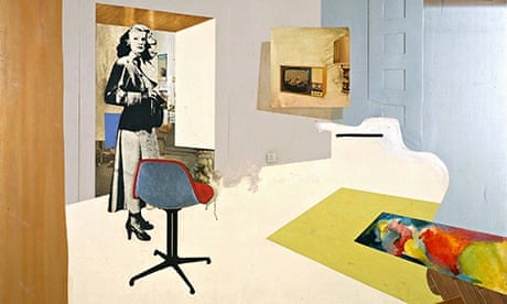
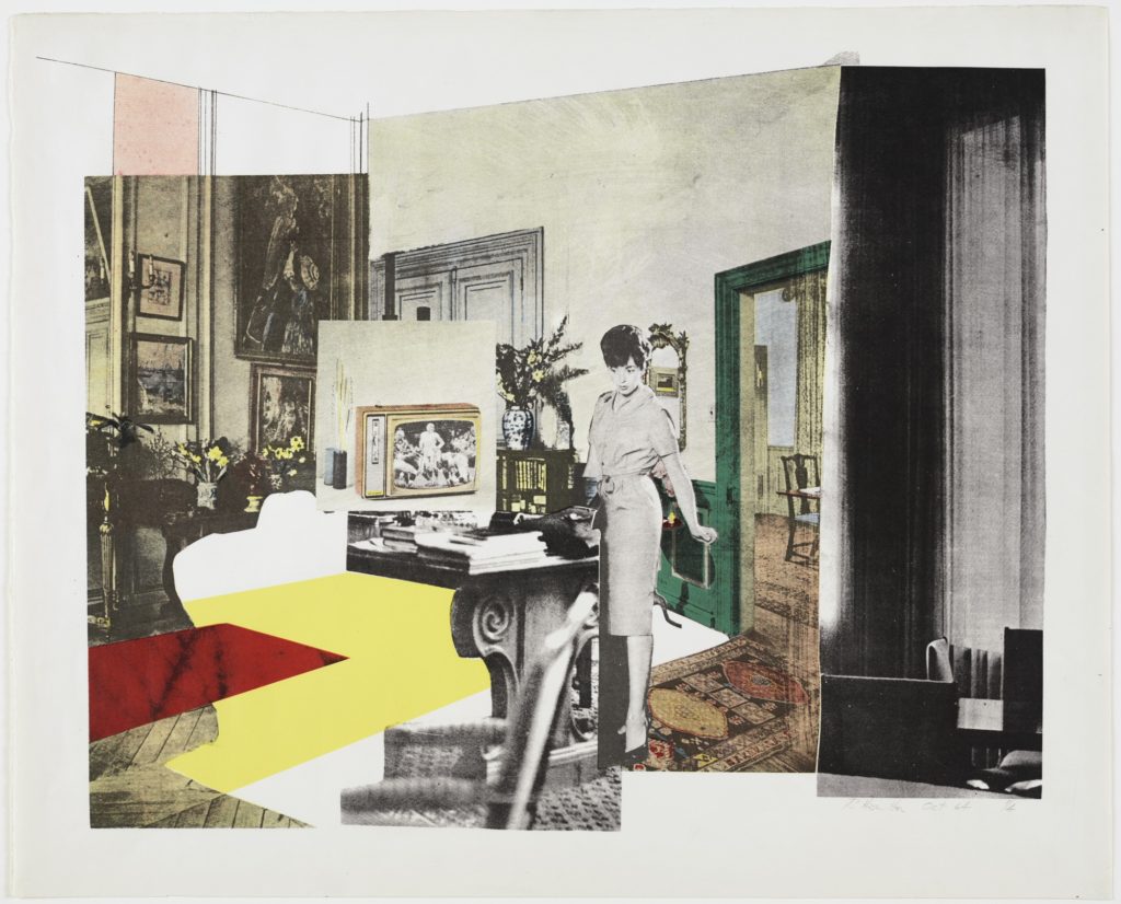
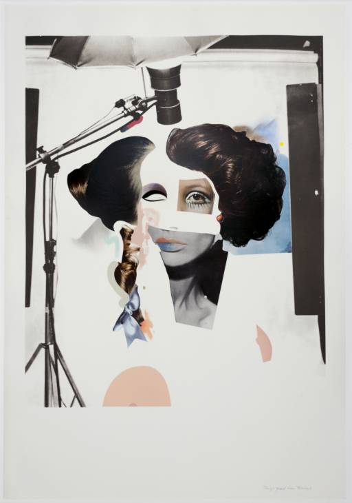
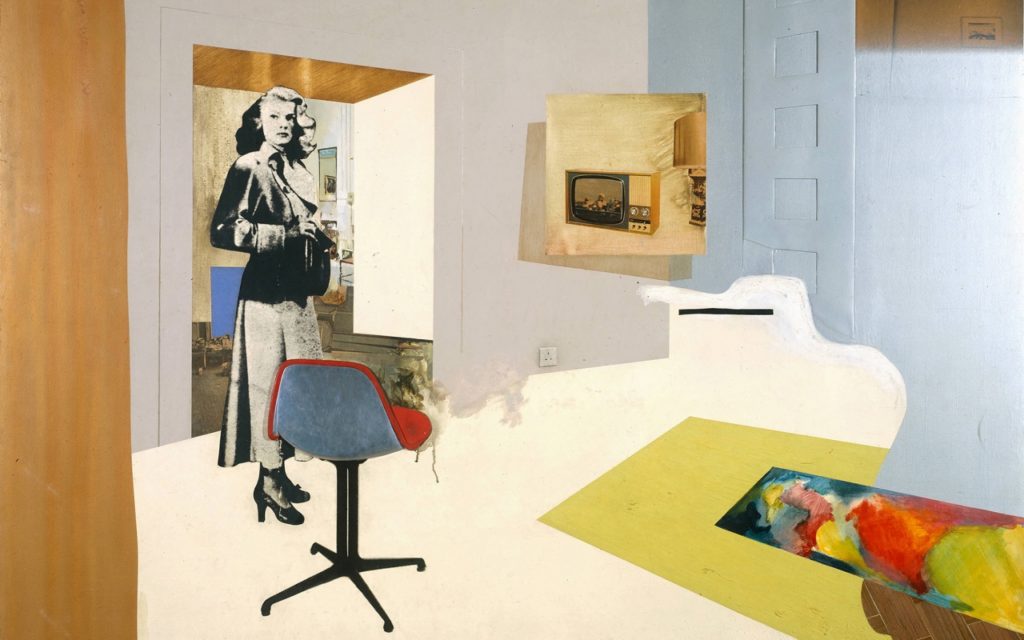
These are my favourite pieces by HAMILTON, because I enjoy the bright colours and how he incorporates his/found paintings, photographs and colour blocks together to create a story for the viewer. I like the way HAMILTON uses negative space to add depth and a 3D look.
image analysis
TECHNICAL
This photo montage is made mostly up of colour blocks or negative space. The negative space brings light and focus to the montage, although it is not technically lighting, the blank spaces act as light. It is mostly flat light though.
VISUAL
The negative space adds dimension to some aspects and creates a 2D feel in some spaces too. The white spaces adds an edge to some parts, such as in the door way. The way the aspects are arranged creates a 3D picture, this happens where the room behind the lady is placed, creates another room, and another part of the story that HAMILTON wanted to add. The way the photo montage is composed, is visually appealing, as the lady is stood on the other side of the busy and heavily filled with objects and negative space.
CONTEXTUAL
The use of the women figure links to the time in which the photo montage was created, in the sense that, women were objects and classed subordinate. HAMILTON maybe chose to use the woman, as the main focus to show that women are important to society. Or, did HAMILTON use the woman to show how they can be used and objectified in society.

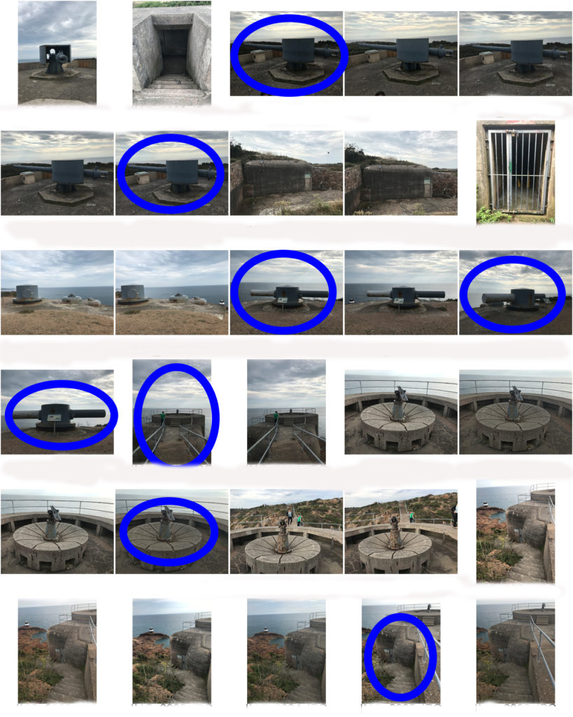
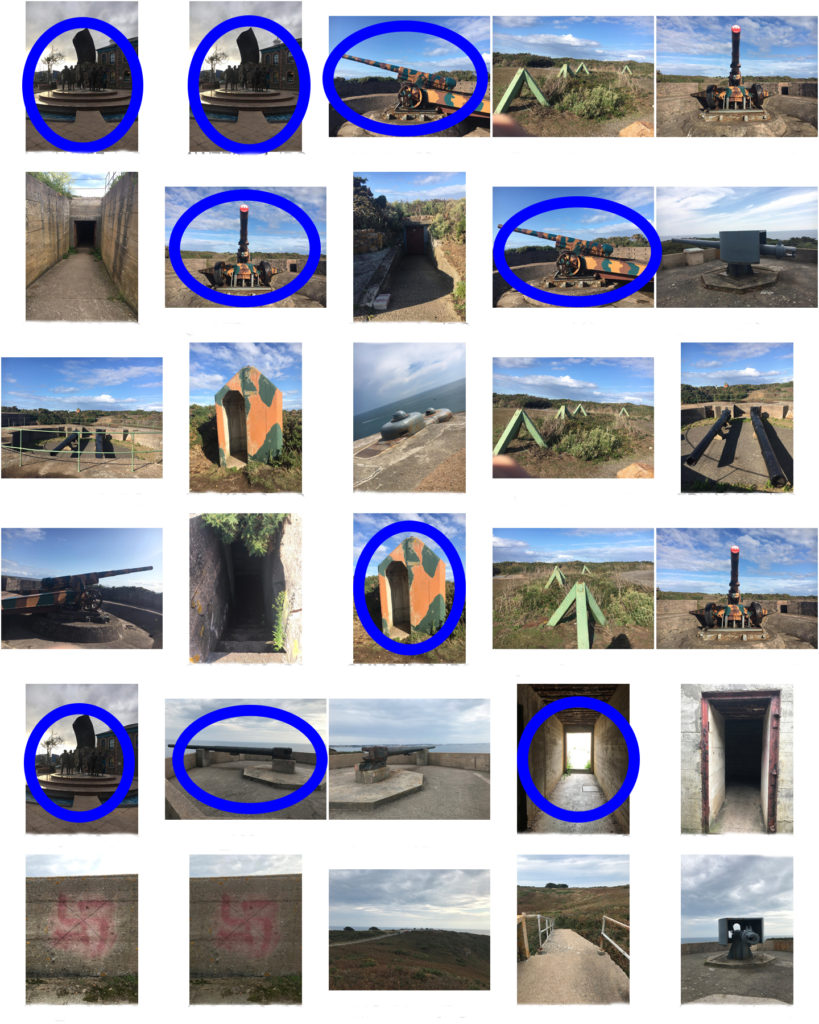
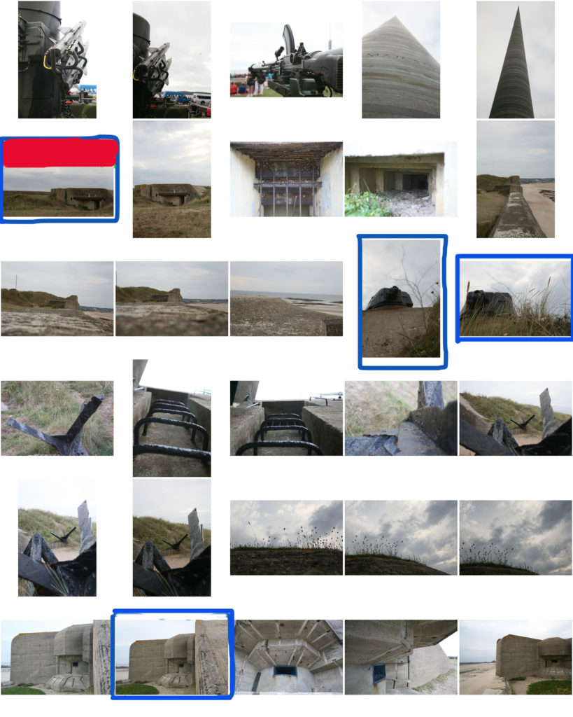
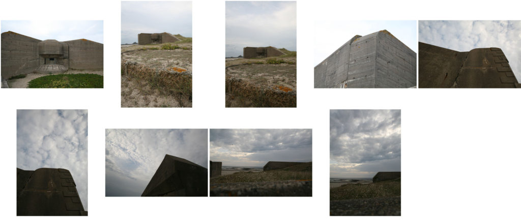
The shoot
Photoshop process
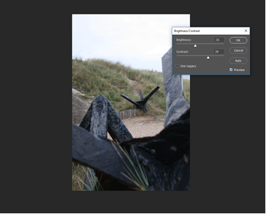
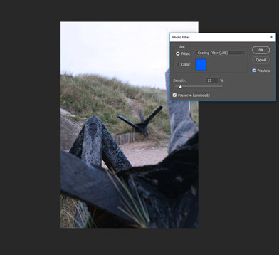
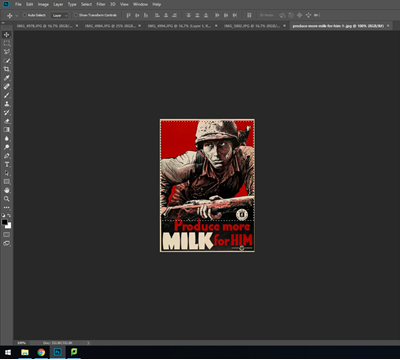

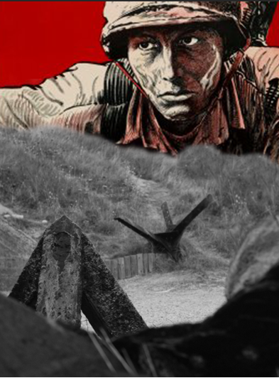
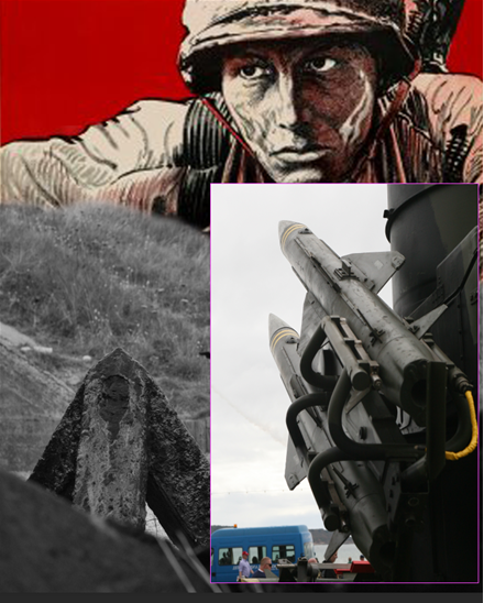
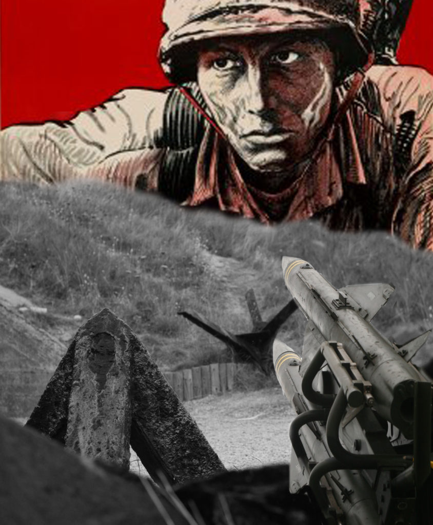
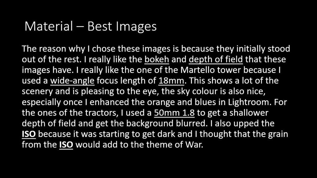
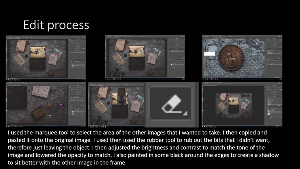
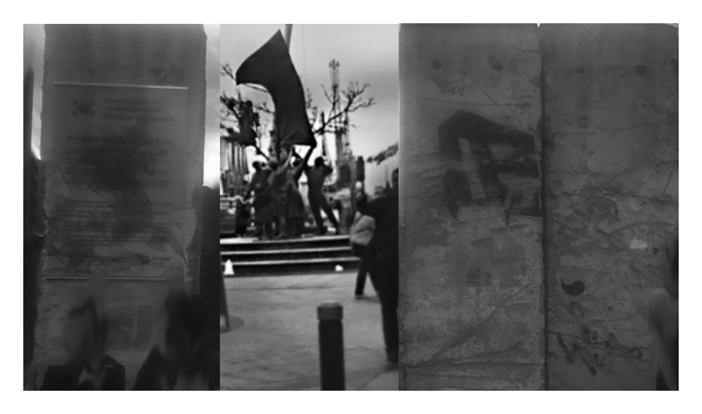
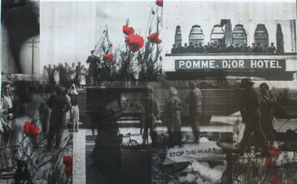
I began the montage by decreasing the brightness of the background to bring out the colour of the steel and grass for the background. I then added a cooling filter (blue tones) to the image to create a dejected atmosphere for the viewer of the photo.
I experimented with the propaganda poster because of the red colour in the background, which I felt would be striking against a black and white image. I changed the colour of the background to be more greyscale and duplicated the background so I could replace the sky with the image.
Having decided I didn’t like the steel covering the background, I got rid of it and patched the grass where it would have been. I placed another own image of mine (Having cropped and flipped it) then blended it into the image for the final result.
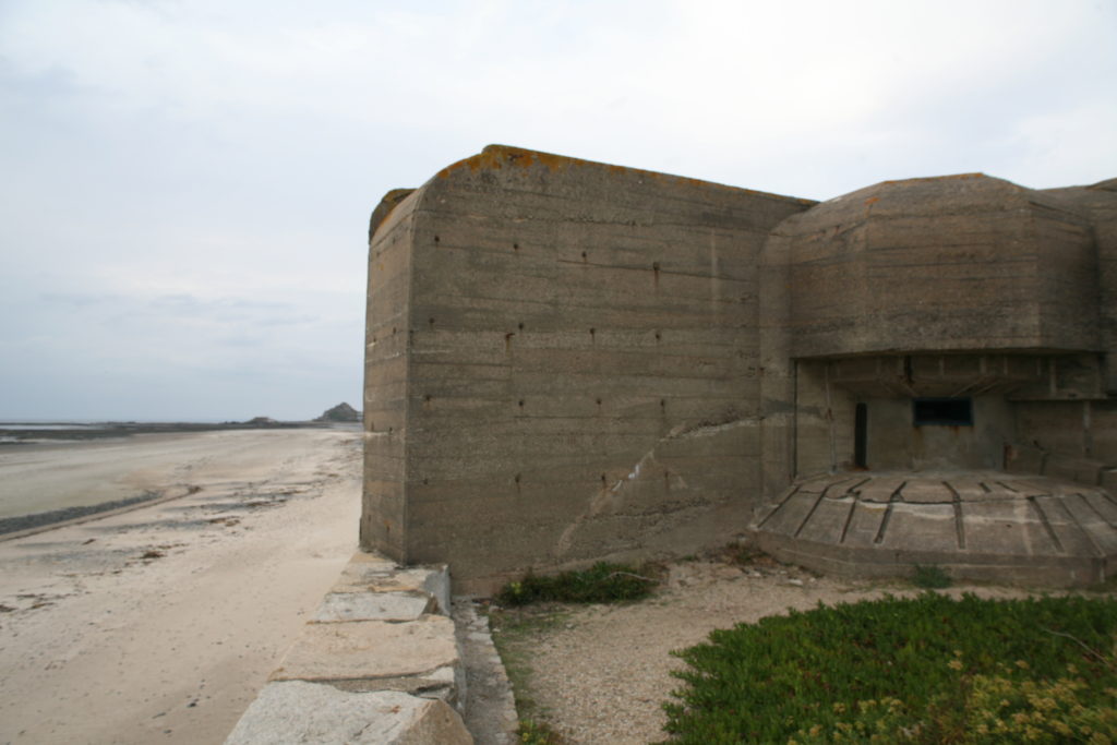
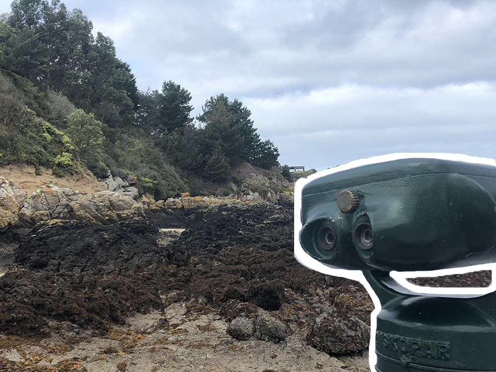
Above is the image I used as a base for my second photomontage.
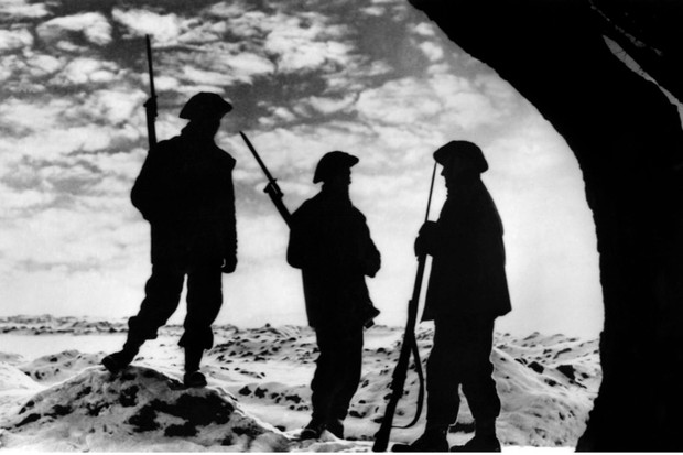
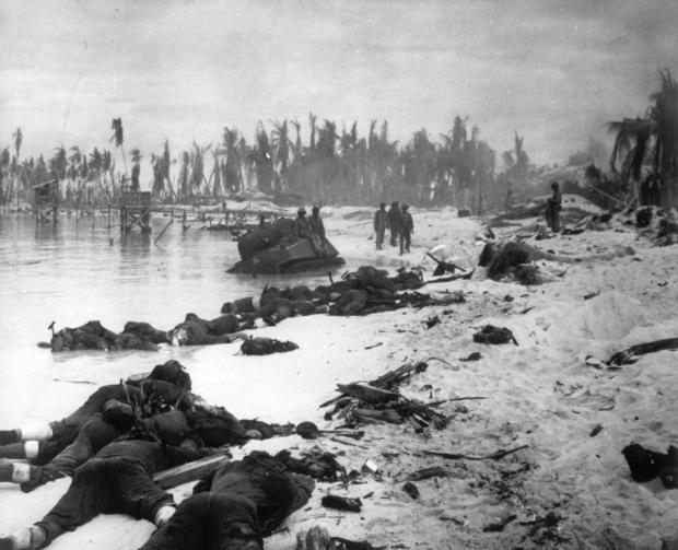

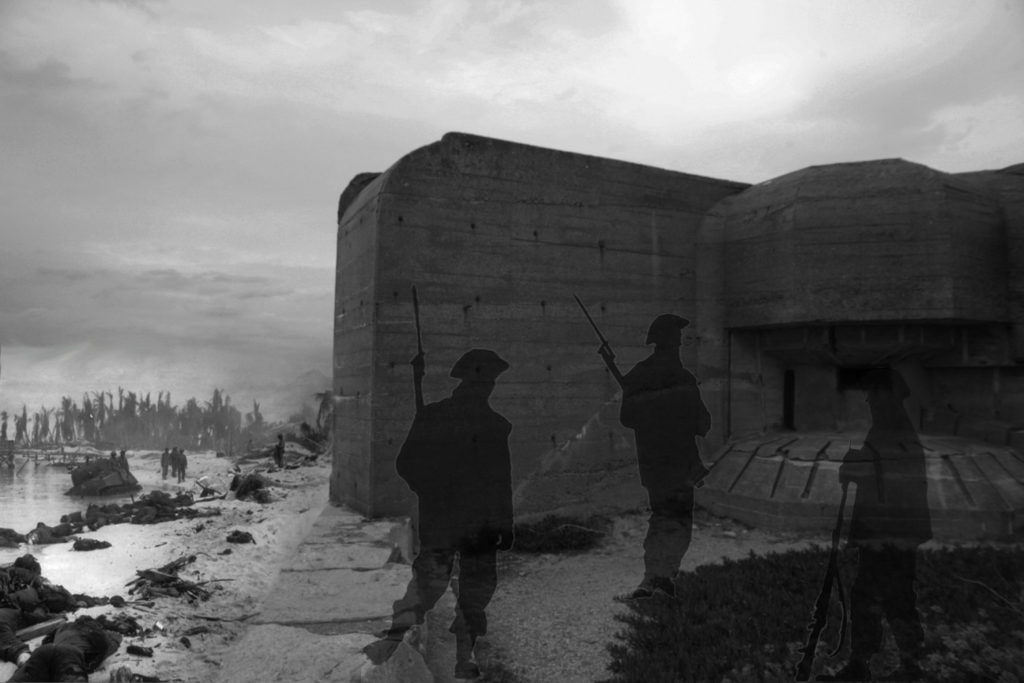
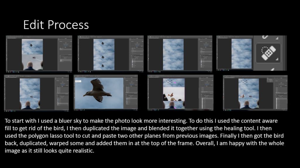
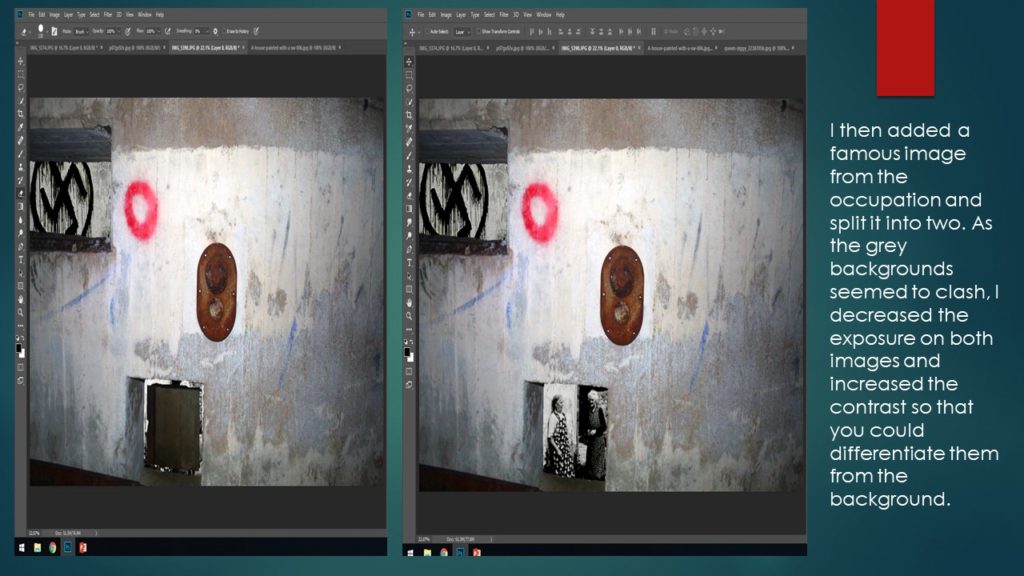
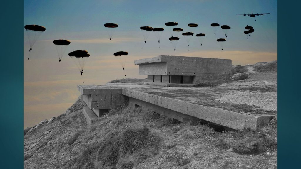
I decreased the exposure of the bunker image and changed it into black and white. I then collected an image from the D-day landings during WWII and used that to replace the original beach in the image. I blended these two images together (decreasing the hardness of the eraser tool and changing the brightness of the beach image).
Finally, I added three silhouette war figures, decreasing the opacity to keep the bunker as a main feature of the montage.
A montage inspired by Raoul Hausmann
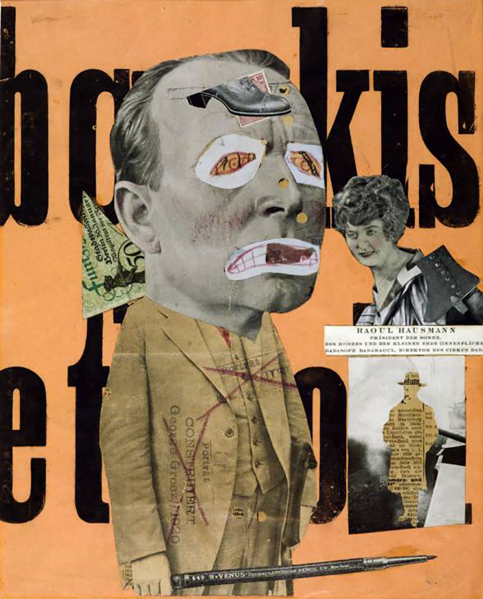
The process:
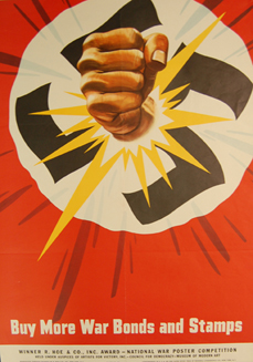

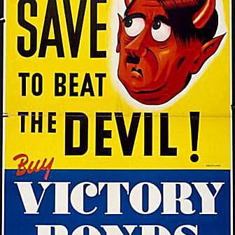


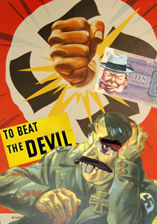
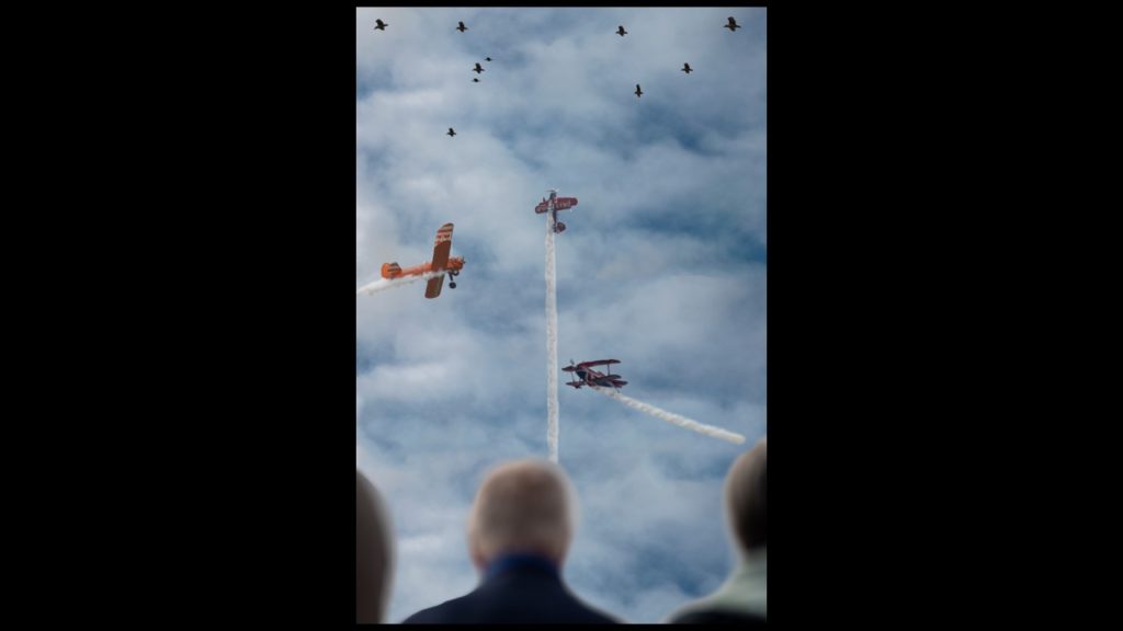
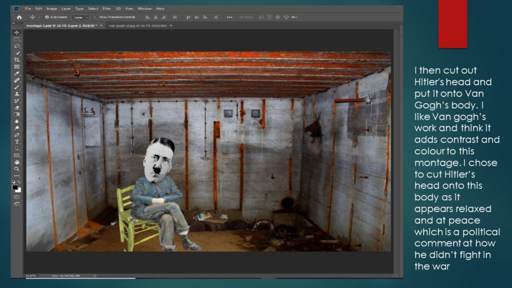
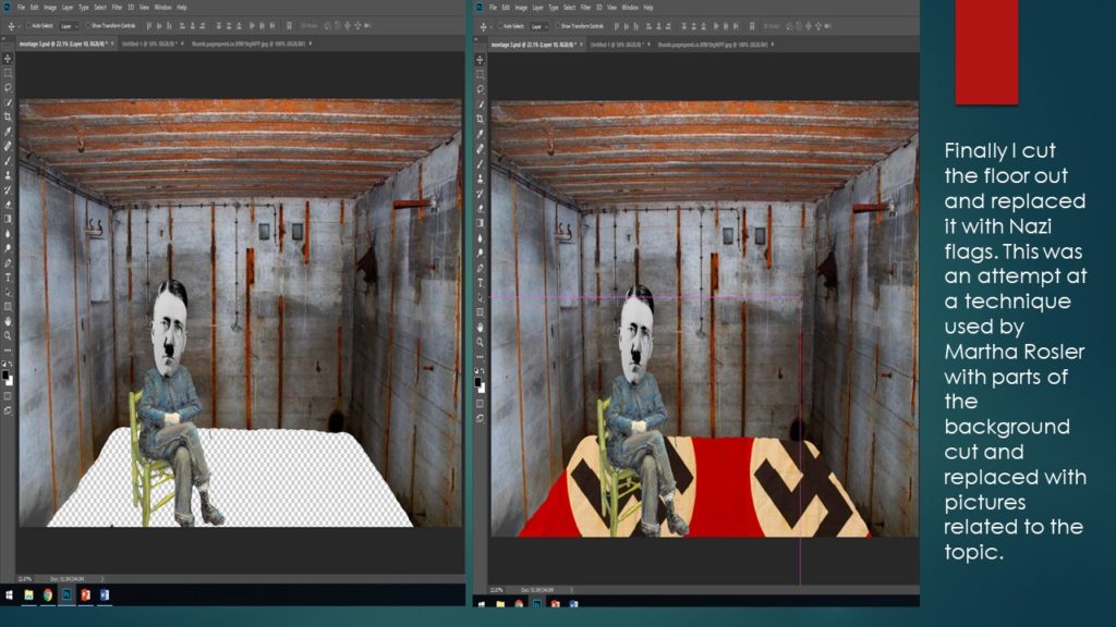
I started off by using the first propaganda poster as a background. I then found another propaganda poster with a caricature of Adolf Hitler on it, having cut him out of the original image, I incorporated it with the background as a new layer.
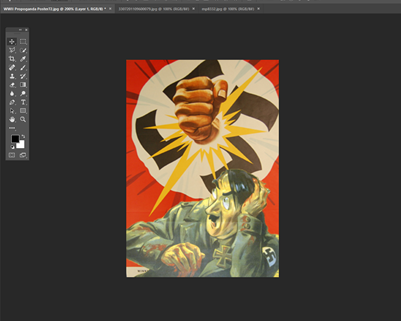
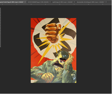
I decided to use this as the photomontage by Hausmann had a figure as a main element of the image. I’d found more propaganda and cut out Stalin’s eye and a rat mouth from another image, I reshaped and changed the angles then placed them on top of the Hitler layer.
This started to create a satirical-like image which had been a main aspect of the DADA artwork Hausmann was associated with. Having added this, I wanted to incorporate a text element to the montage. I chose an image with the words ‘To beat the devil!’. I added this behind the layer with Hitler to add more depth to the image.

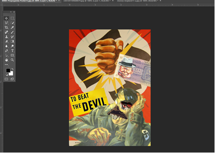
I decided I wanted to add some British elements to the montage, so I collected a cartoonish style image of Winston Churchill (A very relevant figure in WWII) and an image of 10 shillings (old british currency). I layered these and placed them on the image.
I reshaped the false mouth I’d placed on Hitler as a final touch to the montage.
