
EDITING
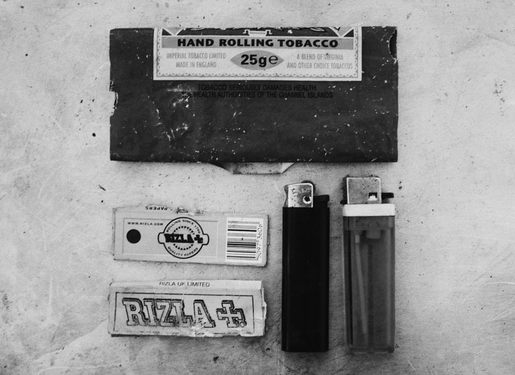
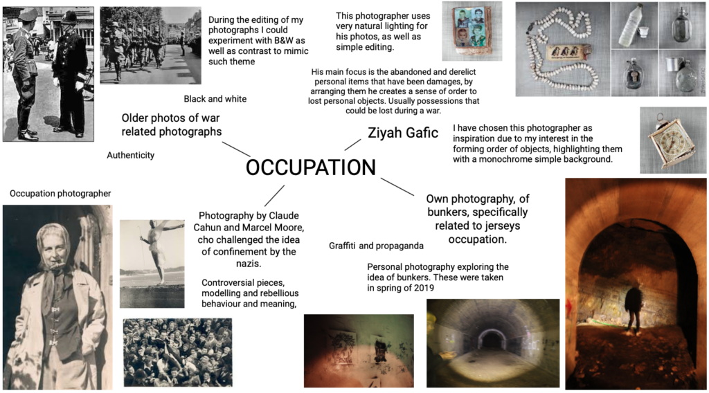
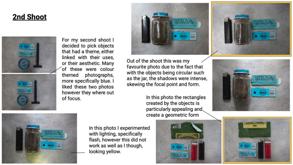
Deciding on the photos with the correct focal points, and the least shadows to make the image look more in proportion, I proceeded to edit them, in the photo below (taken from my second shoot) I made sure that the contrast had been increased and exposure lowered. This edit is inspired by the ‘authentic’ approach to old photos, with no colour, I accomplished this with the use of a filter aswell.
- Increase of exposure, shadows and tone
- Adjustments in cropping and straightening
- Increase in colours particularly pinks and reds to bring out colours of the items selected for this shoot
- also adding a filter
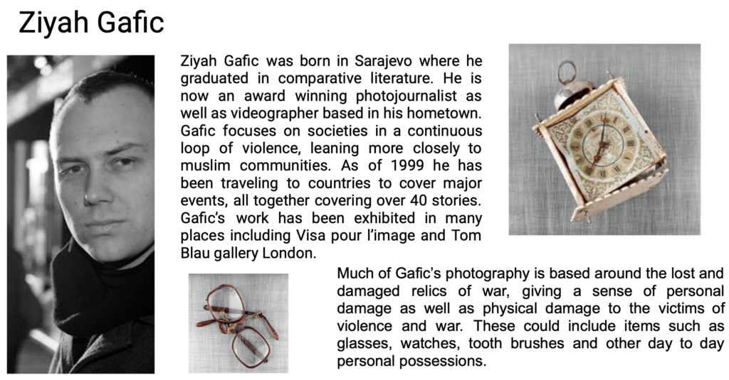
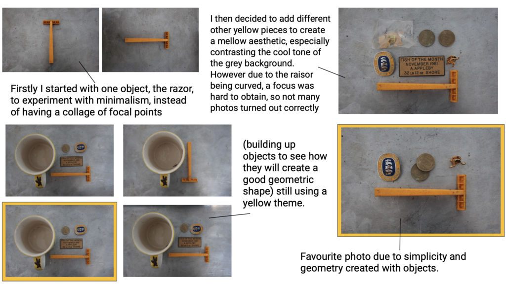
Due to the mass of yellow as the focal point of the photo, I slightly increased the yellow to make to foreground even stronger. By also increasing the contrast and shadows it evened out any odd shadows that were breaking the form in the background. As well as the I made sure that the items were in the correct place using grid lines. This along with cropping the image made sure for a evenly centres focal point.
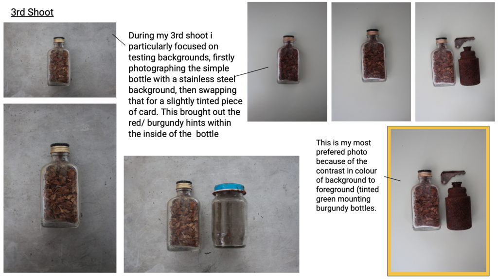
To edit I have used VSCO, a simple photo editing app. In this photo I have enhanced the contrast and exposure to lighten yet keep the objects definition. As well as this i simple cropped and straightened the photo in order to align the sides with the form of the items in focus.
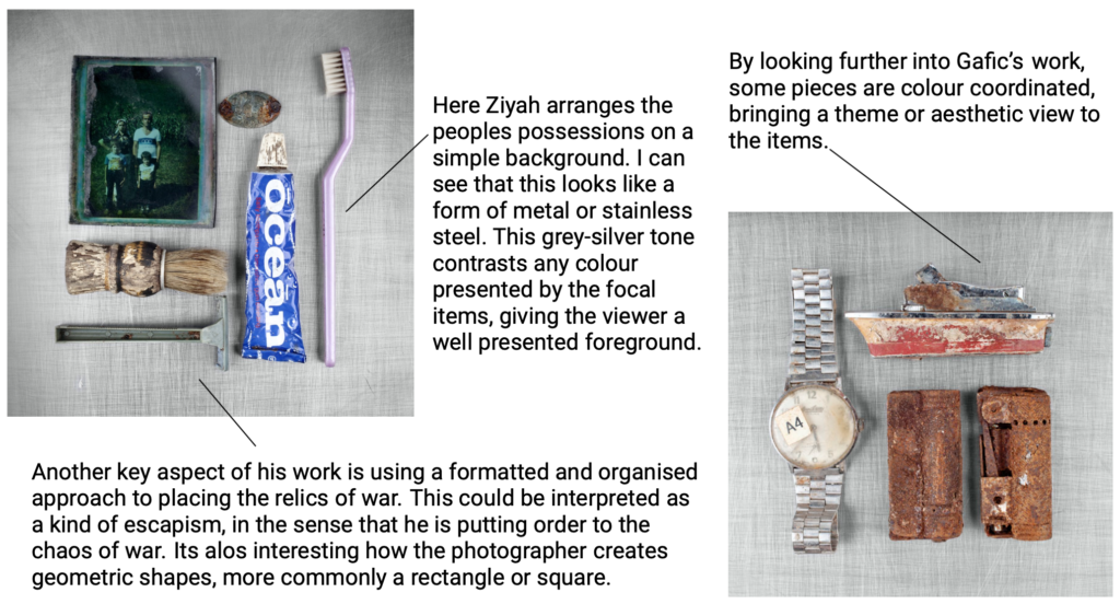
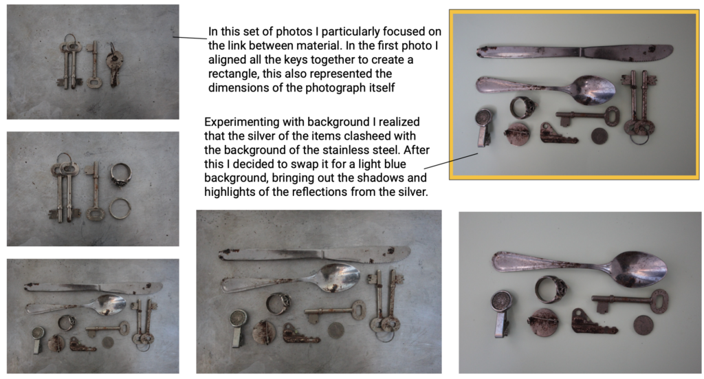
In this photo I also straightened and cropped the image, however due to the two metals (background and foreground) I increased highlights and shadows, making it more clear to view. I furthermore softened the tones of the colours, cooling the image to create a blue/ silver theme.
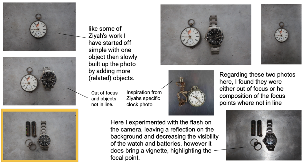
FINAL PHOTOGRAPH
This is my chosen photo from my 3 shoots, due to the fact that it firstly represents the object’s that would be in personal use, much like the ones in the photos taken by Ziyah Gafic. This is personally my favourite due to the link between each item, being silver. This means that every item reflected in a similar way. Furthermore, even though most of the objects are rounded, I like the way they create a rectangular form. I also think that the editing of B&W improves the contrast the the background, making the focal points more visible.

Great summer task but You seem to be missing some key blog posts…
Please add any other tasks that we have tackled so far this term.
We cannot assess your progress without the necessary work uploaded to the blog.