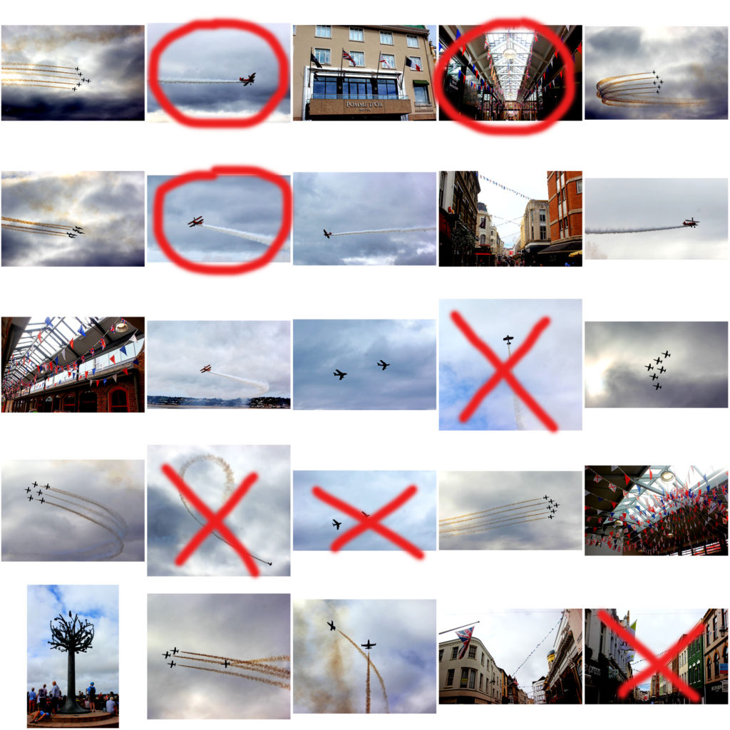

I have displayed a collection of my Air Display images into a large contact sheet using Photoshop, so I was able to compare each image and decide which ones were my best outcomes. I used the pen tool to cross and circle what I believe are the best and worst images in this series, and which ones I will be using again. My reasons behind the crossed out images were mainly to do with the lighting, lack of clarity, composition and view. For example, the planes were very far away, making the image unclear, or the positioning of them wasn’t aesthetically pleasing in my image.
