The first march of gentlemen
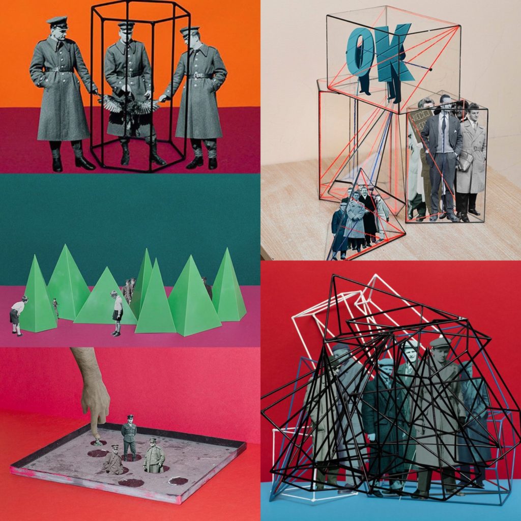
This photo book was created by a Polish photographer named Rafal Milach. He was born in 1978 in Gliwice, a city in Southern Poland. He is best known for being a member of Magnum Photos and also for his photo book “The first march of gentlemen”.
In the summer of 2016, he was invited to take part in the Kolekcja Września artist residency program. While there he became ware of a children’s protest which had occurred when the German had occupied Poland, which the town had become known for. They attempted to change many things, such as getting rid of the Polish language from the school curriculum. This led to over 100 children from the Catholic People’s school going on strike as a protest against the Germanisation of their education and schools. This strike is remembered for its’ triumph and has since become an event that is always associated with the town of Września.
“The most important thing was to create a story that would be accessible to everyone because this is, in the first place, my vision of a society, in which individuals can protest in the public space, regardless of consequence,” he explains. “The initial idea of working with the archive was sustained, but the topic changed as I began looking for material that could occupy two spheres – discipline and pacification, and the sphere of freedom – and to bring these elements together in a series of collages.” – Source
During the time of his residency, there were also mass rallies due to the government trying to gain more judiciary power. The children’s march along with these rallies inspired his book. The photo book contains photo montages which show illustrations from the 1902 children’s strike along with characters who lived in the communist era, which he was able to create thanks to the help of archive images.
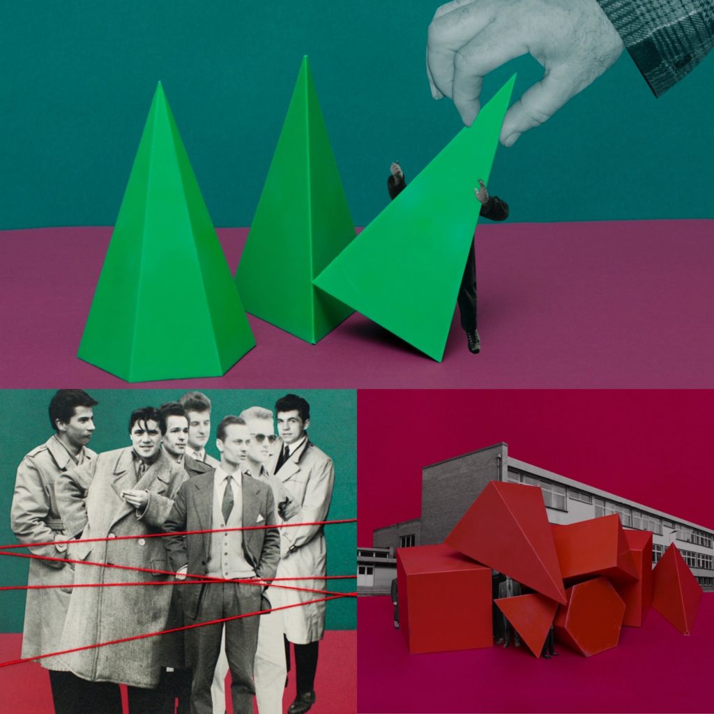
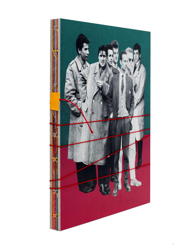
The book is very brightly coloured, contains many different types of shapes and is bound together with a long red string. This along with its size, makes it similar to the size of a children’s exercise book, and this all refers back to the children’s march, which was the initial inspiration for the project.
[the design is] “like a toy, like a candy – something nice to look at and to touch,” – Source
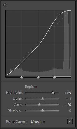
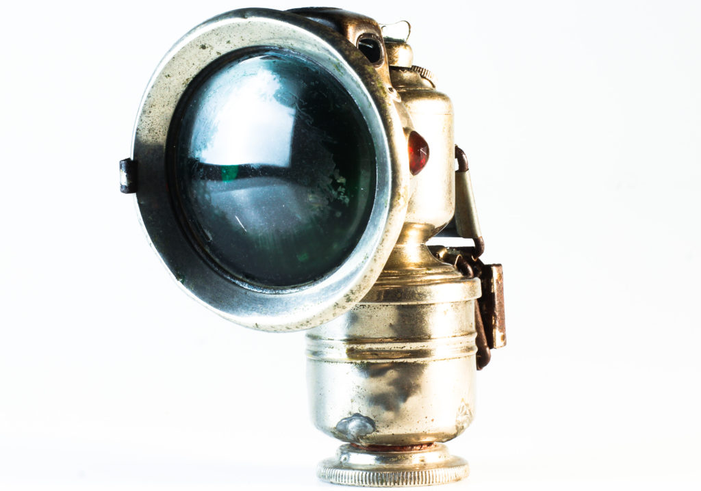
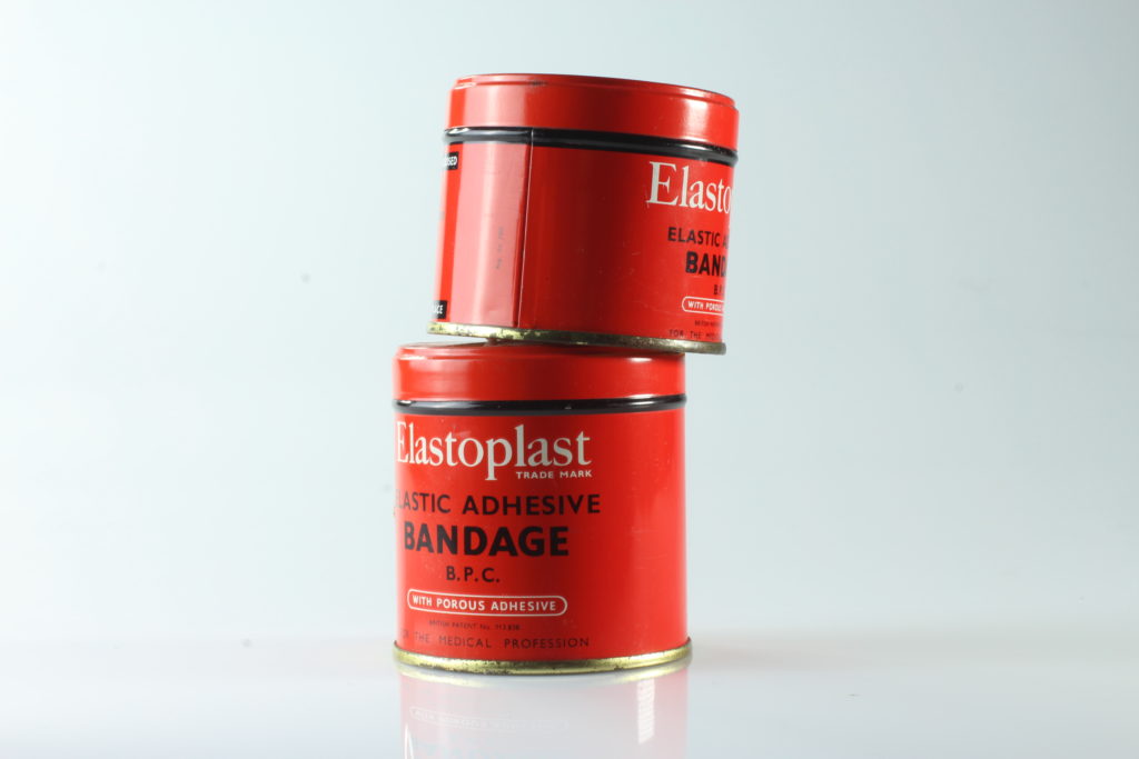
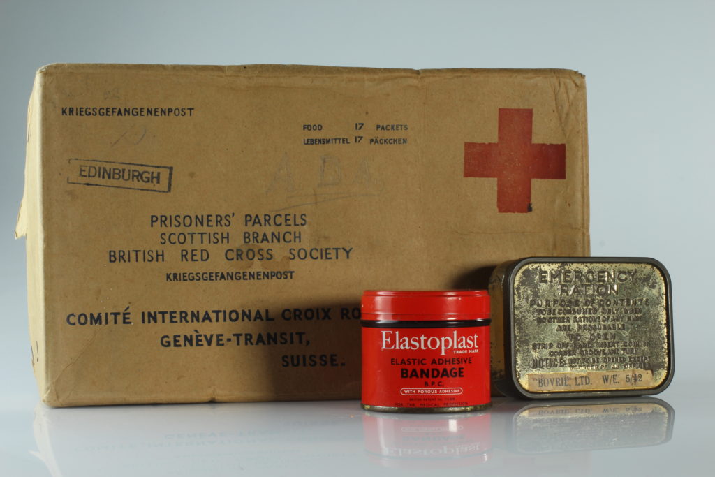
Analysis
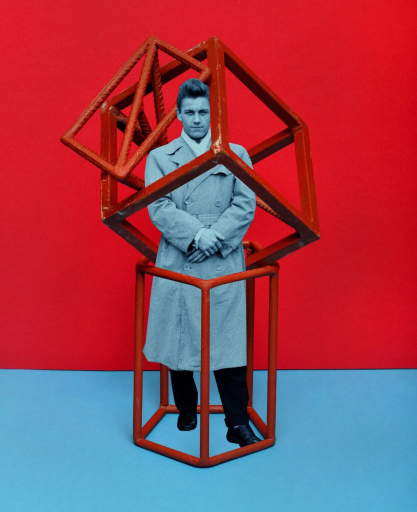
Contextual: This is a montage from Rafal’s book which refers to political activism that came from the children’s march in 1902.
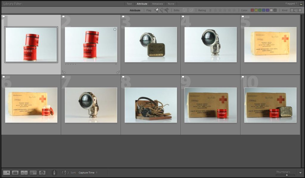
Technical: This was created using archival images along with coloured backgrounds. This could have been made digitally using software such as photoshop, or it could have also been done by hand by simply cutting and sticking images, then photographing them.
Visual: In this image we see a young man dressed in vintage clothing. The young man is also in black and white. This along with the clothing tells us that it is perhaps an older image. We can also see a very colourful, almost candy like, background which is half red and half blue. Both these colours are extremely overpowering to the audience, which helps draw our attention. The person in the photo appears to be enclosed in a sort of geometrical shape, yet his features do not show him looking scared or worried, instead he demeanour appears calm and put together. This book has a strong sense of contrast and displacement.
Conceptual: The colours used and the geometrical shape in the centre is a conceptual metaphor which refers back to the children’s march as vivid colours are normally associated with younger people, and the geometrical shape may refer to mathematical teaching aids. The person pictured almost appears to be trapped, which could be a metaphorical way of showing how the young people must have felt to have their education system changed.