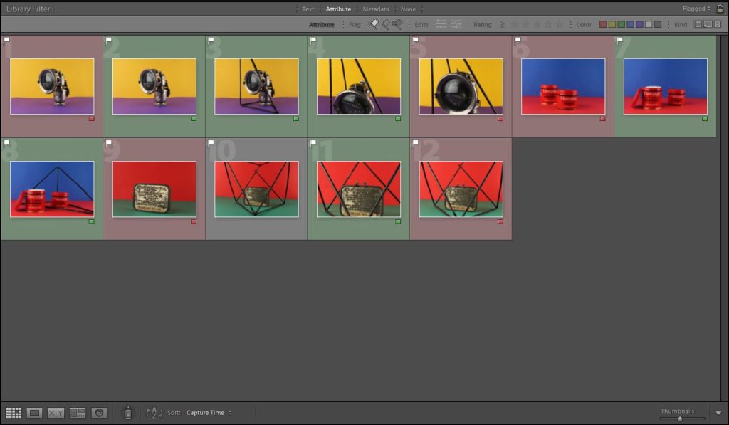
Contact Sheet:
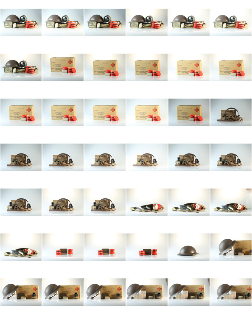

Contact Sheet:
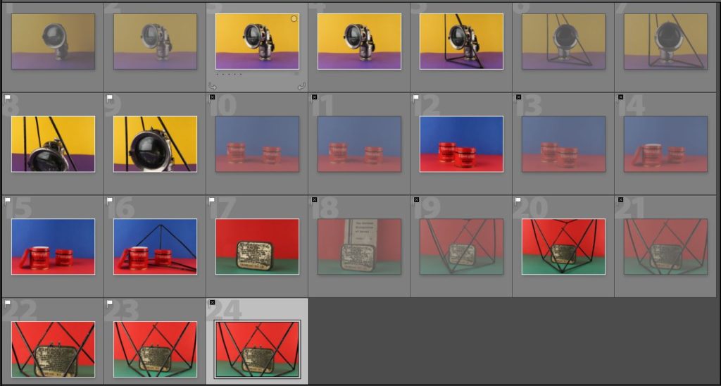
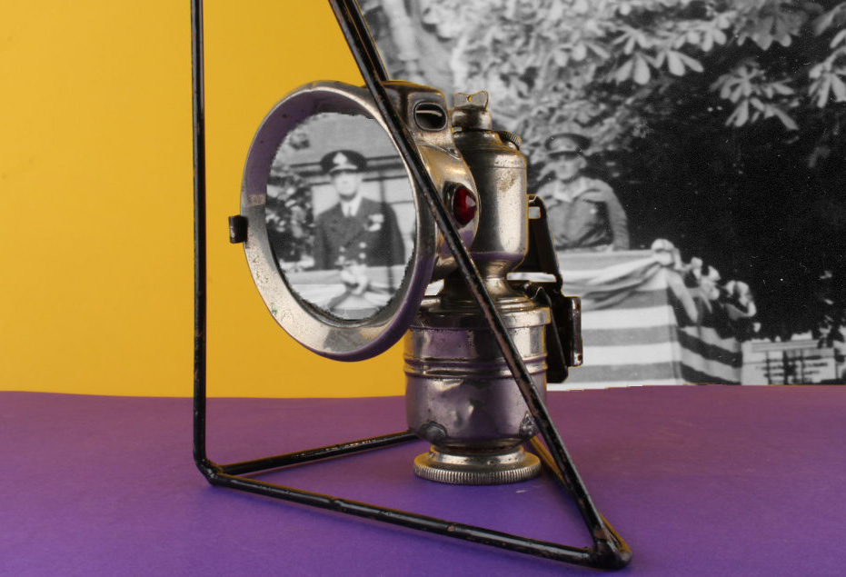
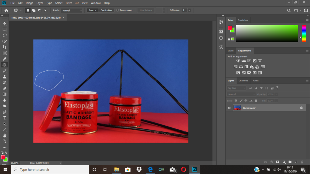
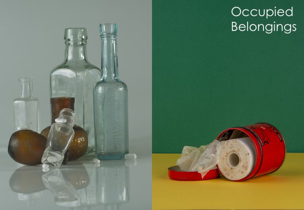
In this photo shoot I plan on taking image of the occupation objects in a slightly more artistic way. I will be using very vividly colored background as this is what Rafal did in his work, and I like how it makes the objects he’s photographing stand out more. I also like how he used geometrical patterns in order to symbolise being being enclosed or trapped, so I will be using different geometrical shapes in order to do the same thing as it symbolises how Jersey people must have felt under the occupation. I want to create a strong sense of displacement through contrasting colours, and a feeling of being trapped through the use of geometrical shapes.
Best images


Further developing using archive images
1st montage:

2nd montage:

3rd montage:

4th montage:
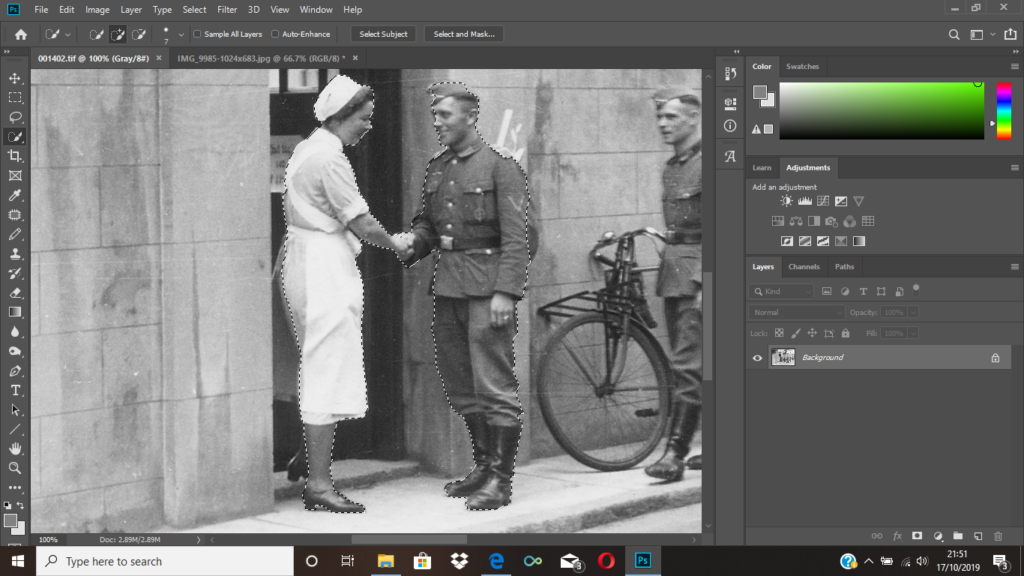
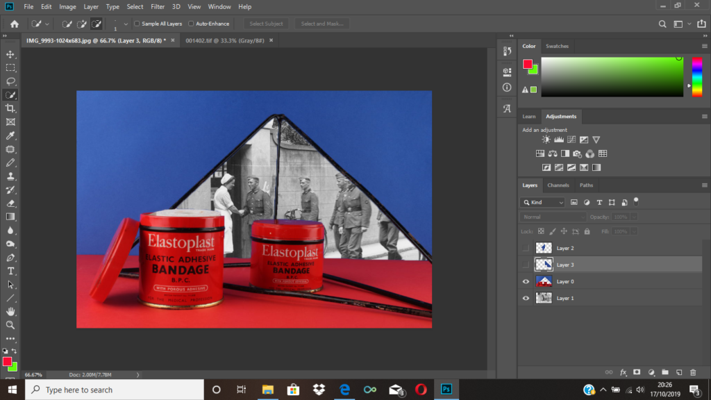
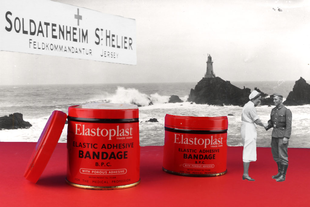
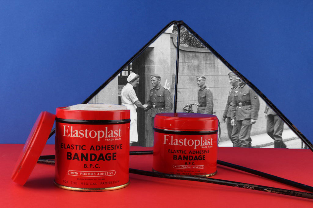
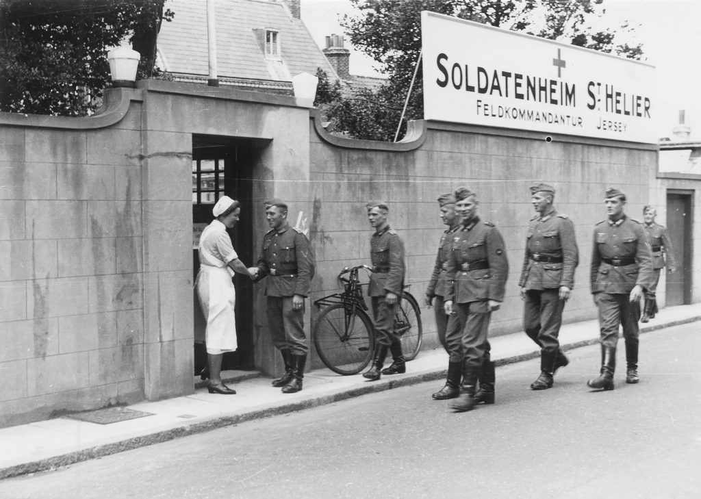
To achieve my final montage, I used the archive image seen above. I thought an interesting part of the image was the nurse and the soldier shaking hands, and also the medical sign. I selected both of these areas using the quick selection took, so that I was then able to place them onto my image. After selecting them, I used to eraser tool to clean up the edges as I knew they would be going onto a photo with a bright background.
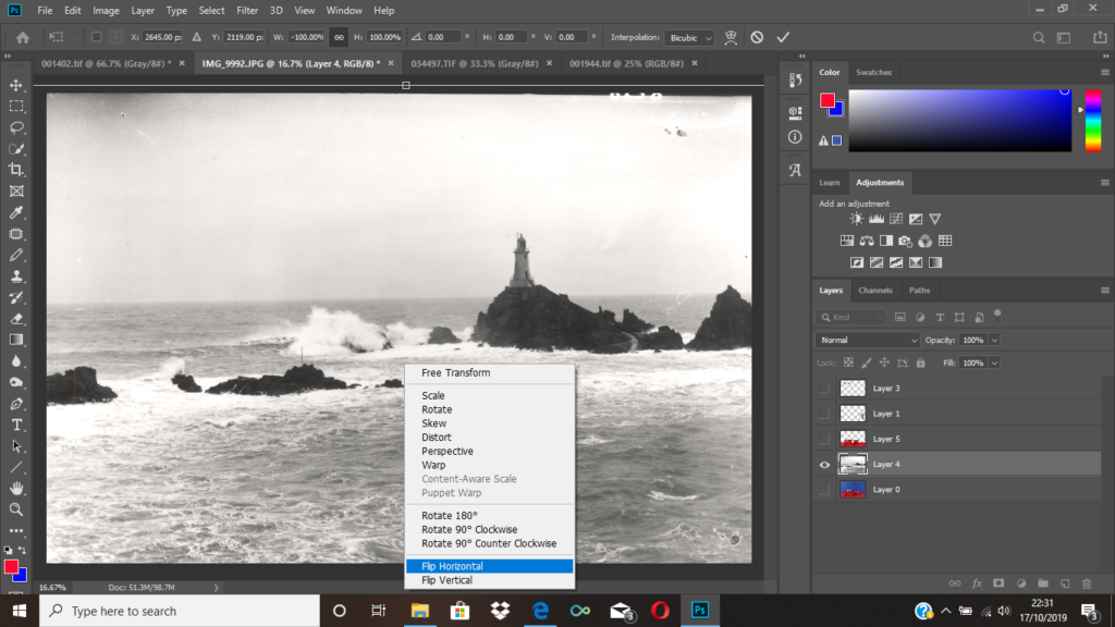
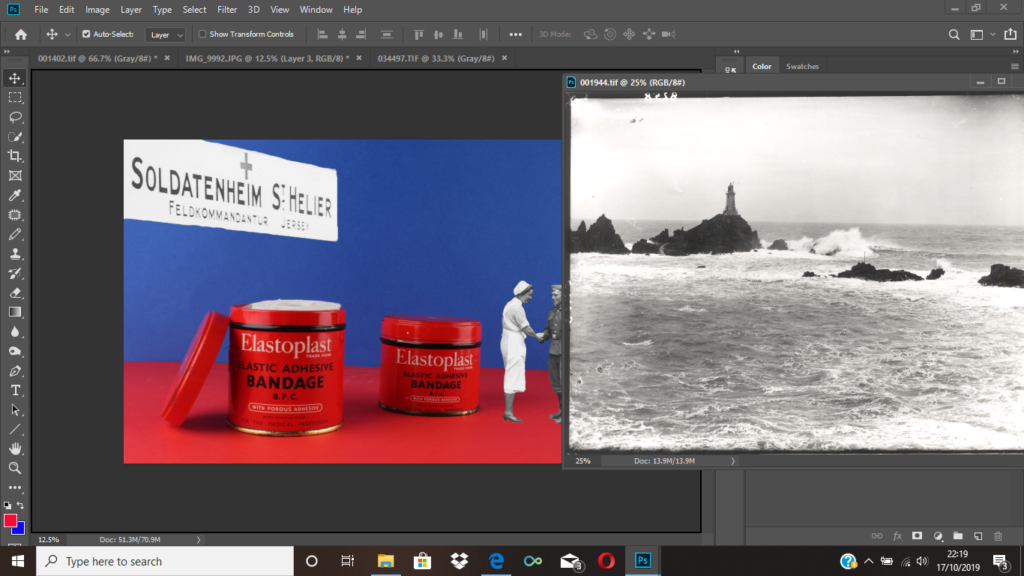
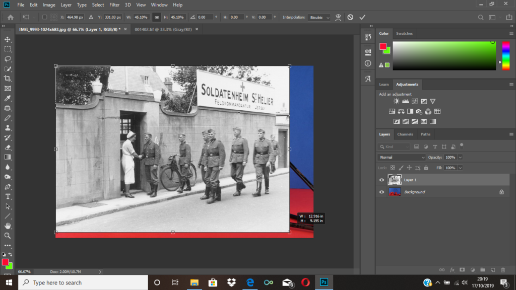
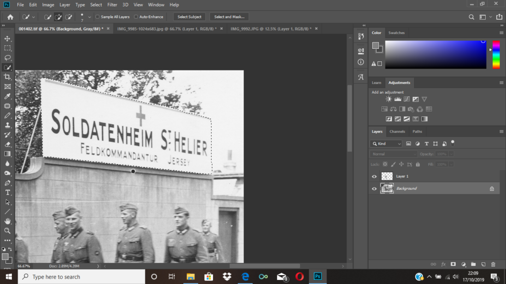
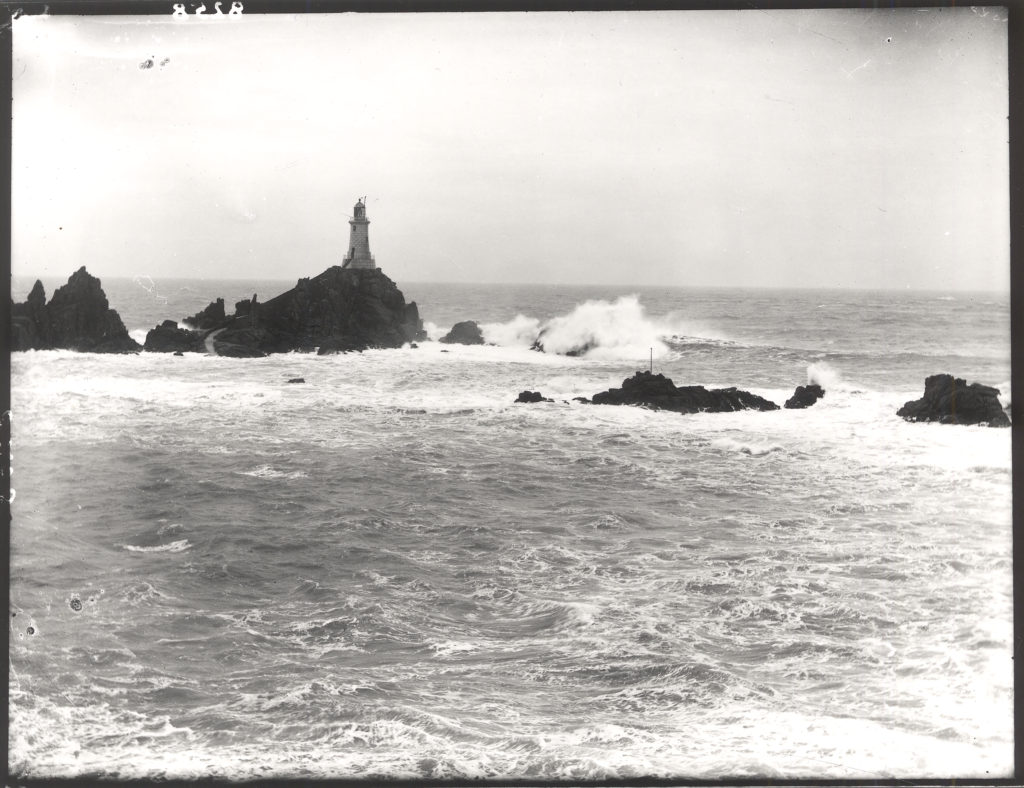
After placing the two sections of the archive image, onto my own, I then went on to open another archival image of a Jersey landscape as I thought this would make my montage more interesting. I selected the blue area of my montage with the quick selection tool, deleted the selected layer and dragged the archival image on. Since the lighthouse would’ve originally been covered to the my placement of the medical sign, I then flipped the image horizontally.
Initial images vs. Final images
1st montage:


2nd montage:


3rd montage:


4th montage:
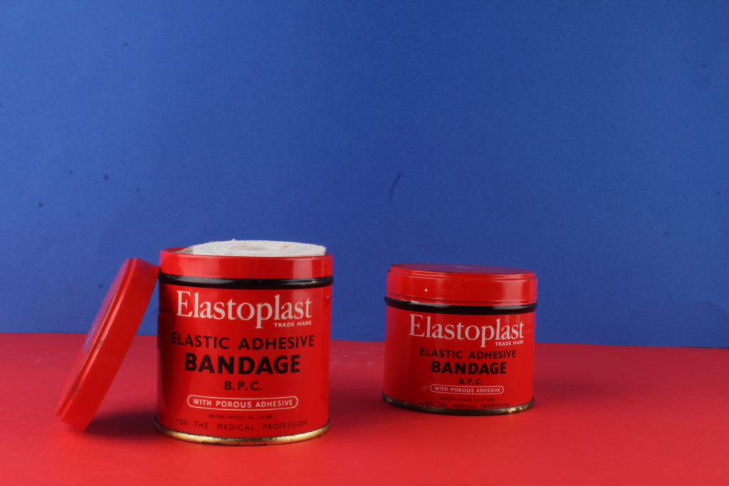

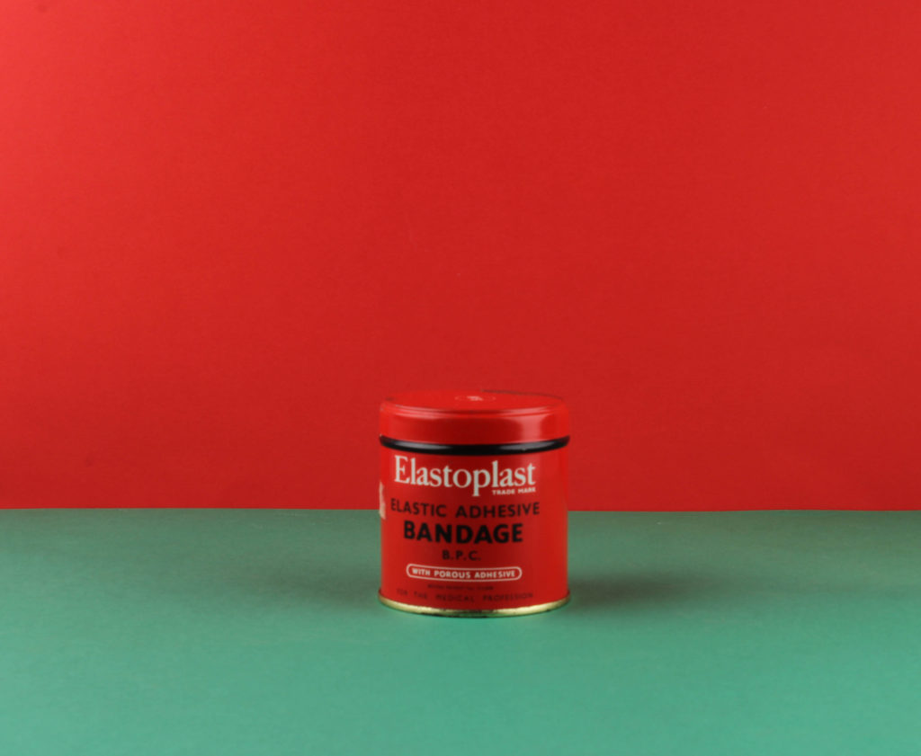
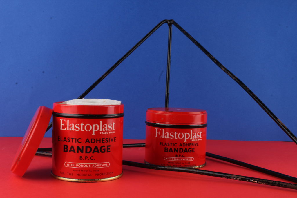
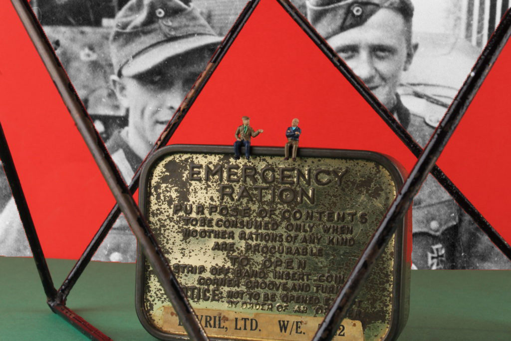
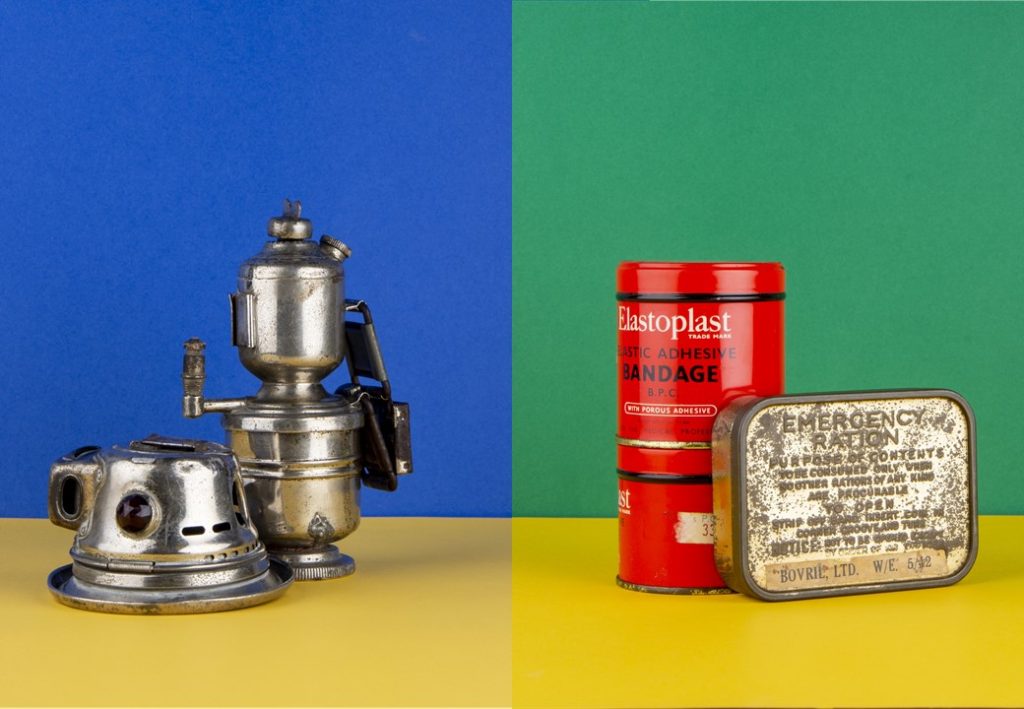
Green and red are complimenting and I wanted their to be as much red as possible to symbolize blood and death. The tin is red which is a metaphor for the how the bandage is going to eventually turn red due to covering up a bloody wound. I made sort the ration of red to green was bigger as the green is meant to look like it is being consumed by the red. The rate of death everyday kept increasing during the war, the green symbolizes life’s left and its gradually becoming less and less. The green also represents nature and how it was being destroyed by bombs, stomping, trenches and deserted rotting bodies.
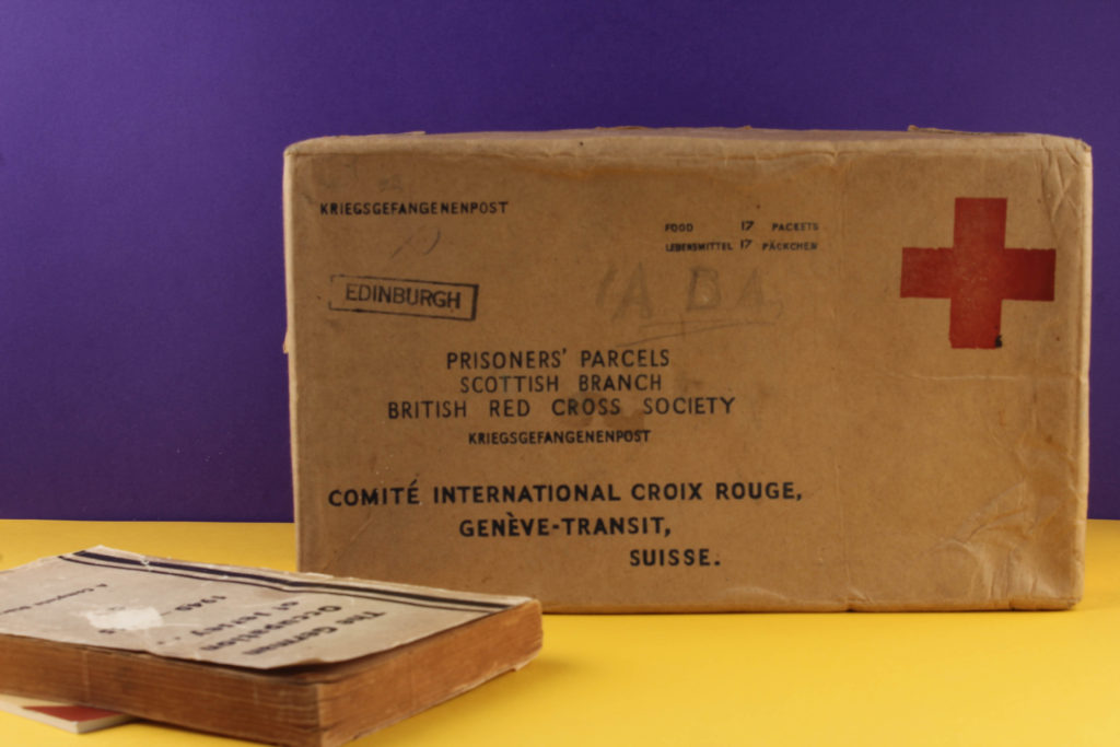
Purple and yellow card was used as my background colours as they are complimentary to each other. The bright colours create contrast between the beige box and book. On the contrary I purposely made the box to look at of place because I wanted it to be the focal point as a Red Cross Box held so much importance to those who received them. Although the outside is plain and uninteresting the contents were the opposite these boxes held the power of life or death for some people.
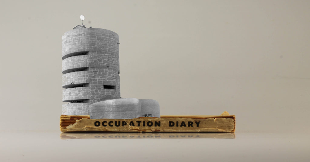
This image was originally from my first shoot, the occupation diary and the radio tower is from an archive image. I went through the process of trimming and cropping the radio tower out of its initial background and placing it on top of the diary to create this montage. The photo highlights the importance of documenting the past through the use of writing and photographing. The radio tower symbolizes the significance of historical documents and how they recreate the past and educate us. Without narrative from the time of the occupation we wouldn’t have a story behind Jersey’s bunkers.
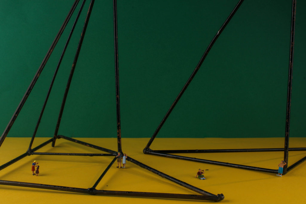
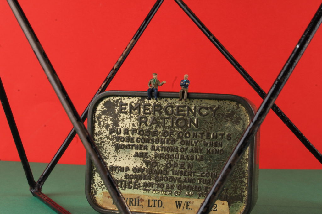
For this image I used miniature people, a green and yellow card background and triangular metal poles. Even though it doesn’t feature any literal occupation objects it has a historical concept. The miniature people symbolize the people of Jersey and the poles are the change made by the occupation for instance bunkers. This image displays how locals had to cope with such drastic changes to their daily life with curfews, their loved ones leaving and rationing. Although this disruption was going on, people had to get on with their lives and stay strong for their remaining families. From another perspective the poles represent mental trauma that was left with some many people after the war.
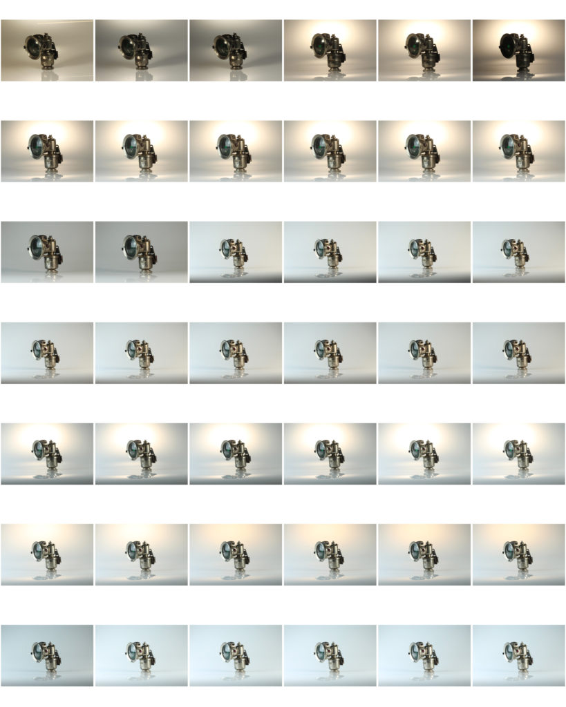
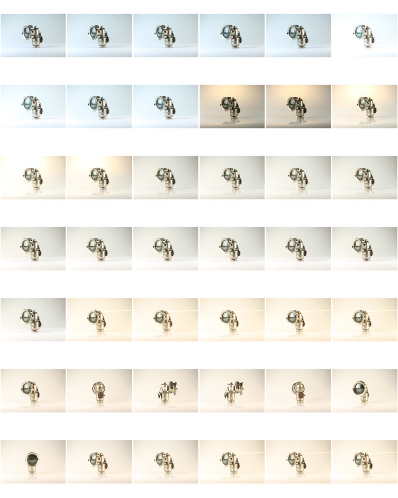
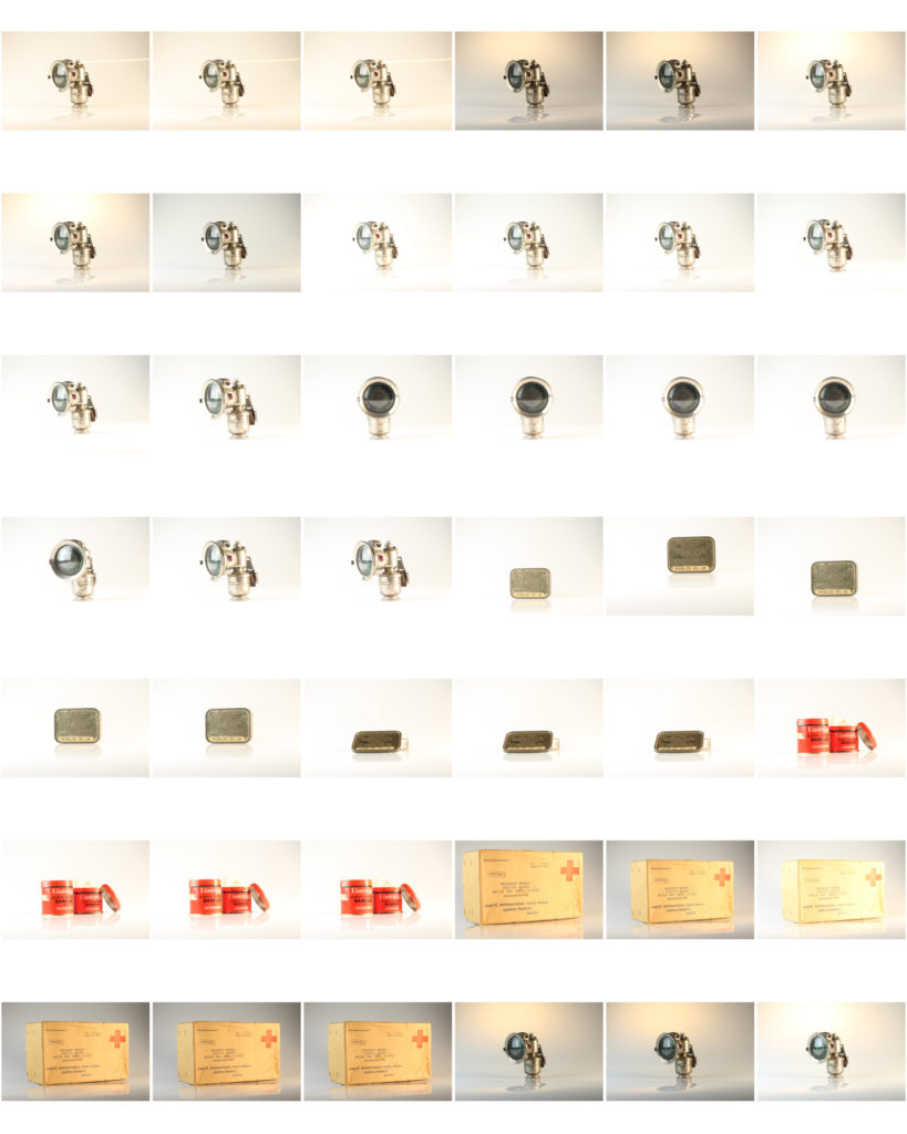
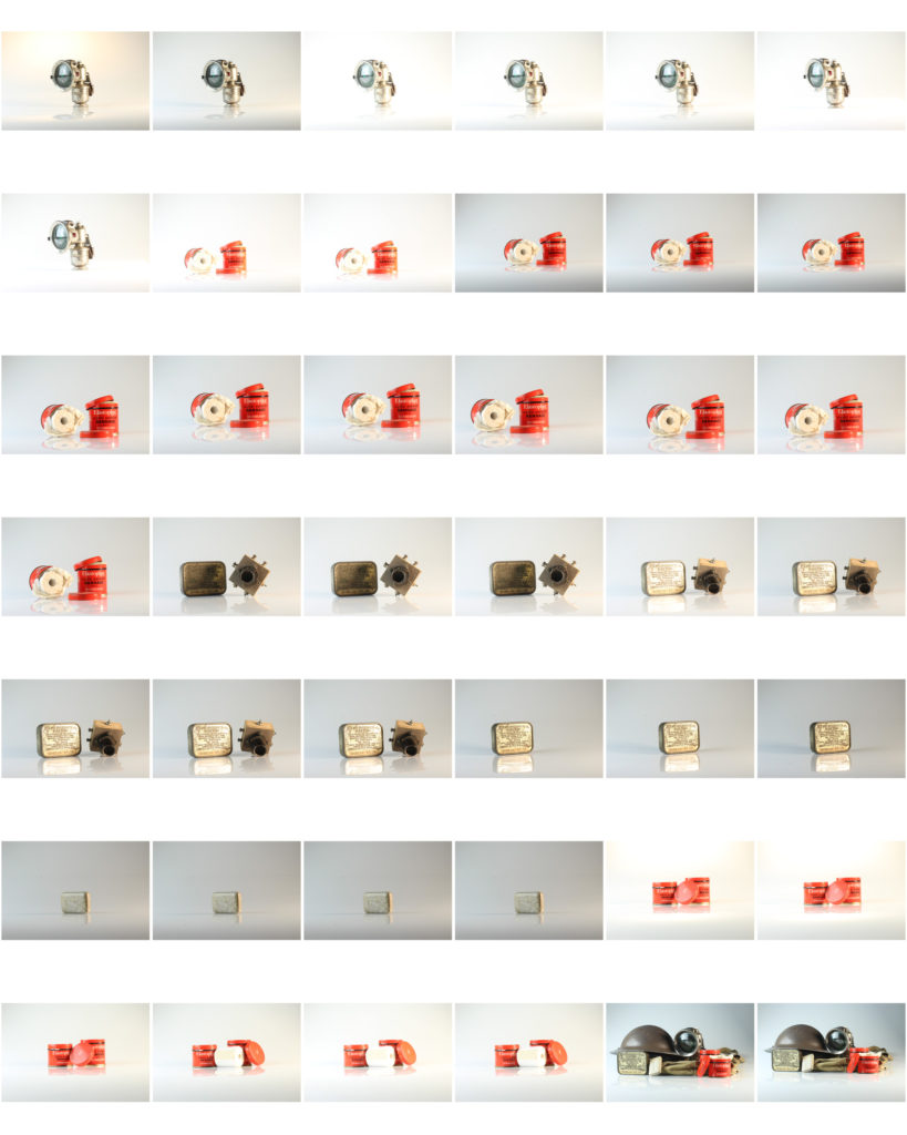
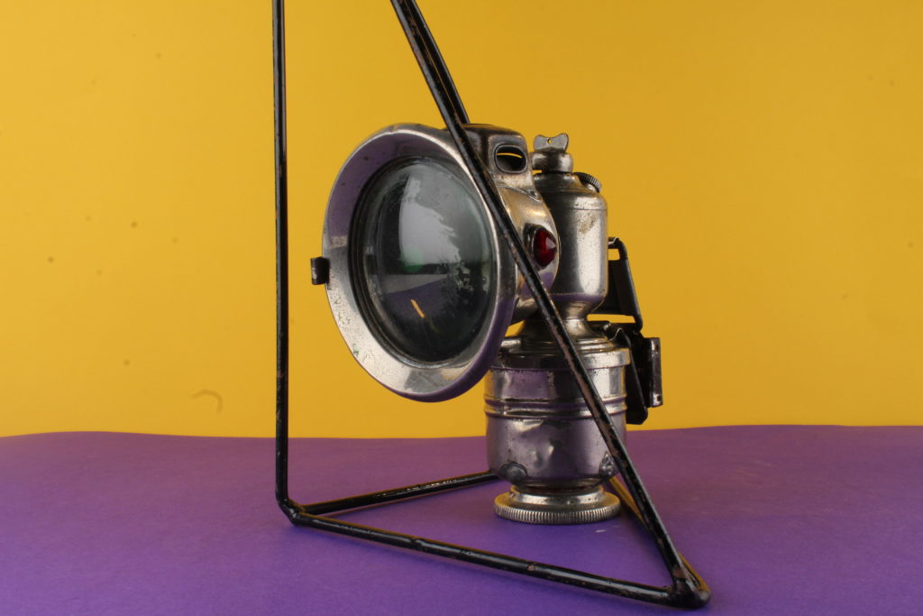
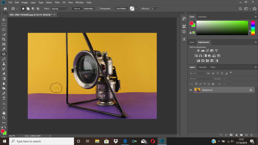
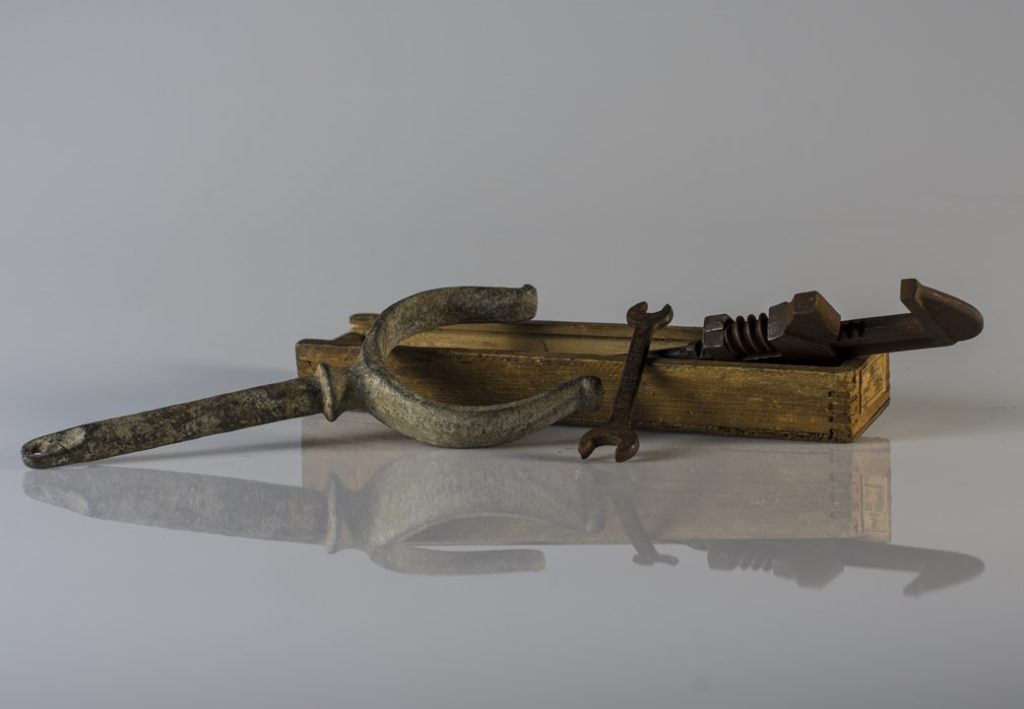
This time in the studio I decided to photograph objects from the occupation of jersey, I photographed a German Helmet, Ration Box, A Crystal radio Set and a Bike Lamp.


For my zine I decided to use a simple design with just a 16 page a5 layout.
The title image was chosen carefully because because it has a large block of the green at the top and the main focus of the image, the bandage, is far away from where the title is. I have done this so that the title doesn’t look like it is cluttering the page and drawing focus away form the image.
I have done the layout so that there are mostly the set of images from the still life table, the reason for this is because I drastically prefer the outcomes.
Most of the images I took were in landscape orientation with the image filled, this meant that there was a large number of double page spreads.
Still life photography is a genre of photography where the subject of the photos are typically small groups of object. Still life originates from the middle ages and Ancient Greek/Roman art, and genre gives the artists creating paintings and photographs more leeway in the arrangement of the design elements within a composition compared to other photographic genres, such as landscape or portrait photography. Lighting and framing are important aspects of still life photography composition. The most popular subjects in still life images include groups of flowers, food, desk space, and many others. Normally still life images are taken close up to the subject but it also isn’t too far away, but instead taken at a medium distance from the subject.
Image Analysis:

This image was taken by Claesz, who was one of the most important Dutch still life painters in the 1600’s. Everything om the table, from the fluted glass and goblet to the lobster and crab, all look very life like. Claesz has captured all these objects together as during the 17th century the Dutch would proudly present these expensive status objects in their homes to show their wealth and remind them of the better things in life. Fish was very expensive and hard to get hold of during the 17th century, so having fish on the table would show wealth. The Dutch would also have bread and wine on the table to add a touch of Christian symbolism, and if it was white bread that would also symbolise wealth as the less fortunate, such as the poor, would either eat rye bread or porridge.
We set up the studio with two stations, one where you take photos from a eye-level angle, and one where you take images from a birds-eye view.

For these photos, I selected objects that were lended to us from the Jersey Archives that are actual objects from WW2. I chose to photographs both images of just one singular object, but I also selected multiple objects to create a narrative.
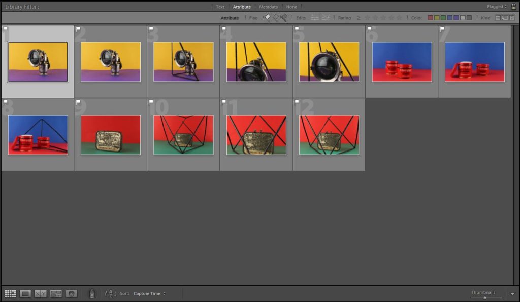
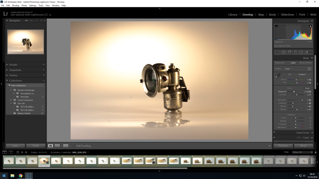
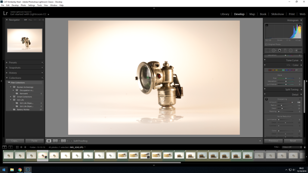
In Adobe Lightroom Classic cc, I used the color rating system to select the images that I thought were the best and I wanted to edit them. First I made them all yellow, meaning a maybe and then after manipulating my images I rated the best photographs as a green.


I rated these images as yellow as I believe they are of a better standard of the majority of the photographs, however, there are some technical difficulties that can't be completely fixed in Lightroom such as lighting differences or some focusing problems. I decided to show these photos to display my selection process and to acknowledge my mistakes in order to learn from them. What I would change next time is where the lights are situated and make sure they hit both the object and background in order to ensure that there aren't patches in the background that are darker than others.

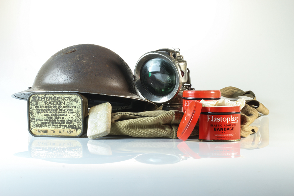


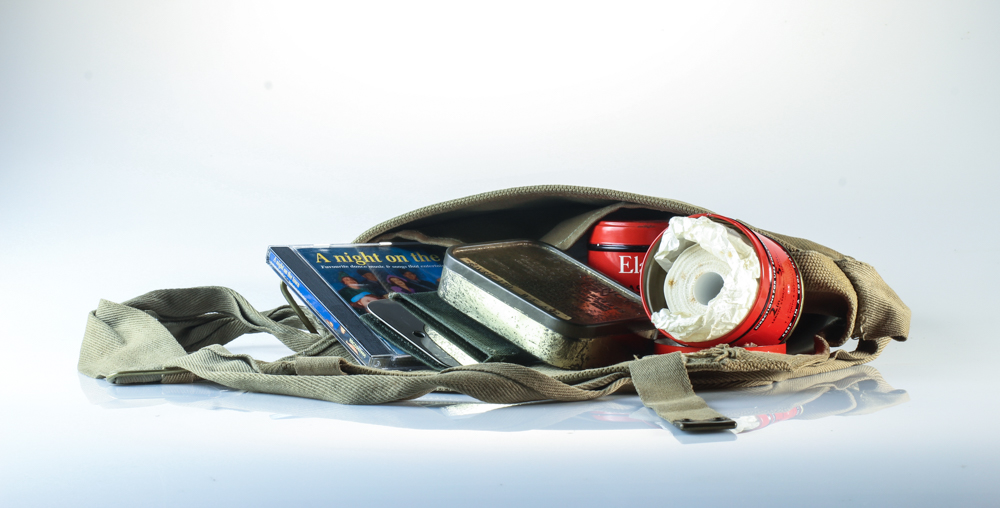

These are what I think are my best images. The focus is crisp and the objects are interesting. I particularly enjoyed photographing multiple objects together to create a scenario. For example, placing the bandage pots and soap bar in front of the First Aid box creates the concept that those items might've been included in the box. I also liked filling up the bag with multiple items that the islanders or soldiers may want to have on them all the time. I also liked taking the birds-eye-view image of the German Occupation of Jersey book. Although I overall preferred taking the images from eye-level, I enjoyed the learning process behind taking the images from the birds-eye-view. I also like the mirror-like effect that the objects reflect onto the surface. It adds more depth into the images and overall make the images more eye-catching. To improve next time, again, I would focus on rearranging the lighting more. I want the images to be a bit brighter and I don't like the blueish/grey effect the background has. I tried to adjust this on Lightroom, but there is only so much adjusting I was able to do.
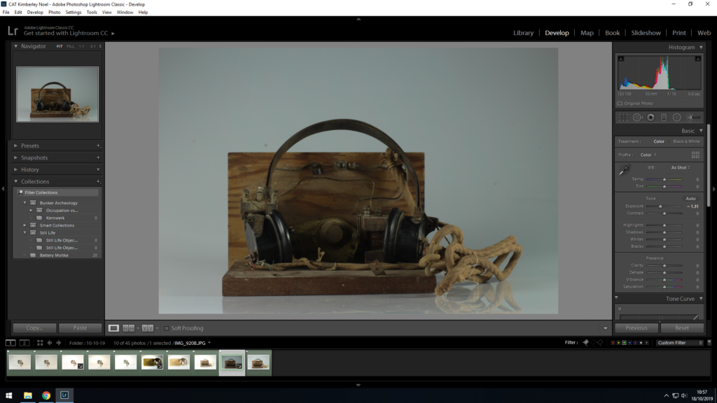
On thing I really learnt from this shoot is the composition of the objects can make or break the image. Here is an example:
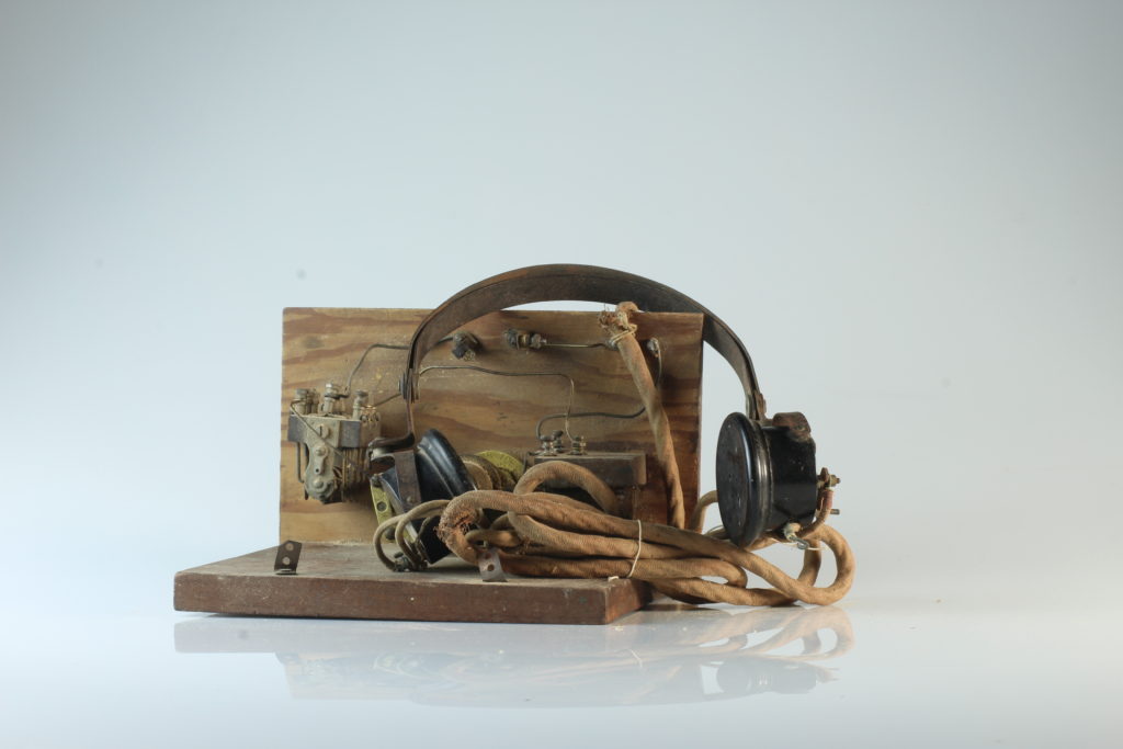
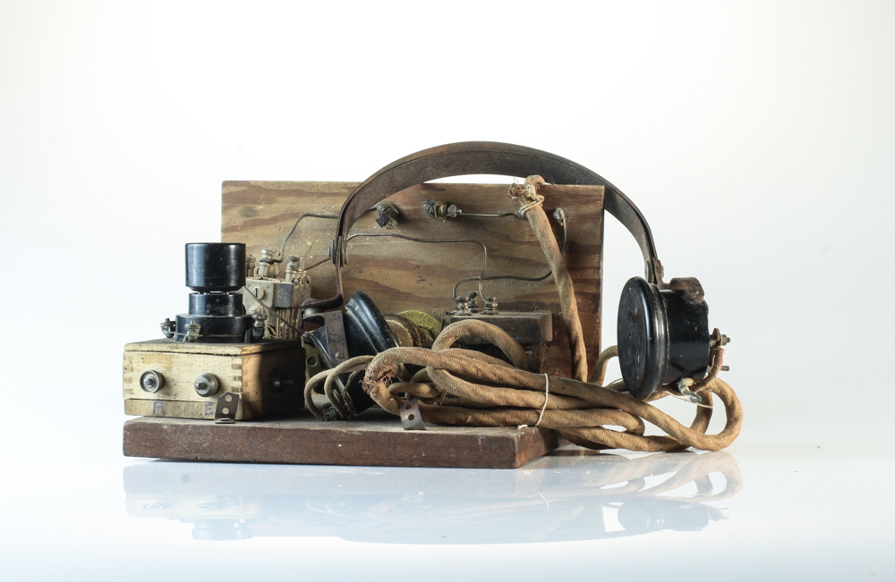
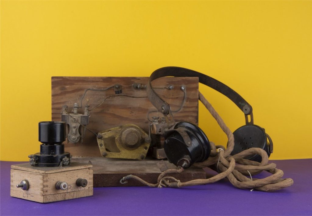
The image on the left is unedited. I wanted to photograph this radio and headphone set but I wasn't happy with how it was turning out. I kept trying to move the wire and headphones into different placed and angles but I just knew something was missing. After trying to make the image work, I decided to see if introducing another object would make the scenario look better. I then found the mini crystal radio set that islanders made and used to find out the news. By linking these already similar objects together added a lot more depth to the image and made it overall more interesting. The similarities between the top of the crystal radio and the headphones are eye catching and the different shapes of the crystal radio adds depth to the photo.
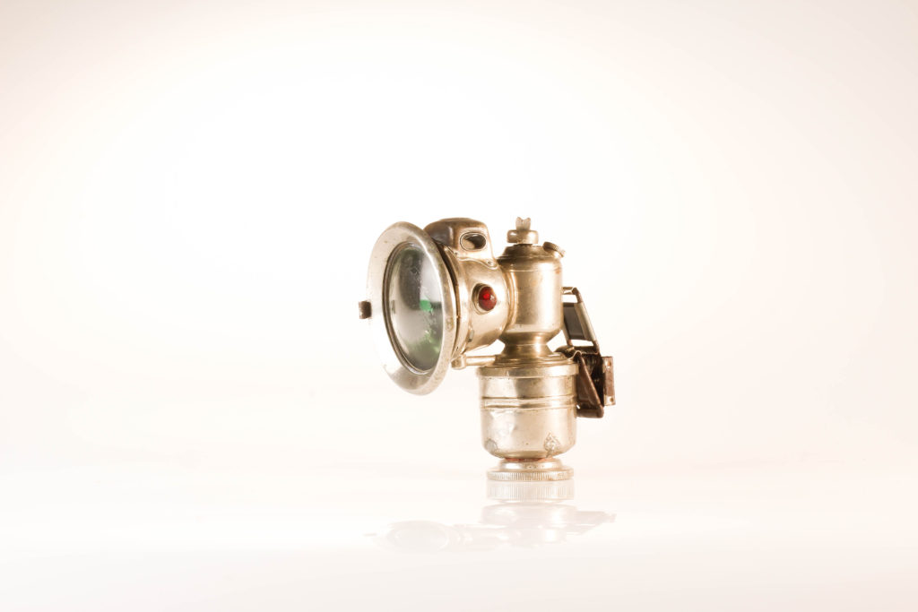
For our introduction into the objects section of our coursework we were to take pictures of archive objects in the studio. We had a lesson in which we were taught how to uses the different lights and how to sync them with the cameras as well as setting up the correct white balance, shutter speed and aperture. There were two different angles used to create these images, downwards and forwards. All my images were created in artificial lighting through the use of tungsten and flash lights in the studio. There is high level of control in the positioning of each object through a system of taking the photo, examining the position and relocating the object if necessary. I kept my aperture at F16 to ensure I had a wide depth of field and ISO at 125. My white balance was sunlight so that there was accurate white colour balance to complement the objects colour tones. In light room I used the spot removal tool to get rid of smear and rain marks that were on camera I used in the studio, that I wasn’t aware was dirty at the time.
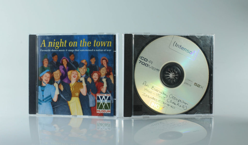
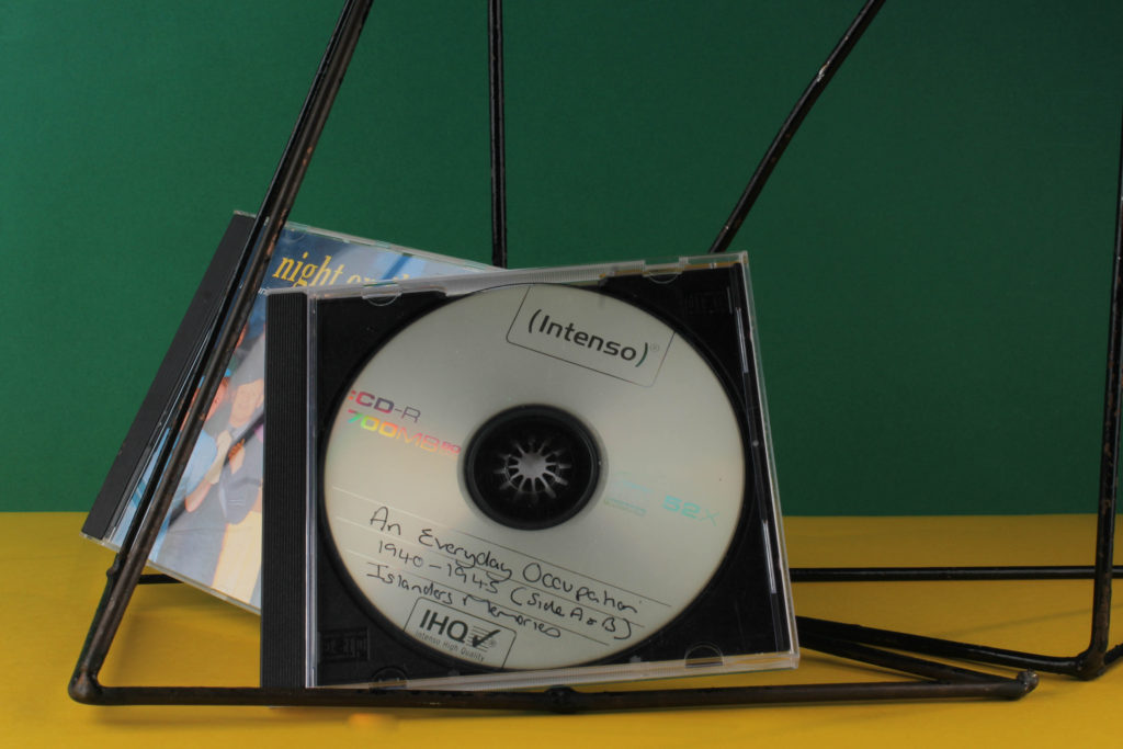
This image features two CD’s with songs from the occupation that were played and sang by people from Jersey. I positioned them centrally at equal angles and with a white background to make them the focal point. The use of artificial lighting creates a reflection of the plastic casing and disc. This image is simplistic from the out look but conceptually the symmetry of the CD’s symbolise the stability music gave to many people. Music was a form of escapism for many, to enjoy and forget about times of hardship. War songs were sang by those in the battle fields to raise spirits of the thought of one day returning home and singing it with the ones they love.
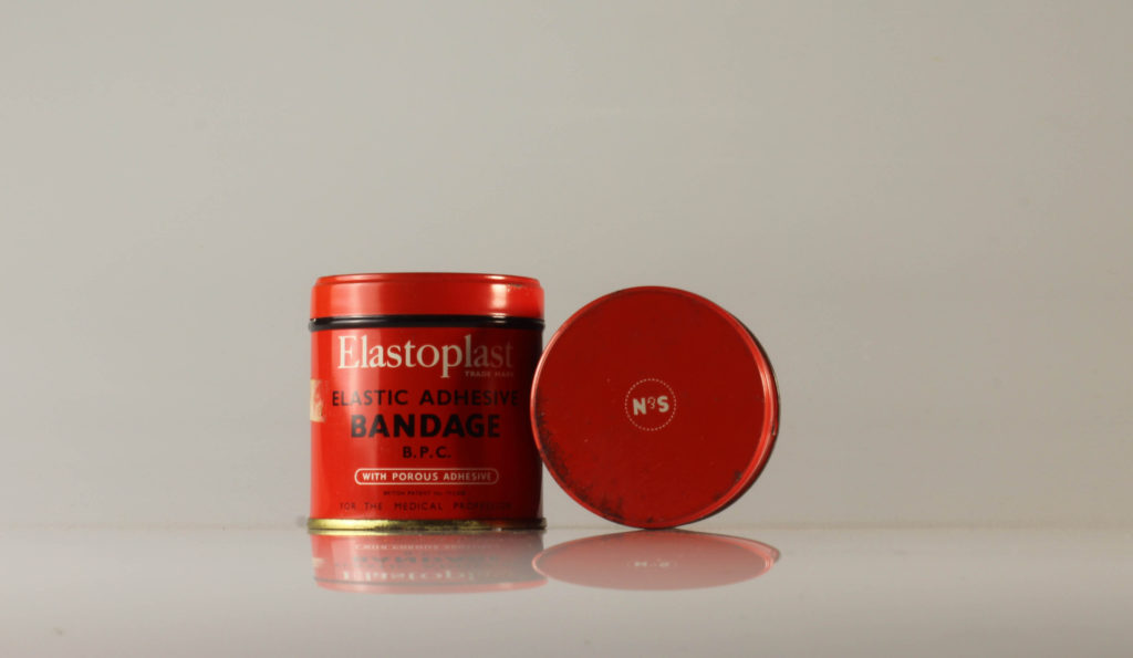
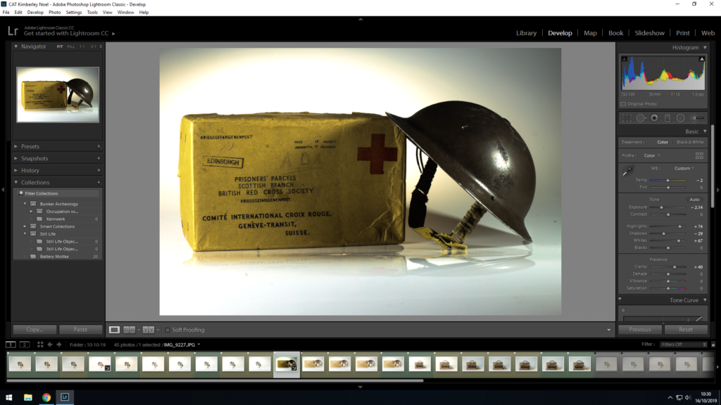
This image features a bandage and its packaging from the time of the occupation. I wanted to have as white a background as possible so that the red would stand out as the focal point of the image. I chose this item as I felt the red box work in harmony with the use of the bandage being to cover up bloody wounds, the literal works as its metaphorical colour. It is ironic that the inside of the packaging will soon look like the outside, this is similar to a soldier at war. The soldier one day many physically be wounded and as time goes on that outside damage becomes internal and mental.
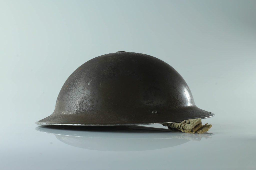
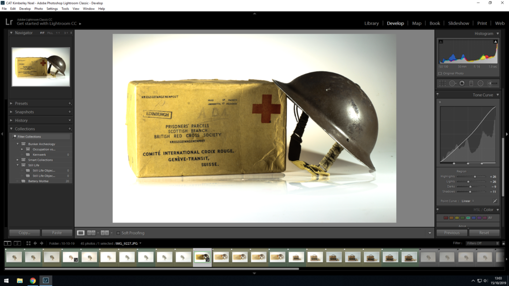
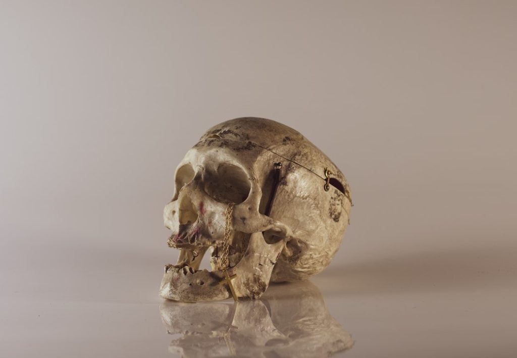
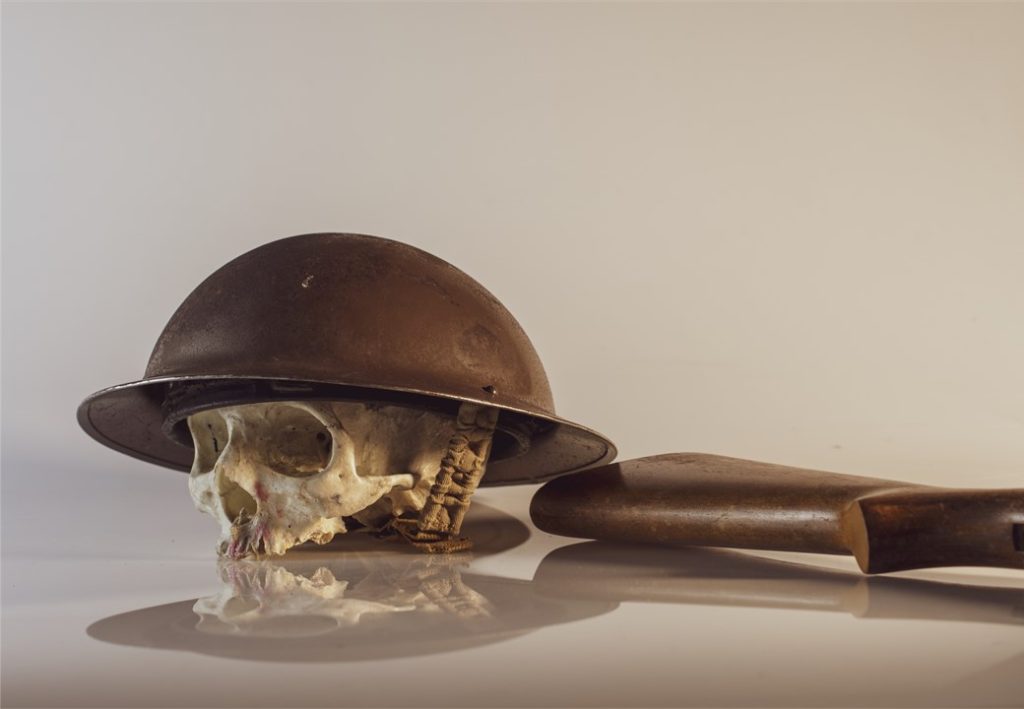
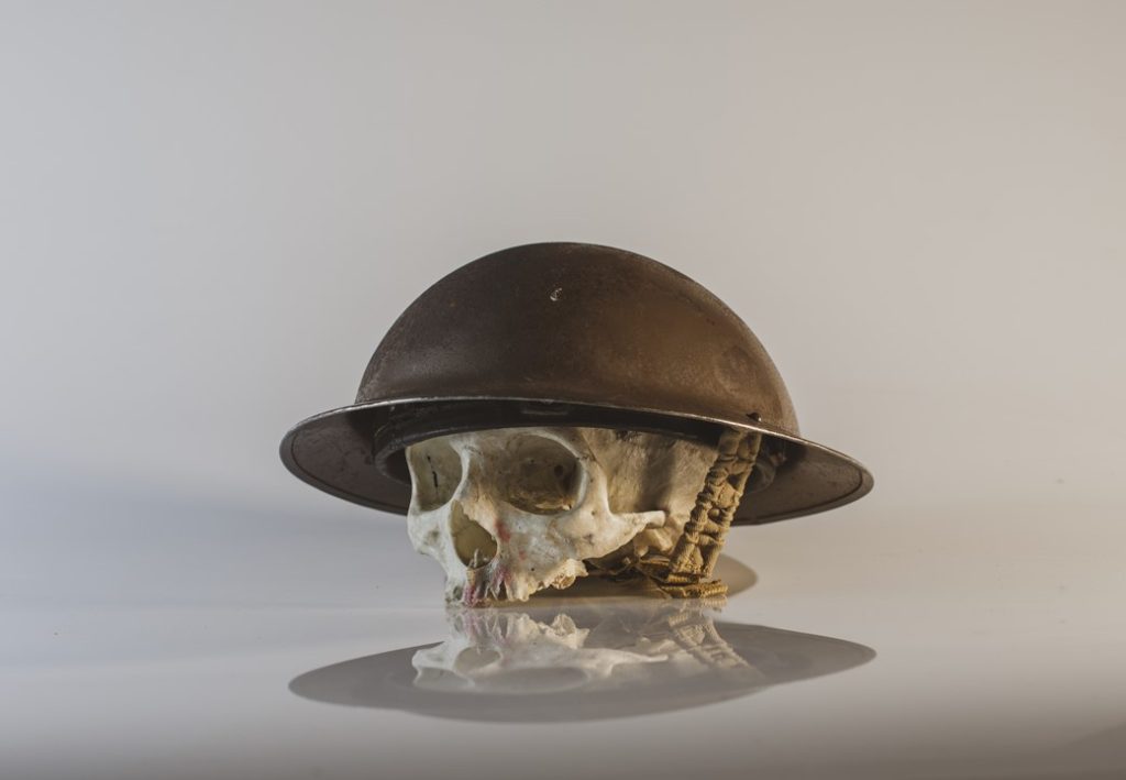
For this image the positions of the hat were limited so I didn’t have any options to work with. I set the camera up in front of the reflective screen as I knew metal helmet along with the flash lights would create a mirroring reflection beneath. The reflection represents the person underneath the hat, ones the hat comes off you dissociate the person with being a soldier but that person never forgets they are a soldier. It’s a metaphor for the trauma they have to walk around with for the rest of their lives, some may say they are lucky because they made it out alive and never have go to battle again but for ex-soldier they are forever wearing that hat and the memories it holds.
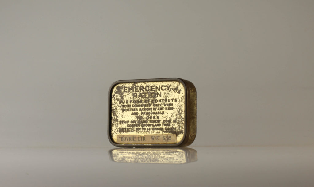
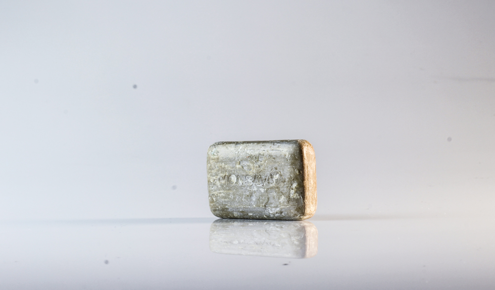
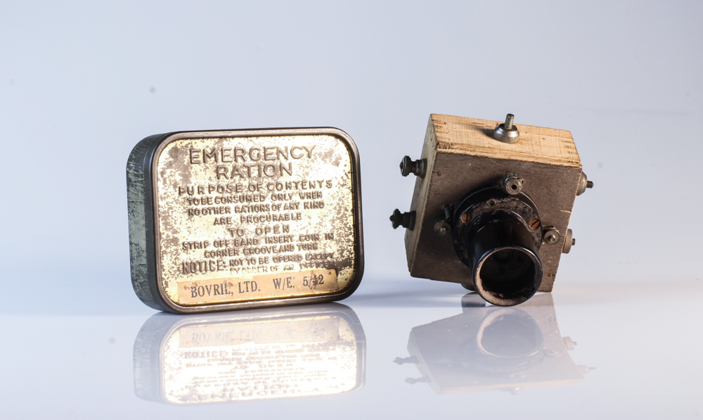
This tiny box may look insigificant but it holds great importance to the occupied people of Jersey. I did minimal cropping as I wanted the large amounts of background to emphasise the lack of awareness the world today has about rationing and although we aren’t experiencing war there are many families rationing. People below the poverty line are having to plan what they eat to see if they can afford it, some aren’t having enough food because they simply can’t afford it. During the occupation people were going through the same thing but not necessarily because of money but lack of access the Island had to food.
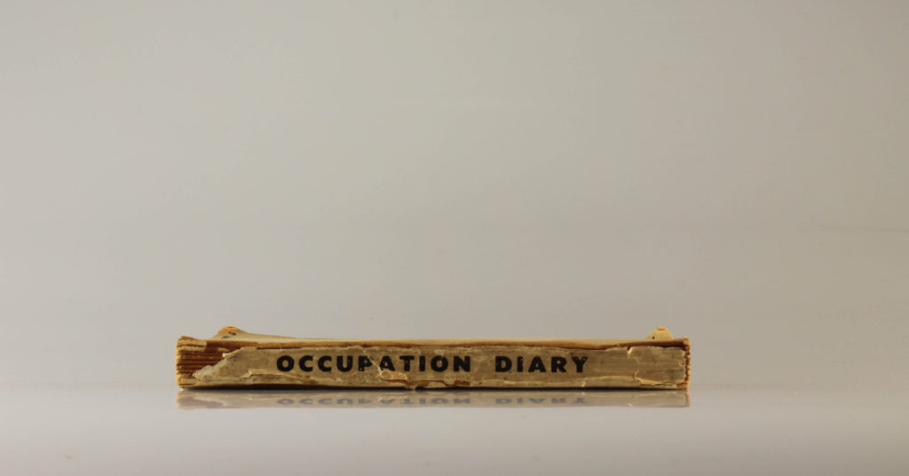
This is one of my favourite images from the shoot because of it’s minimalistic feel. In order to create this photo I went through a trial and error process to achieve this positioning of the book, first I had to upright but it sat at an odd angle and I struggled to keep it stagnant. I am planning on using this image for a photo-montage which is way I left some negative space above the book. I wanted to include the spine of the book because it’s what keeps it altogether which is symbolic of how people use diaries to express their emotions which can be a way of keeping your mental health in one stable piece.
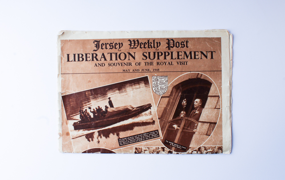
I used an downwards angle to create this image, where I had to stand on a ladder to look through the lense, which makes it harder to centralise the object as accurately as possible. Although the image didn’t come out to be symmetrical, I liked the authenticity of it’s positioning. To me is reminded me of a scene on a movie where someone slams down the newspaper on the table and it lays at an skew angle until someone picks it up. Newspapers at the time were so important to people because other than the radio it was their only access to the news, so anyone who could afford it had it.
Who Invented It?
The Autochrome process, also known as the Autochrome Lumière, was invented in France by brothers Auguste and Louis Lumière. The commercial manufacture of autochrome plates began in 1907, and the first public demonstration of the autochrome process took place on 10 June 1907, at the offices of the French newspaper L‘Illustration.
How Does It Work?
Autochrome plates are covered in microscopic red, green and blue colored potato starch grains (about four million per square inch). When the photograph is taken, light passes through these colour filters to the photographic emulsion. The plate is processed to produce a positive transparency. Light, passing through the colored starch grains, combines to recreate a full colour image of the original subject.
How Was It Made?
transparent starch grains were first passed through a series of sieves to isolate grains between ten and fifteen microns thick. These microscopic starch grains were separated into batches, then dyed red, green and violet, mixed together and spread over a glass plate coated with a sticky varnish. Next charcoal powder was spread over the plate to fill in any gaps between the coloured starch grains. A roller with over five tons per square centimetre of pressure was applied in order to spread the grains and flatten them out. Finally, the plate was coated with a panchromatic photographic emulsion.

This painting, named Mens Grooming still life is a still life oil panting by Czech painter Charles Cerny. This image depicts typical everyday mens grooming objects from western European civilisation. During the onset of the 20th Century when this image was painted, Male grooming became an increasing trend amongst middle class men of the era due to the development of professions such as lawyers, accountants and tax officers. The process of industrialization where many millions of people migrated from the countryside into the cities plays a role in the context of this image as the movement into crowded areas prompted a new form of mannerism and social etiquette.
In the image, The most prominent object is a bowler hat. Typical male attire for the early 20th century, The bowler hat is in itself a symbol of masculinity as well as the fact that its main purpose was to preserve a mans hairstyle an protect it from the elements without altering it. The mustache Guide card is one that was typically given out at barbers throughout the early 20th century as moustaches were a trend amongst males as it connoted signs of class. The classic shaving knife in the bottom left of the image is also representative of masculinity and the care and attention to detail men put into their image. The blade would have to be used carefully and slowly with a steady hand otherwise a man could slit his own face open. The central shoe brush would have been used to polish and shine shoes, creating a sense of cleanliness and order.
Soap was also a key factor in a mans grooming collection. Due to the dirty nature of the industrial cities, It was seen as highly important to maintain health and cleanliness on the go in order to keep this dapper look up and maintain a presentable appearance. Therefore, many early 20th century men would carry bars of soap on them, often keeping them in a packet or soap dish and use them periodically to keep their hands clean and smelling fresh. The pink bottle in the top right of the image was a male form of cologne which was used to give a man a masculine aroma and to mask up any smells present on the man and replace these foul odours with pleasing scents. Even to this day, many men use and carry around cologne, keeping this process alive